2010 - Chart of The Year
Posted by Euan Mearns on January 1, 2011 - 6:57pm
A picture says a thousand words. In this post you will find only charts and graphs conveying important points from the world of energy 2010.
Readers are invited to post their favorite charts from 2010 in the comments. Instructions are given at the end of this post. This is a charts only thread, no text at all (though posting links is OK), noncompliant posts will be deleted. An energy theme is preferred though other related themes such as economy, population, sustainability are acceptable. Climate charts that do not link directly to energy will be deleted.
Within a week or two TheOilDrum will host an open thread that will enable discussion of the charts posted, but today is New Year, discipline please - charts only. Thank you - and hopefully a happy 2011 to one and all.
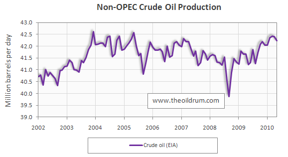
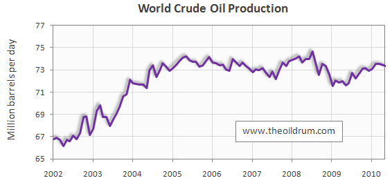
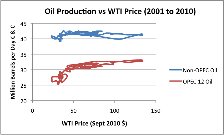
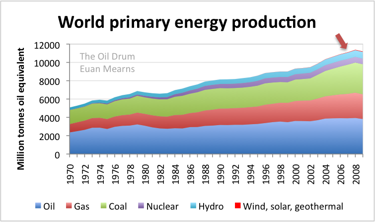
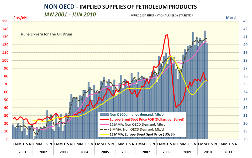
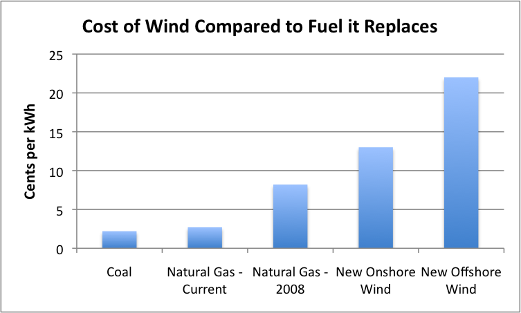
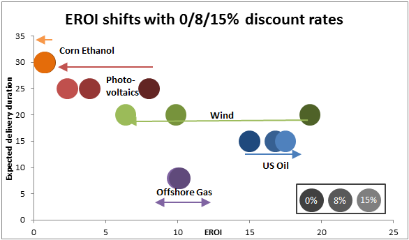
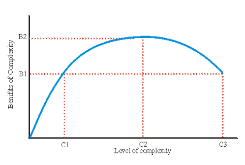
Click to enlarge

Peaknik
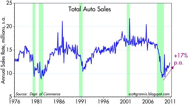
USA Auto sales
abundance.concept
anyone

Daddylonglegs
Early Warning


To add your own images (no text), use the following procedure:
1) If you have an image on your computer, upload it to an online image hosting server (e.g. www.photobucket.com)
2) Copy the hyperlink to that image
3) Paste after < img src=" and before "> (remove the space before the 'img')
(It will look like < img src="http://s571.photobucket.com/albums/oilchart.jpg" > or some such (but without the spaces at beginning or end)
Contact
- Content: editors at theoildrum dot com
- Tech support: support at theoildrum dot com
License

This work is licensed under a Creative Commons Attribution-Share Alike 3.0 United States License.
Source
Norway hydro reservoir content
http://www.nordpoolspot.com/reports/reservoir/Reservoir-content-Norway/
Here's the same graph for Switzerland (download pdf and look at last page):
http://www.bfe.admin.ch/themen/00526/00541/00542/00630/index.html?lang=d...
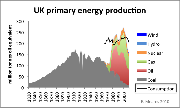
Office for National Statistics
http://www.energybulletin.net/node/16459
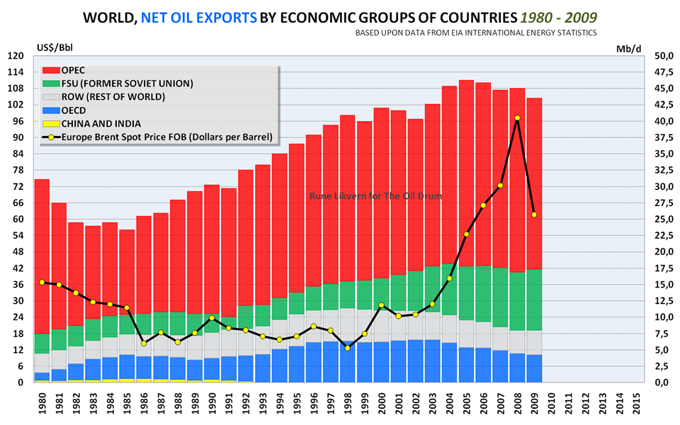
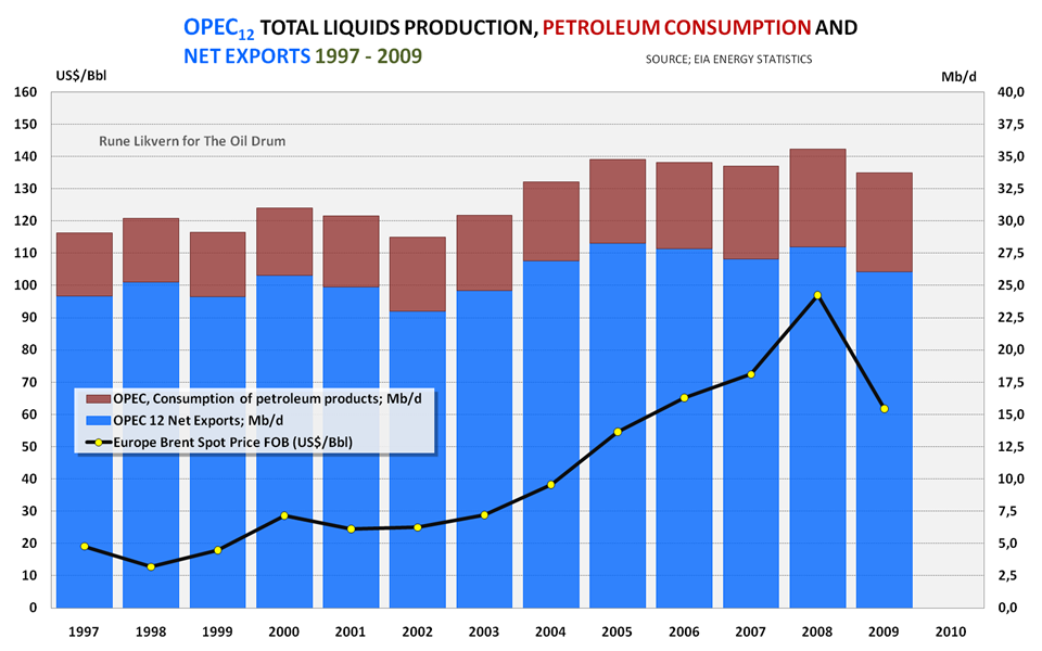
Crude oil graphs
http://www.crudeoilpeak.com/?page_id=51
Gross Renewable Energy Sources vs. Consumption

http://en.wikipedia.org/wiki/File:Available_Energy-4.png
http://www.ren21.net/Portals/97/documents/GSR/REN21_GSR_2010_full_revise...
Saudi Arabia oil production vs consumption (Ref. BP)
From the front page of today's WSJ:
This figure shows the correlation between resource exports as a share of GDP for a number of countries and their GDP growth:
Source?
http://mazamascience.com/Population/IDB/
US Federal Deficit rises and hides fall in Real GDP
Swedens energy supply.
From the bottom, oil, natural gas, coal, mostly soil biofuels, heat pumps, hydro power, nuclear including losses.
Swedens government debt in giga sek , the next downslope is expected 2011.
Swedens government debt related to GNP in percent
Sweden's use of fossil fuels for transports and GDP (=BNP in Swedish). Correlation 0.95.
http://www.gold-eagle.com/editorials_08/long040310.html
The Maturity Wall
IFR = Integral fast reactors
MC = methane clathrate (maybe)
Source
Here's an update of the first chart. At least for the US.
Related:
And ...
Not to mention . . .
Total contents of reservoirs on the Colorado River.
See hydro-power, irrigation, and water supply.
Powell at 63%
Mead at 39%
Total system at 56%
http://www.powerauthority.org/documents/power%20operations/2010/09.pdf
My projections for Freedom Fertilizer's (shameless plug) wind energy to NH3 fertilizer potential, along with world population growth
Economy and energy consumption: an identity, despite singularities. or the myth of energy efficiency improvements at global scale.
Source, Discussion
(http://www.theoildrum.com/node/7185#comment-748379)
(US Minerals databrowser)
(US minerals databrowser) .. to follow up on Fertilizer from Wind
(Energy Export databrowser)
Deaths Per TWh for All Energy Sources
The world society proceeds in a traditional manner without any major deviation from the policies pursued during most of the twentieth century. Population and production increase until growth is halted by increasingly inaccessible non-renewable resources. Ever more investment is required to maintain resource flows. Finally, lack of investment funds in the other sectors of the economy leads to declining output of both industrial goods and services. As they fall, food and health services are reduced, decreasing life expectancy and raising average death rates.
From Limits To Growth: 30 year update
Yet, death rate now on apparent upswing:
http://www.indexmundi.com/world/death_rate.html
Though not predicted to start increasing till ~2030
Years CDR Years CDR
1950-1955 19.5 2000-2005 8.6
1955-1960 17.3 2005-2010 8.5
1960-1965 15.5 2010-2015 8.3
1965-1970 13.2 2015-2020 8.3
1970-1975 11.4 2020-2025 8.3
1975-1980 10.7 2025-2030 8.5
1980-1985 10.3 2030-2035 8.8
1985-1990 9.7 2035-2040 9.2
1990-1995 9.4 2040-2045 9.6
1995-2000 8.9 2045-2050 10
http://en.wikipedia.org/wiki/Mortality_rate#cite_note-2
And birth rate continues to fall:
http://www.indexmundi.com/world/birth_rate.html
http://www.safeenergyassociation.org
Oil dependency in the EU, related to debt and deficit and the sovereign debt crisis.
World measure of efficiency and sustainability.
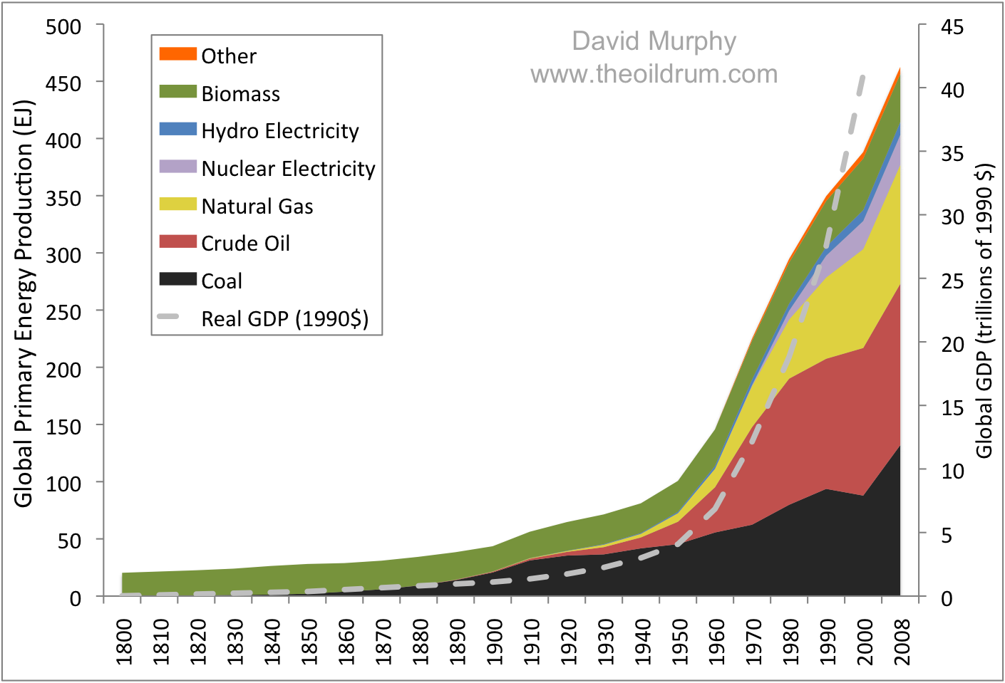
http://www.theoildrum.com/files/murphyfig_1.png
http://www.theoildrum.com/node/7246?utm_source=feedburner&utm_medium=fee...
http://zup.samassaveneessa.info/jpg/Exploited.jpg
A cornucopia, pun intended, from desdemonadespair.net: 50 Doomiest Graphs of 2010. Also check out their 50 Doomiest Photos of 2010. They have linked to The Oil Drum: Graphgasm 2010, squaring the circle, as it were.
Not specific to 2010, my own effort, attempting to figure out commute options in the US (2000 census data, 281M population):
Discussion and spreadsheet link here: http://dr2chase.wordpress.com/2010/05/09/us-cycling-density-excuses/
And the price, scroll down the page aways:
http://phosphorusfutures.net/why-phosphorus
Jan 2007 $50/ton
Jul 2007 $75/ton
Dec 2007 $200/ton
Mar 2008 $350/ton
Source
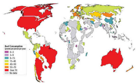
The paper where it comes from, with, among others, similar graphs for the Americas, Africa and Asia.
UK petrol prices...
Some stuff from the 2010 Transport Energy Data Book (http://cta.ornl.gov/data/index.shtml):
And the Chinese E-bike surprise
(Something went wrong with your images from michaelbluejay - EM)
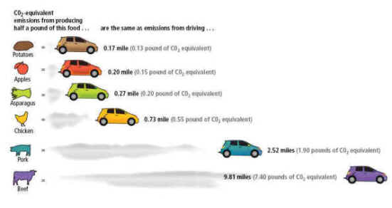
How Meat Contributes to Global Warming

In the red
"Peak Oil Cheapness"
I made this sankey chart of 2010 oil supply and demand:
Petrol prices from the AA, earnings from median earnings in 2009 using the average earnings series from measuringworth.com to derive the other years
Australia - the lucky country!


This is silly; here's my energy usage chart-
Energy Intensity - Gross Inland consumption per GDP, EU 27
Source: EEA
Prediction v performance; Eriksen 2009: