Rembrandt Koppelaar's Oil Peak
Posted by Stuart Staniford on September 10, 2005 - 8:06am
Lest I seem unappreciative in some of my critique later, I want to say at the outset some of the things I like about his analysis. Firstly - it's open. His assumptions and methodology are laid bare, so we can meaningfully investigate them. No proprietary databases, and no $2500 fee. Secondly, he's done a good job of assembling a big list of projects, against which other analyses can be checked. He has a much more nuanced analysis of depletion rates than the ODAC analysis. He was even kind enough to us linguistically challenged Anglo-Americans to write it in English, not Dutch. In short, he has tremendously helped anyone else doing the same task in future. Let's take a look in more detail.
Koppelaar's Methodology
Koppelaar proceeds in a series of stages:- He gathers recent country production statistics from the IEA's Oil, Gas, Coal and Electricity Quarterly Statistics ,
- For countries that have been in decline for at least a few years, he calculates the average production decline over those few years and extrapolates that decline rate into the future as the decline for existing production.
- Otherwise, he takes estimates of decline rates on existing production from a wide variety of published sources (which he generally does a good job of footnoting). Where nothing useful is available, he uses a SWAG (Scientific Wild-Assed Guess).
- Onto that base, he adds new production from a long list of projects which he itemizes.
- For the long haul (past 2010), he decomposes production into four components (existing production in decline, bringing on known but not yet produced reserves, EOR projects, and projects from recent and future discoveries).
- He makes estimates, that are pretty much SWAGs, of the change in those quantities over time, and then adds them up.
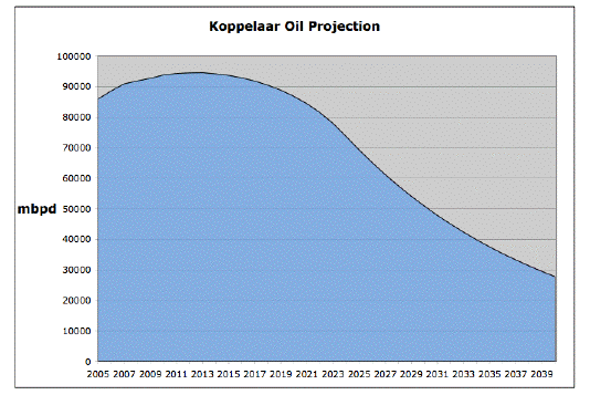
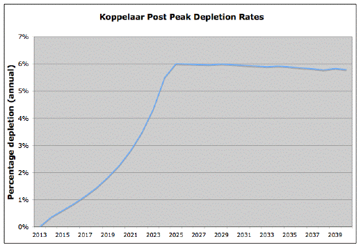
Here's what his total depletion rate ends up looking like:
So in terms of the Green-Yellow-Red model he's up towards the top of the yellow zone (give or take, depending on exactly what you believe the contraction threshold would be).
Critique
The following thoughts are offered in a spirit of improving our ability as a community to do this kind of analysis.Error Bars
There are very large uncertainties here. Future depletion rates depend radically on what one assumes is the real state of non-transparent reserves and the way in which technology interacts with the fields. Projects often get delayed. Production profiles (as opposed to peak capacity) of future projects are often unknown. Wars and revolutions regularly make huge and lasting differences in production. When you add together lots of uncertain things, you get even more uncertainty in the total. I think we need to have analyses that don't present a single curve, but rather a range based on error analysis, so we can see that uncertainty very clearly in the graphs.Treatment of Unconventional Oil
One of the reasons Koppelaar is much more pessimistic than CERA in the long term is that he doesn't assume a major ramp-up in production from tar-sands, oil shale, coal-to-liquids, etc, as CERA does. His statistics for Canada include some syncrude projects (ie syncrude is included in his definition of oil), but his long term extrapolation effectively assumes that the world will not develop it very much (Canada doesn't increase that much, Venezualan production is flat, and the US continues to decline at 5% a year). However, he doesn't justify this assumption. Certainly these sources are low quality and expensive to develop. Their EROEI is low, but it's significantly better than one and there's vast amounts of these resources. A long term projection needs an explicit theory on how much these sources will get developed and why (this obviously interacts very strongly with assumptions about future measures to combat global warming, and it has a lot to do with the relative economics of developing them versus conserving instead).Conflation of Type II and Type III depletion
Chris Skrebowski introduces a helpful analysis of different depletion types. Type I depletion is where individual wells are being depleted, but the field can maintain production by drilling more wells. Type II depletion is where the field is depleting, but country production can be offset by new fields. Type III depletion is when the country as a whole is in depletion. We could imagine a Type IV depletion for when the whole world is in depletion.Koppelaar, when he takes existing country production statistics and extrapolates them into the future is extrapolating the Type III depletion rate. But then, he adds on new field production. So he's treating the extrapolated depletion as though it was Type II, not Type III. To really know how to extrapolate Type II depletion, we'd need to know the recent history of new field development in the past years, subtract that out of the national statistics, and then extrapolate that, higher, depletion rate.
Depletion Surprises
New technology has led to some nasty depletion rate surprises in recent years. Use of seismic imaging, MRC wells, big frac jobs, etc has led to very high production followed by very rapid declines especially in small fields where the thing can be sucked dry in short order. The very high North Sea depletion rates of the last few years were not foreseen. Nor was the situation in Oman. It isn't at all clear at this point how widely that disease is going to spread. Matt Simmons is essentially arguing that this is going to happen to Saudi Arabia soon. Koppelaar effectively assumes this isn't going to be a big global factor. Even for the UK, he assumes 7% decline in future and adds new projects on top of that (whereas depletion 2004 on 2003 was 10%, and 2005 is running around 15% down on 2004 so far).Production Profiles
As far as I can tell, if Koppelaar has a project that starts in 2008 with a peak capacity of Y, he pretty assumes flat production of the project at Y for its life. But modern offshore projects have a very different production profile from that (and most new projects are offshore) . See, for example, the anticipated White Rose profile. It rises rapidly, but not instantaneously, to the peak and then declines less rapidly. This is going to make a big difference in the near term numbers and has to be accounted for.Conclusions
In summary, I think Koppelaar's analysis has a variety of interesting features, but I don't think we are good enough at this kind of thing that anyone should be trading stocks or making major life decisions based on the assumption that these bottom-up analyses are solid (of course the fact that different people can do the same kind of analysis and come out with wildly different answers should have already hinted at that).Contact
- Content: editors at theoildrum dot com
- Tech support: support at theoildrum dot com
License

This work is licensed under a Creative Commons Attribution-Share Alike 3.0 United States License.
Although, as Stuart points out, the depletion rates probably will be much higher caused by 3th and 4th generation of extraction techniques.
But I think there is another interesting part to this. What will happen when we come closer to peak and demand is still rising? Maybe there is stil a lot of oil left, but who gets it? As China now has been doing:
http://news.xinhuanet.com/english/2005-08/31/content_3425387.htm
other countries will soon follow (Indonesia, Russia, Venezuela to name a few); the oil will just not leave the country where it has been taken out of the ground. I think that this is the main reason why Bush Inc. grabbed Iraq allready years before the production peak. It will get unreasonable hard for the US to import it's oil, years before the peak hits.
"Record high export duties in recent months have prompted Russian firms to limit crude exports and refine more oil to sell gasoline at home and export more products, as they are subject to lower duties."
http://www.themoscowtimes.com/stories/2005/08/30/048.html
http://www.sptimes.ru/story/15378
Venezuela:
http://www.usatoday.com/news/world/2005-08-25-chavez-oil_x.htm
http://english.epochtimes.com/news/5-8-19/31398.html
Equador:
http://news.bbc.co.uk/2/hi/americas/4153318.stm
Iraq:
http://www.contracostatimes.com/mld/cctimes/news/nation/12452331.htm
"BEIJING. September 6. INTERFAX-CHINA - Oil will peak at USD 90 per barrel by March of next year, CNOOC Dep. Chief Economist Zhang Weiping said at conference discussing China's energy needs in Beijing on Monday. Zhang also expected global oil production to peak at 94-100 mb/day during the next five years."
http://www.interfax.cn/showfeature.asp?aid=5412&slug=OIL
This is to be taken seriously. This is not the first time that the Chinese have signalled that they see the world production peaking relatively soon. This makes China one of the rare major oil producing countries to officially acknowledge the Peak Oil.
Besides, Koppelaar don't really say that oil production is growing 2% a year until peak. If it would the production level would be about 100 mbpd in 2013. But the graph shows top at 94 mbpd.
CERA, Koppelaar, CNOOC, ASPO, ODAC, Simmons et al. are not so very far from each other. All see the top coming at a capacity level that is not much higher than the present - may be 10% higher. All see significant depletion after that.
Besides the peak is somewhat diffuse. What is "oil" here? Does it include all the "liquids" too?. But are really equivalent to oil? What about tar sands and all that extra heavy and sour stuff? This makes a difference in pricing, refining and fuel use. How do we recognize the peak? The production statistics are all unreliable. The Saudi export is monitored by looking the tankers. Nobody knows exactly how much is produced today. How wide is the error margin here? 1% would mean about 860,000 bpd, 0.5% would mean 430,000 bpd. Most of the new projects in CERA or ODAC list are smaller than this.
When we look at oil prices and consumption it must be taken to account that oil markets deal mostly with exported oil. This makes the development of domestic consumption in the oil exporting countries crucial. In many oil producing countries domestic prices are much lower than the world prices, ie. Venezuela, China, Indonesia and Middle East. Rising oil income is boosting the domestic economy and increasing domestic oil consumption right now, especially when oil is subsidized. And all the exported oil is not on market. Many national oil companies own foreign subsidiaries and import oil from them at contract basis. This adds to the volatility of the remaining markets.
All this makes the peak oil a quite complex phenomenon. But Katrina has shown some tangible facts: no major oil producer has raised production to compensate the loss of production in the GOM. This is a strong indication that there is no spare capacity left. This is something new. The new projects will add some production when they come online but no real spare capacity. This means that when a majos producer (Russia, Saudi-Arabia, Mexico, China) starts depleting (the total output starts falling) it will be felt quite soon. If Russia starts depleting 5 -6% a year, after three years it will supply about 1.5 mbpd less than now. That's more than 1% of the world total. This is a lot. But after the 1987 absolute peak the depletion rate was still higher, about 7%. In any case one major producer starting to decrease will cut most of the projected growth and make the world production quite flat. We don't know the exact situation in any of them so predicting is virtually impossible. But the risk is of course rising.
In my view, it still comes down to how things deplete. This is the big unknown right now. The unfolding data is not encouraging and leads one towards pessimism.
I think this is a valuable piece of work, and I would look at it as the optimistic end of things. In my view, because of its over-reliance on unconventional sources CERA is off the charts. So, this is what things look like if you are honest and use an optimist view of depletion rates.
Personally, I believe that is a mistake, but all good planning should be based on working a broad range of scenarios so that you are not surprised by any eventual outcome. And this result is certainly defensible. So, the question under this scenario becomes, can business as usual be sustained with a 2% per year growth in production of liquid fuels? Is that sufficient to maintain the current pace of growth in the US and Europe, while carving out a bigger piece for the developing world? And what exactly do we do with these eight years?
As you know it is a draft version and i intend to incorporate any errors i can find. The whole idea so far was not to make an exactly correct model but to give a general outline which makes it quite certain that the peak will be within now and 10-15 years.
The problem that i have is mostly lack of data.
On a point by point basis:
Error bars -->
i wanted to do that but i don't have enough time to make different graphs for it. That's why i incorporated 2010-2015 as a peak range. I don't think that economical,political and natural factors will shift the peak as much as people say. These things are also countered by increased investement because of high prices and stuff.
Unconventional oil -->
Big question how these forms of oil will develop. Venezuelan developments are a weak point didn't do much with that. Canadian tar sands are factored in (4-5 mb/d eventually), as for oil shale i think those will only come into development much later (around 2020) which could increase production. Except that we have no clue on the EROEI of oil shale. Is it viable to produce it?
Type II and III depletion -->
Correct, i have no data on past increases so it is quite hard for me to be able to factor in the exact depletion rate. As a counter argument i would like to say that because we are dealing with a variety of factors (possible fields coming online, depletion increases and decreases because of potential EOR etc..) it might not matter that much.
Depletion suprises -->
This is the big thing as to what is going to happen... Don't know i am quite concerned about depletion in the Deepwater from what i have seen lately.
I intend to rework the North Sea, thx for pointing out the major errors that i made there.
Production Profiles -->
only for the period 2005-2010, not for the extrapolation part (which is based on an entirely different method (SWAG as you call it :D)
Thanks again for all the hard work you put into your analysis.
Read the estimates and specific information on the various countries. The usual official optimistic talk about raising the production is taken at its face value. Oil producing countries are ussually utterly reluctant to admit depletion and keep talking about fancy new projects that will boost production and the need of new investments. This is exactly why ASPO is there and why Simmons, Campbell and others have made their own estimates. The ASPO liquids curve is still the most realistic.
By the way, CGES has nice table on OPEC production and spare capacity. You can see that only the Saudis claim any reserve capacity - should we believe them? (CGES: Centre for Global Energy Studies
"CGES ESTIMATE OF OPEC PRODUCTION"
http://www.cges.co.uk/default.asp?cdn=MORHighlights&pt=Monthly%20Oil%20Report&nav=MOR&ln av=subscriptions)
The curves are close to linear. I held a straightedge up against the 2% curve, and there is a definite slight upward curvature.
But I checked the Russian oil situation and found this: http://www.neftegaz.ru/analit/reviews.php?id=518
It is dated 8/11 2005 and is written by Tatjana Zaharova. It cites FAE (Federal Energy Agency) chief Oganesjan saying that during the three previous years the Russian oil production grew about 10% a year. It should grow a little this year but the growth will slow down and stabilize in 2006. (We know from the recent statistics that the production is already stabilizing this year).
The article states that the Russian Ministry of Natural Resources has a more optimistic prognosis that gives a lot of growth up to 2010. But counters that quoting Jan Kapitski from Chevron/Texaco. He says that the growth potential of the Russian energy sector has practically run out.
In fact the Russians has signalled peaking production for some time now. It is already a great difference to go from 10% growth to zero growth. That is almost 1 million bpd missed increase or 1% of the world production or 50% of the average projected world supply increase of 2%. If Russia goes to 5% decline it will take away 75% of the projected 2% growth. So we see how extremely difficult it is to make these estimates and where the error sources are.
Here we have an example of an optimistic and a pessimistic prognosis. The difference is significant and the reality seems to be on the darker side...
Besides that its a draft version, lots of stuff still needs to be added. And as answered before those 2 curves are not linear. As for depletion i usually factor in either historic values or data from specific fields declining. Could be that some of the things that get in the paper are too optimistic (for instance 10% Cantarell decline). But who knows? You think it is better to just make some sort of quesstimate based on thin air?
How come the ASPO liquids curve is the most realistic? Based on what? ASPO hardly produced any data to prove that curve to be true. Im still waiting on their database to come online. Until i see real figures i don't take the ASPO outlook seriously.
It is quite possible that Saudi-Arabie has 500.000 to 1 million barrels of heavy crude spare capacity. We just don't know.
The peaking and starting of production decline makes huge difference in the future projections. If we project that a country will increase production three years by 5% a year, but in reality it starts to decline by 5%, it means that the production will be 31% lower than projected. Note: three years, 5% and 31%. If this kind of turn happens, it will crush all predictions for that oil area. And these kind of turns have happened. They have been quite a shock for those countries (take Argentine), especially if they coincide with bad price fluctuations. If investments, economic activity and economic policy is geared for continuing oil production growth, the peaking will mean that the economy falls flat down. That is why the peak is so interesting.
We can really see kind of "Hubbert phases" in many oil producing countries: an oil euphoria when the curve goes exponential and wild projections of the oil industry growing and money flowing in are made. Liberal economic policy is adopted, currency revalues, importing stuff and taking loan becomes cheap and everbody has fun. At his moment the production peaks, without real warning (OK, some oil engineers may have hinted something). At this moment the oil officials usually make some optimistic statements of increasing investment and boosting production next year because it has been rising before. The plateau is usually not long (it might be less than a year) and the decline begins. The Hubbert curve is mostly more or less symmetric and the oil hangover begins. The drop is steepest in the beginning and the gap of expectations and reality widens rapidly. Nobody has fun any more. Currency collapses, debt becomes a burden, stocks and real estate lose their value. But nobody connects this to the oil depletion. So no lessons are learned. but some rioting is done.
Even if ASPO is using a DB, there's something wrong with it. ASPO is currently predicting production of 82mbd for 2005 (see the Sept. 2005 newsletter at www.peakoil.ie), even though the DOE has production for the first six months of 2005 at 84.3mbd. The prediction is already wrong.
I realize I've been making this point a few times before and Stuart refers to these issues as second order effects. But I still ask: what makes anyone think that the are second order? What makes anyone think that the depletion rates you compute for the first half of the oil age will look anything like the second half, taking into account the response of the system to the depletion? Yes, I know, new technology will speed up the depletion. Those are words. What will really happen? What are the dynamics of the current depletion numbers in terms of investment, for example? Given the price of oil over the past twenty years, would you expect such depletion rates, running up into a world production barrier. And then entering a new regime? Which could be faster depletion? Or slower, depending upon the response of the system and the investment to slow the depletion rate through taking advantage of the higher oil price to tap into all those odd pockets of oil that currently are not viable.
Are there depletion models that exist? Has anyone considered this? I don't just buy into assumption even if they seem reasonable. I've found reasonable to be often wrong.
Any research out there on this topic?
This has been addressed by some folks, who mention that technology will lower the depletion rates but then it will drop much more quickly later. So what I'm getting at is that this should be considered. And in addition, the economic system is going to interact with this depletion. I'm not sure that can be ignored. This isn't like depleting a fishery. As the fish stocks deplete, the fisherman don't get so hungry that they slow down fishing. I'm not convinced that we will see that behavior will fossil fuels. We just don't know. Everyone assume that the economic system is going to draw at that straw as hard as it can. Is that true? As the economic system is strained, it might not draw on that oil sucking straw as much. That will affect depletion.
Because what we are modeling is the interaction of a consumer with a depleting resource. We've never seen how the economic system deals with depletion. We've not really seen it. Not true depletion. Not of this kind. The depletion modeling is great and must continue. But I'm not sure what bearing it has on how this will play out.
Caveat emptor.
There are now a lot of countries which have experienced their peak oil. Many of them have had great motivation to keep the production up. Most of them accused the lack of investments for the declining production. But that has usually not been true. Any amount of money cannot bring oil where there is none.
I think all the real word experience tells that the effect of investment or R&D in the oil production curve is now quite small. Simmons makes the case that the peak of oil is not fixed beforehand. But what is time range? Not very wide, 1 - 5 years. None of the experts will really predict the exact date. It may never be known because of the bad statistics. So it is rather useless to guess when it will happen. But it is also useless to guess that something (new investments, technology) will postpone it for many more years. The mass of the oil producing system is so big and the geological constraints of supply so well known that this is not possible.
Simmons makes also the point that the Saudi fields (Ghawar) can start declining the same way that happened with Samotlor field in Russia or Prudhoe Bay in Alaska. That could mean sudden 15% decline in a year. In five years that could take 3 mbpd out of production. Something like this is happening right now in Russia: oil production grew 14% in 2004 but this year the growth is nearing zero. This a great change, comparable to the Simmons examples.
And look what is happening in Mexico: "Mexico's Pemex says 2006 oil output steady to higher"
http://66.249.93.104/search?q=cache:CtMWxMHxlYwJ:www.mywesttexas.com/site/news.cfm%3Fnewsid%3D149929 38%26BRD%3D2288%26PAG%3D461%26dept_id%3D474107%26rfi%3D6+Mexico+oil+production+2005+Pemex+Cantarell& amp;hl=fi&client=firefox-a
Read the news item and you will see that Mexican oil production was stable last year, but exports declined 3%. "Carlos Morales, head of exploration and production at Pemex, said projects other than the company's massive Cantarell field should boost production by 85,000 barrels a day in 2006." Note: should boost. But the giant Cantarell field declined 1st Q 2005 y-to-y 60,000 bpd, but is expected to decline 180,000bpd 2005-2006. This makes the depletion rate over 8%. So it is in doubt if Mexico can really boost its production next year. One more country in decline?
Another couple thoughts to consider: (1) How do the behaviors of producers change when oil is an appreciating resource when sitting in the ground? (2) How will production behaviors change as world economic growth stalls?
In a flat to decreasing oil price environment, oil in the ground is losing money that could be better placed into incoming bearing investements. Post peak, I don't think this will be the case. Therefore we could be looking at two different issues to consider in all these models: (1) constaints based upon financial reasons on the production side and (2) the consumption constraints I've been blather about for a while now (the wasteful uses of energy such as international travel, unnecessary and inefficient use of SUVs, etc).
I think the assumption by many is that we're going to draw on those oil straws as hard as possible, riding the depletion curves down. I just want to continue to throw in caveats that may cause deviations from the depletion curve.
Bardi argues that the hubbert curve, even if it fits existing well depletion (local depletions), is not a good model for global depletions. If one well is depleting, there are others elsewhere that make it unnecessary to invest too heavily in that locally depleting well.
Global depletions could have a much different behavior. Another note: In figure 7 he shows an oscillating production model, which I think should seriously be considered.
Where his modeling may be weak, or unrealistic to what may actually happen, is that the consumers, if I read the model correctly, do not weaken in their consumptive behavior. The consumption of oil is a collective behavior, an industrial behavior, what one could almost call an emergent behavior of sorts. It requires industrial society to extract and process it. Depletion will interact with the industrial process and need for energy in ways that need to be considered more thoroughly.
To more accurately model what may happen, I think that the islanders--in the Bardi model--should weaken without dying. Looking at the oscillating Figure 7, one could argue that industrial society will experience shock after shock as depletion sets in. Depletion could be very rapid. That will lead to the first shock. Though I'm thinking that perhaps that first shock need not even occur with depletion. The enormous imbalances that exist in the global economy could very well tip over without depletion actually setting in. That could reduce demand for a time.
It seems that Reynolds has been looking at this issue for a while. I picked up a copy of his book Scarcity and Growth to see what he has to say.
As I look at the PO situation and the inevitable questions of predictions about the date and shape of the peak, decline rates, and ultimately the effect all this has on people and the environment, I'm struck by how hard it is to guesstimate some of the many unknowns. Reserves, extraction rates pre-peak, decline rates post-peak, demand response as prices rise, public policy, exogenous events (e.g. war, strikes, natural disasters), technological breakthroughs (especially in terms of tapping unconventional sources), etc. These are like a series of unknown coefficients, any one of which could turn out to be a wildly unexpected number that radically changes the value of the entire term.
If anything, probability insists that there will be surprises; even the most reasonable, middle-of-the-road set of predictions for all the unknowns could still be thrown into a cocked hat by one outlier value. Or there could be offsetting surprises--demand responds much better than expected, but the decline rate is higher than most predict.
However things play out, I'm glad that there's at least on online home like OD for substantive PO discussions.
effect of the gradual increase in density of oil production and the
consequent decrease in yield of refinery products since these are all
that really matter.
Does anybody have any idea if the effect is significant on a global
scale or is it lost in the noise of the uncertainties.
As the Chevron ads imply, the era of cheap oil is over.
Please elaborate
A remote gas well, say in offshore West Africa, is not going to be developed for gas, LPG, and condensate production, even if the gas is very "wet" (i.e. contains lots of C3+ hydrocarbons and hence a good source of LPG and condensate). The big cost item in any gas development project, be it GTL, LNG or simply pipeline, is not the condensate or LPG recovery but rather the methane/ethane part. Unlike crude oil which can be produced anywhere and sold anywhere, gas plants need a market and/or large enough reserves to justify the capital investment for transporting the gas to the market.
There are only a few places in the world with gas reserves large enough to justify the $2-3 billion GTL investments -- South Pars in Iran, North Field in Qatar, and Siberia. So contaminating the crude oil database with these projects scews the peak to a later date.
Kenneth Defeyes has a very good analysis in his book "Beyond Oil" on production peaks for gas vs oil wells. They are different and it is best to keep them separate.
However, having looked at your analysis, the percent of the gas-well sourced projects there is fairly small and probably do not affect the conclusions regarding the approximate peak date. I just wanted to point out the inconsistency between this and traditional peak oil analyses which are oil-well based.
But, as someone earlier in the discussion noted, we do need to quality weight (heavy stuff is a bit less useful, or takes more work to make useful).
http://news.moneycentral.msn.com/provider/providerarticle.asp?feed=OBR&Date=20050910&ID=5101 651
And in mythological news OPEC promises to put 2 more million barrels a day of oil. Since they did not specify what oil I am gonna believe it has to be sunflower oil they are talking about.
http://news.moneycentral.msn.com/provider/providerarticle.asp?feed=OBR&Date=20050910&ID=5101 631
2 The price encourages investment when demand exceeds supply
3 Investment reduces depletion rates initially and higher depletion rates occur later.
4 The cycle only ends when the economic system is destroyed. Considering that the economic system is not wholly dependent on oil, it will remain. We still have renewable energy and biomass. That really is all we need. When we end up needing more biomass we will use less for rearing battery fed chickens and the like and more people will have to become vegans. Many in poor economies will become self sufficient or die. Unfortunately much of the population of poor countries are in cities that depend on the global economy.
- Reliance on local biomass resources could see the loss of the remaining wilderness areas in the third world.
- Those remaining in the developed world will carry on, as ever, stealing wealth from the third world, purchasing their food, buying their resources, etc. The shift to renewable technology may result in a population drop and recession because it hasn't occured soon enough.
- Those who invest in renewable energy and things could be the new rich. Considering that we can all invest in it, maybe the world would be a better place? Right now all the wealth is with rich oil owners. We can produce plastic from crops, hell, the isle of wight in uk found that enough waste is thrown away from farmers each year to power all of their buses and refuse carts if it was converted to biodiesil. That's without any landtake.
- There are enough resources for a society based on public transport, and other types of collective services. Growth can be found from increasing sustainability and efficiency.
Yer, I'm freaked out too. But rather than spending your time predicting the fall, you should go out, earn as much cash as you can and plough it into things like wind turbines. I worked out that turbines give 20% return on capital (payback in 5yrs www.windsave.co.uk ). Keep ploughing profits into more of them and you've got a business that doesn't need long until its fully self supporting. It only continues to grow as energy prices take off.This is the real answer. Freaking out is just falling into the hands of the oil well owners. They want you to think that there is no option. This is infact a real opportunity for us. Peak oil can benefit people and societies that who invest in sustainable commodities that will increase in price as a result of peak oil. that's all you need to know. Thats all we all need to know. That's what we need to tell our governments to do. The uk government ploughs about £500m into oil each year and about £10m into renewables. That's what we need to reverse. Then we can possibly weather the storm. I'm not counting on the government for this!
Anybody reckon that city centre flats will retain value when oil peaks? Will it just be the suburbs that fall as transport rises or will the whole market plummet?
Probably the most useful observation above is that domestic consumption by producers is growing, so export is going to peak sooner and decline faster than than production.
As for the shape of the curve, Hubbert is an unconstrained case. We already have the situation where refining capacity is putting a constraint on heavy crude production, and this situation is likely to worsen. High prices are already impacting demand growth, and a price peak in the order of $90.00/b this winter will surely cause some, at least temporary, demand destruction. The top of the curve and early decline is very unlikely to be smooth.
I will post some observations on shale oil separately. Murray
- The starting point is the oil endowment. They try evaluate how much oil there are. That is why they want to discuss the real shape of the OPEC reserves.
- They make assumptions about the distribution of the oil fields in an oil province (or the whole world). This is what makes the curve bell shaped.
- They look at the cumulative production and try to define the production midpoint
- They date the discoveries and try to fit them to the actual production curve.
This way they try to make a picture of the whole life cycle of an oil province and the world oil. This is how Hubbert could make a long range prediction on the US oil production. And of course this means that we speak about the same stuff - "oil". If we start adding propane and butane derived from natural gas, it will not fit in. From this viewpoint extra heavy oil, tar sands etc. have their own Hubbert curves that should be analyzed separately. The Hubbert methodology gives a lifecycle picture of oil production and can predict the turning points. Listing ongoing new oil projects gives a short term picture and cannot really tell about the important turning points.The shape of the Hubbert curve is not a trivial matter. It tells that the oil production will not grow and then collapse suddenly to zero. So it is not an overshoot curve. It tells that in a large oil area the production doesn't stay stable for a long time and then stop but makes a bell shaped curve. I tells that oil doesn't end and it has long "right tail". It tells that the geological factors are very strong and cannot be easily "overrun" by technology. New investment in oil production can change the curve somewhat but not much. It is not really possible to "beat" or "cheat" the Hubbert curve.
Hubbert curve is very important when you make long time-span investments (let's say for 20 - 40 years), whether that means buying a house or investing in a refinery or in an energy-intensive factory, building a motorway or a train connection. In the '60s you could expect a steady oil, energy and economic growth. What about now, the next 30 years? In this context it is not all-important to know if the peak arrives next year but that it will arrive and have tangible consequences during that time range. This way the Peak Oil has an effect already now.
to show the extra downward push of useable products rather than
just crude production due to the increasing proportion of heavy
oil. In a previous post on the peak in sweet light crude
http://www.theoildrum.com/story/2005/8/23/233714/826
There was at least a graphic showing recent trends. Does anybody
have figures on the conversion efficiency of various grades so that
we may have some indication of whether this effect is significant.
May I suggest a further refinement. Such studies tend to accept the
published forecasts of start up date and yield as given. Sceptics
say that there are bound to be delays and indeed projects that
come on line early and ramp up production better than forecast rate
are as rare as the proverbial. Rather than just guess wildly,
is there sufficient data around from recent projects to produce
a curve of percentage of forecast production actually achieved
against time from forecast start of production. If we applied this
curve to each of the projects that make up the forecast we might
edge a little nearer reality.
May I add my thanks, Rembrandt, for the work you have done and
for making it publicly available.
I find their figures quite unrealistic. It is confusing because they
post "all liquids" where the EIA list each individual country only
in "crude plus condensate". However using the UK and Norway as an
example, their numbers just do not jive. For instance here are their
figures for the UK and Norway: (in thousands of barrels per day
average, all liquids.)
UK ...... 2004 ....... 2005 ... Percent Decrease
.........2,025 ...... 1,922 .... 6.43
Norway ...2004 ........2005 ... Percent Decrease
........ 3,188 ...... 3,141 .....1.47
EIA figures for the first six months 2004 verses the first six months
of 2005, (crude plus condensate).
UK ...... 2004 ....... 2005 ... Percent Decrease
.........1,939........1,746 ..... 9.97
Norway ...2004 ........2005 ... Percent Decrease
........ 3,095 .......2,742 ..... 11.41
So you see their figures, so far, are off for the UK by over 3.5
percent but for Norway they are off by a dramatic 10 percent. If
their other figures are off by a comparable amount, then they are
overly optimistic as to when the peak will occur. Of course my
figures are only for the first six months of 2005 vs. the same six
months of 2004. This is necessary because most down time maintenance
is performed in the fall so you must compare a given period against
the same period last year.
My best guess. There is a 50% chance that the peak will occur by the
end of 2005, a 75% chance it will occur by the end of 2006 and a 95%
chance that it will occur by the end of 2007. My figures are from:
http://www.eia.doe.gov/emeu/ipsr/t11b.xls
Any comment?? Rembrandt?? Murray
Anyway you seem to be basing your peak chance on the north sea. It doesn't matter much wether the decline is 7% or 15%. If you add 15% decline each year it gives about a 1.5 mb/d difference over 5 years of production. On a basis of 20 mb/d of production increase it doesn't differ that much (it changes the situation ofcourse).
As to you prediction of the peak. I think peak in 2005 or 2006 is very unlikely. 2007 peak is possible if Russia goes downhill and Saudi Arabia goes downhill and some geopolitic tension disrupts current production + project delays disrupt new production.
I would say the peak range is between 2008 and 2015 if you factor in political, economical en natural factors and the saudi arabian and russian wildcard.
The possibility of such a scenario to happen is quite low however.
Regions to watch (besides Saudi Arabia) are:
Kazakhstan, Azerbaijan,Algeria, Nigeria, UAE and Brazil for major increases.
Iran (could go up but also down..) Mexico (down and down hard or up just a little bit and down hard later)
China (down hard,, but when?)
Russia (down? or up?)
Venezuela (down? or up?)
First off, thanks Rembrandt for your forecast, I know that was a lot of work and thanks also to Stuart for presenting it to us.
A forecast has limited usefulness if it is not maintained to ascertain its accuracy, whether it is CERA, ODAC, or Rembrandt. So, as we pass into 2006, for example, we'd like at some point to evaluate the 2005 forecast and so on for additional years going forward. Even a "crude" country by country result from year to year would help everyone see where the world stands and help measure "Type III" depletion.
Its a lot of fun here at TOD to look at the forecasts and we've got good reason to be worried about the peak, but ultimately time and data will tell the story. I find it ironic but not surprising that the most important and unprecedented historical event any of us will see in our lifetimes is so poorly reported and kept track of. As we mull over the forecasts we should bear in mind that there needs to be a new global organization whose sole purpose is to evaluate and track forecast reports on liquids production. Such an organization would be non-profit and make its analyses available to public or governments. Perhaps TOD could be the seed of such an organization.
It's certainly past time for such a reporting organization to exist given the magnitude of the problem.
But why would , for example, the Saudis and the Russians sign up for such data transparency? Isn't non-disclosure more in their interest?
Depends on what they will or will not disclose. I am not interested in their reserves or their promises about future production, I am interested in their monthly/yearly production numbers on a country by country basis. They may not be forthcoming. In which case, a reporting organization will at the very least tell the world that country X refuses to disclose this minimal information and thus endangers world markets and their ability to respond to new circumstances. By the way, such a reporting organization can also speak directly to "above-ground" disruptions & delays based on political turmoil.
Without a way to measure data or the degree of data transparency, humankind stumbles blindly into future disaster just as we did in New Orleans.
In other words, any participating country can make it up as they go along. JODI's statistics are as likely to be as reliable as those of the former USSR -- though of course their aggregate figures might accidentally be correct if the participating countries happen to disinform the public to an equal degree in both directions.
But who's to tell?