| The Course of Our Lives May Be Determined by the First Derivative of a Function | The Oil Drum | This ain't Ragnarok |
Pictures are sometimes worth much more than a 1000 words...(or, "it's here")
PDF version
36 comments
Pictures are sometimes worth much more than a 1000 words...(or, "it's here")
PDF version
36 comments
“Every time I see an adult on a bicycle, I no longer despair for the future of the human race.”
—H. G. Wells, 1904
Contact
- Content: editors at theoildrum dot com
- Tech support: support at theoildrum dot com
License

This work is licensed under a Creative Commons Attribution-Share Alike 3.0 United States License.
Now if you could only patch two "versus-time" graphs above those columns showing supply rate descending down Hubbert's back slope and demand growing exponentially over the next 10 years, with a "we are here" sticker in each maybe someone will "get it"
I don't get it. Maybe I should consult the respective supply and demand functions and calculate the integrals.
ok i posted concept on my lemmings page
JLA: not exactly my point (as I have clarified in the comments in the prior post)...but funny nonetheless. :)
Finally some truth from the major media. Supply is X. Demand is X +1.
Thus, prices must increase to make Demand = X. It's that simple.
Well done Professor. If these numbers are correct and hold over time, I guess the Laurel goes to Defeyes for his Peak will be 3 months the either side of Thanksgiving in 2005... prediction.
I have been following peak oil since Campbell published his first book on the topic back when oil was so cheap (late 1990s) no one was noticing. In fact, until this year, no one was noticing.
Dont forget to toast Dooms Day this Thanksgiving!
R. Nemo.
Peak oil is easy to explain after the event before hand thats where the problem was.
Its all to late now anyways.
Fu.. it party like theres no tomorrow:)
Nemo -
This doesn't necessarily mean that we've reached peak oil. It only means that demand has outstripped supply at the current price of oil which is exactly why the price is increasing.
If we truly are at peak oil and oil production will decline now over time, then $65 a barrell is going to probably be seen as very cheap.
yeah, remember, there's still some spare capacity out there somewhere, which is why some argue there will be a plateau for a little while...assuming enough demand is destroyed by higher prices.
Of course, we all know what happens when we assume...
R nemo
I notice P.O when New Scientist published an article back in the late 90's
There where people watching.
My response was how do i make money from said event selfish but atleast i wont starve and my faimly and friends wont either.
Speaking of inumeracy ... what is a silly one degree change in temperture?
End of the world ? read this:
http://www.commondreams.org/headlines05/0811-03.htm
Sorry, today is not a "happy-news" day
"yeah, remember, there's still some spare capacity out there somewhere, which is why some argue there will be a plateau for a little while...assuming enough demand is destroyed by higher prices".
If this storied spare capacity exists I see no indication that it will be brought online faster than the current rate of depletion.
SW: that's right...but there's supposedly ~.5-1 mbpd between the Saudis and others. I doubt it is ready right now as well, especially with all of the numbers that HO has been putting out lately in his analyses...all I am saying is that there's a chance for a plateau instead of a quick imbalance.
Either way Q4 is gonna be interesting.
Yes, prof. Goose, Eric. There is some spare capacity still out there. I guess some define Peak Oil as the point where supply starts declining. I view it more as a process that encompasses both sides of Hubbards peak. But that is probably because I am not a science major type but an artist. So for us modestly numerate types it is more like a melody that has an apex but the apex is only part of the melodic progression.
That is a more organic view, I suppose, and less reductionist . But you are correct, of course.
This relates to why Peak Oil is so difficult a concept for so many. Also, I think it is because it is a paradigm shift from the Modernistic concept of eternal progress as defined by growing GDP numbers; toward a recognition of natures limits. We do not want nature to limit us in our culture.
R. Nemo.
please, please...I didn't mean to attack the modestly numerate in that post...at all. In fact, just by demonstrating you understand differentials intuitively, you're ahead of 90% of the world! seriously.
as to your latter point, you couldn't be more correct.
It's easy math to multiply both of the totals by 365 and see the disparity a year would make.
We all know it isn't that simple, there are fluctuations on both sides, plus the notoriously unreliable inventory snapshots which we are given (which never agree with one another) make it pointless to try and be precise.
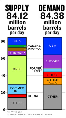
Still, if you are looking at this chart you might think "well, the difference is only 0.26"
But if you write that as "260,000 barrels per day" that might gain some more attention or "94,900,000 barrels per year" it might also attract a notice.
And by next year, the gap will be...
(on the other hand, I think the majority of americans look at our growing national budget deficit and go "somebody will fix it, it's not so bad.")
R. Nemo,
I think me will be a dustin off my old copy of Moby Dick to see what happens when man has the audacity to challenge the overpowering forces of nature.
Call me Ishmael.
Call our automobile / highways infrastructure the harpoon we have stuck into the Levithian's back. Realize now that as the Giant Black Whale starts his deep dive, and the tsunami wave of overpopulation rolls in over us, we are all going down deep deep under.
...http://www.angelfire.com/md2/timewarp/mobydick.html
Demand has outstripped supply before, especially during the summer months. Usually it is met with increased production which comes online just in time to keep prices down in the winter. The question of course is whether this year the Saudi's can actually bring online their paper capacity. Maybe it's time to buy some extra sweaters, that heater might not get as much use this winter.
Saudi Arabia is tapped out production-wise now. Oil is still cheap even at $66/barrel.
There will be a respite after Labor Day lasting until Thanksgiving. We might call this period "Purgatory", a place where nothing much happens and everybody waits....
As winter hits the Northern Hemisphere, the shit will hit the fan.
Let's also not forget the value of stored reserves to balance this imbalanced equation. I think this is a very serious situation. But barring a catastrophic collapse of Ghawar or a variety of other ills, our reserves and timely demand destruction from the less well off (Buh-bye poor countries, see ya wouldnt wanna be ya poor folks) and we may thread the oily needle. But it is real frickin tight already.
Here is another point to ponder: refinery capacity has it's own limitations. If demand exceeds refining capacity, it really doesnt matter if we have 100K Bpd or 100M Bpd crude oil production to spare, the hang ups will occur at the point of refineries
ANyone else think we can squeeze out one more tight year before TSHTF for good.
Does anybody have any idea where the data came from for that graph? CNN credits the EIA but I don't know where to look on that web site, http://www.eia.doe.gov/.
I can see how you'd measure production, in principle you can see how much oil is coming out of the ground everywhere, but how on earth do you measure "demand"? Do you go around and ask everybody, say, how much oil would you like, if you could get it?
I don't want to be pedantic but the whole supply=demand thing and the concept that demand depends on price aren't ideas that we can just completely ignore.
I can see one kind of "accounting equality" (ie true by definition): oil consumed plus oil stored equals oil produced plus oil withdrawn from storage. That's just another way of saying that oil doesn't just disappear nor materialize out of thin air. What gets produced gets consumed, not counting the relatively small amount that is stored.
But where in this equation does "demand" appear? That seems to be much less tangible and hard to define, at least precisely enough to claim to measure it to four significant figures! If someone asked you, what was your consumption of gasoline last month, you could figure it out if you kept track. But if they asked, what was your "demand" for gasoline last month, what does that mean? Is it the same as consumption? Or is it how much you would have used if the gasoline fairy had appeared and offered to grant you a wish?
Seems like a pretty slippery concept to be the foundation for such a graph. If the EIA does define and measure "demand" I'd be interested in seeing how they do it.
Halfin, good question: how do you estimate demand?
I understand that you can physically estimate supply by counting the number of oil tankers for example, but demand? demand will always be less than supply by definition so how can it be higher!! maybe they projected last year consumption assuming a 2% growth.
demand=contracted oil delivery
The data comes from table 21 on the EIA site - it's an Excel spreadsheet and you get there by going to
http://www.eia.doe.gov/emeu/international/petroleu.html#IntlBalance
and clicking on the World Oil Balance title where it says XLS. This gives you the table. It should be noted that the info that they have plotted was for the first quarter. This is the low demand quarter. The second quarter, through June, isn't out yet, and the high demand months can be expected to be worse in the 4th Quarter. Note that this is not the first time the balance has been the wrong way (2003, 4Q 2004) but since this is usually the quarter where we build stocks it is troubling.
How do you measure demand, probably by the throughput of the refineries, since a lot of this is extensively tracked, and you can follow through the reams of tables that they have at that site.
PG
Hope you don't mind I added the source table to the main post.
HO
Not at all! :)
Actual current use can outstrip any snapshot of current production because of storage of oil from a previous period.
Interesting points. Does "demand" essentially equal consumption, which means that when one says, in the context of these numbers, that demand exceeds supply, that consumption exceeds production? And therefore that the various projections of demand into the future means, not the economist's term (which is really "quantity demanded" rather than "demand"), but "consumption assuming ample production"?
Historically there have been two buffers -- the first one is OPEC (particularly Saudi) spare capacity, and the second one is inventories on hand. I suppose that for the US, the SPR may be a potential third buffer (although if prices soar as the second buffer is drawn down, the SPR might be opened up simultaneously). If consumption is exceeding demand by 260kbpd (which of course changes, but that's what we have from the EIA snapshot for Q1), what are the available inventory levels? If the size of this buffer is in the 200mb - 500mb range, then a 0.25mbpd drawdown would exhaust the buffer in 800 to 2000 days (assuming no growth in the gap). A 1mbpd drawdown would exhaust the buffer in 200 to 500 days.
It seems to me that one of the differences between this year and previous years is that although the buffer is as high or higher than it has been in previous years, market participants are understanding that in the past, draws have really been against Saudi spare capacity rather than the buffer, while this year there is a growing suspicion that the draw may really be against the supply buffer because Saudi capacity (at least for light sweet) is tapped out for now. However, I don't think that the numbers yet show a critical draw on the buffer, i.e., one that people believe will not be replenished.
If Pickens' prediction that consumption will be 86-87 mbpd in Q4 with production at 84 mbpd comes to pass, we should see this in the inventory numbers without having to speculate about "hypothetical demand" because the stocks are large enough to be drawn down at that rate for a while. They should also show the effects of price-caused "demand destruction." The real crude crisis point (at least for US) begins when the buffer depletes to a level in which it is not possible to move inventory on a JIT basis to where it is needed.
At the same time, we have various refining bottleneck issues as well, but that is a separate issue. I keep hearing that no new refineries have been built in US in 30 years. Are there currently significant refinery extensions being built that will allow more crude to be processed? Otherwise, how would consumption of crude oil increase beyond its current levels (other than refineries being run at more than maximum sustainable capacity)?
I think you have to remember that this was the season where stock rebuilds were going on, and the US was also buying into the SPR so "demand" in this case had a broader definition than just immediate use.
Thanks for the pointer to that spreadsheet link. Note 3 there defines "demand": "The term Demand is used interchangeably with the terms Consumption and Petroleum Products Supplied. See Appendix C for " (that's all it says - anyone have a link to Appendix C?).
So Demand is synonymous with Consumption. That means that the chart is not really showing a supply/demand imbalance, it is showing production vs consumption. As I noted before, these will always be approximately equal, except for net storage or draw down on reserves. That is the reason for the slight difference between the two.
The point is that this graphic is fundamentally misleading, if people are interpreting it like some here, as showing that "Demand" is finally overtaking "Supply". In fact, this graphic would have looked pretty much the same, in terms of the supply-demand balance, throughout history. In every period, the two columns would be approximately equal, except for whatever slight net storage or draw-down occured in that period. Really, this graphic doesn't mean anything as far as a supply/demand imbalance and it has no implications for the future of the oil situation. As far as the supply-demand difference, you could have drawn pretty much the same graph 5 or 10 years ago, or for that matter 50 years ago.
I sent mail to CNN complaining about the misleading presentation, but here is their response:
"Thank you for your note.
"You raise a valid point about the pure economic meaning of demand. In
this case, however, it was simply an editor using a word short enough to
fit the space available in the graphic. And for the purpose of getting
across what was 'consumed,' which obviously had to be 'demanded,' it
works. The figures are available on the EIA web site.
"Again, thanks for writing."
I think this is pretty much BS, a chart with headings Supply and Demand has a certain implication, which people here were eager to take up. If it had been labelled "Produced" and "Consumed" it would have been far more accurate and it would have been clear that there was no such implication and that the data neither explains the current high prices nor predicts the price levels to remain high in the future.
Halfin: as someone who is a stickler for well operationalized terms, I couldn't agree with you more. It's bad semantically and conceptually, but that's a common error in the press, sadly. This is a simplification that lacks complexity and nuance, but that's how pictures and summaries work! This is the equivalent to the politician's soundbyte. Good for educating the masses who don't understand the ins and outs of oil supply and demand. It is powerful because it is brief and pretty in its own way.
So, I'll agree that demand is a really tough idea to measure, because, by definition, it's how much oil we would use if it was there, or how much oil we would use to maintain the status quo. You are correct that consumption will always be close to supply, because there's no more available to consume.
So, the more important, and perhaps more valid, question is: What happens when other developing countries want that oil and are willing to pay a premium for it to fuel their development or drive their growing economies? Does the first world standard of living go downward because prices go up because "demand" (maintenance of the status quo defn) is higher than supply? Does this imbalance mean that there will be more and more geopolitical wrangling over scarce resources? etc., etc.
I think CNN graph is data from Q1 of 2005. I actually made a quick graph with the DOE data from 1970-2005 Q1: http://www.thewatt.com/modules.php?name=News&file=article&sid=667&mode=n...
I suppose we're drawing on reserves to make up that 260,000 bbl/day difference. It would be nice to have more up-to date info, if we know we're drawing on reserves in Q2 and Q3 then we would have a better idea of what's in store for Q4 when, I believe, we normally rely on oil reserves.
According to the IEA though, supply should be much better in 2006 with OPEC supposedly not having to up their output since it'll all come from non-OPEC sources, if this is true then I guess we'd be safe for another year if we get through this winter.
I don't find it nesessary to place a firm number on demand. What I do need to know is what happens when demand exists that cannot be met and, more importantly, what happens when, for the first time, this becomes a permanent condition with an ever expanding differential.
PO wont be seen through the windshild. It can only be viewed through the rear view mirror.
Bill
Just thought of a new scenario:
Suppose that this current spike in prices is good enough to spawn investment in the shale/oil sands arena. "Several trillion barrels estimated" b/t Canada and areas in the Southwest US - and our problem of full infrastructural overhaul is solved (as long as we can eliminate all environmental opposition).
Anyone game to give me an estimate as to the chance that this scenario might play out? It was noted that there was an 87% jump in Canadian Tar Sands investment this past year, but I couldn't track back to where this way cited.
albert,
Canadian tar sand production is now around 2.6 mbpd and is planned to reach 5.0 mbpd in 2015. Oil extraction from tar sands require plenty of water and natural gas (which production is believe to have peak in North America).
1000 words and 1000 assumptions - We are not yet at peak. The Supply measure here does not include the approx. 1.5 MBD of supply cushion. The yearly shortfall over the last few years has not amounted to this amount yet. Did anyone bother to go to the IEA website and check out the original spreadsheet? This is the sort of obfuscation we accuse the oil industry of pulling, we need to be more careful or we lose our credibility.