| Advice to President Obama: Yes We Can, But Will We? | The Oil Drum | Tech Talk - Oil Production from Timan-Pechora |
World Energy Consumption - Beyond 500 Exajoules
Posted by Rembrandt on February 16, 2012 - 4:42am
Today's post goes into the global consumption of energy and provides a dataset in Excel for researchers on global primary energy consumption from 1830 to 2010. In other words, the energy contained in fossil fuels, uranium, and biomass in their raw form before processing into electricity, heat, or liquid fuel, and direct electricity production from hydro, solar, wind, and geothermal. The dataset, based on an assessment of seven different data sources, shows the following:
- We are now burning 10 times as much energy as a century ago to provide the goods and services we consume.
- Energy consumption is still increasing rapidly, with an approximate 550 exajoules (523 Quadrillion BTUs) consumed at the primary energy level in 2010.
- Of this total 80% was provided by fossil fuels, 11.3% by bio-energy mainly from wood combustion, 5.5% from nuclear, 2.2% from hydro, and 0.4% from other renewable energy sources.
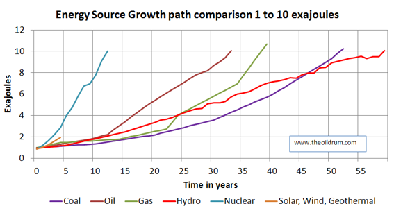
- The historic time for each energy source to grow from 1 to 10 exajoules in primary energy production was 12 years for nuclear, 33 years for crude oil, 39 years for natural gas, 52 years for coal, and 59 years for hydro-power.
A graphical depiction of the data and comparison of sources can be found below the fold.
The charts below can be found in the Excel file, source attribution can be found at the bottom. The data in the charts is normally displayed in exajoules (10^18 joules) and in a few cases in Quadrillion (10^15) BTU's for data comparison. The following conversion factors were used:
- 1 joule = 9.48×10⁻⁴ BTU.
- 1 boe (barrel of oil equivalent) = 5.45 x 10⁶ BTU.
- 1 cubic feet of natural gas = 983 BTU.
- 1 metric ton of coal = 22.72 * 106 BTU.
- 1 exajoule = 174 million barrels of oil equivalent.
A few notes on calculations made to make a data comparison:
- The dataset displays primary energy for oil, gas, and coal, as well as nuclear power. To obtain primary energy data for nuclear power, electricity produced has been adjusted for the efficiency losses assuming a 33% efficiency factor, as per IEA standards.
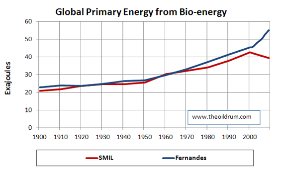
- The historic data for bio-energy from Fernandes (2007) and Smil (2010) is calculated by estimating the average energy use per person for a large number of countries, multiplying this value with the population, and adjusting for other energy sources. In this manner, a reasonable estimate can be obtained for bio-energy consumption across historic time. Smil (2010) covers not more than a dozen countries in this manner, while Fernandes (2007) covers more than a hundred and is more complete in his decadal time series.
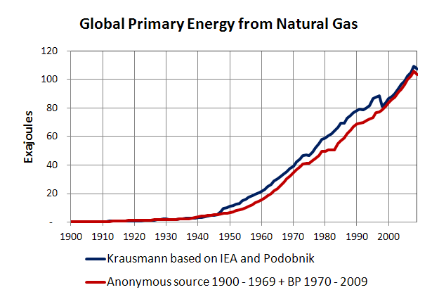
- The data for coal is normally best taken in million tonnes of oil equivalent (mtoe) as this filters out the energy differences between coals, as opposed to taking data in million tonnes of coal. To convert these values to joules/btu's the lower heating value of the coal was used. Similarly, for natural gas the values were for BP Statistical Review (2011) converted from cubic feet to BTUs and exajoules using lower heating values.
- To convert installed solar pv, geothermal, and wind power capacity to electricity produced, a number of conversion factors were applied. For solar a capacity rating of 15% was assumed, for wind a capacity rating of 23.4%, and for geothermal 90%. In case of hydropower, no conversion efficiency loss has been applied in the data.
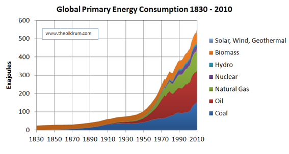
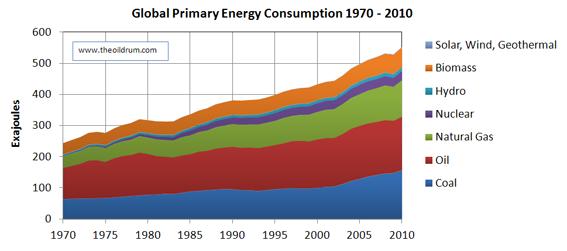
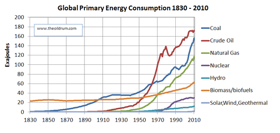
Global Primary Energy Consumption per source stacked and individual graphs
The first two charts in this section display the evolution of primary energy consumption broken down by energy sources. Figure 1 shows the evolution from 1830 to 2010 and Figure 2 from 1970 to 2010. The same is shown in Figures 3 and 4 but by the individual curves of each energy source.

Growth path comparison of Primary Energy delivered per source
In this section, a dataset is graphically depicted wherein a comparison is made of the number of years for each energy source to grow from 1 exajoule to 10 exajoules of energy production. By comparing these, it can be shown how long different energy sources took to become influential in global energy supply.
Comparison of different Primary Energy Data sources
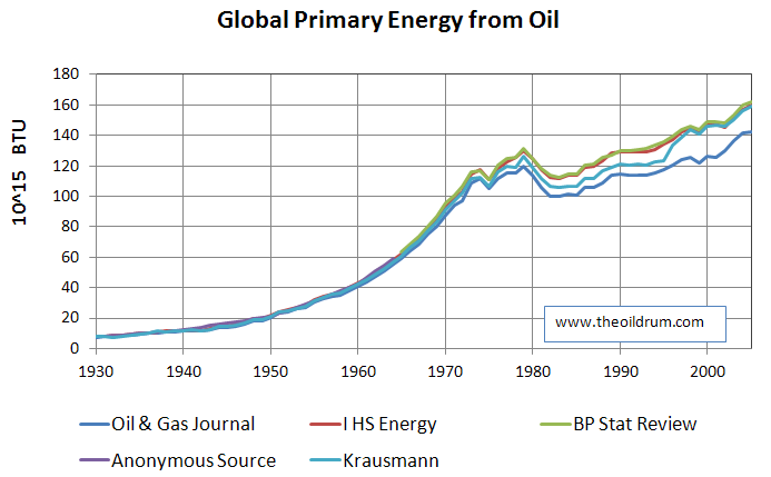
Four charts are shown below that outline the differences between datasets for bio-energy (biomass + biofuel), coal, natural gas, and crude oil. The main differences in the datasets can be found in the years after 2000 for biofuels, 1950 to 2000 for natural gas, and 1945 to present for crude oil.

Sources of data
Anonymous Source - Book reference not available due to permanent library closure
BP Statistical Review - BP Statistical Review of World Energy 2011
Fernandes - Fernandes et al. 2007. Global Biofuel Use 1850 - 2000. Global Biogeochemical cycles. Vol. 21
IHS Energy - old petroconsultants database
Krausmann - Krausmann et al., 2009. Growth in material use, GDP and population during the 21st century. Ecological Economics. 68
Oil & Gas Journal - Oil & Gas Journal
Smil - Smil, V., 2010. Energy Transitions: History, Requirements, Prospects. Praeger: Santa Barbara, California
Contact
- Content: editors at theoildrum dot com
- Tech support: support at theoildrum dot com
License

This work is licensed under a Creative Commons Attribution-Share Alike 3.0 United States License.
Rembrandt,
Thanks for the great post. Figure 5 is particularly encouraging because it indicates that nuclear capacity has grown more rapidly than any other source. This is consistent with a high energy density ore efficiently burned in high power density plants.
Question. Are you plotting ExaJoules per year?
@CyclemotorEngineer
The plot in figure 5 is Exajoules per year for a given fuel source, in the range of growth from 1 to 10 exajoules of production provided. Hopefully that answers your question.
Rembrandt,
Thanks for your answer. I was fairly certain this was so, but could not find a description of time in your article. If your vertical axis labels are taken at face value, they are integral quantities rather than rates.
Of course it is very easy to confuse energy and power and treat the terms synonymously because people routinely do so in colloquial speech. The exact meanings of two terms are indeed related; power is the rate of energy use. As a nitpicking physicist, I prefer using Watts to describe power because time is embedded in its fundamental definition. 500 ExaJ/yr = 16 TW.
Here in Madison this week, we were fortunate to host a debate regarding coping strategies for peak oil between John Hofmeister and Dr. Tadeusz Patzek. The latter opened with the comment that we have a shortage of power, not energy, making the point that it is the rate at which we use energy that is the problem.
"we have a shortage of power, not energy, making the point that it is the rate at which we use energy that is the problem."
While this may be true, I don't think that's the correct way to think about it. It seems to me that the rate issue is more to do with efficiency, and how much value we extract from each unit of energy. If we got more value, we
1. would use less energy per unit of work
2. could therefore afford to spend more to obtain the energy, and thus would delay this impasse.
Ie. the rate constraint has more to do with economics than physics, IMO (though, clearly, economics is merely an abstraction layer on top of the physics!)
Anyway, I'd be interested to hear more about the constraints on power vs energy..
Gustava,
We agree that the rate issue has everything to do with efficiency. Dr. Patzek concluded with an example of poor choice in this regard: driving an SUV to the convenience store to pick up a gallon of milk.
The milk example can be quantified and compared by dividing the kinetic energy of the milk by the rate at which gasoline is burned. The result is a benefit /cost ratio, and also a residence time. An element of gasoline thermal energy resides as kinetic energy in the milk for about 5 milliseconds. Ironically, we squander energy that is brought to us by a relatively efficient system. The residence time of diesel fuel thermal energy as kinetic energy in crude oil shipped by a supertanker is about 100 seconds.
The concept of residence time adds to our distinction between power and energy. Residence time of a converted energy form (typically thermal) in a sustained form is the time integral of the conversion efficiency. In the steady state, this is also the sustained energy divided by the thermal power required.
I've described the above in depth at several Google Knols. Google is closing that project down this May, so I'm looking for a site or Journal in which to publish the content.
Also ironically, if it wasn't for wasteful behavior none of these delivery systems would exist. Oil is produced for us because there's profit in the endeavor.
Matt,
Many of us would probably not exist if it weren't for these delivery systems. My guess is that, for our existing world population to survive to a ripe old age, developed world per capita power demand must drop, but developing world power use must increase while global birth rate drops. Addressing supply, demand or population growth alone may not be enough.
Thanks for your reply, CyclemotorEngineer. If they're publicly available, could you post a link to your Google Knol please?
Thanks!
Gustava,
Thanks for your interest. Here are links to the three Knols.
Energy and Power Primer:
http://knol.google.com/k/energy-global-warming-and-electric-bicycles#
Residence Time, Polished Version:
http://knol.google.com/k/speed-costs-power#
Residence Time, Complete Version:
http://knol.google.com/k/residence-time-of-momentum-energy-and-other-con...
Excellent and very disturbing at the same time.
It would be interesting to see some of the charts expressed "per capita" of human population.
With regards Figure 5, what was the year when wind, solar, geothermal broke the 1 exajoule barrier? I'd expect that growth curve to outperform even that of nuclear given the rapid year on year growth in deployment of solar and wind in the last few years.... whether they can sustain such deployment growth rates is another question entirely.
Edit: took out my last paragraph since I see that the information I requested was already there in front of me...
@NFE
For wind + solar (pv) + geothermal that has been 2007/2008:
My calculation yields:
- 0.97 exajoule in 2007
- 1.2 exajoule in 2008
- 1.51 exajoule in 2009
- 1.87 exajoule in 2010
As the chart shows these rates are slower than that of nuclear (for the three renewable energy sources combined). I would doubt the "sustainability" of such deployment rates continuing especially for Solar, where the majority of growth is dependent upon very favorable market conditions set by government feed-in tariffs. In 2006 60% of solar PV growth came from Germany and Italy alone, and both countries have had a substantial cut in the level of feed-in tariffs. It would be worthwhile to do an analysing of market growth in the last years for wind and solar and see how much matches up with Feed-in-tariffs and how could be sustained if these are phases out in a number of years. Italy is going to phase out feed-in by 2015/2016 under the current plans to my understanding.
With solar panel prices having crashed hard, a lot of sales should be happening even with comparably weak subsididies. The real question is are the low prices sustainable? The growth rate over several years was over 60% per year.
I work for a company that buys and resells Chinese solar panels. The one factory group we deal with will produce 9Gw of solar panels this year. About 6Gw for internal consumption and 3 for export.
I agree, it would be very instructive to see time series of global per capita energy consumption. I recall seeing several years ago data showing this had reached a plateau by about 1980. One has to wonder if this s borne out in the new data.
Holy smokes, Batman! And there are still people talking about sustainable growth? I don't think so.
As energy analysis for anyone industry in any one country is extraordinary complicated, expect energy analysis for the whole world to be even more so. I suggest having a look at the problem in smaller parts for useful solutions. Identify what's working and attempt application to where the problem is most severe. When doing so, we quickly see that in the developed world energy consumption per head is either flat or declining for the last decade or two. Population is generally flat as well in the OECD. One might argue that some energy consumption has been exported from a given country via offshore manufacturing, but not so much external to the entire OECD.
Using the link in Falstaff's post above, I did some simplistic "what if" scenario analysis, splitting the world into the following categories:
1. OECD and other "rich countries": population ~1.50 billion, energy use: 4.90
2. BRICS (including Turkey): population ~2.85 billion, energy use 1.37
3. Asia, South/Cent Am, MENA (ex the above): population: ~1.85 billion, energy use 0.85
4. Sub Sahara (ex Sth Africa): population ~0.80 billion, energy use 0.50
"Energy use" is a rough calculation of weighted average per capita primary energy use in metric tonnes of oil equivalent, using data from the link in Falstaff's post (don't know how to replicate it here).
I assumed that Category 1 countries were sufficiently philanthropic or economically strapped to reduce weighted average per capita consumption from 4.90 to (surprisingly low) UK levels of 3.30 - mainly achieved by a massive reduction (>50%) by North Americans
I assumed that Category 2 countries would aspire to raise living standards (eg energy consumption) to those enjoyed in Portugal, raising energy consumption from 1.37 to 2.20
I assumed Category 3 countries would aspire to a Turkish standard of living, raising energy consumption to 1.50 from 0.65
I assumed that sub-Saharan Africa would sadly (for them) not increase energy consumption at any appreciable level
Net effect of all the above was to raise average global per capita energy consumption from current levels of 1.80 tonnes/year to 2.06 tonnes/year, a 15% increase.
Per Rembrandt's calcs, this would raise world energy consumption to ~625 exajoules/year...
There are, of course, gaping holes in the analysis, and it's massively over-simplistic, but the simple thought experiment goes to show how gargantuan the task is of meeting "modest" aspirations (by OECD standards) of developing countries, even if the wealthiest countries undergo a huge belt-tightening efficiency drive and reduce energy consumption by ~33%.
And, lastly, I assumed zero population growth from now on...
Interesting approach.
but the simple thought experiment goes to show how gargantuan the task is of meeting "modest" aspirations (by OECD standards) of developing countries
A 15% increase in world energy consumption is 'gargantuan'? Or the developed world proposed efficiency increases are large?
I notice also that OECD energy use per head is highly inverse correlated with population density:
Canada 3.5/km^2, 7.4t
US 32/km^2, 7.2t
UK 255/km^2, 3.2t
Japan 337/km^2, 3.8t
So I would not expect the US, for instance, to decrease much faster in energy use than its current rate of decline of 1%/year (2000-2010).
China's density is ~18,000/km^2 and is forecast to continue rising for the next ~30-40 year before declining again. If the population density - energy use correlation holds, we would expect a very low peak of Chinese energy use/head.
I think you've confused mainland China density with Macau. IMO this correlation is more a result of previous low density supply conditions than a requirement of future low density demand conditions
~170 billion in China... that even staggers the imagination
Eh? China is 1.5b people, expected to top out at 2b something and then decline, somewhat dramatically.
~170 billion is how many would be in China if the country's population density were 18,000/km2. Envisioning your miscue truly did stagger my relatively supple imaginative powers.
In what time frame? 7 years or so? Because that's the most likely scenario.
As you say, your calculation is way, way too conservative. The current 550 exajoules means we use some 17 TW on average, for an average per-capita consumption of 2.4 KW. Expect 6 KW/capita and 10 billion people, for 60 TW as world peak energy consumption in a hundred years. This is still low-balling it - North Americans use 10-12 KW/capita.
How will we produce 60 TW per year one hundred years hence, including all the yearly amounts of energy between now and then? and of course from year 101-hence and on?
Just set up 20,000 1 GWe nuclear breeder reactors, using about the same amount of uranium/thorium per year as the current fleet of 400 reactors does today.
Shouldn't be a big deal, actually. A buildout of 400 per year would suffice (given a 50 year life time), which is quite little spread out over a 10 billion population. That would be 12 reactors per year for the US - very doable. (The US military budget of $680 billion should suffice to build at least 100 reactors per year, to put the task in perspective.)
Or a similar amount of wind and solar, of course, or a combination.
Thank you for the information.
Are there production-ready designs for the Uranium and Thorium breeder reactors yet? Which country is pioneering/taking the lead on this? Did I hear correctly before on this list that perhaps India has interest in Thorium reactors, in part due to it having large Thorium resources?
China seems to be spreading its bets across the waterfront to be able to produce all the electricity it projects needing/wanting in the future, as its people's consumption profiles become more like those in Europe, perhaps aiming for American consumption profiles...are the Chinese working on prototypes? They do have the benefit of an authoritarian government, with control over what they want to invest in, develop, and build, and the ability to quell opposition.
The World Nuclear Organization sums up the Chinese plans like this: "By around 2040, PWRs are expected to level off at 200 GWe and fast reactors progressively increase from 2020 to at least 200 GWe by 2050 and 1400 GWe by 2100."
China is indeed spreading its bets. They seem to have some 15 research reactors, plus the military stuff (but not all breeder, of course). One track is an indigenous 65 MWe experimental fast reactor already connected to the grid, with the aim of a derivative 1000 MWe design to begin construction in 2017. Another track is building on the Russian BN-800 technology that the Chinese bought, and they are planning to build two of those with construction start in 2013. A third track is the LFTR research started a year ago, with a 5 MW research reactor already under construction. A fourth track is some solid thorium research, some jointly with Canada for their Candu reactors. There is more, including both domestic efforts and participation in international Gen4 programs.
"If you hear a giant sucking sound around 2020, it may be the energy market revenues and profits moving to China", someone said (don't remember who). The Chinese are aggressively clearing IPR obstacles, creating their own IPR and are getting ready to sell nuclear plants like bread toasters. It'll be interesting to see the global effects of this.
Jeppen,
Thank you for the detailed information.
I would like to see a KeyPost allowed by the TOD staff on this subject, with a keen focus on China's plans/efforts/accomplishments to-date, with even more detailed information.
Perhaps you would be willing to submit such an article to the TOD staff, or you may know someone else who would be able and willing?
Hi Rembrandt,
I was a big fan of your "Oilwatch Monthly" reports. Do you still produce them? if yes where can I find them? If no, could you suggest a link to something similar?
thank you for your work !
@Surcouf
I stopped producing the Oilwatch Monthly last year hence you can't find any new editions. To my knowledge nothing similar exists. I have had some thoughts about starting a new similar product but that hasn't happened yet. I also discussed with a few folks that were interested to start the publication on their own but these haven't been substantiated either.
do you need us to send you $5 each by paypal perhaps?
Forbin
no seriously ! I miss those reports !!
I'll second (or third?) that.
Thank you for your prompt answer. Too bad really. Fog is as thick as pea soup without Oilwatch Monthly. Best wishes.
With 5000 gigatons of coal in Alaska, coal is looking like the future of energy. Old reliable.
There is 5 trillion tons of coal in Alaska?
5.5 actually, and that, as the politicians like to say, is "trillion" with "t".
The number comes from the USGS. While they haven;t always been that accurate in their guesses on oil, coal is a bit easier to estimate;
http://pubs.usgs.gov/bul/b2198/B2198-508.pdf
Would be enough to supply the US at its current rate for 5,500 years!
Now, that is the "resource", not the "reserves" - how much could actually and economically be mined is a whole different question.
Even the 140 billion tons of reserves is a bunch.
I wonder what the depth profile for these reserves is?
That is, how much of it would be mountaintop removal, how much would be strip mined, and how much would need to be extracted using vertical shaft/horizontal drift mining?
Put more succinctly, would AK resemble the Moon after extracting a significant portion of this coal?
I will leave the CO2/AGW implications to others who have the expertise...
Put more succinctly, would AK resemble the Moon after extracting a significant portion of this coal?
It's a big place--only some of it. Of course other arctic and subarctic regions likely have vast coal resources as well...seems we have better paths in front of us than that...
If memory serves about a quarter of Alaska's coal resource is under the Cook Inlet. The lion's share of Alaska's coal lies on the north side of the Brooks Range a couple hundred or so miles west of the North Slope oil fields. There is only one, a fairly modest commercial operation (big drag-line), coal mine up here now at Healy on the northern side of the Alaska Range.
There is a fair amount of opposition to a proposed coal mine on the wild side of the Cook Inlet, more or less in the neighborhood of the mountain below. Those mountains are about 35-40 miles west across the inlet from where these red salmon dipnetters were following the tide out at the mouth of the Kasilov River. The proposed Chuitna project is about 45-50 miles north of the dipnetters.
Signature gatherers trying stop the mine had fair success filling petition pages during the salmon run. Thousands of Alaskans take advantage or the personal use fisheries around the edge of the Inlet.
Luke,
Thank for the great information.
It is hard for me to imagine a way to get at the coal under the seabed in the Cook Inlet area that would not have a serious detrimental impact to that environment.
It is equally difficult to imagine many multiple parallel rail tracks from Northern AK to the Lower-48 U.S. (and Canada) (or even to the port of Valdez) running 24/7/365 with massive coal unit trains....doesn't require warp drive or Unobtanium, 'just' huge-scale engineering and $$$. Then there are the environmental impacts of all that mining and all those rail lines, and the impacts from burning the coal.
It is not as hard imaging rail lines running a couple hundred miles west following the Brooks Range that would feed stockpiles of mountains of coal that would ship out of the Chukchi then Bering Sea during the ever longer ice free seasons. That route accesses the whole Pacific Rim . I do hope far better paths will become evident before we get that far. It seems harder to model the economics that would bring that scenario into being than it would be to model the consequences it would bring about.
I have seen a Power Point delivery (televised) that was given to the state legislature. It proposed building CTL facilities in the northern coal region and piping the value added liquids away while piping the CO2 produced to the oil fields for injection. No hard numbers were attached. Water--not so very abundant on the arid North Slope--pipelines were also in the presentation. Lots of pipedreamers in this land...but then look at the pipe that pretty much built the state's economy...
Great info!
The things you speak of could come to pass...as we stare down the barrel of diminishing easier-to-access/cheaper energy supplies.
Perhaps the Alaska fund may exist for a very long time...
I wonder what the climate in AK will be at ~ 600 ppm Co2? Temperate rain forest, like Olympia National Park in WA?
I again have to come out strongly for Wind Power. It's not popular because its low on the Jobs per KWh, but its potential is truly vast. A comprehensive study titled "An assessment of the available windy land area and wind energy potential in the contiguous United States" was made in 1991 by the US DOE and is available at:
http://www.osti.gov/energycitations/product.biblio.jsp?osti_id=5252760
Note the study uses 50 meters as the maximum Hub height of the Wind Turbine when today new Wind Turbines have average Hub heights of 80 meters. This is important because Wind speeds increase with elevation and the power output of a Wind Turbine is proportional to the CUBE of the Wind Speed. So the study significantly underestimates the potential of Wind power.
bmiller -
The upper limit of wind power was discussed here last September in a guest post by Carlos de Castro, a professor of Applied Physics in the University of Valladolid in Spain.
Global Wind Power Potential
The surprising result was that wind can never provide more than about 6% of our primary energy needs.
No offense, but I'm concerned with the US, not the world. Thanks anyway.
I believe Dr de Castro's result can be extended to smaller regions as well. Changing his factor f2 from 20% to 1.5% (approx US portion of earth), the equation predicts a maximum available wind power in the continental US of no more than about 75 MW.
That study included a lot of dubious assumptions. It's really quite hard to believe that the layer of air near the ground is independent of the layers above it.
Further, 6% of primary energy is misleading: that study suggested a limit of 1Terawatt, which is 50% of global electrical production right now. Even that's not bad.
US wind capacity installed now exceeds 43-46GWe peak without trying hard - no offshore, etc. Wind does not replace primary energy (or should not).
http://www.eia.gov/todayinenergy/detail.cfm?id=1410
http://www.windpoweringamerica.gov/wind_installed_capacity.asp
46919MWe as of YE 2011 per AWEA, 14.5% of which was installed in 2011 (17% YOY growth). Notable trends were newly strong (30.7% YOY) growth in California (adding 921.3MW, more than any other state) due to completion of some transmission upgrades, and slowed growth in Texas (3% YOY) due to pending transmission. 72% of growth occurred in the 9 states with over 1500MW installed--making up 70% of installed capacity, which, with the exception of Texas, each added at least 350MW of capacity and grew faster than the national average. Texas narrowly lost bragging rights to having more wind generation capacity than the next 3 states combined, as the Texan share of national capacity slipped from 25% to 22%. Illinois jumped from 7th to 4th, over Minnesota, Washington, and Oregon, but all 4 states were neck and neck between 2513-2743MW. OK became the 8th state to pass 2000MW (2007MW) with addition of 525MW. Colorado rounded out the top 9, adding more than 500MW to reach 1800MW. The renmaining 5 states with more than 1000MW installed (ND, WY, NY, IN, KS) were narrowly grouped between 1274-1445MW. The next state had just 789MW installed.
With 118337 thousand MWh Nov 2011 12 months rolling generated against the 46919 MWe installed capacity that's an impressive 28% capacity factor, more than double China's (12% 2008) and better than any other country except the UK with its high capacity offshore wind resource. At this rate US wind generation will exceed the combined output of the EU in several years.
http://205.254.135.7/electricity/monthly/excel/epmxlfile1_1.xls
The need for a top-down analysis, and the existence of limits not apparent in a bottom-up analysis is important. The actual numbers presented by de Castro do not appear to be determinative, and I would suggest that all of the probable errors are in the same direction. This issue needs more work.
And had some serious faults.
http://www.theoildrum.com/node/8322#comment-833843
http://www.theoildrum.com/node/8322#comment-833874
Rembrandt,
Thanks for this post. I'm glad to see that it has some numbers for biomass. They are hard to come by but leaving biomass out makes nonsense of long term national Energy/GDP plots.
BobE
Nice collection.
I think the biomass picture is seriously distorted by including food that is fermented to make alcohol to burn in a heat engine but excluding food that is eaten to power human and animal muscles.
To a lesser extent including wind that turns turbines in 2004 but excluding wind that powered shipping in 1840 is also a distortion. Its trivial compared to modern energy use, but its not trivial at the scale of coal use in 1840.
I like having the different fossil trajectories all comparable with one another. The thing that strikes me is the way coal is fast catching up to oil. 2004 looks like a peak oil moment, coal use accelerates in 2002, oil matches it for a couple of years and then can't respond any more, and is on course to be overtaken any time now.
Good points. The treatment of mechanical energy like wind and hydro as directly equivalent to heat liberated from fossil fuels is likewise something of a distortion from a certain perspective, in ignoring entropy.
Not directly related to that post, I wanted to calculate, as a ballpark estimate, how our total cumulative fossil fuel energy consumption since say 1900 (or only oil if too difficult to calculate, with 1,5 trillion barrels already consumed) relates to the energy produced by the sun (total energy, not only the fraction received on the earth). Is it 2 seconds of the sun's energy, 2 miliseconds, 2 minutes?
I cannot find the figures for the energy produced yearly by the sun. Do someone have it?
Thanks for the work.
Tom Murphy threw these solar radiation numbers out the other week in "Basking in the Sun"
The Sun, on the other hand, at 5800 K, emits 64 MW per square meter!
Summing over the area of the spherical Sun, at 109 times the radius of Earth, we find the total radiant power of the Sun to be a whopping 3.9×1026 W. Now that’s a light bulb
you should be able to take it from there, knock yourself out.
The Earth receives about 100,000 terawatts of continuous insolation.
Human produced energy is currently a max of about 20TW - annual human energy production equals maybe 90 minutes of insolation.
So all the fossil fuels ever consumed by humanity probably adds up to about 3 days of sunlight received on earth.
Total sun output is roughly 4 billion times larger, so that's what, about 100 microseconds?
I see figure 3 as the most interesting although it is no suprise. Coal consumption ramps up 1870 - 1910 which was the railways which
1] Used coal in manufacturer
2] Transported coal
3] Ran on coal
Then post WW11, diesel trains, ships and road transport allow coal and oil to ramp up further. Without liquid fuel transport, coal use will decrease as the effort to move it increases, and human and animal labour to transport it will increase - increasing employment and the cost of coal.
There has been a 3 fold increase in pop from ~1910 to now, but most of this growth is in warm places that do not need space heating versus the coal users of 1910. The near vertical from 2000 - 2010 is scary though..
Without liquid fuel transport, coal use will decrease
I think that diesel for the mines and RR's to produce and move coal will be protected as an "essential service" under any oil shortage scenario that you can imagine.
And, if need be, we'll go to coal to oil to power the loco's, or electrify them, so I don't see coal use being inhibited by oil constraints.
However, it is being inhibited by environmental and cost constraints, at least in OECD countries, where almost all new power plants are NG.
The near vertical in the last decade is all due to Asia, and that is indeed scary...
I think there's a CTL project underway by Peabody in the US in cooperation with a large train company.