The Productivity of Vehicles
Posted by Stuart Staniford on October 20, 2005 - 6:04am
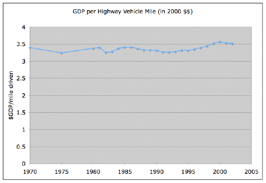
It seems like there must be some deep reason for this, but it's not obvious what it is. One might think that any of the following might be relevant and might change to significant degrees over thirty plus years:
- Proportion of miles spent for "economically productive" versus "frivolous" purposes.
- Number of economically productive individuals carried in each vehicle mile.
- Average length of commute (as housing sprawls).
- Average distance trade goods moved.
- Labor productivity of individuals after they get to work/jobsite.
At any rate, given that the productivity of vehicles hasn't changed, fuel efficiency of US vehicles is easy to figure out (again from the Transportation Energy Data Book)
Taking the aggregate number, the highway fuel use per $GDP has dropped by 30%. So we're not at a 50% drop in oil/GDP yet (though we've got most of the way there). The rest must come from using less oil for electricity and heating, and maybe getting more GDP out of our industrial oil usage:
Source: DOE
Contact
- Content: editors at theoildrum dot com
- Tech support: support at theoildrum dot com
License

This work is licensed under a Creative Commons Attribution-Share Alike 3.0 United States License.
While a reduction in GDP would mean less disposable income, it's easy to reason how that would result in less miles driven. However, since some of the driving is for pleasure, it doesn't seem unreasonable that one could drop the amount of miles without directly effecting GDP.
Unless you want to do a write up showing that GDP is directly related to miles driven, as Stuart's done this excellent example of the correlation.
http://www.bts.gov/programs/freight_transportation/html/transportation.html
Paraphrasing Jevon's Paradox here: When we are able to do more with less, we eventually consume the difference anyway.
Will
There's some question in my mind about the averaging though - given the large differences between the different groups of vehicles, are you getting the right numbers for the improvement from the "weighted average"? And is the averaging within a sector even giving the right sort of numbers?
Even if the weighting is by highway miles driven, it still might not give you the right improvement ratio.
For an example, let's say cars get 20 mpg, light trucks 15 mpg, and other trucks 5 mpg. Let's say of every highway mile driven, 40% are cars, 40% light trucks, and 20% heavy trucks. Then, with those percentages you get a "weighted average" mpg of 15 (0.4*20 + 0.4*15 + 0.2*5). However, the actual number of gallons of oil used for one "average" mile is 0.08666 (0.2/5 + 0.4/15 + 0.4/20) giving a true average mpg of 11.5, not 15.
I.e. the real improvement may be much less than you would get from a simple weighted average of sector mpg's.
Also, the numbers for "transportation" energy use in your final graph presumably include air transportation (which has gone up considerably) and railway transportation (which has gone down), which would further shift the numbers to use of more energy per mile traveled. Given that transportation is using a greater fraction of the economy's energy that probably agrees.
The commonly referred to numbers are either - averages across one vendor's vehicles - or averages across models sold in a year.
To really find out who is driving what and how far ... we'd need surveys, which AFAIK we don't have.
I think I've seen more little old cars on the road since gas prices went up. I'm sure that is the case nationally. I'm also sure this shift in usage pattern won't show up in the fleet mpg statistics.
apsmith is right about the weighted average. Just like if you ride a bike uphill for 1 mile at 10 miles per hour, then down the hill for 1 mile at 20 miles per hour, the average is NOT 15 miles per hour, because you spend much more time at 10 mph. The correct weighting is (0.667*10 + 0.333*20)=13.3 mph.
http://www.epa.gov/ttn/chief/eiip/techreport/volume04/iv01.pdf
Of course in California:
"Beginning January 1, 2005, vehicles 6 or less model-years old will be exempt from the biennial Smog Check inspection requirement. For vehicles with registration renewals due in the 2005 calendar year, this exemption includes model-years 2000, 2001, 2002, 2003, 2004 and 2005."
Those guys are going to miss their data.
This post, like several others lately, uses a graph as a teaser for further content that you have to click through to. However, the way the click-through works (at least on my browser), is that after I click through, the graph is scrolled up off the screen. The result is that I must first click through and then scroll back up halfway to bring the graph back on the screen.
I'd like to suggest that people who do put a graph (or other graphic) in the post before the click-through, put at least the first paragraph of discussion of it before the click-through as well. Doing that would mean that people would have the graphic in front of them as they read the initial discussion of it. Admittedly the user may still have to scroll back after clicking through, but at least it won't necessarily have to be the first thing done after clicking through.
Perhaps an economist out there can answer these question:
Recreational travels create make the business of the cinemas, theaters, restaurants, parking lots, lodging services etc. This is a two way correlation - to create a product/value you need to travel some miles to produce it and to consume it you also need to travel.
I'd expect this to change only if the avarege miles needed for a product to be created and consumed drop and/or the consumers shift their preferences from "high-miles" to "low-miles" products. Both are unlikely to happen unless energy prices go really high, I'd expect the economy to react with improvements in efficiency and/or contraction of energy-intensive sectors. The other way would require major restructuring of the economy,the infrastructure and the consumer behaviour, which can only be expected in the very long term.
Here is a graph where the dark blue line is total vehicle miles travelled (1987=1.0):
http://www.fhwa.dot.gov/policy/ohim/hs02/mvfvm.htm
As you can see, the line is almost completely straight, with only a few tiny jigs and jags. I assume therefore that GDP growth is also straight (since their ratio is constant). Dividing one form of straight growth by another produces a flat ratio.
This means that the correlation is likely spurious. Any other commodity whose consumption has growth steadily over the same period would also show a flat curve when divided into GDP. Perhaps lawn furniture purchases per year or bicycle miles travelled per year might show similar curves.
The whole notion of "productivity of vehicles" implies a degree of causation which is entirely unfounded. The mere fact that vehicle miles travelled has grown at a steady rate just like GDP does not imply that these vehicle miles are producing GDP growth, any more than we would speak of "productivity of lawn chairs" if their sales also happened to be growing steadily.
In short I think this analysis is misguided and is based on a spurious correlation due to the fact that vehicle miles travelled has grown at a very steady rate over the past several decades.
Disagreed. Any other commodity whose consumption has growth steadily over the same period with the same rate as GDP would produce a flat line. Other rates of growth would produce positively or negatevely sloped straight line.
The striking part in the graph is not the correlation (it is logical that when you have more income you'll consume more) but the 1:1 correlation. That is 1% economic growth corresponds to (or requires?) 1% increase in miles travelled. I am suspicious at deductions at such macro level but my guess is that breaking this correlation would require quite painful adjustments.
(GDP / P) / (M / P) = GDP / M
I'm not quite sure what you're attacking here since I was careful not to state a precise causal relationship. I would have expected a rough relationship between GDP and miles (since clearly economic activity is quite dependent on people showing up at work which tends to require vehicle miles) but I find the precision of the correspondence surprising and in need of further investigation to find out if it's just luck or because of some deeper reason not presently apparent.
Similarly, there is some question as to which direction the causality arrow points. Do we have higher GDP because we drive more miles, or do we drive more miles because higher GDP lets us afford more travel? I'm more inclined to limit the consideration to GDP versus energy consumption as shown in this graph. Log per-capita energy consumption and log per-capita GDP from The Economist for 2004 for 20 or so countries. The size of the circle indicates population, which is not used in the simple regression.
Typically I just use this to make the point that, as a general rule, there are no rich countries that don't use lots of energy, and there are no countries that use lots of energy and manage to stay poor.
Multicollinearity, with GDP and miles jointly dependent on each other:
More highway miles cause more GDP (because we sell more gas, oil, cars, trucks, mechanical service, road maintenance, insurance, radio advertising, road food, etc.) and
More GDP causes more highway miles (more trucks of commodities, more salesmen, more new suburbs create more commuters ...)
This is a feedback loop, and it gets hard to see what is causing what.
Both miles and GDP also show the incredibly aptly-named autocorrelation, (or series correlation) where the numbers from this year are highly correlated with last year. We don't start each year's GDP or mileage with a zero base: we do what we did last year, plus or minus a little.
Unfortunately, without a lot of data, it's hard to tease out the exact relationships. It might work if one data series is transformed. It is a generic problem. I've been looking at energy per-capita figures, and they are a bit clearer but not without statistical problems. More people cause more energy consumption. Does more energy consumption cause more people? Worldwide, long-term, absolutely. In America, 1970-2005? Probably not.
But he's right on most points...
yes, we can still model this, but since t-1 is a very good predictor of t here, it's going to account for much of the variance of the DV...but this is a standard time series problem, so if we have measures of our units of analysis on all variables of concern at all time points, we can still model it, it's just a lot of the variation over time is going to be attributable to autocorrelation.
I'm sure I'll get lambasted for this, but why not take the $GDP/miles result at face value? The correlation is expected if we simply consider the geographical expansion of the area in which economic activity takes place (by which I mean suburban and exurban sprawl and the concomitantly larger network of physical economic connections - driving - between places). Now, what would it take for the graph to not be flat? Since 1970,
- $GDP/mile is rising over time. Driving less and getting more done. Geographically, the network area over which goods & services are delivered is flat or has slow growth.
- $GDP/mile is falling over time. Driving more and getting less done. Geographically, the network area over which goods & services are delivered is expanding faster than the amount of goods & services delivered.
Plainly, in American culture #1 is impossible as stated. But, I'll have to think about #2. It seems implausible but I can't pin down why.I'm just throwing this out there for discussion.... but think literally of the physical network graph of highways, roads, streets, etc. over which goods & services are delivered.
It would be interesting to see maps of geographical GDP density and mileage density to see how they spatially correlate.
It would also be interesting to see the history of GDP density over time. I can imagine this great animated GIF - those meteorologists shouldn't have all the fun!
The problem of measuring energy used per GDP dollar is in the GDP. Structural changes and the way GDP is calculated have quite significant effects. Foreign trade can have significant effect also. As I estimated in a previous post, the foreign trade deficit may represent 10% of the energy usage in the US economy and even more.
I am not quite ready to accept the idea of significant and continuing technology-based energy efficiency increase. No doubt the technological energy efficiency has gone up somewhat but it has a price. This price is investments. Adopting new technology means using new equipment. This means that increased energy efficiency means using more energy. So we get a little bit more with more.
We speak about increasing energy efficiency but see growing overall energy consumption. Jevons' paradox works, but this might tell also that increasing efficiency is really tied to increasing consumption. One explanation could also be the learning curve. Doing something long and widely enough teaches to do it better and more efficiently. But doing means usually using energy. So energy gets technological advance. Besides, learning curve leads to optimization, not to continuously increasing efficiency.
I have even speculated with the hypothesis that all seeming advances in energy efficiency are generated by more energy use. The world may be more efficient but still uses more and more energy. If this hypothesis is true decreasing energy supply would also slow down energy efficiency improvment. I think that there is some evidence to support this view.
We get less with less, may be even a little bit more less with less.