Linearizing a Gaussian
Posted by Stuart Staniford on January 11, 2006 - 9:41am
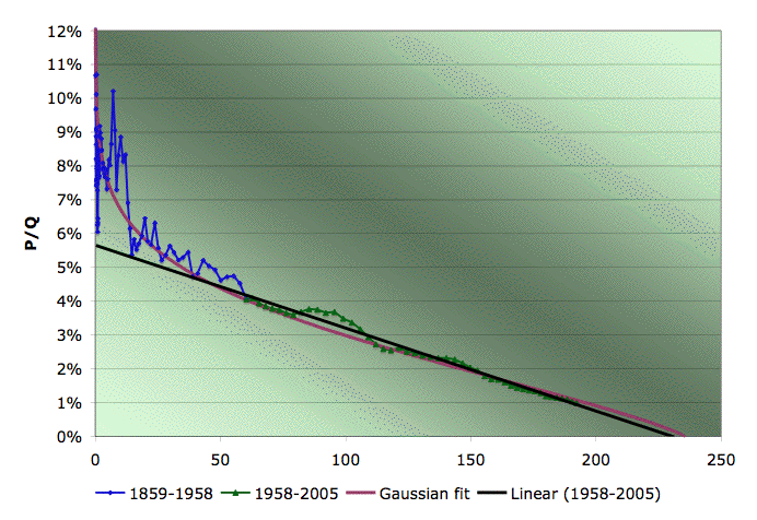
EIA Field production of crude in the US, logistic (Hubbert) fit based only on 1958-2005 data, and Gaussian fit (quadratic fit to log of all the data). Source: EIA for the data.
I didn't think to make this picture the other day when writing about Predicting US Production with Gaussians. It seems to explain a lot.
There seem to be two salient points:
- A Gaussian turn-on explains why the data lie above the linear fit early on in the life of the production history.
- The Gaussian extrapolates forward very close to the straight line. If a Gaussian is a better fit, we don't have to throw out the linearization technique for extrapolating. (Well, if the result holds true over a range of K, anyway).
“The aim of every political constitution is, or ought to be, first to obtain for rulers men who possess most wisdom to discern, and most virtue to pursue, the common good of the society; and in the next place, to take the most effectual precautions for keeping them virtuous whilst they continue to hold their public trust.”
—James Madison, FEDERALIST #57 (1787)
Contact
- Content: editors at theoildrum dot com
- Tech support: support at theoildrum dot com
License

This work is licensed under a Creative Commons Attribution-Share Alike 3.0 United States License.
What is the utility of PQ vs Q domain if it<s not used for regression?<br> I was wondering what is the link between the regression coeff and the Gaussian parameters:
y= ax^2 + bx + c
y= a(x + b/(2a))^2 + c - sign(a).b^2/(4|a|)
Consequently:
var= -1/(2a)
mean= -b/(2a)
URR= exp(c-sign(a).b^2/(4|a|)) x sqrt(2xPIxvar)
So, in this case, var= 949.0 and mean= 1982.9.
Since, I've performed a more rigourous bootstrapping analysis using the R software (I also put the code):
Bootstrapping Technique Applied to the Hubbert Linearization
I looked at the world production (BP data) but I will post results on the US production probably tonight.
If someone could come up with a theory for why one or the other of these curves is followed by oil production I would be very interested.
This theory would then also be useful in explaining why the curve is symetrical and could be used to counter the arguments of the folks in the EIA who believe we will be able to increase production rates well past the midpoint.
I don't have a full theory, but:
. Population growth follows a logistic curve;
. World oil production per capita is flat since 1982 (the year when the linearization method starts working).
I think there must be a strong link between the two.
Still I must remember that we are looking at data from at least two discovery cycles.
It would be interesting to see a gaussian fit on a single discovery cycle (for instance lower-48, without Alaska).
This is more or less the same type of plot that Deffeyes had in his 2005 book.
I too am uncomfortable with the fact that there isn't a solid theoretical underpinning for what type of curve to fit - there are too many variables, including population growth, changes in extraction technology, market forces and all of the rest. Then again, it is hard to deny that this does fit the data quite well. I suppose the next step would be to try the same sort of thing for the North Sea oil and see if we get similar results. You could do the same thing for Prudhoe bay by itself I imagine, but both of these cases are essentially just one oilfield, so we aren't quite modelling the same thing.
Something else that would be interesting I suppose would be to plot the predicted depletion rates as a function of time. The first couple of years after a peak, production won't go down much at all. It could be 5-10 years after peak before we start to get into some of the steeper depletion, so it isn't just a matter of predicting the steepest depletion, but in having a guess as to how long it will be before we get there.
Using two logistic curves, one for each discovery cycle, the fit is nearly perfect. I don't know what you'd get fitting two gaussians in this case...
I just played with these numbers a little bit. The main question I had was how do the depletion rates vary with time.
There is one oddity in the graph though - the 'peak' happens in 1983 or thereabouts...
For US production, 10 years from the peak (year 1993), the production was dropping at about 1.1%/year.
20 years from the peak (year 2003), it was dropping at about 2.1%/year.
30 years from the peak (year 2013), it ought to be dropping at about 3.2%/year.
40 years from the peak (year 2023), it ought to be dropping at about 4.2%/year.
50 years from the peak (year 2033), it ought to be dropping at about 5.2%/year.
My point here is that at least in this model, the steeper depletion (which is relatively modest compared to some of the worst case numbers) is something that you slowly ease into. If we assume that the world peaked this year for example, production for the first 10 years or so is likely to be fairly flat with a fairly small decrease from year to year. Once you get 20 or 30 years out, then you are in the thick of it - that is where you are forced to make larger changes on an annual basis.
No guarantee of course that world production will follow a nice gaussian though...
why the logistics curve is appropriate ...
But there is: essentially, a logistics curve
says that the growth of [take your choice:]
* number of trans-Atlantic voyages of
discovery before 1700,
* number of Hitchock films,
* quantity of oil produced,
tends to increase based on previous actions, but
is held back by the increasing amount learned or
the increasing difficulty of finding and doing.
Mostly, people look at it as an `S' shaped
growth curve. In biological models, the maximum
comes from the carrying capacity of the niche.
It is somewhat odd to see linearization.
Usually, graphs are for an `S' or a bell.
I don't know of an equal mechanical argument for
an oil-based Gaussian. The mechanical argument
for a Gaussian is that a central value has
errors that are equal on both sides and that
occur less frequently the further away from the
central value. Gauss invented the curve for
analysing astronomical observations. He figured
that a celestial object was in a defined orbit,
but that astronomers made mistakes or lacked
good equipment, but did not try to sway their
observations one way or another.
A 15 year old book,
The Rise and Fall of Infrastructures
Dynamics of Evolution and Technological
Change in Transport by Arnulf Grübler
reprinted 1999, ISBN 3-7045-0135-2
gives examples of numbers of cars registered,
kilometers of roads blacktopped, and the like.
It uses logistic curves extensively.
Theodore Modis wrote a book on logistic curves
called "Predictions" (that is where I got the
choices listed above). That book was copyright in
1992, ISBN 0-617-75917-5
Modis quantified the uncertainties in
determining logistic curve fits, given just the
beginning of a curve. This could be useful.
The logistics curve has a logical mechanical reason for applying to bacterial growth where in an unconstrained situation the rate of increase is proportional to the current bacteria population and the availability of the constraining resource.
However for oil production it isn't the past cumulative historical production (Q=sum(P)) that determines the rate of production growth but the current size of the exploration industry (I). Here is an alternative simple model that has to my mind some more relevant significance to the terms.
dI/dt = (h(Qt-Q)-j)I,
dP/dt= r(Qt-Q)I - nP,
where:
r is a parameter related to the exploratory success rate
n is the average infield decline rate
j is a depreciation factor
h is a parameter associated with the insentives to increase exploratory effort.
If we add some apropriate parameters this also forms a nice bell curve. Is this a better model than the logistic curve? I couldn't say, but it does have the advantage that it makes some mechanistic sense.
I(t) = Discoveries,
dQ/dt = I(t) - n Q(t),
P(t) = a Q
I go through a few more 1st-order transforms because you have to consider latencies corresponding to fallow periods, construction periods, and maturation periods. I have the math all worked out, have the source code to do the numerical integration, and it basically looks like this if you assume that the Discoveries curve follows a quadratic growth curve for the USA (peaking after 1930)
That blue curve comes out to a quadratic (i.e. peaked parabola) convolved with a 4-th order gamma curve (i.e. 4 exponentials of the same rate convolved sequentially). It accurately maps over a range 5 orders of magnitude.
http://mobjectivist.blogspot.com/2006/01/would-you-believe.html
http://www.globalresearch.ca/index.php?context=viewArticle&code=%20CH20060103&articleId=1714
This may be just so much saber rattleing, but if Iran calles their bluff, do you really think George Bush is going to back down.
original image
The production is mainly gaussian but deviates a little bit at the beginning.
Gaussian:
log(P)= -6.6824e-004 x t^2 + 2.6406 x t - 2.6075e+003
mean= 1.9758e+003
variance= 748.23
URR= 220.5 Gb
Logistic:
K= 6.11%
URR= 221.6 Gb
The fit was performed using a robust fit technique (function robustfit in Matlab) with the data from 1936 to 2005.