IEA Monthly Report for December
Posted by Stuart Staniford on January 18, 2006 - 2:08am
|
Ok, you happy plateau watchers. The IEA is out with the latest word (thanks Halfin). Quotes:
Global demand increased by some 1.3% in 2005 and should grow by 2.2% in 2006 as demand rebounds in the US and China.So non-OPEC supply is flat over 2004, but never fear, they're sure it will go up next year. The graph at right includes the latest information. The key point is that although the "initial claim" line stays at the November value of 85mbpd, the "revised" line for November is down to 84.4mbpd, and is not yet back to it's May peak. So Freddy Hutter will have to hold the schadenfreude at least for a little while longer.
|

|
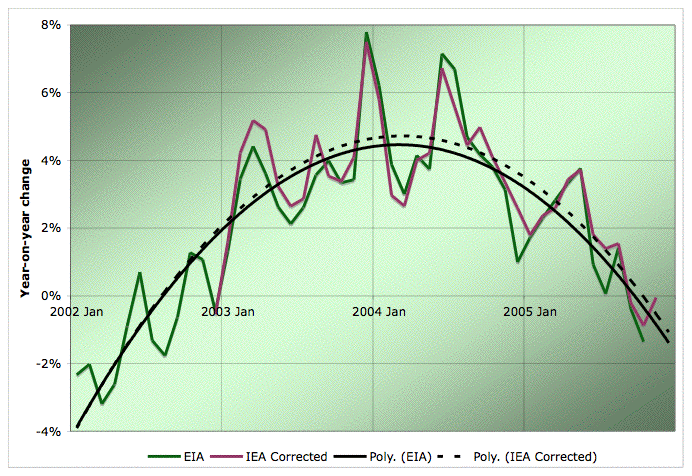
Percentage change from same month in prior year. Average monthly oil production from various estimates. Click to enlarge. Believed to be all liquids. Source: IEA, and EIA. The IEA corrected line is calculated from the month-on-month production change quoted the following month. The smooth curves are quadratic fits to each data set.
Here's the contextual plot requested down in comments. This is the history of annual global oil production from 1930 to 2004. The little yellow box shows the small piece of recent history we are plotting in the top picture that introduced the piece, and is also the timescale for the year-on-year growth plot above.

Average annual oil production from various estimates. Click to enlarge. Believed to be all liquids. EIA line includes refinery gains, others do not. Sources: ASPO, BP, and EIA.
Contact
- Content: editors at theoildrum dot com
- Tech support: support at theoildrum dot com
License

This work is licensed under a Creative Commons Attribution-Share Alike 3.0 United States License.
Had to look that one up.
"Schade"=harm "Freude"=happiness
So, I left with nothing but Schade, Schade, and more Schade.
"OPEC crude supply declined 280 kb/d in December to 29.3 mb/d. Iraqi supply fell to 1.55 mb/d from November's 1.7 mb/d. Nigerian production was also disrupted in December and January."
And yet production increases substantially Nov to Dec?
Can't wait for the revised figures next month.
Sometimes these IEA spreadsheets look like some sort of horror movie catalog.
"The Others' production" coming to theatre near you.
It was just a form of speech, I was referring to the Oil Market Report, where others is recurrent.
"The others" is also referred by Deffeyes as a way IEA has been using to hide the real numbers. That's why I asked Stuart for the O&GJ data.
You're "player hating" us folks with small monitors.
I got a big one coming any day, but for now I'm left out in the cold.:-(
BTW, where is this data coming from exactly on the IEA site? Is it their Oil Market Report? I couldn't find it. Is it free or do you have to subscribe?
Does it break out individual countries? If so, what do they give for US, Saudi, Angola, Kazakstan for December?
Why are their numbers 1.5mbpd higher than the EIA's?
I used EIA's and BP's number alomg with my own calculations to determine monthly total liquids from raw (crude+lease condensate numbers).
I put down the US for about 7.5 mbp for Dec up a million from Nov. I've got Iraq at 1.3mbp, Angola at 1.5mbpd for the hell of it.
I get a total of 83.090 with a probable error rate of +/- .300.
I don't even know half the time if EIA's data matches itself internally. Take a look at their world oil balance numbers, the data is completely different for the exact same time periods from what they come up with when they calculate supply and demand separately. If you look at their demand tables - the numbers are higher than the corresponding supply.
At this point, to make things easy, I'm not using a particular number for November since we are already into Jan and I'd like to wait for a revised, published number.
I arbitrarily made December 7.500 as a mark on the road to hurricane recovery which will eventually take us back to the 8.1 level. I realize this is probably premature and I will be using your input to revise my table. Thanks.
You can obviously see the fun involved in trying to come up with accurate, up-to-date info.
What browser and OS are you using?
I just tried IE on my Mac, and there is no resize restriction on either the permalink or the front page. The layout doesn't look great with very narrow window widths, but there's no problem getting things to fit across the width of the window.
First the column of text to the left of the chart squeeezed until it got to a certain, fairly narrow width, and then the column on the right (about us, personnel, etc.) started to move over the chart from right to left thus effectively "cropping" it progressively as the size of the window was reduced.
The text is shrunk to a skinny, unreadable little column, and the image is also cropped as the screen size gets smaller.
Windows XP, 21" LCD monitor, set to 1280 x 960. In IE 6, TOD looks okay at full size, but quickly becomes an unreadable mess as the screen shrinks.
Firefox handles it a lot better, shrinking the image rather than cropping it. Though it still does ugly things to the text.
Also, what program do you use for your graphs?
I have been looking at some programs to make my own graphs, but yours look the best so far.
Is the program spendy?
Stuart (or anyone else) have you got the 2005 O&GJ data? Wasn't that soppused to be publish late December?
http://money.cnn.com/2006/01/06/news/international/opec_output.reut/index.htm
"Saudi Arabia cut production by 150,000 bpd to about 9.4 million bpd as buyers in the U.S. requested less crude ahead of shutdowns for spring refinery maintenance, according to the survey of consultants, shippers, industry and OPEC sources."
"Production from the 10 OPEC members not bound by quotas, excluding Iraq, fell 50,000 bpd to 28.23 million bpd as increased output from the United Arab Emirates partially compensated for the fall in Saudi output"
This will probably start a firestorm, but I believe Saudi production has peaked. The problem is, the powers that be do not want the situation to get out of hand, so any information reguarding Saudi production is fudged / distorted / suppressed. The disconcerting thing is that the post peak production fall off for Saudi production will likely be quite steep, as we are now finding with the North Sea. For those who are more skeptical about information suppression; What do you think would happen if CNN reported that Saudi production IS declining?
http://www.theoildrum.com/comments/2006/1/18/13443/5542/19#19
They talk of increasing production to 12 mbpd by 2016, which seems realistic but too little, too late, though it's quite likely plans have changed in the 2 years since then. One very interesting figure I got from the presentation: they say the maximum ever field decline rate that they have had is 4.1% per year, the average is 2%. We'll see what happens when Ghawar starts to seriously decline, I'd bet its decline rate will top 4%.
But even if Ghawar is / does decline at 5% or more they can probably manage to hide that fact from the world for a couple of years. Until there is a real global supply shortfall and Saudi has to increase exports - or be found out - we are unlikely to know the real situation there.
It'll depend on the type of heavy. Give me an (the) API and sulfur content and I'll think about it.
"It is an old maxim of mine that when you have excluded the impossible, whatever remains, however improbable, must be the truth."
- The Adventures of Sherlock Holmes, "The Beryl Coronet".
My guess is that thanks to all these factors we'll be on an undulating plateau (as Jean Laherrère has predicted) for several years, right up to the time geology takes over and the true oil peak comes into play.
If Hirsch is right, and the peak is sudden, sharp, and completely unexpected...it will be like all those countries that peaked. We'll think it's just temporary technical difficulties, next year will be better. Until five years later, we look back and realize yes, that was the peak.
We're used to seeing oil production, and we see a curve that goes up and falls back. With a nice tight fit. And then it crosses zero--yesterday! Eeek!
But this graph is year-on-year growth. That was quite negative in Jan. 2002. But we know that year-on-year growth has been mostly positive. No one was talking about a peak in Jan. '02. So it's clear that crossing zero does not mean peak.
Also, the fact that the graph was positive for most of the pre-'02 period means that the nice polynomial fit couldn't possibly continue if the graph were extended back to '00 or '98.
It'd be worth seeing the graph for the past ten or twenty years. We'd have a lot better idea of what zero-crossing meant and how common it was. I know Stuart had to go through a lot of back issues to get this much data, but the graph as it stands is misleading, since it shows a very close fit that we know can't continue even a few months to the left.
Chris
As Chris points out your parabolic fit can only be an illusion, it will never work when extended a bit farther to the left. This is a variant on the complaint I made previously, that in selecting this time window for the "plateau" graph you are giving a misleading impression. The fact that the % change graph fits a parabola rather than a straight line is more evidence of how anomalous this short time period is.
I don't see any deep reason for the parabolic fit to the y-on-y growth curve beyond that any peak in anything looks quadratic locally in the neighbourhood of the peak. We are fitting what in the grand centuries-long Hubbert linearization scheme of things would look like a little chunk of noise in the production curve. And asking is this the top piece of noise, or not?
I don't think this is invalid - this focussing in and out at various timescales. It's just important to remember the different contexts. Perhaps it would work better if I added a decades long graph and showed a box on it which this graph is the blow-up of. I'll try later and see if I can figure out a way to add a box to an Excel graph.
I had thought that your analysis of Gaussian vs logistic curve was leading up to an analysis of world production levels using those same techniques. I have been waiting eagerly to see those results. If you could show the world percentage production change graph over the whole period, and fit a Gaussian curve to it, I think that would be very useful.
Then you could show this long-term graph with its fit, and the blow-up graph with both the blown-up long-term fit and also your short-term parabolic fit.
I believe the logistic curve shows linear production percentage declines in the vicinity of the peak, while the Gaussian of course shows linear declines throughout the whole curve. So I would expect either model to be showing a linear decline if we are near the peak now.
<center>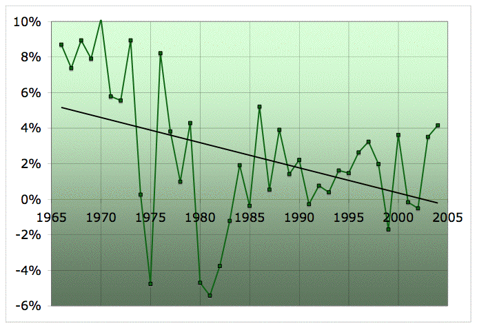
</center> The last sharp rise, ending in 2004, is the first half of the parabola above. You can contrast that with the US case: <center>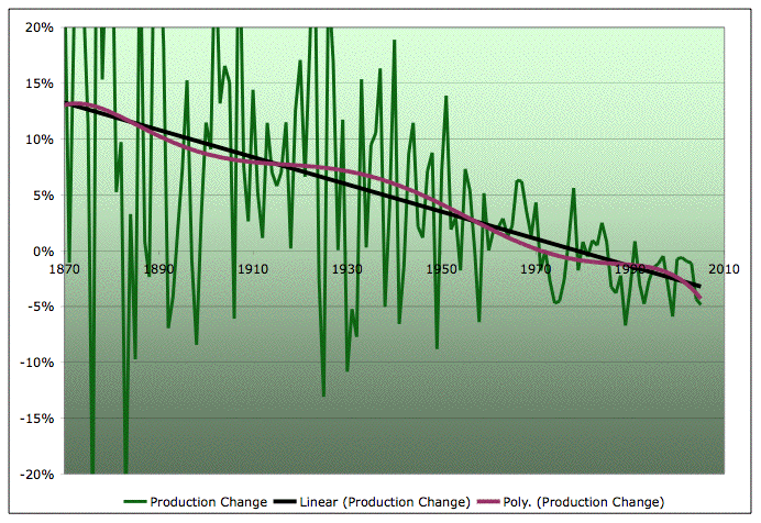
</center> (However, be aware that we know of no global equivalent to Alaska, which was known in 1970, unless you want to cast oil-sands/Orinoco/coal in that category - which is probably valid in the long term, but not in the short term).
Come to think of it, probably the visual impact wouldn't even be noticeable to the person who made it (you), since you were familiar with what the lines meant before you ever saw it.
The box-and-zoomed-graph would certainly clear up the confusion. A disclaimer on the parabola would also have helped; here, you're a victim of your own success, because so many of your fits are so meaningful and useful that I just assumed this one was intended to be meaningful too.
Chris
If this is the explanation, then yes, it seems very ominous that the low is basically gone. That would seem to imply that production can't now be increased any faster than the winter max has been increasing.
Chris
Not that I think you need any more work to do, but I was thinking about the flat production curve for the last year or so and the rise in prices we've seen over similar sorts of time frames.
If you project increases in demand based on some sort of extrapolation of recent oil demand growth, flat production represents a virtual "loss" of supply that we would have had at a constant price.
I wonder how that "supply loss" and related price rise looks compared with your analysis the other day of the supply shocks and corresponding price increases of the 1973, 1979 oil shocks etc.
Cheers,
Xuewen
This is how they reported every month
Month Year Inc/Dec Volume Reported
jan 2004 395000 82100000
feb 2004 -15000 82100000
mar 2004 60000 82000000
apr 2004 410000 82300000
may 2004 -440000 81500000
jun 2004 460000 82000000
jul 2004 790000 82500000
aug 2004 550000 83500000
sep 2004 300000 83600000
oct 2004 640000 84000000
nov 2004 890000 84600000
dec 2004 -40000 84400000
Total reported growth 4000000
Total Growth (Dec-jan) 2300000
Exageration Factor + 1.7
Month Year Inc/Dec Volume Reported
jan 2005 -45000 84400000
feb 2005 -645000 83600000
mar 2005 885000 84300000
apr 2005 365000 84200000
may 2005 435000 84500000
jun 2005 260000 84600000
jul 2005 -155000 84600000
aug 2005 250000 84700000
sep 2005 440000 84900000
oct 2005 -845000 83800000
nov 2005 865000 84400000
dec 2005 1300000 85000000
Total reported growth 3110000
Real growth (dec-jan) 600000
Exageration Factor +5.2
Interesting trend. If we take jan '04 as a baseline, then if we added all the reported growth numbers, we would today be at : 89.2 MB/day. Clearly there is a policy at work, because if this were a learning organisation there errors would level out over the years, but they don't.
From 2004 through 2005, the world produced almost 650 million barrels more oil than demand consumed, according to the accepted International Energy Agency model. But where are these barrels of oil?
"Little of this glut has shown up in observed petroleum stocks," writes Mr. Simmons, author of Twilight in the Desert: The Coming Saudi Oil Shock and the World Economy, in the January issue of World Energy Monthly Review. "In fact, as demand for oil continues to grow, daily usage rates indicate many key stock points are at historic lows."