| Conference: Global Energy Systems - June 26-28 2013 | The Oil Drum | Oil Watch: Europe and North America - Total Oil Products Demand |
The Need for Crowdsourcing Energy Data
Posted by Rembrandt on December 18, 2012 - 4:00am
This is a guest post by Andreas Ligtvoet a PhD. Researcher at TU/Delft department of Energy and Industry in the Netherlands. Andreas is a contributor to EniPedia (energy wiki), a site that his colleague Chris Davis created and maintains.
The effort to get a better grip on peak oil runs into the problem of data availability, data accessibility and data quality. As most TOD readers will recognise, there seems to be data asymmetry between the oil producers (NOCs and IOCs), international energy agencies, and the general public. Some transparency has been achieved by streamlining and organising data collection, e.g. through the JODI initiative. However, this encompasses top-down data collection that runs the risk of being polluted by non-data-driven incentives (the political need to over- or under-report, for example).
Click below the fold to read this discussion on the need for savvy open-source data gathering and to learn more about EniPedia.
There have been a lot of bottom-up attempts to collect and combine data, many of which have been reported in TOD. This high-quality information is often represented in such a way, that does not allow others to build upon the work. Excellent collective efforts like the megaprojects taskforce on Wikipedia seem to have died. One of the reasons for this demise could be the lack of analytical power the current setup of Wikipedia allows: timeline data, conflicting sources, and large sets of relatively unworthy facts (e.g. location of wellheads) are not handled well. But also the Wikipedia community may not be aware of the notability of energy data.
This article is an attempt to re-ignite the spark of combined cognitive efforts in the TOD community, to spend some of your mental surplus on checking and updating facts and figures on oil projects and production, a topic you are passionate about to begin with. Why do it? Because credible data underpins a well-informed debate. Even commercial databases that cost loads of money and are inaccessible to the general public face the problem that they are full of mistakes, because the time and effort required to update them is enormous. Many of the contributors to TOD discussions have access to excellent data and spend time analysing it. A combined effort is possible (as projects in other domains have demonstrated) and arguably leads to better curated information.
Quality control of crowdsourced data
Quality control is naturally an important issue. Who do you trust: Encyclopaedia Britannica or Wikipedia? One could argue that only paid experts provide the necessary comprehensiveness, accuracy and oversight. However, paid experts' time is limited and possibly biased. TOD community has ample well-informed members who can check facts & figures. That' s what TOD is all about to begin with! There is a lot of collective cognitive energy being spent on TOD, and it would be beneficial if we could channel this more effectively so that we can leverage each other's efforts instead of repeating them. We also notice that the cognitive energy of experts is often wasted, as they find it easy to point out problems, but there are not always systems in place that permit them to contribute their knowledge to improving the data.
There are several ways in which data quality can be managed, based on the type of systems that are used. For example, wiki systems employ a revision control system that records who did what when, meaning that every edit is logged, and mistakes can easily be reverted. This means that it is harder to vandalize a page than to fix it. Without this functionality, Wikipedia would have failed a long time ago. There are also systems in place like ScraperWiki , which allow people to write scripts that gather and clean up data from across the web (example from oil megaprojects) and then create different views that enable people to visualize the contents of the data. Having different means of visualizing and interacting with the data is key in order to expose errors in the data. Some issue may be spotted using a map or table, while for others, a more in-depth statistical analysis may be needed. Overall, this is about collectively building the modules that allow different people to contribute different steps in a process of gathering, analyzing and improving data.
Enipedia, an example of a crowdsourcing data platform
Of course this is no easy task. We argue, however, that a relatively large group of motivated individuals can curate data more effectively than one or two paid professionals who have to wade through tens of thousands of data points. To show some interesting examples of what can be done with open data, in particular OpenStreetMap, ScraperWiki, and Wikipedia, we have set up a portal on our own Delft University of Technology site Enipedia.
The project uses open source semantic software that is readily available. However, to our knowledge it has not been used in an online attempt to gather, curate, and display scientific data on energy infrastructures. It opens up possibilities to a community of interest that was until now unavailable in a dynamic fashion: to contribute to each others' work and to critique and improve the available information.
Why did we not focus more specifically on e.g. nuclear power plants in Germany? First of all because such a limited set can still be handled by single (research) organisations. Because more is different: no one entity could seriously claim to know all the details or have the manpower to find out all the required details. Because we don't know where the interest of the community lies: our largest non-colleague contributor seems to be French; (s)he may not have participated if the project were about Germany. Because we think people need this broad information to make useful policy decisions.
We most actively work on information on power plants, combining e.g. the Carma.org, eGrid, E-PRTR databases that each have (limited) information on these infrastructures. For a list of all the data sets we used, see Energy and Industry Data Sets
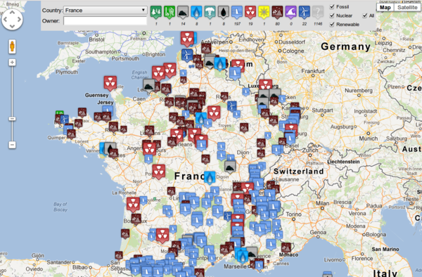
To provide an example, overviews and insightful maps such as the one above can be generated, which depicts all power plants for France. This is a picture taken from our interactive map where you can obtain an overview of country by country power plants in existence. For some more examples, check out http://enipedia.tudelft.nl
The tools for more productive cooperation are available. There is a large and perpetual need for people to check and update the information regularly. The more computer savvy enthusiasts can design new analyses.
Contact
- Content: editors at theoildrum dot com
- Tech support: support at theoildrum dot com
License

This work is licensed under a Creative Commons Attribution-Share Alike 3.0 United States License.
As someone who is new to the European gas market, I find this is a great tool. However as mentioned already, the difficulty lies in keeping the database current.
R -& Andreas - Very timely given the emphasis on year end reporting. "...that a relatively large group of motivated individuals can curate data more effectively than one or two paid professionals..." Which I believe is one of TOD's great strengths especially when we disagree amongst ourselves. As you imply we'll seldom have black and white proof of much of the international data base as well as holes in the domestic data base. So, like any good intelligence agency, TOD will piece the story together using a good bit in inference.
The only big potential pit fall to the effort may be too great a desire to come up with specific yet not fully supportable answers to various components of the puzzle. Sometimes the best answer is "I don't know". An answer can always be provided even when there's insufficient support for it. The problem develops when we forget there's little to back up that answer and carry forward with it as though it's correct. At that point one begins building a structure with some very weak foundation members. If so an entire model can be subjected to criticism by attacking those weaker components even when the general theme is valid.
I agree that there are certainly pitfalls, but the way we see this is that it isn't just one effort, but it's more about multiple efforts aimed at increasing the efficiency of the various steps that help us to collectively process and make sense of data.
For example, Pirolli and Card have an interesting paper about the sensemaking process where they include a figure that illustrates the various feedback loops between stages in the process of going from external data to a collection of evidence, to a hypothesis, and to some presentation of the insight gained.
Regarding your point about having answers with insufficient support, it's important to be able to revisit earlier steps in the sensemaking process, see what underpins the data/conclusions, and if necessary, be able to branch off in a different direction. The work in these steps is not necessarily conducted by a single person, and gains can be made by automating parts of the process where appropriate, and also by employing systems that allow for greater collaboration while using revision control to highlight contributions and allow them to be reversed if needed.
That's extremely interesting. Are you interested in also including datasets about electricity generation ? The fact they are disseminated on many different national site, with each it's specific organization and not exactly the same information available each time, makes it really hard to exploit what is actually available in Europe. But usually those sites don't make it easy to extract the data for reprocessing, and actually most have some very harsh conditions that restrict the reuse a lot.
For example, I just checked for EEX, and by default you're only allowed to use the downloaded data on your personal computer. I think ENTSO-E is more open, and you can diffuse the data as long as the actual source is clearly mentioned.
It's not yet totally clear to me what your current database includes, and having to learn SPARQL to query it is a bit of a deterrent at first. At least as long as you don't know clearly how useful the content is.
I've had a look at the power generation emissions charts. I think they would be more intuitive if you inverted the axes, that would result in the surface of the graph representing the amount of CO2 the country releases. The graph could also include the average CO2/MWh and total CO2 numbers as a legend.
Very interesting! It seems like this model could be applied to other energy related issues, such as pollution for instance. That would likely be more hearsay than energy data like this, but it could be a boon for disseminating info on fracking, for instance.
There is the European Pollutant Release Transfer Register that registers certain emissions for large facilities. The E-PRTR is now available from the EEA as RDF, but as of Sept 2012, it's missing data such as coordinates and there are some known issues with the conversion process. The work that we've done on converting the E-PRTR to RDF doesn't have this issue (https://github.com/cbdavis/E-PRTR-to-RDF), but we should update our code to match the schema that they have in use.
I was not aware of this. I follow the Megaprojects pretty closely and they seem to update them every two to three months. At the bottom of the current Megaprojects page we find: This page was last modified on 4 October 2012 at 14:20. That was just over two months ago. And the task force pate was updated just over three months ago. This page was last modified on 11 September 2012 at 19:41.
Some people mistake the "Scripts" note at the top of the page for the last update: This script is not run every day so some discrepancies may appear (last update: 18-JAN-2010). This note and date should be removed since so many people mistake it for the date the Megaprojects itself was updated.
However I do wish someone from the task force could comment on this an explain exactly what is going on.
Ron P.
I'm not aware of what's going on with the task force, but we've created a script on ScraperWiki that every day reads the tables on all the wiki pages for the megaprojects per year, and allows people to download the latest data as csv. For people with programming experience, an advantage of this approach is that the code is in the open so people are free to collaboratively improve it. Additionally, Scraperwiki provides an API for the data scraped, meaning that people can make their own custom visualizations which query the current state of the data.
If you look closely at the edits to the wikipedia projects, most are just bots fixing style, or references or similar. No significant content has been added for a very long time.
I like the webscraper tool, as it makes it a lot easier to incorporate the information with other analysis.
It would be good to get the megaprojects current again, as without having a handle on this, it's pretty hard to work out the underlying decline rate worldwide. To start the ball rolling I've added the three 20+ kbd Australian projects to wikipedia, and I look forward to seeing them (tomorrow?) in the webscraped csv file.
The scraper has done its job - only I suggest you do not list Australian projects with the OPEC countries... :-)
I am working on a semantic web knowledgebase that allows access to a number of environmental models. It will be available sometime in the coming year.
I'm from Cape Town. I see the nearby Darling Wind Farm isn't shown. I will attempt to update the database and give feedback.
1. On the map up top is a box saying "Open Street Map". It covers the label of the top text box, which is irritating. (I realize the label is something obvious like "Country", but it should be able to be seen.)
2. The "Location" text box does not accept coordinates. This is a surprise. I expected behavior similar to Google Maps. It should be an essential functionality.
More to follow... (Edit: added link)
I have located the wind farm on your map. I see the four turbines at -33.31694, 18.25944.
Now I'm a bit stuck.
What I would like to do is drag the wind turbine icon off the top bar and drop it on the wind farm. Then hopefully a text box will open and prompt me to input information on the farm, give links to home pages, Wikipedia, photos etc.
No such luck. The icon drags but doesn't drop. Maybe I need to be a registered user, or I need to open the web page for editing?
Note: Using Firefox 17.0.1, Windows 7 Home Basic SP1
I look around. No place to sign in or register, no help button.
All I see is fine print above the icons, (Click for advanced menu)
I click.
It says (Click to load all power plants on current map view)
I click.
A link appears, (download data)
I click.
Do I want to save file "sparql" a Microsoft Office Excel 97-2003 Worksheet (328 bytes)
Yes.
I'm hoping that I can edit this file then send it off to the powers that be and the information will be captured and appear on Enipedia.
I check the file in my "Downloads" directory. "sparql", no extension. I add ".xls". The size is 1 kB. I am not hopeful.
I open the file with OpenOffice.org 3.4.1 Calc (I don't buy MS products if I can help it).
It asks "Select language for import". Huh? I've never seen this prompt before. I push the "auto" button.
A spreadsheet opens. It has a number of headings. The cells are blank.
wiki
name
ownerenc
owner
zip
city
state
Output_MWh
point
fuel
CO2_emissions
CO2_intensity
capacity_MW
Now I'm really stuck. Maybe it's time to RTFM, if I can find one.
More later, maybe...
(Perhaps I should add at this point I used to program databases years ago in the DOS days, and I recently did quite a complex editing job on Google Maps, which had got my apartment complex hopelessly mixed up, so I'm not a total noob at data manipulation and display, but obviously I'm unfamiliar with procedures at Enipedia.)
The manual for the maps is at http://enipedia.tudelft.nl/wiki/Enipedia_Maps, and this link has just been added to the maps interface itself. Also, information about our work on documenting power plants and how people can contribute is at http://enipedia.tudelft.nl/wiki/Portal:Power_Plants. As this is a wiki, feel free to add comments, as we use this to improve the documentation.
The reason you found an empty spreadsheet was probably because you were zoomed into in an area where no data was found in the bounding box. If you select South Africa or zoom in on a more populated area, you should be able to download data without problems.
I wish the maps interface was interactive as you hope it is, but we need to do a bit more development first, and we're using your feedback as input. What you're seeing with the map is that it's basically a visualization of the live data stored in a semantic wiki. The map is currently read only, but if you click on the markers, you can find a link to the corresponding wiki page where you can edit the data. After you save your changes on the wiki page, refreshing the map will bring up the changes.