| Total Production by the Top Five Oil Majors Has Fallen by a Quarter Since 2004 | The Oil Drum | Tech Talk - OPEC and EIA Short-term Projections |
Tech Talk - The BP View of the Future
Posted by Heading Out on April 21, 2013 - 1:10pm
I suspect I should apologize. Here I am talking about the future projections for energy production made by companies such as ExxonMobil and Shell, as though they were still the key and only players in the world. Yet in reality, Saudi Aramco (12.5 mbdoe), Gazprom (9.7 mbdoe) and National Iranian Oil (6.4 mbdoe) appear in the list before ExxonMobil arrives (at 5.3 mbdoe), and then there is PetroChina (at 4.4 mbdoe) before BP arrives (at 4.1 mbdoe), and it is only then that we find Shell, which lies 7th at 3.9 mbdoe.
So the projections of the ExxonMobil’s of the world are of somewhat lesser value than they might have been at one time. (For those curious, the list continues with Pemex (at 3.6 mbdoe), Chevron (at 3.5 mbdoe) and Kuwait Petroleum Co (3.2 mbdoe). This not only rounds out the top ten, it also closes out the list of those producing more than 3 mbdoe. (Abu Dhabi comes next at 2.9 mbdoe).
Yet with those caveats, and recognizing that Saudi Arabia now produces only slightly less than ExxonMobil, Shell and BP combined, let me review the BP forecast, having already completed that for ExxonMobil and Shell. While the latter two looked sufficiently far into the future as to obfuscate a little their shorter-term projections, BP is still focusing on the relatively short-term that runs to 2030.
Within that time frame, BP expects overall energy demand to grow by 36%, though like the ExxonMobil projection, BP expects that a “tremendous increase” in energy efficiency will continue to develop, thereby slowing the need for future resources. They point out that without this improvement in efficiency, global energy supply will need to double by 2030 in order to sustain economic growth.
This is particularly true for the United States, which BP sees approaching self-sufficiency in Energy, while it is the continued growth in demand from countries such as China, India and the Asian Pacific countries that provide most of additional need. Comparing their view from 2 years ago with the present there does not appear to be much change in the overall forecast. (Note that after the first two figures all the remainder come from the 2030 BP Energy Outlook).
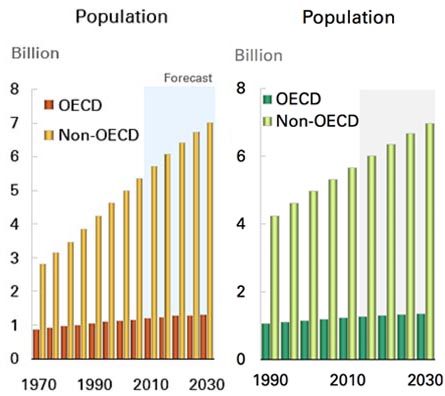
Figure 1. Comparison of BP data and projections for population growth between their 2011 report (left) and that for 2013. (right)
Figure 2. Comparison of current and anticipated energy demand through 2030, from 2011 (left) and 2013 (right) BP reports.
There is a small increase in the overall demand from non-OECD countries in the more recent projection, but not a great difference. But this increase in demand reduces from a growth averaging 2.1% in the 2010-2020 time frame, to a growth of 1.3% in the following decade.
Within the period to 2030, BP anticipates that all major energy sources will continue to see an increase in overall energy production.
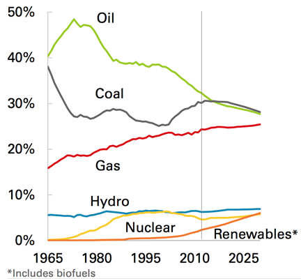
The fastest growing fuels are renewables (including biofuels) with growth averaging 7.6% p.a. 2011-30. Nuclear (2.6% p.a.) and hydro (2.0% p.a.) both grow faster than total energy. Among fossil fuels, gas grows the fastest (2.0% p.a.), followed by coal (1.2% p.a.), and oil (0.8% p.a.).
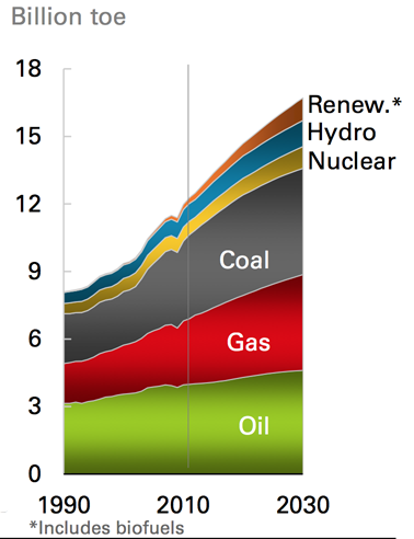
However, there is a change in the ranking of the different fossil fuels from the earlier projection. While BP were projecting two years ago that coal, oil and natural gas would virtually tie in terms of market share by 2030, coal is now given a more dominant role, with natural gas falling below oil.
Within this time frame, coal is not really bounded by available supply, though BP anticipate that more will be produced indigenously in the Asian Pacific than at present. One assumes that this is partly necessary for financial reasons, although it will also be a need-based growth as the countries increasingly need electric power.
In terms of natural gas and oil supply, questions are more urgent and BP provide the following answer:
By far the largest production from the tight oil and gas shales will come from North America, where the current growth in production is anticipated to continue.
One of the drivers that BP see in the fall in oil demand comes from its continued high price. This has already significantly lowered the use of oil as a power generating fuel, and the continued high price will drive the move to vehicles of increasingly greater efficiency. Thus, although global liquid fuel demand will continue to grow, it will only be at the rate of 0.8% pa, reaching 104 mbd by 2030. The sources to meet this are various:
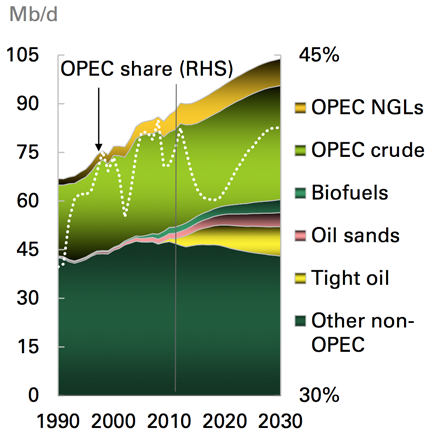
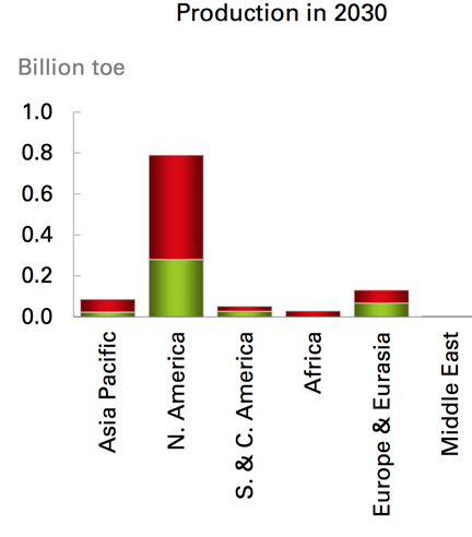
With the conventional supply of crude from non-OPEC countries diminishing, OPEC crude levels can be seen to increase over the next seventeen years while the major increase in production from tight oils is anticipated to come from North America. In 2030 it will provide 9% of overall demand, providing almost half of the 16.1 mbd of overall increase in production. The increase will, however, slow post 2020, as the costs of production and the limits of the resource base.
BP make the following prediction:
The US will likely surpass Russia and Saudi Arabia in 2013 as the largest liquids producer in the world (crude and biofuels) due to tight oil and biofuels growth, but also due to expected OPEC production cuts. Russia will likely pass Saudi Arabia for the second slot in 2013 and hold that until 2023. Saudi Arabia regains the top oil producer slot by 2027.
Other than tight oil, BP anticipates some increase in biofuel production, and from the oil sands, with significant increase in Iraqi production, and some gain from the remaining OPEC countries (one suspects Venezuela is included here) and from NGL production.
The largest increments of non-OPEC supply will come from the US (4.5 Mb/d), Canada (2.9 Mb/d), and Brazil (2.7 Mb/d), which offset declines in mature provinces such as Mexico and the North Sea. The largest increments of new OPEC supply will come from NGLs (2.5 Mb/d) and crude oil in Iraq (2.8 Mb/d).
In this regard, BP believe that currently OPEC has a spare capacity of around 6 mbd, but will continue to cut production to sustain prices over the decade.
BP see roughly a 7% p.a. increase in shale gas production with most coming from the United States, Mexico and Canada. This will bring total natural gas production to 459 bcf/day by 2030. Of this, North America will see a growth in production of 5.3% pa and by 2030 will be exporting roughly 8 bcf/d. In other countries the biggest growth will be in more conventional natural gas production, coming from the Middle East (31 bcf/d), Africa (15 bcf/d) and Russia (11 bcf/d).
This increase in supply, and the greater use of LNG tankers is likely to keep natural gas prices relatively stable.
Contact
- Content: editors at theoildrum dot com
- Tech support: support at theoildrum dot com
License

This work is licensed under a Creative Commons Attribution-Share Alike 3.0 United States License.
Hello, I'm from India and have lived in Kuwait for the last 20 years or so. I've been browsing energy and peak oil websites on and off since the mid to late-2000s, and have finally mustered up the time to set up an account here.
Realistically, the only countries which have 'any' medium to long term spare capacity within OPEC circles are Saudi Arabia, Kuwait and the UAE. With that said, the estimation of it being as high as 6 mbd is a huge stretch by any measure. A figure of 2-2.5 seems to be more accurate in comparison.
I don't disagree. But I think that it is helpful to see the underlying reasons that are provided to generate this air of complacency which is pervasive at the moment.
The term oil seems to be used rather loosely here(not helped by your initial reference to mbdoe: Saudi Aramco-12.5, etc). Is there a whole lot of spare natural gas capacity in OPEC--enough to add a billion or two bbls a day of NGLs into BP estimate? Six billion barrels per day of OPEC spare capacity isn't even close to anything I seen projected recently.
where is the increase in US bio fuel expected to come from? Cellulosic ethanol the great hope for bio fuels not based on food has so far turned out to be a complete bust. A couple of more droughts and we can kiss corn based ethanol goodbye.
http://www.bloomberg.com/markets/commodities/futures/
I can see the Brent price is now $99/barrel and the West Texas (Cushing) price @ $88/barrel, both prices are near to- or below the marginal cost of bringing the replacement barrel to the marketplace.
http://www.zerohedge.com/news/2013-04-18/soft-cost-curves-hard-assets-wh...
Prices have declined because consumers are broke and credit is diminished. Higher prices are needed by the drillers to extract from smaller reservoirs that are harder to get at.
How the energy industry expects poorer customers to fund both higher efficiency (of a massive world-wide automobile fleet) or new crude extraction is not explained. BP's marketing appears to be living in an isolation chamber: costs matter.
I think it will be extremely interesting to see how the oil price reacts to this newest global economic downturn. I would be curious to hear expert comments how low they expect the marketprice to fall. I personally think that this time the price dip will be shallower than in 2009 due mainly to higher production costs and perhaps sharper drop in production (smaller producers throw in the towel quicker, Saudis have a greater motive to preserve reserves, etc.)
It is another matter how prolonged the depressed prices are, or in other words, how prolonged the downturn is. My personal gut feeling is that it will be more of a "permanent crisis" than 2008-2009 was, but less intensive day-to-day.
In recent years, we have seen a cyclical pattern of higher annual (oil price) highs and higher annual lows. Here is the progression in annual Brent lows (year over year price declines) since 1997:
1998: $13
2001: $24
2009: $62
Of course, the key question is what happens going forward to demand in the oil exporting countries and in the developing countries. What has happened is pretty clear:
And annual Brent prices versus the 2002 to 2011 decline in the GNE/CNI* ratio:
*GNE/CNI = Ratio of net exports from (2005) Top 33 net exporters (GNE) divided by combined net imports from China & India (CNI), BP + EIA data
"Prices have declined because consumers are broke and credit is diminished."
Actually the price decline was a selectively targeted high frequency trading attack by Wall Street (i.e. The Fed) against the commodities of gold, silver, platinum, palladium, copper and oil. There was no macro news to trigger such a crash, it happened on a quiet Sunday night when trading is thin, and it occurred only in those markets.
500 tons of gold were put on the market in one transaction - over $20 billion in one shot. It is unclear who did it, it could even possibly be an institution selling to a branch of itself. Its not normally done this way because the price will be depressed - better to divide it and sell portions over a short period of time. Very few entities are capable of this - TBTF banks and a few governments. The transaction triggered HFT sell orders from our retirement funds - looks like Morgan Stanley made out royally, and furthermore will get out of a bad spot re silver. So maybe it wasn't the Fed.
If my future retirement income depended upon Wall Street, I'd be pretty unhappy about this.
The only one somebody can sell 500 tons of gold if is somebody else buys it.
Rgds
WP
An article I read last night said it was possible for an investment bank to sell to another branch of itself. I don't know how possible this is - perhaps they were wrong. Wall Street people can be very creative though.
There are lots of buyers at different price levels. As the margin calls unzip the paper longs who then capitulated, price dropped and the buyers who were down there at $1400 and lower were buying. That's why price dropped -- because enough of the higher price buyers were satisfied and it got down to $1340 before the selling stopped. That's what's dangerous about breaking support levels - price can drop quickly after support is broken because there are fewer buyers down there. It goes the other way too and resistance prevents upward price breaks. Once the resistance is broken with enough buying pressure price can then rocket higher. The difference is, the buyers are generally increasingly physical and finite in quantity. The sellers are selling paper only, which is available in infinite supply.
This is a good summary, though focused on gold and silver, but the same principles apply to the oil and copper takedowns too:
The Underground Investor Why the Western Banking Cartel’s Gold and Silver Price Slam Will Backfire – And How You Can Protect Yourself from the Inevitable Blowback
double post
Ultimately, the answer will be electric cars. Lighter batteries are in development, and higher oil prices will just accelerate the transition to wind and solar power generation.
What about decline rates?
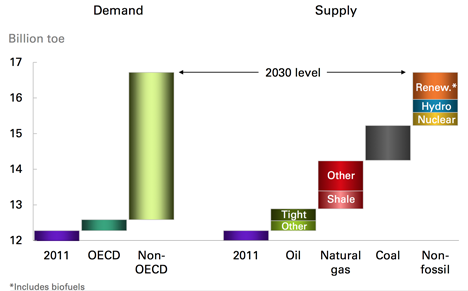
I'm a bit confused re: BP's Figure 5 - Demand vs. Supply.
BP shows the world's 2030 energy supply growing from 2013's in a cascading set of "flying bricks" from a base level of just over 12 Billion toe current supply.
But how have decline rates been factored in? It's not clear from that diagram.
The oil and gas sources providing 2011 supply will decline significantly by 2030 (at about 5% a year, that's a lot of missing barrels). Am I missing something?
BP 2030
http://grandemotte.wordpress.com/2013/03/18/energy-outlook-2030/
Decline Rates
http://grandemotte.wordpress.com/oil-and-gas-5-production-decline-rates/
More on Decline Rates
http://grandemotte.wordpress.com/2013/04/15/future-decline-rates-why-the...
[edited for punctuation]
Jeff
Does the second chart you show.... is this saying that China/India are consuming roughly 1/5th of net exports from top 33
exporters? Am I reading it correctly?
In 2011, Chindia's net imports were 8.3 mbpd (BP), while GNE was 43.7, so in round numbers Chindia consumed close to 20% of GNE (18.9%). Nine years ago, Chindia only consumed 9% of GNE.
The reason for using the ratios is to extrapolate the declines in said ratios, and predict when GNE and ANE might (theoretically) approach zero (when the ratio = 1.0).
My very detailed paper on this topic:
http://aspousa.org/2013/02/commentary-the-export-capacity-index/
I would particularly focus on Charts 22 & 23.
(Edited to remove erroneous earlier comment)
[edit] What is GNE? I checked all your comments and gather that NE is net exports. But what is G? The G-spot? Generic? Genomic?
Seriously, please provide a glossary with your posts as GNE/CNI etc go right past me. Thank you :)
It's defined in my post up the thread:
*GNE/CNI = Ratio of net exports from (2005) Top 33 net exporters (GNE) divided by combined net imports from China & India (CNI), BP + EIA data
GNE = Global Net Exports