Four US Linearizations
Posted by Stuart Staniford on January 6, 2006 - 8:13am
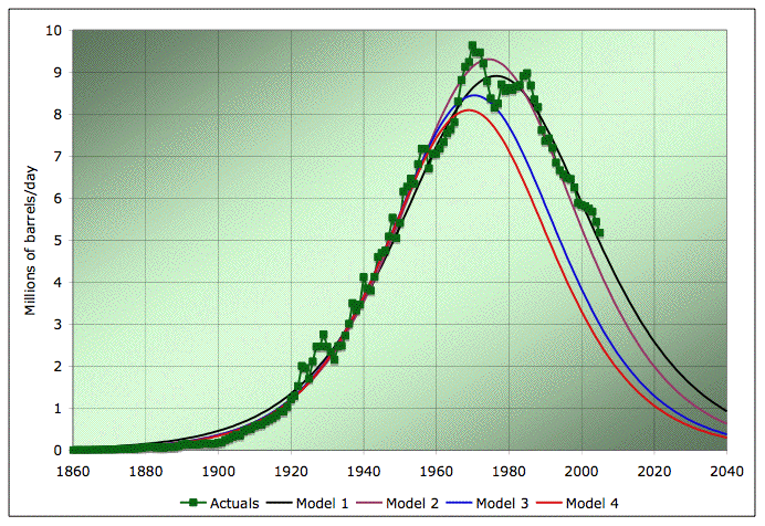
EIA Field production of crude, and four Hubbert models based on different linearizations. Source: EIA for the data, models as described in the text.
To kick us off, I started with a regression of the data between 1958 (which is the point Deffeyes chooses) and today. That gives me this picture (Model 1):
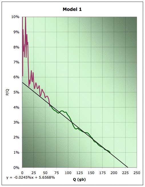
Linearization plot of EIA Field production of crude, together with linear fit for the data from 1958 to 2005. Green data is used for line fitting, plum data is not. Source: EIA for the data. 2005 data is extrapolated from data through October.
Clearly, we got a pretty good fit on recent data, and we ended up with a URR (ultimately recoverable resource) estimate of about 230gb, and a K of 5.7%. Remember that K is best thought of as the initial growth rate in the model, or equivalently, the final decline rate (with change rates gradually interpolating from one to the other over the history).
Now, recall that there's this slightly black art in the linearization process. They hardly ever fit well early on in the history, so one has to choose some point from which to start fitting. Obviously, choosing different points gives slightly different results. How sensitive are we to that? Well, if we picked 1930, which is about the earliest vaguely plausible place to try and start a straight line, we'd end up looking like this picture, which I'm calling Model 2:
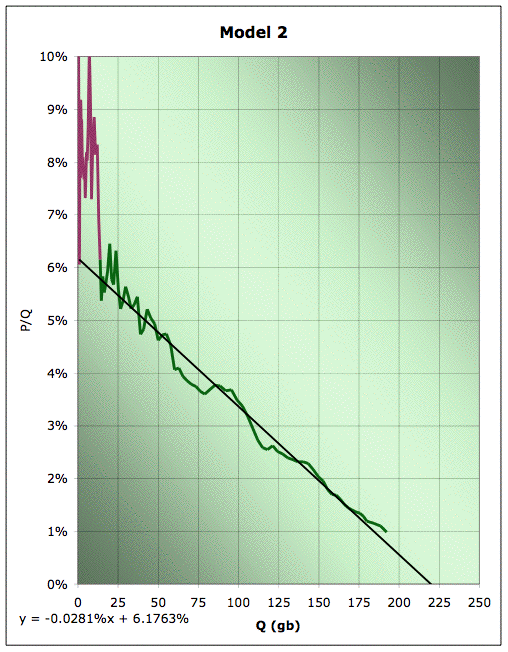
Linearization plot of EIA Field production of crude, together with linear fit for the data from 1930 to 2005. Green data is used for line fitting, plum data is not. Source: EIA for the data. 2005 data is extrapolated from data through October.
Clearly, this doesn't do quite as well on the recent data. Our URR has changed to about 220gb, and our K is now 6.2%. So the URR changed by around 5%, and K changed by around 10% of it's value. Those are probably decent rough estimates of our uncertainty in these quantities with the full history known to us now.
But how would we have done in the past? Based on model 1, the 50% point would have passed in about 1976. So let's try and do a linearization analysis if we only have data up to 1976 (but sticking with the 1930 starting point). In the world case, this is roughly analagous to trying to extrapolate linearizations today. That gets us Model 3:
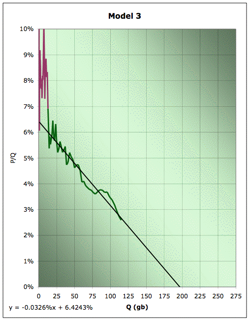
Linearization plot of EIA Field production of crude, together with linear fit for the data from 1930 to 1976. Green data is used for line fitting, plum data is not. Source: EIA for the data. 2005 data is extrapolated from data through October.
Clearly, we've dropped our URR down to about 190gb - off by a little more than 15% from a current estimate. Our K estimate is now 6.4% - about 11% higher than we would estimate today. Finally, let's suppose we were doing this back in 1955, and trying to scoop Hubbert. I would have come up with something like Model 4 here:
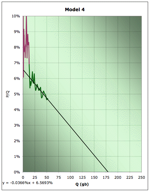
Linearization plot of EIA Field production of crude, together with linear fit for the data from 1930 to 1955. Green data is used for line fitting, plum data is not. Source: EIA for the data. 2005 data is extrapolated from data through October.
Our estimate of URR is now down to about 180gb - over 20% low. Our estimate of K has gone up to 6.6% (and truth be told, we're lucky to do that well - there's a lot of countries where we'd go hopelessly wrong trying to extrapolate from this early on in the history).
If we translate these four models back into production versus time graphs, we get the following picture:
EIA Field production of crude, and four Hubbert models based on different linearizations. Source: EIA for the data, models as described in the text.
Again, Model 1 is our best current fit. It is indeed a remarkably good fit for such a very simple model applied to what would appear to be a very complex process (I confess that I still don't fully understand why this model works as well as it seems to in practice). Model 2 is the one where we started fitting in 1930 instead of 1958. It doesn't work quite as well, but it's not bad either.
Model 3 is if we only have data to 1976. You can see pretty clearly where it goes wrong: it misses the Alaska North Slope production. Of course, if we had really been doing this in 1976, we would have known that there was a super-giant field about to come on stream much later than the others and change the picture. And of course model 4 is a little worse again - that's the one where we only have the history to 1955.
The conclusion in the US seems to be this: doing the linearization in the early days causes you to underestimate URR and overestimate K. However, it's by no means useless. The errors even in 1956 are much less than a factor of 2 - it gets us in the right ballpark. And I think it's particularly striking that even when you get the URR somewhat wrong, the shape of the downslope is still about right. Very early on in the history, you could tell with about a 10% relative error what the post peak decline rates were going to be. That's remarkable.
What I'd like to do next is write a little program to more systematically estimate the uncertainties in the linearization. I think we can also make some improvement by underweighting the early data and overweighting the later part of the history. Then I want to get into people's concerns about whether the world is fundamentally different enough from individual countries that we cannot safely use the same process. But those will have to wait for future posts.
Contact
- Content: editors at theoildrum dot com
- Tech support: support at theoildrum dot com
License

This work is licensed under a Creative Commons Attribution-Share Alike 3.0 United States License.
But that would only gives us an offset of a couple of years before the peak hits. The downslope would be the same after that. I think Stuart shows us that here.
If it contained 60 Gb, Detroit would have been receiving that oil for many years now... ;)
A reasonable P50 estimate for ANWR might be 2 billion barrels. The structures are small and complex. 12 billion is out of the question, and 60 billion is for people who don't know what a rock is. No one in the industry is predicting finding another Prudhoe Bay or Kuparak River field in ANWR.
And of course no one has found a drop of oil in ANWR. There could be nothing there worth trying to go after. If it ever opened up, the industry might drill 5 to 10 wildcats, find some small volumes, and walk away.
"An evaluation was made of each of 10 petroleum plays (similar geologic settings). For each play, USGS constructed statistical distributions of the number and size of potential accumulations based on a probabilistic range of geologic attributes."
http://www.eia.doe.gov/pub/oil_gas/petroleum/analysis_publications/arctic_national_wildlife_refuge/h tml/analysisdiscussion.html
Does anyone know any more about the amount of information we have on ANWR resources and hopw reliable they are?
The "softness" of your predicted global depletion rates compares to what you have shown here for the USA. My problem with global versus country-specific depletion rates is the fact that when the USA peaked, oil I suspect became increasingly more expensive to extract from US wells. So, would it not be the case that American oil consumers would buy up more cheaper and foreign oil even if domestic oil production could be increased? The result being companies profits drop and wells are capped or throttled?
This would have the effect of "softening" the USA depletion curve due to cheaper alternatives abroad.
Now for the global situation, at a global peak, there is no cheap seller of last resort to go to. The world cannot go off-planet to obtain cheaper crude to soften the depletion curve like the USA did.
You only have two options, pump faster and accelerate the depletion or cut back in terms of recession or alternatives.
The truth as ever will be in between these.
That would seem therefore to suggest depletion rates will be more like 7%+. It seems in the case of recently peaked Britain they have decided just to pump and pump or perhaps Peak Oil has already forced them too?
I bet on the whole Hubbert will be pretty true as long as we account for new fields coming on line, with my biggest concern being whether techniques used to extend the production volume have significantly changed the shape of the curve.
Actually to a degree the Hubbert model does try and account for oil that is yet to be discovered.
In Deffeyes 2005 book "Beyond Oil", he applies Hubbert linearization not only to the oil we have already used, but also to two others.
The second plot is the amount of oil we have used plus the known reserves (removing bogus reserves from OPEC nations).
The third plot is 'hits'. Essentially a measure of oilfield discoveries, and this is an attempt to measure the amount of oil in oilfields yet to be discovered.
You can then fit straight lines to all 3 of these, and he has such graphs in one of his books. In the summary, he has the parameters for the lines that he fit to the things. All 3 have a Qt of 2.013 trillion barrels.
The first curve (oil that we have consumed already) has a=5.9%, peak 2005, and percentage used is 49%.
The second curve (oil that we have consumed plus reserves) has a=7.2%, peak 1978, and percentage of total of 82%.
The third curve (hits - oilfields that we know about) has a=8.1%, peak in 1964, and percentage of total of 94%.
The third curve implies that only 6% of the total world oil is in oilfields that we don't know about yet.
I have to admit that I am still a little fuzzy on the concept of 'hits', and what it means.
Hubbert works well for USA oil, but by your definition, it is not entirely "natural". For geopolitical factors, many areas were placed out-of-bounds for environmental reasons. There were many innovations integrated into the production data. Even with the major recent discovery, the North Slope, the older estimates project forward fairly well.
For USA oil, Hubbert seems to cope well with most of the "unnatural" factors that you mention. Going global, politics will probably throttle production more than disasters. New discoveries probably won't be as significant for the world as for the USA. It is likely that we will need some stupendous additional innovation just to match the innovation embedded in the USA models. This reasoning implies less global URR "loft" and global depletion rate "depression" than we see with the USA models.
I would like to see you try linearization on the North Sea Fields....and see how they behave. Collapse rates that will occur in Mexico's largest field, as well as the Saudis, the Kuwaitis, and the Russians will be quite interesting to see if they behave nicely to linearization.
BUT.....
http://news.ft.com/cms/s/f39fa8e4-7e25-11da-8ef9-0000779e2340.html
I think this is the first time China has overtly expressed a desire to move away from the dollar. Please correct me if it isn't. The dollar is already moving lower - if this continues into the immediate future, it doesn't bode well for international trade.
My company is watching this closely, as dollar valuation plays heavily into our international exploration budgets.
And last week semiofficial sources started talking about increasing the percentage of gold in China's official monetary reserves. You can follow these sorts of things on the Kitco.com website, which is dedicated to information about investing in gold.
I bring this up to say: for several years the Chinese have accepted our essentially worthless dollars in order to keep their export-led growth going. They will keep doing that until they decide, that they won't. And when the markets wake up to that (before or after the fact, I can't say) everything will change. No one can say how it will look, but it won't be pretty. For some interesting (if economically heterodox) thinking on the subject, try this: http://www.business-in-asia.com/dollar_crisis.html.
The whole system seems to feed off itself, producing its own internal dynamic which is only loosely connected to reality. The inevitable result is swings of positive feedback at various degrees of trend, so to speak. There are those who see in this the application of fractals to market behaviour. Robert Prechter is the one I am most familiar with, but I also remember an article to that effect by Mandelbrot (I'll try to find the link). Its an intriguing concept which I follow out of interest, but am not intellectually wedded to. The psychological argument seems more compelling to me than the potential mathematical applications, but then my approach to life is generally more qualitative than quantitative.
Here's an excerpt from the interview Sunlight links to:
"Question 6: Also in the book you note that "over-investment causes excess capacity and excess capacity causes deflation." Could you explain to our readers exactly what deflation is, why it is to be feared and why you believe the threat of global deflation is real?
Answer: Inflation comes about when there is too much demand relative to supply. Deflation is caused when there is too much supply relative to demand--or, more precisely, purchasing power. When credit is abundant, companies borrow and expand industrial capacity and aggregate supply increases. However, the purchasing power of the public does not necessarily expand in line with supply. During periods of very rapid credit expansion as in the 1970s and `80s in Japan, in the Asia Crisis countries during the 1990s and in China during the last 15 years, supply grows much faster than the personal income of the public. When supply exceeds purchasing power, prices fall. That is why Japan and China are suffering from deflation now. The Asia Crisis countries avoided deflation by devaluing their currencies and exporting deflation abroad. For example, the devaluation of the South Korean Won after the Asia Crisis contributed to the downward pressure on global semiconductor and steel prices.
The US current account deficit is flooding the global economy with dollar liquidity. When the dollar earnings of the surplus nations are deposited into their domestic banking systems, those dollars, being exogenous to those banking system, act as high powered money and spark off an explosion of credit creation. Excessive credit creation permits over-investment, which, in turn, causes excess capacity and deflation. So long as the huge US current account deficits continue to flood the world with dollars, global deflationary pressures are very likely to continue to build, as reckless credit creation results in more industrial capacity than can be absorbed at the prevailing price level.
The reason that deflation is harmful is because it undermines corporate profitability and, thereby, leads to rising unemployment and falling purchasing power."
Demand is not what we would all like to use, it's what we can afford to use, and demand will plummet with havoc in the global financial system. Economic activity would be further constrained by the very high real interest rates that result when inflation is negative, further depressing demand (a positive feedback loop). Nominal interest rates cannot go lower than zero, but zero is not low enough when the real rate of interest is the nominal rate minus negative inflation. Japan has had this problem for many years.
I think Richard Duncan's work helps to bridge the gap between the economics camp and the energy camp in order to build a realistic scenario for the future. Whether we will have inflation or deflation is a crucial distinction when it comes to planning for the future as the strategies one would employ are very different. Personally, I am convinced that we are headed towards an extremely severe global economic depression. This topic of discussion, and Sunlight's link to the Richard Duncan interview, would make a good separate thread.
...he did indeed.
If I may, I computed the URR fluctuations for a finer and larger range of years (assuming a minimum of 20 years between the starting year and the ending year).
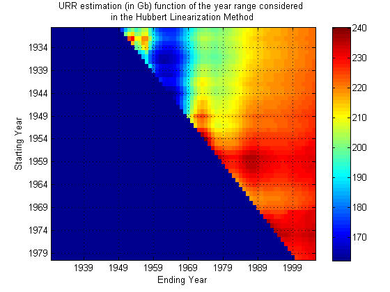
We can see clearly that the ending year has a larger impact on the quality of the estimate. From 1989 up to 2005, the estimate is quite stable (between 200 and 240 Gb) regardless of the starting year.
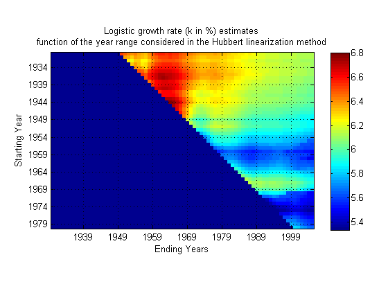
The same for K which is quite stable:
Question: How do you find the peak year date? it's not directly available from the Hubbert linearization fit and requires a second fit (usually on the production curve).
Another intresting aspect we should look into is the impact of the discovery distribution on the Hubbert linearization. Some countries are problematic such as Nigeria for example.
The resulting RMS error between the data and each curve:
To find the peak (at least of the Hubbert curve), just divide your URR estimate by 2 and then find the year where Q = URR/2.
The quality of the estimates will only be known when the actual data are gathered. The URR estimate graph is a plot of a hypothesized function.
The other errors are economic & social, the latter factor being the one I expect to be too difficult to more than list possibilities,yet possibly the most significant.
The presumption being that seemingly benign decline rates of 4%, when viewed from net energy, and fixed vs marginal usage may be ginormous.
Pmax being the maximum value of the logistic curve. In a curve fitting application, the Pmax value is generally fixed by the observed data therefore K is inversely proportional to the URR value:
One consequence is that if the production data considered is immature (cumulative production < 50% URR), Pmax will be then underestimated. Because K is generally a more robust estimate, the URR estimate will be underestimated on the left side of the peak and the error will be proportional to the difference between the observed Pmax at the current point in time and the ultimate Pmax value.
thanks!
How sensitive is this analysis to changes in the zero point of Q, i.e. changes in the initial Q value used?
In one of his books (the 2001 book, I think), he showed what a linearization plot looked like for these other distributions. They all converge to the same result in later years, but in the early years the gaussian tended to be higher than the straight line and the lorentzian tended to be lower than the straight line.
That being said, a gaussian function should give a better fit to the linearized data plot than the logistic function. Not perfect, of course as there are fluctuations. Then again, it is entirely possible that we are wasting time in trying to fit something this closely to the actual data :-).
http://mobjectivist.blogspot.com/2005/12/hubbert-linearization.html
That's why the data fat is usually chosen right around the "meat" of the curve. The logistic curve formulation fit is simply a fortuitous heuristic.
About the error analysis and the sensitivity, Khebab made that point a while back. I have it quoted on the same post above.
Here's the model 3 equivalent: You can see it would anticipate that we still hadn't hit peak US production today.
The model 4 equivalent has no hope (I didn't bother graphing the extrapolation because you can see it's curving up instead of down.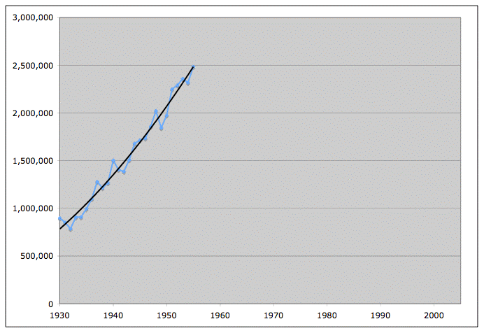 While the corresponding logistic extrapolations (the red and blue curves in the following) are certainly not perfect, they are not worthless either - they are 15-20% off, which is a lot better than no prediction.

In my opinion, there are two ways to handle the data: (1) just look at the Lower 48 (which is what I am doing) or (2) look at Canada + the U.S. Alaska is so far away from the Lower 48 in terms of both geology and development (the Lower 48 peaked before serious production in Alaska even kicked off), that it might as well be in the Middle East.
The only Lower 48 data that I have found is on the Wolf at the Door website (link is on the TOD website). I printed out the data and did a linear fit to the data and came up with a Qt of 200 Gb for the Lower 48, with the peak at 48% of Qt.
I think that this method works because it primarily plots the decline of the big fields. While small fields are certainly profitable, the one Gb and larger fields drive the world economy. We find the big fields first, and the smaller fields that we find later don't have that much effect on the data.
For example, consider Texas, with a Qt of 66 Gb. Let's assume that we find 1,000 new oil fields with an average size of one million barrels of recoverable reserves (which if Matt Simmons is right, will yield net cash flows of more than $150 million per field). These 1,000 oil fields would have boosted the Texas recoverable reserves by a grand total of 1.5%, from 66 to 67 Gb. Again, based on Matt's prediction, these 1,000 oil fields would generate cash flows of $150 billion to the owners, but they would only take care of 12 days of world oil demand.
This another way of saying that we are going to see an incredible divergence between the rising fortunes of the energy producers and the declining fortunes of the energy consumers. The best advice that I can give to energy consumers is to immediately start trying to reduce your energy consumption using every means at your disposal.
I'd suggest, only slightly tongue in cheek, the opposite advice: use as much energy as you can now, while it's cheap. If you really believe that energy is going to get vastly more expensive in a few years, you are about to descend into a state of harsh economic misery. You will look back on these years as a lost golden age when everything was cheap and easy and life was great.
Won't you want to be able to look back and say that you enjoyed life while you could? If oil becomes rare, you won't have the choices and options that you have today. Your life will be miserable and constrained. I think most people would say that in that situation you would do better to take advantage of the opportunities offered to you while they are available.
By analogy, imagine that you are diagnosed with a degenerative disease and you know in a year or two your options will be extremely limited. You'll be tied to a bed and complicated machinery and you won't be able to get out and do anything. Wouldn't you want to take advantage of what you can do today? Travel, see the world, go to parties, enjoy the good life while you can. You can store up happy memories which will perhaps make the hard times ahead more bearable.
The same consideration applies if you believe that energy costs are going to greatly increase. You'll be in a similar situation with regard to the new limitations which will be imposed upon your lifestyle. It makes sense to take advantage of present-day opportunities in the same way.
Some might argue that this is selfish, and that by depriving themselves today they are making more available for everyone else. While this is technically true, with 6 billion people in the world the amount of goodness that you are spreading, per person, is miniscule and essentially undetectable. Your sacrifice comes at great cost to you but provides essentially zero benefit to any other person. If you really want to help others, go down to the local charity and volunteer; you will be doing far more good to individuals who will notice the difference.
If there's failure, you can still go back to your oil-heated stoves to warm up for the second try for now ;-)
I decided, in the 80s, to scale back life significantly, just in case things turned out not to be as rosy as they seemed in the future.
We endured an ice storm here several years ago, and though we were without power for nine days, it was a cakewalk. Dale Pfeiffer published my account here.
But I love working with hand tools! The older I get, I find a lot of satisfaction in learning how to do what appear to be simple jobs, but which actually require skill and knowledge. Glaze a window with old-style putty? Masonry mortar without cement? It's amazing how well simple wood tools work, as long as the blades are sharp. How to split wood, what wood burns well and how to stack it, how to light a coal stove. These kinds of things have proven useful to me, and somewhere in the back of my mind it seems like they will again. I know I will not be able to hire others to do most of the work I need, and I enjoy knowing that I can figure out how to do most any task if I really try. Now I need to get that garden going!
There is no reason to be an energy pig, but it is probably foolish to minimize your personal use of oil now if it causes you any disadvantage in long term preparations. And it's OK to enjoy it some too - after all, right now there is a giant freighter crossing from China loaded with worthless plastic items that will break within days after they are purchased. Think how much diesel/heating oil is being used to ship that crap here, not to mention what went into making it, and what will be used to move it to the landfill.
There are times, like at 3am, when I must decide if I should get up and reload the wood stove, when I think that I should go back to sleep and let the furnace kick on this time - because someday, it will not be an option. The other day the kids & I took my old Jeep (5.9L V8, 5000lbs, full-time 4WD, 11mpg) to visit their grandparents, and I told them to remember driving in this old thing, because when they get older they will find it amazing that anyone ever used such a vehicle!
Also, I am looking into purchasing things that I think I will need long term, while they are still available/affordable.
You guys make me really proud to be involved with this site. While I certainly don't understand half of the math you guys are using, Hubbert's theory seems to have been proven in many cases around the world.
It doesn't seem to be out of the realm for this to be taught in college/grad school to a fairly broad audience. Why has this been held back so long?
The best way to reduce your energy usage is to move your place of work to where you live or move where you live to your place of work--ideally in a New Urbanism setting, i.e., Kunstler Kommunes.
By living in smaller, more energy efficient housing and virtually foregoing the use of an automobile, I would argue that you can: (1) reduce your energy usage; (2) save vast amounts of money; (3) have more time with your family or to enjoy pursuits other than being stuck in traffic driving to and from while elephant McMansion in the 'burbs and (4) increase in your quality of life.
The key point is that conspicuous consumption is a relic of the 20th Century. The mantra for the 21st Century is going to be that "cheap is chic."
Re: "Why has this (Hubbert Linearization) been held back so long?"
In my opinion, it's because the cornucopians don't like the answers it provides.
In regard to whom do you believe from here, the Hubberrt/Deffeys method accurately predicted the Lower 48 Peak and the North Sea Peak. In addition, it at least qualitatively predicted that the North Sea would have a sharper decline rate than the Lower 48. As Matt Simmons pointed out, ten major oil companies were 100% absolutely dead wrong about the timing and magnitude of the North Sea Peak. If ten major oil companies can be that wrong about their own oil fields, do you think that the Saudis might be just a tad optimistic about their remaining reserves (which the Hubbert/Deffeyes method shows to be only 80 Gb)?
I wish the world was more interdisciplinary - where curious/concerned people would take a little time to learn 70% of a wide variety of subjects and then synthesize them -instead of spending 90% of their time learning 99% of a very specific area and then spinning its fine points.
Because it is a grab-bag of heuristics and empirical relationships. He says hisself that " (I confess that I still don't fully understand why this model works as well as it seems to in practice)". I wouldn't feel comfortable teaching this to a bunch of sharp graduate students myself. Some people can do this quite well, I usually get chewed up and spit out if I have to say "and then a miracle occurs" or "as you can plainly see" or "the exercise is left to the readers" or "for some reason this seems to work".
What would you say about the accuracy of the initial "reserves" in new discoveries are? What are people talking about concerning new discoveries when they reference "reserves"? P5? P50? Whatever they are, are they good within some reasonable margin of error? Are they essentially worthless? In between? Let's take Kashagan (Kazakhstan) and Azedegan (Iran), the last two very large fields (>= 5 Gb) that have been discovered in my current research, as examples in this case.
I'm trying to work up a post on new discoveries and any insight you might give me here would be appreciated.
A good rule of thumb for a field that is large and complex without significant production history is that P90/P10 ratios of EUR (estimated ultimate recovery) would range from 1.5 on the low end to as much as 5 on the high end.
Estimating UR from fields is a tricky business because involves the extrapolation of sparse and imperfect data along with predicting the future of technological enhancements to recovery techniques within a world of economic uncertainty.
The discovery curves actually don't approximate bell curves as they are too noisy even with a moving average applied. The fluctuations are very apparent because we have only had on the order of thousands of discoveries. This small number over a span of <100 years gives rise to big yearly fluctuations. The size distribution seems to follow a log-normal function, much like cloud droplets (which also show a definite peak in average size due to coalescense). I wouldn't quite say that the biggest fields are found first, only that they have a higher probability cross-section. The big ones may actually be found later because over time, more resources get applied to exploration (increase in number of darts thrown at the dart board). And then eventually the resources get applied to more difficult exploration avenues as that dries up. That basically accounts for the noisy rise and fall.
The real smoothing process comes about when we apply extraction to these discoveries, essentially dragging the data through several transfer functions that extracts at rates proportional to what is left. This does not result in a logistic curve, but something more closely resembling the convolution of the discovery data with a gamma distribution.
Could it be that you suffer from a maniac disorder ?
I have been called a brainiac, but maniac does not really fit my disposition.
If we look at the regions that have peaked, e.g., the Lower 48 and the North Sea, an obvious question presents itself. Have there been any discoveries that have shown any tendency to reverse, or even slow the decline? The answer is no. Regardless of better technology, the oil industry finds the biggest fields first.
Worldwide, we have not found a one million bpd or larger field since Cantarell, in 1976. The Caspian Sea fields are promising, but as I understand it, it's really not a question of finding the fields, it's been a question of developing the fields and delivering the oil. After the Caspian Sea, as far as conventional oil is concerned what else is on the horizon besides small fields in proven basins?
What the P/Q versus Q method is really plotting is the decline of the big fields. As I outlined in my above essay on Texas, if we found 1,000 oil fields with an average size of one million barrels, it only increases the recoverable reserves by 1.5%. If we scale up my Texas analogy to the world and assume that we find 1,000 fields with an average size of 30 million barrels, it would only increase total recoverable reserves by 30 Gb, or 1.5%, and it would only meet world oil demand for one year.
Of course, 30 Gb, if Matt Simmons is right, would generate cash flows of upwards of half a trillion dollars, which again highlights the emerging gulf between the fortunes of the energy producers and the energy consumers.
How Reliable is the Hubbert Linearization Method?