| Chinese lower their intended purchases | The Oil Drum | UK's Channel 4: Oil Supply, Simmons, and This Winter |
Another Way of Looking at CERA
Posted by Stuart Staniford on September 14, 2005 - 8:05pm
Methodology
The idea behind this kind of graph is as follows. Hubbert's model of total oil production is that it follows a logistic curve. The logistic curve is a famous mathematical model for exponential growth in a finite system. It was originally derived by Pierre Verhulst in 1838 for modeling human population, but has since been widely used in ecology, economics, epidemiology, marketing, and no doubt many other fields. My own connection with the equation is that I rediscovered it in the middle of the night during the spread of the Code Red computer worm, and showed that it predicted the spread of the worm fairly well.In terms of oil production, the differential equation looks like:
Here, Q is the cumulative production as a proportion of the ultimately recovered resource, t is time, and k is a constant that sets the width of the peak.dQ/dt = kQ(1-Q)
The solution Q(t) to this equation is a sigmoid function, and the derivative is the famous Hubbert peak. The idea behind the equation is that early on, the oil industry grows exponentially - the annual increase in production is proportional to the total amount of knowledge of resources, oil field equipment, and skilled personnel, all of which are proportional to the size of the industry. Thus dQ/dt is proportional to Q.
Later, however, the system begins to run into the finiteness of the resource - it gets harder and harder to get the last oil from the bottom of the depressurized fields, two miles down in the ocean, etc, etc. The Hubbert model assumes that all of this complexity just comes down to that annual production gets an extra proportionality term of (1-Q) - the amount still to produce.
Now, there's a nice trick which I learned about from Deffeye's book "Beyond Oil", but I don't know if he thought of it or got it from somewhere else. The idea is that if we plot dQ/dt / Q versus Q, the above equation says that it should be a straight line, since
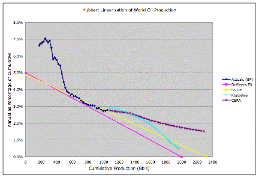
(excuse the lousy HTML math). So we plot the ratio of annual production to cumulative production to that date, versus cumulative production. In his book, Deffeyes does this on p37 for US oil production. In the beginning, the data are crazy, but after about 1958, they settle down into pretty much a linear regime (with a little noise) that has held good ever since. The nice thing about this method is that you do not need to input an estimate for the URR. Instead, you extrapolate the straight line, and it tells you the URR. Deffeyes gives a US estimate of 228 billion barrels. Then you can take a point half way, and that fixes the location of your smoothed Hubbert Peak, which Deffeyes reports as 1976 (but noise actually means the year of highest production was 1970). Note that what Deffeyes is looking at is total production including Alaska, not just the lower 48 states as Hubbert was.dQ/dt / Q = k(1-Q)
It doesn't work quite as well for global statistics, since the world as a whole is less mature in oil production than the US. But there does appear to be a generally similar pattern where the data is crazy until about 1983, and then settles down to a fairly linear pattern till today. This is shown on p43 of "Beyond Oil". Deffeyes fits a line that gives a URR of 2 trillion barrels, and derives his famous estimate of Thanksgiving 2005 for the peak of the smoothed curve.
I wanted to look at various proposals for future oil production in the context of this picture. Now, Deffeyes doesn't cite his data source (which is really annoying). What I did was to take the data from the BP Statistical Review of World Energy 2005, which has oil production numbers from 1965 to 2004. They define oil production to include conventional oil, syncrude from tar sands and oil shale, and gas condensates. They do not include coal-to-liquids (CTL). I think there's only a tiny amount of the latter in South Africa, so presumably it doesn't matter in production to date. But otherwise, the numbers claim to be all-in.
The BP report doesn't have any data for before 1965. To calibrate my graph, I measured off one point from Deffeyes book - he labelled the 1983 dot, and I estimated cumulative production then at 529 billion barrels. Then I used the BP annual numbers to work backwards and forwards in cumulative production, and built my own graph. That's the blue Actuals (BP) line in the above graph. You can see the linear regime fairly clearly, as well as the fact that the model isn't that great before 1983.
The Projections
Deffeyes Fit
Having the actuals plotted, the next thing I did was to put Deffeyes' straight line fit into the picture - that's the pink line labelled Deffeyes. That's his 2 trillion barrel URR, peak in November 2005 line. As you can see, there's a problem. His line fits his data, but it doesn't fit the BP data as well as it might. Since he doesn't cite his data, we don't know exactly why, but in general there do seem to be systematic errors between various oil production times series of at least a few percent, so that's presumably what's going on here. Hopefully the Joint Oil Data Initiative will cause everyone to start telling the same story.
My Fit
To give us a better straight line, I added the yellow curve, which is an eyeball fit to the linear regime (I'm not going to get fussy and do a computer regression when we have systematic problems in the data as large as we seem to have here). The yellow line has a URR of 2.325 trillion barrels, and that gives a smoothed peak in approximately 2007.
Rembrandt Koppelaar Projection
Next, I took Rembrandt Koppelaar's recent projection, and put that on the picture too (pale blue line). It looks like Rembrandt has been working off yet a different set of data (the IEA statistics) which are a little bit higher than the BP numbers so there's a slight discontinuity between the start of his curve and the end of the BP actuals. But even if you imagine lowering his curve by a little bit, it's still clear how he relates to the Hubbert fit: he's more optimistic in the short term (going up to a peak in 2013), and then towards the end gets more pessimistic as he heads down to a roughly similar URR just over two trillion barrels.
Cera Projection
Finally, I put CERA on there. I don't really have precise information on their scenario, but they report in the press release, that capacity can go up by 16 billion barrels by 2010, or maybe a bit longer if there's delay and disruption, and that the peak will be in the "third or fourth decade" of this century and be a bumpy plateau that lasts "several decades". So I built a scenario that goes up from current production at 2% a year till it gets to 96 mbpd (16mbpd over BP's 2004 number). They reach that in 2013, and I assume they are then flat until 2040. That's the purple CERA line in the picture. If CERA wants to give me more precise numbers about their scenario, I'm happy to replot their curve. As I have it at present, they are headed off to a URR of 4 trillion barrels or somewhere thereabouts.
Summary
The difference between Deffeyes' line and mine is a data problem. Koppelaar is basically assuming that we can pull in a bunch of production early, and then, later on, will drop faster later than the Hubbert model predicts. I think the only remotely possible interpretation of CERA's line is that we will be making very large scale use of oil shale, tar sands, etc - with the eventual URR from those reserves being comparable to what we get from conventional oil.But I think what they are also effectively assuming is that those reserves can be ramped up as fast as conventional oil ramps down. That, I think, is a very problematic assumption, given that those alternatives have EROEI on the front side of their peak an order of magnitude poorer than EROEI on the front side of the conventional oil peak, and heaven knows what it's like on the back side of their peak. I don't see how the curve today can possibly extrapolate in the way they suggest. Not to mention the lousy climate (and us poor suckers that have to live in it). But those are subjects for another day.
Finally, here's the big version of the graph:
Contact
- Content: editors at theoildrum dot com
- Tech support: support at theoildrum dot com
License

This work is licensed under a Creative Commons Attribution-Share Alike 3.0 United States License.
First, it seems strange to me that we don't settle down to the "straight line" part of the curve until 1983. You sort of downplay this point by suggesting that world oil production was not "mature" in oil production until then. But that seems to be an odd thing to say. Worldwide oil production had been going on for decades by that time. What happened in 1983 to make oil production "mature" afterwards and not "mature" beforehand?
And besides, the reasoning behind the logistics curve is supposed to apply just as much in the early days as the late days. We are supposed to have exponential growth, an inflection point, and then exponentially decreasing growth. If the data doesn't fit that curve before 1983, it casts doubt on the model.
I also think that the theoretical justification for the model's end-state behavior is pretty weak. While it might make sense for a given oil field (and I have seen such curves look pretty good for individual fields), running out of oil on a world-wide basis is a very different phenomenon, especially if there are no good replacements. With prices rising through the roof the incentive to find more oil and increase productivity will plausibly move us considerably above the logistics curve. The very fact that prices are higher towards the end of the curve than at the beginning is going to bias most production towards that end state. That means that extrapolating behavior during the low-price regime is going to underestimate total production levels. That makes the CERA curve not look so bad to me.
Even just eyeballing the graph, the CERA and Koppelaar projections both look to me like better extrapolations of the last few years' trends than the yellow line.
These are all problems with the theory being used to model the shape of the worldwide production function. I still think it was very nice work to present the data in this form and compare the different estimates and models in this way.
At least in the US data (which I guess I should make another post of some day), if you plot price on the same graph as the overall production, you can pretty clearly see that price causes the second order wiggles around the basic logistic form of the graph. Global peak might cause larger price excursions and be able to distort the graph more than the US graph got distorted.
Remember, the graph is not a graph of time, and the 'early' values depend heavily on accumulated production, so small 'inaccuracies' at the beginning are heightened.
It is not unlike the 'estimated time left' calculation that is done when you download a file. In the first few seconds the estimate can go all over the place, but then it settles down to a fairly steady rate.
I would say that given the fact that a lot of that early data would have been in the first half of the 20th century, that it's reliability would be questionable, compared to the accuracy of data resulting from the second half.
Anyway, the more settled data later is just that, settled, so I would tend to believe that was more the 'norm'.
Bingo! This is a point that I've been meaning to bring up here. Worldwide PO is a very different phenomenon than an individual well, field, or even country reaching peak. The reason is simple: Incentives.
Halfin correctly points out the effect rising prices have as we approach the world peak, but let's also look at what happens when a country reaches peak. Assume it's 1970-ish, and you run an oil company. You have the rights to some fields in the US (onshore or off) that can be profitably exploited only at a ridiculously high market price, say >= $20/barrel. Of course you don't extract and market that oil, as it would be a money losing operation. The fact that the US just reached peak is irrelevant--there's enough production from the rest of the world to keep the price below your magic threshold.
Fast forward to 2005, and not only have market prices increased, but improved technology has likely reduced your cost of production by anywhere from a little to a lot. It could very well be a financially sound move to produce oil from that field now.
Similarly, as market prices rise there will be some demand response, as we've seen very recently from China.
And on top of that, we have public policy, in which those of us lucky enough to have enlightened leaders can look ahead and take actions now to further reduce consumption. Plus infrastructure bottlenecks, supply constraints caused by natural and man-made phenomena, etc.
Any model that's based solely on geology and ignores these other factors will inevitably predict a quicker arrival of the peak, with a sharper decline. I have no idea how to adjust the model to take all these issues into account; if I did, I would be on the short list to replace Alan Greenspan.
I'm not anti-model, by any means; hell, when I was (briefly) in economics grad school one of my planned areas of specialization was econometrics. IMO, as useful as models are, they're most useful when we're aware of both their strengths and weaknesses.
Eg, Colin Campbell used to estimate URR at 1.6T. He's had to increase his estimate several times in order to have a roughly Hubbertian peak (to the great joy of Michael Lynch). But one alternative explanation would be there really only ever was 1.6T (or some number thereabouts), and technology effects will cause the curve to dive below the linear trend (ie a substantially asymmetric peak on the production/time graph).
At this point, the data are too unclear for me to feel comfortable taking a firm position on this possibility. I don't think it can be ruled out.
JLA offered good comments, which I responded to there. In particular, he pointed out that if competition from cheaper oil sped up the decline following the 1970 peak (i.e., from 1970-1973), the high prices in 1974-1985 should have led to a resurgence in US production. As I noted - that's what in fact happened.
I think perhaps a way to moderate the mutual distrust of the geologists and economists is to view the market for oil as having distinct segments: $10 oil, $20, $40, $80, etc... (in inflation-adj. constant dollars) They replace each other. They exist in different quantities, in different locations, and peak at different times and rates.
$10 oil peaked decades ago.
$20 oil peaked very recently.
$40 oil is only starting to be developed (again - it's first heyday was 1979-85).
As a result, while the depletion curves for a specified price may be accurate, you'll have to consider the effects of rising prices on total oil production. While field depletion in a constant-price environment - recent North Sea, US 1970-73, etc., may be steep, global depletion in a rising price environment will be MUCH slower when it happens (and the transition to declining production may consequently be quite far off).
Article:
http://www.washingtonpost.com/wp-dyn/content/article/2005/06/06/AR2005060601742.html
Graphic:
http://www.washingtonpost.com/wp-dyn/content/graphic/2005/06/07/GR2005060700548.html
There is no question that higher prices make the exploitation of more fields feasible. My question, however, is whether any combination of tar sands, heavy oil, deep water, polar, etc., will make up for declining production rates from the North Sea, Alaska, Saudi Arabia (sooner or later), Iraq, Mexico, Indonesia, etc.? I have my doubts. If not, the oil that might be produced profitably at $40 might sell for $100+ due to overall limited supply.
You must recall that from 1973 until at least 1981 we were operating far from an unconstrained Hubbert curve, with 2 oil shocks and supply artificially constrained, by withholding, by war and by economizing and efficiency. Only after 1983 did the situation settle down again to a more or less "unconstrained" pattern. Remember the notch in the upslope of the production vs time curve. The curve of annual/cumulative vs cumulative would have to be plotted way back to pre WWll to begin to look better.
The reason such curves for individual fields look peculiar when plotted from year one is that in year one the ratio is 100% by definition, and we have to get out to year 7 or so before the curve begins to linearize. or even longer if the volume ramp is quite steep over a longer period of years.
The peculiar shape of the early curve does not invalidate the later linear projection. Murray
I enjoyed reading this post, Stuart, but couldn't help wondering why, if you can talk about differential equations, you can't explain work as an integral. Newton may be more famous for the three laws of motion generally, but it is calculus (not to get into who invented this [really off topic, have you seen what Archimedes was doing with instantaneous intervals?]) and the derivatives of the function of position with respect to time that makes all of this possible. One could even skip the itegral part (and all that Rieman sum convergence) and discus the area beneath a curve.
All this being said (and impertinant), thank you for your posts, and I look forward to more on motion, heat, and light.
Here in this post, I couldn't think of a way to explain why this graph has anything to do with Hubbert's peak without showing the differential equation. You're right it's not consistent in level. I call Emerson to my defense:
(I always imagine him being taken to task for some slip-up and coming up with this arrogant, imperious gem of a quotation as a response).I have prof. Deffeyes 2nd book, he doesn't says where he got his data from, but he gives us a hint. He probably colects the info put out in every year's last Oil & Gas Journal issue. He doesn't says it directly but he leaves that somewhat evident.
As for the descrepancies I think they are due to Tar Sands, Shale and Heavy Oils. If they're included in the Oil & Gas Journal numbers, there might be some differences.
Secondly I'de like to stress that since Koppelaar and CERA models don't produce a stright line, they are actully denying Hubbert's theory. These models do not follow a logistic curve, which by the example in the US is closest thing to reality.
Stuart I'd like to ask you 2 things:
. Where can one find global data no oil production in the internet? To play arround on those sleepless nights.
. Could you apply this linear method to convetional oil? Without tar sands, heavy or shale?
Thanks.
He describes the chart as plotting "the cumulative oil production on the horizontal axis and the ratio of annual production to cumulative production on the vertical.
Then he says later: "world production, discoveries, and hits started off all together. Hits initially have to grow faster than discoveries. Discoveries initially have to grow faster than production." Or: "the [initial] production happened when the cumulative production (in the denominator) was low."
I dropped my geology major because I sucked at math, and yet even I understand what Deffeyes is saying.
Canadian oil production in the first 6 months of 2005 fell 6.3%
over the corresponding 6 months of 2004 mainly due to
a 30.8% fall in synthetic crude from the tar sands.
Was this the marvelous source thats booming production was
going to save us all?
whole story. In the first half of 2004 Suncor were producing
something like 220,000 barrels per day (Suncor's 2004 Annual report
average 2003 216,6000 bpd, average 20004 226,500 bpd)
http://www.suncor.com-518_AnnualReport2004.pdf
Total tar sand production for the first half of 2004 was about
930,0000 from the Graphs in the long and detailed report:-
Canada's Oil Sands Resources and Its Future Impact on Global Oil Supply
by Bengt Söderbergh under the supervision of professor Kjell Aleklett
president of ASPO
http://peakoil.net/uhdsg/OilSandCanada.pdf
All four forecasts quoted in the report give the projected output
for the first half of 2005 as increasing by 200,000 bpd to about
1,130,000 bpd. If instead it has dropped by 30.8%, that
is about 285,000 pbd, that means the Suncors fire is not enough
to account for the decline and that overall, the rest of the tar sands
projects did not grow as projected but did in fact decline. This assumes
that Suncor had zero production in the first half of 2005 and I believe
that did have some output towards the end of that period which makes the
decline of the rest even worse.
Things are clearly not as rosy with the tar sands as some paint.
The report details the many problems with tar sand extaction that
could be the root of this decline.
It also points out that even with the most optimistic forecasts of
tar sand production growth and decline of North sea output that
has already been exceeded, The growth in tar sand output is not
even enough to compensate for North Sea decline out to 2030.
As has been written about extensively, there has been a surge in world wide demand the last two to three years, much of it coming from China. Since until recently their has been excess supply capacity, the increased demand resulted almost immediately into increased production, which is what is plotted (in terms of cumulative) on this graph. Without excess supply capacity (that no longer exists) increased demand only results in higher prices, not increased production. I expect that the trend will turn back to at least parallel the yellow line, if not fall back to it entirely.
http://www.cge.uevora.pt/aspo2005/abscom/Abstract_Lisbon_Schoppers.pdf
Follows a quote. [My comments within square brackets.]
* Global oil production grew very steadily 6.5 % per
year for all of 1900-75, but only 1.2 %/year since
1982. That would explain how China's 9 %/year
growth and demand could pull up the price of oil.
[Could it also explain why the fit improves after 1983?]
* The current oil price rise could also be due to US
dollar devaluation, or fear of terrorism, or... Peak
Oil may or may not have anything to do with it.
* Contrary to popular belief, Gaussians are not good
models for time series. The Central Limit Theorem
applies to random walks through controllable dimensions.
To apply to oil production, the theory
would have to be that God dropped 2 trillion barrels
directly above the year 2008, and the barrels
scattered forwards and backwards through time
from there. That's obviously silly.
[So, there may indeed be a physical reason to prefer a logistic curve over a Gaussian.]
* The theories behind the well-fitting Burr, Bass and
Logistic models are economic. Indeed, Peak Oil
can be regarded as a change of regime, from economic
choice to natural physical limits.
* The (extreme-value) theory for the Weibull model
is that we pump the easy oil first, until production
becomes difficult everywhere and many major
fields peak at about the same time. This model fits
well, predicts zero production before the mid-
1800s (without being told that it's so), is comfortable
with a URR of 2 trillion barrels, and predicts
the last peak (in 2014) and fastest decline.
[Doesn't it look like Rembrandt's?]
That is, it can be proven that light sweet crude has peaked. Thus, althought TOTAL production may be rising, the 'better' oil percentage is falling.
That makes sense. The best fields, the best oil, gets produced and processed first. Refineries are starving for light sweet. There is too much heavy/sour for refineries to process at the moment.
If thought about mathematically, we saw that per capita energy use peaked in what, 1979?
What then, of the peak in the actual energy content of liquid petroleum? I believe it could be proven to have already peaked. It is known that it takes MORE heavier/sourer oil to make the same amount of gasoline as it does with lighter/sweeter inputs.
Even though we will be seeing more 'non-conventional' oils, that just might not be good enough. I could have a lot of lettuce to eat, but it's just not going to be enough for me to live versus a steak.
I have the following question: how do you think the structural changes in the oil industry affect this projection?
As far as I get it the interpolated period is between 1983 and now. In that period a substantial part of oil production moved from onshore to offshore fields and also existing fields moved to new faster depleting technologies. My point is the data from the period you extrapolate could be more "slow-declining" than the future which promises to be "fast-declining" as we've recently witnessed with the North Sea production. Thus is it possible when more fields go into a faster-than-before decline phase the straight line to (may be smoothly) "break" at some point and go steeper down? Just a speculation.
Second, I don't know why CERA has any credibility at all. They predicted around 2001 that ng prices would soon decline sharply. Far more credible to me are those who have been right in the past, including Pickens and lesser known Henry Groppe
www.resourceinvestor.com/pebble.asp?relid=10327
And, while I know nothing regarding Simmons' past predictions, he has certainly done more than any other to peek under the Saudi burkha.
When I read Deffeyes I thought this Thanksgiving might be a little early, mostly because Campbell's ASPO site seemed to have a better feel regarding each country's production capability. Interesting that this analytical approach yields the same result as Campbell's latest. No peeking here, I presume.
ASPO and other peak oil sites seem much too gloomy. I think that history provides a better glimpse of the future. In the seventies coal and nuclear replaced oil for electric power generation. 400 new nuclear plants could replace all US coal plants, freeing coal for conversion to liquid fuels (as this is a distillation process, the liquids are very clean.) The amount of coal currently used for US electrical power is about the amount required to replace all US liquid fuels. And, high prices will eventually (and painfully) lead to more efficient vehicles and car pooling, just as they did in the seventies.
Gloom and doomers have pooh-poohed nuclear, carping about the dangers while claiming there is anyway insufficient nuclear material to make a difference. Carter shut down reprocessing on proliferation concerns, but reprocessing plus breeders potentially increases the utility of uranium by a factor of 200, enough to power 500 plants for thousands of years. True, the nation's coal won't last more than a few hundred years even if every ounce is dedicated to liquid fuels production, but the main point is that all fossil fuels are too valuable for electric power generation. This solution would substantially reduce air pollution, including halving US CO2 emissions, just as the existing nuclear power plants have done over the years. Also note that reprocessing reduces both the volume and longevity of nuclear wastes. Proliferation is dangerous, but the genie is already out of the bottle - in addition to the five nuclear powers, Israel, India, Pakistan, North Korea have the bomb, and Iran will have it soon. Nuclear risks seem low to me compared with the mass starvation predicted by some of the sites.
I approached the peak oil issue from an investor's standpoint. For those interested in investing and formulae, I use the following to evaluate resource companies, specificaly E&P's, rather grandly labeling it JKEP:
JKEP = reserves/production x net income / EV
Reserves/production results in reserve life; multiplying this times net income results in total future net income, assuming reserve estimates are accurate and future commodity price and production costs remain unchanged. If the result after dividing by EV is less than 1.0, total future net income would be insufficient to pay back the initial investment, much less providing a return.
(Reserves are published by each company at year end, I re-check using the latest production and net income as published each quarter. EV changes with share price daily and can be seen on Yahoo statistics page.)
Very few companies have a result greater than one, implying investors think either reserves and/or prices will climb faster than costs. Reserves are questionable - all resource companiew will eventually run out - but they may well be right on price; in the seventies, nominal prices rose 9x in nine years. (And, in the same period energy companies, as a fraction of the S&P500, rose from 6% to 30%; currently this is around 8%.) For years Saudi tried to hold prices around $25/barrel, with varying success; we are yet to reach 3x this base price. If history repeats we will be around $200/barrel by 2010, implying yoy increases decline to a relatively modest 25%/year.
JK
We do not have hundreds of years of coal. More likely it the number is around 30 years. The original number came from someone who took the total reserves and divided it by the current rate of extraction at that time. When you factor in growth and the fact that not all reserves can be extracted the number shrinks to several decades.
The non-mathematical justification for using 1983 seems to be that it is the point at which world production is no longer politically constrained and we entered the modern production era. Presumably there could be a 'post-modern' era as well then, where all environmental regulations are thrown out the window and areas currently off-limits are produced to the hilt.
I don't necessarily believe that the slope will be shallower than the SS line, by the way, but I think it's good to bring this up. A regression analysis that produces a markedly different slope if the first half of datapoints is used versus the second half may not yet have enough datapoints for the regression to be valid.
Nevertheless, a decrease in point-to-point variance does not necessarily mean that the curve can then suddenly be fit to a linear model. It may look that way to the human eye, but it still may not be so. I was trying to illustrate this by saying that the slope of the line of linear regression varies depending on whether you pick the first half of the points you/Deffeyes use versus the second half. That implies that the data are not suited to a linear model, or alternatively, that there is very low confidence in any linear model.
What has not been said here is that I think the bottom-up analyses are probably better indicators at this point in history as we go forward year to year. The reason for this is simple: the closer we get to the probable "crunch" the more the actual production data matters. To deflect a possible criticism, this is not "circular reasoning" as it might appear to someone taking a superficial view. Empirically, we will see what happens. The peak is a probable event but may not occur. As you yourself have said, there have been bogus predictions in the past by peak oil theorists using abstract methods. Some people do not have a very good track record (not naming names here!). Generally speaking, both methods (top-down, bottom-up) give us a realistic range of 2007 to 2013 for the peak (or plateau) outside the CERA/Lynch/USGS predictions. Again, we shall see what happens.
Your insight that CERA is unduly committed to large supplies from unconventional sources is very much appreciated by me in so far as I also believe that and can find no justification for this belief outside of a kind of secular religious faith in technology and market forces.
A lot of attention has been given lately about the oil production outlook for the next years, triggered mainly by the recent work of Rembrandt Koppelaar. It seems to me that the oil refining outlook deserves a similar degree of attention. Because, if we hit peak refining ahead of peak oil, any additional increase in oil production will be useful basically just for storing the extra oil in strategic petroleum reserves, such as those being set up by China and India, the end user effect being as if the peak (=topping plateau) in oil production were at a lower level and lasting a longer time.
I.e., if we assume (just as an example) that
- Rembrandt's forecast (as of Sep 06) is right,
- currently the global refining system is working at full capacity, and
- no new refineries will come online in the future,
then peak refining has just started (assuming the Katrina damage will be temporary) and it will last at least until 2020 (the year when global oil production is roughly back at the 2005 level) and up to 2027 if drawdown from the mentioned strategic reserves is used starting from 2020 to compensate for the decline in production. So, from the end user's perspective we have just hit peak oil (Ken Deffeyes being right after all), only that the "peak" will last for 22 years.The first and foremost reason for focusing on refining is that peak refining means peak transportation, i.e. peak gasoline (=peak driving), peak diesel fuel (=peak freighting), and peak jet fuel (=peak flying). (It also means peak heating oil, but this does not equate to peak home heating because it can be replaced by natural gas, which is itself peaking but in turn can be replaced by coal in electrical power generation.)
The second reason is that tracking refineries, their capacity, and their coming online (or offline) should be in principle far easier than tracking oil fields.
I hope that someone will pick up this idea and focus on the refining capacity outlook in a way analogous to what Skrebowski and Koppelaar did with the production outlook.
Although I have don't know what in hell you're talking about when you sayI do agree that, at least here in the US, refinery capacity is definitely a bottleneck and a problem now and in the future. Looks like we're going to have to import a lot more refined products as time goes on.
- global oil production rate at ye2005 will be 86 Mbpd as in Rembrandt's work
- global refining capacity at ye2005 (after Katrina disruption is fixed) will be 86 Mbpd
- no further refineries will ever be built.
Then peak refining capacity is 86 Mbpd by definition. And peak refining will be hit at ye2005. From that moment, all crude oil produced in excess of 86 Mbpd will have to be stored in SPR's, until production is back at 86 Mbpd, which in Rembrandt's forecast will happen approx. at ye2020. At that time the world could start drawing down from the SPR's to keep oil supply (defined as production plus inventory drawdown) at 86 Mbpd. The amount stored would allow doing that until 2027. (Graphically speaking, the positive area between Rembrandt's curve and the straight horizontal line at 86 Mbpd from 2005 to 2020 is the same as the negative area between them from 2021 to 2027.)Net effect: the "peak" in refined products supply will be at 86 Mbpd and last from 2005 to 2027. Since from the end user's perspective what matters is the supply of petroleum refined products, that's peak oil for them.
The point is that until now the global refining system has been able to process all crude oil inputs supplied to it, i.e. global refining capacity has always been greater than global crude oil production so far. And I perceive that everybody is taking for granted that it will always continue to be so. But since the gap has been steadily shrinking lately (to close to zero in the US, don't know what it is globally), this is a dangerous assumption.
There is no global ban on new refinery construction. Check the EIA country reports at their website. Here's a section from the report on China:
Peak refining is not (yet) a problem.
So what is my point. We keep trying to model the whole world, but the world is almost too big to get our minds around. When Peak Oil will arrive and how it will manifest itself is the Holy Grail we are seeking. However, I can't help thinking that the answer, at least to what it will look like, lies in a closer look at the countries who have already experienced their own peak. The US alone should represent a large enough and acceptably diverse population of producing fields that came on at different times and that experienced different production profiles to be a reasonably good proxy for how Peak Oil will manifest itself worldwide. Production in the US started in the 1860's and many basins stopped producing long before the peak occurred. Moreover, some of the biggest and most productive fields did not come on until the peak occurred or much later (Prudhoe Bay, Kuparak River, deep water Gulf of Mexico, etc.).
When I read comments about how the backside of the peak will be very fast (because of all the advanced technology used today to speed production out of the ground) or a slow gentle decline (because of all the incentives that high prices will bring to squeezed every last drop out of the ground) I see these statements as pure speculation, completely ungrounded in the complex system that the worldwide petroleum industry is.
I guess my plea is to try to focus on what we know and what we can model from what we know, and try to avoid the emotional speculation
I know that I am not telling you anything, Bubba, that you do not know, but there are many new readers here at TOD and they may be interested to know this.
Anyway, avoiding emotional speculation as you say, I am having a "trustworthiness problem" with OPEC and all reports tell me that non-OPEC is declining after 2010. Which is why I am sympathetic to Matt Simmons and not very optimistic about the ability of Middle East OPEC nations to raise their production indefinitely in the future as CERA projects.
This is yet another reason why one might reasonably expect the backside of the peak to be very harsh indeed.
(1) Although I reluctantly admit the proliferation genie is out of the bottle, we haven't come close to solving the waste disposal issue with the existing base of nuclear plants. So far waste disposal seems to be running into very heavy NIMBY resistance, and understandably so. To replace all our fossil fuel based electricity production with nuclear would then seem to be a stretch.
(2) The recent increase in Shell Canada's cost estimate for tar sands development would also seem to support Stuart in his guess that CERA might be overoptimistic.
(3) I meant to post this in an earlier thread and apologize if it is somewhat off-topic. A number of you have said that price may be the only thing that will ration demand effectively -- and that if we wait for price signals that will cause us to adapt later rather than sooner. I can't but agree. In the end this may be seen to be a problem of value systems. If price is to be our only true constraint then we are precluding farsighted behavior, or at least enough of it to make a real difference in OECD oil consumption.
If you've considered cultures that think differently (yes, there are some) you know that some of them (the Hopi come to mind) revere the land so much that they would never tear it up in order to extract anything from it, no matter how materially valuable that something might be. Such a belief system has kept the Hopi in what we consider to be material poverty -- but has survival benefits we might begin to think about. A civilization based on Hopi values would never have enjoyed oil based prosperity but would not be endangered when oil ran short. Nor would it have polluted the environment by consuming fossil fuels.
Not that I don't enjoy the prosperity of modern society, or disparage it, but I think that if we are to address peak oil fully we may have to address deeper questions of what is imporant to us and who we really want to be. If we remain the kind of people who wait for price signals alone to tell us what to do we may be the kind of people who don't survive too many more centuries.
Speculation would yank the price of of greatly north, and people would start realizing that biking isn't the end of the world. But instead, we have Saudi Aramco saying, "Trust me." and not giving any reason to trust them. When someone tells you to trust them and doesn't give you any reason to in a business relationship, that's the time when you should be least likely to trust them. IMO at least.
We have to redo these kinds of analyses with models with a more physical basis.
Since I can't do it in a blog commenting box, I did my take on the subject here:
http://mobjectivist.blogspot.com/2005/09/macro-peak-oil-model-vs-logistics.html
Your model does a better job at fitting the beginning of the curve, but that doesn't really help us much, right? The thing we care about is how to predict the future.
So the problem of having only one parameter is that you end up using effectively only the mean of the data. If you use 2 parameters at least you have a chance of fitting the mean along with a variance. And this gets back to the point of not really having a good physical description of the process. I agree with you that a simple model is good but I wouldn't make it so simple that you throw away what little understanding that you would have gotten by thinking about the problem a little bit more. Too simple and you get an empirical relationship and lose all insight.
By the way, that little cusp at the beginning of your curve is an artifact in that you did not use the readily accepted cumulative global production as of 2004, ~ 952 billion barrels. I believe you added on an extra ~100 billion, such that the spike folded over. It shouldn't have folded, but should have looked more like the curve I plotted, a monotonically decreasing hypotenuse-like curve. I will post an update soon at M O B J.
Stuart says "The thing we care about is how to predict the future". You're kidding, right? Maybe other people on TOD will let you get away with a bullshit statement like that but I won't. Either the liquids are there or they're not with respect to demand for them. Geology ultimately determines the peak but other stuff (politics, economics) gets in the way. The only thing we're actually talking about on TOD is timeframes. We peak probably somewhere in the 2007 to 2013 timeframe, but maybe later, or maybe sooner! We don't know. The data is mostly all bullshit and you know that. All your models are based on unreliable data. So, come on. Is this just monkeys grooming each other or are we talking about reality?
And, dwelling on my style in that last post, you did not answer my concerns about the point I raised.
I completely agree with you that there are significant uncertainties about the future. However, there were significant uncertainties in the past too, and that didn't mean the Hubbert model has been without any predictive power. There are significant residuals to the model, but it explains most of the trend (at least for certain kinds of countries, and apparently for the world too). The way to deal with uncertainties is not to throw up one's hands and do nothing, but instead to analyze the source of the errors, look at how they propagate into the model, look at how one's model would have done at predicting today or last year if it only had data up to five years ago, etc. Then you have some basis for an extrapolation.
I know you've said you prefer the bottom up models. I think we should do those too (and I will). But it wouldn't surprise me if the simple Hubbert thing ends up being just as good precisely because it has hardly any parameters. The bottom up models inevitably require putting in large numbers of fudge factors, and all those add up and can lead to the noise overwhelming the signal.
I have spent my entire adult life with a fair fraction of my time going on data analysis, modeling, and inference of one kind and another. I have multiple research papers with hundreds of citations doing just this kind of stuff in other applications. Not to say I won't make errors and get surprised - that invariably happens. Not to say this is the only way of knowing about the subject - the gossip from insiders in the markets and oil companies is every bit as important and insightful. But I have worthwhile stuff to say, and it will get more worthwhile as I continue to get up to speed on the problem. I suggest you pay attention and try to learn something instead of just blowing up because you don't agree with or understand everything I say. If you don't like my analyses, write you own. If you have thoughtful critique, I'd love to hear it - I thrive on debate with informed thoughtful people who have a different view than me because it helps me to learn faster. But I have no use for a bunch of invective and personal attacks.
Dave: yes, peak oil is going to happen. Whether it's political or geology based, eventually, even with abiotic oil, we humans will hit the most oil that we're able to extract from the earth. However, just knowing that doesn't spell doom, or even necessarily anything bad. It all depends on when peak oil occurs, and how quickly the transition is from monotonic increasing supply to either undulating plateau or monotonicly decreasingly supply.
Trying to wrap ones head around when the peak is likely to occur and just how bad the peak is what allows one to get a good idea of what preparations to make as well as when. Yes, it won't be exact, but with refinement of ideas we might very well get closer. Jumping off without any real idea other than planning for the worst (and without actually knowing what's going to happen, how can one really know that one's hit the actual worst case scenario) isn't something I can get behind.
As Dave and Lou Grinzo have mentioned yes, these are numbers which might not be the best, and they are individual tiles and we can't guarantee that one can extrapolate the design. However, if one doesn't try to get *something* from the numbers, I'm curious as to what one should discuss regarding peak oil? Other than turning TOD into a survivalist website with all of us buying our own parcels of land where we'll aim for self-sufficiency and hope that the governments have been dissolved before they reclaim the land for failure to pay taxes.
I find everything you write worthwhile and I'm sorry about the "invective". I did not want to make any personal attacks and was out of line.
Hubbert's original model was successful because he was working with a mature (lower 48) oil province with which he was totally familiar. Unfortunately today, the worldwide data are not so clear and technology has opened up new opportunities for producing liquids that Hubbard could not have foreseen. Now, when you sayI can only infer that you think that any effort like the CERA report is basically worthless -- although at $2500/copy, that's plainly not true :)
For many years after Hubbard, Duffeyes, ASPO folks and others have been defining functions as you do here and showing us the graphs. Reluctantly, I have to ask: "where has that got them?" No where at all, I'm afraid to say. In the 1990's, some theorists called for a peak which did not occur. Clearly, this looks bad. Don't fall into this trap. CERA did not say we would peak in 2020 by the way, they said it would likely be years after that in their video conference remarks. That can't be right. If the peak (plateau) is coming up fast, there should be a way to identify the signal and filter the noise. This requires some kind of yearly "Anti-CERA" report using last year's data for country by country "Type III" depletion similar to that used in Skrebowski's Emerging Signs of Oil Depletion - Where Reality Meets Theory (pdf). CS used the BP 2003 data in this ASPO 2005 talk. He notes that rapid supply expansion in recent years used up the excess capacity that then existed. Since there is no excess capacity left now, and some new countries have "tipped" over into type III depeletion (e.g. Mexico), it should be relatively straightfoward to demonstrate that the countries on the "plus side" are or are not meeting the required expansion in production for the previous year. The list of countries must be complete since there are now many small producers contributing to the world supply (e.g. Chad, Trinada, Sudan). Demand growth for the previous year is also available. Right now, for example, Canada is not meeting production growth expectations -- they are actually down a bit!
best --
One possibility is that it is an approximate prediction of the ultimate consumption and corresponding peak for fossil fuels. Being efficient consumers, we burn a mix of fuels based on which are best for various applications. The peak occurs both because of a Hubbert-style extraction limit, and because of decreasing efficiencies as we are forced to burn natural gas and coal in applications for which they are not as well suited (eg, converting them to a form suitable for powering airplanes). Interpreted this way, the model suggest a fossil fuel peak around 2020.
The dashed red line in the second figure is also quite interesting. It is based on a logistic model for total energy consumption that, rather than continuing to zero, finishes asymptotic to ongoing energy demand of 12.5 Gtoe (billion tons of oil equivalent). Details of why that figure is used are in the document. The difference between the two, starting around 2020 and proceeding forward, would be the amount of energy that would have to come from non-fossil sources in order to meet total demand. Eyeballing the numbers (I really should do this myself so that I have the underlying data series to play with), it looks like by 2050 we would need about 4.5 Gtoe annually from those sources, equivalent to about 40% of today's global energy consumption. It provides an interesting estimate for the size of the problem.
I'd be inclined to distinguish total non-renewables versus renewables since it seems the dynamics are very different. When we're finally done burning all the fossil fuels and uranium we can get our hands on, if we haven't rendered the planet completely uninhabitable, there'll be some kind of residual renewable-only economy (much as there was before we discovered fossil fuels).
The end of the curve turns downward and drops sharply. To produce the last 10 - 5% takes long time (stripper wells). During that time the production rate falls to zero and makes the end of the curve drop. So the real curve should be S-shaped. Koppelaars curve is nearer the real shape.
The curve fits for mathematical reasons best a straight line somewhere near and after the middle, when the cumulative production is big enough to even the percentage out (100 000 barrels of 10 million barrels is 1%, next year same production is 0,99%) and production is rather flat. So in fact this curve doesn't tell anything much. We cannot of course estimate the URR from the cumulative production in the beginning. Only if we are near the end we know something: if the production has gone down a lot it is clear that there are not much oil left.
There is no sense to try fit all liquids in these kind of curves. The natural gas liquids are derived from natural gas and follow the natural gas production which has an another production curve that behaves differently. Also offshore and especially deepwater production is very different from "regular" oil. Here the Hubbert curve is usually very steep. There are no stripper wells offshore. Tar sand extraction is essentially mining and oil shales are more like coal or peat. This means that all these curves are basically of different types and therefore it is not possible to fit them into a same model (or the model becomes very complex).
Generally speaking I find here overestimation of price and technology effects. The oil production in world scale is a huge and very slow-moving system. It is exttremely capital intensive and the life-cycle of production and refining investments is very long, several decades. Also the time required to plan and build new pipelines and production facilities is quite long. So the system is massive and has a lot of inertia. This makes it quite predictable, too. This brings out the underlying geological factors.
By the way, if there are any among you who hasn't seen with his own eyes a mature oil field, those stripper wells working, go and take a look! There you can see the oil depletion live. There are lot of these old small fields around, many in Europe, too.
If you know the ultimate quantity that will be produced, and the cumulative production at several points in time, you can fit the curve. That's what Hubbert did originally. There's a lot of debate about the ultimately recoverable amount of oil: ASPO and the USGS have really different ideas about it. Stuart approaches it from a different direction: we know cumulative production at several points, and we know the year-over-year change in production at those points, which approximates the derivative of the function. Those are also sufficient to fit a logistics curve and from that get an estimate of the ultimate recovery and the location (in time) of peak production. As described, both problems are general nonlinear minimization problems, which can be difficult to solve.
Once you assume the underlying model is a logistics curve (another subject over which there is debate), it turns out that there is a linear relationship between cumulative production and the derivative of production with respect to time at any point. Fitting data to a linear relationship is a simple problem. As an additional benefit, it's easy to read off the estimate of ultimate recovery, and from that to get the time of peak production.
The real data on the graph shows that the fitting of a straight line to it is very difficult. Here it was done guessing. Small changes in the slope will change the expected URR considerably. OK, this a nice mathematical exercise but it proves that it cannot give us more information that we already have.
Actually, the fact that nuclear waste can be concentrated into a relatively small volume is an advantage - pity CO2 can't be handled in the same way. There are many solutions to nuclear waste once you consider the true dangers of fossil fuels; the current selection, Yucca Mountain, located in a desert thousands of feet above the water table, is a fine one. Perhaps finally realizing the environmental dangers from coal, the Sierra Club is apparently changing their long opposition to nuclear power.
Regarding the statement that it takes too much energy to build a nuclear plant:
I first saw a similar argument on the ASPO site, worrying that the energy cost of windmills may become too high to justify building them. ASPO and I both think energy costs will rise faster than labor, so higher future energy output is bound to be greater than the energy plus (reduced cost) labor inputs. The energy cost of nuclear power is much more complicated, involving mining, enriching, building and other costs. Don't put your trust in reports by those who may be biased one way or the other - trust greed instead. If investors see a return on their investment, based on their best guess of current costs and future returns, the plants are viable. There is no obvious reason why they are less economic today, with sharply rising fossil fuel prices (coal has more than doubled over the past two years), than in the seventies. The existing plants are making their owners a fortune - and, they were a godsend when California ran short of fossil generated energy a few years ago.
Some ANPC's claim the government subsidizes the US nuclear enrichment program. While I have no knowledge on this subject, the government does subsidize many things, from food production to research. If any subsidy makes sense, it would be to increase our energy independence while reducing CO2 output. Nothing comes close to nuclear for such a role.
All forms of power involve substantial risk and trade offs. Gasoline kills over 25,000/year on US highways alone. Our concern over energy supplies is costing lives in Iraq and elsewhere. The attraction of coal was its low cost, so the legions of illness-related deaths have been quite acceptable. As all fossil fuels increase in price nuclear will become more attractive, possibly leading to a crash program by 2010 (like Katrina, now is still too early to begin, but it is never too late to respond to an emergency after it arrives). Government won't act on controversial issues absent an emergency, but $200/barrel oil, and the deep recession it induces, will be seen by the public to qualify. NIMBY objections will be trampled for both coal conversion and nuclear construction, just as the new energy bill does regarding LNG plant siting.
As an aside, current laws strongly discriminate against nuclear power. Ash from coal plants concentrates metals in the coal and is somewhat radioactive; if this waste was from a nuclear plant it would cost at least $300/cubic foot to dispose of, except that the the immense volume would fill the existing low level waste site the first day. Workers in and around ng are exposed to radon, which comes out of the ground with the gas, and stays in the gas stream all the way to the burners in your kitchen. The US release/hour from this radioactive material exceeds the release per year from nuclear plants, including the minute gas release at Three Mile Island.
The ideas expressed here regarding coal to liquid fuels conversion and nuclear power are not new. They are just a prediction of what will occur if fossil fuel prices continue to rise, and based in part on what did occur in the seventies.
Finally, peak oil sites advise individuals wondering what they can do about peak oil to live closer to work, carpool, buy a Prius and junk the SUV, etc. All of these involve economic trade offs, generally requiring a larger capital outlay to offset future energy costs. All such trade offs vary with the individual - for many, most won't make any sense, or at least not yet. However, if energy prices continue to increase, it is clearly good to invest in energy stocks. There is nothing like having energies in your portfolio to help shrug off higher prices at the pump.
As for wastes, you seem pretty down on carbon sequestration technologies.
The primary uranium production might grow somewhat but it is doesn't seem likely that it will be able to supply fuel for all those new nuclear plants now in planning. And no talk about massive nuclear buildup for sustituting oil or coal. This, not the environmental problems, have been the real reason for the lame interest in nuclear power.
The facts are here: oil will peak within ten years time (this is wide consensus even inside the big oil). North American natural gas has already peaked. Western European gas has also peaked. World gas will probably peak within 20 years time. Chinese coal production cannot very long grow 10% a year from the present level of about 2 billion tons, may be they have merely 5 years more for that. This alone will make the world coal peak. Nobody can match the Chinese production, not even the US.
All this put together means that we will have world total energy peak within 20 year, but much more probably in 10 years time. And this will happen at much higher supply level than the present. The fossile energy quantity will be so huge that there is not even the slightest possibility to compensate it with renewables or any other way. Not with any new technology or anything. It is the sheer volume. Only fusion energy could make a difference but we won't have it in 10 years time and we don't know when if ever we will have it.
So there is no other alternative but to reduce energy consumption. A lot. Prepare to that.
Fission, on the other hand, is here. Breeder reactors have the capability to expand usable uranium supplies 200x (20,000%). And, there are the essentially infinite supplies of thorium for the thorium cycle (Th232+neutron = U233), somewhat more proliferation resistant. French breeders were shut down on account of cost. Higher energy prices, and the lack of other options, will bring this technology to center stage. I expect rapid nuclear expansion to begin around 2010.
Even earlier will be coal gasification. Current oil prices are more than high enough (that is, in spite of doubling, coal is still cheap enough) to justify coal gasification for liquid fuels (or hydrogen) production. An industry/government initiative was recently announced.
http://biz.yahoo.com/prnews/050913/cgtu032.html?.v=25
Expanded use of coal will drive up coal prices, accelerating the conversion to nuclear. Although the government is involved peripherally, the coming changes will be market driven. Nuclear will magically replace coal by 2030.