| DrumBeat: December 12, 2006 | The Oil Drum | Some Predictions from the Time when Today Was the Future of Oil |
| Fuel duty and the effect of oil prices on the UK economy | The Oil Drum: Europe | Peak Oil at the Movies: Oil Crash & Crude Impact |
The forecasting record of CERA and other commentators
Posted by Euan Mearns on December 12, 2006 - 10:27am in The Oil Drum: Europe
Central to the Peak Oil debate, is the ability of individuals to forecast the future, based upon information that is available to them today. Different people and organisations come up with different forecasts based on the same data. So how does anyone know who to believe?
Cambridge Energy Research Associates (CERA) in March 2006 presented a model for UK oil production capacity showing around 2,350,000 bpd for the UK in 2006. That's around 700,000 bpd higher than the actual production figure.
Where does the truth lie? A full review of CERA's and other UK oil production forecasts are dicussed under the fold.
One problem with forecasting World Peak Oil is the poor quality of data that is available from certain key areas such as the Middle East. Another problem, however, is the fact that industry professionals are able to draw quite different conclusions from the same data sets. I therefore feel that it is time to examine the forecasting records of some leading industry commentators.
Whilst there may be a fog swirling around the oil production and reserves data in certain parts of the world, this is not the case in the UK which has a comprehenisve production data set for all fields that is available on line. You may think therefore, that there might be a high degree of concordance between UK oil production forecasts for the coming years. This is not the case. Forecasts for 2008 oil production - that's just 2 years away - vary by up to 500,000 bpd.
Last week, I presented a detailed analysis of the history of UK oil production together with a forecast of future production to 2012 (Mearns2). So lets get down to the nitty gritty and see how forward production models recently presented by CERA, Kemp, Koppelaar and the UK Department of Trade and Industry compare with Mearns2 and the historic production data.
Summary of UK oil production models
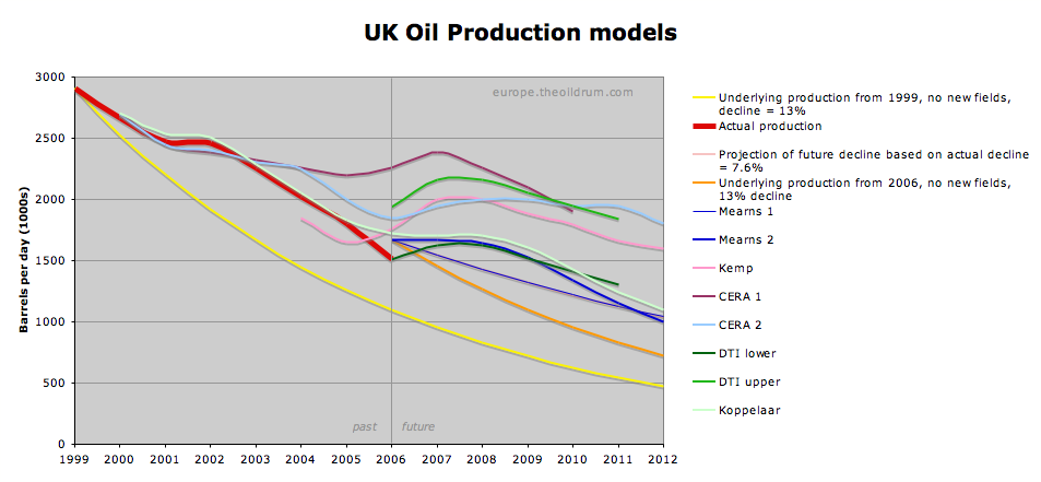
Figure 1 summarises oil production models for the UK. I refer to these as models as the data from CERA and Kemp are lifted from conference presentations which cannot necessarily be viewed as formal forecasts. The thick red line represents actual UK oil production (crude+condensate+NGL), BP data 1999 to 2005. The actual 2006 figure is compiled from monthly DTI figures found here and here (XL spread sheet) and include figures from January to September. The foundation of the Mearns2 forecast was discussed at length in my post last week and this is used as a benchmark against which the other forecasts are compared. It is of course possible that Mearns2 falls wide of the mark, but if you wish to query the validity of Mearns2, please read the foundation article first.
A draft of this article was sent to Dr Peter Jackson (a Director of CERA), Professor Alex Kemp at the University of Aberdeen and to Rembrandt Koppelaar inviting them to comment. Jackson and Koppelaar responded and I have tried to incorporate their comments. Kemp did not reply.
CERA
In correspondence with Peter Jackson, he brought to my attention the fact that their UK oil forecast that was presented at the APPEX conference in London on 8th March 2006 had been revised in October and he sent me a copy (not for publication). One of the first points Jackson wanted to make was that CERA forecast "productive capacity" and not actual production.
"we are not projecting production but productive capacity - which will be a little higher than production in most cases. In the UK production gyrates with the maintenance season and we look at capacity as being nearer the winter 'production' highs."
"we include crude plus condensate and NGL's in the outlook."
And he then went on to say:
"I agree we were optimistic about the UK and this was dealt with in our last update in October. The UK declined rather more quickly than we expected last year - because of above and below ground factors."
"Overall our outlook will give a slightly optimistic view relative to absolute 'production' - we don't take account of some of the big (high risk) above ground risks that will impact production such as hurricanes and geopolitics -"
"Our numbers are calibrated against activity in a very detailed manner - for example we have a database of 400+ new projects expected onstream by 2010 and more generally we have access to IHS data. So we believe that the capacity trends we calculate are robust and that the absolute numbers are sound."
The CERA1 data are read from the chart shown in Figure 2 that was presented to the APPEX conference in a presentation titled "Factors Driving the Global Liquids Capacity Surge". The CERA2 data are read from a chart with the title "United Kingdom - struggling to stay still".
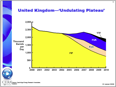
Figure 2 shows how the CERA forecasts are constructed from four basic elements:
FIP - fields in production
FUD - fields under development
FUA - fields under appraisal
YTF - yet to find
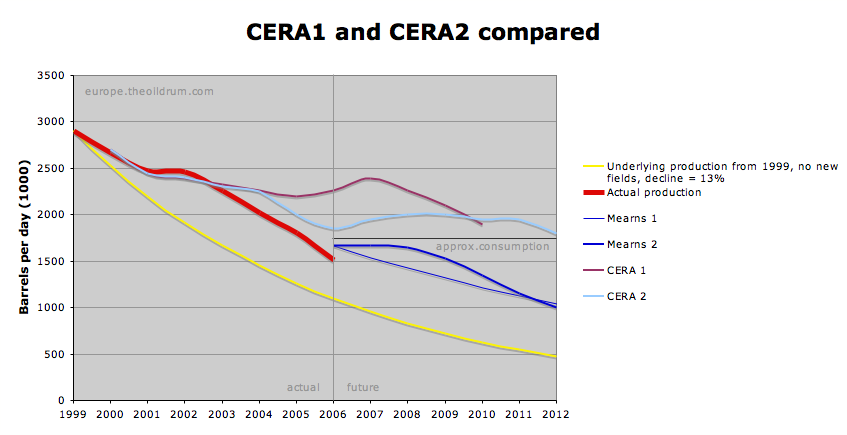
In order to disentangle all the lines shown in Figure 1, The CERA1 and 2 data are re-plotted in Figure 3.
Some key observations:
- CERA plot productive capacity
- The CERA1&2 productive capacity data are concordant with actual production from 2001 to 2003 but track above it from 2004
- The CERA1&2 curves are concordant with each other until 2004, thereafter they diverge significantly before converging again in 2010.
- The 2006 productive capacity figure was adjusted down from around 2,260,000 to 1,850,000 bpd between March and October this year.
- The CERA1&2 productive capacity forecasts track well above the Mearns2 forecast. By 2010 they are both around 560,000 bpd higher.
- UK daily oil consumption, discussed here, is around 1,750,000 bpd, a fundamental difference, therefore between the CERA1&2 forecasts and Merans2 is that the former project to UK oil self-sufficiency until 2010 whilst the latter points to rising imports. This is no trivial matter for the UK.
So how is it possible for CERA and I to reach such different conclusions? CERA no doubt may point to the detail and "400 projects" included in their forecast. The claim of "very detailed" analysis needs to be considered in the context of their March forecast being around 700,000 bpd too high for this year. CERA themselves have acknowledged this problem and have revised their forecast downwards by 18% for the current year.
In a general sense, I see three main problems with how the CERA forecasts are constructed:
- The fields under development band runs at around 400,000 bpd in the interval 2007 to 2010 - and this is an appropriate figure. However, beyond 2010 these new fields will probably start to decline more rapidly than shown.
- Fields under appraisal are not yet scheduled to produce oil. When they become scheduled for production they become "Fields Under Development" and should in my opinion be shown as a continuation of FUD and not stacked on top.
- The same applies to Yet to Find. Once found, new fields will first be appraised before being developed. YTF should also in my opinion be shown as a continuation of FUD.
The CERA2 model shows around 200,000 bpd in the YTF class by 2010. This simply does not look feasible. When you consider that the already found Rosebank / Lochnager field, west of Shetland is unlikely to see first oil before 2010, it looks wholly inconceivable that 200,000 bpd of productive capacity could be built by 2010 for fields that have not yet been found.
Finally, I have a very substantial problem with the CERA2 forecast. The large downwards revision in October 2006 is in my opinion a significant step in the right direction. However, by 2010, the CERA1 and CERA2 forecasts are the same. In 2006 CERA2 has a much lower starting point than CERA1. Therefore, to reach the same point by 2010, CERA2 must be "more bullish" than CERA1.
So let's recall why CERA1 was revised downwards to CERA2 in the first place:
"I agree we were optimistic about the UK and this was dealt with in our last update in October. The UK declined rather more quickly than we expected last year - because of above and below ground factors."
Surely, the next logical step from here is to be more bearish about future prospects - not more bullish?
I've not managed to look in detail at how CERA get from 1 to 2 but I have compared the underlying decline - that is the projection of Fields in Production - and this is shown in Figure 4. The underlying decline rate for CERA1&2 are the same up until 2005, but from that point onwards they start to diverge (remember that the data are read from charts).

CERA2 uses a lower rate of underlying decline than CERA1. The FUD, FUA and YTF bands in CERA1 and CERA2 look roughly the same - but these are stacked on top of a lower underlying decline rate. So, having just learned that the UK has declined more rapidly than expected, CERA then proceed to reduce and not increase the projection of that underlying decline.
Kemp
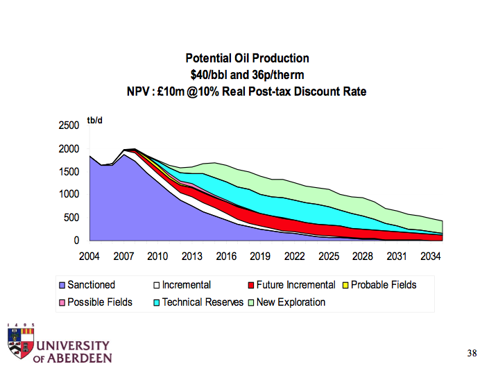
Alex Kemp is Professor of Petroleum Economics at the University of Aberdeen, and is highly respected and influential in this field. Strange then that his oil production model for 2007, is running at right angles to the oil production trend of the last six years (Figure 1). At the Oil Depletion Conference, hosted by the Energy Institute in London, November 2006, Professor Kemp presented a variety of oil, gas and total hydrocarbon models based on different economic assumptions. The one I have chosen for comparative purposes here is the $40 / bbl oil model (Figure 5) - conservative in today's terms.
In discussion at this conference Professor Kemp dismissed what he called "single line" forecasts, referring to Hubbert linearisation and depletion analysis and scoffed at the notion of peak oil. He seemed to view the current low level of UK oil production as due to unscheduled maintenance shut downs.
What's OK with the Kemp model?
- The 2006 production number lies close to the actual figure - though as already mentioned Kemp's trend is going up, while the actual trend is going down.
- The underlying decline rate from 2009 to 2012 averages 16%, which if anything would lead to underestimation of future production.
What's wrong with the Kemp model?
- In 2004, 2005, the Kemp trend lies parallel to the actual production trend, but is displaced about 200,000 bpd below it - this looks odd.
- Kemp shows a massive reversal in the underlying decline from the actual figure which is minus 13% per annum for the last 6 years to underlying growth of +15.6% from 2006 to 2007.
- This combined with "incremental growth" points to 2007 UK production of 2.0 million bpd. This is over 300,000 bpd higher than the Mearns2 forecast and sets the scene for forward inflation of UK oil production which in my opinion is never likely to occur.
- From 2007 onwards there are multiple layers of "Potential Oil Production" such as "incremental; future incremental; technical reserves and new exploration" that are built upon the underlying decline curve. The net result is that by 2012, Kemp has 600,000 bpd more production than Mearns2 (that is 60% higher).
As already mentioned, the Kemp production line falls close to actual for 2006, and this makes it difficult to simply dismiss the Kemp model - he is after all the recognised expert in the field of UK oil and gas forecasting. And so we will need to wait a year or so to see if Kemp's model is validated.
Some of Kemp's forecasts are presented and discussed on the DTI web site and for those who are interested I have been invited to present the Mearns2 forecast to the same forum next month.
If UK oil production comes anywhere near to 2 million bpd average in 2007 then I will accept that I have been wrong, offer my appologies to those who I have criticised and will resign as an Oil Drum contributor. This will be a clear signal that forecasts of an imminent peak in global oil production are unfounded and I will seek gainful employment else where.Euan Mearns theoildrum Dec 2006.
Koppelaar
Rembrandt Koppelaar, Chairman of ASPO Netherlands and TOD Europe contributor sent me his preliminary UK oil forecast which is shown in Figure 6.
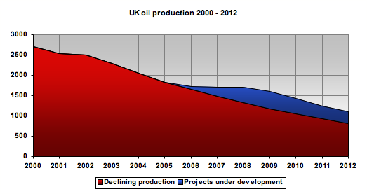
Figure 6. Forecast from Rembrandt Koppelaar. The blue slice representing new fileds under development are the same fields used to develop the Mearns2 forecast.
Note that Koppelaars preliminary forecast has been updated since the summary chart I presented last week was prepared. The main difference is that the underlying decline has been raised from 9 to 11.5%.
Koppelaar's preliminary forecast falls close to, but just above Mearns2. This is not surprising since I used Koppelaars data base of new field developments to compile Mearns2. Koppelaar tracks above Mearns2 because the underlying decline rate I used was 13% as opposed to Koppelars 11.5%
There is little material difference between these two forecasts.
Department of Trade and Industry (DTI)
The DTI forecasts were the subject of an earlier post and I do not intend to go into detailed discussion here. It suffices to say that the DTI provide a forecast range that is based on data returned to them by the operating companies.
The upper forecast falls between CERA and Kemp and therefore in my opinion is a gross overestimate of what is likely to come to pass based on assessment of current data.
The lower forecast falls close to Mearns2 and not surprisngly is in my opinion rooted in the reality of oil production decline that is partialy offset by sparse new field developments.
The $ value difference between the upper and lower DTI forecasts at $60 / bbl is $68 billion between 2006 and 2011.
Mearns2
The ink on Mearns2 is barely dry but it is already in danger of looking over-optimistic. September oil production is up from the August lows but the prospect of reaching 1.67 mmbpd in 2006, the starting point for Mearns2, is looking increasingly remote.
Several commentators (the DTI, Chris Skrebowski and Rembrandt Koppelaar) have all pointed out that the Rosebank / Lochanager project is not likely to start before 2010 - the likelihood of delays were noted in my earlier post, and this would further reduce forecast production between 2008 - 2010.
To offset possible delays with Rosebank / Lochnager, a good friend and senior industry advisor suggested that a growing number of small projects may provide a significant boost in the years ahead.
Khebab has pointed out I should use logistic and not exponential decline - next time maybe.
Hubbert linearisation
For those not familiar with Hubbert Linearisation (HL) it is a technique that uses historical production data to indicate the ultimate recoverable oil reserves (URR) for a country or sedimentary basin. This technique has been discussed at length on TOD by Khebab, Stuart Staniford and others. A brief overview is provided by Wolf at the Door.
The UK has an unusual production history with twin production peaks giving rise to two linear decline legs to the HL. The projection to URR provided by the Mearns2 and Kemp forecasts are shown in Figures 7 and 8. I have not shown the CERA2 forecast because HL is only applicable to real production and not to productive capacity. Nevertheless, performing HL on CERA2 provides a similar conclusion to Kemp.
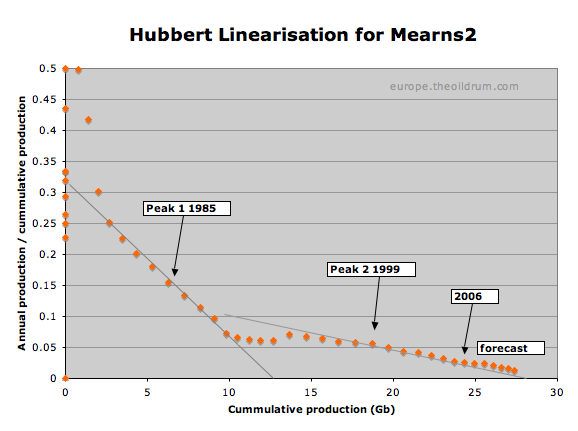
Figure 7. HL forecast for Mearns2 points to a URR above 28Gb but probably less that 30Gb
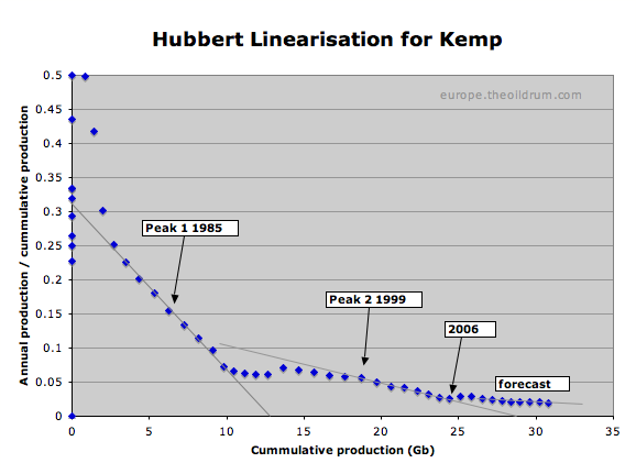
Figure 8. HL forecast for Kemp points to a URR well over 35Gb
As of the end of 2005, UK cummulative production was around 24Gb. By 2012, the Mearns2 shows cummulative production of 27.4Gb and this would suggest that the UK North Sea would be reaching the end of its productive life based on URR less than 30Gb. Kemp shows 28.4Gb cummulative production with over 7 billion barrels still to go based on URR over 35Gb.
Impact of oil price and economics
Certain observers seem to be bemused by the fact that high oil price and high activity levels in the North Sea have not managed to stem the oil production decline in the UK and Norway. They fail to recognise that high oil prices are caused by falling production in mature areas like the North Sea. In London, Kemp was keen to promote the role of economics in production forecasting. So here's a couple of economics observations.
Thanks to Nick Rouse, who pointed out here, that massive rises in oil industry expenditure over the past 5 years have by and large been swallowed by rising costs. This issue was recently covered by Dave Cohen in his post on Investment in Oil Exploration and Production - An above ground factor.
With respect to the ability to massively increase drilling activities, this article in the Canadian Globe and Mail digs out of the biannual IEA report that the vast increase in the money invested by the international oil and gas companies over the last 5 years, $340 billion, a 70% increase, has resulted in only a 5% increase in real terms, the rest being swallowed up by inflation. This increase in drilling only yielded a 2% increase in production.
It is also important to note that since the $10 / bbl oil price lows of 1998, the UK rig count has been tracking sideways. $78 / bbl for oil earlier this year has not significantly influenced the number of drilling rigs operating in the UK North Sea.
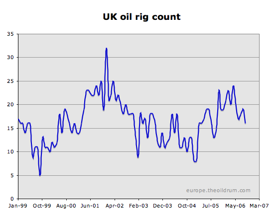
The reason for this I believe is straightforward. The oil price is high everywhere, the UK and Norway are past peak production, and oil companies are drawn to areas where both exploration and production growth prospects are better than in the North Sea. In this respect, high oil prices may in fact have worked against the North Sea, with new rigs being attracted to more prospective areas while oil prices and drilling costs have soared.
Decommissioning
Finally, it is worth looking at this rather sobering chart from the DTI that shows planned decommissioning activity in the UK North Sea. Thanks once again to Nick Rouse for bringing this to my attention.
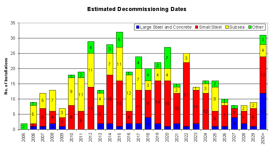
It has to be expected that continued high oil price may delay this decommissiong schedule. The emphasis here is on delay as with ageing infrastructure and falling production, the sun has begun to set on the North Sea.
Summary
The UK oil production forecasts discussed here fall into two groups. One group comprising Mearns2, Koppelaar and the "DTI lower" are very similar to each other and point to UK oil production continuing to decline in the years ahead and the UK importing increasing amounts of oil.
The other group comprising CERA2, Kemp and the "DTI upper", sees UK oil production increasing in the years ahead and the UK remaining more or less self sufficient in oil.
One final comment from Peter Jackson
"anyone who thinks they can get this kind of work accurate to +/-50kbd is dreaming and when you go out 5 years there are so many variables that a deteministic approach has to be couched in a description of the uncertainties"
I happen to agree with that, there are many uncertainties in this world today. I will nevertheless revisit this subject around every 6 months to see how the various forecasts stand the test of time.
Euan Mearns
TOD Europe Contributor
I'd like to thank Peter jackson and Rembrandt Koppelaar for providing helpful comments and background information.
Personnel
Editors
Contributors
Peak Oil Primers
Archives
- November 2010 (3)
- October 2010 (6)
- September 2010 (4)
- August 2010 (7)
- July 2010 (6)
- June 2010 (7)
- May 2010 (2)
- April 2010 (8)
- March 2010 (4)
- February 2010 (6)
- January 2010 (3)
- December 2009 (5)
- November 2009 (8)
- October 2009 (12)
- September 2009 (6)
- August 2009 (5)
- July 2009 (11)
- June 2009 (8)
- May 2009 (16)
- April 2009 (10)
- March 2009 (7)
- February 2009 (10)
- January 2009 (15)
- December 2008 (9)
- November 2008 (9)
- October 2008 (9)
- September 2008 (13)
- August 2008 (10)
- July 2008 (14)
- June 2008 (23)
- May 2008 (16)
- April 2008 (12)
- March 2008 (16)
- February 2008 (9)
- January 2008 (13)
- December 2007 (13)
- November 2007 (16)
- October 2007 (22)
- September 2007 (8)
- August 2007 (9)
- July 2007 (16)
- June 2007 (8)
- May 2007 (7)
- April 2007 (7)
- March 2007 (10)
- February 2007 (10)
- January 2007 (12)
- December 2006 (9)
- November 2006 (15)
- October 2006 (4)
- September 2006 (5)
- August 2006 (5)
- July 2006 (9)
- June 2006 (5)
- May 2006 (10)
- April 2006 (9)
- March 2006 (13)
Vital Trivia
License

This work is licensed under a Creative Commons Attribution-Share Alike 3.0 United States License.
There was once an engineer who said: "at the end of the race it doesn't matter if you win or lose, it's what you learn that counts".
I make mistakes all the time, so I hope you reconsider those words, acknowledging one's errors and learning from them is what matters. But then again 2 Mb/d....
On current growth rates CERA's forecasts can only maintain UK self-sufficient for no more than 5 or 6 years.
This is a great post Euan, and the due acknowledgments to Mr. Jackson for his collaboration.
I have put the results of the Logistic/Loglets modeling on my blog:
The Loglet Analysis Applied to the United Kingdom's Oil Production
The loglets model suggest a higher decline rate in the future (Ultimate decline rate at 22%).
I have to go for now, more comments later.
One thing I've been looking at visually is how the underlying rate of decline fans towards steeper values with time. So I had already reckoned that using 13% which is the underlying rate now, is probably an underestimate for the future. However, with actual decline running at around 7.6%, that growing to 22% seems a lot.
Jeffery Brown (aka WT) we need an import land model as well. If the UK is going to increase the ammount of imported oil it needs to even maitain the status quo....
Is anyone else frighten by this stuff? This looks like it could get very ugly very quickly to me.
I look at all the homes, apartments and town houses around Portland, OR all heated by nat. gas or electric(48% coal fired)-
No trees for fuel, no land to grow food, and ton's of people hooked on electronic toys.
The perfect storm...
also (i don't think i have the numbers to plot the above graph myself) could someone plot what the general decline rate vs time has been, and extrapolate that to the future?
What Khebab is saying is that his modelling suggests the actual decline may accelerate to 11% from 7.6%.
Some financials.
If this loglet curve is accurate then before 2010 Gordon Brown -the new PM- will have a budget gap of:
=((Use - Production) * No. of days in a year * per barrel price) / $ to £ ratio
=((1,750,000-750,000) * 365 * 60 ) / 2
=approx -£11 Billion / year (Logistics curve gives approx -£3B)
That's a big difference (Cost of current usage is around £20B)
As Oil gets scarcer / more expensive importer countries will increasingly have to devote more and more of their budgets to these increasingly expensive oil imports. If the rest of the economy is unable to make up the difference (and bear in mind the UK is highly service / finance dependant -something that is likely to be badly hit) this will lead to severe hard times.
I went shopping for Christmas gifts at the local Mall the other day -people where spending like there is no tomorrow -and they're right!!
Regards, Nick.
http://www.theoildrum.com/story/2006/9/17/135527/399
If you are wrong then yes you should stop commentating on this subject, resign your position, your research is not up to scratch! Should you be correct then your opposition have no other recourse than to do likewise.
Fantastic that Jackson goes into the debate!
CERA's Tango with Peak Oil
How can any energy business, with a straight face, predict UK's oil production will average 2.35 mbpd for 2006, when figures for Jan and Feb are both well under 2.0 mbpd. When August's figures of 1.2 mbpd were announced, then you need one month of 3.5 mbpd to get back to 2.35 mbpd over the year.
Surely companies that buy CERA's figures and analysis want accurate numbers. When CERA state that UK oil production will average 2.35 mbpd for 2006, that must raise eyebrows with the buying companies analysists. And if it doesn't, perhaps CERA could publish its client's names so that ordinary investors can short their client's companies stock. If the clients can believe those numbers, then they can obviously believe anything can be true that costs large amounts of money to buy. If I were an investor in those companies I would want the chief executive to sack anyone who authorised large payments for Scotch Mist.
However, they make the qualification that "many significant risks to production capacity loom on the horizon, but these are largely above-ground risks."[1] So they haven't excluded above-ground risk from potential capacity - they are talking about potential of potential capacity!
Now, I think at this point they diverge from a credible prediction. The way they use the term "productive capacity" in their reports is essentially synonymous with production. Basically they are presenting a doubly optimistic case, but with a convenient escape clause if they are wrong.
(1) The Oil Industry Growth Challenge: Expanding Production Capacity
Funny, with CERA using "capacity to produce", it sounds more like the other kind of FUD - Fear, Uncertainty and Doubt
As we watch all the forecasts from the 70's, 80's & 90's, there have been major changes in trends. In the early 80's, IEA was predicting lower supply in the future (1995 & Y2K). This was based on an assumption that hydro-elec & nuclear power generation would dominate in the overall energy mix. When the treehuggers quashed that momentum, it was necessary to ramp up oil supply in a major fashion to meet projected energy demand.
Now that nuclear is back on the table and payback efficiencies are being attained with wind, solar etc etc, we can see the scaling back once again of oil. Clean coal has also presented new opportunities.
But getting back to forecasting, while the optimists were as high as 160-mdb for some bold Outlooks, the Peakists have been just as drastically wrong when we look back at the tops forecast for 1996, Y2K, 2001, 2002, 2003, 2004 & 2005. All wrong. And all with Peak rate targets betwen 58-mbd to 84-mbd that have been blown away.
MSM cannot presently identify a spokesman for Peak Oil. And with all the noise at TOD, it sure as hell ain't here in its present format. IMHO, the weekly specialty articles should be data based and the subjective arguments that inflame should be dumped from allowability. Much like the RealClimate disucssion forum. I do not visit Drumbeat often and i consider this domain the venue for the blowhards, thoughts for the day & current events.
Back to the Peak spokespersons, we have seen their credibility dashed due to a combination of poor forecasting or forecasts that don't reflect any longer the imminency of the problem. To wit, not one of the 13 Oil Depletion forecasters is presently seeing a Peak before 2010. Not one. Well that sure back burnered this topic for the MSM. And rightfully so.
I have mentioned before that the poor forecasts are more a reflection of the methodology. The conservative approach. This approach in its present form cannot reflect the 236-Gb/yr growth of URR since Y2K. It cannot even rationalize the 63-Gb growth in URR over the last 50 years! In some cases, it does not even acknowledge certain magnitudes of URR. Consequently, the most conservative forecasts must be continually revised upwards ... and that brings us where we are today: Nobody with credentials and data that can justify the doomster camp at TOD and elsewhere. Lotsa blowhards. None with data.
You see, once they take the time to acquire the data ... they find the other guyz were right!! Sucks, eh.
Future forecast is difficult business. But why you think other guys were right? Please provide the data.
The complete article is at:
http://sepwww.stanford.edu/sep/jon/world-oil.dir/lynch/worldoil.html
The core debate revolves around the World's "capacity" to continue to meet demand growth forever - with many of the prime assets now used or in decline.
The UK was once a part of the solution, being a significant oil exporter. Today, the UK is having to import oil from a shrinking number of countries that still have oil for sale.
You forget that URR does not equal production due to costs of developing fields can rising much faster than the market price of oil. Look at Canada's tar sands: a couple years ago price of oil had to be $23 per bbl for profitable production. Now Shell's project requires $45 oil price. Should this trend continue some of Canada's Alberta oil projects may never be produced as costs (oil production plus associated environmental) may exceed market price.
I think this is a fundamental point which is often overlooked. When oil companies, analysts etc say "economically recoverable at $X" they assume costs will be the same as current costs. You might think that obviously they factor in some cost inflation, but if you read the analysis closely they say things like "costs have risen unexpectedly". Predicting costs is next to impossible anyway, oil price itself is a proportion of costs, plus you need to predict future demand etc.
Diminishing returns is the characteristic feature of the logistic curve. So costs will rise above past trends. Therefore the equation is at least something like recoverable at $X * a, where a is dependent on oil price.
Now, the Norwegian oil sector has had some enourmous cost overruns, but so far none of them has approached Pi. Consistent with your argument I would expect cost overrruns to approach Pi in the future.
Where are your refernces so we can compare?
Your reserves are bull.
You didn't address the production figures or discussion above at all.
You are big with straw man arguments, but don't think we buy them.
Consider this:
Look at figure 2 (the article quotes the Atomic Industrial Forum):
From Who Killed U.S. Nuclear Power?
The nuclear lobby is trying to resurrect nuclear power thanks to the "oil fear factor", but an oil shock that causes a recession also has the effect of depressing energy consumption, and it seems that that is what happened with the nuclear industry in the US.
You know, this really doesn't bother me. Due to the nature of the methodologies, early peakers make estimates that err on the conservative side, whereas optimists err on the high side.
Pre-peak, while production is still rising, the peakists wll likely be proved wrong. Actual production will tend to oustrip estimates, because of factors unaccounted for. Peakists are continually having to revise estimates upwards, until the peak is upon us.
Post peak, with production declining, the optimists will be proved wrong. Production will fall short of estimates, closer to the peakists estimates. Optimists will be continually revising their estimates downwards.
In 100 years time, when we tally up the count, I would bet that the number of wrong estimates will be about even on both sides. I also wager that the average estimate will be pretty close to actual peak. It is just a feature of the arrow of time that we get to verify the peakist estimates first.
So the substance of the debate really is how someone like you can draw such different conclusions from the same data as someone like me.
Your comment about CERA also reporting actual production forecast figures is noted. However, in this case Peter Jackson had ample opportunity to provide this information, and if it exists, I would have preferred him to do so - because that would remove one layer of complexity from the debate.
The issue of reserves growth is I believe a substantial one - so you can look forward to a series of articles on this topic from Rembrandt in the coming weeks. I've made this point to you before that I suspect that reserves growth is an "up-curve" phenomenon whereby companies tended to under-estimate reserves in giant fields for a variety of reasons - poor technical understanding of giant field reservoirs, desire to be conservative for investment purposes, concealing an embarrassment of riches from host governments - to name but a few. The situation now, I believe may be the exact opposite, where oil companies struggling to replace their reserves, are tending to over state the case. The Chinguetti Field in Mauritania being a good example. I believe this could be the Achilles heal at the core of your current line of argument.
Of the various scenarios for the UK I presented here, I'd be interested to know which one you believe is likely to be most reliable? Who knows, maybe we can have a bet on this.
I wonder if anyone can tell me what the point of all this analyis is? -Sorry if it's too dumb a question but I only found out about the concept of Peak Oil a few months ago and so back then I was just like 99% of the population...
It seems to me that there are two camps -and I have no idea how big they are- but they represent say 1% of people talking about this stuff on a regular basis. Some possible reasons for 'hard work and effort' (and there is a lot going on here!):
On the Pro Peak side (0.5%):
Start doing something about it? Try and motivate popular support in order to influence government policy? Or just scare the bejeezers out of people? :o)
On the Peak is a far-way place side (0.5%?):
Make Peakers eat their words by pointing to the 'no cliff reached yet' sign year on year...
(In the Middle) BAU (99%)
Spend and consume like there's no tomorrow. Worry about 101 other things (the list seems to grow by the week).
Happy Christmas -Regards, Nick.
[/tongue in cheek]
The amplitude between summer low and winter high is currently around 300,000 bpd in the UK - so actual production will lie somewhere between the highs and the lows and I'd guess that "productive capacity" will run around 100,000 bpd above actual production.
In the UK context productive capacity is a near meaningless concept IMO. Maintenance work just has to be done and the case never arises that all fields get to produce all the time for 12 months. If they did - then the decline rate would accelerate.
IMO, in the UK, the huge gap between the CERA2 forecast and Mearns2 cannot be closed using the productive capacity scape goat.
For many years, ME OPEC countries did maintain spare capacity - and in that context, estimating spare capacity is a valuable measure - but only if this is done objectively.
Going back to the UK, there's no good saying we could produce a lot more oil if we had 50 more FPSOs (floating production ships) because we just don't have them.
Euan, you are to be commended for your work but I have concluded that entities like CERA are as intellectually dishonest as the climate change deniers who are paid by fossil fuel producers as well.
Having used IHS data / CERA estimates over the last ten years, I just thought I'd add a comment on productive capacity.
It is an extremely odd measure when forecasting production and an over simplificatin which I am very surprised they make. (very).
General practise would be to take productive capacity on a platform level and then assume an availability (say 80-90%) and use that for the forecast. No-one uses capacity in such a naive way, CERA should know better!
Second comment - on Rosebank dev in the West of Shetlands. One of the discussions seems to be start up date. I think this is over optimistic - a commercial reserve base has not been proven yet - though appraisal drilling is under way at the moment. Rosebank is remote and may not prove commercial at all.
Lastly - above ground factors - in my view CERA / IHS typically assume far to optimistic development times from discovery to onstream. Particularly in today's market, if all projects are simply stacked, this would result in a structural error in the forecast, by bringing on many projects too soon. It is likely that their project database is quite representative of industry activity, but projects will on average deliver later than they expect - lowering any peak and smearing the production increase over a longer time (and probably making the forecast look rather like yours!).
The basic approach I would take is to take a new project database and add 3-5 yrs for discoveries (bigger = longer delays as more complex and thus requires more contractor capacity), 2 yrs for fields under appraisal.
One thing also to think about is whether the contractor capacity problem is going to solve itself. For drilling rigs this may well occur by 2010 due to all the new builds, though probably not other segments which are skills / people constrained.
Because it makes their predictions unfalsifiable.
"Convential Resources" resources in the table is 1,070 Bn barrels while in the graphic 1,080 bn barrels are in the "yet to be discovered" catagory.
"Exploration potential" resources in the table are 758 Bn barrels while in the graphic "From Conventional Sources" resources are 760bn barrels.
Both numbers of potential resources sums exactly to 3.74 trillion barrels.
Blame a non-attentive analyst.
Looking at cera's recent predictions is just giving them endless new chances. Better to look at their past predicitons, eg falling ng prices in 2000, falling oil repeatedly. How about a study that stacks up their predictions over the past decade?
The only reason to do an HL plot is to derive a Qt estimate, which is a mathematically derived estimate of URR. I am not aware of a single instance of a large region showing a sustained P/Q intercept with anything remotely approaching 30%.
The opposite to your export land we need an "import land" model. How to cover the gap in falling internal production...
yikes...
In 2006, these same two factors were at work in Saudi Arabia, leading to my estimate of a year over year decline in net exports of 13% (12/05 to 12/06).
What the biggest importer wants to import is increasing.
What the biggest exporter can (IMO) export is falling.
When a country like the UK slips into Import Land status because of falling domestic production, the only way for imports not to increase is if the volume of the domestic production decline is offset, barrel for barrel, by a decrease in consumption. And this has to happen every single year going forward. In other words, if imports are not going to to up, domestic consumption has to track the decline in domestic production. Which leads to the Export Land question: If everyone is becoming a net importer, who is exporting?
Khebab has already noted that a 30% P/Q intercept falls in the "noise" section of a HL plot. As such, it has no relevance in trying to derive a Qt estimate.
In regard to the long term reliability of the HL method, Khebab has addressed this. The Lower 48 and Russia are the two largest regions that are well advanced along the linear HL progression. These two regions have jointly accounted for about one-third of all of the oil produced to date worldwide.
Khebab took just the production data through the Lower 48 and Russian 50% of Qt marks, and predicted the post-50% of Qt cumulative production for each region. Through 2004, the post-50% Lower 48 cumulative production was 99% of what the HL model predicted, and the post-50% Russian cumulative production was 95% of what the HL model predicted.
My North Sea (crude + condensate) HL plot showed that the North Sea peaked at the same point as the Lower 48, and that the total North Sea is about 70% depleted.
Please excuse my pedantry about a minor typo, but it jumped into my eye. Shouldn't it be "higher than .."? (don't know if that can be re-edited. The excellent article deserves it.
Thanks for the detailed discussion.
One point I'm confused about. You talk as if the UK may be a net oil importer this year, and the previous import/export post you've linked to also holds out that possibility. You seem to be basing this on a reported domestic oil use vs domestic production.
However, the actual recorded data are available in the UK trade stats, and these show that the UK became a net oil importer in 2005 (even HM Treasury states that UK became importer in 2005 - it's in black and white in the pre-budget report). In 2006 the situation has deteriorated, particularly in Q3.
Data: UK Trade Statistics Sept 2006 Table A11
Million tonnes: Exports/Imports/Bal
2005    50.51/54.05/-3.54

2006 Q1 12.57/13.71/-1.14

2006 Q2 12.09/13.73/-1.64

2006 Q3 10.29/14.87/-4.58
(Pre-release Oct stats show 3.21 exports, 4.16 imports)
So, UK has imported 7.36m tonnes in first 9 months of 2006.
Am I missing something?
There's two ways of looking at the consumption balance - one is what we produced relative to what we consumed. The other is to compare exports and imports. I have done the former based on the BP statistical review data, whilst the data you present are determined using export / import balance.
Looking at Table A11 you'll see that our oil exports (tonnes) have been falling since 2001 and our imports have been rising. There is actually quite a large two way trade indicating two things perhaps - some of the foreign operating companies are repatriating oil to their homeland refineries (compensated by the UK importing from else where) and we are perhaps exporting and importing particular grades of crude for refinery tuning purposes. There is also a third item here which are oil products (refined products). The fourth item that may need to be considered in balancing the trade equation would be stock draws.
So this is a good way of estimating oil and products trade but perhaps not the best way of getting at an oil trade balance.
Having said that I have to admit that using the BP data in the way I have done could be over-simplified. The production data should be quite straight forward, but I am left wondering how the oil consumption figures are measured. If these reflect gross consumption then I am on firm ground.
In talking to the DTI my understanding is that the UK became a net importer of oil fourth quarter 2005 (though I may have to check that), and that we are importing significant volumes this year. So looking at the trade balance figures of -£2229 for 2005 and -£2063 for jan to sep 2006 I would hazard a guess that these figures may not be a fair reflection of the underlying oil trade balance.
I need to state that these are provisional comments. If you want me to look into this further then please say so. This is interesting stuff - so thanks for your comment.
Euan
Thanks for your response. I can see the distinction you're making, and I'm not asking you to look into it further.
My only reservation with this is that the same argument could equally apply to the US, in which case you're saying the EIA import/export data isn't necessarily representative of the US oil trade balance (the US trade data from the BEA uses SITC commodity definitions and the data closely match that of the EIA).
Speaking of the pre-budget report, it was notable that Gordon Brown had to raise taxes and will be borrowing more to cover a projected £3 billion shortfall in oil taxation receipts in 2007 and a further £4 billion in 2008-2010. It seems production declines/delays are taking everyone by surprise...
Thanks again for your time and effort on this post.
ABARE has consistently denied peak oil, but surely this result from 2005-06 (like the UK) shows the problem, where Australia's aging oil fields peaked in 2000 and are declining at about 15% per annum. ABARE does have an interesting list of oil and gas projects projected for Aust- http://www.abareconomics.com/publications_html/minerals/minerals_06/me_projectionsoct06.xls
Because of a mismatch between the light crudes we produce and the refining setups, we import about 70% of our finished products and export a similar figure of our production. A recent Govt enquiry had the Geoscience dept admitting at present consumption rates, Aust has only 5-7 years of oil production left. WestTexas can add Australia to his 'export land' model as well.
Has to be noted that the BTC pipeline will be ramping towards its 1 mmbpd capacity - so this will be one reason for OPEC needing to cut back. But all the while, decline of thousands of old fields going on everywhere is the greasy pole that the oil industry currently clings to.
Pardon. I think I laid an egg.
This kind of blatant (and repeated!) error makes one less sanguine about the usefulness of the big database of projects they supposedly rely on.
Amerada Hess Triton FPSO ship is offline till Feb 2007, this production ship produces 105k bbl/day They were in Teeside getting retrofitted top sides, new equipment etc. Then over to Aberdeen for further fitting. I believe is been offline for most of the year.
This is one official fact over looked and may contribute to the charts decline in the UK field.
Rolling Start sched:
The Triton in detail
Regards oilcan
Can you explain what the rolling start schedule is?
This surely is the job of the consultant , to take a simple task and make it more complex. The concept / axiom / assumption of production capacity - apparently undefined in a verbal, arithmetical, analytical or mathematical sense is meaningless. Production is ultimately a single, useable, acceptable (by all) single figure which can eventually be quantified. Production capacity is a Humpty Dumpty word as my nanny used to say.
Imagine such a term or concept being used in, (say) a forecast of housing in the UK, we have the land, the materials and 500,000 Polish builders so "Production capacity" is (virtually) infinite.
Snide remarks about econometricians apart, FTX puts his finger on the key point Imports exceed Exports and result in a net (and evidently rising) cost to UK PLC.
Brown's prestidigitation in the December statement only serves to emphasise the rapidly developing black hole (notwithstanding the theft of £400Mn per month £5Bn annually caused by VAT fraud on a monumental scale) which he is so desperately attempting both to explain away and to conceal.