Drilling Faster Just To Stay Still: A Proposal To Use ‘Production Per Unit Effort’ (PPUE) As An Indicator Of Peak Oil
Posted by Rembrandt on July 1, 2013 - 7:45am
This is a guest post by Andrew McKay, who is a trained ecologist and currently works in fisheries in New Zealand. In his spare time he writes about peak oil and energy issues at Southern Limits.
Within the fields of harvest and fisheries management catch per unit effort (CPUE) is one method that is used to determine the health of a biological resource. The underlying assumption is that as a population declines it becomes harder to catch and therefore CPUE decreases.
Effort can be measured in a number of ways. In fisheries this unit of effort could be vessels in a fishery, days fished, hours fished, number of tows or sets in a season or any number of other units of measurement. Theoretically these should all show similar results.
As a very basic example of CPUE, if in the first year a vessel fishes 10 hours per day for the season and catches 4,500,000 kg of fish and in the second year still fishes 10 hours per day for the season and catches only 2,000,000 kg of fish the CPUE has dropped from 5000 kg/hr to 2778 kg/hr. A standardised CPUE would show a drop from maximum catch of 100 (the maximum of the data set) in the first year to 56 in the second year. A drop of almost half. All other things being equal this would give fisheries managers reason for concern as the effort has stayed the same while the catch has decreased. However, an increase or no change in catch can also sometimes mask an underlying problem. If in the second year the vessel fishes 15 hours per day for a season and still catches 4,500,000kg the CPUE drops to 3333 kg/hr. This is a standardised CPUE of 67. This represents an increase in effort for the same amount of catch.
There are a number of limitations to CPUE in fisheries management that largely come from fish stocks being highly mobile, impacted by a number of environmental conditions, disease and predation from other species. That being said, what if we applied the concept of CPUE to a non-biological resource such as oil? What if instead of catch per unit effort we calculate production per unit effort (PPUE)? This is exactly what I am proposing and what the rest of this post will address.
Production Per Unit Effort (PPUE)
In the case of oil these units of effort could be number of rigs, footage drilled or money invested. We can hypothesise that when peak oil occurs we would expect to see PPUE decline for all these factors. As rig numbers increased the amount of production would decrease, as footage drilled increased the amount of production would decrease and as the money invested increased the amount of production would decrease.
I have standardised the PPUE figures below so that they can be easily compared across all regions. The basic calculation is simply to divide the production figure (thousands of barrels per day) by the corresponding unit of effort for each year. This is then standardised by dividing each figure by the largest figure in the data set and then multiplying by 100 to assign a ranking of 1 to 100. A PPUE of 100 represents a minimal amount of effort for the maximum amount of production while a PPUE of 1 represents a large amount of effort for minimal production. Obviously it is in the best interests of oil producing nations to be at the upper end of this scale. From what I have calculated below this is by and large not the case. The majority of regions around the world are facing falling PPUE which signals one thing: oil is getting harder and harder to get out of the ground. If this is indeed the case then high oil prices are here to stay and will only continue rising in the future.
The Global Outlook
By taking oil production figures from the 2012 BP Statistical Review (includes crude oil, shale oil, oil sands and NGLs) along with international active rig counts from Baker Hughes and calculating the PPUE we can compare how each region is faring.
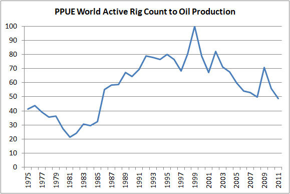
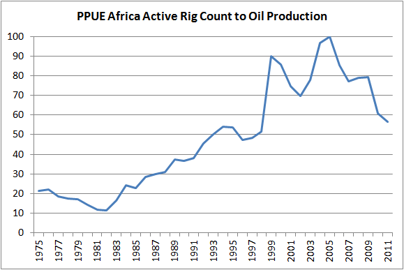
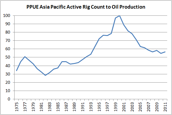
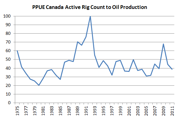
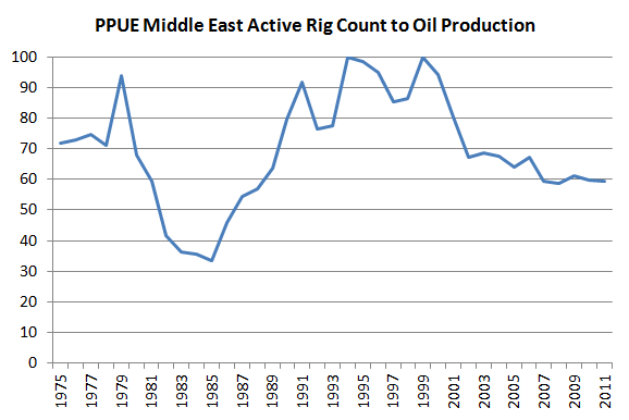
We can see that PPUE for most regions peaked around 2000. The big exceptions being Canada in 1992 and Europe and Africa in the mid 2000s. What this means for the majority of the world is that in little over ten years the average number of barrels of oil a single rig produces has almost halved. Put another way oil companies have had to double the number of rigs in operation just to maintain oil production at 2000 levels. This is the very definition of drilling faster just to stay still.
| Region | PPUE 100 Year | PPUE 2011 | Years Between | Decline in PPUE |
| Africa | 2005 | 57 | 6 | 43 |
| Asia Pacific | 2000 | 57 | 11 | 43 |
| Canada | 1992 | 39 | 19 | 61 |
| Europe | 2004 | 58 | 7 | 42 |
| Latin America | 1999 | 45 | 12 | 55 |
| Middle East | 1999 | 59 | 12 | 41 |
| US | 1999 | 34 | 12 | 66 |
| World | 1999 | 49 | 12 | 51 |
World PPUE has dropped almost 50% since 1999 after a steady climb from 1981 up to 1999. Despite huge investment individual wells are on average producing less oil.
Africa is past peak PPUE.
Asia Pacific is past peak PPUE.
Canada is past peak PPUE. It appears that after Canada’s peak PPUE in 1991 it plateaued and bounced around the 40-50 mark for most of the last 20 years. The increase in PPUE in the late 2000s can somewhat be explained by the Athabasca tar sands ramping up production since 2003. Roughly half of Canadian oil production now comes from tar sands oil.
Europe is past peak PPUE.
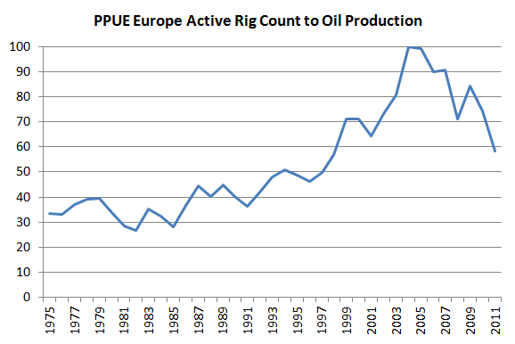
Latin America is past peak PPUE.
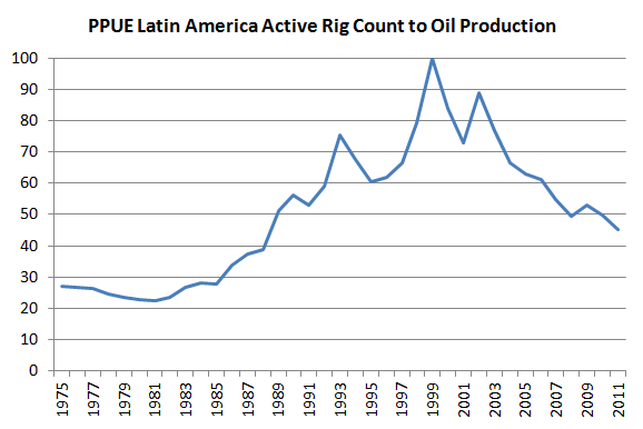
The Middle East is past peak PPUE. The dip from 1979 onwards can be attributed to the Iranian Revolution which severely disrupted global oil prices. OPEC countries made huge profits by reducing production and keeping the price of oil high during this period.
The U.S. is past peak PPUE. The massive rise in the PPUE from 1981 onwards is the other side of the coin showing the impact of the Iranian Revolution. We see a short term rise in PPUE after the global financial crisis but this gain appears to largely now have been lost.

An American Case Study
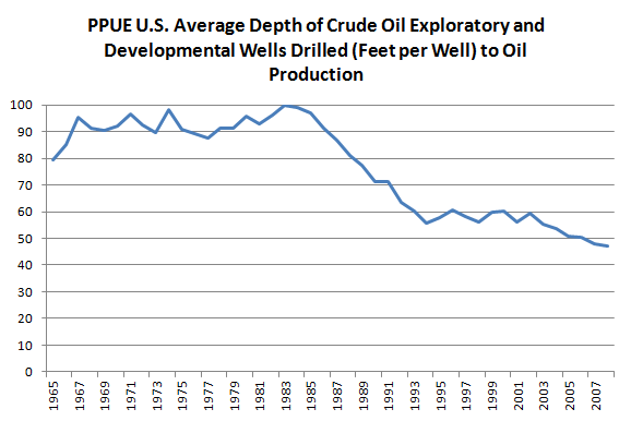
If we then look specifically at U.S. data (because it’s the easiest to find) we get similar results no matter which unit of effort is chosen.
All oil production figures are from the BP Statistical Review of World Energy 2012.
The average depth of wells is getting deeper and yet greater oil production is not reflected by this increase in effort.
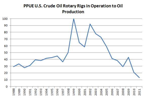
The increased number of crude oil rotary rigs in operation has not helped oil production either.
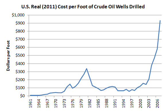
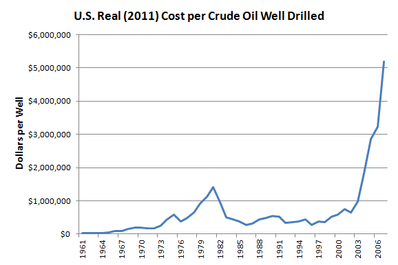
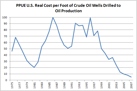
The two graphs below both essentially show the same picture. The cost of drilling per foot has skyrocketed since 2000 driving up the cost of each individual well. Unfortunately the EIA data cuts off at 2007 so we can’t see the impact of the global financial crisis. If well costs are anything like production levels it is likely that the cost fell considerably after 2007 and then climbed back up to to pre-GFC levels.
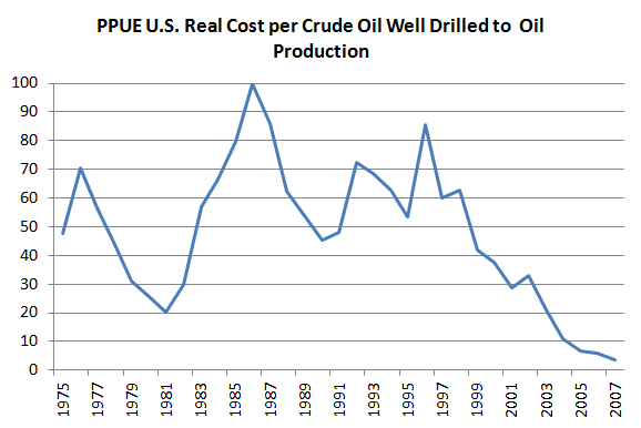
When the above two graphs are converted to a standardised PPUE we see the same trend as other all other metrics. As costs per well and per foot drilled have continued upwards production has not followed suit.
Potential Issues With PPUE
Now it may be that I have missed something fundamental and PPUE is completely useless as an analytical tool. Or it may be that it just needs a tweaking of inputs. No doubt there are some harvest management experts out there that can point out where I have gone wrong. I have outlined a few issues I have identified below that I have some doubts about.
- PPUE has not been standardised appropriately.
- PPUE does not represent increases in effort accurately
- PPUE data cannot generally provide information needed to assess resource management
- PPUE is inappropriate to assess peak oil
I in no way think PPUE represents the whole picture but see it as supplementing other methods already out there such as EROEI. I welcome comments and criticisms.
For deeper reading on issues surrounding CPUE there are two excellent papers here and here.


I believe PPUE is a valuable tool for evaluating our situation.
Andrew... excellent work. That is an amazing figure that PPUE has basically fallen in half since 2000. I would imagine this would also have an impact on pushing the global EROI oil ratio down even further.
Charles Hall, Cleveland and others put out a new EROI study back in 2011 called "New Long Term Assessment on the EROI of U.S. oil & Gas", and it showed that when drilling picked up in the 1980's, the EROI declined. According to their calculations, as drilling increased substantially in the 1980 period, the actual EROI of oil and gas fell to 8/1, whereas in 1970 it was 20/1.
They also went on to show that when drilling declined again by 1990, the EROI had risen to 15/1.
I would be interesting to know how much the falling PPUE since 2000, has impacted global EROI.
Thanks again.
steve
Thanks Steve for the encouragement!
Interesting points about EROI, it really shows the treadmill effect and the impact of low quality well sites.
I am interested in looking closer at how PPUE and EROI matches up, it is definitely a worthwhile project.
Regards,
Andrew
I wonder how PPUE relates to oil price? Might be an interesting relationship there.
NAOM
I put this together quickly:
Uploaded with ImageShack.us
It is interesting that World PPUE peaked in 1999, right around the same time that Brent prices started climbing from $20 a barrel to over $100. It's going to take further analysis to see if this is anything other than a coincidence but I think it is an avenue worthy of more exploration.
It is worth noting as well that due oil prices being heavily skewed by traders it will often not reflect the true price of getting it out of the ground. The current EU investigation into Platts is an example of this: http://online.wsj.com/article/SB1000142412788732468220457851706405363689...
Thanks NAOM for the idea.
I suppose the trouble with dollar costs is that unit efforts cost vary too much. Money is troublesome for all sides of the argument. This length and number of straws argument appeals to me.
Very interesting graph. Thanks for taking the trouble.
NAOM
Good post. As some have pointed out in the Drumbeat (comments were disabled here initially), there may be some quirks to this analysis that make it not as meaningful as it could be (oil comes from wells, not rigs, etc.), which could be refined in further analyses, but I think this is definitely another step forward towards providing more accurate assessment of the quality of the remaining oil reserves than a simple EROEI figure would reveal. EROEI doesn't incorporate all the embedded energy in the infrastructure and labour required to get the stuff out.
I do, however, have a minor quibble with your characterization of oil as a non-biological resource. It's interesting because this fisheries analysis may not be too far off from a genuine application to oil extraction as one might initially assume. Both fishing and drilling for oil are basically doing the same thing -- expending effort to harvest mysterious sea creatures from the deep ... and then burning them. With oil, we dig up ancient algae that got buried in the sea floor, and then we burn them in our cars. With fishing, we instead catch living fish, with nets, and then burn them in our bodies when we eat them.
Just another example demonstrating that we are still 100% dependent on ecological fixation of carbon for our survival, regardless of how much technology we have. With the exception of the 4% of global energy supply that comes from solar and wind technologies (and nuclear too, which however seems to be on a decline), all technology does is make us better at finding, harvesting, and burning that fixed carbon. Try to convince that to any mainstream economist, though.
Thanks Null Hypothesis. That is a good point about rig numbers vs well numbers. I imagine the PPUE results won't be too different, although I will definitely rerun the figures when I get a chance to account for this. I'm not sure if I can find easily usable global well figures but can certainly do it for the US.
Point taken about characterising oil as a non-biological resource. I think on a meta-scale they are essentially the same thing, but the physical realities of each 'stock' are quite different. Oil is not mobile, is finite and cannot rebuild stocks in anything meaningful to a human lifespan, is not impacted by external predation, habitat destruction or disease where as fisheries are the opposite for all of these.
Mainstream economists will never be convinced as their ideological blinkers are too firmly stuck in place. That's why sites like the Oil Drum are so important in dispersing information to those who really get it.
Kind regards,
Andrew
While we're on the marine biology theme, many here may not be aware of the origins of the Vanadium contamination in the newer heavy crude being developed by Saudi Arabia in its Manifa field, and other countries as a last resort because their easy light sweet crude is running out. Vanadium is taken up by marine algae and is part of an enzyme that is used to brominate hydrocarbons. Tunicates also concentrate it in their tissues, for unknown reasons.
Joulesburn did a good post last year on the contaminants in the new heavy sour being developed. Note the similarities of the structure of vanadyl porphyrin to the chlorophylls (and it's chlorophyll that gives algae all their bang)!
In some Venezuelan crude it can get up to 11 parts per thousand, that's 1% Vanadium! Lucky there's a market for it in steel alloying.
Sulphur is also another big contaminant, as H2S, which has as its origins the sulphate in the oceans at 2700 ppm, or 0.3%. Also note how natural vanadium concentrations are 0.002 ppm!
Oil is like a milkshake.
It's a wonderful discovery when you're young to be given a delicious glass of ice cold milkshake; you suck it down enjoying the moment, forgetting all else, then you get near the bottom and the air gets into the straw, so you poke around the rim at the bottom and tilt the glass to get the last drops out, but you don't give up, you finally guide the straw around the sides of the glass to try and capture what you missed, and finally you lick the inside of the rim with your tongue. It's pretty desperate at the end.
But even kids realise that when the glass is empty there isn't any more milkshake left.
But perhaps some kids think that they will be given new milkshakes as often as they want them, for ever.... do they?
There is a lot of milkshake left - it's just harder to get to, spilled on the floor - a desperate child will learn to access it with horizontal straws.
I think the essential idea is that the current volume plateau for liquid fuels is actually a downward slope if net energy is used, the turning point having occurred some years ago. A few months back I suggested that the component series be downweighted to reflect useful fraction after the internal effort required, the factor being (e-1)/e where e is EROEI.
Examples; tar sands EROEI 4 useful fraction 3/4, giant conventional oil field EROEI 20 useful fraction 19/20, corn ethanol EROEI 1.25 useful fraction 1/5 and so on. The advantage of this metric over PPUE may be that it is not technology specific requiring rig counts or fishing hours. Also EROEI should take into account upfront effort as well as ongoing, for example the energy embodied in the fishing boat.
Thus a constant flow of liquid fuels in barrels per day will convert to a declining series as EREOI wanes. With coal more remote deeper deposits require more digging and transport. LNG takes substantial liquefaction effort as well as shipping across oceans. My guess is peak useful oil happened in the period 2000-2010, peak useful gas will arrive about 2020 and peak useful coal not long after that.
Great post. A couple suggestions intended to help this get the attention it deserves beyond ToD:
In the figure titles, the phrase "ratio of A to B" typically means A/B, not B/A. Skimming the figures left me very confused.
Also, you should be more explicit in the introduction about how you're defining "effort" -- it's simply active rig count, right? If so, you need to wrestle with the fact that not all rigs are equal. A "There Will Be Blood" wooden derrick is not the same thing as a 21st century deepwater platform. Even considering only modern technology, oil rigs are much more varied in their scale of effort than, say, New England fishing trawlers.
Thanks goodmanj.
Apologies for the confusion with the ratios, that was an error on my behalf.
That is a very good point that all rigs are not created equal. My train of thought was to look at this at a rather crude scale with a number of simplifications (ie all rigs are equal), see what came out of it and then go back and refine the figures as suggestions came up. I think that is why drilling footage will be a better indicator of effort than rig count because a foot is always a foot no matter where or how it is drilled.
I am currently looking at the US on a state by state basis which will naturally show some of this variation. It would be very interesting to compare rig and/or well type PPUE figures between say deep sea wells, conventional land wells and shale wells.
One other question: how does your analysis address the lag between drilling and production? This year's production does not reflect this year's drilling effort, but drilling that was performed years ago.
Of course, this is becoming less of an issue, as the productive lifetimes of modern fracked wells are measured in months and years rather than decades...
Short answer: it doesn't.
In terms of the overall picture though I don't think this really matters. The point is that their is a hell of a lot of drilling today that will lead to only a small or no increase in oil production next year. I could stagger the data by a year or two (depending on the well type of course) but this would be a massive amount of work and I don't think it would tell that much of a different story.
I second goodmanj's comments in finding the titles very confusing and contradictory.
The first slide is introduced by:
“World PPUE has dropped almost 50% since 1999 after a steady climb from 1981 up to 1999. Despite huge investment individual wells are on average producing less oil.”
Yet the slide title says the opposite:
“PPUE World Active Rig Count to Oil Production”
In common technical English, I would state this as:
“PPUE as Oil Production/World Active Rig Count”
I strongly recommend correcting ALL the slide titles to this conventional format to avoid this serious confusion. I cannot recommend this article without these major corrections.
Otherwise the concept is useful.
Thanks David. Unfortunately I don't have editors access so I can't change anything. I will alter it on my own website though.
Regards,
Andrew
Good arguments to refute the cornucopians with.
This may not be perfect but it is simple and to the point. It is very easy to understand. Almost idiot proof if it wasn't for the quality of the idiots.
Well done
Very nice post. The work left is to incorporate how decreased production per effort interacts with economic production, and how this will in turn effect oil production.
In response to several comments above, I would like to point out that there is a major problem with units when one tries to measure economic production. The most common unit is money, but this is a deeply flawed unit as it is constantly being manipulated. Money is many things, among which it is a measure of value, but a very non democratic measure of value as there is a great consentration of wealth among few individuals, giving them many more votes than the average person. One can switch to units of energy. This has the advantage of being a tamper proof unit, but the disadvantage of not taking into account what we actually do with energy. People who study EROEI are using this unit. Ayres and Warr introduced the unit of "useful work". This is efficiency times energy production. It measures how much energy gets turned into mechanical energy. This unit goes more towards measuring what we do with energy and gives a measure of technological progress. One can carry this idea further by measuring exactly what we do with the energy, for example measuring vehicle kilometers traveled per year, but then we end up with several economies with incompatible units. One can also consider man-hours of work. I think all these units give insight into different aspects of the economy.
One thing I like about this post is precisely that the effort variable is left somewhat open. One can measure barrels per Kwh, barrels per dollar, barrels per foot drilled, etc. I think all of these units shed a slightly different light on oil production and the economy.
thanks for saying what i was trying to say, but with much more nuance and sophistication. Your comment wasn't there when i started, so everyone doesn't think I'm a complete tool. I wouldn't have posted mine had i known you beat me to the punch. Cheers.
theoretically this is a perfectly valid tool. I'm sure you'll figure it out with help from people much more savvy than myself in regards to this business. I'm fairly new to this site, and my interest is more on the geo-politics. The technical discussions are largely above my head. That said, it occurs to me that this method at least implicitly takes into account externalities, but i can't figure out to what extent; for example, is it not true that squeezing out those last drops takes more water and energy input, and if those inputs (and the resulting extra pollution) increase at some exponential factor, than perhaps the PPUE might be under-represented to this point? Just a thought. Good work, good luck, many thanks to you, the people who run thus site, and the commentors who help me understand these issues to a much greater degree. Truly grateful.
Needs thought.. I suspect there are some big holes in this model that need addressing but I am not seeing it. The real cost per well graph is shocking
one of the better ideas I have seen around here for some time.
I think this is a useful concept & appreciate the keypost.
I will kick out a slight cautionary tale of using CPUE from the "fisheries management" perspective. There too, it's a useful concept, but it can be manipulated politically. Depends how it comes to be used.
I'll just share one painful example. In early '78 (I think it was), Hawaii congresswoman Patsy Mink decided to champion the cultural rights of the Alaskan Inuit with regard to killing endangered bowhead whales. (Which are, interestingly the longest-lived giant-brained creatures on earth.)
She managed to get a small bowhead kill quota for US natives by trading with Japan on the sperm whale quota.
The way this was managed behind closed doors was by inserting an arbitrary coefficient into the model, relating to the increased efficiency of killing sperm whales using ASDIC sonar. The data seemed to indicate that 100% was right, but the dealing with Mink resulted in a bilateral agreement between Japan and the USA that the coefficient be changed to 5%. This created a "paper reality" in which the population of sperm whales exploded, and the kill quota was raised from 763 in '77 to 6,444 in '78.
All quite scientific, except that it wasn't. I don't mean to be off-topic, just sharing an anecdote which still rankles decades later, about a fight I lost.
OT as well: What happened to your comment over at the 'end of TOD' thread? Wanted to respond. Anyway, thanks!
Seems that someone accidentally hid it, but it's unhidden again.
Thanks Greenish.
The work I have presented here is relatively straight forward and anyone who has a basic handle of Excel can repeat it in less than ten minutes.
Coming from a science back ground I am acutely aware of the politicisation of a lot of science data, removing negative results etc and adding arbitrary coefficients. I would rather have robust debate about my work and have as many holes poked in it as possible. Once no one has any more reservations it is very hard to reject.
Feet drilled is perhaps a good metric for difficulty. Dollars (or any currency) is very subjective, given price increases for drilling resource contention, relative valuation, inflation, and so forth.
The time delay factor is perhaps a harder factor. Really, drilling to production delay isn't so much of an issue for your analysis as it could be a factor for others, though, given most trends are years in the making.
I wonder if WHTs discovery and production models could provide a prediction for PPUE? Certainly they should provide some indication of the increasing difficult to find and produce reserves, and he already factors in some time delays as well.
I think delay is a bigger factor in price curves, though, as the drilling to usage delay is a critical part of the feedback loop that seems to forever make energy production a cyclic business. Of course price is of immense importance to the consuming public and nations. But given the many contributors to pricing . It is also of significant important to nations (whether they are importing or exporting, overall cash flows, etc.). I think you would do well to skirt such secondary aspects and focus just on the mechanistic aspects of PPUE. That'll provide a underlying basis for financial analysis.