| Tech Talk - Of Egyptian Bread and Oil | The Oil Drum | Energy Products: Return on Investment Is Already Too Low |
Will the Bakken “Red Queen” Have to Run Faster?
Posted by Rune Likvern on July 29, 2013 - 3:59am
This post is an update and continued expansion to my previous posts about tight/shale oil in Bakken/Three Forks in North Dakota (ND):
Is Shale Oil Production from Bakken Headed for a Run with “The Red Queen”?
Is the Typical NDIC Bakken Tight Oil Well a Sales Pitch?
This post documents:
- At present oil prices Bakken tight oil has the overall prospects of being profitable.
- Between 70-75% of the studied wells (well cost @9Million and oil price @$90/bbl) were found to have a prognosis for being at or above breakeven (being profitable).
- If (or rather when) average well productivity declines further, this will add a new meaning to the term tight oil.
- Developments in average well productivity.
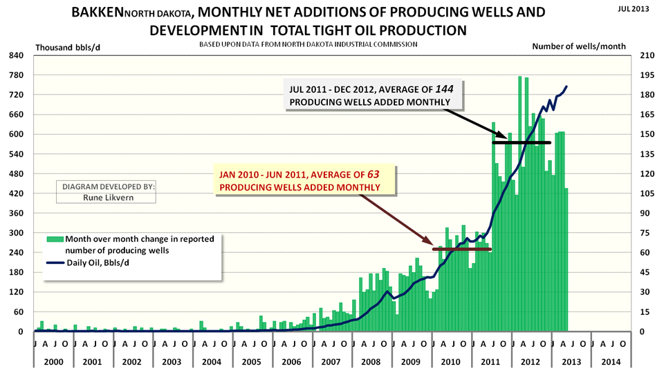
FIGURE 1: The chart above shows monthly net additions of producing wells (green columns plotted against the rh scale) and development in oil production from Bakken (ND) (thick dark blue line lh scale) as from January 2000 and as of May 2013.
In May 2013 production was 745 kb/d and between January 2013 and May 2013 average shale/tight oil production from Bakken/Three Forks was 716 kb/d.
This post presents statistical analysis about normal distributions of wells by productivity {first full 12 months (year 1) and 24 months (year 2) of total reported flows)}. Further it presents results from regressions, correlations, and moving averages analysis of the studied wells and an update on the simulations of production based upon number of actual wells added monthly and production data as of May 2013 from North Dakota Industrial Commission (NDIC).
Finally a little about well economics and some general observations related to how Net Present Value/Internal Rate of Return (NPV/IRR) and DEBT may shape companies’ strategies for future developments in tight/shale oil plays.
The attractiveness of shale oil (and gas) comes from the manageable and limited capital expenditures for a well and the short investment periods. Shale developments thus offer great flexibilities for CAPEX adjustments with movements in the oil/gas price, developments in cost and well productivity.
MODELED VERSUS ACTUAL PRODUCTION
The developments in total production from tight oil and gas in a short time span have been unprecedented and truly amazing.
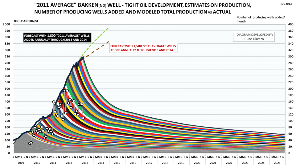
FIGURE 2: The colored bands show total production (production profile for the “2011 average”/reference well multiplied by net number of wells added during the month) added by month and its projected development (lh scale). The white circles show net added producing wells by month (rh scale). The thick black line reported production from Bakken (North Dakota) by NDIC (lh scale).
The chart also shows forecast developments for total oil production with respectively 1,500 (red dotted line) and 1,800 (light green dotted line) reference wells added annually through 2013 and 2014.
The model was calibrated to start simulations as from January 2010.
NOTE: Since my last post about Bakken more wells were added to the data bases and all the wells were crosschecked against data on total production from the formations. This led to an upward revision of the “2011 Average”/reference well with about 1% which now is at 85.2 kb oil for the first 12 months of flow. This improved the accuracy of average modeled versus actual production to less than 1% for the period January 2011 - May 2013.
The “2011 average” well also serves as a reference well and so far in 2013 average modeled production follows actual reported production from NDIC within 1%.
Any divergences developing between modeled and actual production may over a period of months give early indications about directional changes to average well productivity.
The forecasts with 1,500 and 1,800 (“2011 average”) reference wells added through 2013 and 2014 also serve as additional references that may be indicative of directional changes in average well productivity.
If the model over time develops a growing deficit against actual reported production, this would suggest that newer wells have an improved well productivity relative to the reference well and vice versa.
The chart shows a deficit between modeled and actual production during 2010 which also demonstrates higher average well productivity in 2010.
ESTIMATED CASH FLOWS
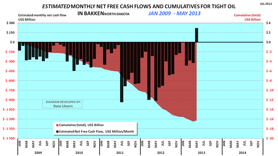
FIGURE 3: The chart above shows an estimate of cumulative net cash flows post CAPEX for tight oil from Bakken (ND) as from January 2009 and as of May 2013 (red area and rh scale) and estimated net cash flows post CAPEX for the same months (black columns and lh scale).
Assumptions for the chart are WTI oil price (realized price), average well cost starting at $8 Million in January 2009 and growing to $10 Million as from January 2011. All costs assumed incurred as the wells were reported starting to flow (this creates some backlog for cumulative costs as costs in reality are incurred continuously as the wells are manufactured) and the estimates do not include costs for completed non- flowing and dry wells.
Economic assumptions; royalties of 15%, production tax of 5%, extraction tax of 6.5%, OPEX at $4/Bbl, transport (from wellhead to refinery) $12/Bbl and interest of 5% on debt (before any corporate tax effects).
Estimates do not include any effects from hedging, dividend payouts, retained earnings and income from natural gas/NGPL sales (which now and on average grosses around $3/Bbl).
Estimates do not include investments in processing/transport facilities and other externalities like road upkeep etc.
As from January 2009 and through May 2013 an estimated $17-$20 billion is literally present as “capital in the ground”. There are now good reasons to believe that all this capital will be recovered and the investments will provide acceptable overall profits.
The chart may however raise questions about how much additional debt the companies are willing and/or capable to take on, and the prospects for continued debt access. Companies are normally aware that at some level their debt overhang could expose them to liquidity crunches in periods with lasting lowered oil prices.
An estimate for total CAPEX is obtained by adding an estimated total net cash flow of $30 billion from operations as from January 2009 through May 2013. This does not include capital spent for acreage acquisitions and investments in processing, gathering and transport systems for oil and natural gas.
A LITTLE ABOUT NPV/IRR AND DEBT
- What I found was that there are lots of financial considerations to be made about future developments in shale and the optimum financial solution appears to be about getting right the expectations for future developments in the oil price, quality of acreage (location, location, location), anticipations of future aggregate demand for goods and services for well manufacturing and thus cost developments, and not least the companies’ remaining capacities to take on additional debts.
The oil companies are in the tight/shale oil/gas business to make profits and grow their financial wealth by extracting oil and natural gas from the ground and selling it. The oil companies use several economic parameters in their planning processes which shape their development strategies.
The most important is Net Present Value (NPV, or the time value of money) or Internal Rate of Return (IRR).
The scale of present shale developments in Bakken (ND) require high CAPEX flows which so far have been met from growth in net cash flows from operations and at times an accelerating and growing use of debt and/or other outside sources for financing. The impression left from quarterly/annual reports showing high and growing profits may be somewhat deceptive if the external funding that has also has been used to make growth in tight oil production happen is not included. By looking at the financial statements for some companies it was found that growth in tight oil production had been facilitated by considerable growth in debt. A company can only take on so much debt before its financial resilience becomes threatened by even moderate declines in the oil price.
Even with lowered well costs the oil companies have to exercise strict budget controls.
By running several simulations for a generic oil company to find the best way (most profitable) to develop its remaining acreage, provided it holds its acreage by production, a somewhat interesting phenomenon was observed. Under equal assumptions the slightly more profitable strategy was a development with continued growth in production and debt.
However the differences between a continued growth and a plateau (provided the plateau had reached some size) development was not found to be significant enough to exclude any alternatives solely by using NPV. For that the NPV differences were too small considering all other uncertainties. In other words the alternatives were for all practical matters NPV neutral.
The growth strategy would also expose the company to growth in debt and sustain (or increase) the pressures in the delivery chains for goods and services for well manufacturing and thus contribute to cost inflation.
With the prospects that drilling for shale gas will pick up as the present North American oversupply in natural gas has been burnt through, this could further amplify cost inflation for well manufacturing sometime in the near future.
The plateau alternative offers the prospect of reducing aggregate demand for goods and services for well manufacturing and thus potentially contributes to reduced cost inflation and improved profitability.
The plateau alternative also offers the prospect for a faster and gradual reduction in total debt, which improves the companies’ financial resilience towards sustained lowered oil prices and lowers costs for debt services.
The oil price is the most important factor governing the shale developments. If expectations are for a higher future oil price, this would also favor the plateau development.
From what I found it looks as if NPV and DEBT also may be considered as the ”Red Queen’s” invisible helpers.
DISTRIBUTION OF WELLS AND DEVELOPMENTS IN PRODUCTIVITY
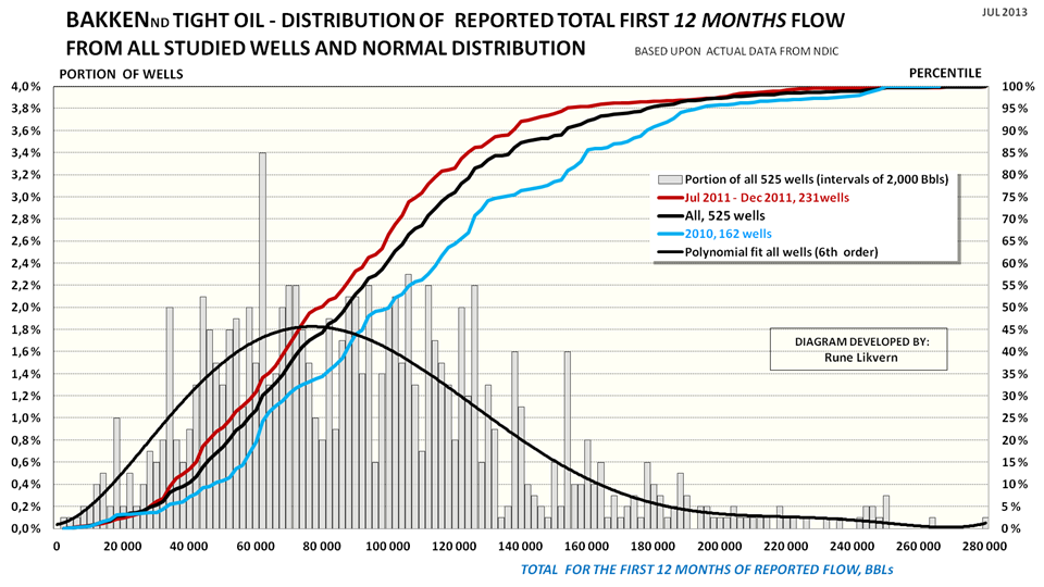
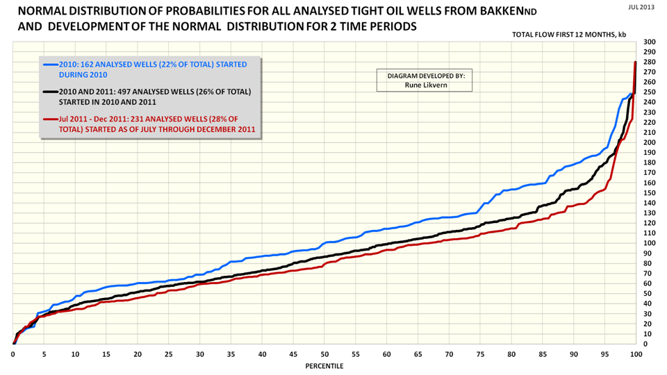
FIGURE 4: The chart above shows distribution and normal distribution of the first 12 months total flow for the 525 tight oil wells from Bakken (ND) subjected to full time series analysis. The intervals used for the distribution (grey columns, lh scale) in the chart are 2,000 Bbls and also shown is a polynomial fit of 6th order (black line, lh scale).
The chart also shows the normal distribution (plotted towards the rh scale) of the first 12 months total flow for the 525 wells (black line), the normal distribution for the first 12 months total flow for the studied wells for 2010 (162 wells, blue line rh scale) and the normal distribution of the first 12 months total flow for the studied wells started in H2 2011 (Jul 2011 - Dec 2011, 231 wells and red line, rh scale).
How to read the chart: The grey columns show the distribution of total first 12 months production for all 525 wells with full time series (lh scale).
The black line shows the normal distribution for all the studied wells, 50% had a first 12 months flow of around 86 kb or lower. Alternatively 50% of the wells had a first 12 months flow around 86 kb or higher.
Of the studied wells for 2010, 5% of the wells had a first 12 months flow around 193 kb or higher.
See also figure SD2 for an alternative presentation.
The chart shows the development in the normal distribution for well productivity (first 12 months total flow) and that the well productivity has declined (the lines for the normal distribution have moved to the left).
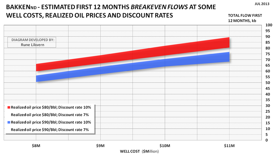
An alternative way to solve the equation for breakeven cost is to solve it for breakeven flow at some oil prices, discount rates and well costs. This was done and is shown in figure SD1. If the well cost is $9Million and (average) realized oil price is $90/Bbl, the commercial prognosis for the well appears acceptable with a first 12 months (year 1) total flow of around 60 kb and first 24 months (year 2) total flow around 100 kb.
From the chart in figure 4 it can be found that for 2010 around 20% of the wells had a first 12 months total flow at or below breakeven. For H2 2011 this portion had grown to 30%. Wells that are below breakeven and do not meet expectations to returns will have to be carried by the better wells.
The portion of the wells below breakeven does not represent a similar portion of total flow.
The movements of the lines for the normal distribution illustrates that tight oil with time has become tighter in another sense.
See also SUPPLEMENT DOCUMENTATION for more about studied wells with 12 and 24 months or more reported flows.
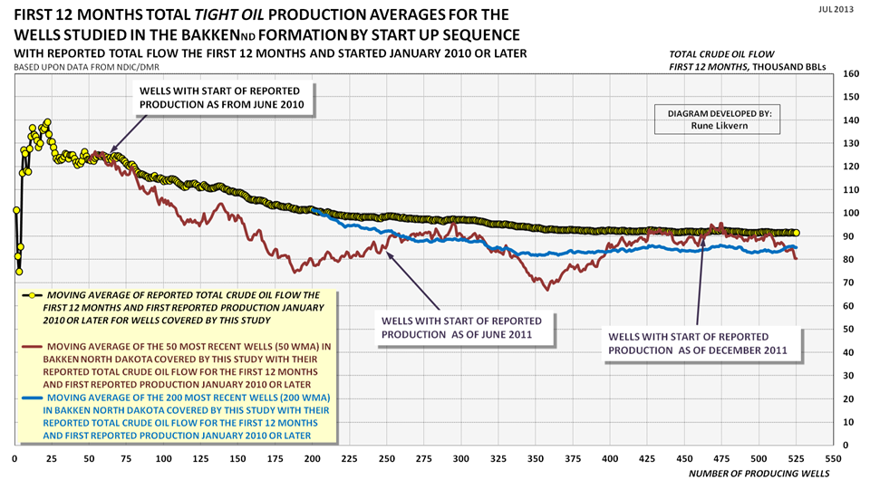
FIGURE 5: The chart above shows development in the sequential moving average of reported total flow for the first 12 months for wells studied and that was started as of January 2010 and through January 2012 (yellow circles connected by black line).
For 2010 and 2011 this represents around 26% of the wells started in the period.
The dark red line shows the sequential moving average of the most recent 50 wells (50 WMA; 50 Wells Moving Average). The blue line shows the sequential moving average of the most recent 200 wells (200 WMA; 200 Wells Moving Average).
The chart above documents that average well productivity has declined and stabilized at an average first 12 months total flow around 85 kb. Simulations with the reference well, (see also figure 2), now strongly suggests that the average well productivity has remained at this level through May 2013.
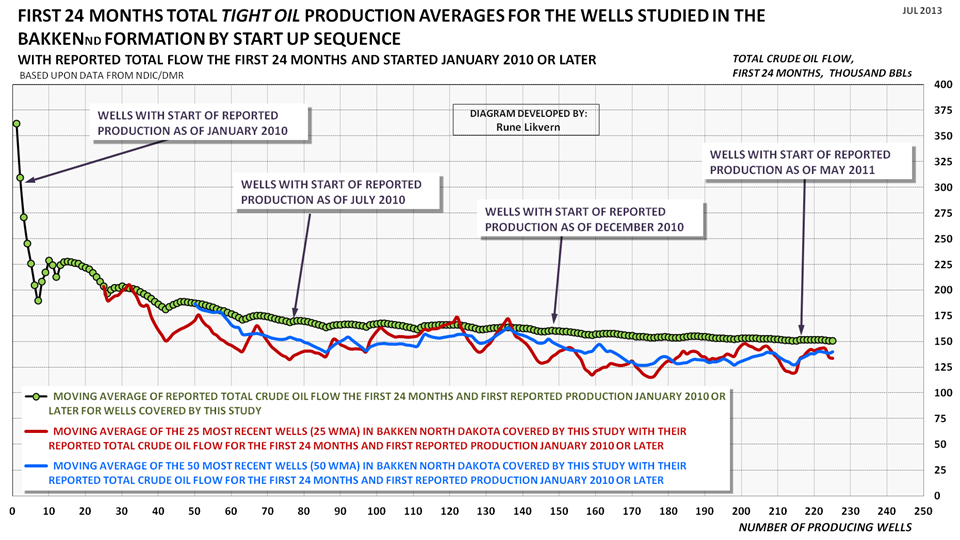
FIGURE 6: The chart above shows development in the sequential moving average of reported total flow for the first 24 months for the wells studied and that was started as of January 2010 and through May 2011 (green circles connected by black line). The dark red line shows the sequential moving average of the most recent 25 wells (25 WMA; 25 Wells Moving Average). The blue line shows the sequential moving average of the most recent 50 wells (50 WMA; 50 Wells Moving Average).
This represents around 21% of the wells started in the period.
After 2 years (24 months) of flow the pattern remains that of a general decline in total production for newer wells.
SUPPLEMENT DOCUMENTATION
All the wells studied have full time series with production data that was crosschecked against their totals by formation.
BREAKEVEN FLOWS
Breakeven costs may be a familiar term for most readers. However it is also possible to solve the equation to determine breakeven flows for shale/tight gas/oil wells.
FIGURE SD1: The chart above shows estimates from the equations solved on total number of barrels of oil for the first 12 months of flow to make breakeven at some well costs, realized oil prices and discount rates. Other economic assumptions as presented with figure 3.How to read the chart: If the well cost is $9 Million and (average) realized oil price is $90/Bbl, the commercial prognosis for the well appears acceptable with a first 12 months total flow at 60 kb and above.
For the lower oil price of $80/Bbl (all other things remaining equal) the breakeven flow for the first 12 months moves up to around 70 kb.
Total early flow has the biggest influence on the NPV/IRR.
The chart above also illustrates how sensitive the commerciality of the well is to flow, oil price and well costs.
NORMAL DISTRIBUTION FOR ALL STUDIED WELLS
FIGURE SD2: The chart above is likely a more familiar representation for normal distribution of probabilities of productivity for the wells than what is shown in figure 4. The black line represents all the studied wells, the blue line shows the studied wells that started in 2010 and the red line the wells started H2 2011 (July - December 2011).How to read the chart: The black line shows the normal distribution for all studied wells. It shows that 30% of all the wells had a first 12 months total flow of 60 kb or less. Alternatively 70% of the wells had a first 12 months total flow of 60 kb or more.
The chart documents how well productivity has declined from 2010 to H2 2011. Simulations with the reference well show that average well productivity has remained stable through May 2013 (see also figure 2).
WELLS WITH 24 MONTHS OF FLOW OR MORE
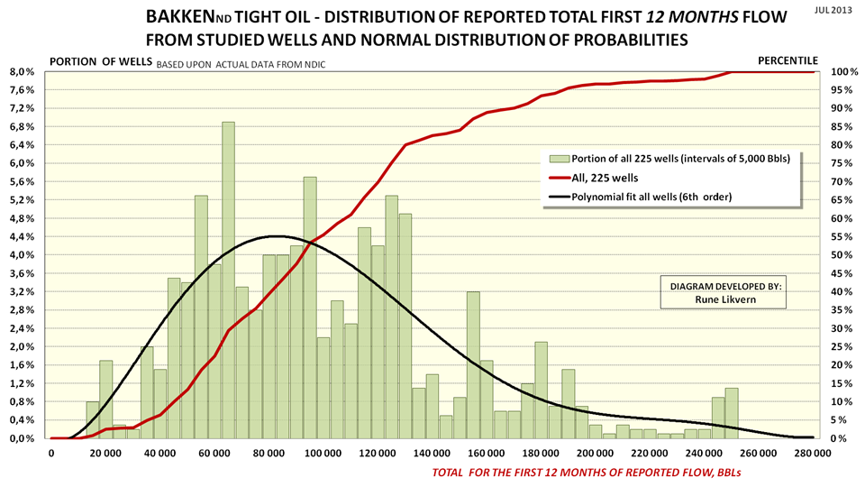
FIGURE SD3: The chart above shows distribution and normal distribution of the first 12 months total flow for the 225 tight oil wells in Bakken (ND) subjected to full time series analysis that as of April 2013 had 24 months or more of reported flow (these are wells started as from January 2010 through May 2011). The intervals used for the distribution (green columns, lh scale) in the chart are 5,000 Bbls and also shown is a polynomial fit of 6th order (black line, lh scale).The chart also shows the normal distribution (plotted towards the rh scale) for the first 12 months total flow for the 225 wells (black line).
How to read the chart: The green columns show the distribution of first 12 months total production for all 225 wells (lh scale).
The black line shows the normal distribution of probabilities for the 225 studied wells, 50% had a first 12 months total flow around 86 kb or lower. Alternatively 50% of the wells had a first 12 months total flow around 86 kb or higher.
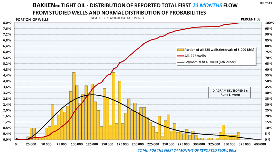
FIGURE SD4: The chart above shows distribution and normal distribution of the first 24 months total flow for the 225 tight oil wells (shown above in figure SD3) in Bakken (ND) subjected to full time series analysis that as of April 2013 had 24 months or more of reported flow (these are wells started as from January 2010 through May 2011). The intervals used for the distribution (orange columns, lh scale) in the chart are 5,000 Bbls and also shown is a polynomial fit of 6th order (black line, lh scale).The chart also shows the normal distribution (plotted towards the rh scale) for the first 24 months total flow for the 225 wells (black line).
How to read the chart: Apply same principles as described with figure SD3.
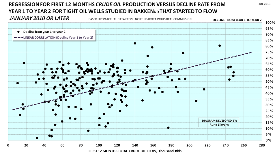
REGRESSION ANALYSIS OF DECLINE RATES FROM YEAR 1 TO YEAR 2
FIGURE SD5: The scatter chart shows decline rates with a linear regression for tight oil wells from year 1 to year 2 for 225 wells that started as from January 2010 and through May 2011 that had a history of 24 months of production or more as of April 2013.A total of 1,070 wells started to produce during the abovementioned period that met the criteria.
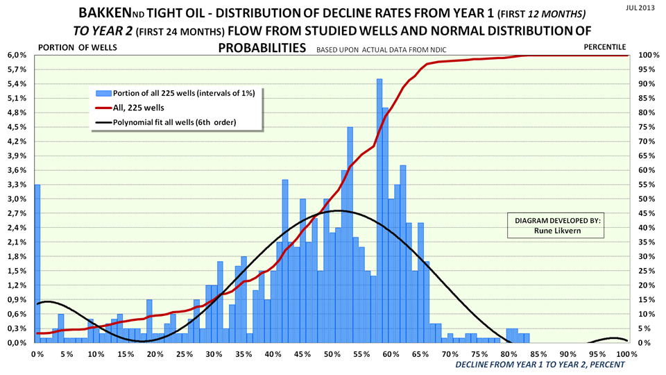
NORMAL DISTRIBUTION FOR DECLINE RATES FOR THE STUDIED WELLS
FIGURE SD6: Chart shows distribution of decline rates (blue columns, lh scale) from year 1 to year 2 at 1% intervals for the 225 wells (out of a total of 1,070) that was studied.Also shown is the normal distribution of probabilities (red line) for decline rates from year 1 to year 2.
Note: a few wells (around 3%) had negative declines (growth) from year 1 to year 2.
Dry wells and wells shut in with less than 24 months flow are not included.
How to read the chart: 50% of the wells had decline rates (year 1 to year 2) at 50% or below, the other 50% had decline rates that ranged from 50% upwards to 85%.
Contact
- Content: editors at theoildrum dot com
- Tech support: support at theoildrum dot com
License

This work is licensed under a Creative Commons Attribution-Share Alike 3.0 United States License.
Incredible to see the decline rates in SD6. Half of the wells studied are declining by 50-85% in the first 12 months. 30% of wells are declining at rates of over 60% in the first year. Assuming the best wells have been tapped first I would be surprised if ND production rose as fast as it has been for much longer.
Charts SD5 shows how decline from year1 to year 2 develops with first year flow. In general the higher the first year total flow, the higher the decline rate.
So the lower the first year total flow the lower the decline rate. Is it then likely that EUR of wells with lower total first year flows would be "much" more than the EUR of the wells with a higher first year total flow? If so then perhaps the Bakken production tail will be fatter than what many of us might have presumed?
As figure SD5 shows the decline rate is all over the place, the general trend is shown by the linear fit (regression line).
Many of the wells are still “young” and many EUR estimates are now curve fitting exercises, so I would like to see longer time series with actual production data.
There are wells that “surprises” to the upside as they grow older and vice versa. There may be several reasons for this, like restimulation, geology etc.
What I observed was that wells with, “only average first year flows”, often had a total flow after 2 years very close to wells that had a much higher first year flow. How this develops after 3, 4 years etc. remains to be seen.
The perfect well for an oil company would be one that gave away 90% of its EUR in 2 years. Geology and physics will constrain that for happening.
If we should go by actual production data for the 2-3 first years of flow an “average” well may due to lower decline rates contribute to a fatter tail. Wells come in all kinds of designs and productivities and there are lots of discussions about later life decline rates and little actual data.
May I paraphrase that? I would say, "The faster the oil company can get the darned stuff out of the ground (given a fixed quantity available), the lower the cost for ongoing labor and maintenance. Therefore, a 2-year well is financially better than a five year well, ultimate production being equal."
Craig
Yes, but . . . where it gets more interesting is if one has low operating costs, with onshore shallow crude oil production, it might be worthwhile in the longer term to produce the oil over a longer time period, if one is expecting a continued cyclical pattern of higher annual oil price highs and higher annual oil price lows.
Well, heck, if you're confident that prices will be higher in the future, all you have to do make a lot of money is go long in the futures market.
Oil traders lost a great tool, when Yergin stopped making future oil price predictions. As a general rule, oil prices tended to trade at about twice Yergin's predicted price, within one to two years of his prediction.
But in any case, as an oil producer, I would benefit from a cyclical pattern of higher annual oil price highs and higher annual oil price lows.
Sure, but are you going long in the market??
What I would like is a chart that says "what percentage of a well's total lifetime production must be sold to pay for the cost of drilling the well?" From what I'm seeing on these charts, it looks like about half the total lifetime production of these wells must be sold just to pay for the well. And that doesnt even include all the dry wells?
"what percentage of a well's total lifetime production must be sold to pay for the cost of drilling the well?"
Do you mean EUR (Estimated Ultimate Recoverable)?
About 50% of the EUR for the typical/average well is produced during the first 5-6 years of the wells life.
But not these wells right? After 5 years and a 50% decline rate, these things would have to be pretty much gone after 5 years.
Year 1: 100000
Year 2: 50000
Year 3: 25000
Year 4: 12500
Year 5: 6250
Year 6: 3125
Year 7: 1563
That's like one barrel per minute. At what point do they stop pumping?
Normally the relative decline rate tapers off with the years, like;
Year 1: 50%
Year 2: 40%
Year 3: 30%
Year 4: 20%
Year 5: 6-10%
.
Year N: 6-10%
The wells will be kept in production as long they have positive cash flows (there are exceptions of course), i.e. the wells income covers its operating expenses.
One barrel per minute =1,440 Bbl/d (if you know of such a well, let me know) ;-)
How likely is it that we will see stripper wells in the Bakkan fields after the boom? I drive around south Texas all the time, and the landscape is littered with them, sedately pumping a few bbl per day. I have heard that this would not be feasible with fracked, tight oil.
Craig
Simplest model for flow rates is diffusion, which has an initial fast transient followed by a slower decline. The total amount of oil collected by diffusional processes is ultimately determined by the volume and spatial extent of the underlying reservoir.
The difference between the conventional stripper wells and these fracked wells is that the underlying reservoir volume is simply not there for fracked areas. This makes perfect sense since they are only collecting oil from cracks and fissures in the shale, and that is a fraction of the pore space that is available in conventional reservoirs. Thus, conventional reservoirs can turn into strippers that provide flow for years as the oil migrates from a heftier volume with greater porosity, allowing the oil a greater diffusion coefficient and allowing it to travel a greater distance. So a trickle on a huge potential volume is much more reliable than a trickle off of a marginal reservoir. That's why fracked wells won't turn into strippers.
These are interesting homework problems in the math of diffusion, and I am continually amazed that it takes relative amateurs to point this out as the supposed experienced geologists are nowhere to be found on this subject.
Well, would it look like this?
Initial flow rate 100
Year Decline
1 50%
2 50%
3 30%
4 20%
5 8%
6 8%
7 8%
8 8%
9 8%
10 8%
11 8%
12 8%
13 8%
14 8%
15 8%
16 8%
17 8%
18 8%
19 8%
20 8%
21 8%
22 8%
23 8%
24 8%
25 8%
26 8%
27 8%
28 8%
29 8%
30 8%
Year Year end flow rate
1 50.00
2 25.00
3 17.50
4 14.00
5 12.88
6 11.85
7 10.90
8 10.03
9 9.23
10 8.49
11 7.81
12 7.19
13 6.61
14 6.08
15 5.59
16 5.15
17 4.74
18 4.36
19 4.01
20 3.69
21 3.39
22 3.12
23 2.87
24 2.64
25 2.43
26 2.24
27 2.06
28 1.89
29 1.74
30 1.60
Year Average flow rate:
1 75
2 37.50
3 21.25
4 15.75
5 13.44
6 12.36
7 11.38
8 10.47
9 9.63
10 8.86
11 8.15
12 7.50
13 6.90
14 6.35
15 5.84
16 5.37
17 4.94
18 4.55
19 4.18
20 3.85
21 3.54
22 3.26
23 3.00
24 2.76
25 2.54
26 2.33
27 2.15
28 1.97
29 1.82
30 1.67
Year Cumulative production
1 75.00
2 112.50
3 133.75
4 149.50
5 162.94
6 175.30
7 186.68
8 197.15
9 206.77
10 215.63
11 223.78
12 231.28
13 238.18
14 244.52
15 250.36
16 255.73
17 260.67
18 265.22
19 269.40
20 273.25
21 276.79
22 280.05
23 283.04
24 285.80
25 288.34
26 290.67
27 292.82
28 294.79
29 296.61
30 298.28
This touches on the exponential versus hyperbolic decline rate debate for shale play wells. Most of the industry assumes a steadily slowing decline rate, i.e. hyperbolic, which results in a more optimistic EUR per well estimate. I think that Art Berman is modeling most of the plays using a two step exponential model, i.e., a fast exponential decline, and then a slower exponential decline.
In the Barnett Shale Play, two recent studies, one by the USGS and one by the Texas Bureau of Economic Geology (BEG) basically bracketed Art's number for average horizontal EUR in the Barnett Shale (1.3 BCF). USGS was slightly lower, BEG was slightly higher. The industry has generally been claiming an average EUR of about 2.5 to 3.0 BCF.
As noted down the thread, the 2007 vintage wells on the DFW Airport Lease provide us with an interesting case history. The wells that Chesapeake said would produce for at least 50 years had declined by 95% in only five years, and 10 of the 21 wells were already plugged and abandoned only five years later.
My guess is that at least 90% of the Bakken wells currently producing will be down to 10 bpd or less, or will be plugged and abandoned, in 10 years.
Following is an excerpt from a February, 2013 Fort Worth Star Telegram article on the preliminary version of the Bureau of Economic Geology (BEG) report on the Barnett Shale (apparently the final report, or at least the summary of same, did not address average per well EUR).
Report questions long-term productivity of gas wells in Barnett Shale
(For link, search for above title)
Remarking on natural gas, it turns out an underestimated amount of gas is being flared on the Bakken.
http://thinkprogress.org/climate/2013/07/29/2373991/report-emissions-fro...
And this gas is 30 times less valuable than the oil, illustrating why it is flared. Imagine now that if what Rune says that the oil is only marginally profitable, then the gas is barely worth recovering.
As for the models of gas decline rates, most of the industry relies on heuristics, and the heuristics are obviously different for fracked gas reservoirs, just as they differ for the fracked oil.
Rune,
Do you have any numbers on how many wells have already been plugged and abandoned in the Bakken Play since 2008?
In any case, if we use a, IMO a conservative, estimated 10%/year decline rate in existing overall US crude oil production, then in order to maintain the 2013 US annual crude oil production rate, the industry would have to put online the productive equivalent of every oil field in the United States of America, over the next 10 years. Or, assuming a 2013 annual crude oil (C+C) production rate of 7.5 mbpd, the industry would have to add the current productive equivalent of the Bakken Play every single year, in order to maintain a crude oil production rate of 7.5 mbpd.
A shale gas play case history from the Barnett Shale Play, in Texas, follows.
(MMCFPD = mmcfpd = million cubic feet per day, cfe refers to natural gas + natural gas liquids converted to gas equivalent).
A couple of items follow, emphasis added, from 2007 regarding Chesapeake's DFW Airport Lease, in the Barnett Shale Play.
In 2007, Chesapeake estimated that late 2011 production from the lease would be up to 250 MMCFPD, and they estimated that production would continue for at least 50 years. In 2007, they also said that the lease " likely contains one of the thickest and best-developed reservoir facies anywhere in the play."
Actual late 2011 production from the lease, based on some data that Art Berman sent me, was only about 35 MMCFPD. Of course, the sharp decline in gas prices had an impact on drilling, but it's interesting to take a look at how the wells that Chesapeake drilled and completed on the lease in 2007 have done over the past few years. (That info is found below.)
Chesapeake Announces First Natural Gas Production from Dallas/Fort Worth International Airport Lease with Initial Sales of 30 mmcfe Per Day from First 11 Barnett Wells (October, 2007)
(Search for above title for link)
And here is an item from the July, 2007 American Oil & Gas Reporter:
Chesapeake Images Barnett Shale Beneath DFW Airport
(Search for above title for link)
Update on Wells Completed in 2007
Production data that Art Berman sent me showed DFW Airport production of 52 MMCFPD in January, 2008, which would presumably be attributable to the 21 wells drilled and completed in 2007. Some data that Rockman sent me show that the wells still producing from the 2007 group produced 2.6 MMCFPD in April, 2013 (with 10 of the 21 wells already having been plugged & abandoned).
This is about a 95% simple percentage decline in a little over five years, or an exponential decline rate of about 60%/year in monthly production (2007 wells only).
Total cumulative production from the 21 wells completed in 2007, based on Rockman's data, appears to be 16.5 BCF, or about 0.8 BCF per well, after a 95% decline in production from January, 2008. Note that Art Berman puts the average EUR per well on the DFW Airport Lease at about 0.9 BCF per well.
It does seem that Chesapeake's proclamation that the DFW Airport gas wells would produce gas for at least 50 years is a "little" on the optimistic side, especially since about half of the wells that they publicized in 2007 have already been plugged and abandoned. Odd that they did not issue a press release about that.
Here's a thought experiment. Assume that the 21 wells they put on line on the DFW Airport Lease in 2007 were the total gas supply for the country. In a little over five years, our total gas supply would have dropped by 95%. This is the revolution that will power us to a virtually infinite rate of increase in oil and gas production?
A recent Citi Research report confirms much of what Art Berman and David Hughes have been saying about shale plays. Citi Research puts the decline rate from existing US natural gas production at about 24%/year. So, based on this decline rate, all we have to do in order to maintain a constant US dry natural gas production rate of 66 BCF/day over the next 10 years is to put on line, over a 10 year period, the equivalent of the peak production rate from 30 Barnett Shale Plays. The Citi Research report also implies that the industry has to replace about 100% of current US natural gas production over the next four years, in order to maintain constant production. Consider that for a moment--the industry would have to replace the productive output of every US natural gas source, from the Gulf of Mexico to the Bakken, in a four year period, in order to maintain the current natural gas production rate.
As of now I do not have data on any number of wells plugged and abandoned in Bakken since 2008.
Of the wells I studied with full time series that started as from January 2010, I found no well getting plugged and abandoned as of May 2013.
That's a similar mistake to Maugerie when you talk about decline rates. Decline rates only apply to wells that are in decline. You can't apply them to the entire US production and assume we need to replace 750kb year after year. You need to work out how much of US wells are in decline first, then apply your decline rate to them, and also account for wells that are increasing in production etc, etc.
I completely disagree, and in any case it's a concept that ExxonMobil uses. A few years ago, they put the overall annual decline rate from existing wellbores worldwide at between 4%/year to 6%/year. The question is, how much would annual US crude oil production fall from 2013 to 2014, if no new wells were completed in 2014? This would be the year over year overall decline from existing wellbores.
If we assume that the overall decline rate from existing wellbores was about 5%/year in 2008 (when US crude oil production was 5.0 mbpd) and use, IMO a conservative estimate of 10%/year in 2013, and assume an annual US crude oil production of about 7.5 mbpd in 2013, the annual volume of oil lost to production declines from existing wellbores would have risen from 0.25 mbpd in 2009 to about 0.75 mbpd in 2014. And of course, this is why Peaks Happen. For a while, production from new wells more than offsets the declines from existing wells, but in a finite world that can't go on forever.
In any case, the North Dakota + Texas boom is not the first post-1970 increase in US crude oil production that we have seen. Alaskan crude oil production increased at 20%/year from 1976 to 1988 (causing an overall increase in US crude oil production), and at that rate of increase in less than 10 years the US would have been crude oil self-sufficient, but the inevitable happened, and Alaskan production started declining in 1989. I suspect that are currently seeing a continuation of this "Undulating Decline" pattern in post-1970 US crude oil production.
So roughly estimated, when will the US shale/tight oil peak? I assume conventional US oil production is already in decline.
Can someone tell me what all of these means? For example, does Figure 3 really say that they've been losing money in the Bakken for the past 4 years and only recently just went cashflow positive? If so, I can't imagine this is a real profitable businesses since the early wells will start going dry soon.
What figure 3 shows are estimated monthly net cash flows and cumulative as from January 2009.
It is not possible to deduce anything about overall profitability from the chart.
The point is to illustrate that so far developments in Bakken has relied upon external funding of some form, most likely debt.
Neither is it possible to say anything about future monthly net cash flows as this will be dependent upon primarily future well additions and the oil price.
If future monthly net cash flows again goes negative, that suggests continued use of external funding. There is a limit for how much external funding the oil companies can apply or their debt capacities.
Some companies in Bakken now appear to primarily use net cash flow for drilling new wells and have thus reduced their number of rigs.
Is the $450 million increase in cash flow from Apr-May 2013 real or an artifact?
Comparing Fig. 1 and Fig. 3 does not show another event of similar size.
It is an estimate (all months are) and real as far that goes, primarily a result from higher oil prices, growth in total production and fewer net producing wells added as reported by NDIC/DMR.
See also my comment above and assumptions used listed with the charts.
One quick note.
Average production per well in North Dakota peaked in December 2012, at 96 barrels/day/well. The highest since 1953. It has since dropped a couple of barrels/day/well.
Also, the # of active drilling rigs has declined to 179 a couple of days ago, the lowest in several years. (Since back up to 181).
The bloom is off the rose in the Bakken.
Alan
Regarding FIGURE 3: ESTIMATED CASH FLOWS
Assumptions for the chart are WTI oil price (realized price), average well cost starting at $8 Million in January 2009 and growing to $10 Million as from January 2011.
So who is right? $10 million per well or $5.9 million?
Can you cite your sources for well prices please?
Welcome to The Oil Drum RetronymMermaid (account created less than 2 hours ago).
Carrol county is that one county in North Dakota? Or is it the Utica shale in Ohio you refer to?
This post is about Bakken, North Dakota and there is a huge spread in costs due to geographical reasons and wells come in all kind of designs depending on depth, length of laterals, number of fracking stages etc. so the costs for a well in Bakken are reflected in a range from $6M - $12M. Costs are expected to come down in Bakken.
Some sources to start with;
This article gives some ideas, this and this.
Apart from that data from several company presentations.
Thanks for providing some sources.
They drilled one well for $8.5 million and the next five for $5.9 million each, $8.5million + 5*$5.9million divided by total number of wells six equals to about $6.3 million each in average.
As all wells are drilled from the same pad I guess it cost some money to get the pad in shape and move the equipment there. $8.5 million - $5.9 million equal to $2.6 million but some of it may be because they know what to expect.
Congratulations TOD on another great article. I wanted to say thank you to all current and past contributors to this site on this day that you will be shutting down. You've been around for 8 years which, interestingly enough, has been about as long as my own personal journey along the Peak Oil trail. Books from Matt Simmons, Heinberg and others line my shelves and my browser favourites for "Peak Everything" has slowly grown over time. But at the top (just under JHK) of my favourites list is "TOD". The excellent information you've shared over the years wasn't merely information...it influenced big time how I (and many others) live my life today from the career path I've chosen (energy auditor), to my rooftop solar collector and solar PV's, to my big garden and chicken coop, to my fuel efficient home and truck, and so on.
More than likely I won't be joining many of you on the otherside of the civilization bottleneck looming large ahead of us. One thing I'm sure of is that while Hubbert's curve is smooth the ride on the downside will be anything but. The EROEI going up the Hubbert curve is far higher than coming down. Couple that with rapidly dropping oil exports (as any good TOD reader knows), throw in a couple of other mitigating factors (such as more resources going to protect the remaining resources and climate change damage) and things will be getting a lot uglier much sooner than most people realize.
So to all of those past and present at TOD - "You done good kid!!"
dmiller
The EROEI going up the Hubbert curve is far higher than coming down.
Wind has an EROEI of around 50. Fossil fuel EROEI is declining, but only slowly. Just as importantly, we have a large level of consumption of marginal value (think single passenger SUVs), that can be shifted to investment in alternatives.
I'm more worried about climate change, although the end game is similar - we need to kick the fossil fuel habit ASAP.
Nick,
This is a myth that I have corrected you on previously, please stop repeating it. In Vesta's own documentation on the energy cost of construction, they make a huge error in the energy used in production of steel used in their towers. They only included the energy used in smelting the steel, not the total energy used in mining, transport, smelting, manufacturing, then transporting again.
The real EROEI figure is around 8.
Steel was the only component that I followed up on when checking their figures. I imagine that rigorous analysis on other components would find similar anomalies.
If you could provide *quantitative* documentation of that, I'd be curious to see it. If they really do make that error, I suspect the estimates you're using for the contribution from those other sources are too high.
Still, I'm not primarily relying on Vesta's estimate. Look at Cutler Cleveland's summary of the literature (which I'll attach in a separate comment, to reduce the problem of moderation), which showed that wind's E-ROI was around 19. If you study his sources, you'll see that that most of the studies are quite old. If you look at the turbines used in those studies, you'll see that the turbines studied were much smaller than those in use today - look at Figure 2, and read the discussion. If you study that chart, you'll see a very clear correlation between turbine size and E-ROI. It's perfectly clear that Vestas' claim for a current E-ROI of around 50 is in the correct range.
Finally, an E-ROI of 19 is more than enough. There isn't an important difference between an E-ROI of 20 and an E-ROI of 50. It's like miles per gallon: we're confused by the fact that we're dividing output into input, when we should be doing the reverse, and thinking in terms of net energy. An E-ROI of 20 means a net energy of 95%, while an E-ROI of 50 means a net energy of 98%: there really isn't a significant difference.
Here's the link:
http://www.eoearth.org/article/Energy_return_on_investment_(EROI)_for_wind_energy
You are quite wrong. Adding mining for iron ore & coal and transportation does NOT transform 50 to 8, That utterly fails the "smell test"
Wind turbine towers, if the same weight & size wind turbine is used, can be used for a second one before scrapping.
All the steel of the turbines & towers can be recycled very efficiently, with almost no loss. Same for copper & aluminum.
If one takes a long view, the EROEI may be higher due to the ease & efficiency of recycling wind turbines & towers (except the blades).
Alan
The german Wind Power Association claims, that new turbines have a EROEI of 40 without recycling, with recycling og about 60. A source that is still untapped is that many turbines could be operated longer than the 20 years that are the base of these calculations.
So, they calculate that all energy inputs are returned in 6 months.
Do you happen to have a link to documentation in english?
Sorry, only in German (page 13)of the linked document:
http://www.wind-energie.de/sites/default/files/download/publication/z-fa...
They claim to use data of the University Stuttgart. However, I have not found open acess data of their "Institut für Energiewirtschaft und Rationelle Energieanwendung". I would like to see the new studies, that include not only production but also installation and scrapping of the turbines.
... ok - thats as close we get to a Perpetuum mobile-machine - without actually being one. If this claim holds water I foresee "all fossil- and nuke power generation stations " go sleep with the Doo-Doo within a decade or two.
Do I believe that the Doo-Doo will get company from the above mentioned ? No.
Btw - the Doo-Doo is now turned fossil- what a shame.
Good luck and TOD speed to you both. Send word from the farm when you can, I intend to relearn old homing pigeon raising skills as a way of keeping in touch, but I fear it will be for naught as TBTB are raising falcons now as a way to maintain BAU in times of tight oil.
Wait..... It's another month till closing so despair not and save a few more bags of yummys for the DoomCave.
Rune,
I really want to keep following your excellent work on the Bakken, will it be available in English anywhere after TOD flips off the the lights? I sure hope so. Three of four years out your analysis should be bringing the long term picture into much finer focus.
Luke
Hi Luke,
This post admittedly is highly technical, but there is a reason for that which I hope you will soon understand. I have another post about tight oil in Bakken queued for TOD editor’s review which hopefully will make that point.
I also post on my Norwegian blog Fractional Flow. I will not make any promises now about future posts on my Norwegian blog, and if I make and post updates on Bakken those may be in English (alternatively there is Google translate {or similar} whose translations from Norwegian into English makes my ropy English look good in comparison).
Rune
Thanks for the reply Rune
Looking forward to the next post. I believe I followed this one well enough, though I'll be honest and admit I've no idea of the significance of 'polynomial fit...(6th order)'
I do remember you set some specific parameters for the wells you included in your study. In this post you wrote:
NOTE: Since my last post about Bakken more wells were added to the data bases and all the wells were crosschecked against data on total production from the formations. This led to an upward revision of the “2011 Average”/reference well with about 1% which now is at 85.2 kb oil for the first 12 months of flow. This improved the accuracy of average modeled versus actual production to less than 1% for the period January 2011 - May 2013.
What I'm not clear on is whether you added more wells that fit your original parameters after they came online or if you expanded your original parameters to include more wells. Hope I'm being clear. English is my only tongue and it gets plenty ropy from time to time ?-)
Luke
Oh by the way the silence from Great Bear has been deafening. If you recall that is the outfit that hyped it was going to have significant tight oil production on the North Slope by the next year or so. This winter Great Bear's CEO even declined an invitation from the state legislature (to whom he had given extensive presentations a couple years back, right after his new company had leased big chunks of North Slope property abutting the TAPS) to provide his company's input on if/how it would like the state's oil tax structure to be altered. Quite a change in tone since Great Bear partnered up with Halliburton and actually drilled two core holes...change of tone might not be the right way to put it, actually Great Bear now seems to be producing no tone at all.
Luke,
I abide by a simple principle, show me the data/arguments and I will form and/or revise my opinions.
The parameters I set was that the wells subject to the detailed analysis was; wells (in Bakken) started as of January 2010 or later and that had at least 12 months of reported flow or more.
I have no predisposed opinions/biases, I am educated and have always worked and abided by the scientific principles (Like everyone else I am also entitled to beliefs, but that is not what TOD is about and few (if any) would be interested in my beliefs).
I believed the MSM hype about shales until I started looking into the hard data. Most companies PR departments are about perception management and little about facts.
Thing is I continually expand my data bases on Bakken (which is a very time consuming process and done as time allows and doing full time series analysis involves lots of data) and all the data are subject to rigid statistical analysis and checking (quality control, if data cannot be verified they are quarantined until they are) so that they can survive any review by an independent third party. There will always be uncertainties for several reasons and it all boils down to how much deviations should be expected and accepted.
Are deviations of +/- 2% in any direction for shale oil/gas accurate enough?
All random wells (to obtain a significant base for a cross section of Bakken) used for my analysis were selected by an independent third party who was unaware of how the data would be processed. There was no way for me to “cherry pick” wells (I got the well ID and not the data, from there it was to use the data for the well as reported by NDIC) that suited any predisposed conclusion. Data from the wells was processed in a professional manner; dry wells were not included and likewise those with tiny and erratic flow. I tried to avoid being branded as pessimistic or negatively biased, I was likely not pessimistic enough (but the judges are still out on that one).
In my first “Red Queen” post (in September 2012) for Bakken I presented the “average” well (first 12 months total flow, with time series from 200+ wells, most recent well back then started in June 2011; 12 months criteria of reported flow) at around 85 kb, and I was aware there were error bars, but statistics is a great tool. One of the challenges writing to a wider audience is to “simplify” without bargaining on the story of hard data.
The model developed (input revised as data justified) is of great assistance to get an early warning about developments in well productiveness, and so far and over time the model has performed better than expected and last summer it had an accuracy about +/- 1,5%, now it is down to below +/- 1% on flows. This was good enough to establish a good picture about cash flows, which tight oil/gas developments is primarily about and not least good estimates about companies financial positions and outlooks, crosschecking against their balance sheets and financial statements.
Deafening news is that the same as a roaring silence? “They answered my questions with questions”?
Is 40% of 0 better than nothing? ;-)
Rune
I never got the impression that your data was cherry picked, unlike the wells chosen by that Filloon guy who wrote the red queen rebuttal series on his Bakken promo site.
Now that I looked back on your original post I realized I misremembered, what I should have asked was whether you had added wells drilled by companies other than Brigham (now owned by Statoil) Marathon and Whiting as you expanded your data base not whether you had modified the original parameters. The original parameter were just fine and needed no modification, but possibly adding wells from other players (especially the largest, Continental) might have fine tuned the model generated average well.
'Roaring silence' might not be quite the same as 'the silence was deafening' In Great Bear's case there was lots of noise about North Slope shale productions until they started analyzing their core samples. Since then its been 'deafeningly quiet,' not a peep.
The wells I used for the previous and this post was well data from 30 companies and around 90 pools (this from gradually expanding the data base) with the objective to have wells that represent a cross section of Bakken. As wells were added and thus the portion that met the criteria grew, there was small changes to the "average" and how this "average" developed with time.
The "average" well also serves as a reference well in the model and if actual production deviates from modeled this may over some time suggest changes in well productivity. Using the reference well it "undershot" total production during 2010, which was expected as actual well data showed better "average" well productivity during 2010.
Using the "typical" well from others, inasmuch the "typical" represents the average, in the model it was found that these typical wells overshot actual reported production by a wide margin.
There are differences between pools and between companies and where they have their acreage. Apparently the more prolific areas, Parshall, Sanish, Van Hook became first drilled. There are also other "newer" pools that looks promising. As more data becomes available and other methods applied by others to map the "sweet" spots, it as of now appears that the sweet spots has been found.
FWIIW
Presently the rig count in Bakken has come down while the oil price has strengthened.
Mother nature may still have surprises left.
It could be interesting to know why things went quiet from Great Bear. What did they experience?
As you know; Experiences is something one get, right after it was needed. ;-)
Rune
speaking of rig count, this is an interesting chart showing Bakken rig count relative to oil production growth (pulled from the Steven Kopits interview on ASPO-USA)
FYI, an excerpt from an ASPO-USA Commentary I am working on:
Great post Rune- and what little I can grasp from this highly technical post is that tight/oil is not fully what they promised -- I mean abundant local homemade American oil till about 2100ish- or was that just 2010ish ?never mind
When looking around for some Bakken info I came across this interactive site - http://maps.fractracker.org/latest/?webmap=b27a81c0649c43438e834664613ff8f1 - and zooming / playing with Layers I get the impression that "all of Bakken is already in operation" -and knowing that the 2 first years of production takes away about half of the economical extractable volume- its right there >> Houston- we have a problem - we already used all the area - we will be shooting blanks from here on and in..