Is the Typical NDIC Bakken Tight Oil Well a Sales Pitch?
Posted by Rune Likvern on April 29, 2013 - 3:40am
In this post I present the results from dynamic simulations using the typical tight oil well for the Bakken as recently presented by the North Dakota Industrial Commission (NDIC), together with the “2011 average” well as defined from actual production data from around 240 wells that were reported to have started producing from June through December 2011.
This post is an update and extension to my earlier post “Is Shale Oil Production from Bakken Headed for a Run with “The Red Queen”?” which was reposted here.
The use of the phrase “Typical Bakken Well” by NDIC as shown in Figure 01 is here believed to depict what is to be expected from the average tight oil well.
The results from the dynamic simulations show:
- If the “Typical Bakken Well” is what NDIC recently has presented, total production from Bakken (the portion that lies in North Dakota) should have been around 1.1 Mb/d in February 2013, refer also to Figure 03.
- Reported production from Bakken by NDIC as of February 2013 was 0.7 Mb/d.
- Actual production data shows that the first year’s production for the average well in Bakken (North Dakota) presently is around 55% of the “Typical Bakken Well” presented by NDIC.
- The results from the simulations anticipate a slowdown for the annual growth in oil production from Bakken (ND) through 2013 and 2014.
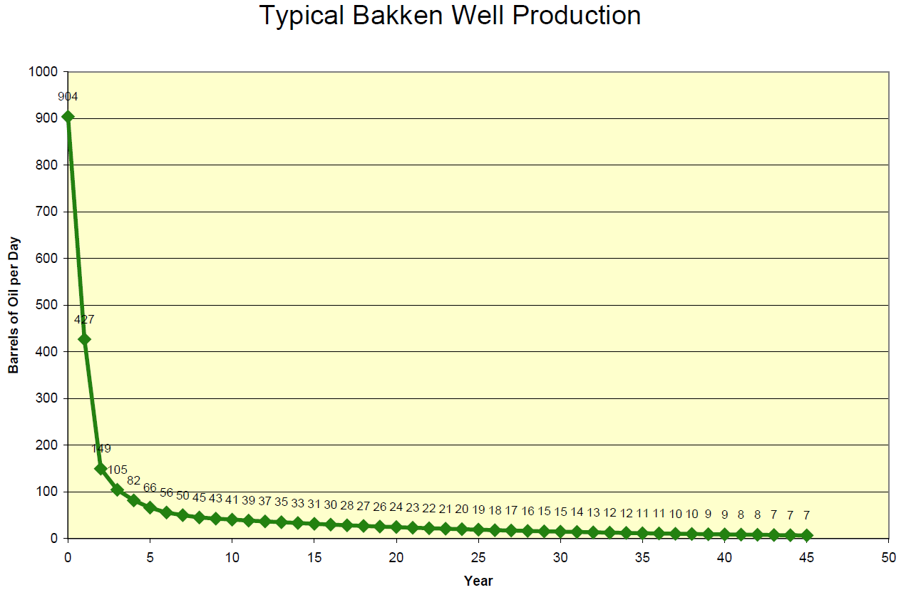
Figure 01: The chart above is taken from the NDIC/DMR presentation Recent presentations “Tribal Leader Summit” 09-05-12 slide no 5 (pdf; 8.7 MB). The chart shows NDIC’s expected average daily oil production by year. The first number (on the y-axis) is the IP (Initial Production) number, and this is followed by the average daily production by year.
The well shown above has a first year total oil production of 156 kb (427 Bbl/d).
Similar well profiles may be found in other NDIC presentations.
In this post the term well productivity is used to describe total tight oil production from a well during the first 12 months of reported production.
In this case, the Bakken refers to tight oil production from Bakken (Sanish, Three Forks) as this is reported by the authorities of North Dakota.
As of February 2013, around 84% of North Dakota’s oil production came from 4 counties; Dunn, McKenzie, Mountrail and Williams. These 4 counties cover an area of around 8 700 square miles of North Dakota’s total area of 70 700 square miles.

Figure 02: The chart above shows monthly net additions of producing wells (green columns plotted against the right hand scale) and development in oil production from Bakken (ND) (thick dark blue line plotted against the left scale) as from January 2000 and through February 2013.
Approximately 1,770 producing wells were added during 2012, in Bakken (ND), but the timing was not distributed evenly throughout the year. The big ramp up began in the summer of 2011. There was an increase in general from 63 to 144 producing wells (more than 120%) on average each month from July 2011 and through 2012. From January 2010 and through June 2011 63 producing wells were added on average each month. During the winter months of 2010/2011 oil production growth slowed as a response to fewer well additions.
The acceleration of producing well additions from the second half of 2011 resulted in a steeper build up of oil production as shown in Figure 02.
With time, and as more actual data is published, more precise estimates of the decline rates will become feasible. In the current analysis the decline rates used beyond 2-3 years after the start of production are the ones derived from the typical NDIC well shown in Figure 01.
Presently there are lively discussions about future decline for tight oil wells that span from moderate declines (beyond year 3) to those who expect tight oil wells in general to become stripper wells 6 to 8 years after they began to produce.
A well producing 10 - 15 Bbls/d is commonly referred to as a stripper well.
Presently the number of actual data for a significant amount of tight oil wells and their later time decline rates (beyond year 2 of the well life) is very limited, and for this reason it was decided to use the decline rates beyond year 2 for the “2011 average” well as these were derived from the typical NDIC well shown in Figure 01.
Decline rates later in well life (beyond year 2) that deviate from what has been used in this study may affect developments in late life total production (decline). The wells’ first year production and net added producing wells were found to be the dominant parameters for development in near term total production.
THE TYPICAL NDIC WELL
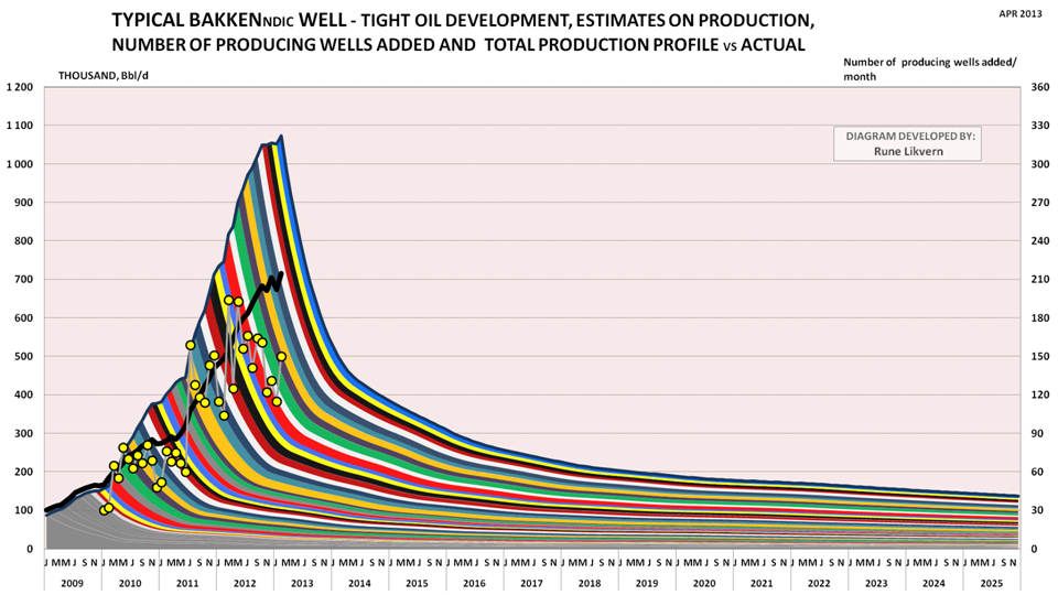
Figure 03: The colored bands show total production (production profile for the typical NDIC well multiplied by net added producing wells during the month) added by month and its projected development (left hand scale). The yellow circles show net added producing wells by month (right hand scale). The thick black line shows actual reported production from Bakken (North Dakota) by NDIC (left hand scale).
The model was calibrated to start simulations as of January 2010.
The results from the simulation show that if the wells added as from January 2010 were like the typical well used in recent presentations by NDIC, total production from Bakken (ND) by February 2013 would have been around 1.1 Mb/d.
The thick black line shows actual production from Bakken (ND) reported by NDIC which was 0.7 Mb/d in February 2013.
If the NDIC typical well represented the “average”, the production build up would have been steeper as shown in Figure 03.
This supports earlier findings that the “average” well yields less than what has been reported, and actual well data from NDIC shows that the first year’s production from the average well presently yields around 55% of the typical NDIC well production used in several public presentations.
THE ”2011 AVERAGE” WELL
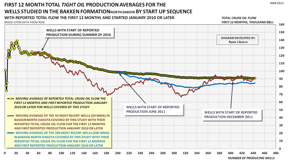
Figure 04: The chart above shows development in the sequential moving average of reported total production for the first 12 months for wells studied and that started to produce as of January 2010 and through January 2012 (yellow circles connected by black line). The dark red line shows the sequential moving average of the most recent 50 wells (50 WMA; 50 Wells Moving Average.The blue line shows the sequential moving average of the most recent 200 wells (200 WMA; 200 Wells Moving Average).
Figure 04 illustrates that the well productivity (as expressed by total oil production for the first 12 months) has been in general decline since the summer of 2010. Presently it appears that the well productivity stabilized around 85 kb during 2011. Simulations with the “2011 average” well suggest now that the level of around 85 kb has been maintained through 2012, refer also to Figure 06.
Through 2012 it was observed from NDIC data that a high number of wells continued to be added in the “sweet spots” (like Alger, Heart Butte, Reunion Bay, Sanish, Van Hook to name a few). In areas/pools with wells that had a lower well productivity than the “2011 average” well, it was found that few or no wells were added during the second half of 2012.
Around 30 pools that show promising/good well productivity were also identified.
Future developments of well productivity
Presently it appears that companies give priority to drilling wells that have the potential to meet targeted returns within the boundaries of (oil) price, (well) costs and (well) productivity. This may cause the average well productivity (as expressed by first year total productivity) to improve for the near term.
More than 870 producing wells were added between June 2011 through December 2011 and the study included more than 230 (more than 26%) of these wells to develop the composite well which in this post is referred to as the “2011 average” well and which is shown in Figure 05.
Of the studied wells that started during 2010 around 14% were equal to or better than the typical NDIC well shown in Figure 01.
Of the studied wells that started during 2011 around 3% were equal to or better than the typical NDIC well shown in Figure 01.
Figure 05: The chart above shows the well profile and cumulative for oil from the “2011 average” well that was derived from 230 wells that started to produce as from June 2011 and through December 2011.
This “2011 average” well was used for the simulations shown in Figures 06 and 07.
Dry wells and wells with tiny and erratic production were not included for the development of the “2011 average” well. These wells were found to be 1 - 2% of the total number of wells studied.
NOTE: The decline from year 1 to year 2 has been derived from actual data (refer to Figure SD2). Decline rates later in the wells’ life according to those derived from the typical NDIC well shown in Figure 01.
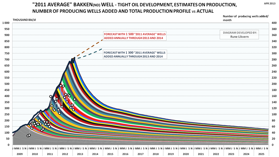
Figure 06: The colored bands show total production (production profile for the “2011 average” well multiplied by net number of wells added during the month) added by month and its projected development (left hand scale). The white circles show net added producing wells by month (right hand scale). The thick black line reported production from Bakken (North Dakota) by NDIC (left hand scale).
The chart also shows forecast developments for total oil production with, respectively, 1 300 (dark blue dotted line) and 1 500 (red dotted line) added through 2013 and 2014.
The model was calibrated to start simulations as of January 2010.
Simulations with the “2011 average” well result in an almost perfect fit with total reported production by NDIC as from early 2011. The model comes in lower than actual production during 2010 and the explanation for this is believed to be due to higher well productivity for wells started during 2010, refer also to Figure 04.
If the model over time develops a growing deficit against actual reported production, this would suggest that newer wells have an improved well productivity relative to the “2011 average” well and vice versa.
SOME FORECASTS WITH THE ”2011 AVERAGE” WELL
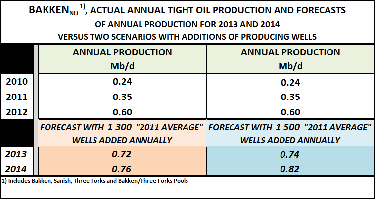
Table 1; Actual annual production and forecasts for tight oil production from Bakken (ND) with 1 300 and 1 500 “average 2011” wells added annually through 2013 and 2014.
NOTE: Forecasts should be viewed in the context of developments in well productivity, (well) costs, (oil) price, decline rates from the “older” population of wells and the strategies the companies deploy as they come to hold acreage by production.
PLATEAU OF 700 kb/d THROUGH 2013
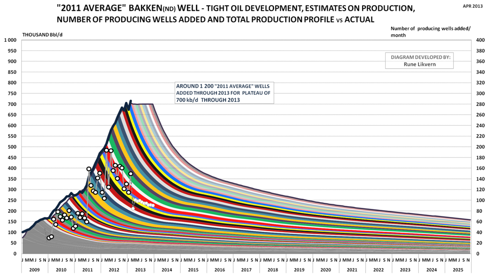
Figure 07: The colored bands show total production (production profile for the “2011 average” well multiplied by net number of wells added during the month) added by month and its projected development (left hand scale). The white circles show net added producing wells by month (right hand scale). The thick black line reported production from Bakken (North Dakota) by NDIC (left hand scale).
The transparent colored bands shows a plateau of 700 kb/d through 2013 and the white (smaller circles) estimated number of “2011 average” wells added each month to sustain the plateau of 700 kb/d.
The model was calibrated to start simulations as of January 2010.
Simulations with the “2011 average” well found that around 1 200 wells were needed through 2013 to maintain a plateau of 700 kb/d. As shown in Figure 07, the number of wells added monthly will decline as a result of a “thickening” production base from a growing population of wells.
TIGHT OIL IN A GLOBAL SUPPLY PERSPECTIVE
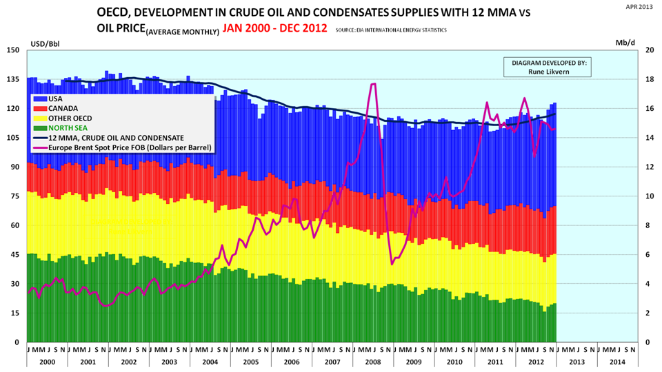
Figure 08: The chart above shows development in crude oil and condensates (C + C) production for OECD split on Canada (red columns), North Sea (green columns), USA (blue columns) and the rest of OECD (yellow columns). (Data from EIA.)
Between December 2011 and as of December 2012 OECD had an annualized growth in (C+C) supplies of 0.71 Mb/d. This growth was facilitated through the rapid production growth from tight oil in USA and from oil sands in Canada that more than offset the decline in oil production from the North Sea and other OECD countries.
As shown in Table 1 a slowdown in the growth in tight oil production from Bakken (and other tight oil formations) should be expected through 2013. This needs to be seen in conjunction with production developments from conventional oil reservoirs in Alaska, Gulf of Mexico and the Lower 48 to get a complete understanding of what to expect through 2013 and beyond for developments in total (C+C) production for USA.
For 2013 it is expected that (C+C) production from the North Sea will continue to decline at an annual rate of 10%. Thus total OECD (C+C) production for 2013 may experience less growth than in 2012.
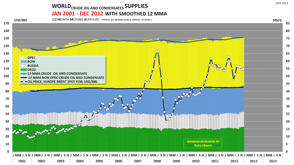
Figure 09: The chart above (based upon data from EIA International Energy Statistics) shows developments in (C+C) production for the world split on economic zones (plotted towards the right hand scale).
The economic zones are OECD (green), Russia (white), Rest Of World (ROW, which includes Brazil and China) (blue) [OECD, Russia and ROW is also referred to as Non OPEC] and OPEC (yellow).
Development in the oil price (Brent spot) is shown as white dots connected by the black line (plotted towards the left hand scale).
Figure 08 shows that annualized Non OPEC (C+C) production has been flat for recent years. The growth from tight oil (USA) and oil sands (Canada) has offset declines from the rest of the OECD and provided growth in OECD (C+C) supplies. Annualized growth in Russian (C+C) production has slowed to around 0.14 Mb/d during 2012. ROW (C+C) has seen an annualized decline of roughly 0.54 Mb/d since 2011.
Chances are that (C+C) production for Non OPEC may decline in 2013 (and beyond) despite the expected growth from tight oil.
Growth in global (C+C) supplies during the last 2 years has primarily come from OPEC.
If Non OPEC experiences a decline in (C+C) supplies in the near future, this leaves OPEC to offset this decline and also provide for any growth in global (C+C) supplies. This combination may put OPEC’s (C+C) capacity to a stress test during 2013 or later.
SUPPLEMENTARY DOCUMENTATION FOR THE “2011 AVERAGE” WELL
All the wells included in this study have verified full time production series.
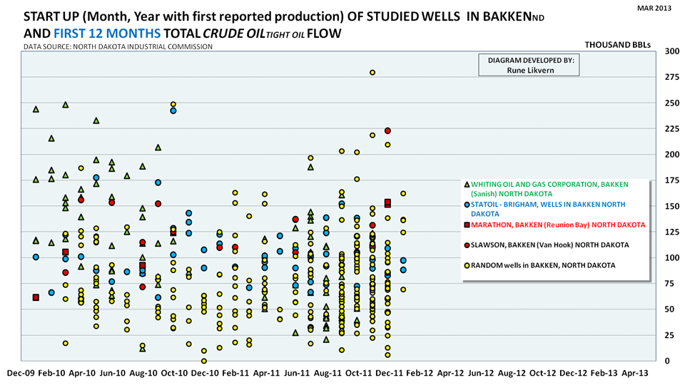
Figure SD1: The chart above shows the first 12 months’ production for the wells studied against their reported start of production and the study included the production history of more than 440 wells that started to produce as from January 2010 and through January 2012. This represents around 22% of the wells meeting these criteria.Around 2 060 wells were reported to have started to produce as from January 2010 and through January 2012 and thus had 12 months or more of reported production in January 2013.
443 of these 2060 wells were subject to in depth studies of the full time series of production.
The wells studied were from 30 companies and 89 pools in Bakken North Dakota.
The density of wells with a production above 200 kb during the first 12 months was found to decrease with time.
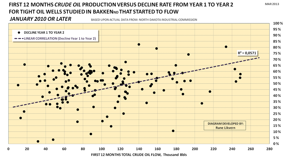
Figure SD2: The scatter chart shows decline rates for oil from year 1 to year 2 for 156 wells that started as from January 2010 and through February 2011 and thus had a history of 24 months of production or more as of January 2013.A total of 860 wells started to produce during the studied period that met the criteria.Figure SD2 illustrates that the decline rate is all over the place. A linear fit suggests that decline rates from year 1 to year 2 should be expected to be a function of first year (first 12 months) production. It appears that the higher the first year’s production the higher the decline rate from year 1 to year 2 becomes.
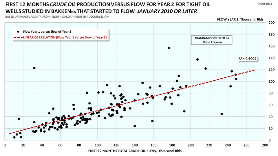
Figure SD3: The scatter chart above is a variant of the one shown in Figure SD2, and here first year (first 12 months) production has been plotted against the production of year 2 (months 13 through 24) of the wells’ life.
The production developments in Bakken and other tight oil plays are very much a function of monthly additions of producing wells, developments in well productivity, decline rates (for the growing population of “older” producing wells), development in costs, strategies deployed by the companies for development of their acreage, adequate infrastructure and not least the developments/expectations for the oil price.
Contact
- Content: editors at theoildrum dot com
- Tech support: support at theoildrum dot com
License

This work is licensed under a Creative Commons Attribution-Share Alike 3.0 United States License.
Rune, Clearly companies are going to try to drill the best prospects first.
Do you think it would be possible to extract an extra "quality trend" variable from the data (assuming an increase in initial decline rate, or a decrease in initial production), or is it basically impossible to split that out from the uncertain tail?
Finally, would it be possible to extrapolate this to the total number of wells which could be drilled across the 8 700 square miles to finish the sales pitch with the total recoverable resource?
Hi Andrew,
In order to estimate the URR one would need to make a couple of further assumptions. Does the "average well" remain unchanged as the sweet spots become saturated with wells or does the future "average well" become less productive over time? Let us assume it becomes less productive after Dec 2014, now we need to ask how rapidly does this decrease in productivity occur?
We also need to guess at how many wells per square mile are drilled (NDIC assumes about 4 wells per square mile). Using a 30 year EUR of 304 kb per average well and assuming no decline in well productivity as sweet spots become saturated (a totally unrealistic assumption to get an upper limit), gives about 11 billion barrels. When we assume that well productivity decreases by 12.4 % per year (a guess) starting in Jan 2015 with other assumptions (34800 total wells drilled) remaining the same the URR falls to 7.4 billion barrels. If the total wells drilled increases to 40568 (with the same well productivity decrease assumed above) URR increases to 7.8 billion barrels. Keep in mind the US used about 6.79 billion barrels of petroleum products in 2012, so the Bakken URR amounts to 1.15 years of US petroleum consumption under realistic assumptions or 2 years if we assume no well produtivity decrease and 45000 total wells drilled.
These numbers do not match the recent post on my blog because there I assumed the decrease in well productivty started in Feb 2013 rather than in Jan 2015 here (to match Rune's assumption in his keypost.)
DC
Would this actually be the main method used for determining Ultimately Recoverable Resources in a shale/tight oil formation? I could be wrong on this point, but it just doesn't sound right. It seems that such a method could produce corrupted results when there is major usage of horizontal and/or multi-branched drilling, since these underground aspects of the production build-out may not be obvious to 'outsiders'. And these drilling innovations are constantly being cited as "game-changers" for US Oil Production, especially for their role in opening up American shale formations for new and mostly unexpected increases in domestic gas and oil production.
Another aspect that may go unnoticed in any count of drilling rigs are those deposits reached not by drilling "wider" with more wells, but by drilling for even deeper shale formations, long known to exist as "source rock" for the shallower sedimentary formations above, but not considered economically viable for access by direct drilling until recent years - due to the greater drilling depths, the very low permeability of such shales, and the lower oil prices during much of the late 20th century. Such additional "shale" formations (Sanish, Three Forks) are typically stacked at ever greater depths below the original and best known formation (Bakken).
Rune, it seems that 904 b/d refers to first 24 hours IP rate for a typical ND Bakken well.
AlexS,
That is right. The second number (427 bbl/d) is the average daily for the first year (which results in a first year total flow of roughly 156 kb)) and so forth.
Isn't that a little high? Eyeballing your charts, Figure SD1 shows the average well producing about 75,000 barrels the first year. That works out to be 205 barrels per day per well the first year. Figures SD2 and SD3 show it a little higher, between 100,000 an 120,000 barrels the first year. That works out to be around 300 pb/d per well the first year.
For all the wells in the Bakken, the official ND Monthly Bakken* Oil Production Statistics has all Bakken wells producing 135 barrels per day and ND Monthly Oil Production Statistics (all North Dakota) producing 95 bp/d. (I did the math and North Dakota wells outside the Bakken are producing 22 barrels per day per well.)
Ron P.
Ron,
Alex (I take it) and I referred to the typical NDIC well.
The "2011 average" well (derived from actual data from 230 wells started to flow during the second half of 2011) I used and also presented in figure 05 has an average daily flow of 234 bbl/d in the first year and a first year total close to 85 kb.
The typical NDIC well from figure 01 has a first year average of 427 bbl/d and a first year total of around 156 kb.
The number 135 bbl/d refers to an average for all wells (in Bakken ND) and which have different vintage, highly different production profiles and are in different stages in their productive life.
Figures SD2 and SD3 does not refer to vintage (if it was possible to include the time axis (without impairing readability), I would).
Rune,
As I understand it, 427 bbl/d is the average daily production 1 year after the well started producing. It is not a year-average number.
Rune, thanks a lot for the analysis.
Would be nice to have the deduced average well (fig 5) on the same scale and graph as the one presented as typical (fig 1).
Rune,
Awesome job! Thanks.
Just last Friday I posted on the Bakken. I agree that the NDIC Typical Well does not represent "the average well" and that a lower well profile simulates the Bakken much better. I used a well profile for Jan 2008 to Jan 2013 with 1 year EUR of 93 kb, 5 year EUR of 189 kb, and 10 year EUR of 234 kb compared with 84 kb, 206kb, and 288 kb that you used. I then assumed that the average well would become less productive in the future by 1 % each month as sweet spots become fully drilled up (this translates to 12.4 % lower well productivity each year.) By Jan 2013 the average well productivity has fallen to 1 year EUR=51 kb, 5 year EUR=128 kb, and 10 year EUR=134 kb.
A Google search on
peak oil climate and sustainability Bakken Model suggests
will find my latest post on the Bakken.
If you were to guess,how long do you think the Bakken "average well" will remain at its current level (assuming real oil prices do not fall or rise by more than 5 % over the next 12 months)?
DC
For future decline rates on the “2011 average”, I expect the decline rate as from year 2 to year 3 to be higher (for the “2011 average” well I used it is around 35%, which is the same as NDIC used for their typical well). A higher decline is now suggested by actual data, but presently I have actual data (for decline from year 2 to year 3) for only 20-30 wells, so I still have to wait until I have actual data for a larger (significant) number of wells.
A higher decline rate (from year 2 to year 3 and so forth) would also affect the EUR. Presently I therefore believe the EUR for my “2011 average” to be on the conservative side.
Simulations suggest that new wells now and on average have productivity close to the “2011 average” well.
It appears as companies target drilling of wells that offers the prospects of meeting their requirements to returns. This suggests that the average well may (for some time) “wobble” around what I found. I also observed that wells from the same pad could have a wide difference in their production.
This suggests to me some caution about predicting how well productivity develops over time, but I would expect productivity to start to decline at some point.
As productivity declines and if not offset by growth in oil prices (and/or reduced costs for wells) companies could (provided they hold acreage by production) come to defer drilling lower productivity wells until their expectations for returns are met.
The above may be illustrated by thinking about the total area made up of smaller areas where the best areas requires a break even price below $60/bbl, then an area with break even prices of $60-80/bbl, another with break even prices of $80-$100/bbl and so forth.
At present oil prices companies would most likely go for areas having break even prices say below $80/bbl. As they run out of locations offering such prospects, they may defer further drilling until the price is right. This is one of the features that make tight oil attractive, a great flexibility about when to commit capital (and limited amount of capital) and short time from drilling (committing capital) until cash is generated. But this feature also allows for rapid swings in activity levels.
Nicely illustrated and well balanced key post Rune. Your above comment concisely sums up most of the key 'fortune telling' variables. I see one more that could be very significant. One might project that in a fractured source rock play like the Bakken as economics favor working areas whose well yields are 'the next step down the productivity ladder' the acreage worth working will be significantly larger than that of the sweeter areas first developed. Is that what the geologists most familiar with the region expect?
http://oilpeakclimate.blogspot.com/2013/04/bakken-model-suggests-7-billi...
Link to my Bakken post is above, note that along with the slightly different average well profile that I used (more optimistic over first 5 years than Rune and less optimistic over years 6 through 10). I also used a more optimistic ramp up of 2460 net wells added per year, where Mr Likvern uses about 1200 net wells added in 2013 for his plateau chart. He also predicts 820 kb/day in 2014 if 1500 net wells are added per year and 760 kb/day if 1300 net wells are added per year. I believe he assumes no decline in well productivity through year end 2014.
I will do a quick post at my blog to see how the "average well profile" that I used compares under similar assumptions.
DC
DC,
For the forecast plateau (through 2013) I used the “2011 average” well as derived from actual data. Well productivity may decline, we will not know for sure and from when before after the fact.
As of now (as I do not have actual data for a significant number of wells) it appears as the decline from year 2 to year 3 is higher than what has been used (35%) for the “2011 average” well.
If the decline from year 2 to year 3 was 45% (as opposed to the assumed and used 35%) this would require an estimated 20-30 additional “2011 average” wells to maintain a plateau of 700 kb/d throughout 2013. A higher decline rate would also affect later life total production and this could be compounded by the accelerating number of “newer” wells as these “mature”.
For the forecasts with respectively 1 300 and 1 500 wells annually throughout 2013 and 2014 it was used the “2011 average” well (as derived from actual data from 230 wells started in second half of 2011).
In other words no change in well productivity was assumed.
Further my impression is that activity levels and production developments from tight oil plays in general will be governed by;
- Rune
Jim Kunstler gives the Bakken wells an airing over at CF Nation today...under the title "Wishful Thinking". First year production falloffs of 69%. In today's desperate bid to maintain the appearance of BAU they are rather more like a Mentos and Coke...Sound and Fury for a bit, then the pitiful leftovers.
great job Rune!
One question that I haven't been able to get a satisfying answer to is, how much capital was invested in all these wells and what are the operating costs once they are running. Regarding the Opex, not just of the well itself but also the truck that might have to pick up the oil every once in a while if there is no pipeline to which you are directly connected to...
And then, in a second step, it would be interesting to see how many MW/MWh of wind or PV that Capex would have bought you in the US. I have a feeling that it would have been a lot...
for that matter, a rule of thumb for Capex and Opex of a well would do the job too. I vaguely remember the Capex being somewhere around USD 10m per well but going down due to efficiencies?
Bakken Well Costs Coming Down For Hess
Ron P.
Ron, thanks!
One of the things I have found challenging is to get hold of detailed break down of (tight oil) well costs (and wells come in various designs), and do the costs include hook up to processing/transport/storage facilities infrastructure costs (disposal of produced water, electricity supply etc.), pumps, and later plugging and equipment removal as the well has ended its economic life.
Presently there is a decrease in number of rigs drilling for shale gas, thus relieving some of the cost pressure in the supply chain. What happens generally to costs as the gas price gets higher and induces more drilling for shale gas?
Rune, I have found that a wealth of information can be found here: DW Energy News
And if you scroll down to just below the small map of the Bakken you will find a link to NDIC's Lynn Helms' Full Director's Cut. That is a report of all North Dakota and Bakken production, wells and such. He also includes a description of why production was up or down during the latest month.
I think "wells waiting on completion services" are wells that have been drilled but not fracked.
Ron P.
Hello,
The chart above shows an estimate of net cash flows post CAPEX for tight oil from Bakken (ND) as from January 2009 and throughout February 2013 (red area) and estimated net cash flows post CAPEX for the same months (black columns).
Assumptions for the chart were WTI oil price (realized price), average well cost starting at $8 Million in Jan 2009 and growing to $10 Million in Jan 2011 and from there $10 Million/well. All costs assumed incurred as the wells were reported having started to flow (this creates some backlog for the incurred costs as costs are incurred continuously as the wells are being made) and further the estimate does not include costs for wells that are completed and not flowing nor dry wells.
Royalties of 15%, production tax of 5%, extraction tax of 6.5%, OPEX at $4/bbl and transport (from wellhead to refinery) $12/bbl and interest of 5% on debt (before corporate tax effects).
No hedging assumed, no dividend payouts, no retained earnings no income from gas/NGPL sales (which on average now grosses close to $3/bbl).
Presently I believe that the numbers used for OPEX and transport to be on the conservative side.
Numbers do not include investments in processing and transport facilities.
The chart illustrates that presently at least $16 Billion is literally “capital in the ground” (from January 2009 and througho0ut February 2013) adjusted for effects describe under the chart, the true number could now be closer to $20 Billion.
There are now good reasons to believe that this capital will become recovered and also provide profits.
However the chart may raise the questions about how much debt the companies are willing to take on and the prospects for future debt access. Companies will be aware that a high debt load makes them vulnerable to a period with lowered oil prices.
I do not have any estimates about how much wind/solar the total expenditures in Bakken would have bought.
Wow, 20bn! Using very rough rules of thumb that’ll buy you 20bn /1.5 = 13 GW of onshore wind. That 13 GW nameplate will have a capacity factor of around 30+% for annual GWh of 8760h*13GW*0.3 = 34000GWh of electricity. That is 34000GWh p.a. for 20-25 years, maybe even longer...
Now, if only there are some non-lazy people who could do the math to figure our how much GWh are in the oil being produced (for different purposes…)
Solar costs - Current large-scale utility-connected PV installed cost ranges $4-$5/watt. Use the conservative value. $16B Capex would = 3,200 MW installed, generating about 5,000,000 MWh/year. All solid-state - very low Opex other than cleaning the panels.
Wind Costs - Per the NERL at the DOE, current-generation large wind-farm turbine installed cost = $2,000-$3,000/kW range. Use the conservative value. $16B capex = 5,333 MW, generating 14,000,000 MWh at 30% annual capacity factor. Ongoing Opex to maintain the moving parts per DOE - $60,000/installed MW/year for Opex for 5,333 MW = $320,000,000/year.
After 20 years, with a land-based oil well, you have essentially zero residual value (other than stripper value) - just a hole in the ground. After 20 years of PV, you still have PV panels that may have 30% degraded performance, but with upgrades can run another 20 years. The same with wind turbines. They will require a major mechanical overhaul, but a substantial portion of the infrastructure originally put in-place is still viable. There is long-term residual value.
So where should our Capex go? Into high-depreciating, all-too-soon empty holes in the ground or slowly-depreciating energy generating hardware?
Hey hvacman, which NREL report are you quoting on the 2000-3000 USD/KW for land based wind? Seems a bit on the high side...
NERL wind turbine cost study 2-12
See slide 8. It has a historic turbine cost plot. The chart suggests that the cost may be at about $2000/kW, but the range shown as of 2011 was in the $2K-3K range, so I took the conservative number. I couldn't find if they had any transmission costs, land costs, etc. folded into their historic or estimated costs.
I ran some back-of-the-envelope numbers on 3 investment options
Oil -"pre-purchasing" 20-years of refined gasoline wholesale @ 12,000 miles/year a 40 mpg car at $2.50/gallon. Upfront cost - $15,000 for 6,000 gallons. 52 tons of CO2. At the end, an empty hole in the ground plus a beat-up refinery.
PV - generate the equivalent electricity to run an EV like a Leaf or a Volt for 12,000 miles/year. 0.35 kWh/100 miles x 12,000 miles = 4,200 kWh/yr @1,600 kWh/kW = 2.6 kW x $5/watt = $13,000. zero CO2. At the end, some used but still-usable PV panels.
Wind - 4,200 kWh/yr/(8,760 hrs/yr*.30) = 1.6 kW wind to invest in. 1.6 kW x $3000 = $4,800 Capex. Opex = 1.6 kW x $65 x 20 years = $2,080. Total investment = $6,880. Zero CO2. At 20 years, a wind farm that needs overhauling, but still with value.
Bottom line - The case for electrifying as much transportation as possible is becoming an economic one as well as an environmental/resource one.
I'm a huge fan of PV, but these numbers cannot be right:
0.35 kWh/100 miles is 3.5 watt hours per mile. Your could run an LED bulb off that supply, but there is surely no way you could propel a >1 tonne vehicle for a mile.
1,600 kWh/kW/year is 18.25% net efficiency. I'd wager that few places outside the SW of the US could generate that kind of output. A perfectly sited array where I live in south east England (UK) might generate 950 kWh/kW/year, and that's pretty good by UK standards.
$5/watt is an outrageously high price. Small residential systems (up to 4 kW) in the UK can be installed for as little as £1.25/watt ($1.95), larger systems for as little as £1/watt ($1.56). There are dozens of installers who will put in small systems for £2/watt ($3.12/watt). Why is the US so expensive????
Smaller systems in US (FL specifically) would generally be priced at $4-5 per watt. Larger systems (10 kw+) can be installed for $2.75-3.50 per watt.
re: 0.35kWh/100 miles. You're right. That was a typo. I intended to write 0.35 kWh/mile, but I had 35 kWh/100 miles in my notes and typed a blend.
re: 1,600 kWh/kW/year. 1,600 kWh/kW is what we get in my local area of the Sacramento Valley in northern California. Nationally or internationally, it is all over the map.
re: estimated PV cost/watt - What I've seen for actual installed residential 4 kW system all-in costs here in northern California is $3-$5/watt, depending on whether it can be a roof-mount or requires a ground-mount system. Beyond the basic hardware and installation, we have permit costs, modifications to the main panel, etc. Regarding panel costs, I'm thinking we may be at a panel cost low-point for a bit, as manufacturers are all losing tons of money (even the Chinese) and many are going under.
The bottom line point I was trying to make - even with very conservative installed cost estimates, both PV and wind, as long-term investments, already have a better ROI than oil drilling/refining without even considering the environmental benefits.
Just to simplify this thread a bit:
(1,000W*4.5sun-hours)/(300Watt-hours/mi)
So (installed Wattage):
1kW = 15 miles/day (5,475/year)
2kW = 30 miles/day (10,950/year)
3kw = 45 miles/day (16,425/year)
4kw = 60 miles/day (21,900/year)
Yep, the PV & EV combo can be quite compelling. Get an EV and throw PV panels on your roof and you've compltely covered the fuel cost for your commute . . . for the next 25 to 30 years!
Installed price for 1 mW solar PV in Georgia including land lease $2.20 per watt.
I was slightly surprised that there was no mention of fracking in this discussion. The frequency and quality of fracking that can be purchased from a given company's oil/gas revenue stream (plus investments/loans, and perhaps minus environmental limits/costs) would seem to be a key variable in any analysis of shale oil production levels over time. Do the North Dakota regulators not have, or choose not to provide, useful data on fracking per well? Just a guess...
Exceptional work. Thank you for your efforts!
The usual caveats apply. Rune's and DC's models will be qualitatively right, but not dead-on in predictive power. But, as we wait a few more years, we will tune the models slightly and understand exactly what is happening with these fracked wells.
When complete, we will have a set of formulations perhaps suitable for petroleum engineering textbooks, but we will have no chance to use these formulations again because oil is a finite resource and these areas will be gone from the map.
C'est la vie. The modeling is interesting nonetheless. All we are doing is documenting the equivalent of the baseball scorecard for the demise of oil. Tinker to Evers to Chance. Oil's sad lexicon.
Tinker to Evers to Chance
good one...and the Cubs haven't won a World Series since those three were turning double-plays...
Great analysis, Rune. I'd love to see a similar analysis for shale gas at Bakken and/or Eagle Ford.
I didn't see this posted: the latest USGS estimate on oil & gas posted yesterday. Here's a link and an excerpt: http://www.ogj.com/articles/2013/04/bakken--three-forks-resources-rise-t...
"The Bakken and Three Forks formations in North Dakota, South Dakota, and Montana hold an estimated mean of 7.38 billion bbl of undiscovered, technically recoverable crude oil, the US Geological Survey announced.
The updated assessment represents a two-fold increase from the 2008 estimate of 3.65 billion bbl in the Bakken, it noted. The update includes the Three Forks for the first time.
USGS’s latest assessment found that the Bakken has a 3.65 billion bbl estimated mean resource—unchanged from 5 years ago—and Three Forks has an estimated mean 3.73 billion bbl. The formations’ combined estimate ranges from 4.42 million bbl, with a 95% chance of production, to 11.43 billion bbl, with a 5% chance.
Since 2008, however, more than 4,000 wells have been drilled in the 2 formations producing 450 million bbl of crude, and Three Forks activity has increased significantly, warranting its inclusion in the area estimate, the US Department of the Interior agency said.
The new assessment also found mean undiscovered, technically recoverable volumes of 6.7 Tcf of associated/dissolved natural gas, and 0.53 billion bbl of natural gas liquids in the Bakken and Three Forks formations.
Gas estimates ranged from 3.43 Tcf (with a 95% chance of production) to 11.25 Tcf (with a 5% chance) and 0.23 billion bbl (95%) to 0.95 billion bbl (5%) of NGLs. These estimates represent a nearly three-fold increase in mean gas and NGL resource estimates from the 2008 assessment, due primarily to the inclusion of Three Forks Formation, USGS said."