The JODI-EIA Divergence
Posted by Sam Foucher on May 23, 2011 - 9:31am
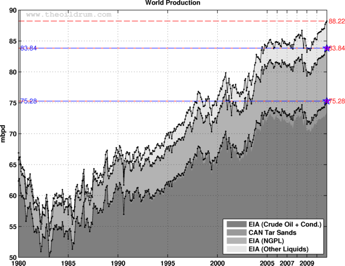
This is a follow-up on a discussion started by Darwinian (Ron) in the Drumbeat that I think is significant and deserving more eyes. Lately, looking at the EIA data we have seen new production records in all the categories (see post by Gail here for a discussion):
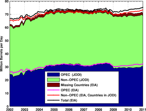
The public database JODI contains monthly data from more than 90 countries (90% of world production) but does not give a world production estimate, some countries are also missing or incomplete (about 20 countries), it gives something like this:
We can get the missing data from the EIA energy database, more precisely:
- Incomplete series: Iraq and Kazakhstan.
- Some Non-OPEC countries are not in the JODI database, we then get the data from the EIA (in total 124 small producing countries).
Once completed, we get the following chart:
There is clearly a divergence since 2009 and also before 2005. The difference seems to originate both from OPEC and Non OPEC countries, OPEC production is significantly lower for JODI than for the EIA:
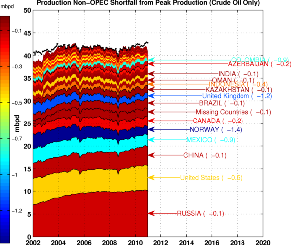
The chart below summarizes the difference between the two databases. We can see that even when adding the missing countries (the red area), we are not able to account for the difference with the EIA data.
We then add the EIA monthly estimates for NGL and other liquids to the JODI data past 2005 and we get a new version of Figure 1 shown below. The records for monthly supply are now back to 2006 for C+C and C+C+NGL.
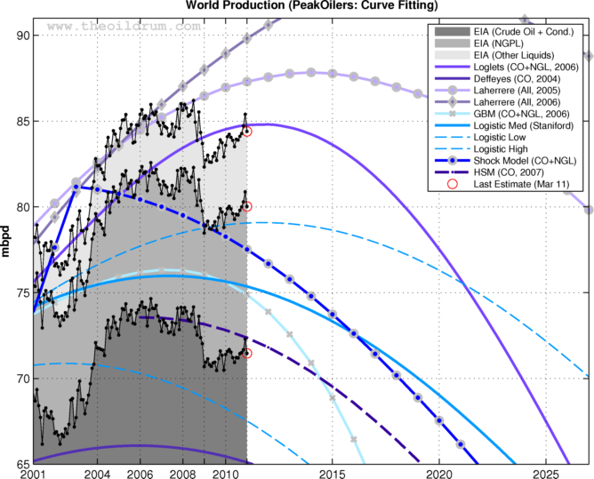
This is a significant divergence, in particular the drop in supply following the financial crisis in mid-2008 is more acute (~2 Mb/d lower) as shown on Figure 8 below. When looking at the EIA data only we can see that production levels have strongly increased since 2009 and are now close to the population based model (the magenta area) and the EIA 2008 forecast. However, this is not the case when using JODI estimate (shown as a green line), supply is much lower and it is following closely the average peak oil forecast (the red line).
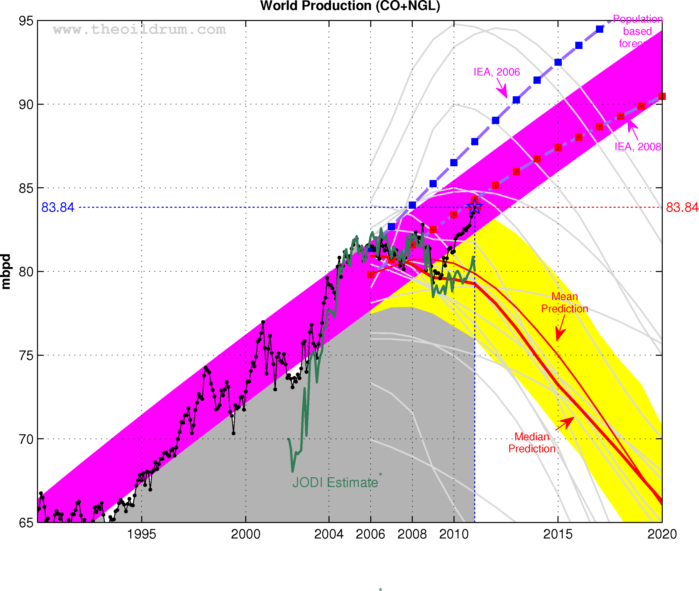
I was struck by the fact that the JODI estimate is following the median forecast for crude oil and NGL whereas the EIA trajectory came back in the business as usual domain. The new production data based on JODI seems to follow closely most peak oil forecasts:
It remains to be seen what will happen in the next few months with respect to updates and corrections for both JODI and the EIA. Production levels were lower before 2005 and were never corrected to match the EIA data. If anything, it shows the large uncertainty surrounding production data coming from OPEC, the reason why OPEC members would report lower production data to JODI is unclear.
The way the production data is collected vastly differ between the EIA and JODI, for JODI the data is collected using a 42 key oil data points questionnaire. The data is then revised twice a year:
Jodi is a voluntary activity. Participating countries complete a standard data table (see table on page 2) every month for the two most recent months (M-1 and M-2) and submit it to the Jodi partner organisation(s) of which it is a member. The respective organisation compiles the data and forwards it to the IEF Secretariat which is responsible for the JodiOil World Database.
The EIA does not collect international production data but apparently pays IHS for the data (at least until the recent budget cuts).
Update:I've added the spreadsheet showing the EIA and JODI data for the period 2002 to 2011 after corrections for incomplete series. Common countries are in the same order (non OPEC first then OPEC), only the total volume is shown for missing countries.
Contact
- Content: editors at theoildrum dot com
- Tech support: support at theoildrum dot com
License

This work is licensed under a Creative Commons Attribution-Share Alike 3.0 United States License.
And of course, the EIA recently posted some sizable and fairly unusual upward revisions in production data. If the EIA is relying on IHS for data, that may explain a lot.
In any case, what this excercise shows, especially as the global production data base becomes more unreliable, is that at best we may only have two significant figures of semi-reliable data. In practical terms, for most countries this means semi-accurate data to 0.1 mbpd and to one mbpd for global production.
What (if any) is the relationship between IHS and CERA?
So is IHS just a branch of CERA?
The other way around.
dohboi - No relationship...they are not seperate entities. IHS CERA is a company owned by the IHS corporation. There are about a half dozen more IHS divisions.
Thanks. I see I got it backwards above--not unusual '-)
IHS, Inc. (nee Information Handling Systems) bought:
Petroconsultants S.A. in 1996
http://en.wikipedia.org/wiki/Petroconsultants
(didn't know Colin Campbell worked for them...)
Cambridge Energy Research Associates (CERA) in 2004
http://en.wikipedia.org/wiki/Cambridge_Energy_Research_Associates
Jane’s Information Group. (e.g. Jane's Defense) in 2007
a bunch of other names...
http://www.ihs.com/about/glance/history.aspx
Westexas, you make some good points here, and I do applaud your rounding the annual figures to the nearest mbd, as this is a clear attempt to deal with the problem of error.
In terms of available oil extraction data, there are many, many issues. As exemplified by the article above, few, if any of the charts posted on The Oil Drum contain error bars. Without error indicated, the presentations are not scientifically rigorous. Before any claims of a "peak" in the monthly or annual data can be made, error has to be known. This is basic science. Without error indicated, the person presenting the data only has a weak argument. Especially in a case of claiming a new "peak" that is only a tiny amount higher than previous upward excursions.
The best one can probably say is that world oil extraction rates are still on plateau in the case of maximums that are very close in magnitude (e.g. 75.2 mbd vs. 74.8 mbd). Even this claim, without error demonstrated, can not be made with a high degree of confidence. My suspicion is that error in the monthly oil production figures is in the range of 2-4% (for 2 σ), if not higher, and maybe somewhat less for annual averages. The pronounced difference between the EIA and JODI numbers provide some indication of how much error can exist in the data: 75.3 mbd vs. 71.5 mbd equals a 3.8 mbd difference on the monthly figures. This is a difference of about 5%. This suggests that a difference of even a million barrels per day in the monthly data series is not meaningful. There is also the question of bias in the measurement, which is an additional complication.
An actual determination of error and bias for world oil extraction rates would be very difficult to do--maybe impossible as it would require a different and reliable measuring system outside the one(s) being used to make a good calibration check. Nevertheless, even with error determination quite difficult, it does not mean that error does not exist. On the contrary, error is present in all systems of measure. Error is inescapable. And in the complex and convoluted human world of oil extraction, which takes place in many different countries/cultures, it is a safe bet that error in the reported figures for extracted volumes is probably quite high.
Futhermore, in longer data-series, there is the problem of changes in methodology for determining oil extraction volumes (e.g. how were oil volumes determined in 1970 vs. say 2000?). Inflections in extraction rates could simply be due to changes in the way oil production in measured. As with error, very large swings, for example the climb in crude+condensate extraction rates from about 55 mbd in 1985 to 67 mbd in 2000, are likely real. However, small changes, such as the claimed ~2 mbd drop during the Great Recession are not strongly supported by the available data, partly due to the large error (a 2 mbd change is probably not large enough to be meaningful) and the potential for changes in the methodology used in acquiring the numbers in the first place. To fully understand a given data-series, methodologies for the acquisition of data over the duration of the time interval being explored have to be documented and discussed openly. Without this, any claims about particular small (say ≤ 5 mbd ΔQ/t) “downturns” or “upturns” in a series cannot be made with a high degree of confidence.
http://earlywarn.blogspot.com/2011/03/iea-confirms-new-highs-of-fuel.htm...
This chart from Stuart is a version of one that I and others have made showing correlation between oil price and production. Towards the end of last year the data wandered out of the historic data cloud suggesting perhaps that high price had led to increased production capacity and a new trend relationship.
It struck me from Sam's analysis that if production is actually around 85 mmbpd that we are still in the middle of the historic data cloud.
What the hell is going on at the EIA is anyone's guess - is there a conspiracy to cover up peak oil?
might even be simpler. there have been lots of budget cuts at EIA? I think with everything else going on in the world, I seriously doubt there is any conspiracy at EIA, especially given IEAs stark warnings.
I don't want to sidetrack Sams thread, but do continue to wonder at the real elephant in the room: what would your price/production envelope look like without debt extravaganza of last 2 decades (culminating in huge govt. debt replacing private/corp/etc. during last 24 months). I would hypothesize that with a tethered currency (i.e. something with physical grounding -not digitally leverageable), that max global oil production would have been over a decade ago, and decline rates would be less steep. Probably not easy to model but the fact that debt in reality (as opposed to textbooks) is not a neutral transfer between parties and that it has been used as a larger and larger crutch to keep things socially stable by borrowing from future affordability, certainly impacts oil discovery/production curves. Ergo, Keynesian endgame is gonna muck up oil production figures bigtime.
So IF Hubbert had anticipated the Steroid-like monetary stimuli, his model might have predicted a drawn out peak period? Hubbert didn't anticipate the affect of financial doping ? Hubbert didn't anticipate the Lance Armstrong Effect.
And one of the more horrendous side-effects of the monetary steroid/doping was hypertrophy of the dysfunctional financial system.
Next stop, 'Roid-Rage and Crash?
Hubbert anticipated a growth curve that was significantly higher than the one we ended up with. Seems like at it's peak it was somewhere between 43 and 45 GB/year before falling off. Looking at the area under his curve from years ago (giving you "total production" of crude oil over the duration of the curve), you would have reached the peak somewhere in the last several years rather than the late 1990's or 2000.
Over the past few years, depending upon what data you use, oil production/consumption would finally total the quantity that Hubbert anticipated at the peak (YMMV).
The US curve (both lower 48 and the additions from Alaska and deeper water GOM) are instructive in that the lower 48 (minus GOM and Alaska) seems to follow a fairly symmetrical curve with an extended tail. The additions from the other sources as a result of other exploration and production extends or flattens the tail off, but eventually it falls off.
We know that the "other side" of the curve is waiting for us.
There is no doubt that creating debt has caused energy use. If we had had to work for the money we would likely spend it more wisely or save some of it. Its Gregors comment that is more relevant to this post though.
tethered?
to what?
Basically similar data, with crude oil (C+C) data on horizontal axes with oil prices on vertical axes, for the Texas and North Sea peaks. IMO, once conventional production peaks in a given region, there is probably not a realistic oil price that will keep conventional crude oil production on an upward slope.
If we look at slightly rounded off annual global crude oil (C+C) data, so far we have not materially exceeded the annual rate of about 74 mbpd that we saw in 2005 (EIA). But of course the real story is the 2005 inflection point. At the 2002 to 2005 rate of increase in crude oil production, we would have been at 86 mbpd in 2010.
If Saudi crude oil production had kept increasing at their 2002 to 2005 rate of increase (when they went from 7.6 mbpd to 9.6 mbpd), they would have been at about 14 mbpd in 2010, versus the 8.9 mbpd that the EIA currently shows for Saudi crude production in 2010.
The cornucopians of the 1980s probably argued that vast oil supplies were reachable in Texas if only a) regulators would get off their backs (known today as 'drill baby drill') and b) oil prices would go higher. I wonder how much oil they thought they could get if prices would only just go to $50/bbl and stay there for a while!
And maybe, to be fair, they wouldn't have been entirely wrong. With prices consistently exceeding $90/bbl since 2008 (which is a lot like $50/bbl in 1985), Texas production has grown 2.3% per year. Would that be liquids from shale, primarily?
It would be great if Texas could keep growing production at these prices. At this rate, the state will be back to early-80s production levels in a scant 30 years. :)
steve - I don't have the hard numbers but if your 2.3% growth includes all liquids and not just crude oil it would be readily explained by the big increase in drilling NG reservoirs that have a high NGL yield. Such a play has been going strong for several years in SE Texas. The Barnett Shale may also get some of the credit. The hot Eagle Ford Shale play in S Texas wouldn't: it's too new to have added much yet. But with current drilling activity it should start showing up in a year or two. But with a 70%+ decline rate those wells won't hang in long. Only an ever increasing completion rate will get it done.
Thanks Rock. I'm just looking at a page from the EIA:
http://www.eia.doe.gov/dnav/pet/hist/LeafHandler.ashx?n=pet&s=mcrfptx1&f=a
"Field Production of Crude Oil" -- I guess that would imply that it does not include NGLs, although I hate to read too much into a table header.
You're on that, right? ;)
steve - Thanks for the links. Does seem to indicate crude only. Actually a rather dramatic change in the trend given the long standing decline rate. I'm going to guess it's the fractured shale plays like the Barnett but the timing doesn't quite fit. Just a feeling. There really haven't been any other new oil trends developed in Texas for a long time.
Are we into the fracturred oil shales? Not at all. They don't generate a sufficient rate of return for us. We make a better profit drilling deep conventional NG even at current low prices. We're privately owned so we don't have a stock to hype. The public companies can't do what we're doing. There just aren't enough conventional wells to be drilled to satisfy Wall Street's demand for ever increasing reserve base for public companies. Just my WAG but if it weren't for the various shale plays the public oil stocks wouldn't be worth half of what they are today.
Similar developments have been taking place in western Oklahoma and the Texas panhandle. Horizontal drilling in tight, condensate rich gas reservoirs in the Granite Wash, Tonkawa, Cleveland, etc formations has produced a large amount of new condensate production since about 2004.
Thanks for a very informative post. It's remarkable that numbers from the two sources agree for a while but then diverge. The EIA data is saying total liquids production is increasing twice as fast as JODI says.
A couple of questions come to mind: how long after the fact are revisions made? and, Was this analysis done during a period when the two data sets agreed (ca 2006), and was the agreement apparent at that time?
thanks again.
Data are revised often, JODI has also a bi-annual assessment, I'm not too familliar with JODI and their documentation is rather minimal but it seems to have improved over time.
Here is a chart showing the EIA-JODI difference over time:
The data series here isn't long enough to confirm it, but on the surface it looks like the EIA and JODI series diverge coming out of recessions. Now, I have no idea what would explain that. Is there some dynamic in the measurement systems that causes one to overestimate and the other to underestimate as the economy turns up? For instance, if one was taking the most recent number and the other was using a rolling average, you would see something like this, but in that case you would expect to see the inverse occur when the economy turned down at the top. That doesn't seem to happen as the two track closely before and during the recession.
Probably just coincidental, but it would be nice to have a longer comparison and include recession bands.
Doesn't it take time to clean up JODI data? Aren't more current JODI records less reliable?
Also JODI data comes with a numeric code which indicates the level of reliability declared. Has Sam Foucher taken that into account?
Indeed, you are correct, it is less reliable, and some monthly estimates are revised. JODI is usually 2 months ahead of the EIA (it shows March already, EIA stops in January).
I have not taken into account the code, it is much more work, this is a quick post.
Thanks for clarifying these points.
Actually the EIA February data is out. International Energy Statistics
They have world C+C down by 789,000 bp/d in February. Of that decline OPEC was down 419,000 bp/d while non-OPEC was down 370,000 barrels per day.
World All Liquids was down 1,041,000 barrels per day. I did not break out the OPEC, non-OPEC share of All Liquids.
Ron P.
The upward revisions to the 2010 EIA Crude Oil Only data is the largest swing I have ever seen, in following EIA data since 2004. The revisions added nearly 750K-800K bbls to each month of 2010.
Notably, however, the overwhelming direction of revisions in EIA data the past 7 years has been down. Not only the short-term revisions which come in on a rolling basis from month to month--but also the big multi-year revisions which come every year or two. Would love to see a separate tracking chart on just revisions, with their direction and size plotted inside/outside normal ranges.
With the 2010 revisions, the annual average of C+C production has now just poked above the all time high year of 2005, when the total stood at 73.712 mbpd. Now 2010 stands at 74.047 mbpd. I really look forward to seeing what happens with subsequent revisions.
Updated Global Average Annual Crude Oil Production 2001-2011 (hosted at my site)
Finally, nota bene that EIA did produce updated International data this month, even though I was informed by an EIA rep that the data halt(s) would take place immediately. I assume this month therefore is the last international oil production data we will receive.
Update: I have been on the phone with EIA again today, and they confirm that updating to International Energy Stats is indeed due to be discontinued. It's just unclear when the shutdown will actually occur. Could be anytime from here going forward.
G
Gregor, are you saying that EIA are going to stop following international energy stats? A strange irony infone casualty of PO is our ability to follow story via "reliable" data. IEA next to go with spending cuts? And then BP gets taken over by XOM who see little merit in keeping their global energy stats charity going.
Gregor and Stuart both posted on the EIA budget cuts; Heading Out as well I think. Gregor was first to mention it. Other bloggers harrumphed about it as well but primarily over concerns regarding GHGs etc. Not much outcry about our not keeping track of world oil production - yawn...
There Goes the Data: Major Cuts at EIA Washington
http://gregor.us/eia/there-goes-the-data-major-cuts-at-eia-washington/
G
Over the past month, as I've shared the EIA announcement and Gregor's assessment ("bad news") with energy-aware associates who, mostly, don't read TOD, the nearly-universal reaction has been, "Are you kidding? Whose idea was that?"
Talk about fodder for conspiracy theorists...
I'm astounded at how counter-productive many of these government actions are in the US. Oil prices skyrocket, so the federal government cuts funding at the EIA so they have less information about what is going on. Local governments suffer a decline in tax revenues because fuel prices are higher and people are abandoning their houses in the far-flung suburbs, so they cut public transit to prevent the newly-deprived from going anywhere.
It's all very counter-productive. I think it's a subconscious desire by Americans to see a full-on, welcome-to-Hell collapse of society rather than a slow and painful decline into third-world status. But that's just an unscientific guess.
Nah, it's just a combination of real resource limits, ignorance and the focus on short term personal gain for those making decisions. It's what collapse looks like.
I agree with you Twi. Especially when you consider that the primary short term gain for most politicians is to get re-elected. A good dose of technical ignorance mixed with self serving political interest seems best to explain "our" reaction to PO. really quit logical and predictive IMHO.
The cuts in funding for the EIA are not about them having less information, it's about you having less information.
I'm sure the 'world crude and condensate' data will still be collected by some branch of government, the issue here is that the public may no longer have access to this information.
Thanks G, next thing to go GDP, borrowing and inflation statistics? Its amazingly short sighted.
I would guess that there was a brief, high level meeting where a political appointee asked a representative from DOE
"How can you save money - what's low priority - what can you drop?", and the DOE rep said
"Well, we keep statistics for world oil production, but that duplicates what the IEA gathers.". The political appointee said
"What, we're doing their job for them? It's duplicate data?!?!? Let them be responsible - this is a waste of money. Discontinue work on that immediately.".
Agreed. But its still pretty startling that world's largest economy can no longer afford to track international energy statistics.
It can afford to. It's choosing not to, because the congressional representatives of legacy industries (e.g., Koch brothers) are "starving the beast" as part of their drive to reduce the democratic process they fear.
This is not a matter of energy type power resources, it's a matter of political power.
The proof: the fact that only spending cuts are on the table, and not revenue increases. US taxes are at a record low. US taxes aren't low because the US can't afford to pay for government.
Sam,
Your figure 8 is titled Crude + NGL. You include the JODI line from figure 3, which is crude + condensate. Therefore, in figure 8, aren't you comparing EIA apples to JODI oranges ?
(And, your figure 3 is titled "crude oil only" but then below the graph you seem to imply JODI numbers are crude + condensate)?
see in the text:
"We then add the EIA monthly estimates for NGL and other liquids to the JODI data past 2005 and we get a new version of Figure 1 shown below"
What JODI calls "crude" is in fact crude oil plus condensates.
If these figures are correct, would you not expect data like this to be showing the opposite of what it is?
http://www.trend-news.com/default.asp?newsid=9604
http://uk.reuters.com/article/2011/03/11/china-autos-idUKN1129734320110311
All this fuel has to come from somewhere and biofuels is far from sufficient
Sam
Instead of wasting your time on an obviously flawed data set you need to do a complete study of ALL the top 50 oil producing countries.
It is a given that oil exports from past peak countries are falling but what about the other half of the story. The 22 significant oil producing countries that are increasing in production?
Unless you provide this full picture then the half you do provide will be seen as misleading.
If you cannot be bothered, tell me which data set you use and I will do it.
If its JODI don't bother.
Even the EIA has net oil exports peaking in 2005 and that includes all exporting countries. Below is a graph of Net Oil Exports for all countries in thousands of barrels per day. That is exports minus imports of crude oil. The data is derived from the EIA's International Energy Statistics, annual exports of all exporting nations minus the annual imports of all those nations.
Just curious but whatever gave you the very silly idea that folks on this list were only posting export data from countries that were past peak?
I would just love a list of those 22 significant oil producing countries that are still increasing production. I can count only 9 or 10 and several of them are importing nations.
Ron P.
Darwinian
Could you tell us all EXACTLY how you produced this graph.
With shortcuts to relevant page. The link above is of zero use.
I think we are just about to see another hole being dug by yourself, don't worry I got a very long ladder :-)
In your never-ending efforts to calculate production down to meaningless decimal points, you continue to overlook the big picture, which is that all of the C+C data bases and net export data bases are showing a major inflection point in 2005. Crude production effectively stopped growing in 2005, and net exports appear to have peaked in 2005/2006, with Chindia taking an ever greater share of what is net exported.
Arguing over extraneous decimal points in various data bases is akin to a couple of engineers standing on the stern of the Titanic arguing over who had the best estimate of when the ship would sink.
Westexas
The above graph produced by Darwinian is highly questionable, when he provides us with his data set I will explain why it is so.
Regardless of the merits of his approach, note the rapid increase from 2002 to the 2005 inflection point. Whatever the merits of his methodology, it was consistent, and it shows an inflection point.
This is the same pattern that we showed in our analysis. We looked at net exporters with 100,000 bpd or more of net exports in 2005 and primarily relied on the BP data base, with EIA data used for some minor countries. We subtracted domestic consumption from domestic production to derive net exports.
Global Net Oil Exports Less Chindia’s Combined Net Oil Imports = Available Net Exports (ANE)
(BP + Minor EIA data, mbpd):
2002: 39 - 3.5* = 35.5 (ANE)
2003: 42 - 4.0 = 37.4
2004: 45 - 5.1 = 39.9
2005: 46 - 5.2 = 40.8
2006: 46 - 5.5 = 40.5
2007: 45 - 6.1 = 38.9
2008: 45 - 6.6 = 38.4
2009: 43 - 7.3 = 35.7
2010: 44 - 8 = 36**
*Chindia's combined net oil imports
**Estimated
If global net exports had continued to show the 5%/year rate of increase that we saw from 2002 to 2005, global net exports in 2010 would have been about 59 mbpd, versus my estimate of about 44 mbpd, with Chindia taking an estimated 8 mbpd of that 44 mbpd.
No. C'mon, jaz, just stop it.
westexas is right: Darwinian's charts are designed to reveal and demonstrate trends, and trends are the most important things we need to know about oil production.
Nitpicking infinitesimally-small details, over and over, isn't adding to the value of the exercise and discussion.
kalliergo
The differences are not that small, 3 million barrels a day and the difference between a not inconsiderable fall and a slight rise.
This makes a massive difference in what we can expect in the next few years as it will take Iraq a few years to ramp up production. That is if they stop killing each other long enough to build the infrastructure.
Also the data for imports and exports of refined products makes a large difference and needs research.
Okay go to the link I posted then mouse over "petroleum". Then slide your mouse down to "exports" and click. Then you change the date to 2000 thru 2009 and change the "product" to "crude oil exports". Download to Excel. Copy and paste the data on a blank spreadsheet.
Then repeat the process except with imports. (Imports, unlike exports, are given as either monthly/quarterly of annual. Choose annual.) Then download to Excel. Copy and paste this data to the same spreadsheet. Then you must sort the data to pull out all exporting nations. I chose all nations with any net crude exports in either 2005 or 2009. (All nations except Brazil and Indonesia had net exports in both years. Indonesia had exports in 2005 was an importer by 2009. Brazil was an importer in 2005 but an exporter in 2009. I included both these nations in my data. All nations with any net crude oil exports were:
Then you take the crude oil imports of these 42 countries and subtract them from their crude oil exports. That gives the graph I displayed. Also I had to do the subtraction before sorting the net exports. Many net importers export some crude but just import a lot more than they export.
Important: A chart of only exports from these nations would give a chart very similar to the net exports chart except it would be a little more pronounced, down slightly more than net exports. The 42 listed nations above account for 100% of all net oil exports that I can ascertain.
Also I have read reports that Brazil became a net importer of crude oil again in 2010. However excluding both Brazil and Indonesia from the chart that would not change it significantly.
I have not dug any holes here Jaz. The data is what it is.
Edit: Also, very important. The EIA only gives net exports of refined products thru 2007. But net exporting nations show an even greater percentage drop in their exports of refined products 2005 thru 2007 than they do crude oil. If we include exports of refined products the drop, I suspect, would show a much higher decline than the 3 mb/d of crude. At least that's what the 2005 thru 2007 data indicates. The actual drop in exports of refined petroleum products, from the nations above that actually had exports of refined petroleum products 2005 thru 2007, was half a million barrels per day. (4,986,000 bp/d in 2005 to 4,480,000 bp/d in 2007.)
Ron P.
Darwinian.
I take it you except this EIA data set Then?
and there is the hole
I assume you meant accept not except.
The EIA has no motivation to show net oil exports declining at such an alarming rate. If anything they would play down the numbers. If they were inclined to fudge they would have obviously fudged the numbes in the other direction. So yes I accept the EIA data for what it is. I know it must have been hard of them to admit that oil exports were declining at such an alarming rate. They would not want to set off any kind of panic. Perhaps they thought no one would notice. And very few did notice. There was Sam, WT, myself and a few others, otherwise their data has been totally ignored.
What I am saying is that I accept the EIA numbers when they are being very pessimistic. It is when I sense that they may be fudging the numbers, trying to be very optimistic, that is when I get suspicious. I do so because I think the EIA is going overboard to be very optimistic. When they report numbers that show oil exports are in serious decline, I take them seriously.
But I am very disappointed in you Jaz. I surely thought you would have come up with a better rabbit hole than that. ;-) I really think you thought you would find a serious flaw in my data or my method of calculating net oil exports. You did not so you just picked the only thing you could think of, that the EIA data is unreliable.
Make no mistake, no data available anywhere is 100% reliable. Such data just does not exist. So we must make do with what we have. And folks who say we should just not do any calculating at all are out to lunch. We make do with what we have and that is all we can do. Those who do not accept any data because of possible flaws should just go somewhere else. Well that is my humble opinion anyway.
If we think the data is flawed we should express our opinion, and explain why we suspect the data, then use it anyway. We simply have no other choice.
Ron P.
Darwinian
Your entire argument in this post has been peak oil was in 2006, EIA Data clearly says not. Both for C&C and total liquids.
http://www.eia.gov/cfapps/ipdbproject/IEDIndex3.cfm?tid=50&pid=53&aid=1
You cannot use this data set to prove peak exports 5 years ago and then say it is flawed when it suits you.
My two external links show that for the countries I highlighted the EIA data was accurate and JODI was not, you really do not know when you are beat.
This is an obvious hole you have dug for yourself. So I could not resist it.
The point I was going to make is some oil producing and exporting countries have recently built or are building extra refining capacity. So any calculations of exports which does not include refined products will be seriously out.
http://www.bbc.co.uk/news/10527308
http://www.presstv.ir/detail/135551.html
http://www.terradaily.com/reports/Iran_To_Build_Oil_Refinery_In_Venezuel...
http://economictimes.indiatimes.com/articleshow/3238921.cms
http://www.cacianalyst.org/?q=node/5505
For example the UK imports crude and exports crude but it also imports refined products but exports even more refined products. Other countries refined products has grown considerably in recent years.
e.g.
http://uk.reuters.com/article/2007/04/17/energy-russia-refining-idUKL174...
so simply saying exports peaked in 2006 is too simplistic and without refined data cannot be proved.
You are correct. If Platts, JODI, the OMR or anyone else publishes net export data then we will use that.
But you miss the point completely! The EIA says Peak oil, so far, was in 2010. But the same EIA says net oil exports peaked in 2005. YOU Jaz, cannot use EIA data for peak oil production and ignore their data for net oil exports!
I have no problem with the EIA data except for their vast OPEC divergence beginning in late 2008 and their vast revisions of OPEC data in 2010. I simply cannot understand why JODI, Platts, the OPEC Oil Market Report and various news reports that I follow, disagrees so greatly with the EIA OPEC data.
You are correct that the net oil export data should include exports of refined products. The latest 2007 data shows net exports of refined petroleum products down half a million barrels per day from the 2005 data. This is understandable since the increased consumption in exporting nations is primarily that of refined petroleum products. They need to build even more refineries to keep up with this ever increasing domestic consumption.
However if you have any evidence that exports of refined petroleum products have made a dramatic turn around since 2007 I would gladly put that in my calculations. But you cannot claim that the absence of data since 2007 means that that all other data is invalid. On the other hand the trend in net exports of refined petroleum products was clearly down in the latest data we have. Therefore the burden of proof would be on the one arguing that this trend has been reversed. Not just reversed but reversed to the tune of 3 million barrels per day since 2007. That is just silly.
Ron P.
I think the burden of proof lies with all of us here.
Now if you look at the available data for refined products.
http://www.eia.gov/cfapps/ipdbproject/IEDIndex3.cfm?tid=5&pid=54&aid=4
You will see several countries increasing exports of these products. The large number of new refineries being built have a dual purpose refined products for internal consumption but also to gain export value.
So it will take a lot of digging country by country to get a true picture.
The only thing the price rise tells us is demand is increasing faster than supply but to what extent is open to debate.
Yes you do. They are Germany, Japan, Greece, the United States and several others. You will notice that they are all net importers. They are importing crude and exporting refined products, a wash. We are concerned here with nations that were listed as net oil exporters. That is they were exporting some of their production as refined petroleum products. Of those a quick look sees Canada, down slightly and Mexico, up slightly in exports of refined products. None of the other major net oil exporters show exports of refined petroleum products beyond 2007.
Soooo.....
Net crude oil exports clearly peaked in 2005. Exports of refined petroleum products can only change that data slightly. And that change, up until 2007 was down. It remains to be seen how much their exports of refined petroleum products were up or down since then. Even if they do reverse direction and go up they will have to increase by half a million barrels per day just to get back to where they were in 2005. To suggest that they might increase by another three million barrels per day is just reaching a bit too far.
Ron P.
Even if they do reverse direction and go up they will have to increase by half a million barrels per day just to get back to where they were in 2005. To suggest that they might increase by another three million barrels per day is just reaching a bit too far.
Darwinian
Remember this...
That being said, September 2010 C+C production was 73,596,000 barrels per day. July 2008 was 74,686,000 barrels per day or 1,090,000 barrels above September production. It just ain't blood likely that we are going to surpass that this year.
I think you will understand if I do not take your assumptions to seriously, the data for trade in refined products is three years out of date. This is exactly the period of time many countries have adopted the policy of increasing exports of these products. So your oil export figures are way out and need updating. 74,831,732 :-)
Jaz said:
You are really all over the map. One moment you are complaining about people suggesting that world production is dropping, and the next you are suggesting that it won't go above July 2008. You really have to get your story straight if you want to make a coherent argument.
You should probably learn how to use blockquotes. Gooogle html blockquote if you need some instructions. Barring that, the use of quote marks "" would help.
Jaz, yes I remember that. You should learn to use blockquotes, or at least italics to indicate when you are quoting and folks would not get confused. It's really not that hard to do.
Yes it was not bloody likely and without those massive revisions in the 2010 EIA data it would not have happened. The OPEC OMR did not make those revisions and no one else I know of made those revisions, only the EIA. According to JODI, according to to the Fatih Briol and the IEA, peak oil was in 2006.
So yes I remember that and I was correct.
Ron P.
Darwinian
Actually the original figures were sufficient.
Record number of cars and vehicles built in 2010 and 2011
http://www.globalgiants.com/archives/2011/02/global_light-ve.html
http://www.ipmd.net/news/001137.html
http://www.thejakartaglobe.com/bisindonesia/record-car-sales-overtaking-...
Record number of flight miles and passengers
http://www.centreforaviation.com/news/2011/02/15/worldwide-capacity-incr...
http://sydney.checkintoday.ws/blog/impact-of-low-cost-airlines-results-i...
All this ties in with an increase in production, what do you think all this is running on angel dust?
Don't say increased efficiency and bio fuels, leave yourself some dignity.
[edit]
The US consumed, during 2010, 1,654,000 fewer barrels of petroleum products per day than we did in 2005. During the first three months of 2011 we consumed 1,567,000 fewer barrels per day than we did in 2005.
Go to Table 3.1 Petroleum Overview and you will find the following data.
Here is a graph of US Petroleum Products Consumed in thousands of barrels per day, 1998 thru the 2011. The last point on the graph represents the average of the first three months of 2011.
As you can see consumption peaked in 2005 right at the point net oil exports peaked. We recovered a very tiny bit in 2010 and are still recovering but at a very slow pace. Our consumption of crude oil and all other forms of petroleum products clearly peaked in 2005. And so did the rest of the world. We are still not back to 1999 levels.
In my opinion we will never return to the 2005 level. Crude oil production peaked in 2006 and peak oil exports peaked in 2005. There is a slim possibility that crude oil production will surpass the 2006 level but there is no chance that net oil exports will ever surpass the 2005 export level.
Ron P.
[edit]
Anyway I was talking global consumption, I am well aware that consumption in the US has gone down, or rather the production of ethanol has gone up since 2005. Globally biofuels cannot explain the increase in road and aviation.
This is why i am happy with the EIA data, it simply matches the facts.
During 2008/2009 global oil production was down due to the recession and air transport and vehicle production and freight were all down.
Now globally they are above levels of 2007, you can believe in fairy dust if you want, I will use logic. Does it not occur to you that global Production could be increasing even though exports are in decline?
Well that disagrees with what you were suggesting when you wrote this:
Nevertheless... the International Petroleum Monthly, which suspended publication with the January edition has OECD consumption peaking in 2005 as well. Yes, that matches the facts as you suggest.
OECD consumption in thousands of barrels per day.
Imagine that! OECD countries consumed over 4 million barrels per day more oil in 2005, the year exports peaked, than they did in the first nine months of 2010! And consumption is still below 1997 levels!
Yeah, the vast majority of the time I like the EIA data as well. It is only the late OPEC data, since about October 2008, that I have a problem with. That was the point where their OPEC data suddenly started to diverge with what everyone else in the world was reporting.
I especially like their data that says net oil exports peaked in 2005. And all their consumption data confirms that.
Ron P.
Darwinian
I have no problem with OECD consumption falling, the EIA data shows that quite plainly. However I see it in the context of Global oil production having increased over that time as EIA data infers.
The increase in consumption from OPEC and non OECD countries is greater than OECD decline in consumption. As the recent quarterly and annual report shows.
http://www.eia.doe.gov/ipm/demand.html
If oil production had fallen over this period of time then non OECD consumption could not have increased more than the fall in OECD consumption could it?
I will know when global oil production starts to fall we will see $300 oil and all hell break loose.
I take it that you mean to say that when oil hits $300/bbl and all hell breaks loose, you will be convinced that global oil production has started to fall.
Or that demand is decreasing more slowly than supply. Or that supply is decreasing while demand is stagnant.
It is useful to have actual production/consumption data.
Thank-you to those who dig the data mines.
The simple definition of net exports as domestic production less domestic consumption (of total petroleum liquids) covers the export of refined products.
Here is an explanation that I have used before:
Let's assume two countries, Production Land (P) and Refinery Land (R).
Each country consumes one mbpd of refined petroleum product.
P has production of two mbpd of crude oil, but no refineries.
R has two mbpd of refining capacity, but no production.
Let's ignore refinery gains (the volume of refined product exceeds the crude oil volumetric input).
P ships two mbpd of crude oil to R. R refines the crude oil and ships one mbpd to P, while R consumes one mbpd.
So, P's net exports are two mbpd of production less one mbpd of consumption = one mbpd of net exports
And R's net imports are zero production less one mbpd of consumption = one mbpd of net imports
P's gross exports are two mbpd, and R's gross imports are two mbpd.
Funny. I have a world export graph on my computer showing EIA data. While the graph has the same profile, it peaks at 47 millin barrels a day. This graph peaks at 40 millions. What explains that differense?
I really don't understand where you are getting your data Jedi. If you just look at total crude oil exports and forget about subtracting imports, the peak was 44,415,000 bp/d in 2005.
The above data is copied directly from the EIA web page. This is world data and includes all crude oil exports from all nation, not just those of exporting nations only, as my data does. So I really don't understand how you are getting a higher number.
Check it out at: International Energy Statistics: Crude Oil Exports
Ron P.
I got it here on TOD. Some article about world exports a while ago. It's in the archives somewhere.
http://images.staticjw.com/fil/9218/figure01.jpg
The divergence between EIA and JODI is striking not only for its size but also for its consistency -- the gap widens over time which would not happen with random differences. There is some systematic cause for the divergence.
So who is correct? I don't know if that can be determined, but it does appear that the JODI methodology is less opaque than the IHS. I'm not sure that it should, but it gives me more confidence in JODI.
Conspiracy Theory #1: EIA decided to shut down international reporting after discovering consistent and unexplainable reporting anomolies from IHS. The budget cut is just a cover story to avoid embarrassment.
In any case, it appears that JODI will be the only game in town for monthly data from here on out.
Conspiracy theories aren't required. It is oddly similar to the Fed canceling M3 just before the housing bubble and consequent meltdown. The explanation is simple and straight forward:
PS Someone on TOD coined this gem but I forget who.
So IEA/JODI data has become reliable and EIA data is fixed because
IEA believes in Peak Oil and EIA seems to follow 'projections'.
Talk about circular reasoning.
If you average the CO+NGL JOD 80mpd and EIA 83.84 mbpd you get the same value today 2011 than the high point in 2008 which is surprising given the 2009 decline in OPEC from 33 mbpd to 30 mbpd.
And immediately we see HL graphs showing the precipitous decline into the abyss. [edit]
What's your point? I didn't read anything to say that JODI has become reliable. The only thing I read pertaining to reliability is "... at best we may only have two significant figures of semi-reliable data." That's a long way from saying JODI is reliable.
[edit]
I don't understand either of your guys arguments. JODI tells you that their data is not completely reliable. They even color code it for reliability. And we know that they report only what is reported to them, if they are lucky enough to get a report.
The point is that the JODI data is consistent. That is their 2006 data carries the same reliability that their 2010 data carries. I think it is the best data we have. And soon it will be the only data we have for monthly international oil production.
Ron P.
Does Occam's provide some clarity here? Yergin is always wrong --> Yergin = IHS --> IHS data = EIA data --> EIA data is wrong.
Not Conspiracy Theory, with capital letters, but more conspiracy theory as in a real conspiracy. We had a whistle blower claim the IEA, e.g., was telling us what the US wanted them to tell us. The EIA is a gov't agency, so why would it do this less so? We had confirmation from Birol that peak is Nigh not many months ago, but, golly, there's a recovery to keep going. And, that recovery, by pretty much all accounts isn't really happening much beyond the financial sector.
JODI has no reason to lie that we know of, IHS might. Besides, all the claims of huge energy consumption rises have never squared with reality while JODI does.
I'm going with JODI until better info is there to be had.
So am I.
Ron P.
Darwinian
Where do JODI get their Data from?
I thought you said it was from the horses mouth, so to speak.
http://www.upstreamonline.com/live/article230527.ece
Obviously not, if the Angolan Oil Minister admitted to exceeding oil quota, considering the animosity that causes in OPEC, then that figure should be accepted, you saying they know better than him?
JODI is 200,000 to 300,000 barrels a day out and their figure for Angola for October is ZERO how ridiculous it that.
Also you claim that their data is consistent, this is nonsense, they reported on Kazakhstan until December 2009 and then nothing.
At the time they put Kazakh production at 1.3 when good sources reported it at 1.6.
http://kazcham.com/?p=332
http://www.reportsnreports.com/reports/21356-kazakhstan-oil-and-gas-repo...
This clearly shows how unreliable JODI data is.
OPEC's "secondary sources" in their Oil Market Report report Angola producing remarkably close to what JODI publishes. Apparently you are looking at JODI all liquids, not C+C.
However OPEC's Oil Market Report does not accept any data from their own producing countries so why should they ask Angola? It is a matter of principle for OPEC to accept "secondary sources" for the data they publish. However nothing prevents any country from telling other sources what they actually produce. And of course nothing prevents a country, (Venezuela), from inflating the numbers they report to JODI.
Also, JODI reports zero if a country does not report for a month. If they later report then report the data. I clearly stated that in a previous post that Sam linked to up top. No, that is not ridiculous, if they don't have the data they don't publish it.
They put Kazakhstan figures at exactly what Kazakhstan stated they were until Kazakhstan stopped reporting. So JODI stopped reporting Kazakhstan when Kazakhstan stopped reporting to JODI.
JODI data is only as reliable as the countries reporting. They report what is reported to them.
Ron P.
So the missing month for Angola, Do you just lick your finger and stick it in the air?
In fact you go to the data set which has proved you wrong otherwise your figures would be even more meaningless.
What has suddenly happened to Cuba did it sink?
What happened to Vietnam Oct Nov Dec 2009?
What happened to South Africa between Dec 2009 and Jan 2010?
The more I look at this data set the more I realize why you use it, if you think this furthers the message of PEAK OIL you are greatly mistaken.
Obviously you did not read the link posted by Sam above at the very top of his post. MY post: Peak oil in the Rear View Mirror
As I explained when a zero is inserted by JODI I carry the previous months data forward. This will not be completely accurate but it is as close as possible. And also as I explained in that post, the JODI data is not complete. There are several nations that do not report at all. In those nations, if they are large producers, I use the EIA data. But very small producing nations like Cuba the data is just omitted. That is why I say the data is only 98 to 99 percent complete.
I use the JODI data because after the EIA discontinues their reporting it is the only monthly data, reported every month, that is available. If there were other data I would use it.
Ron P.
There is a presidential election coming up. If the incumbent has to run with government data showing oil production down the incumbent will be blamed. But if the last available data from the government sponsored data provider shows an upward trend then the incumbent was successful as a president and should be re-elected.
They are not suspending the US data, only the international data. I really don't think anyone is going to blame the US president for what happens to Saudi oil production, or what Venezuela does or even what Mexico does. Anyway the average Joe has no idea what oil production is anyway. He only knows what the price of gasoline is at the pump. And the EIA has no control over that.
Ron P.
Oh, sure they will, for all three, at least. If the price of gasoline is a significant issue in next year's election, some opponent of the incumbent, or an "independent expenditure" entity of some sort, is certain to claim that part of the problem is that Obama is soft on "fellow Commie" Chavez, or some similarly goofy argument. And some depressingly-large segment of the population will believe it.
I'd be surprised (but not astounded) to learn that the EIA international data is being "disappeared" for simple, crass political reasons, but it's such a good conspiracy theory that you can count on several versions circulating.
Killiergo, you miss my point altogether. Sure they will blame the president for high gas prices but I really don't think they will connect him with Chavez. And of course there will be a lot of goofy arguments but those making them will be in such a minority that no one will pay any attention to them.
The data is disappearing because of budget cuts. Let's not get overly dramatic here. There is no conspiracy. The problem is that the people directing the budget cuts have no sense of priority. They have no idea what is going on with the world oil's supply. They simply believe, like every other fool in the nation, that the oil will always be there so there is no need to track who is producing what.
"The fault, dear Brutus, is not in our stars,
But in ourselves, that we are underlings."
The fault is not in our politicians but in our pure ignorance of what is really happening in the world. Not one in one hundred seems to have a clue.
Ron P.
No, I didn't miss your point, Ron. I think you misread mine.
We agree that brain-dead prioritization in the face of budget cuts is the reason for the EIA cutbacks (although we can't be entirely certain that morons in Congress and/or the administration don't have some twisted political agenda).
We only disagree as to the extent to which politicians (and their masters) might be willing to use international O/G production as a weapon against their opponents, and the possibility that significant portions of the population might buy into some nonsensical story.
I fully expect that, if gasoline prices remain at the forefront of what passes for political awareness in America, during next year's election campaign, the opposition will use almost any tactic, concoct almost any story, to blame the incumbent for high prices. Whether it's charging him with blocking domestic production or failing to conduct foreign policy in a manner that insures the flow of affordable product from KSA or Venezuela, I would be astonished if they don't use anything they can cook up.
Likewise, I would be amazed if many Americans don't uncritically accept whatever idiocy they are fed.
Remember the endless nonsense we've seen, for years, over Obama's birth certificate?
Also, please don't forget that, last summer, polling showed that nearly one in five Americans thought he was a Muslim.
Growing Number of Americans Say Obama is a Muslim
Trust me, nothing is too outlandish for opponents to use as a bludgeon, and nothing is too ridiculous for Americans to believe. That's just how it is, here in the world's greatest democracy.
So what does IHS use for its international production figures? I don't see JODI being less reliable than anything that IHS can produce. If we are awash in oil output higher than 2008 with a big chunk of the world economy still in a state of recession why are crude prices over $100 per barrel?
Libya doesn't explain it since a 1 million bpd market supply difference is less than the measurement noise in the global production. It is also less than the EIA claimed increase.
A few points to consider tossing in to the ring:
1. As is typical, the truth could be somewhere in between the curves.
2. The possibility of double counting or improper accounting of liquids. As cheap oil becomes more scarce more of the alternatives come on the market and get mixed up with crude.
3. EIA counts "underground" production, not associated with countries.
4. Accounting issues at refineries, i.e. could get double-counted again.
The head-scratching part of this exercise is that EIA is used to fill in the missing gaps in the JODI database, yet I don't see a similar stacking of just the EIA numbers. I would think the stacking of the EIA country data would quickly reveal where the possible overcounting exists.
The seems kind of an obvious thing to do. The countries are here:
http://tonto.eia.doe.gov/cfapps/ipdbproject/iedindex3.cfm?tid=5&pid=57&a...
One could do this on a country-by-country case just as well. That is what redundant data is good for -- statistical forensics studies.
Regarding 2: Is it possible EIA but not JODI have "refinery gains" in their statistics?
Good point, small but every bit counts when doing accounting.
Here is a start at stacking the EIA numbers. I will clean this up with labels and proper ordering after work.
EDIT:
Completed reconstruction further down the thread ->
http://www.theoildrum.com/node/7949#comment-806233
A bit problematic to explain the convergence and then divergence between JODI and EIA using refinery gains.
I think the sudden introduction of the JODI database into discussions here on the oil drum stinks. I have been reading most posts on TOD for the last 4 years and the JODI numbers have scarcely every been mentioned. "Everybody" has accepted and argued their points based on the EIA, IEA and BP statistics numbers.
Now that the EIA, IEA and BP are consistently showing rising production - contrary to the doomers predictions - the doomers have suddenly started jumping up and down about the JODI numbers as they are the only ones that vaguely support their extreme predictions.
It is important to the note that the EIA, IEA and BP use their vast resources to estimate the real production around the world whereas JODI simply takes the data countries chose to give it. Then, as I understand it - the people arguing against using EIA data simply add the data from the EIA where it is missing (suddently trusting it) from JODI and come up with the curves above. This is the lowest quality data-use I have ever seen on TOD and borders on the ridiculous. Self-reporting to JODI CANNOT be taken as reliable under any circumstance and all OPEC countries have an INCENTIVE to under report to JODI.
BP numbers will be out in June and we can compare. We can also compare with IEA.
Come on! This is cherry-picking of the very worst kind.
I must say, I have to agree with this. The one possibility not considered in the post is that production actually went up.
Instead of complaining, what you have to do is take the data and show that it is correct or incorrect.
As I said right above, there is enough redundancy in the data sets that you can do some forensics on the trends and figure out the questionable areas.
[edit]
My argument is very clear: IEA, EIA, BP - who all have the time AND the skills show increasing crude and condensate AND all liquids producition. Isn't it then slightly more likely that they are all right rather than assuming that the JODI database is right?
Taking the JODI numbers and adding the numbers from the EIA where there are blanks does not take any skill whatsoever - merely time. :-)
To have such self-belief that you really believe that you can show that the data from EIA, IEA and BP is wrong (probably a conspiracy I assume?) seeems to be stretching it a bit to put it mildly.
It's really not that hard and is nothing more than a statistical bean-counting exercise. Get a few countries up or down and the curves will start to diverge, and then you can point to the questionable nations. If the fluctuations are equally weighted up or down then the curves will likely align, as they did in 2008.
Do what I did. Make a hypothesis and then go get the data and run some tests on it. After discovering the fact that only a few countries are responsible for the diverging data, I wouldn't be surprised that a better statistical estimate can be made by taking the average of the two curves.
This is a bit harsh I think. Sam has simply brought an observation to everyone's attention. I think you may find that EIA, IEA and BP all get their information from a common source, and so agreement between these data sets may be self fulfilling. JODI at least has some autonomy from these other sources, but since the data are incomplete (which is why this is not a favoured source), it is perfectly legitimate IMO to try and fill in gaps from other sources.
The real question is to try and understand why there is divergence. I don't think anyone is prejudging that JODI is correct or superior - just giving a different result.
In Twilight, Matt Simmons claimed that ME OPEC data was compiled by counting tanker traffic to and from Gulf ports. But is seems they do also report to JODI? I'd feel more inclined to believe official government returns than numbers from some Geneva based tanker counting outfit.
Euan, I agree with you! And I wasn't actually trying to criticise Sam, but rather Darwinian who suddenly introduced JODI in the "Rear View Mirror" post a few days ago. Immediately WHT and a few others jumped onto the bandwagon and within seconds I had the feeling that "all" TOD posters were suddenly aligned that JODI was the new mesiah and everybody else was useless.
Also: I work in the oil field, producing oil, and I have to say that there are currently a hell of a lot of oil fields being discovered and there are still many of the mega-projects to be developed. As you yourself have argued earlier there is no obvious reason why oil produdction should fall any time soon (based on the mega-projects data-base). Add to that the fact that in 2010 RECORD reserves were discovered around the world and the prospect of an ACE-like collapse seem highly unlikely.
I think it's great that Sam wrote this post: But let's not just suddenly all say JODI is great and everybody else is useless - just because JODI shows Peak Oil in the rear-view mirror.
Nordic, I must point out that the data in question is primarily OPEC data, not non-OPEC. JODI and the EIA pretty much agree on non-OPEC data, though there is a slight divergence.
We have several sources of data for OPEC data that are simply not there for non-OPEC data. We have Platts, we had MEES but I haven't been able to find their data lately. And we have OPEC's own "secondary sources" published in their Monthly Oil Market Report. All this data tracks pretty close to the JODI numbers! (With the exception of Venezuela of course.) All this data tends to agree with JODI but disagrees with the EIA's OPEC numbers. And of course the EIA, without explanation, dramatically revised their 2010 OPEC production numbers. This made the divergence between the EIA and everyone else increase to about 2 million barrels per day by 2010.
So no one is picking JODI over everyone else, I am simply saying that the EIA data has diverged just since late 2008, from ever other major OPEC reporting agency! And that divergence reached 2 million barrels per day for several months during 2010.
You think that stinks? So do I.
The chart below shows that JODI agreed almost completely with the EIA data up until late 2008. OPEC's OMR data was slightly lower because it is crude only while JODI and the EIA are both C+C. Then in late 2008 the EIA data suddenly diverged greatly with JODI and the OMR. JODI and the OMR continued to track each other however. Yes this stinks!
The above is monthly data from January 2002 thru March 2011. Thru February for EIA.
(I don't gather data from BP or the IEA so I don't know how much JODI, Platts, the OPEC OMR and others diverge from BP and the IEA, you will have to figure that one out yourself.)
Ron P.
Nordic Mist says:
I've been utilizing JODI data and posting comments here about the results for years. There was an early TOD post about the divergences between the various data sources. Jon Callahan set up a JODI databrowser. I like JODI, their numbers are published ahead of others and easily obtained, unlike IEA/OPEC. Stuart Staniford posts on his blog about the latest production numbers using all available sources, too, if you want more detail. BP I only use for a few applications such as refinery capacity; their production is given as C+C plus NGLs with no biofuels which yields a number inbetween the usual C+C and AL that isn't of much utility anymore. Also they only provide annual figures, which are handy as they go back 46 years, unlike the EIA who start in 1980 in most cases. You can flesh out EIA using Annual Energy Review data though.
Until this post I had no idea JODI numbers showed any downtick. Excellent work, Sam, btw. And thanks for doing a grand job of going head on with these people in the comments, Ron.
JODI is slowly improving, It's not the easiest database to use and the documentation is a little bit short, it took me a while to be able to access it from Matlab also.
Yes, many thanks to Ron for providing very good answers.
Here's that post I alluded to, from November 23, 2005: The Oil Drum | JODI Hall of Shame. One of Stuart's comparing JODI and numbers from the Oil & Gas Journal - EIA weren't online at that point?
I notice you can access old versions of the OPEC site at the Internet Archive Wayback Machine, which may be true of these other sites - TOD and peakoil.com are archived there, I've checked 'em out. May be of interest in anyone wanting to relive the good old days, such as they were. All that untested water, 8% decline rates for the world etc. Of course we know so much more now...
I was looking at the old versions of the OPEC site to see if their published numbers were different then, btw - a more utilitarian use for the WM.
I forgot about this post, looking at the last chart, JODI had only 40 countries at the time, now it's around 90.
Ron, this is great sleuthing. I for one have had a large number of doubts raised in my mind. From your chart here I'd note that JODI agreed well with EIA up to around month 80, and then it shifted to agree better with OMR. The offset between OMR and Jodi accounting for condensate does not stay constant. I imagine that many countries actually have problems compiling stats. Arab accountants / engineers wondering whether to classify some production as C or C?
I agree that 2 mmbpd surplus in EIA data does stink a bit.
Thanks Euan. The stinky thing is not language I would normally use. It was in response to Nordic Mist's statement: I think the sudden introduction of the JODI database into discussions here on the oil drum stinks.
I think we would be neglectant if we ignored any source of data.
Ron P.
Ron, thanks for that chart, it's very telling, what would be interesting to check is past revisions for OPEC in the EIA IPMs and see if downward corrections by 1 mbpd and plus have occured in the past.
Nordic – You have in numerous posts reminded readers of the big discoveries in Brazil and record finds in 2010, and from that drawn the conclusion that oil production is not likely to decline anytime soon. But of course you know that those big finds will take some time to turn into significant production flows, and in the meantime many existing fields elsewhere will indeed suffer declines. So it seems that the central issue regarding the likelihood of a near-term peak in overall production seems to come down to a comparison of two rates – (a) the rate at which big new discoveries can be turned into production flows, versus (b) the rate at which existing fields will decline over that same time period. As somewhat of a “dissenting voice” here on the TOD with respect to a near-term production peak, why don’t you take a stab giving us your best quantitative estimates for (a) versus (b)? Perhaps you could use historical precedents of past mega discoveries and the actual time it took to bring them up to substantial production as a basis for estimating (a) within your analysis? Since most of the big new discoveries are offshore, maybe you could restrict your historical precedents to offshore mega-projects in the past.
Others here on TOD have attempted different variations on the above analysis and arrived at a conclusion opposite yours. It would be interesting to see you put some real numbers to your qualitative assessment of the situation, so we can see your basis for arriving at a different conclusion. IMO, differing viewpoints promote a healthy debate, and it would be interesting to see a quantitative analysis from someone with a dissenting view.
Nordic_mist, could you elaborate on the "record reserves" that were discovered in 2010? Are you saying that more recoverable oil was discovered last year than in the mid 60s, or than the discovery of giant field in the Middle East? Do you have links?
I believe they may actually have been higher. I'll post a full reply when then the BP Statistical Review data is out in June.
But even if the reserves added in 2010 constitute some new record, that still doesn't answer the fundamental question: "What is the rate at which these new reserves will be converted into production flows, and how does that compare to the rate at which existing fields will decline in the meantime?" Reserves additions - in an of themselves - don't really mean much until they are converted into production flows. And it is the rate at which that takes place, minus the rate at which existing fields decline, that will determine the net production profile.
You also have to be careful to differentiate between oil and gas. the term boe is misleading.
http://www.offshore-mag.com/index/article-display/7580142997/articles/of...
However 2008, 2009, 2010 were good years, but nowhere near the record discovery years of the 1950s,60s and 70s.
Are you quoting someone again?
I am confused because a minute ago you were slamming Ron for making a peak oil production prediction. Now you are quoting or claiming peak discovery long ago. In case you haven't noticed, discovery and production numbers are fundamentally tied together.
You really need to have a consistent story, or otherwise it looks like you are just arguing for the sake of arguing.
Could it be that Jaz has just seen the light?
Discovery of Giant fields. Discovery of Oil
What might have happened is that Jaz did a lot of googling trying to find an article that proved his point but alas... he found the truth instead.
Ron P.
I agree with Jaz’s point about the importance of distinguishing between actual crude and boe. Your table above is also pretty compelling. However, I do believe that the pre-salt Brazilian discoveries will ultimately be ranked in the top 100, maybe even fairly high up on that list. So looking at the areas where massive reserves exist that might be brought on line in the relatively near term, I can see Iraq, the Caspian and Brazil.
When you look at the political and logistical challenges in Iraq, and the geologic complexity and cost of developing production in the Caspian and ultra deepwater, sub-salt Brazil, it seems to me that the rate of production increases from those areas might very well be slower than it was for the mega, super and gigantic fields of the past. The track record so far in the Caspian has not been good, and the other two remain to be seen. That’s why I think reserves additions alone don’t tell the whole story on the likelihood of a near-term drop in production.
The rate at which current reserves can be turned into production flows will be influenced by geologic complexity, political stability, world financial stability (availability of credit) and of course the price of oil relative to the cost of production. Except for geologic complexity, all of the other factors are impossible to predict with any accuracy. But I would nevertheless like to see some proposed rates for production increases from people who have an optimistic assessment of near-term production increases over the next 5-15 years.
Except for the minor detail that they keep downgrading them as more information comes to light.
http://www.bloomberg.com/news/2011-05-26/brazil-s-libra-field-likely-has...
"Brazil’s oil regulator reduced its estimate for the Libra field after conducting a drilling program at the site, director Magda Chambriard said."
Considering the possibility of an oil shortage and its effect, maybe, the supply/demand balance should be considered more important than the actual level of production. Now, we can see that production statistics are far from perfect. Probably consumption/demand statistics are even worse.
Statistics on stock will show the net effect of the production/consumption (im)balance. Such statistics are also far from perfect, but probably OECD data on stocks give a reasonable picture how OECD-stocks have changed. Obviously, this excludes changes in stocks of non-OECD countries and thus gives a far from perfect view of global production/consumption balances. Still, I have the notion that non-OECD countries in general have much less capacity for storing crude and product than OECD-countries. Though, it appears that China is striving to increase its capacity. Still if the major part of stocks are in OECD-countries these statistics would be highly interesting for judging the production/consumption balance. If I am incorrect in the assumption that OECD-stocks are outweighing non-OECD stocks I would be happy to get some data on the relationship between stocks in the different areas.
As can be seem from a chart produced by IEA, OECD stocks from February 2009 to February 2011 are trending downwards. The amount compared to 5-year average has decreased
In addition stocks in floating storage as reported by IEA have also declined. (My own compilation of data presented in the OMR:s).
Alot depends on whether one is a passive consumer of this data, even here at TOD, or if one is an active user and analyst of this data. My experience is in the latter category, as I've been wading through EIA, BP, IEA for years--since 2004.
Volatility in Crude Oil only data from EIA Washington, throughout the entirety of 2010, was among the highest I have ever seen. Indeed, 2010 is shaping up to be a very unusual year for EIA data. The year started out with repeated reports on a monthly basis of very high crude oil production--which were successively revised downward by 350-600K bbls each month. My personal data sets and the charts within them were bucking up and down all year. Finally, the revisions died down and we had what appeared to be a pretty good series for all 12 months of 2010. Until the the last revision, which put back 600K-800K bbls into each month. Never seen that before.
Backgrounded here was a website overhaul at EIA Washington, and reorganization of International Petroleum data sets and presentation. We've even seen TOD-ers placing calls this year to EIA on the occurrence of having completely left out some data. Never seen that before either. And finally we get a budget cut that will kill the production of this data altogether. Like I said, one's interest in this post of Sam's has a lot to do with how much time one has spent spelunking in the caves of this data.
Most of the data divers here know all about the holes in the JODI set. So, we're likely to see this comparative post for what it is: worth knowing, and worth pondering.
G
G - As a casual observer of this effort I'm thankful for all the work you and others put in. Especially since my nature is to not put much faith into anything the various "official sources" sources put out. I use production data for Texas and La. and have very high confidence for two very good reasons. First, multiple confirmation. The various working interest owners as well as the royalty owners will audit the production data for accuracy...tens of $millions on the line. Second, all this data is submitted to state agencies that have the power to fine and, in extreme cases, imprison false reporters of production data. And they don't even need a warrent to show up and check matters out. A TRRC inspector, with perhaps a Texas Ranger at his side, can walk in and you'll open your records up or they shut you down on the spot.
I see nothing close to this level of confidence from production reports from the vast majority of countries especially those in the ME. To be honest I don't even bother to pay attention to all those reports. But I do pay attention to what our investigators on TOD offer. And am very grateful for those efforts.
Interesting quote in a front page article in today's WSJ:
http://www.theoildrum.com/node/7961#comment-805953
"have pumped more than half their oil — the point at which production traditionally begins to decline". Don't have the hard number handy but this isn't even close to true. Perhaps he's just being loose with his terminology. Most oil fields begin their decline slope (after all development drilling has been completed) within the first 10-20% of recovery. Many fields, especially water drive reservoirs like Ghawar, recover the great majority of the URR after they've started heading down their decline curve. I can point to hundreds of fields/wells in Texas that have recovered 90% of the URR long after decline set in. In fact I can't recall a single Texas field that hadn't been down it's decline path for a long while by the time it hit 50% of it's URR.
And back to what PO is all about: Not URR but production rates. It's not uncommon for a field, especially water drive reservoirs like Ghawar, to take 5 to 10 times the time to get the second half of its URR as the first half, The KSA may well have half the URR in its existing fields left to produce. But since the first 50% of their URR has taken 50 or so years to produce the last 50% might take 100-200 years to recover. We can apply all the EOR methods we want to improve recovery but Mother Earth still rules. Horizontal wells can bump the rates up initially but they are still subject to the laws of physics and will still recover the bulk of their URR after their decline sets in.
Individual wells or fields?
They're not interchangeable.
Let's say that we have a finite number of randomly initiated individual wells individually producing according to an exponential decay function.
Then the cummulative production should follow the Levy distribution according to the Central Limit Theorem.
If the wells produce according to a uniform distribution of production you get the bell curve of C.F.Gauss.
http://en.wikipedia.org/wiki/Central_limit_theorem#cite_note-1
or a cummulative distribution function below.
Maybe this is WHT is trying to say but I can never seem to decypher his math.
The convolution of a large set of exponentially-declining functions approaches a normal Gaussian distribution according to the central limit theorem. You can look that one up in a standard probability and statistics textbook. It is the sanity check for the Oil Shock model but it takes quite a few exponential convolutions before the Gaussian is approached. It tends to have an asymmetric tail and looks more like the set of Gamma distributions, which you are showing,
The Levy is a stable distribution that comes from the convolution of several fractal fat-tail distributions. The Cauchy is the other stable distribution that comes from a fat-tail.
"The convolution of a large set of exponentially-declining functions..."
Not sure what you mean by that. Convolve f1 with f2; then convolve the result with f3, convolve that with f4, and so on? In that case one might expect any large set of 'reasonable' functions with bounded or even quasi-bounded support to converge towards a gaussian, for roughly the same reason that the probability distribution for the sum of a set of coin tosses, taking, say, heads as 0 and tails as 1, would do so.
However, it's not clear what that models; certainly an overall oil production curve won't be like that. It will be simply the sum of the curves for the individual fields, with no applicable coin-toss analogy. If the (significant) fields all start producing within a bounded range of time, and they decline exponentially, then once the last field starts up, they'll all be declining and the one(s) with the slowest decline rate will become dominant eventually, giving, in the limit, an exponential (e-x), not gaussian (e-x2) tail with that decline rate. [In the real world, of course, Rockman's cash-flow effects, plus (non-uniform) human psychology, will truncate the component tails and thus the sum.] So where would a gaussian have to come from?
MajorIan specifically used exponentials in his examples, so I stated the outcome for convolving exponentials.
There are only three accepted cases of what are called stable central limit distributions. You have the (1) normal Gaussian, (2) the Cauchy, and (3) the Levy distribution. The normal is the stable CLT outcome for all thin-tailed distributions when convolved. The latter two are from fat-tailed, power-law convolutions. The Cauchy is easily proved because when you convolve a Cauchy against itself you get a Cauchy. All others, including fractal power-laws, go to the Levy.
But what possible connection has the convolution of the distribution with itself to a model of oil production? Or the set of successive convolutions involving f1, f2, f3, f4...? The total oil production at any given moment is simply the sum of the individual field production values at that moment. Nothing more, no convolution needed at all. It's got nothing to do with the successive convolution of the individual production curves, which is more like a product, and will multiply 1980 production of f1 by 1995 production of f2, etc. and all other such combinations over the support, and what use is that? There's the confusion. On the face of it, it still seems like a fairly heroic set of assumptions about individual field sizes and start dates must be in play to force the sum, the overall production curve, to look like one of those distros.
I really don't understand where your confusion lies. I was just trying to answer Majorian's questions.
It is pretty obvious that oil production is a generalized compartment model, with flow rates and probability flows controlling the entire process after a discovery has occurred. If you have specific questions, point them out to me with respect to my explanation of the Oil Shock Model in The Oil ConunDrum. I don't feel like giving a complete exposition of the model in a dead thread.
The UK North Sea production data is on line and it is interesting to look at the field production shapes. Most of them appear to follow Rockman's comment about an early peak followed by a long decline. Check out the "Forties" field below for a good example.
https://www.og.decc.gov.uk/pprs/full_production.htm
Some smaller ones are different. And I am guessing that delayed drilling / platform destruction did something to shape a few of these curves.
Jon - Just a guess but the smaller fields might have been prematurely abandoned because the cash flow couldn't support the high cost of operating offshore... especially in the North Sea. I've abandoned many wells in the GOM I could have produced for 10+ more years had they been onshore.
Thanks for this very interesting analysis.
What is the source of the oil from canadian tars data that you have used?
The source is the National Energy Board (NEB):
http://www.neb-one.gc.ca
Fatih Birol says: "Crude oil peaked in 2006".
Want to hear him say it? Then just watch the video found here:
VIDEO: Peak Oil Made Easy (To Understand, That Is)
Ron P.
A little off topic but:
We get more than our fair share of Washington establishment refugees in my nieghborhood, as it is a very nice , relatively undeveloped area, and unfortunately only a day's drive from the DC area.
I met one a couple of days ago who took an early retirement from his career as an intelligence analyst.After a few minutes of casual banter , I asked him point blank what he thinks the future holds, and he replied "systemic collapse" immediately and without batting an eye.
It turns out that he was when employed and is now a regular reader of this site, as well as most of the sites most frequently mentioned here.
After a few minutes comparing notes, he opened up a bit more and said that the biggest single reason he "dropped out" was the pressure to conform by writing what his immediate superiors wanted to send upstairs, rather than the truth as he saw it, professionally speaking.
He was (according to him, personally) told, in no uncertain terms, that he could have a great continueing career but only if he would "get with the program" and "support the president" , etc.
This will of course not come as a suprise to anybody here, but it is one more fine example of the problems involved in dealing with information that has been run thru a couple of political mills before being released.
The need to go along to get along is as powerful a force, in human terms, as the exponential function in the mathematical/physical realm.
Another off topic but relevant comment-I would like to remind all those folks who used to post comments, when the discussions were more freewheeling, about how much food can be grown in a backyard that while we have had not had a flood here, we still haven't been able more than half of our usual garden acreage, and none of our field crops due to excessive rain-heavy rain is falling at this very minute, and the forecast likely more for three more days at least.
If this excessive rain lasts two more weeks, we won't be planting any corn.
We are however, giving some consideration to learning how to grow rice.;)
Anybody who is contemplating growing his /her own food as a matter of choice or last resort needs to keep such inconvenient facts as the variability of the weather first and foremost in the planning process.
Reminds me of Tom Whipple, who I believe is a retired analyst from the CIA. He often writes on peak oil and climate change for the Falls Church, Virginia News-Press and ASPO-USA.
Anybody who's overthinking relocalization should also keep those inconvenient facts in mind.
Your warning is off-target, if you ask me. The warning should not be, beware of localization, it should be, look at this great reason to localize, but only systemically, don't try to go it alone. make sure you and your community plan together for just such situations. What do you eat if you have floods or droughts or what have you? Plan ahead, plan as a system. And always have year of food in storage.
Fatih Birol was interviewed today on New Zealand's National Radio. Much the same messages as he has had of late.
The full interview is available here:
http://podcast.radionz.co.nz/ntn/ntn-20110525-0922-is_the_age_of_cheap_o...
Naive questions - has EIA gotten their data from IHS for a long time? Where does IHS get it?
thanks.
Here is the deal.
I took the country data from EIA and compared it to the stacked-bar graph of JODI.
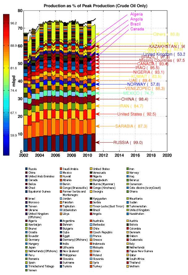
The EIA is interspersed with the JODI so you can see where it starts to diverge.
1. Iran is high in EIA compared to JODI
2. USA is high in EIA compared to JODI
3. Mexico is low in EIA compared to JODI
4. Venezuela is low in EIA compared to JODI
it looks like these first four tend to balance out (2 highs + 2 lows ~ 0)
then
5. Canada is high in EIA compared to JODI
6. Angola is high in EIA compared to JODI
7. Algeria is high in EIA compared to JODI
These last three make up the majority of the difference between EIA and JODI.
Then you look at 2008 and you notice similar erratic deviations in the country-by-country, yet they all seem to balance out in the end.
Let's get some more eyeballs on this and we can come to some conclusions.
What are the interesting aspects?
1. Iran has lots of natural gas, weird politics
2. USA is extracting from Bakken
3. Mexico is dropping
4. Venezuela has heavy oil, weird politics
5. Canada has tar sands
6. Angola is ???
7. Algeria is ???
Web, first a question. You (and Sam) are plotting production as % of peak production. What is that?
Second, key observation about your list of deviating countries comprises whole of N America, OECD countries, not exactly what I'd expect. In UK, it will be the Department of energy and Climate Change (DECC) that will have responsibility for compiling and reporting statistics. It's probably one person, and I'd fully expect the exact same number to be reported to EIA, IEA, BP and JODI. Which agency is it in the USA that has responsibility for compiling US production statistics? In UK it would take me 30 minutes to find out who is responsible for reporting, fire an email off to them and get a reply. Someone in US (you or Sam) should be doing same.
Finally I'd like to see your stats plotted differently if that was possible. Id like to see EIA minus JODI for all countries plotted as bar chart for all years. XL has a good chart that allows you to display the time series beside each other. That way we see which countries have zero to little deviation. And those that do and how any deviation has come and gone with the years.
In your list of countries, they are either reporting different numbers to EIA and JODI. Or EIA / IHS is miss-reporting the numbers provided to them.
Euan,
I dumped the data in a spreadsheet and attached it to the post if you want to have fun with it:
http://www.theoildrum.com/files/JODI_EIA_DATA.xls
The color of the areas is function of last production as % of peak production for the period (2002-2011), it is a simple way to visualize countries that are producing at their recent maximum.
Paul is right, there is a difference for Canada but it does not seem to be tar sands (too small), US numbers are the same.
Thanks v much Sam - I will do. Hopefully have something by this evening.
Thanks to the spreadsheet, the following countries account for 2 of the 2.25 total difference in the year 2010.
I missed Qatar graphically because it was buried in the "others" category. KSA and Russia weren't off a lot percentage wise but they tended to balance each other out, so it was hard to sense the shift in the stacked bar chart. I definitely misread Mexico and USA on the chart.
That looks like the full story; just a few countries account for most of the difference between JODI and EIA totals.
Russia is something different going on with long term systematic bias between EIA and JODI, this maybe linked to condensate classification. Qatar and Saudi Arabia though are part of problem.
Here is a chart of Saudi Arabia and Russian production January 2002 thru April 2011. Note: While the Russian JODI data differs from the EIA data it agrees very closely with what Russia publishes on their CDU TEK website. The below chart is from JODI data.
Ron P.
What I find interesting is that in a lot of that data between 2005 and 2009, the JODI and EIA (besides lining up) have similar fine structure in their totals. This still happens even though many of the individual countries don't match, by quite a large margin! This normally can't happen by random chance, as countries that go +/- will leave lots of fluctuation noise in their wake. See the figure below for the part I am talking about.
This is basic forensic statistics and the same kind of sleuthing is used by the government to determine if you are cheating on your income taxes.
If someone agrees with this assessment, it might be worth a look and a possible discussion of what else can cause it. It's possible it can occur because the reconstruction of JODI uses some of the EIA data, but the +/- deviations are totally JODI and should be reflected as variable noise at the top.
As I say, very strange.
EDIT: Thinking about it some more, this could be strong seasonal variations or economic shocks that propagate through every country. Or it could be simply strong variations from a single country that drawn out the noise from the smaller countries.
OK, here's a first quick look, picking on countries identified by WHT. Each country is monthly data, EIA minus JODI, starting Jan 2002, ending Jan 2011.
Iran is most significant with swing from about -200,000 bpd to + 600,000 bpd in period of interest. So that accounts for about 800,000 bpd growth in global C+C supply in EIA data relative to JODI.
Canada is interesting since always high. Growth in EIA data in period of interest is +400,000 bpd
USA shows essentially no bias but with one period of data aberation during 2009.
Angola shows growth of about 200,000 bpd for EIA over JODI
Algeria is kind of like Canada, always biased high in EIA data and shows no / little swing in period of interest.
UK shows small systematic bias towards higher numbers reported by EIA.
Iran, Canada and Angola between them account for 1.4 mmbpd growth in EIA production relative to JODI in period of interest since end 2008.
Interesting, I wonder if the 0.7-0.8 mbpd difference for Canada is the fraction of non upgraded bitumen showing up in NEB statistics, only syncrude would have been included in JODI, just an hypothesis I don't have the numbers handy.
Here is what I got from the NEB for January 2011 (in mbpd), the total production for C+C conventional + syncrude is 2.371 mbpd, not sure what to add to get 2.85 mbpd, if I remove condensates (0.180 mbpd) I get 2.192 mbpd which is close to JODI value (2.116 mbpd).
 CONV. LIGHT CRUDE OIL/

PÉTROLE BRUT LÉGER CLASS.

AB	0.443

BC	0.027

SK	0.202

MB	0.046

NWT/NT	0.019

NF/NL	0.349

ON	0.002

SUB TOTAL/SOUS-TOTAL	1.088

AB UPGRADED BITUMEN SUB TOTAL	1.103

C5+ / CONDENSATE/C5+/CONDENSATS	0.000

AB	0.160

BC	0.012

SK2	0.001

NS	0.008

SUB TOTAL/SOUS-TOTAL	0.180

TOTAL LIGHT/LÉGER	2.371

HEAVY CRUDE OIL/ PÉTROLE BRUT LOURD	0.000

AB CONV./CLASS.-AB	0.185

AB NON-UPGRADED BITUMEN / BITUME NON VALORISÉ-AB3	0.994

AB SUB TOTAL/SOUS-TOTAL -AB	1.179

SK CONV./CLASS.-SK	0.371

TOTAL HEAVY/LOURD3	1.550

TOTAL PRODUCTION	3.922

WESTERN CANADA/OUEST CANADIEN	0.000

CONV. LIGHT/LÉGER CLASS.	0.738

AB UPGRADED BITUMEN/ BITUME VALORISÉ-AB 1	1.103

PENTANES PLUS	0.172

TOTAL LIGHT/LÉGER	2.013

CONV. HEAVY/LOURD CLASS. 	0.556

AB NON-UPGRADED BITUMEN / BITUME NON VALORISÉ-AB3	0.994

TOTAL HEAVY/LOURD	1.550

TOTAL WESTERN CANADA/ OUEST CANADIEN	3.564

TOTAL EASTERN CANADA/EST CANADIEN	0.358

TOTAL CANADA	3.922
2011 (updated 9 May 2011) [EXCEL 232 KB]
Following this data (January 2011 estimation) from NEB I get this result in barrels/d.
C+C: 467,602 M3/d * 6.29 Barrel/M3 = 2,941,216.58 Barrel/d
AB non upgraded bitumen (heavy oil): 118,537 M3/d * 6.29 Barrel/M3 = 745,597.73 Barrel/d
I used the wrong conversion factor, 6.29 US barrels/M3 is the correct one. 2.941 mbpd is not strictly for C+C, it includes non upgraded bitumen (0.746), if you remove it, you get something close to JODI (2.196). Canadian production numbers are often revised also.
Light crude 1.088
Upgraded bitumen 1.103
Cond 0.18
Sub total = 2.371
Heavy crude 1.55
Canada total 3.921
non upgraded bitumen 0.994
Canada less non-upgraded 2.927 - close to EIA number
Where does the non-upgraded bitumen get accounted, where does it go?
The correct numbers are (with the correct conversion factor):
Light crude 0.816
Upgraded bitumen 0.828
Cond 0.135
Sub total = 1.779
Heavy crude 1.163
Canada total 2.941 (Close to EIA)
non upgraded bitumen 0.746
Canada less non-upgraded 2.196 - close to JODI number
I think the EIA is taking the total Canadian production, JODI is excluding non upgraded bitumen. I think it makes sense to exclude it as there are 80-90% volume losses associated with the upgrading process.
Conversion factors from what to what?
Is non-upgraded bitumen a number for a change in stock level?
The data from the NEB is in cubic meters per day, to convert it in US barrels per day you need to multiply it by 6.29 (I used 8.39).
Here is the NEB spreadsheet link given by KarlMarx:
http://www.neb-one.gc.ca/clf-nsi/rnrgynfmtn/sttstc/crdlndptrlmprdct/2011...
The non-upgraded bitumen is basically raw bitumen mixed with diluent and shipped by pipeline to US refineries for upgrading.
JODI is excluding non upgraded bitumen. I think it makes sense to exclude it as there are 80-90% volume losses associated with the upgrading process.
Say what? Depending the processing method you can take 100 barrels of non-upgraded bitumen and get 110 barrels of product out of it. Refinery gain, you know.
I'm talking about the upgrading from bitumen to SCO not the refining of SCO, the loss depends on the upgrading process (hydrocracking or coking). You don't lose any volume with hydrocracking, with coking you lose 15% I think.
The product yield from non-upgraded bitumen is not a great deal different from conventional heavy oil, assuming the refinery has been modified to handle it.
It still doesn't make sense to exclude non-upgraded bitumen from the total since it is sold directly to oil refineries, mostly in the US, and competes with conventional heavy oil in that market. Why include the latter and exclude the former?
Is it possible the difference is crude oil imports into eastern Canada, which run around 850,000 bpd? They might be deducting that from oil production to produce a net number.
It makes sense to me also.
Last one for now.
These six countries are all biased toward higher numbers at EIA. Bias was constant from 2004 to 2008 at about +1 mmbpd. Then the bias trended up to 3.5 mmbpd and has since fallen back to 3 mmbpd. These countries result in EIA production rising + 2 to 2.5 mmbpd compared with JODI and trend initiation seems to coincide with the great crash of 2008.
I checked UAE and this bias / trend is absent in that data. Another post?
Euan - As I understand the problem there's potential variations between the different organizations based on what countries are reported, designation of crude vs. C+C, refinery gains, etc. TOD folks are working hard to clear this fog. But the one area where there cannot be any significant variation (excluding the categorization issue) is US production. You ask "Which agency is it in the USA that has responsibility for compiling US production statistics?" The silly answer is any agency that wants to...or any individual for that matter. I've seen any number of industry groups report this number over the years: SPE (Society of Petroleum Engineers), AAPG (American Assoc. of Petroleum Geologists), etc. But all anyone has done is simply access the production records of each state. AFAIK only one state doesn't keep (as of 6 years ago) detailed compilation of all crude and NG production volumes: Kentucky. Given the very small amount of KY production this shouldn't cause much of a problem even if some organization uses a "guess' for that volume. And it's all the more true for crude since KY production these days is primarily NG.
And anyone in the country can access each states' monthly production records. Might take a bit of effort but can be done for free. But for a very modest subscription price anyone can sign onto a commercial service that updates all the states on a monthly basis. I'll focus on the two states I work: Texas and La. The operators in each state report their production on a monthly basis. And it's done in extreme detail: down to every individual well or lease. If I'm producing a Texas oil field with 50 different leases (in Texas oil is reported by lease...not by well) with 70 wells producing wells the operator doesn't report how much the field produced that month. They report how much oil each lease produced. And if I have a NG field with 40 wells in it the same holds true: the reported volume isn't for the field but each individual well with each one having its own unique ID number. Same true for each oil producing lease. IOW not only can you ID each component of the production stats but you can pull up the entire production history on a monthly basis from the first day of production. With a couple of mouse clicks I can pull up the entire production life of every NG and oil producing lease in either state for the last 50+ years. And be completely confident in the accuracy. Besides the fact that misreporting production data is a criminal offense all the production is audited by other parties. Primarily these would be the working interest partners in the wells and the royalty owners. I periodically check the numbers reported to the state, the numbers reported directly to me and the numbers carried by the purchaser of the crude/NG. Not only are the state reported numbers audited but also the sales receipts thru the purchasers. IOW the readily available state reported numbers are very accurate.
And what would it cost the EIA, IEA, BP, or JODI to have access to this commercially available US data set? Less than any one of these organizations spends monthly on coffee for their employees. I'm not kidding...really. Anyone who wants to find out just needs to go to Drillinginfo.com and check the web site. I don't know if it's still available but at one time anyone could get a FREE short term trial subscription. And it's much more than just a production list. The subscription price also includes software to screen,filter, compile, contrast, plot, etc to your hearts content. With just a few mouse clicks I can pull up exactly how much crude or NG was produced in the entire state of Texas during November 1987. Or with the same few clicks I can tell you exactly how much NG the ExxonMobil #86 Simth well in Nueces County produced during July, 2001. And with a couple more clicks generates a plot of mothly production for that well from when it first went on line on March 22, 1979 up to about 3 months ago. And I can make it a linear plot or log normal. And make the oil curve green and the NG curve red. And, again, I can do this at cost less than my small company spends for our monthly coffee service.
As long as each organization is counting apples as apples there should be no significant variation at all for their stats for the US. If there is a variation then that needs to be investigated IMHO. If every entity is starting with the same numbers then any variation has to be with their manipulation of the numbers. If the source of that misfit can be ID'd then there a good chance it can explain why variation exists for other countries and thus for variations in the global number.
BTW: the same accurate numbers are available for all production from federal leases both onshore and offshore. And it's free and available at the govt web site
Data for Canada is similarly detailed (by well and producing zone) to that for the US, but like the United States, Canada is a federation of provinces (states). Most production data is reported to the provincial governments, and the federal government only monitors offshore production, plus production on federal and Indian lands. This makes oil monitoring in the US and Canada different from the UK, which is a unitary country where all production monitoring is done by the central government.
There is a big issue involving definitions in this reporting. Canadian regulatory authorities are consistent within Canada, but define "oil" differently than US ones, so you need to look at the data at a very low level to resolve the differences between countries. There is no guarantee that EIA, IEA, BP, or JODI are using the same definitions, or that they process the numbers the same way to make them add up the same for all countries.