Driving Recessions
Posted by Stuart Staniford on October 23, 2005 - 10:16am
It's worth noting that this line of posts has now sparked interesting discussion over at Dead Parrot Society, and Econbrowser.
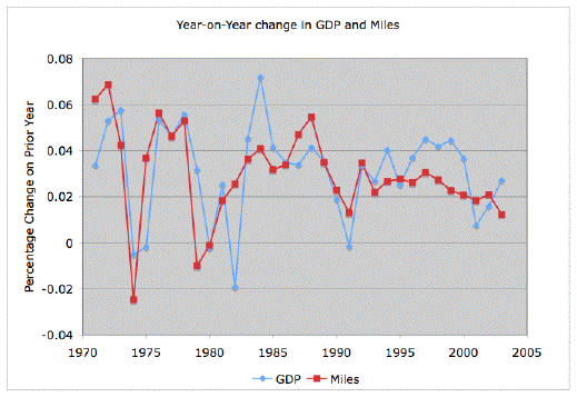
Recall that I've been obsessing over this picture, now with the 1970s annual data and the 2003 number (from here) included.
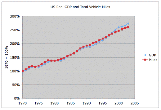
The GDP is the real (inflation adjusted) numbers from the Bureau of Economic Analysis, and the miles come from the Transportation Energy Data Book, the Federal Highway Administration Summary of National and Regional Travel Trends, and Highway Statistics 2003. Both series have then been rescaled to make 1970 be 100%.
I have to say in passing that I thoroughly approve of the portion of my federal and state taxes that have been expended on assembling and publishing these statistics. Money well spent in my book.
So then the big question is, is the very striking agreement between these series a fluke, or is there a deep reason why it must be this way? It's definitely not the case that all things that just generally grow with the economy agree this closely with GDP. This next graph adds the time series for total US population (in green), US "economically active" population, in yellow, and number of housing units (from the Census) in purple. Clearly, these have all been generally growing, but not at the exact same rate as the GDP (though there's a very good correspondence between housing units and employed population - I guess it's hard to pay the rent if nobody in the house has a job).

We saw yesterday that there's evidence from Europe of a similar pattern over there, though the coupling is definitely somewhat looser.
Well, let us look at the year on year changes in GDP and miles (ie what was the percentage difference in the respective quantity from one year to the next) now that we can see into the Big Kahuna oil shocks in the 70s:
Ah, beautiful. We've clearly got a fair amount of correlation in the annual growth rates. For pretty much every strong, oil-shock driven, recession, the driving line takes a dive right around or slightly before the GDP line, and then recovers at the same time or slightly earlier too. Note also that now we can see the 70s, we can see all four shocks during this period:
- 1973 Arab embargo (7.8% of oil supply)
- 1978 Iranian revolution (8.9% of supply)
- 1980 Iraq-Iran war (7.2% of supply)
- 1990 Iraq invasion, and US freeing, of Kuwait (8.8% of supply)
However, it's also clear that not all features of the two curves match. There's a 1982 nasty recession that the driving data totally ignore. The driving data doesn't really follow the late nineties tech bubble and subsequent crash, which is clearly visible in the GDP growth line. There's a dual peak structure around 1985 in both lines, but they disagree about which should be the bigger peak.
So how similar are they really? There's a technical way to assess this known as R^2, the correlation co-efficient. This measures the percentage of the fluctuations (technically variance) in one line that can be explained by a linear rescaling of the other. So if the two lines have exactly the same shape (even if size and vertical position were different), they would have an R^2 of 100%. If the two lines were completely unrelated, they would have R^2 of 0%. So these two lines have an R^2 of 35%. So, in addition to the long-term trend being the same, 35% of the fluctuations in one line about it's long term trend are explained by the fluctuations in the other line. Not too bad for a social science R^2...
Before anyone gets upset that autocorrelations mess this up, the 1 year lagged autocorrelation R^2 in GDP growth is only 3.8%, and the 1 year lagged autocorrelation in miles growth is only 9.6%. (The lagged autocorrelation studies how much of the fluctuations in some year were explained by where the fluctuation was up to the previous year - so they measure the degree to which the line wants to wander around smoothly rather than jerkily. These low autocorrelation R^2 values tell us these lines, in so far as they wander, wander fairly jerkily - this year's growth has very limited memory of what last year's growth was). So that maybe gives us a better sense of what this 35% correlation between the two lines means - if you want to understand this year's GDP growth, this year's mileage growth has about 10 times as much explanatory power as last year's GDP growth. And if you want to understand this year's mileage growth, this year's GDP growth has about 3 1/2 times as much explanatory power as last year's mileage growth.
I think there's a little bit of a lag here - things seem to happen a little bit earlier in the mileage line. However, it's only a few months, not a whole year, so it's a bit tricky to compute a shifted R^2, even though it might be a shade lower. It's also noteworthy that there are no big features in the mileage line that are missing from the GDP line, but there are big features in the GDP line missing from the mileage line (such as the 1982 dip and the late nineties boom). This suggests that causation is more prone to run miles-to-GDP than the other way round (though I'm sure there's some feedback arc both ways).
Now, in addition to the local correlations, we also have the fact that the long term trends are the same. In fact, over the whole period 1970-2003, mean GDP growth is 3.1%, and the mean miles growth is 3.0%. Obviously the fact that these growth rates are so similar is the core reason the graphs line up. We can say a little more about the significance of the similarity. In particular, if we look at the population of 32 growth observations of each type, we find that the standard deviation in both is the same value: 2.0%, which (given there's not much autocorrelation so we might not be hopelessly off-base to treat them as iid and divide the standard deviation by sqrt(32)), means that the expected standard error in each rate is 0.35%. Ie, if you just looked at the pretty large growth rate fluctuations, you'd think the mean of each of them might have come out different than it did with a fluctuation size either way of 0.35%. Thus the error in the difference between their two rates is sqrt(2) larger, or 0.5%. So the two trends are quite close together compared to the fluctuations in their growth rates. But, if that difference were normally distributed, the chance of being at 0.1% different or better (ie within 0.2 standard deviations either way) would be 16%. So we can't say "there is statistically significant evidence that these lines are closer together than you'd expect just based on their average and fluctuations in growth" - we'd need a much longer trend.
I meant to repeat this with a bootstrap Monte Carlo for good measure (since the normality assumption doesn't seem too solid), but I think I need to do a bit more work. The residuals of GDP growth minus mileage growth look like this:
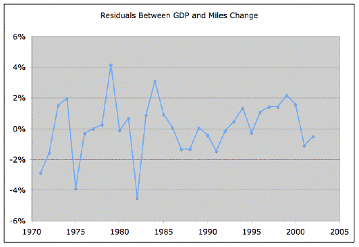
The autocorrelation r^2 at lag 1 in this series is only 0.6% (ie negligible), so I built a little Monte Carlo program that takes the GDP series and builds alternative mileage series by picking a random residual, bootstrap style, from the pool of residuals in the graph and multiplying last years mileage by the gdp growth plus random residual. The idea is to then build a population of such lines and see if the closeness of our actual ones is anomalous or not. Some output (two MC runs) of this is shown below. However, this process doesn't work because it produces mileage lines with too high a variance (GDP variance plus residual variance). So I need a better way to generate these random walks.
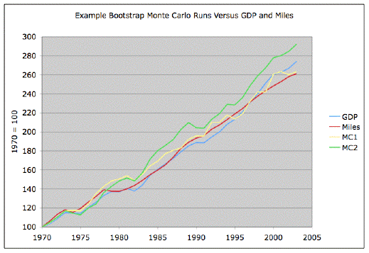
But, that will have to await a new surge of inspiration - tonight's has run out!
Contact
- Content: editors at theoildrum dot com
- Tech support: support at theoildrum dot com
License

This work is licensed under a Creative Commons Attribution-Share Alike 3.0 United States License.
Anyway, your interpretation seems to understate significance of employment changes since GDP changes will induce employment changes with a lag. Also the trends of disposable income are important if vehicle-miles are in some sense a normal good.
More generally, a draft paper you may fine relevant to this topic is Indicators of Dematerialization and the Materials Intensity of Use: A Critical Review with Suggestions for Future Research . By Cutler J. Cleveland and Matthias Ruth. Boston University. Some quotes from their conclusion include:
I am math challenged. Wonder if there is a predictive connection between %loss of oil supply and decline in miles driven and thralled GDP?
Perhaps an explanation for nil effect of the tech bubble bursting was that it was responded to by the FED with massive system liquidity injections. A majority of the non-stock owning public didn't feel a thing, as billions of equities dollars disappeared.
I find it particularly interesting that vehicle miles continue to grow faster than population, the two curves growing farther and farther apart.
As a large fraction of passenger vehicle vehicular miles are the result of going to and from one's place of business, is the rise in vehicular miles an indication that people are finding themeselves driving farther and farther to get to work? My hunch is that this is not just the result of the growth of the deep suburbs, but also possible a reflection that jobs are harding to get and that many people have no choice but to take jobs that are farther away. In other words, people no longer have the luxury of choosing how far away they are willing to work. Sound plausible?
And if commercial vehicular miles is also rising, then that could be another indication of the effects of globalization, as more and more goods are shipped farther and farther from their points of orign to the consumer ( e.g. Chinese goods unloaded on the West Coast trucked to distribution points on the East Coast, rather than from closer US factories say in the Midwest). Sound plausible?
It is also interesting that GDP has similarly grown faster than population. I have a bit of trouble with this one. In a general sense, GDP is supposed to be a measure of gross economic activity. So, if the Real GDP has grown faster than population, then that implies that there is more per capita economic activity than there was a decade ago. And on the presumption that this increased economic activity is generating more wealth, then we should collectively be more wealthy than we were a decade ago. But is that really true? Is it possible that more and more of this economic activity is just marginally productive 'churning', e.g., people buying and selling house, and suing each other?
Also, is it possible that the way the yearly GDP is 'corrected' for inflation to come up with the Real GDP has some built-in faults or biases that creates distortions that gives the illusion that the Real GDP is rising faster than it in reality is? I'm not saying it is..... just raising the question.
The ratio fell back to about 150% or so by 1980, but since then it has exploded to about 304% currently. Imagine what would happen to the debt to GDP ratio in a severe recession or depression.
Also consider the quality of the GDP in 1934 versus 2005. Today, the majority of Americans live off the discretionary income of other Americans. In 1934, probably about 5%, certainly no more than 10%, of Americans lived off the discretionary income of other Americans.
At least in terms of GDP per capita, another way to put it is that the majority of U.S. GDP is an illusion. We use vast amounts of energy in zero sum games that are basically transfer payments. For example, instead of traveling to Las Vegas for a weekend, you could just mail them a couple of thousand dollars, and it would have the same economic impact. Let me put it another way. Would anyone really have noticed if the infrastructure in Las Vegas and Orlando disappeared overnight? Compare that to the nationwide effects of Katrina and Rita on Gulf Coast and GOM infrastructure.
Soon, we are going to have to choose between saving jobs and saving energy. Do we continue to use energy on leisure cruises to nowhere when some people in the Northeast may be literally freezing to death in the dark?
http://www.theoildrum.com/story/2005/10/21/18399/446
I would suggest that since the GDP calculation get decomposed into constituent parts, then take it apart and look at correlations between each of the components.
So the parts of GDP are:
private consumption + government + investment + net exports
Take private consumption first and plot against that. I bet you see a strong correlation with that one, and weak against the others.
Does anyone know specifically how GDP is calculated? What formula is used?
I also want to add that the correlation seems to be strongest in the direction drop in miles -> drop in GDP during the oil crisises. Obviuosly the oil shocks caused drop in the GDP because of the shortages not because of the high price. The high price was just the mechanism to "price out" some miles which in turn caused drop in economic activity.
The good news is that the correlation is to distance traveled rather than energy consumed. Presumably the VMT:GDP ratio will not change even if cars are twice as efficient. It hasn't so far and there have been big efficiency improvements since 1970.
I guess I'll stick around a few more years and see what this graph looks like in 2010. By then Stuart may be getting his Nobel prize for discovering a new law of economics.
It might be helpful to identify what this limiting component is by imagining a world where there were no limits on transportation; where we could go as far as we wanted within the world at any time, at any instant, "Star Trek transporter"-style, perhaps. We wouldn't use that facility mainly for transport of goods; goods go point to point, not back and forth, and as has been pointed out elsewhere, our dependence on physical material goods has been at least gradually declining.
What I imagine we would do with unlimited personal transportation is the equivalent of what we do on the internet now, but in person: inserting our specialized knowledge and skills where needed at any point in the world at any time, going out to gather in-person information about what's going on out there, participating in social events around the world. Rather than trying to communicate over the phone with colleagues in India having trouble getting our automated emails, I'd bop over there for 5 or 10 minutes and try to trace where exactly the problem is coming from. Rather than venturing out to the water park only once every couple of years, hoping the crowds aren't too bad and the weather's good when we get there hours after we depart, we'd probably buy a membership and enjoy our favorite spot almost every summer evening.
With instantaneous travel we could be far more productive, have far more leisure time, and take the economic benefits of the division of labor that globalization makes possible to the limit. So, perhaps present limits on personal travel are the "limiting reagent" in economic growth, at our present stage of world development?
ASPO2005_Ayres.pdf
Not being an economist myself, I'm pretty convinced that oil is the missing term in the Cobb-Douglas expression.
In addition to being math challenged I am economic theory challenged, but this exposition has sure overcome a big piece of my handicap. I still suspect that Stuart's miles driven is the product of petroleum (or gasoline ) consumed times a theoretical fleet average mpg factor. (No one captures actual miles driven). As noted in the top para on page 11, energy has a negligible role in national accounts (petroleum costs less than bottled water), but as Ayers has demonstrated it is the major driver of economic growth ie GDP. (23x multiplier of labor). Since 40% of our primary energy is petroleum, and since petroleum has a bigger impact than other forms of primary energy, it makes sense that GDP follows "miles driven" which is almost certainly a proxy for petroleum. Murray
I have used the following simplistic equation in the generation of the following graph.
Average Miles Per Gallon * Historic GDP per mile driven * Gallons per Dollar
21 miles 3.5 GDP dollars 1 gallon
---------- * ---------- * ----------
1 gallon 1 mile X dollars spent
Where X is the cost per gallon of gas. This leaves us with an equation of the terms GDP dollars per dollar spent on gas.
Graph of GDP gained per Dollar Spent on Gas
Now another interesting thing I'd like to point out from the US perspective, becoming increasingly dependant on foreign sources of oil will have a drag on the "Net Export" part of GDP. If you pay 5 bucks for that gallon of gas and you get 70% of your oil from foreign sources you have paid 3.5 dollars off of GDP because GDP includes net exports. The Current US import rate is around 60% and rising. I've used the 70% number for that reason. The equation used was GDP - 70% of gas price. Note that this number becomes more important as the price goes up.
Arguably the number has been included in the current GDP numbers because the amount imported oil has went from 0% to 60% over the last 35 years while the GDP number has stayed constant, but I would like to point out the difference between that 0% and 60% is less than 5% of the GDP change and falls within the error margin of this 3.5 GDP per Mile number given by Staniford. But as we increase the cost per gallon, it becomes more profound. This allows us to calculate a break-over point after which driving becomes an economic loss. To me, this means the end of the status quo. I don't know what will follow it, but I can reasonably say that we will have to see a different economic structure at the following price point.
Graph of GDP per dollar spent minus the export on GDP
As for what comes after, a follow up done by Victor at Dead Parrots shows a way to attain an 8.5 to 1 ration of GDP dollars per mile namely, the WWII wartime economy. But I include this scenario along in the "change of the status quo" basket. Even in this case, the ratio goes negative at about $15 dollars a gallon. But you'd assume oil acquisition as a pretty high priority with this "wartime economy", so anything goes in that scenario and the driving to GDP metric probably breaks down.
To those of us stuck reading the tea leaves, I think this chart can provide a useful measure of how the US Economy will fair against sustained high oil prices. When gas hit the 3 dollar price the US economy produced 22 Dollars of GDP per mile driven and we had the worst retail month since September 2001. When gas hits $5 per gallon, we'll each only make half as much on average. By the time it hits $9.50, we are spending more on gas than we get back in GDP. Beyond that point, no balancing of the books will hide the fundamental imbalance in the US economy.
As long as the status quo holds, this particular relation will likely hold. Given that, we can use our friendly local gas station as a timely barometer of the US economy. If you see the price hit $10, expect substantial change in somewhat short order. Perhaps if we all know where the wall is, we can persuade others with the evidence so that we can collectively avoid it. Forewarned is forearmed.
Let me know what you think!