| KR: Administration backs off Bush's vow to reduce Mideast oil imports | The Oil Drum | Thursday Open Thread... |
How fast should you boil a frog?
Posted by Stuart Staniford on February 2, 2006 - 11:57am
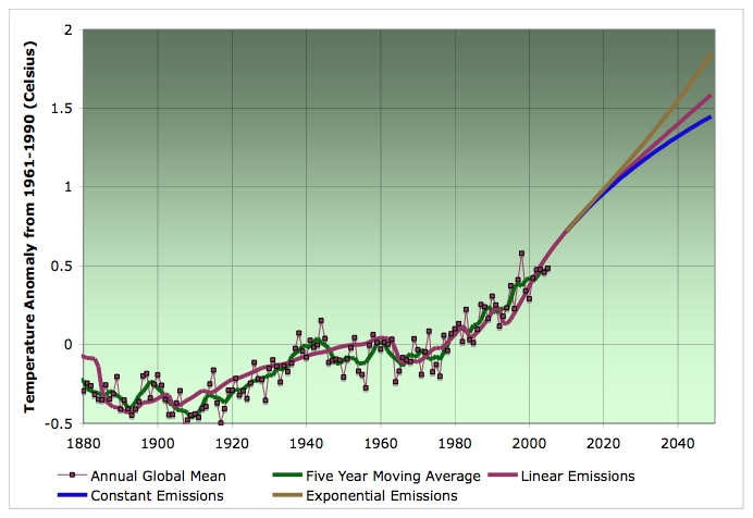
Global average temperature 1880-2005, together with one dimensional model fit (as described in the text) extrapolated to 2050 for the case of linear, constant, and exponential carbon emissions (all other forcings held constant after 2003). Data: UEA CRU.
The very basic physics of the greenhouse effect is probably familiar to most people, but let me take a second to review it for the rest of our readers. The sun, being very hot, emits enormous amounts of electromagnetic radiation. The spectrum of that radiation peaks in the range that our eyes can detect as visible radiation. The earth's atmosphere is mostly transparent to the sun's radiation, and so most of it reaches the ground and the parts that aren't reflected back upwards are absorbed and heat the earth.
Because the earth is much warmer than space, it also radiates electromagnetic radiation out in all directions. However, since the earth is much less warm than the sun, it emits much less energetic (longer wavelength) infrared radiation. If the earth's atmosphere were dry and free from greenhouse gases, it would be transparent and the earth would be quite a lot colder (permanently below freezing everywhere). Instead, certain gases absorb some of the infrared radiation, which warms the air more than it otherwise would be, and keeps the planet warmer.
The infrared absorption of the atmosphere is shown in the following figure which shows how much of the infrared gets through as a function of the wavelength (the blue areas under the curve are where radiation get through, in proportion to the height of curve). Also shown are labels for some of the notches where either CO2 or water molecules are responsible for the absorption.
Transmittance of infrared radiation as a function of temperature. Source: Wikipedia.
So in general, if there is more CO2, then it is harder for infrared radiation to get out of the atmosphere. That means the earth cannot shed heat as effectively, and thus will warm up. As it warms up, it will release more radiation. Eventually, it will get enough warmer that the outgoing radiation will balance the incoming sunlight (referred to as radiative equilibrium). Normally the earth is in radiative equilibrium to a very good approximation, but that is less true at the moment (as we shall see).
So the key question, in light of our explorations in CO2 concentration the other day, is how much temperature rise do we get from any given increase in CO2. This is known as the climate sensitivity, and is often expressed as what would be the effect of doubling CO2 from the preindustrial value of 280ppm, but we will follow a newer and better convention.
This is a very complicated business because there are a lot of feedbacks in the system. Eg, if there is more CO2 and things start to warm up, that means the warmer oceans will release more water vapor, which also blocks infrared, amplifying the effect of the CO2. However, some of the water vapor might create more clouds, which reflect sunlight away from the earth and tend to reduce the temperature increase. On the third hand, the increased temperatures will melt some of the earth's ice and snow in some places, which would have reflected sunlight, but now won't, and so that enhances the temperature. On the fourth hand, the increased water vapor might cause more snowstorms and lead to increased accumulations of ice and snow in some places. Etc, etc. As you can imagine, this is a computer modeler's paradise and the climatologists have engaged in that big time.
Historically, the climate models didn't agree as closely as one might like. For example, here's a set of temperature projections for one particular CO2 scenario (the A2 scenario used by the Intergovernmental Panel on Climate Change (IPCC), which lies between our linear and exponential emissions extrapolations from the other day).

Temperature increase over 2000 for eight global climate models in IPCC SRES A2 emissions scenario. Source: Wikipedia.
As you can see, the uncertainty is considerable. Indeed the IPCC, which is an international organization of government nominated scientists who write consensus reports about climate change, quotes the climate sensitivity to a doubling of CO2 as 3.5 ± 0.9 oC, which is 6.3 ± 1.7 oF. Those are the one standard deviation error bars. This is a lot of uncertainty to add to the already considerable uncertainty that economics and resource constraints introduce into the emissions scenarios (though, as you can see from the figure, there's less uncertainty about the near future than the far future).
Another way to get at the situation is to look to the past. The climatologists have expended extraordinary levels of effort to drill sediments out of lake and ocean bottoms and analyze isotope ratios in them, examine tree rings, drill ice cores in ice sheets all over the world, etc, etc. Then they take all these time series, statistically munge them together, and try to come up with an estimate of global temperature. This graph is the result of a range of such exercises. The black line at right is special however - it depends on actual temperature records since regular meteorological observation began.
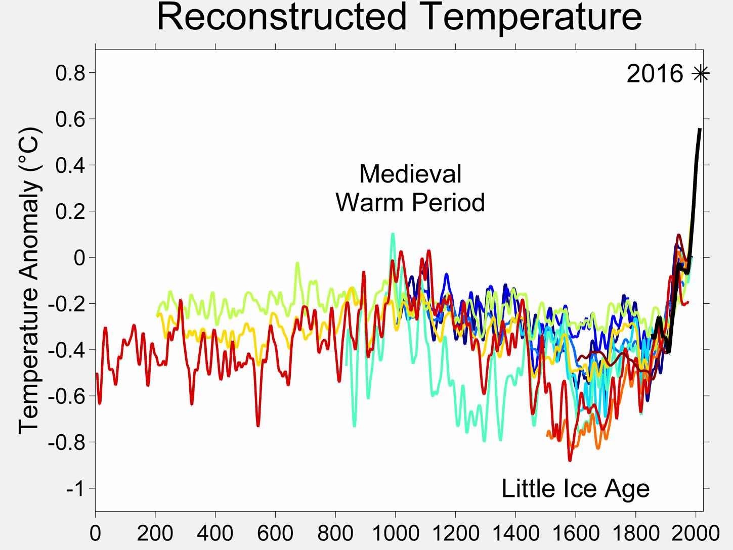
Ten different reconstructions of global temperature anomaly relative to the 1961-1990 temperature. Source and detailed references: Wikipedia.
Clearly, we run into significant uncertainty again. All of these efforts show recent temperatures being unprecedented in the last 2000 years. However, they differ considerably in how much natural variation there has been before (which of course must be considered in deciding how much of the recent temperature rise can be ascribed to greenhouse gases, and therefore used in estimating the climate sensitivity).
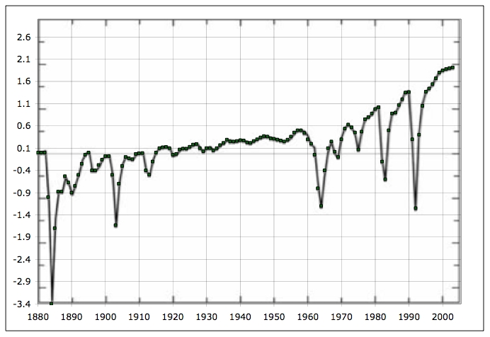
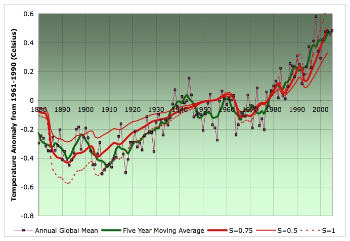
Let's take a look at that instrumental record (the global average data are courtesy of the University of East Anglia Climatic Research Unit who regularly update their time sequence).
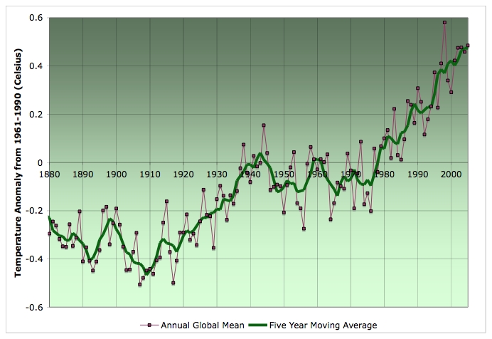
Global average temperature 1880-2005, together with five year moving average. Source: UEA CRU.
Roughly speaking, you can see a cooling trend in the late nineteenth century, then a sharp rise in temperature from 1910-1940, approximate stability in the middle twentieth century, and then rapid rises after the late 1970s. Clearly, there is more going on in this than just CO2. To get at what is happening, here's a figure from a paper of James Hansen et al. which is under submission at the moment and represents a huge array of modeling efforts with the GISS global climate model. The newest models are starting to get quite impressive - probably mainly because of better inputs.
In particular, this next picture shows estimates of all "climate forcings" that have changed from 1880. Climatologists classify all the external factors that affect the climate according to the equivalent change in sunlight at the top of the atmosphere that would have been needed to produce that change. The solar constant is around 1366 Watts/square meter (if the square meter in question faces the sun directly), so the variations of a few Watts/square meter are against that number. By putting all the different effects into a common framework, it's easier to compare their contributions to climate change.
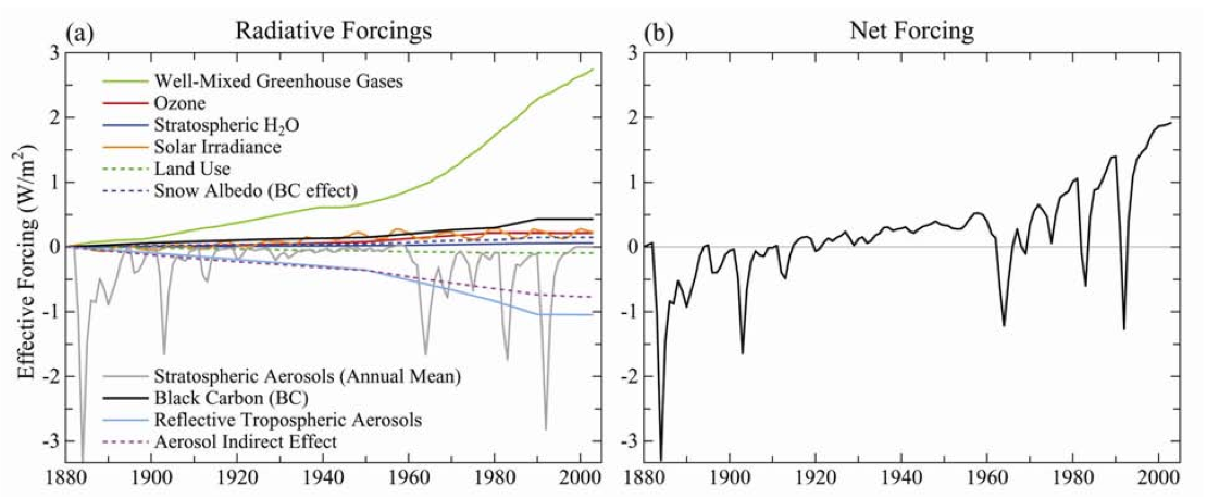
Estimates of main climate forcings over time (left), and net forcing (right). Source: Hansen et al.
You can see that the most important effects heating the planet up are the global warming gases (reaching around 2.7 W/m2), with black carbon (soot) in the atmosphere being a distant second. The most important compensating factors are aerosols (especially sulphates), which have both a direct effect reflecting sunlight, and also an indirect effect seeding clouds. Stratospheric aerosols (mainly from very large volcanic eruptions and early atmospheric nuclear tests) also play an important if intermittent role.
We can see in Hansen et al's figure much of the explanation for the temperature variation. The cooling in the late nineteenth century is primarily due to volcanic eruptions, especially Krakatoa. The warming from 1910-1940 looks explicable as the earth warms up after that (it takes decades for the surface ocean to warm, and centuries for the deep ocean to equilibriate). Then the stable period in the mid twentieth century is due to the fact that global warming gases only slightly outweighed the cooling effects of tropospheric aerosol pollution. In the later part of the century, this breaks down as clean air measures are increasingly taken allowing global warming gases to dominate despite the best efforts of the nuclear weapons community and an assortment of volcanoes (led by Mt Pinatubo).
When Hansen et al. run these forcings through their model, they get this level of agreement:
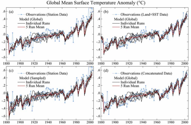
GISS model temperature versus observed temperature for four different schemes of global averaging. Source: Hansen et al.
Pretty good. However, they emphasize that the leading source of uncertainty in global warming is the forcing of the aerosols (both direct and undirect), which has a relative uncertainty of about 50% (ie huge), and the growth rate is so uncertain they can't even say if it's growing or shrinking. Hence considerable uncertainty propagates through into their estimate of the climate's sensitivity to greenhouses gases. They state they probably could produce equally good model fit with more climate sensitivity and less net forcing, or less climate sensitivity and more forcing. Thus the problem of uncertainty in the climate sensitivity persists, which makes extrapolating temperatures more difficult. Indeed, they estimate elsewhere based on paleoclimatalogical evidence that climate sensitivity is 0.75 ± 0.25 oC/W/m2 (1.35 ± 0.45 oF/W/m2). That is to say, if you increase the total climate forcing by 1 W/m2, the world will eventually get 0.75 degrees Celsius warmer, except you could be wrong either way by 0.25 degrees Celsius (one standard deviation error bar).
However, you don't get this warming all at once. In their model, you get 50% of it in 25 years, 75% in 100 years, and it takes several hundred years to get to full equilibrium. That's the ocean; it's slow to warm up and it covers most of the planet.
Let's now dig into what is inside that greenhouse gas forcing (just the green line from two figures up). Here are the main constituents:
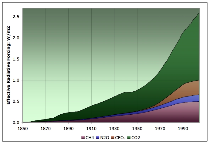
Excess radiative forcing over 1850 level due to various greenhouse gases. Source: NASA, Goddard for mixing ratios and Table 1 of Hansen and Sato, 2000 for conversion formulae.
There are two important things I see here. The first is that the non-CO2 components are a pretty important part of the total. However, they appear to be collectively stabilizing, whereas CO2 is continuing to go through the roof. The reason for the methane emissions stabilizing doesn't seem to be very well understood and is in direct contradiction of the fears of permafrost methane release. The reason for the stabilization of CFC concentrations is the success of the Montreal protocol and its various follow-ons. However, these compounds are very long lived in the stratosphere, and there are still some emissions in developing countries, so there will not be a rapid decline in their concentration.
You might wonder why we don't have water in that graph, given that H2O is an important and effective greenhouse gas. The reason is that water exchanges very fast with the ground/ocean, so there's no real memory in the water concentration (with a partial exception for the stratosphere). It varies rapidly in response to the weather. Thus it becomes one of many feedback loops that are all folded into the climate sensitivity, rather than being viewed as a long-lived greenhouse gas.
Ok. Now I'm going to do something that will make any real climatologists scream, but I'll argue it's defensible. Here's the thing. I need a model of the way carbon dioxide translates into temperature that's blog friendly. Later in this series, I want to be able to play with emissions scenarios, and see what they mean for temperature, and in the space of a blog post, where I might have 5-10 hours to work on it, I don't want to have to download, learn, and run a global climate model that probably needs a supercomputer to run on anyway (yep - you can get a real climate model and run it at home). I want something simple and lightweight enough to be usable in this format. But correct enough that it will keep us within the (significant) uncertainties of the problem. Remember, we have 33% uncertainty in the climate sensitivity overall, and the model spread in the 2001 IPCC report was even larger than that.
So here's my braindead blog-friendly one dimensional climate model, which turns out to work amazingly well. The idea is that we have an atmosphere coupled to a shallow ocean coupled to a deep ocean. We apply a forcing. The shallow ocean slowly starts to heat up. Newton's law of cooling suggests the heat flow should be proportional to the difference between the actual temperature of the ocean and the temperature that would be in equilibrium with the heat source (the sun as filtered through the atmosphere). That would imply that the shallow ocean would approach the new equilibrium temperature exponentially with a timescale of decades. But there's a complication. The shallow ocean is exchanging heat with a much larger deep ocean, which cools it and makes it take longer to reach equilibrium. So a simple model of that situation is that we take a sum of two exponentials - one with a short (decades) lifespan, and one with a long (centuries) lifespan, that together, when they asymptote, will give the full temperature rise specified by the climate sensitivity.
(In mathematical language, which you can safely ignore if it doesn't make sense to you, I'm going to convolute the forcing function with a sum of two (1-e-t/l) type terms, which together add up to the climate sensitivity at their asymptote. One has a long life and one a short life.)
So, to calibrate this braindead model, I took a model run for GISS that only involved the greenhouse gas forcings since 1880 (ie they turned off volcanoes, aerosols, etc). Then I adjust the parameters to match it, given a climate sensitivity of 0.75 oC/W/m2. It turned out to work best to put 60% of the heat into a 15 year lifetime process, and the rest into a 500 year process (but the latter lifetime is not well constrained by the data as long as it's much greater than the first).
In the next picture, I plot this model, based on the greenhouse gas forcings above, and superimposed on the GISS model plot of the same thing. You can see the braindead model cannot quite match the GISS line - there was no parametrization that would bend quite that sharply. However, it's pretty close, and certainly it's well within the bounds of the uncertainty in the climate sensitivity. The upper and lower lines are what the same model with the same parameters does if you just change the climate sensitivity up or down by 0.25 oC/W/m2
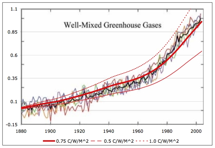
Fit of simple one-dimensional climate model applied to greenhouse gas forcings only, as compared to GISS model run in Hansen et al (top right panel of Figure 10). Center red line is model for climate sensitivity of 0.75 oC/W/m2, while thinner lines above and below represent what the model would produce for climate sensitivities one standard deviation above and below the estimate. Simple model agrees with GISS to within the uncertainties in the problem.
Ok. So I'm not claiming this is a great climatological model. However, I claim it's an adequate one - it will get us by given how large the other uncertainties are in the forcings and how the climate responds to them, as long as we don't try to extrapolate too far into the future, outside the domain it's calibrated on. And it's blog-post friendly.
If we now turn to the full net forcing trace (which I acquired the hard way), my 1D model does this, when compared to the UAE global temperature data:
Global average temperature 1880-2005, together with five year moving average, and 1D model fits for climate sensitivity of 0.75 ± 0.25 oC/W/m2. Source: UEA CRU.
Not bad for a Model with Very Little Brain! I did tweak my parameters somewhat in the face of this more demanding trace. The model is now putting 70% of the heat into a 11 year lifetime exponential (instead of 60% into a 15 year), and the rest into a 200 year exponential. Also, I had no forcing data before 1880 to initialize the state of the model with, so I had to fake some up to get it started off in a reasonable manner. Still and all, the degree of fit suggests the model is capturing the first order physics of what is going on adequately. It's not quite as good as GISS, but it sure was a hell of a lot cheaper to develop :-)
Alright! Finally (and believe me when I say that this post has been harder on me than on you), we get to figure out what our exponential, linear, and constant carbon emissions mean in temperature terms. Recall that in The Carbon Economy post I made this plot:
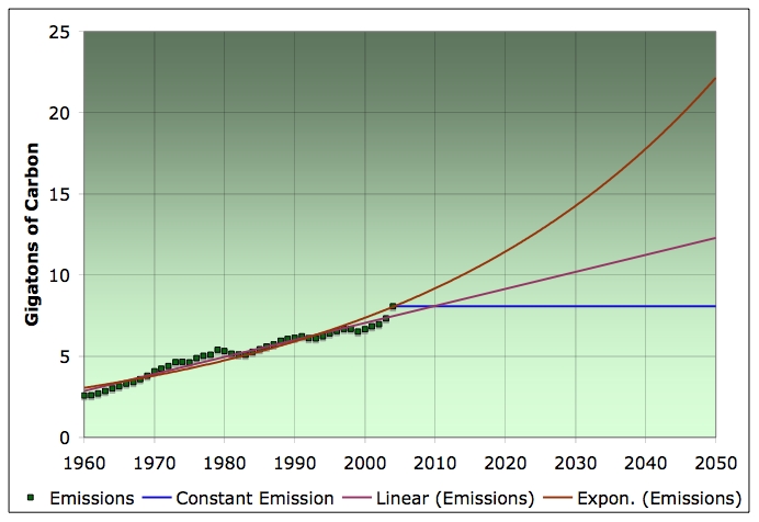
Carbon emissions in Gt/year 1960-2004, together with linear, exponential, and constant extrapolations through 2050. Click to enlarge. Source: ORNL through 2002. 2003-2004 were estimated by scaling the 2002 numbers by the appropriate percentage increases in coal, oil, and natural gas from the BP annual production numbers.
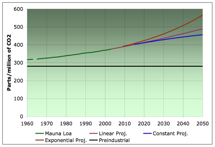
Then, I estimated the resulting CO2 concentrations. What I'm now going to do is hold all other forcings constant:
- aerosols get neither better or worse,
- no major volcanic eruptions or nuclear wars
- non-CO2 greenhouse gases stay flat.
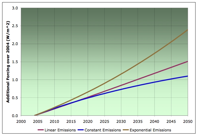
Excess radiative forcing over 2004 level due to various carbon emissions scenarios. All other forcings held constant. Uses Table 1 of Hansen and Sato, 2000 for conversion formulae from CO2 mixing ratios to radiative forcings.
And if we run those into my model with the same parameters as last time (70% into the 11 year exponential, and 30% into the 200 year one), we get:
Global average temperature 1880-2005, together with one dimensional model fit (as described in the text) extrapolated to 2050 for the case of linear, constant, and exponential emissions (all other forcings held constant after 2003). Data: UEA CRU.
A comparison with this figure from the Wikipedia (repeated from above for your viewing convenience) suggests the simple model is well within the range of global climate model projections from the 2001 IPCC report, giving us further confidence that it is a reasonable tool for use in scenario experiments.
Temperature increase over 2000 for eight global climate models in IPCC SRES A2 emissions scenario. Source: Wikipedia.
Obviously, this model can't tell us detail on any other aspect of climate than global temperature, but that will probably serve our purposes here.
In the next post, we'll talk about the emerging implications of that kind of warming, before moving on to talk about biomass flows in the economy (which has certainly been given a new surge of interest by the President's remarks yesterday evening).
Contact
- Content: editors at theoildrum dot com
- Tech support: support at theoildrum dot com
License

This work is licensed under a Creative Commons Attribution-Share Alike 3.0 United States License.
I'm quite amazed with the good results of this braindead model. That has something to tell about temperature modeling, with that two warming fases.
I just don't resist to point out that if we see a nuclear bombing of Iran (or whoever else) it has nothing to do with oil. It's all in order to control climate change.
Controlled detonations of high-yield H-bombs in the middle of some desert might bring enough dust in the stratosphere to cool the Earth with a degree or two. The problem is that we're gonna have to do it on regular basis since aeorosols take several years to settle down.
The only drawback I see is the aesthetically unpleasant view of black smoke tails coming from the planes in the sky... not that it is that high of a price IMO, but I guess it would cause resistance.
Look up into our American Skies and observe what our U.S.Air Force is doing to shade our country from extreme amounts of sunlight.Some call it chemtrails.The patterns from these high altitude spraying ops leave only one conclusion - It nain't commercial jets with contrails making a glaze over our continent.
Two comments/questions, Stuart. The collection of model results seems to show a constantly rising temperature anomaly through the middle of the 20th century, whereas the actual temperature data show a nearly constant temperature during that period; this would seem to lead to a somewhat over-estimate for the future for those models. I would also comment that your model results appear to have a significantly higher temperature rate of change over the last few years of the record than do the actual data.
This is off the subject a bit:
Comparing the costs and rewards of anything requires that everything be put in terms of its "Present Value." To do otherwise would be comparing apples or oranges. Many people avoid this and calculate energy production costs using only an "instantaneous" production cost. However, volatility is very important because it relates to the "risk" that one has for a particular energy production method. Leaving out this risk makes fossil fuel methods seem much more economical.
The following is an example of a present value calculation that shows wind power as a much greater deal than fossil fuel methods when the risk is considered:
http://www.earthscan.co.uk/news/article/mps/UAN/71/v/3/sp/
And, one of the results of "Queuing Theory" is that when the supply of a resource becomes less than the demand (Peak Oil), then the output (price) becomes highly volatile.
In other words, we should expect significant economic impacts from the upcoming price volatility of oil, in addition to the high average cost.
As becomes clear from a close study of your prose, it is vital that we continue to understand that these models are thinking exercise--thought experiment and not predictions. What you have here is are marvelous warming up exercises, sort of like calisthenics before the main sporting event.
Of course there are anomalies. Of course the model is incomplete. All useful models are incomplete--no exceptions.
What you rightly emphasize over and over again is the huge margin of uncertainty; this cannot be overstressed. You have dodged the bullet of the fallacy of misplaced precision seen in some other (not to be mentioned) sources.
Now I do not know whether or not you would like to address this following question, but if you do not, I would appreciate it if you could suggest people I could query on the following topic:
Who are the probable big winners and big losers from global warming? I think Russia and Canada are obvious huge winners from a major warming of the world, the U.S. including Alaska is a pretty big winner, possibly much of Scandinavia is a big winner (if only we could figure out ocean currents and how and why they change), and Greenland, Iceland, and the U.K. seem likely to benefit eventually.
However, climate change may not be a positive sum game; it almost certainly is not zero sum, and the conventional wisdom is that it is a very negative sum game. And thus I return to my question: Are the current losers in the world (the tropical countries) going to become even bigger losers? Bangladesh disappears, and so do other low-lying locales in all probability. Goodbye, Florida. But what about mountainous countries such as Peru or Bolivia? What about the mountainous countries in Asia?
For example, I am guessing that Iceland will be a huge winner in large part because of the following: its exceedingly literate and well-educated population; its advantages in terms of geothermal and hydroelectric power; the fact that there is a lot of ocean around it that makes it hard to attack; the probability that there will continue to be a great many fish in the sea regardless of what happens, so long as liquid water remains in the Atlantic; its 1,000 year history of democracy; its survival during past hard times; its genetic advantages insofar as that 1,000 years ago it was an exceedingly violent society, and much of the DNA that was violence prone probably got eliminated; the fact that all Icelanders are related to one another and know their geneologies, often going back hundreds of years. In other words, they are all cousins of one another and worry about finding a cousin distant enough to marry so as to avoid the hazards of excessive inbreeding.
Cloudy with a chance of chaos
Eugene Linden, Fortune
<<Climate change may bring more violent weather swings -- and sooner -- than experts had thought. ("the most apocalyptic thing I've ever seen in a U.S. business publication")<br> first published January 19, 2006>>.
The captioned article addresses some of the economic impacts of rapid climate change here in the US. For starters, property owners are going to have--and are having--increasing difficulties in getting property insurance, especially within a few hundred miles of coastlines, from Southern Texas to the Northeast US. After reading this article, I concluded that I'm not sure that I want to own property anywhere in the US.
In regard to Scandinavia and Northern Europe, don't forget Stuart's previous post on the possible (probable ongoing?) slowing of global ocean currents. In early 2004, Fortune published an article suggesting that a slowing of the ocean currents would cause (among other things): (1) very cold winters in Northern Europe; (2) more active hurricane seasons and (3) droughts and higher winds in the Southern US. Today, we are seeing all three things happening.
The Gulf Stream delivers something like 27,000 times as much energy to the UK as all of the power plants put together. As I'm sure you know, the UK and Northern Europe at about the same latitude as Siberia. Perversely enough, we could see colder winters in northern climates and hotter summers in southern climates (in the Northern Hemisphere), with more widespread droughts.
The 2004 Fortune article suggested that the US may be the best place (perhaps as a renter, not a property owner) to ride out rapid climate change (which is richly ironic since we have arguably been the biggest contributor to global warming).
This article is about the drought that's plagued the western U.S. for the past few years. It's affecting all kinds of things: farmers, towns that depend on fishing and boating, coal shipments (water's too low for barges), drinking water, hydroelectric plants, nuclear plants (they need water, too), livestock and wildlife, etc.
The cause? Not enough snow.
Perhaps what the data are telling us is that rather than trying to predict the future climate, we should prepare for major changes--without trying to specify what these changes are. I'm writing a series of science-fiction novels based on the premise that climate abruptly flips back to the Cretaceous during the second decade of this century--partly because I don't know of anybody who has seriously proposed that scenario.
Often it is what we do not worry about that gets us.
However, it's consistent with global warming. This study links past global warming with drought in the U.S. west. IOW, even if this drought isn't caused by global warming, it's what we can expect in the future if the world keeps warming.
I'm sure parts of the world will get wetter. The heavy rains in California are probably linked to the drought in the west. Too much water can be as much of a problem as not enough, though, as those people whose houses slid off the hillside discovered.
Perhaps what the data are telling us is that rather than trying to predict the future climate, we should prepare for major changes--without trying to specify what these changes are.
Definitely. One reason not to put it all in real estate, IMO. Your beautiful, fertile farm may end up dry as Death Valley...or underwater.
On a related topic, my recipe for cooking frogs is to use chopped garlic, extra-vigin olive oil, and fry for three minutes in the bubbling oil.
Frying is faster than boiling, and who is to say that climate change will be gradual at all? The most recent research from ice cores (as I understand and interpret it) is that major climate change can happen extraordinarily fast sometimes (perhaps due to asteroid strike, perhaps due to to exceptional volcanic activity, perhaps also for other reasons). Thus, one scenario I prepare for personally is drastic change within the next ten years. Is this likely? No. Could it happen? Based on what I've seen, yes. Can I put a subjective probability on this scenario? Maybe. I'm working on trying to make my premises as explicit and noncontroversial as possible, and also am trying to avoid math beyond the simplist algebra.
You can get a lot of mileage out of ninth-grade math, but you have to work at it; at least, that has been my experience.
Anyway, recent conferences in modelling have shown climate sensitivity converging on 3 degrees C with a doubling of CO2 from pre-industrial levels (about 550 ppmv). This was written up by Richard Kerr in an article Three degrees of consensus, Science, 305, 932-4. Unfortunately, it is not available online without a subscription but here's a nice article What 3 Degrees of Global Warming Really Means that looks at the implications of the results by Peter Barrett, Professor of Geology at Victoria University of Wellington and director of the Antarctic Research Centre.
If the atmosphere were exceedingly dry, so that splashing water from swimming and evaporation from our showers or whatever other water source was important, significantly increased the quantity of water in the atmosphere, then of course those actions would be included in the models as a separate forcing, even if the water didn't stay there long.
The reason the other things are included is because human actions (or irregular planetary events like volcanos) make significant changes to the total concentrations, not so much from the longevity of their stay (though that's part of why human actions make a difference, particularly for CO2).
You probably meant this to be some kind of reference to global warming (although it doesn't make much sense to me - global warming is gradual but society is hardly accepting it like a frog).
But I see it as applying to this series of postings. If you started right off with some wild extrapolation, a flight of fancy, everyone would reject it out of hand. But if you do it gradually, you might get away with it. You start with well accepted figures on carbon dioxide concentrations. You then go to standard climate models, which are somewhat controversial and are known in the community to have problems. You switch to your own model, which is highly nonphysical but which serves your purposes.
Next you will use this model and add even more assumptions and extrapolations, to reach some authoritative sounding conclusion about the future. Presto, a boiled frog! And we never even noticed when we stepped from solid ground into airy fantasies.
EXCERPTS>
Scientists warn of Greenland, West Antarctic ice sheets melting
"The UK government-commissioned report collates evidence presented at a Meteorological Office conference on climate change last year. It says scientists now have "greater clarity and reduced uncertainty" about the impacts of climate change.
In a foreword, Prime Minister Tony Blair said it was clear that "the risks of climate change may well be greater than we thought."
"It is now plain that the emission of greenhouse gases, associated with industrialization and economic growth from a world population that has increased six-fold in 200 years, is causing global warming at a rate that is unsustainable," he wrote.
"The last IPCC report characterized Antarctica as a slumbering giant in terms of climate change," he wrote. "I would say it is now an awakened giant. There is real concern."
http://edition.cnn.com/2006/WORLD/europe/01/30/uk.greenhouse.ap/
That's pretty scary.
The first shows temperature records from the ice cores taken at two Antarctic sites: Epika and Vostok.
The second shows additionally, for Vostok only, CO2 and dust concentrations.
It is clear from these charts that, as far as the natural forces in play during the last 450K years are concerned, we are due for the start of the next glaciation cycle, which btw should be quite fast if it follows the previous ones.
In this context, the global warming effect of the massive release of greenhouse gases from human activity that started around 1950 can be viewed as counter-balancing those natural forces that, by themselves, would have the Earth plunging into a new ice age soon.
Thus viewed, global warming does not look that bad. Particularly knowing, as everyone here does, that in 100 years there will be negligible quantities of oil and natural gas left, and in 200 years there will be no coal left either. In other words, that from 2200 the only fuel people will have to keep themselves warm will be biomass, particularly wood. If on top of that they would be entering a new ice age, life for them would be real hard, wouldn't it?
Note also that this contradicts the minority hypothesis of William Ruddiman that past human activity over the Holocene raised CO2 levels in the atmosphere sufficiently to advert a new ice age. See Debate over the Early Anthropogenic Hypothesis for stuff about Ruddiman.
The Earth's orbital parameters (the Milankovitch Cycles) are the primary forcing causing the Ice Ages in the Pleistocene. Their values now seem most similar to the long interglacial revealed in the EPICA core. So, the majority opinion now is that the paleoclimate data says we shouldn't expect an ice age anytime soon. And the more we force the climate by GHG emissions, the advent of a new ice age would seem to become more and more remote.
(Check out THIN ICE by Mark Bowen).
Finally, you may notice the the temperature and CO2 are strongly collelated. However, if you examine the data carefully you will see that the temperature fluctuations lead the CO2 changes - impling that the temperature changes are forcing the CO2 levels. (It may be hard to see that in the data presented, but I've seen a paper on this where careful analysis shows the temp leads the CO2 by 100-300 years or so.) This is part of an important feed back mechanism - where increased temperture leads to increased CO2 levels (just to make our lives harder when trying to unfold the effects of human caused CO2 emmisions.)
http://www.pbs.org/wgbh/nova/magnetic/about.html
As you suggest, the CCSM climate model is a bit hairy for most people to play around with, but Columbia University, the National Science Foundation's Paleoclimate Program and NASA's Earth Science Directorate have created a version intended for students and instructors, and usable on home computers.
EdGCM runs on Macs and Windows (although most of the analysis tools are Mac-only), and provides a wealth of built-in charts and tables. If you're using the Community Atmosphere Model from UCAR, it can't compare, but for readers who want to play with these concepts at home, EdGCM is a terrific tool.
(I wrote a longer review for WorldChanging last year, available at: http://www.worldchanging.com/archives/001936.html )
5001.         SUBROUTINE RIVERF

5002.   C****

5003.   C**** RIVERF transports lake water from each GCM grid box to its

5004.   C**** downstream neighbor according to the river direction file.

5005.   C****

5006.         USE C477

5007.         IMPLICIT REAL*8 (A-H,M,O-Z)

5011.         COMMON /WORK01/ dMLK(IM,JM),dHLK(IM,JM)

5012.   C**** Location of river entry in downstream ocean cell

5012.5        REAL*8, PARAMETER ::

5013.        *  XK(8) = (/ -.5d0, .0d0, .5d0, .7d0, .5d0, .0d0,-.5d0,-.7d0 /),

5014.        *  YK(8) = (/ -.5d0,-.7d0,-.5d0, .0d0, .5d0, .7d0, .5d0, .0d0 /)

5118.   C****

5119.   C**** Calculate net mass and energy changes due to river flow

5120.   C****

5120.5  C$OMP Parallel DO   Private (I)

5121.         DO 10 I=1,IM*(JM-1)
That's a surprisingly small codebase. I wonder how much potential there is to optimize it? Fortran programs can sometimes have less than optimal cache locality because they pull bits and pieces from lots of arrays instead of combining related data into structures (and it's much worse if you loop through the indices in the wrong order). Also, it looks like they are locked into doing everything at fixed resolution. Somehow it seems like there'd be advantages to simulating some places coarsely (like the middle of the ocean), and others were a finer granularity would be nice (like the coastlines of one's own country). I feel a sudden overpowering temptation to write my own climate model in some nicer language - 17000 lines seems like an attainable target... Must resist, must resist, must resist...
such detail, but I suspect there is another graph
that needs to be calcualted and is probably
impossible to do the maths. What will be the
effect on average temperature if a huge quantity
of extra CO2 is added in a relatively short
period, as vast tracts of permafrost melt,
releasing whatever CO2 is currently trapped?
What effect is deforestation and drought having
on carbon uptake by trees? It was reported
toward the end of 2005 that the Amazon had been
suffering an unprecedented drought; presumably
the uptake of CO2 in the region was
substantially reduced. That brings us to the
nightmare senario of large numbers of trees
dying, so not only do they stop taking in CO2,
but during decomposition, they start releasing CO2.
Then there is the matter of economic growth in
the face of high oil prices. In many regions of
the world those who can no longer afford oil
are now scavenging for wood or coal, whilst in
places like China, coal burning has been
increasing anyway, in line with economic
activity. It is ironic that the Australian
government trumpets every new deal to export
more coal to China. whilst the nation suffers
ever higher temperature and rainfall anomalies.
A few days ago the staggering CO2 emissions of
cement manufacture were noted on TOD, but not
the even worse emissions associated with the
production of iron and steel. And of course,
even the production of aluminium generates substantial quantities of
CO2. Noting that both China has expressed a desire
to get people off of bicycles and into cars, we
must anticipate a surge in CO2 from steel
manufacture and rising emissions from motor
vehicle, up to the point when the oil supply
starts to decline.
I suspect we face an almost exponential rise in
CO2 emissions and will suffer abrupt climate
change within a decade or two as a consequence,
unless the world economy fall over or is shut
down very quickly.
Well, how many Americans (or other for that
matter) are going to vote for economic
collapse? We've seen the pattern repeated for
decades; they always vote for environmental
collapse, rather than econiomic collapse.
Did I just hear about a tornado hitting New
Orleans? In the middle of winter! A portend of
things to come.
http://www.msnbc.msn.com/id/11143365/
I am waiting to see what relationship, if any, there will be between AP6 and the AEI.
http://news.bbc.co.uk/1/hi/sci/tech/4673586.stm
http://www.voanews.com/english/2006-02-02-voa78.cfm
The already drought-stricken west is predicted to get even drier. And next hurricane season may be even worst than last year's.
Extreme Temperatures in January Click here to view full image (2066 kb)
While those in the eastern half of the continental United States have been experiencing an unusually mild January this year, others around the globe have not been so fortunate. The North American Great Lakes remain ice-free so far this season, but many areas in Europe and Asia are experiencing one of the most frigid winters in several decades. According to reports from the BBC Website, temperatures in Moscow have hit lows not seen since the late 1920s, and the energy infrastructure, which supplies many neighboring countries, struggled to keep up with demand.
The dramatic difference in January temperatures between the northern halves of the Eastern and Western Hemispheres is revealed in this image of land surface temperature data collected by the Moderate Resolution Imaging Spectroradiometer (MODIS) sensor on NASA's Terra satellite. The image compares the temperatures between January 1-24, 2006, to the average temperatures for that period from 2001-2005. Regions where temperatures were up to 10 degrees Celsius colder (18 degrees Fahrenheit) this year are dark blue, while places where it was 10 degrees Celsius warmer are shown in dark red. Places where temperatures matched the 5-year average are white. Most of the United States and Canada east of the Rocky Mountains are much warmer than the 5-year average, while Eastern Europe, much of Russia, and central Asia are decidedly chillier.
According to climatologist David Rind of NASA's Goddard Institute for Space Studies, the unusual January 2006 temperatures are linked to the position of the polar jet stream. The polar jet stream is a fast-flowing river of air that whips around the planet at high altitudes at speeds equal to or greater than 50 knots (92.6 kilometers/hour, 57.5 miles/hour). This current of air generally divides cold, polar air, and warmer, mid-latitude air. The jet stream doesn't always stay at the same latitude; it has peaks and valleys in it like a wave. In January 2006, an unusually persistent "peak" in the latitude of the jet stream across North America often kept polar air from creeping southward into Canada and the United States. In Eastern Europe and Russia meanwhile, a persistent "valley" kept the jet stream flowing at more southerly latitudes, allowing cold air to dip deeply in the region.
While there are cyclic climate phenomena, such as the North Atlantic Oscillation, that are associated with more- or less-severe-than-normal winters in parts of the northern hemisphere, there doesn't necessarily have to be anything "behind" an unusually warm or cold month or season. The weather is a chaotic system with a lot of variability, and it can exhibit seemingly "out-of-the ordinary" behavior, especially over the short-term, that is not linked to any specific climate phenomenon.
NASA image by Reto Stöckli, based on data provided by the MODIS Land Surface Temperature Group
Recommend this Image to a Friend
Back to: Newsroom
Also see