The Loglet Analysis
Posted by Sam Foucher on September 7, 2006 - 10:37am
Most peakoilers on this site have been introduced to the logistic curve through the famous prediction of King Hubbert on the Lower-48 production. Fewer maybe knows that curve fitting techniques have been extensively applied by people that we may qualify as cornucopians. Ironically, the logistic curve is also used as a prediction tool for market share and technology subsitution. For instance, a pioneer in logistic-based technological forecasting in the energy domain is Cesare Marchetti:

More recently, there is also the work of Jesse H. Ausubel and his team about the Loglet analysis:
"Loglet analysis" refers to the decomposition of growth and diffusion into S-shaped logistic components, roughly analogous to wavelet analysis, popular for signal processing and compression. The term "loglet", coined at The Rockefeller University in 1994 joins "logistic" and "wavelet". Loglet analysis comprises two models: the first is the component logistic model, in which autonomous systems exhibit logistic growth. The second is the logistic substitution model, which models the effects of competitions within a market.src: Perrin S. Meyer, Jason W. Yung and Jesse H. Ausubel, Logistic Growth and Substitution: The Mathematics of the Loglet Lab Software Package. Technological Forecasting and Social Change 61(3):247{271, 1999.
The Loglet analysis is interesting because it
can potentially handle
multi-peak production profiles which is a common challenge for curve
fitting techniques. I won't go
into
too much details for the Loglet transform, all the mathematical
details are well explained in the aforementioned reference (there is
also a
pdf version here).
The Loglet
decomposition is an elegant mathematical framework which consists in
fitting a sum of
logistic curves. The decomposition is
performed
using successive Fischer-Pry decompositions (
J.C. Fisher and R.H.
Pry.
A simple substitution model of technological change.
Technological
Forecasting and Social Change, 3:75-88, 1971.)
which consists in plotting
the log
of the cumulative production as a fraction of reserves versus time:
An example of a Fischer-Pry representation is given on Fig. 1. The notations used for the logistic parameters differ from the notations usually encountered on TOD:
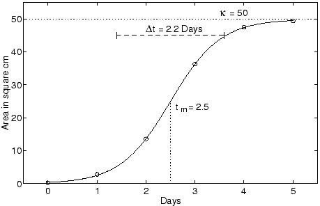
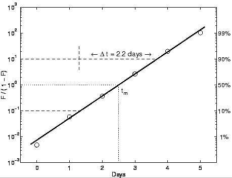
Fig. 1- The logistic growth of a bacteria colony plotted using the Fisher-Pry transform (bottom) that renders the logistic linear (from Meyer et al.). Click To Enlarge.
Fortunately, an open source software (in Java) is freely available called Loglet Lab. The software is fairly simple to use and well documented (there is a tutorial here). I tried to apply different Loglet analysis on the world production with an increasing number of curves.
Table I. Results on the world
oil production (all liquids excluding refinery gains) for different
number of loglets. The RMS (Root Mean Square Error) measures the
quality of the fit.
The best fit was reached for a number of loglets equals to 7, the corresponding production profile is given on the figure below. Note how the different Loglets are concentrated around the different oil shocks.
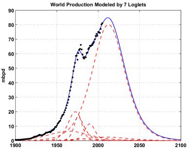
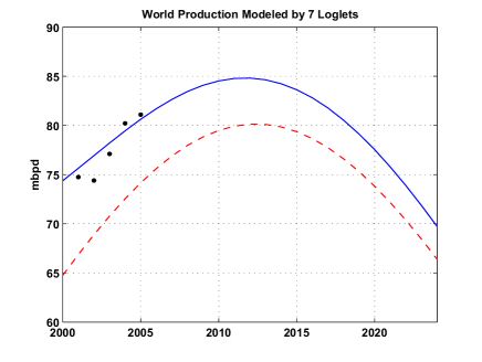
Fig. 2- Results of the Loglet analysis for 7 loglets applied to the world production (all liquids excluding refinery gains). The different loglets are the dotted red lines. Click To Enlarge.
The table below gives the parameter values of the different Loglets (the dataset is also available on EditGrid):
One Loglet dominates the production and contains nearly 73% of the total URR and is due to peak in 2012 (see Fig. 3). The rest of the contributions come from 6 Loglets and has peaked in 1975. I wonder if this component represents the early "easy oil" from the super-giant fields.
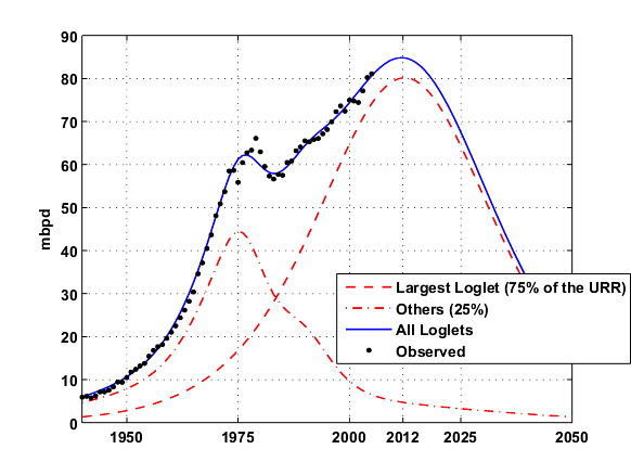
Fig. 3- Same as Fig. 2 but only the Largest loglet is shown and the 6 others are merged in one contribution (~25% of the URR) . Click To Enlarge.
Compared to other curve fitting results (Fig. 4 below), the Loglets give a better result on the left side but is much more pessimistic on the production decline.

Fig. 4- Different logistic-based predictions: Stuart staniford (in green), Double Hubbert Linearization (in magenta) and Loglets (in blue). The spreadsheet is available here Click To Enlarge.
In summary, the Loglet analysis gives promising results and could be applied on other difficult cases (e.g. Russia). With this approach, the oil shocks and the different production regimes are well modeled. The Hubbert Linearization technique could be used instead of the Fisher-Pry transform which I don't find very practical. The Loglet Lab software could also be used to model energy substitution scenarios (i.e. conventional oil replaced by synfuels, biofuels, etc.). I have noticed a few limitations in the software:
log(Q(t) / (1 - Q(t) / URR))= -K(t - t_half)
An example of a Fischer-Pry representation is given on Fig. 1. The notations used for the logistic parameters differ from the notations usually encountered on TOD:
- N(t) is the cumulative production (i.e. Q(t))
- t_m is the peak date (i.e. t_half)
- Dt is related to the logistic growth (K= log(81)/Dt) and corresponds to the time necessary to deplete between 10% and 90% of the total resource.
Fig. 1- The logistic growth of a bacteria colony plotted using the Fisher-Pry transform (bottom) that renders the logistic linear (from Meyer et al.). Click To Enlarge.
Fortunately, an open source software (in Java) is freely available called Loglet Lab. The software is fairly simple to use and well documented (there is a tutorial here). I tried to apply different Loglet analysis on the world production with an increasing number of curves.
| Number of Loglets | URR (Gb) | Peak date | Peak Production (mbpd) | RMS (Gb) |
|---|---|---|---|---|
| 1 | 1408 | 1990 | 71.3 | 61.1 |
| 2 | 1470 | 2002 | 63.8 | 104.5 |
| 3 | 1995 | 2005 | 75.0 | 20.8 |
| 4 | 2020 | 2007 | 78.2 | 20.0 |
| 5 | 2018 | 2011 | 78.0 | 15.8 |
| 6 | 2094 | 2011 | 83.1 | 13.3 |
| 7 | 2119 | 2012 | 84.8 | 11.4 |
| 8 | 2125 | 2012 | 83.9 | 12.4 |
The best fit was reached for a number of loglets equals to 7, the corresponding production profile is given on the figure below. Note how the different Loglets are concentrated around the different oil shocks.
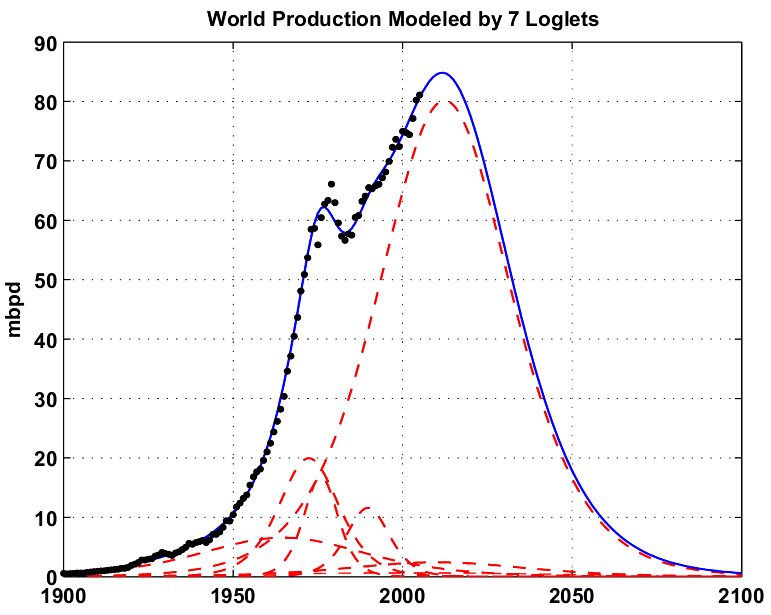
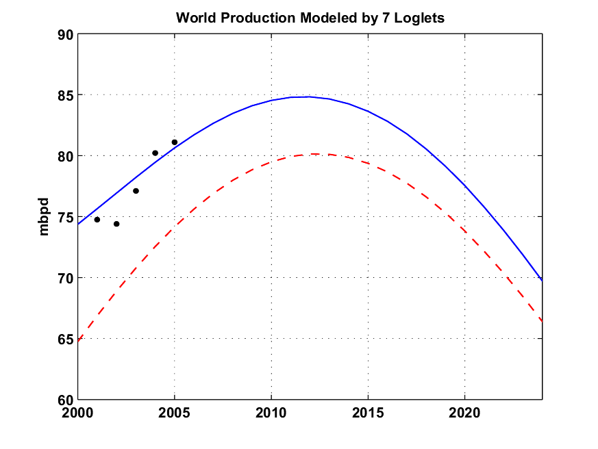
Fig. 2- Results of the Loglet analysis for 7 loglets applied to the world production (all liquids excluding refinery gains). The different loglets are the dotted red lines. Click To Enlarge.
The table below gives the parameter values of the different Loglets (the dataset is also available on EditGrid):
| URR (Gb) | 1541.7 | 172.5 | 156.5 | 83.8 | 72.1 | 62 | 30.3 |
| % of total URR | 72.8 | 8.1 | 7.4 | 4 | 3.4 | 2.9 | 1.4 |
| Dt (years) | 57.9 | 26 | 71.8 | 15 | 18.7 | 77.2 | 141.9 |
| K (%) | 7.6 | 16.9 | 6.1 | 29.3 | 23.5 | 5.7 | 3.1 |
| Peak date | 2012.4 | 1972.3 | 1964.7 | 1975.9 | 1989.8 | 2010 | 2001.1 |
One Loglet dominates the production and contains nearly 73% of the total URR and is due to peak in 2012 (see Fig. 3). The rest of the contributions come from 6 Loglets and has peaked in 1975. I wonder if this component represents the early "easy oil" from the super-giant fields.
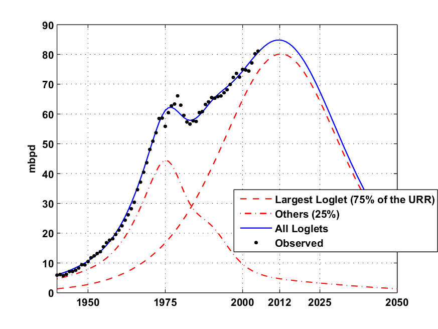
Fig. 3- Same as Fig. 2 but only the Largest loglet is shown and the 6 others are merged in one contribution (~25% of the URR) . Click To Enlarge.
Compared to other curve fitting results (Fig. 4 below), the Loglets give a better result on the left side but is much more pessimistic on the production decline.
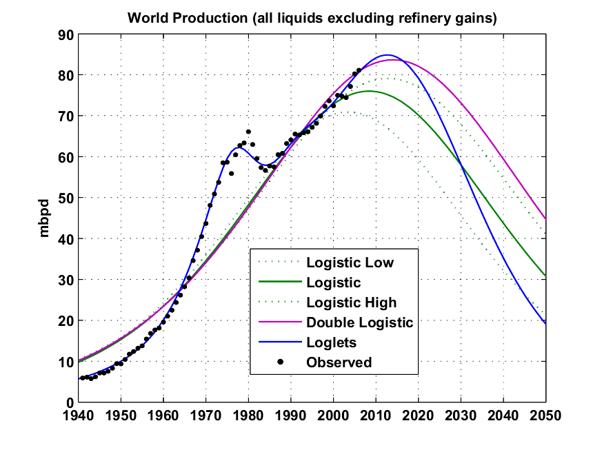
Fig. 4- Different logistic-based predictions: Stuart staniford (in green), Double Hubbert Linearization (in magenta) and Loglets (in blue). The spreadsheet is available here Click To Enlarge.
In summary, the Loglet analysis gives promising results and could be applied on other difficult cases (e.g. Russia). With this approach, the oil shocks and the different production regimes are well modeled. The Hubbert Linearization technique could be used instead of the Fisher-Pry transform which I don't find very practical. The Loglet Lab software could also be used to model energy substitution scenarios (i.e. conventional oil replaced by synfuels, biofuels, etc.). I have noticed a few limitations in the software:
- The Levenberg-Marquardt algorithm is used to perform the Loglet analysis and is dependent on the initialization.
- There is no display of the resulting production curve, only the Loglets and the cumulative production are given.
- Some statistics on the quality of the resulting fit are missing (e.g. RMS error).
“It takes as much energy to wish as it does to plan.”
—Eleanor Roosevelt
Contact
- Content: editors at theoildrum dot com
- Tech support: support at theoildrum dot com
License

This work is licensed under a Creative Commons Attribution-Share Alike 3.0 United States License.
Below is an example of a bi-logistic model:
The cumulative curve in panel A is the sum of the two logistic process in panel B (you then take the derivative to get the usual Hubbert/Bell curves).
The Loglet is an extension of the Bi-logistic case to a multi-logistic case.
Maybe this requires a bit of a leap of faith. The idea of diminishing returns (more effort, not so much reward) lends itself to S curves. However not every S curve has a bell curve as a tangent. It has to be just right. A similar example is using a sheet of shiny metal as a reflector; it has to be an exact parabola to get a sharp focus.
An alternative theory is that the bell curve is really a triangle with fudgy corners. But I don't wanna go there. Given the uncertainties bell curves are OK.
Mark Folsom
If you do a country analysis, try and make a prediction for the North Sea or Britain with the data up to 1990, 1995, etc. and checck how the predicted values change.
Second, the "slow squeeze" is Stuart's best view on the next decade or so based on his linearizations. Since his obviously useful Hubbert formulations are a good thing, we need only remember that these are a model of the way things work and not the law.
Fundamental irresolvable discrepancies exist between the "bottom-up" approach of Skrebowski (and CERA) and Stuart's analysis. But it's all short-term stuff. Stuart thinks the peak is likely now. Skrebowski thinks it's in 2010.
Who gives a damn? Big problem either way.
My criticism: we are making rough predictions based on partial information. While this method focuses enough precision on the logistic curves to distinguish individual fields (or wells?) in logistic history, it does not predict the placement or size of future bumps in the tail.
The original, monomodal method is a crude approximation to historic data, but also a crude prediction of undiscovered sources, basing its expectations on the historic end of the bell curve.
For example the historic data through, say, 1956 would probably not anticipate the bump from the recently trumpeted finds in the deep areas of the GoM. But in a hand-waving sort of way, Hubbert does this by expecting a tapering-off rather than a logistic cliff as known reserves are consumed.
Always moving the future is.
I agree with you, the loglets on the left have taken away some of the area from the main loglet in order to model the different oil shocks. The result is that the main loglet has a steeper decline.
This sort of analysis would be an excellent way of stating proven reserves, wouldn't it? If we don't do any more exploration or drilling, we have exactly this much in the ground right now. The multimodal analysis should give an excellent answer.
First glance said to me "peak in early 70's, must be US". But the size is too large.
(data taken from Simmons's book)
The largest fields are also the oldest and the most accessible with high flow wells.
Stuart identified several time periods where the growth rate is stationary:
1891-1929 7.9%
1929-1942 3.9%
1942-1973 7.4%
1973-1979 2.1%
1979-1983 -4.0%
1983-2004 1.5%
Between each period, we have economic transitions, oil shocks, wars, etc. I agree with you that the transitions in 1973 and 1979 were politically driven (OPEC embargo and the Iran crisis respectively) and not a natural decline of some subset of fields. However, prior to these two shocks, the period between 1942 and 1973 enjoyed an exceptional growth rate (7.4%) which was possible mainly because of a few giant oil fields discovered in the 40s-60s (see graph about discoveries above) that not necessarely required a mature oil infrastructure.
% of total URR 72.8 8.1 7.4 4 3.4 2.9 1.4
Dt (years) 57.9 26 71.8 15 18.7 77.2 141.9
K (%) 7.6 16.9 6.1 29.3 23.5 5.7 3.1
Peak date 2012.4 1972.3 1964.7 1975.9 1989.8 2010 2001.1
Wow. There's something really tempting about this....
Let's squeeze the data until they scream. :)
1st column: 2012 bulk of mature OPEC/mideast/venezuela
2nd column: 1972 US lower 48.
3rd column: 1964 rest of world, not normally oil producers???? (not clear here)
4th column: 1975 Saudi Aramco pre nationalization
5th column: 1989 USSR and Alaska?
6th column: 2010 technically advanced enhanced oil recovery offshore
7th column: 2001 North sea (the long Dt says otherwise)
In red are the different production regimes identified by Stuart:
1891-1929 7.9%
1929-1942 3.9%
1942-1973 7.4%
1973-1979 2.1%
1979-1983 -4.0%
1983-2004 1.5%
Actually, this is a whole lot prettier than a seventh order polynomial would have been. You can fit anything with a high enough order polynomial, but such a fit to sparse noisy data is apt to be analytically useless. Usually it oscillates extremely wildly and has little or no interpolative or predictive value. (Denial of this phenomenon creates dysfunctional superstitions among practitioners of numerical methods, but that's for some other time and place.) These analyses are a bit like water balloons, squeeze them here and they bulge there; here, the main fit is nice but there's still the wide variety of tails. In the end one can only extract information that is actually present.
Then again, these things are only models - at best only aids to understanding - and they are far less exact than, say, Maxwell's equations.
The US has 2+TW of wind, and the world gets it's current usage via solar every 20 minutes.
It's the transition over the next 25 years that is the problem: if oil disappeared tomorrow there would be no way to move to electric transportation quickly enough.
The key to how painful the transition will be is how quickly we convert to electric transportation. The conversion has started (Tesla, Prius, Calcars), it's just not fast enough to prevent serious risk of pain.
To know the difficulty requires both better information of 2050 technology, which will have 40 years of high energy prices under its belt, plus information of population, which probably cannot be extrapolated based on the past 40 years' growth.
But as always, Khebab is doing the hard digging and greatly appreciated
Still, I come from the school that the more models you run, the better job you do critiquing the assumptions of other models.
In the end, all we have is incomplete information, and we are forced to guess. I like having as many (prima facie valid) tests of those guesses at my disposal as humanly possible.
I like to back up the intuition with the data ... and that analysis -- being fair, of course -- always seems to work out, ain't that something?
Happy motoring!
The confidence that this would give me in the predicitve power of the model ould be helpful to me in deciding if the U.S. is about to attack Iran, or if the Islamofundies will be sucessful in the future in their efforts to blow up Saudi production facilities, both of which are possibilities and both of which I would expect to impact on global production totals
Marco
That's my guess.
Some points of interest:
. This exercise gets the same peak date as Jean Laherrère, who also uses multi-logistic analysis;
. The URR is very close to that got from a simple Hubbert Linearization fit (2165 Gb with 2005 data);
. The decline is much steeper than the growth period, in line with Jean Laherrère's and Samsam Bakhtiari's models; also in line with the declining EROI analysis.
Naturally with time more logistics will fit the data better, I expect in some time from now that bigger logistic to splitin two, with a little one for deep offshore exploration.
For now this is the best logistic fit for World Oil Production I have ever seen.
Finally I'd like to recommend a read of Marchetti's Energy Substitution Model:
Early 1977 paper (short pdf)
Full 1979 text part I (large pdf)
Full 1979 text part II (large pdf)
Marchetti's work shows that an energy source takes about half a century to become the leader in the market. Since Nuclear didn't happen in the eighties...
http://www.iiasa.ac.at/Admin/PUB/Documents/IR-05-005.pdf
I agree, the Loglet based estimate is not very far from Laherrère, Bakhtiari and Stuart. It's just more precise on the left side.
The text under Fig. 3 is the same as under fig. 4 and mentions Stuarts' predictions in green, which is not in fig. 3
Conclusion: no matter which model you apply(HL, Logistic, Loglet), they show more or less the same result, PO between 2005 and 2012.
I agree, they mostly show the same result, the Loglet curve is situated between Stuart's low and high estimates.
However, in the interest of stimulating some more discussion, here's an alternative view.
The historic production data is conditioned mainly by demand and is a function of price, population growth and economic growth. Supply is one of the variables that feeds into price.
The main break in the historic demand trend is 1978 where a sharp rise in price transformed consumption patterns setting demand growth off on a completely new trajectory - the last 23 years of data. In detail, you can see that demand was flat to falling during the great bear market of 2000 - 2003.
It seems perfectly reasonable therefore, to project the near linear demand trend (1982 - 2006) into the future. That is unless of course something happens to re-set the consumption pattern of the last 23 years.
What I'm saying is that the actual date of peak oil production will be determined by demand and understanding how price impinges upon the economic cycles (of all countries) will be the key to understanding the future.
Like Dave, I'm totally flummoxed by the current price trend. With KSA "so obviously in decline" along with so many other countries - why is the oil price not heading towards $100. Being flummoxed is normally a sign of not understanding what is going on. What I imagine is going on is demand destruction throughout poorer countries leaving a glut of oil on the market. So the future demand curve will be determined by a series of demand destroying events. The only role supply plays is determining price. I guess this is pretty much what Westexas has been saying.
Pessimists may want to point out that high oil price will lead to world recession. The really gloomy even forecast that world population may start to fall and both of these events will reduce the future demand for oil.
I'm going to see if I can make any sense of consumption data from bp review this weekend - though my wife says I should compile a CV.
This volatility seems to have been magnified in the last few years by the migration of speculative capital into Hedge Funds.
The more I look at the 1980 to 2005 data I see a trend of global demand for oil marching onwards and upwards that has nothing to do with geology or Hubbert - but that is not to say that geology and Hubbert will not have a role to play one day.
http://crudethoughts.blogspot.com
I used only crude oil + NGL (BP data).
Khebab, the 1975 loglet peak is not in fact a true production peak at all but a manifestation of a 1982 trough caused by demand destruction resulting from twin oil shocks of 1974 and 1979. So this has little to do with easy oil from super-giants - but rather the withholding of production from super-giants. The demand that got destroyed I believe was mainly oil fired electricity generation.
Otherwise, I think it is very interesting that this treatment introduces assymetry and a very steep decline - 20 million bpd by 2050! Dave posted a cartoon on this several weeks ago and I guess this helps quantify both peak date and shape of decline curve.
- I love Khebab's work because he is actually doing the work and it is the hard stuff that we need to be doing.
- Cry Wolf made me think of this again. In my work, I don't necessarily look at 1973 and 1979 as two separate events. I tend to see 1969 through 1980...(well to about 1985-86) as one long period.
How we view things tends to color our work. Which in turn colors our thinking.Osama bin Laden's view of paradise is 99 black eyed virgins. Personally I'd like a lot fewer girls with slightly different qualities. But whatever.
The point being my view of paradise on earth would be me, Khebab, Freddy Hutter, Stuart, Westexas, Cry Wolf, Darwinian, and others who are too numerous to name right now - getting together and hashing these differences out.
It is extremeley difficult to do this even with modern communications. The back and forth takes too long. Maybe at ASPO Boston.
My gut feel on this is that 2012 could be as good a year as any - what are we going to do for the next 6 years ? - but it will all depend upon how much the world on average will be prepared to pay. Peak consumption may already be past for some of the poorer countries.
ASPO - Boston - I could be tempted - but will need consent from She Wolf - since my 35% per annum capital growth plan got blown out of the water in May - and I've not actually worked for two years.
Bye the way, what's wrong with black eyed virgins?