Extrapolating World Production
Posted by Stuart Staniford on January 24, 2006 - 5:18am
This piece takes on how to model and extrapolate the world production curve. It is long and a bit complex. However, I think it's worth the effort, because there's some absolutely fascinating stuff going on in the world production curve.
We will try to build the graph to the right in a series of easy stages. It shows average annual oil production on a semilog plot with a variety of models fit to the data and extrapolated. Click to enlarge. Believed to be all liquids, but excluding refinery gains. Data sources: API, ASPO, and BP.
Oh, and for you inpatient ones, the linearization stability analysis says the world
- URR is 2250 ± 260gb
- K is 4.93 ± 0.32%
- the logistic peak is May 2007 ± 4.5 years

Average annual oil production from various estimates. Click to enlarge. Believed to be all liquids, except API line is crude only. EIA line includes refinery gains, others do not. Sources: ASPO, BP, and EIA.
The discrepancies are likely due to different definitions of exactly what is being measured. The API data I believe does not include NGLs, which all the others do. The EIA includes refinery gains, which the others do not. The ASPO and BP data agree quite well in their overlap (though not exactly).
Now, we recently discussed the fact that the US production curve is beautifully fitted by a Gaussian mathematical model. That allowed for some fairly stable extrapolations. Also, the similarity of the logistic and Gaussian curve, except in the extreme tails, explained why the logistic also works ok in the US case. In the world case, even a cursory glance at the data indicate we are not going to be in quite such happy curve-fitting territory (though it's not nearly as sketchy as our quick exploration of Kuwaiti production). We will get to more modeling in just a second, but first let's look at the data a different way.
This graph shows the percentage change from one year to the next.
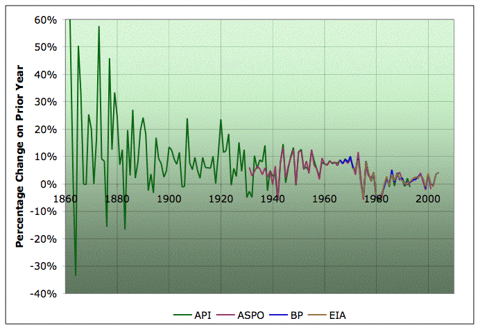
Percentage change in average annual oil production from one year to the next according to various estimates. Click to enlarge. Believed to be all liquids, except API line is crude only. EIA line includes refinery gains, others do not. Sources: ASPO, BP, and EIA.
You can see that, on the whole, growth rates have been steadily declining, though not smoothly so. Also, the noisiness of the curve is decreasing a lot: as WebHubbleTelescope noted in a slightly different context a little while back, this is significant. It's decreasing because we don't have lots of big new fields coming on to cause wild increases in production (and corresponding gluts, price collapses, and shut-ins). Of course, the point where the growth rates cross the x-axis and become negative is peak oil.
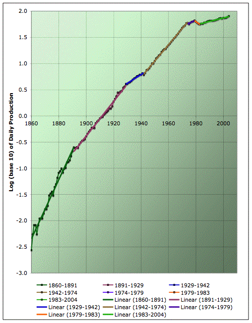
In order to have a single sequence to model, I proceeded to combine the production sequences as follows. Before 1930, I only have the API series, so I use that. From 1930-1964 I use the ASPO series. Then from 1965-2001, I use the average of the BP and ASPO values. Finally, from 2002-2004, I use the BP series. So this approximately models all liquids without refinery gains. The rest of this post all takes that combined series.
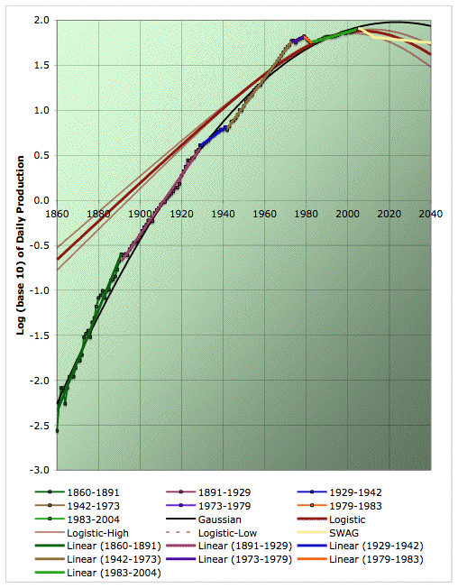
I was next moved to plot the data on a semilog plot. Partly this is because semilog plots make a gaussian curve into a quadratic (which fits the US production curve beautifully), and partly it was because of intriguing things I noticed in the growth graph. So anyway, here's just the data, before I start leading your eye with models of it. The x-axis is just the year from 1860 to 2010. The y-axis is logarithm to base 10 of daily production in millions of barrels. So "0.0" corresponds to 1mbpd, "1.0" corresponds to 10mbpd, "1.5" to 31.6mbpd, "2.0" to 100mbpd and so on.
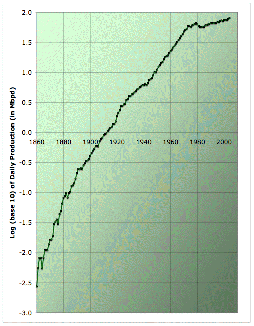
Log (base 10) of average annual oil production from various estimates. Click to enlarge. Believed to be all liquids excluding refinery gains. Sources: API, ASPO, and BP.
So, is it just my eye, or does that look to you like a sequence of straight lines - with a little noise on top? Of course, a straight line on a semilog plot corresponds to true exponential growth in the production versus time graph (ie a constant growth rate).
Well, now I will lead your eye. Here's how it breaks down visually to me:
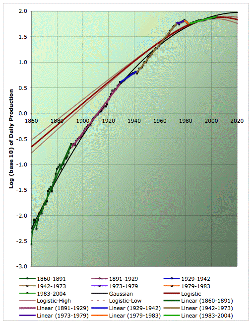
Average annual oil production on a semilog plot with piecewise exponential fit. Click to enlarge. Believed to be all liquids, but excluding refinery gains. Data sources: API, ASPO, and BP.
I've color coded each time range that strikes me as a straight line, and added a linear fit (which would be an exponential in the underlying production graph). Seems to do quite well at describing the data, yes?
Not to say thats it's completely uniquely specified, or perfect. It seems to get better over time, and in particular, there's more than one way to handle the first world-war and early twenties. However, I still think it's capturing some interesting features of the data. Here's a table that give the average growth rates during each of those intervals (as computed from the slopes of the linear fits).
| 1860-1891 | 13.9% |
| 1891-1929 | 7.9% |
| 1929-1942 | 3.9% |
| 1942-1973 | 7.4% |
| 1973-1979 | 2.1% |
| 1979-1983 | -4.0% |
| 1983-2004 | 1.5% |
Many of these dates have some economic or political significance (though I didn't pick them that way - I was just looking at the data). I didn't know of any significance to the early 1890s, but it turns out there were massive droughts in the US in that timeframe, and then monetary problems, culminating in a financial panic in 1893. 1929 is of course the end of the roaring twenties and beginning of the great depression. That seems to have led to lower rate of growth in world oil production, which ends in 1942 as the US, much the world's largest producer at the time, enters the second world war. From then on, world growth in production is higher until the 1973 oil shock. Between the shocks, growth in oil production is lower but still positive (except for 1974). However, after the shocks, there is a brief period of declining oil usage until 1983, when we enter the region of slow growth in oil usage that lasted until very recently. I suspect that we are now on the threshold of a new era, one way or another.
While this model is very interesting descriptively, it obviously has very limited predictive power by itself, since it only asserts "oil production is piecewise exponential", but not how to predict the date or slope of the next link in that chain of exponential pieces.
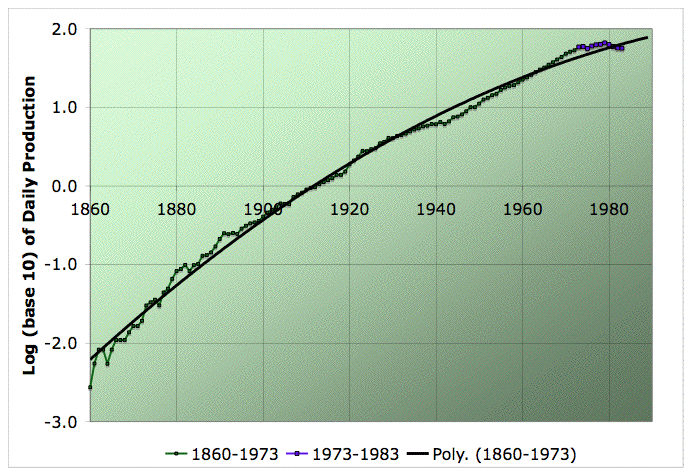
So, let's add in the quadratic associated with a Gaussian peak in the production versus time graph. This next graph fits a quadratic to the entire data series from 1860-2004 (the black curve). Voila:
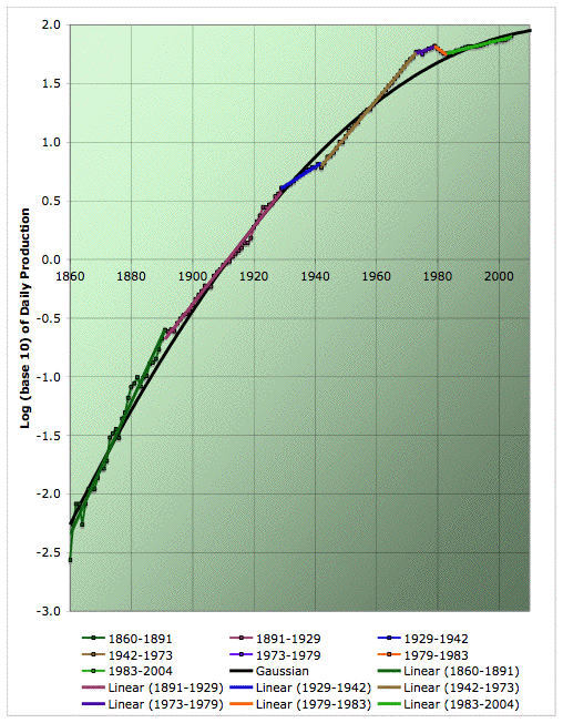
Average annual oil production on a semilog plot with quadratic (ie Gaussian) fit in addition to piecewise exponentials. Click to enlarge. Believed to be all liquids, but excluding refinery gains. Data sources: API, ASPO, and BP.
I have to say this graph nearly blew my mind. Firstly, as in the US, the Gaussian does a surprisingly good job of fitting an enormous range of data (through four orders of magnitude change in the volume of production). But more significant is the nature of the noise. I don't think we have an adequate understanding yet of why the US curve is so Gaussian, still less this one. However, my speculation, following an idea of Khebab's, would have been that it's Gaussian because if you convolute a messy discovery curve with enough different and long lived development and production and decline processes, you end up with a Gaussian. If that was true, you'd expect the leading source of noise about the Gaussian to be lumpiness due to individual large fields being discovered and developed (eg Prudhoe Bay). I didn't check this in the US case, but I was vaguely assuming that to be likely.
However, that clearly can't be what's going on here. Here the leading source of noise about the Gaussians is the different trends in the growth rate (the colored straight lines that cross back and forth over the black line). They have "economics" written all over them, not developments of particular fields. Eg, where's the Ghawar bump (production started in 1951)? Or even the Middle East bump? They're just not there; they are buried in that beautiful straight line from 1942 to 1973.
In short, there is no clear visible evidence of the discovery curve showing through into production any time recently. And yet, there's that quadratic fitting the thing from end to end. Why?
The picture that emerges - and I stress that this is a highly speculative story at this point - is that there is some kind of random-exploration-through-oil-space reason for why production curves in large regions tend to be Gaussian. However, the economy tends to come to relatively long-lived cultural agreements about how fast oil usage should grow, which control the approximate rate of growth (with considerable yearly noise). These cultural agreements last until they get too out of whack with what is possible based on geological/exploration considerations (eg perhaps in 1973), or the economy goes through some kind of trauma which changes the expectation (eg the 1979 oil shock, or the 1942 need to mobilize production for the war effort).
Again, don't bank on that last paragraph - further work is required to substantiate that, or to suggest a better way of looking at the situation. But it's certainly an interesting working hypothesis. (I should also mention that it's worth looking at WebHubbleTelescope's oilshock model for additional backround.)
However, in extrapolating forward to do prediction, we found in the US case that the Gaussian does a bad job before the peak - it's predictions are unstable. The problem is not that the Gaussian does not fit the data well. Instead the problem appears to be that there are too many different Gaussians that fit the data about equally well, and they have a broad range of implications going forward. Until there is post peak data, therefore, the Gaussian projection is not well-constrained and it jerks around violently depending on exactly what data range is used for the fit.
For this reason, we return to our old workhorse of Hubbert linearization, which was the most stable method pre-peak on the US data (I described the basic rationale for this method, such as it is, several months ago.)
What I have done in the following graph is to keep the same color codings of regions as I used in the semilog plot, so we can see what we are linearizing.
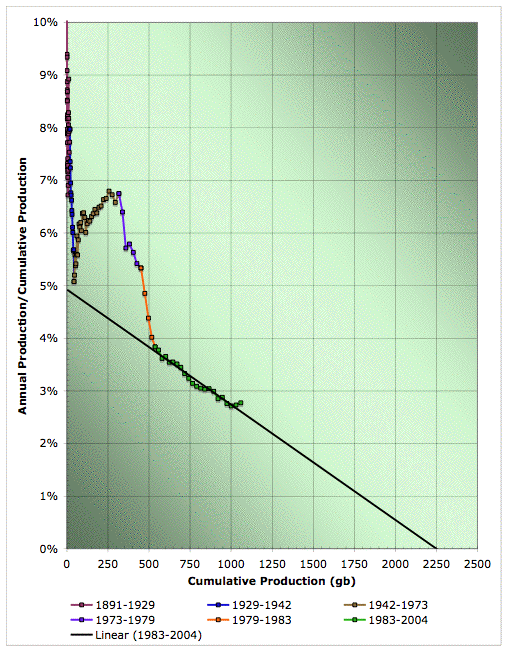
Hubbert linearization of global oil production. Click to enlarge. Believed to be all liquids, but excluding refinery gains. Color coding of data ranges matches the previous plots. Data sources: API, ASPO, and BP.
In his book Beyond Oil, Deffeyes picks 1983 to start his linearization, and it's obvious why. If we do the same, we get the fit shown above, with a URR of 2250gb, and a K of 4.93%. If we return to the production domain and insist on a peak date that means the logistic cumulative production by the end of 2004 matched the actual production to the end of 2004 (1059gb in my composites series), we end up with a smooth peak in May 2007.
Professor Deffeyes was obviously fitting to a different series -- mostly likely crude alone, without NGLs. He doesn't cite his data source, so we don't know.
Before I launch into a stability analysis, I want to highlight one of the big caveats here in light of what we discovered above. The answer we got obviously depends on the fact that we fit to the bright green 1983-2004 region, which is the last of the pieces in the piecewise exponential model I showed above on the semilog plots. If that piece had had a different slope, we obviously would have got a different answer. Do we know if, in an alternative universe with the same geology but different economic history after 1860, that particular segment of the curve must have had that slope? I'm not sure we do - our most compelling argument right now really comes down to "linearization has worked elsewhere" (which is true, but not 100% satisfying). And if we don't know that the slope must be what it is, then the extrapolation is more uncertain than the following stability analysis would suggest.
In particular, had we decided to linearize in 1983, we would have got the wrong answer based off that steep approximately linear region from 1973-1983 (the purple and orange regions in the graphs above). Just for kicks, let's combine those regions and do that bad linearization:
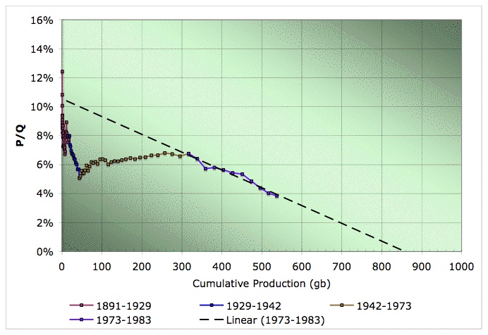
Hubbert linearization of global oil production (warning - this is a bad extrapolation for illustration purposes only. Click to enlarge. Believed to be all liquids, but excluding refinery gains. Data sources: API, ASPO, and BP.
So we'd have thought that URR was 860gb, K was around 10.5%, so bad declines on the way, and that we were at 63% of the URR (what WesTexas calls Qt). How would we have known this was garbage? It doesn't look any worse than what we just did with Kuwait!
Well, if we'd looked at the whole curve, maybe we'd have said, "Oh, it looks like there's some risk we're fitting a noise feature, instead of something that matches the trend, we'd better wait and see." On the other hand, maybe we'd have said, "Gaussian's are not reliable before the peak anyway, let's just trust the linearization."
Semilog plot illustrating the situation in 1983 with the bad Hubbert linearization of global oil production (warning - this is for illustration purposes only). The bad linearization is based on the purple data. Click to enlarge. Believed to be all liquids, but excluding refinery gains. Data sources: API, ASPO, and BP.
My sense is that the last two decades represent a much better basis to extrapolate than that decade, but still, bear in mind as we go into the stability analysis that it fundamentally assumes that extrapolating the 1983 onward linear region is a valid thing to do, and I think some sniff of question-mark should still attach to that until we have a stronger theoretical understanding than we do at present.
I suspect that we really need evidence of peak from outside the linearization itself to tell us whether it is likely to be valid or not. For example, if almost all known discoveries are in production, oil is over $60, and the price is still going up, that might be suggestive:-)
There's another big caveat coming, but let's do the stability analysis. First is the value of K (which is the intercept of the y-axis in the linearization). K controls the width of the peak in the logistic curve, and also the speed of growth in the past and declines in the future (which asymptotically approach K in both cases, though with opposite sign).
If we start varying the start and end date of our linearization and see how K changes, we get the following surface:
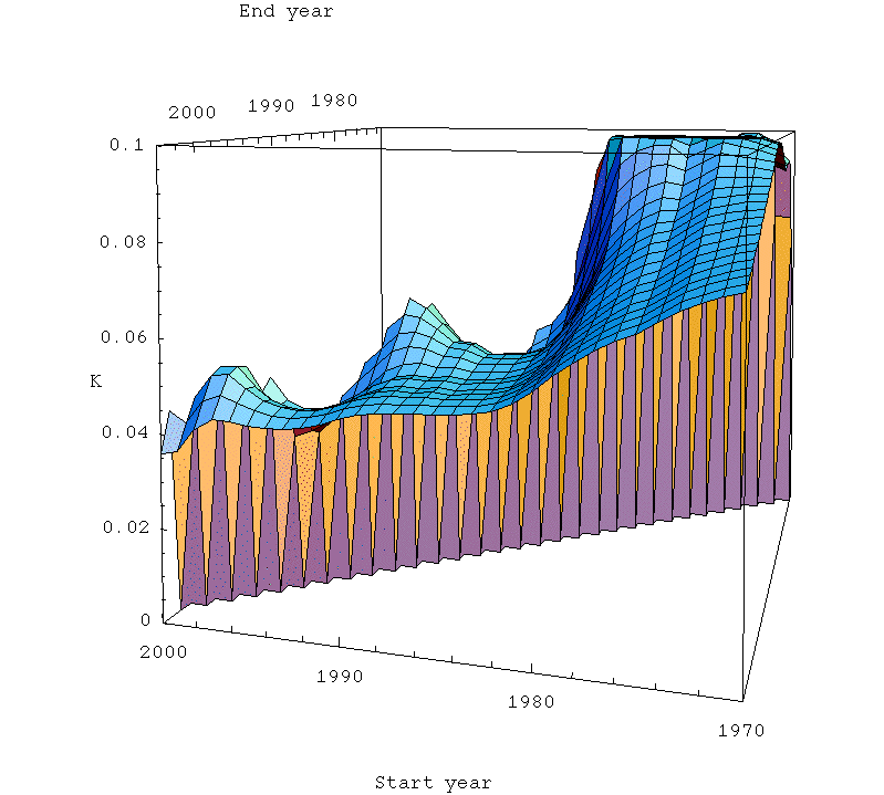
Stability surface for K in the Hubbert linearization of global oil production as a function of the start and end year of fitting. Click to enlarge. Believed to be all liquids, but excluding refinery gains. Data sources: API, ASPO, and BP.
So the stability surface is that small flat area in the front center of the picture, with start dates between 1983 and about 1990, and end dates from 1994 on. Not exactly the broad plains of the US stability analysis, but perhaps we can set up a small farm there on the side of the mountain. Obviously, the linear region only begins in 1983, so if we start before that our K estimate climbs rapidly to the "bad" linearization with K=10.5%. On the other hand, if we work with less than a decade, we get into major problems of fitting the noise instead of the trend.
So this is a density plot just of the actual portion I used for the stability estimate:
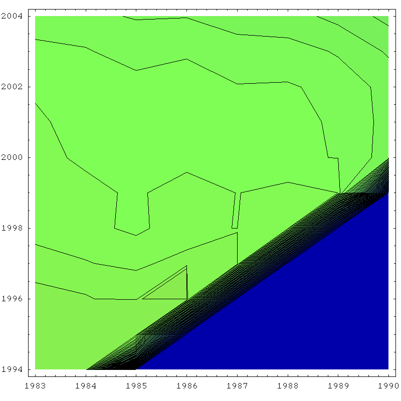
Density plot of stability surface for K in the Hubbert linearization of global oil production. Click to enlarge. Believed to be all liquids, but excluding refinery gains. Scale is 0% (blue) to 10% (red), with 5% being green. Contours are 0.1% apart. Data sources: API, ASPO, and BP.
The blue triangle at the bottom is excluded because it corresponds to places where the linear fit is less than a decade in length. If we look at the sample deviation in the K estimate over this region, we find it that it is 0.16 percentage points, which I doubled to give the 0.32% error bar in the outset.
Turning now to the estimate of ultimate recovery, here's the surface: There's more fluctuation in the URR (because that long extrapolation forward can change it's intercept with only modest changes in slope).
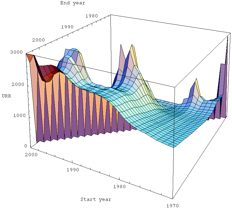
Stability surface for URR = ultimately recovered reserve in the Hubbert linearization of global oil production as a function of the start and end year of fitting. Click to enlarge. Believed to be all liquids, but excluding refinery gains. Data sources: API, ASPO, and BP.
Using the same stability region as we did for K, we get the density plot:
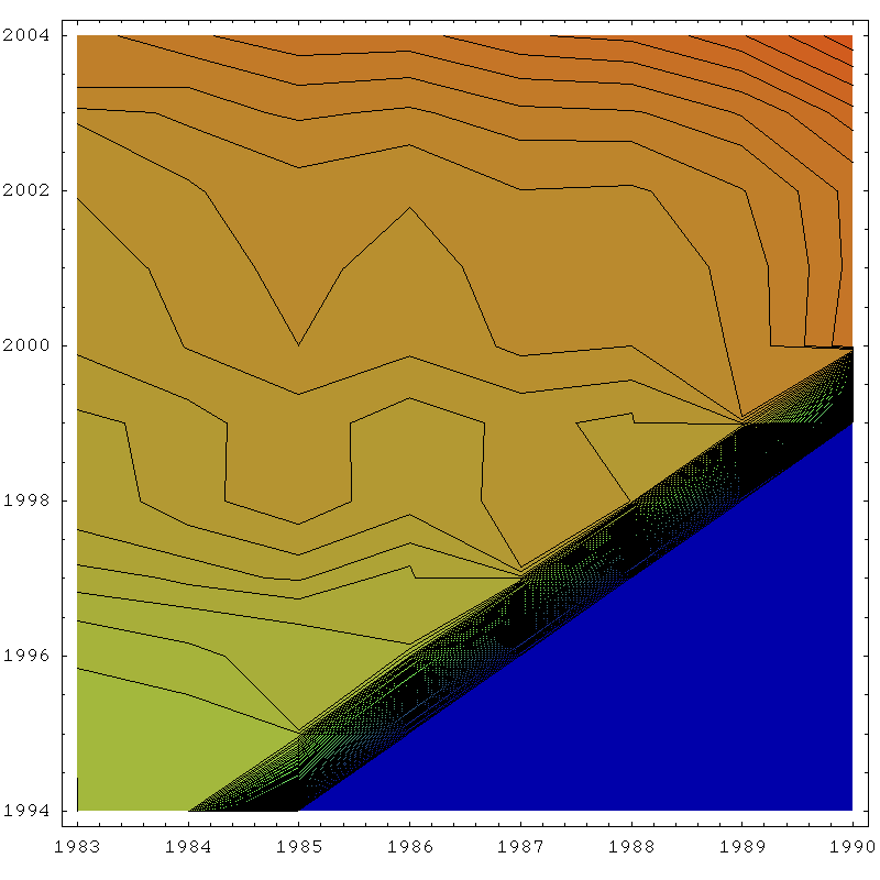
Density plot of stability surface for URR in the Hubbert linearization of global oil production. Click to enlarge. Believed to be all liquids, but excluding refinery gains. Scale is 0 (blue) to 3000gb (red), with 1500gb being green. Contours are 30gb apart. Data sources: API, ASPO, and BP.
The deviation over this region is 130gb, which I double to give a two sigma error bar of 260gb.
To translate these stability estimates into more convenient form, I did the following. Firstly I assumed that the highest URR estimate would correspond to the lowest K estimate (this is pretty close to true, as the main uncertainy in the linearization corresponds to the slope of the line, not it's vertical position). Next, I fixed the date of peak in the production versus time graph by insisting that all models match the correct value for the end of 2004 cumulative production of 1059gb. Ie my constraint insists that the area under the model before 2004 must be the same as the area under the real production versus time graph before 2004.
(One drawback of this is that since the logistic tails are systematically too high, because the tails are really Gaussian, it then has to make up the difference in the rest of the fit).
That gave me two models, which I call Logistic-High (with URR= 2510gb, K=4.6%, and a peak in late 2011), and another Logistic-Low (with URR=1990gb, K=5.2%, and the peak of the smooth curve in the middle of 2002). Those bound the two-sigma region for the center of the model evolution, given the linearization uncertainties.
So if Professor Deffeyes is right about November 2005, it's because he got lucky! The error bars really are quite significant.
The next graph shows everything in a semilog plot to 2020. The middle red line is the best fit logistic, and the upper and lower ones are the logistic-high and logistic-low ones. Note that these are not error bars on annual production. They are error bars on where the center of the model would go, if it was truly logistic, and if extrapolation of this last region of linearity in the linearization is valid. Annual production can have significant noisy excursions above and below whatever the true line turns out to be.
Average annual oil production on a semilog plot with quadratic (ie Gaussian) fit, central, high, and low logistics, and piecewise exponentials. 1860-2020. Click to enlarge. Believed to be all liquids, but excluding refinery gains. Data sources: API, ASPO, and BP.
Moving back into regular old production numbers, rather than the semilog plot, here's the various models extrapolated to 2040:
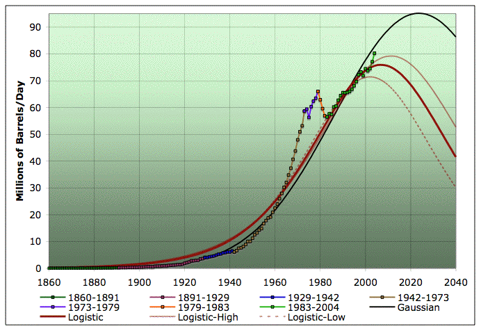
Average annual oil production with quadratic (ie Gaussian) fit, central, high, and low logistics, and piecewise exponentials. 1860-2040. Click to enlarge. Believed to be all liquids, but excluding refinery gains. Data sources: API, ASPO, and BP.
Again, it's very important to remember that the high and low models are error bars on where the center of the model would go, if it was truly logistic, and if extrapolation of this last region of linearity in the linearization is valid. Annual production can have significant noisy excursions above and below whatever the true line turns out to be.
The Gaussian peak is in 2024 at 95mbpd, but I don't trust that extrapolation. The linearization-based logistics are a lot more likely to be correct in my opinion. Notice that the last couple of year's production are a big spike above the logistic models. But that's ok, because the spike seems to be ending in the recent production plateau.
Let's bring it back to growth rates. Here's a year-on-year growth rate graph again, with all models included. The black line is the same Gaussian model from previous graphs (achieved by fitting a quadratic to the logarithm of production). The grey line is a direct linear fit to all the growth rates. That is a Gaussian curve too, but you can see it's much more pessimistic if you do it this way. This is further evidence of the instability of Gaussian prediction at this pre-peak stage, in my opinion. However, that most pessimistic model still takes till 2038 to hit 5% decline rates on a sustained basis.

Hubbert linearization of global oil production. Click to enlarge. Believed to be all liquids, but excluding refinery gains. Color coding of data ranges matches the previous plots. Data sources: API, ASPO, and BP.
Note that the world economy achieved 4-5% annual reductions in oil usage between 1979-1983 without collapsing. So I continue to believe that all this modeling suggests the future decline rates are within the adaptive capacity of the economy -- it's a slow squeeze, as I put it last month. I'm not saying that there won't be major economic hard times, but it does appear to me that peak oil is something that society can handle for quite some time to come, unless these models are just worthless.
A last caveat. One of the major reasons for a linearization extrapolation to go wrong is that there's a big chunk of discovery that isn't even seriously started production yet. I do not think there are any such discoveries in the conventional oil world (the Caspian is quite small on the world scale, and I think deepwater is well under way). However, there are trillions of possible barrels of LQHCs (low quality hydrocarbons), such as tar sands, extra-heavy oils, coal-to-liquids, and then biofuels. That stuff can't be ramped in a hurry, but it will probably get ramped up eventually (depending on the climate wild card). The linearization is not taking account of those things. So if I had to guess, my scientific, wild-ass guess about what will happen is something like the yellow curve in the following:
Average annual oil production on a semilog plot with quadratic (ie Gaussian) fit, central, high, and low logistics, and piecewise exponentials, together with scientific wild-assed guess (SWAG) as to the extrapolation of the piecewise exponential. 1860-2040. Click to enlarge. Believed to be all liquids, but excluding refinery gains. Data sources: API, ASPO, and BP.
In production space, that looks like:
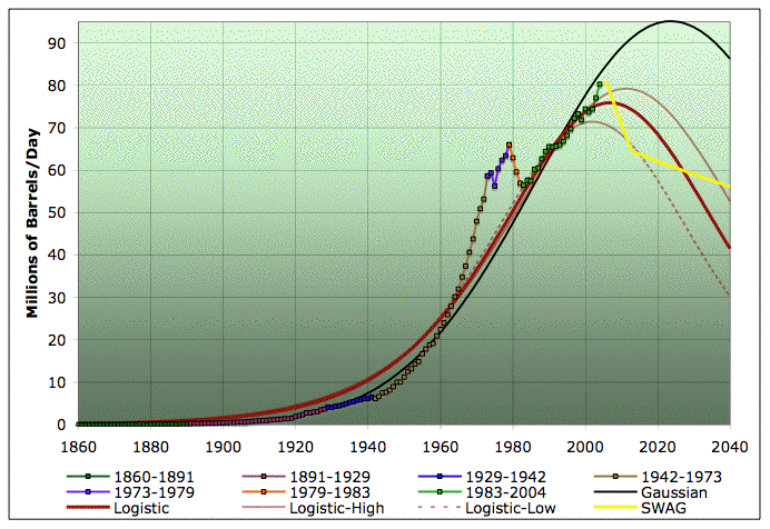
Average annual oil production with quadratic (ie Gaussian) fit, central, high, and low logistics, piecewise exponentials and SWAG extrapolation in yellow. 1860-2040. Click to enlarge. Believed to be all liquids, but excluding refinery gains. Data sources: API, ASPO, and BP.
However, please don't take the specific numbers on that yellow curve too seriously - it's just intended to illustrate a general qualitative idea of what might happen.
Contact
- Content: editors at theoildrum dot com
- Tech support: support at theoildrum dot com
License

This work is licensed under a Creative Commons Attribution-Share Alike 3.0 United States License.
Stuart, thank you for your work, again. Some of your graphs remind me one of the presentations from ASPO Berlin in 2004: A dynamic approach of oil production, by Olivier Rech [Institue Français du Pétrole] (pdf file, 408KB).
As I said, maybe this has nothing to do with your work, but I would like you to check that presentation.
Note that the world economy achieved 4-5% annual reductions in oil usage between 1979-1983 without collapsing. So I continue to believe that all this modeling suggests the future decline rates are within the adaptive capacity of the economy -- it's a slow squeeze, as I put it last month. I'm not saying that there won't be major economic hard times, but it does appear to me that peak oil is something that society can handle for quite some time to come, unless these models are just worthless.
For what it's worth, I agree.
We have a problem Houston. How many people has the planet gained in the past 22 years? How did we achieve that growth? The green revolution? The conversion of hydrocarbons to food? Yes.
What about the compounding effect of year upon year 4-5% annual reductions in production?
Without constant cheap-energy feeding growth, the economy collapses. Demand destruction? Yes. People destruction? Yes.
I do not believe that Cheney, the evil one, will let the U.S. and, in particular, the rich suffer the loss of oil. We will try with our oafish, clumsy little fascist ways to force, intimidate, beat down, and kill any state that stands in the way of easy motoring, but that will back-fire. When Israel drops that first bunker buster on Iran in March, Iran will shut down its production. It may shut down the Strait of Hormuz. Could you whip up a chart showing the percentage drop in production in that event?
Don't forget the stunningly ripe target of Saudi Arabia. A few well-placed Silkworm missiles could end half or more of their capacity to export for years.
The idea that we will have a smooth transition away from cheap energy is panglossian.
The one thing you do not chart is the level of societal stability as related to the cutoff of resources in any one region or state.
Why did Germany go a questing in World War Two? Why did Japan?
The only state to suffer a post oil conversion in a shocking fashion is Cuba. It survived, but it had a command economy. Does that mean we need to emulate Cuba? No more democracy?
Of course no one in the US would ever accede to that. And that is why when the resource wars get really hotted up, the people of the United States will find it is too late to command an effective strategy. We will have a thousand New Orleans, and, given how efficiently the Bush government responded to that single catastrophe, we can assume each region will be on its own right up until the feds institute martial law. (assuming that most of our troops won't be trapped fighting an enormous uprising in Iraq switched on by Iran in retaliation for our insane attack by proxy)
No. I do not believe that "future decline rates are within the adaptive capacity of the economy." The problem is there is a real world out there and the people in it are blowing their noses on the pieces of graph paper that are blowing loose in the streets.
It always amazes me when I see obviously intelligent people shuffle paper, throw down a few graphs, qualify their sources, explain a little glitch, then point at full color charts and say, "Look. There's no need to worry! Everything is just fine."
It is not. We are on the edge of a crumbling cliff. The question is, do we move away from the cliff, or do we argue the definition of cliff? "Look, it seems that the cliff is really only a 50% slope. Let me draw you a chart."
Alas. I fear we will be holding a fluttering chart as we fall ala Wile E. Coyote.
Pow. A puff of dust. Another piece of graph paper blows down the highway.
Tainter's declining marginal returns applies to conservation, too. We picked the low-hanging fruit in the '70s and '80s. It's going to be a lot tougher this time around.
- We gave up a lot of that low-hanging fruit after 1985. It's still there.
- Technology hasn't stood still, and it's brought even more fruit into reach.
Just look at batteries. During the first energy crisis, we pretty much had flooded lead-acid and flooded nickel-cadmium. Today we've got several sealed varieties of both, plus lithium-ion with at least three completely different cathode chemistries (lithium cobalt oxide, iron lithium phosphate, lithium titanate). Even lead-acid is back, with lightweight carbon foam instead of solid metal for backing and interconnection.Transmission wires used to be copper, or copper over steel. Then they moved to aluminum, with or without steel cores. One of Richard Smalley's last projects was wires made of Buckytubes: 6 times as conductive as copper at 1/4 or less of the weight, and made of a material that we literally cannot run out of until we've sucked all of our emissions back to the Industrial Revolution out of the atmosphere and re-solidified them. What kind of fruit is that? It was unknown 30 years ago!
What kind of fruit are multiple-exciton photovoltaics? The 72 TW of wind power available world-wide?
The more we learn to do, the more we learn that we can do. There are ultimate physical limits, but they're far enough away that they cannot become anything that our current expectations would recognize as a crisis.
The problem with technology is that, as Tainter points out, it has an energy cost. Eventually, you reach the point where further investment in technology does not get you any more benefit.
We have suffered diminishing returns on technology now for at least 50 years. It's only going to get worse.
My grandfather was born shortly before the Wright Brothers' flight, and lived to see the space shuttle fly. I doubt I'll see progress like that in my lifetime.
Semiconductors. Genetics. Biotech. Heck, even solar PV is accelerating its energy-payback; thin-film is under 2 years, and single-crystal is below 4. Projections are that both of those numbers will fall by half, and that's assuming no alternatives to silicon.
You're way, way too pessimistic.
Easter Island?
I put a link to a paper by Tainter in my previous message. Here's a synopsis of his book, "The Collapse of Complex Societies":
http://members.aol.com/leanan7/tainter.htm
He did not just handwave. He crunched the numbers.
Semiconductors. Genetics. Biotech.
I'm not saying we've reached "the end of science" yet. Just that the cost is becoming prohibitive, and will be more so in the post-carbon age.
You're way, way too pessimistic.
On the contrary. I am being realistic. You're way, way too optimistic. :)
I used to be optimistic about technology. Heck, I'm an engineer, because I thought the future would be like Star Trek.
But it didn't turn out the way everyone thought it would. A decade after the Wright Brothers, there were commercial plane flights. More than 35 years after man walked on the moon, there are no commercial moonflights. Why is technology slowing down?
That is the question that brought me to peak oil.
Open a few casinos and bordellos.
Seriously, though, we haven't gotten particularly efficient at getting off the planet, have we?
The collapse of the civilizations in Central America seem more apropos. IIRC, they ran out of soil productivity because they mismanaged it and couldn't feed enough population to maintain their cities. The problem with applying this to the US is that there is (once again) so much low-hanging fruit; we can get about a 4:1 improvement in animal protein production just by replacing beef with chickens, catfish and tilapia. If we can farm algae rather than maize, my calculations indicate that we could feed a hundred people off a hectare of algae ponds.
I describe my causes for optimism, with numbers, on my blog. You might want to pick them apart and show me what I missed.Because aircraft were privately built, while manned spaceflight began as and remained a government monopoly.
I think you underestimate "pre-industrial" societies, and overestimate our own. The technology may be different, but the people - and the problems - are the same.
But the links I posted had plenty of other examples, from our own culture. Such as:
Agriculture: To increase world food production by 34 percent (between 1951 and 1966), it took a 63% increase in money spent on tractors, a 146% increase in money spent on nitrate fertilizers, and a 300% increase in money spend on pesticides. To get another 34% would take even more money.
Medicine: Despite the fact that we are spending more money on health care and medical research than ever, the American lifespan is not increasing much. The easy fixes - vitamins, vaccines, sanitation, etc. - have already been done. Now, we are struggling just to keep lifespan from decreasing (due to new challenges like AIDS).
Science: Most of the great work of science was done years, even centuries ago. Many of the greatest contributions to science were made by people without formal training. But the day is past when monks growing peas or people flying kites in the rain can make significant contributions to science. The general knowledge, which provided the greatest benefits, is already known. The specialist knowledge remaining to be discovered requires expensive education, for relatively little return. Something like 90% of all the scientists who have ever lived on earth are alive right now, yet technological innovation is slowing.
Oil: In 1950, one barrel of oil's worth of energy could get you 100 barrels in return. Now, it's more like 1:10 in the U.S., 1:30 for Middle East oil shipped here. That sort of decline applies to most resources: coal, copper, natural gas, etc.
R&D: Technology has saves us in the past; can it save us again? Probably not. Analysis shows that an increase in spending on R&D of 4.2% yields an improvement of only 2%. At that rate, even if every one of us becomes a scientist or engineer, we'll be losing ground.
Government: Increasing complexity means increasing bureaucracy, and all the expenses that entails. Generally, it means higher taxes. At first, the benefits of complexity - roads, schools, defense, public works - are so great that people don't mind paying taxes. But as complexity increases, taxes rise, and the local benefit decreases. The government must spend resources on enforcing compliance. Generally, the tipping point is about 20% - which we're past.
You see what I mean? It's not that we won't continue innovating. It's that it's taking more and more work, more and more energy, more and more resources, for less and less benefit. In the face of peak oil, we will not be able to continue down that path.
Because aircraft were privately built, while manned spaceflight began as and remained a government monopoly.
We would not have commercial air flights now if it weren't for government support. We would not have any transportation systems at all without the government.
Do we need another 34%? I understand that Monsanto has nitrogen-fixing maize (there goes your whole budget for nitrates), BT corn is only the first step (what were you saying about pesticides?), and tractors are only required by non-subsistence farmers. Tractors last decades if properly maintained, and small tractors have been converted to electric propulsion with good results.
If you go to non-traditional crops, things look even better. My (somewhat pessimistic) calculations indicate that you can grow 3000 calories/day of tilapia for 115 people on a hectare of algae pond.
I suppose it never occurred to you that AIDS, heart disease and lung cancer are mostly behavioral diseases. Serve green salads instead of french fries and spend enough time harassing smokers to quit and promiscuous people and IV drug abusers to change their ways, and those problems shrink with no medical advances at all. Of course, you might not like the liberty costs.Outside those areas, science still yields dividends. There have been recent developments in vaccine production, to give one example. Using fragments of DNA instead of whole viruses and multiplying them in vats rather than growing them in eggs could produce a year's worth of vaccine in days or weeks instead of months. The major obstacle there isn't scientific or technological, it's financial/bureaucratic.
Oddly, we are still getting original contributions to science and mathematics from entries in high-school science fairs. Only the creme de la creme, of course, but they exist.You conflate science with technology. Technology uses science, but scientists do not typically create technologies.
The pace of technological change continues to accelerate in many areas; just look at the announcements over the last 2 years in photovoltaics, batteries, and biotech. (That's just what I've been looking at; there's much more.)
What does a kWh of energy into a wind turbine get you back? What are the prospects for coppiced willow shrubs, or Miscanthus Giganticus? (They're perennials; you plant them, and they produce for 10 years or more.)Sounds more to me that there's a limit to the pace at which human institutions can absorb change. Since it is obviously drawn from historical data, it cannot mean that there is some end point beyond which we can't advance; we've never seen any such thing, and such a conclusion cannot be supported by experience.
More likely, it means that we've got X fraction of people who are effective at R&D; once they are fully employed, spending more money means bringing in less-effective people who yield less for the expenditure. No mysteries there. Creating better analytical and other development tools will increase productivity across the board; the easier they are to use, the more people will see greater productivity.
I completely fail to see how advances like better vaccines, improved PV systems or Buckytube wires for electric transmission require more complex government. Lots of things would be improved by a less complex government, with fewer loopholes and preferences for existing special interests (which are threatened by innovation and tend to oppose what they don't control).I understand you, it's just that I'm absolutely certain you're wrong.
Hah. Private turnpikes in the USA date from 1795, and of the major modes of transport over the last 20 centuries, government invented exactly zero of them. The first airfields were private, the first railroads were private, the first steamships were private... I have not studied the matter, but I would not be surprised to learn that the first barge canals were private.
Government serves best by studying to see if the public interest is best served by a particular type or direction of development, setting up non-discriminatory incentives if it is, and then getting out of the way. Fix global warming? Set up a comprehensive system of GHG emission taxes and sequestration credits, get out of the way. If government has done it right it will cost to do the wrong thing and pay to do the right thing, and people will stampede to do the things that pay. The people who set the policy don't have to know how the ends will be accomplished, only that the benefits are restricted to those actions which accomplish them. What gets rewarded, gets done.
Wrong. We have something humanity has never had before: cheap oil.
All the "advances" you list are possible because of cheap energy. Energy has been so cheap, for so long, we cannot imagine life without it. We are fish, trying to imagine the desert.
As a small example...glass-making has been known for 5,000 years or more. Yet most people did not use it until recently. Why? Because it was too expensive. It took so much fuel to make that only the wealthy could afford it. We are so used to cheap energy that the idea of materials such as steel and glass being too expensive for ordinary people to own is completely foreign to us. But that is the future we are looking at.
Private turnpikes in the USA date from 1795, and of the major modes of transport over the last 20 centuries, government invented exactly zero of them. The first airfields were private, the first railroads were private, the first steamships were private... I have not studied the matter, but I would not be surprised to learn that the first barge canals were private.
I'm not talking about the "first." I'm talking about usable infrastructure. How many people would buy cars if there weren't any highways to drive on? And would even Bill Gates be able to afford to build the whole road system himself? No. Similarly, airlines were made possible by government funding of airports. They built a bunch of them for wartime use, and that opened up aviation for widespread civilian use. Even now, the FAA funds 90% or more of airport construction costs. The major airlines have never been really profitable. They exist because of government subsidies.
Yes, the government can be inefficient at doing what it does. But that's sort of my point. Part of the cost of complexity is that "overhead." It becomes harder and harder to coordinate among all the specialists. Yet it must be done...at greater and greater cost.
Oil and coal aren't the only things we learned to make cheap(er). Wind turbines are nearly competitive with coal, and much cheaper than N. American gas. PV has come down from dollars/kWh to a small multiple of retail rates. Ethanol is a boondoggle, but we've got a host of different ways to grow other fuels and raw materials.
We never had those before the past few decades, and they're not something that we can use up. You can't exhaust the sun, the wind or knowledge.
Really? Storage batteries and wind turbines are only possible because of cheap energy? (Both predate the rise of petroleum.) Gene transfer and electric tractors? (We were making tractors with coal and firing them with wood before we learned how to use electricity effectively. That knowledge isn't going away.)And here I was thinking it was because monarchs decided to do silly things like imposing exorbitant taxes on windows when they got popular.
Everyone who bought a Model T did.
Here's what you said:
There were paths passable by wagons in areas where government did nothing. There were boats and barges on rivers, lakes and seas. This isn't much of a transportation system as we understand it, but it was there. Railroads were largely developed with private money (and governmental land grants, but that was mostly money-grubbing). All of these would have been extended where the usefulness justified the investment; as I showed you, in many cases these investments were private. All government has to do is allocate property rights so that the investment can be recovered.This would have been a great surprise to Eddie Rickenbacker, who built Eastern Airlines well before WWII's boom in airport construction (his fleet of DC-3's went into war service). IIRC, the US Army Air Corps was still flying biplanes in 1941.
You mean, like all the specialists who had to coördinate to build all the applications we use on the Internet? Wait, they just took common protocols and built what they wanted on top of them without any need to get permission from anyone. Hey, how about all the specialists who made all our electrical stuff run? Whoops, no coördination there either; they took the electrical codes and built stuff to work with it. Maybe all the people who have to coördinate to get a city's worth of commuters to work in their cars every morning? (snicker)
I'm sorry, but that's ridiculous. The only reason you would have such coördination issues is if the problem cannot be broken down into manageable pieces, or if an idiotic government imposes a command-and-control system where everyone has to get permission before doing anything. The only reason you see problems is because you have no knowledge of how things actually get done, or you willfully ignore what you see.
i would have to agree that based on the raw data (i.e. annualized production growth over last 20 years) that the case for a sharp global decline is unlikely. if there is any sort of symmetry in production, we are unlikely to face decline rates over 2% for 5-10 years. According to Hirsch, the 2% decline is the benchmark for the Lower-48, so i would expect no worse than that globally, barring catastrophic events.
even if we do have 4-5% declines within a few years post-peak, as you state, we weathered that for 3 years in the early 80's. however, i would add that the dollar was not nearly so inflated and in such a precarious position 25 years ago, as it is today. neither was the entire economy leveraged on the housing boom, nor were current account debt, public or private debt out of control. neither was the household savings rate at 0%. so there are some definite qualitative differences (and many others of course). we also don't know how we would handle 5% declines for more than 3 years. i would say 5+ years at 5% decline rates means we're getting into the risky zone; a.k.a. The Final Frontier.
I ask myself, what historical period, in what country, would most resemble a declining First World?
It's just a matter of time.
http://www.dailykos.com/story/2005/12/23/8100/7172
He argues that WWI and WWII were part of the world's adjustment to a new energy source.
...The people on the extreme end of the alarmist spectrum are making dire predictions. They aren't out of line - the last three Europeancentric world conflicts have all had the transition of energy systems as a key component of their continuation. That is, acquisition of energy was a key part of the reason for continued conflict, and the limits of the old energy system - which includes subsistence agriculture - were often a reason for going to war in the first place.
The last energy transition is not reassuring - in the late 19th and early 20th century, internal combustion began to replace steam power. The coal economy of that time could not keep very many people in affluence - though it could keep more people in affluence, and many more people alive than the previous mechanical water/wave economy. The 1899-1918 period saw a series of conflicts which could be labelled "the last of the rock wars" - the last wars over access to coal and gold, the two key commodities in the coal age. Coal ran the economy, and gold measured the economy. Since wealth was created by digging rocks out of the ground and turning them into things, gold was a good measure of the flow of raw value into the society, and therefore a good incentive to productivity.
The first world war made it clear that the rock economy was doomed. The great war machine of that economy - the battleship - was both useless - naval power was indecisive at Jutland and in sufficient to force a landing at Gallipoli - and awe inspiringly expensive in gold terms. It bankrupted major industrial nations, whose economies could not support the war machines that their economies required to have in existence.
I suppose WWII was not quite as bad as Mad Max (though European Jews might have had a different view of it). However...I really fear this "energy transition" will be much harder than the last. Oil was a "better" source of energy. Barring the miraculous discovery of zero point energy or some such thing, we will be switching to a lower-quality form of energy.
It's useful to look at where the oil shock affected total energy use. The chart below is from EIA data -- and clearly shows that industrial users got a lot more efficient over that interval, but the other major areas did not. And of course fairly soon as the economy started expanding again energy use started back up. Some of the gain in efficiency by industrial users was done by switching to alternate fuels such as natural gas. This time around, there's a lot less room for switching to alternatives.
It's going to be a quiet revolution, like the replacement of tubes by transistors, but make no mistake about what it is.
Note that the world economy achieved 4-5% annual reductions in oil usage between 1979-1983 without collapsing. So I continue to believe that all this modeling suggests the future decline rates are within the adaptive capacity of the economy -- it's a slow squeeze, as I put it last month. I'm not saying that there won't be major economic hard times, but it does appear to me that peak oil is something that society can handle for quite some time to come, unless these models are just worthless.Hi Stuart,
Fabulous work again, however I am not so sanguine about the capacity of the world economy to continually adapt to 4-5% annual reductions, and neither does Chris Skrebowski who feels it is beyond the scope of any known alternative to fill in the gap of even a 3% decline in production for more than a few years. I think that our hides were only saved from worse economic turmoil than was witnessed during the period 1979-1983 because the last great non-OPEC oil provinces in Alaska and the North Sea were brought on-line flooding the market with a glut of cheap conventional oil over the next decade and a half which mitigated, and papered over, a lot of the painful structural adjustment that occured. Without these provinces OPEC's stranglehold would have been tighter, and peak might have occured earlier. The gentler powerdown inferred from your projections might have stood a better chance if it had commenced 10 years ago as a result of a long forced economic contraction.
This time I don't know if we'll be so lucky, unless there are a couple of 60+ BB oil fields out there still to find. All we'll have to fill in the widening gap will be a host of second-rate, difficult to extract, unconventional hydrocarbons whose viability appears to rest squarely upon the availability of cheap oil and natural gas to sustain them. You also briefly raised the likelihood of increased global warming that could result as a consequence of mining tar sands, shale, and coal to shore up the decline. But what about the effects of general resource depletion, environmental degradation, and population strain on the global situation moving forward? Not to mention the politics of envy, spite, and revenge which are casting a growing shadow over the prospects of industrial society with each passing year. The world certainly didn't have any of these kinds of spectres to worry about during that time either. Gee, all we had to worry about back then were commies, AIDS, and Mutually Assured Destruction! O happy days...
I wonder how much the production curve has been distorted by the OPEC production quotas since 1973 and whether that justifies separate curves for OPEC/Non OPEC producers.
What sort of Hubbert linearization curve would you have had using the data up till 1973, which one might argue was the last "natural" production date.
What is important is not the peak date in oil production but rather the difference between the production curve and the projected upward-sloping demand curve. With Chinese demand increasing so rapidly it seems to me that the crisis will come some time before the actual peak in oil production.
Also the shortfall is the difference between the rising desired demand and the production. If production is falling at 5%pa and desired demand grows at 3% say due to China etc, then the shortfall is 8%. We are in a competitive bidding war for the remaining oil.
You people are making this too goddamn complex. It's getting as bad as reading economics.
So when is talk talk talk going to be followed by action?
I'm no slouch: I teach at a university, once studied geology, and have studied this issue for two and a half years.
Enjoy your ivory tower.
Good models will get the attention of policy makers.
There are a wide variety of topics on TOD, and I welcome all of them.
And worst case, once peak hits, or starts, if all this analysis has been played through on thousands of computers screens worldwide and talked about in chat rooms and local town halls, people will know what having 80mbpd vs 85mbpd 3 years ago implies.
And there increasingly is quite a bit of action going on behind the scenes.
Don't want to put words in Stuart's mouth but it seems clear he is not claiming any Delphic abilities here - just putting math tools to a bunch of data that may or may not be accurate with an eye to finding statistical regularities.
That, in my opinion, is a very practical application of statistics and math to help us make out what the future may hold. Contrast that approach with someone like Kunstler. Kunstler is simply shrill and apocalyptic. He's made up his mind that we're all doomed and we'd better get back to raising chickens in the front yard (advice I'm taking, by the way). Your drum thumping for action puts you in Kunstler's camp. Isn't it be better to take a long cool look at the situation using all the tools available before we start jumping ship?
One doesn't dismiss images returned by radar or x-rays because they reveal only limited and rather fuzzy information. Stuart is using math to cast a flickering light onto a stormy sea in the hope of finding useful navigation cues. I think that's a better approach than for all of us to run around the ship crying, "DOOM, DOOM, DOOM."
You might profitably read Poe's "Descent into the Maelstrom" if you'd like an example of why this is not "ivory tower" as you call it.
I would like to think that thanks to the internet, peak oil is going to be "better" that otherwise would have resulted.
Do you disagree that we are fundamentally unprepared for chronic transportation fuel shortages?
Do you disagree that our government is fundamentally trapped in a cycle of promoting previous investment?
Do you believe our financial markets are directing significant capital, not speculative trading, at this issue?
What, for example, would it take to get Congress to pass automobile efficiency laws? Was it not easier to go to war on Iraq than on our SUV's?
As far as I can see, Peak Oil is about as discussable in polite society as pornography. So no... I don't think Kunstler is a kook. I think he is incredibly frustrated that our business and civic leadership professes ignorance.
Huzzah, Huzzah, Bravo, Cheers, and so on.
Do not like seeing Kunstler criticized or nay-sayed.
As have said before on this site, Kunstler is a brilliant and necessary voice.
He is responsible for MANY becoming aware of Peak Oil, self included.
Thanks for all your work Stuart.
Am printing your great work so can study...
Thankfully, unlike Kunstler, you managed to write a paragraph without insulting anybody.
I disagree though, there is plenty of room for debate, and constructive criticism.
And with all due respect, you note has an element of Brown shirtism.
One thing that is interesting is that with a gaussian fit, the percentage annual declines in the tails gets quite high, whereas with a logistic curve, they remain much more modest. But by the time you reach the point that the difference becomes important, oil production has fallen so far that it probably won't be terribly relevant to average people any more.
AFAIK, we don't have any oilfield where > 95% of the URR oil has been recovered. Such a field, if it exists, could be of use to see what type of curve would fit better in the very tail.
I guess the next question would have to do with what the economic impacts are likely to be if we have the amounts of oil available every year that your curve would indicate. Unfortunately this is a much harder problem as it seems that there are far too many variables.
In looking at historical production, and year to year changes, I think that you need to keep in mind the impact of the two swing producers, Texas and Saudi Arabia. From roughly 1935 to 1970, the Texas Railroad Commission (TRRC) effectively controlled the world price of oil. Saudi Arabia took over that role from roughly 1970 to 2005.
For example, during the 1967 Arab-Israeli War, there was an attempted oil embargo, which failed because the TRCC flooded the market with oil. The 1973 Embargo worked because Texas was past its peak. The early Eighties decline in production was chiefly due to Saudi Arabia curtailing their production, in order to keep the price up (although Matt Simmons thinks that they might not have had much choice).
Today, the new "swing producer," if you can call it that, is oil from emergency reserves. The problem is of course that it will be difficult to resupply the reserves.
I am aware of two large, 50 Gb plus, discrete regions that have peaked and gone into decline in the absence of political events--the Lower 48 and the North Sea. The Lower 48 peaked at 48% of Qt (URR) and the North Sea at 52%, either side of the 50% mark. Within the Lower 48, Texas peaked at 54%. I would argue that Texas and the Lower 48 are the two models that are most appropriate for Saudi Arabia (currently at 55% of Qt) and the world (currently at 50% of Qt).
For lineaization fans (shorthand for fanatics), I would invite you down the screen to the Kuwaiti discussion, where some of us have had some detailed discussions regarding Russia's remaining recoverable reserves, based on some very interesting plots that Khebab posted.
Below are excerpts from various postings (on the Kuwaiti thread):
Following are the Hubbert/Deffeyes reserve estimates for the top four oil exporters (accounting for more than half of net world oil exports), and the estimated life of reserve estimates, at current rates of production:
Saudi Arabia: 80 Gb & 21 years
Russia: 20 Gb & 6 (SIX?????) years
Norway: 9 Gb & 8 years
Iran: 60 Gb & 40 years
I agree with Stuart that the world decline rate will probably be under 5% post peak, but the immediate problem I foresee is net world oil export capacity. If you believe the Hubbert Linearization plots, the US has more remaining oil reserves than does Russia.
FYI---counting all liquids--the US, according to the EIA, produced 94% as much liquids as Russia did in 2004. Using the EIA data, if the US and Russian consumption figures were switched, the US would be world's second largest net exporter. As I outlined in my posts, I think that we have all been mesmerized by the post-Soviet collapse increases in Russian oil production. It appears to me that Russian oil production peaked at a broad decade long plateau centered at about 53% of Qt, back in the Eighties.
Optimism is replaced with pessimism.
So much of what we do is based on things always being better in the near future. When people start realizing that the decline is long-term, rather than short-term, their whole outlook will change and that will affect everything.
Rick DeZeeuw
I agree, but I come to a different conclusion about what this implies.
If people think they're passing through a temporary tight patch before prices return to "normal", e.g. an embargo or supply disruption caused by political turmoil, a hurricane, etc., then they'll hunker down and conserve mostly through forgoing activities. They'll drive less, knowing there's no point in making a structural change, such as buying a new car, which they know they'll regret once prices come back down.
But if they think they've entered a new, higher pricing paradigm, they'll be far more likely to make fundamental lifestyle changes. There's been no lack of "gas prices aren't coming down in the next few years" stories over the last six months, which have no doubt helped convince people that it's worth downsizing. Just ask Ford and GM.
I find it amusing that the Apocalypticons (a term not aimed at you, RickD) keep saying that peak oil is an unprecedented event in human history, yet they seem to know exactly how it will unfold.
Look at natural gas. Gas-fired generation costs have gone through the roof, so guess what happened? Sales of utility-size wind turbines went up to the limits of production, they are backordered, and prices in 2006 have risen substantially due to demand (Futurepundit story).
People are cautious, not dumb; it became obvious that it was time to move, and the big money is moving. The same will happen in other things.
Would you be pessimistic if you found it made economic sense to replace your gas-burner with a plug-in hybrid, buy wind power from your utility and slap PV awnings over your south-facing windows? Wind power is cheaper from some suppliers than the regular stuff... today! The march toward efficiency and renewables is going to become a stampede.
I'm much more pessimistic about the climate than energy per se.
Totally agree. Well said.
For example for oil: what is happening behind some presumably fixed annual production number is that more and more of it is of lower quality and requires more resources to produce and to process. But on the other hand these resources require other resources which are already in tight supply.
What we notice recently? The price of every commodity rises like hell. Why? Because of energy only? Not really... it is our economical system that has overstrained its resource base and some tight spots are sqeaking... we do need extra resources to replace what is defficient but there are simply not enough of them. For example we need wind turbines to replace oil, but we don't have oil to build the wind turnines... and so on...
Remember Hubbert said that as well as production following his curve, the cost (in terms of both money and energy) increased rapidly after peak. Since we were not at the peak in the 70s and 80s, the cost would not have risen much.
But now, as the peak passes, the remaining production of oil will have much faster increasing costs. In the 80s, Saudi production (and indeed much of the M.E.) would still have been relatively cheap. Now nothing will be cheap!
Also, in the late 70s, optimisim in the oil industry must have been pretty high with the discoveries of Prudhoe Bay, the North Sea and Canterell. People would have been able to look ahead and see increased production from those finds.
Markets and economies can be held up on optimisim like that.
Now, a lot of commentators (including some IOCs and NOCs) are saying that there are no more big fields to find. There is no future production ramp-ups to look forward to.
It will indeed be an interesting discussion of "What can be expected to happen as this crisis develops and unfolds?"
"Stick around, because that's the kind of stuff that we're going to talk about."
Keep up the good work!
Thanks again for a graphical presentation of complex data sets. Very scary results indicating we are on the cusp of the peak if you are right. One thought on your curves and model fit.
I'm struck that the slope of production for the last decade or so would have much greater effect on the slope of lines, or shape of curves going forward, than the same slope 40 years ago. That is, current production level is anchoring the shape of the prediction going forward. If we are close to peak and we can't pump anymore than I see your model as very accurate and predictive. But what if current production is a result of another Political event as the previous ones you listed? Wouldn't your model's predictions be based on something other than field size, production capacity, and field maturity?
Maybe I don't fully understand the math. But it seems you are just as reliant as all others on the quality of the current data and might not be able to accurately predict the peak until it is part of the data set in the past.
Yours is still the best summary I have seen to date and you need to get these into the mainstream media's hands. Along with talking points of course so you aren't misquoted.
http://news.ft.com/cms/s/35f9a53e-8c7f-11da-9efb-0000779e2340.html
But what would happen if for some reason the metabolism of the mould bacteria changes ? If a mutation would cause something similar to horizontal multi reservoir contact wells, would the sugar extraction curve stay symetrical ?
On the bright side of peak oil, there still are some uninfected , unexploited oil fields, which can be brought into production, and thus mitigate the decline of older resources. Once all oil fields (a finite number) are in production, wouldn´t that cause a asymetry on the dark side of peak oil ??
Why should peak oil curves be symetric ???
The analysis, assumes a constant quality for the oil - in Stuarts last graph the red line shows that in 2037 we'll be getting 50mbpd - same as in 1980. How can this be modeled a) to include (at least broad brush at first) assumptions about declining EROI in the second half of the distribution, b)done on a per capita basis (clifman had mentioned that above) and c)looked at in terms of exports available to the world market instead of just total oil production. I realize this is difficult to model. Obviously Id have done it if I could. Is it doable Stuart?
I know that Spindletop back in the 1920s was getting 100 barrels of oil for every one barrel of input and that by all measures has dropped to low to mid teens. In my opinion, to see if ' a slow squeeze' is appropriate, we have to model what is net left over to society. Just throwing this point out there again.
Another quick point - how does this analysis fuse with Khebabs on Iran/Norway/SA/Russia? It seems to me that without those 4, the recent few years would not have had an upward blip at all. Khebabs graph indicated that those 4 were about 4-5mbpd above the logisitic, and it seems the 'world' analysis here by Stuart is about 4mbd above the logistic. Hmmm.
I think the most important feature of energetics is not the final EROEI, but the energy payback time, which limits how fast a source can be grown from it's own energy product.
To me your comment on EROI boils down to some assumptions : 1) coal to liquids has a decent EROI 2) decisionmakers will decide to build (alot) of CTL plants soon and 3) the peak is soft plateau and not steep dropoff, which the most recent analysis (above) suggests. Without these 3 being true, EROI becomes quite relevant.
A peer of mine has written a paper (should be published in spring) on the EROI of gulf of mexico oil drilling based on embodied energy costs - the upshot is the shallow under 300 metres is all now in single digits while the really deep water is quite high EROI (which makes sense - we are puncturing large balloons of oil for first time down there). He did not include a 'depreciation' factor for hurricanes - though not direct energy costs - companies will have to build in some % chance of their platforms and rigs being destroyed more than once in 100 years.
Finally, if you believe EROI wont matter because of alternatives (CTL), does that mean that we produce all the oil AND the alternatives too, or at some EROI threshold we switch over to all alternatives and leave the oil in the ground when it has lo EROI? If the latter, then that too truncates the ultimate area under the hubbert curve.
I think EROI will matter alot. The majority of EROI studies out there have weak boundaries. i.e. dont include total cradle-to-grave and indirect costs and externalities. At a minimum, using coal instead of oil at the margin generates more than double the greenhouse gas emissions...
I think it's your longest post ever on TOD.
At least I'm the only one to do that! :). Are you willing to make your spreadsheet public?
For your info, Shiraz on PO.com explored that approach a while ago: Verhulst, GBM, et al - Model Runs
The conditions for a "gaussianization" of a sum of random curves is not clear. It seems that the presence of any random flcutuations in the shape or surface of the elementary oil field production profiles will induce some level of skewness in the resulting curve (but not that much). If I summarize:
- The gaussian model is clearly overfitting the data despite the bumps but it would require some additional knowledge (ex: a prior distibution of the URR) to give a realistic prediction
- The logistic model don't fit as well the historical data but seems to "converge". My guess is that using the Hubbert Linearization, we are injecting implicitely some prior knowledge about a reasonable URR by rejecting data points that don't give a good fit in the P/Q vs Q representation.
I think that in order to fairly compare the Gaussian and the Logistic models, we would have to find a way to fit the Gaussian in a P/Q vs Q representation.Your estimate of the URR and K are close to what I found using a bootstrapping approach (How Reliable is the Hubbert Lin. Method? the world case) which gives a maximum likelihood estimate around 2,250 Gb:

Also, I like your improved residual process better. However, your error bars are now larger than mine because you effectively modeled the residuals for the entire sequence rather than just the linear regime. So you're pretty safe, but your confidence interval is huge.
I don't think the Gaussian is overfitting - it's just that the fit parameters aren't well enough constrained (at least that's my intuition - I haven't specifically checked yet).
Can't it be done the other way around? (Pardon me my ignorance)
What kind of curve a Logistic yields in the semilog plot?
You put a lot of time into this. Teriffic. In the spirit of constructive debate, I'm going to put out there the idea that linearization won't work on global oil. I think the reason it worked on Texas oil was because production was constrained only by geology, and the investment to develop the oil field was constant. In global oil production, there were several large time periods where production was constrained by lack of demand and/or politics, not geology. Additionally, investment in new oil production in a number of areas was spotty (FSU). From 1980 till 2000, there was excess production capacity which was not tapped because of low demand - the slope of the oil production increase in that time period reflects the growth of the global economy, not geology.
Is there a new, updated Mega Projects type analysis? Can we not revisit pure data of what we know is produced, what decline rates we know, and what projects will come on line in the near future to see how prices will move?
Henry
That's correct but mainly on the left side of the curve which is demand driven. But past peak, on the right side which is supply driven, you have to struggle with depletion which becomes the main constraint.
The real question is can the world increase production from here.
First, there has not been a one mbpd or larger field found for 30 years (Cantarell, which is starting a permanent decline). Second, production is flat year over year. Third, oil prices over the past few months have been at record high nominal levels. All three of these facts support the Hubbert Linearization model.
In regard to Texas versus the Lower 48, the TRRC did constrain production, which probably caused the peak to be later in Texas (at 54% of Qt) than the Lower 48 (at 48% of Qt).
This why I think Texas is to the Lower 48 as Saudi Arabia (at 55% of Qt) is to the world (50% of Qt), i.e., swing producer to entire producing area. Just as Texas production was constrained at various times, Saudi production has been constrained at various times. Note that it took a coordinated release of emergency reserves to bring oil prices down after the hurricanes, i.e, emergency reserves are serving as the new "swing producer."
However, the reality is that we lack a solid theoretical understanding at this point of why these curves work, so we can't say for sure under what circumstances it will work best, other than by empirical exploration.
The North Sea is a limited area, but in order to modeled it right you need two Logistic curves.
As for the world scenario, I think it's acceptable to consider just one discovery cycle (with the peak in the mid 1960s) for regular oil.
I can't help thinking that a principle of objectivity is to trust your data. Looking at the 2nd to last graph, it is obvious that the Gaussian fit works far better than the logistics. And it predicts a peak in 2024! That is consistent with much of the mainstream thinking on this issue. If in fact it does turn out that we peak around 2020 at around 100 MBD then I think Stuart would be able to point with pride to this graph as a successful extrapolation. The close fit of the Gaussian to the historical data is striking and in my mind, highly convincing. The logistic curves don't work at all and I don't see why one would even consider them.
Further, looking at the last two graphs, especially the last one, I don't see that the yellow line, Stuart's guess about the future, makes sense. It shows a sudden and virtually unprecedented reversal of the trend from previous years, a 180 degree turnaround from almost straight up to almost straight down. This appears to be nothing but wishful (or fearful) thinking that has no basis in reality, at least based on these graphs.
I'd say this analysis of Stuart's is the most important so far on this site, but to me it is at least arguably a nail in the coffin of the "Peak Oil" movement. Stuart's best extrapolation shows the peak not occuring for 20 years. While that's not something we can or should ignore - it will require a disruptive transition to other technologies - it is a far cry from widespread expectations of a near-term peak. The clear artificiality of Stuart's yellow-line attempt to fit a this-year peak to the data demonstrates the bankruptcy of this view of the future.
Again, I think this is a fabulous piece of work, that provides us the best foundation yet for extrapolating the next couple of decades. I would just encourage Stuart to believe his data and not his preconceptions.
How sensible is Stuart's analysis to URR variations? Is his URR taking into account reserve claims from OPEC countries and NOC's like Venezuela and Mexico?
What if you constrain yourself to Gaussians that have total area matching your estimated URR from linearization. This imposes an inverse proportionality (I think) between width and height. You can play with this tradeoff, plus the time of peak, to find one that produces a pleasing fit to the production curve. If it does turn out that future production roughly fits a Gaussian (as your yellow curve does not) then this would be a more plausible and convincing prediction than some of the others that have been shown.
you're haunted by Gaussians....
I'm interested in the contention that pre-peak the major fluctuations from an ideal curve are connected with economic events. This makes sense to me, because pre-peak production should logically be demand constrained. The fear is that we are entering a supply constrained prooduction era. One point that I think is often overlooked is that we don't have to reach peak for the oil market to be supply constrained. All that has to happen is for demand growth to exceed supply growth, for example, in the bumpy plateau scenario. In this case, it doesn't matter if peak oil is in 2020 (which I doubt) if the peak is only a few percent higher than we have now. We would still have to cope with supply constraints and higher oil prices through conservation and reduced economic growth.
Hope for the best, Halfin - but plan for the worst.
The logistic fit is the red line that goes through the 0 of "1880". It is nowhere close to the data throughout most of the time series. The Gaussian is the black line that hugs the data so closely, except for about 1965-1980, that you can almost not see the line because it is hidden by the data points.
I don't see how anyone could possibly look at this graph and say that the logistic was a better fit than the Gaussian!
I still think you are whistling past the graveyard here, though.
Does that leave us still with the Hubbert bell curve as the best possible model?
(before I get flamed too much, I must excuse myself, as I am a musician who has no stats, engineering or science background, just an interest in waves)
This is where the geographically limited models come in. The two best models are the Lower 48 and the North Sea. The world--at 50% of Qt--falls precisely between these two models, which entered terminal and irreversible declines in production at 48% and 52% of Qt respectively.
You extrapolate previous data when production was determined both by economy and geology (mostly by economy with geological limitations rising over time) to a future when the role of geology will be 100%. As you note the Hubbert linearization works well only post peak; I'd also add that it works well only for groups of fields that have a common pattern of depletion. On world scale we are entering an era of faster depleting fields so it is realistic to expect that K will rise over time as the smaller fields rise their share in total production.
I don't suggest you throw away your analysis, but for the time being I think the more useful approach is the field-by-field estimates. ASPO's 2010 scenario is based on best case in the best of worlds (where I don't think we currently live) so my five cents are on the claim that the peak is now.
(Not that this really matters that much, my fear are the pretty unpredictable geopolitical consequences, with the technical ones we can cope even now)
I know that it is considered disreputable around here to even discuss the possibility that technology could help the situation, either by improving overall oil recovery from existing fields, by finding alternatives to oil, or by enabling oil that is inaccessible today to be economically recovered. Nevertheless it is likely that technology will not stand still over a ten or twenty year time frame, and it is possible that new techniques will improve the oil production situation.
Even if no techno-fixes appear, geology is not destiny. It's likely IMO that even if geology puts an upper limit on oil production, we will never reach that limit. For either political or economic reasons, oil demand and production levels could be lower than what is technically achievable in terms of maximum oil production rates. Economic slowdown caused by high prices, or political fighting over dwindling oil supplies, would be two possible scenarios which could cause an oil production peak sooner or lower than what is geologically possible.
IMO It's a major psychological hit for our curent arrangement, because up until now we somehow assumed that if we want to, we will be able to achieve virtually anything, it's just a matter of additional investments to make. Now that it is becoming obvious that there are limits I will be curious to see how the markets will accomodate.
From the National Bureau of Economic Research, Business Cycle Expansions and Contractions. Recessions from
January 1980 to July 1980
July 1981 to November 1982
Of the 60 months in the period, the US economy was in recession for 23 months (38% of the time). And the rest of the time wasn't exactly what I'd call "boom times".
So, there's your impact of -4%.
This is the kind of analysis I'd like to see.
However, on the assumption that the world economy can cope, I am not so sure. Recall that in the 1970s we had plenty of slack in the system we could squeeze out for efficiency's sake. Some of those squeezes have largely been made in several areas and further returns in those same areas will become diminishing. This leaves us with the "Kunstler" nightmare - that the primary place where depletion hits is in liquid fuels. This places the entire suburban expansion theme of multiple nations (even China now) in direct opposition to available liquid fuels. When you add in that the greatest part of GDP growth since 2001 has been purely in housing, this gives a worrisome view of the future.
I've always said that I think we can mitigate the technical aspects of peak oil, even at potentially high decline rates. What frightens me are the political and economic aspects of peak oil and the underlying psychology that will develop in a world where the "American dream" becomes a nightmare. In other words, I firmly believe we have the knowledge. What I don't know is whether we have the will.
I'll also add that safety is an issue. If you have kids, a scooter really isn't an option. Even without kids, it's not an option I would be comfortable with at night, or even in broad daylight in certain neighborhoods.
I thought about going car-free, and getting an electric bicycle instead. But I decided against it, because of the safety issue. Something men may not have to consider, but is always a consideration for women.
http://www.tidalforce.com/products/sportsman/specs.cfm
I understand the company has stopped producing them, but there are still a few around.
Given the above, I am less concerned about the technical aspects of solving peak oil than I am about the political, psychological, and economic aspects. I completely agree that we can get around much more efficiently, but the question is whether we will do so without first resorting to some other path that might cause far more harm (evern larger scale oil wars in the Middle East, for example).
That's why I said that the problem always seemed solvable to me technically. It's the politicians and even our fellow citizens who I question. Will they or won't they take the logical path? And if they take some other path, exactly how much will that cost the entire world before it fails too?
However, how does gas change the picture ? Shouldn't we start integrating that into the discussion, especially since technological progress and investments (admittedly, sunk costs in some instances) have reduced both the average and the marginal capital intensity of gas extraction, transportation and distribution ?
Of course, neither piped gas nor LNG are a panacea (as discussed in this very website), but could't declining oil production be offset in part by substitution to gas(especially outside the US) ?
think the "right" way to do
a model, would be to develop
a Green's function for a typical
oil field, that is, a map from
discovery to production.
i.e. Figure out how a discovery "maps" into
a production curve...
Then integrate over discoveries (which are better
known and a good guess for the future can be made.)
This way you will have a distribution of production
over time given discovery over time.
I would like to see this done.
You should read the WebHubbleTelescopes oil shock model (linked above) since he takes a similar approach to what you advocate. It's interesting at developing insight, but has the same problem as the piecewise exponential - how do you know how to extrapolate it?
In other words, individual oil fields are point (delta) sources with a temporal response that we want to model and fit to.
Extrapolation is intrinsically a hazardous calculation.
I took a course on numerical methods, and that is one thing I learned.
Anytime you see somebody use the term "extrapolation", it should be viewed with extreme caution. If you extrapolate, you had better make your assumptions clear and have good reason for believing them.
Stuart did give some motivation for assuming the Gaussian/normal, but I am not convinced that it was correct. I'll have to think about it.
Fascinating in part because of the rabidity of the reserve growth advocates in claiming its importance.
http://www.theoildrum.com/story/2005/10/21/4937/9542
Currently, GDP is arguably twice as sensitive to changes in oil pricing as it was 30 years ago. The slow squeeze will hurt more now because the economy has developed asthma.
"I'm going to operate from 1970 to 2003, as that's the period covered by all the series I need. Over those 33 years, real GDP increased by a factor of 2.74. In the same period, US oil consumption has gone from 5.36 billion barrels to 7.31 billion barrels (according to the EIA). That's an increase by a factor of 1.36. So oil intensity has decreased with a multiplier of 1.36/2.74 = 0.50." (emphasis added)
Oil intensity is half today what it was 30 years ago, hence most economists think the economy should be much less sensitive to oil shocks than it was back then.
Therefore, GDP is less sensitive to oil production.
A more apt analogy: bug X has a less efficient metabolism than bug Y. X needs to eat twice as much as Y to live. Given two identical supplies of food, the equilibrium population of Y is double that of the population of X. Now reduce both supplies of food by some fixed amount. Twice as many Y as X starve, so Y is more sensitive to changes in the food supply.
Both populations respond proportionally to changes in their food supplies, so we could arguably say that they are equally sensitive. Then we could discuss how Y has a more finely tuned digestion than X, with less opportunity for improvement when it is calorically challenged.
As far as I know, nobody is capable of making that calculation with sufficient authority.
We do know the extremes however. At zero oil consumption, our GDP would go to approximately zero. That is, nothing would get done. Probably not a far cry from the truth.
So as we slide from receiving 100% of our needs to 0% of our needs, the GDP would slide from 100% of capacity to 0% of capacity.
In other words, if oil is only 3% of GDP and we suddenly were cut off from oil, our GDP would NOT go to 97% of its previous self, but rather it would go to (essentially) zero.
Y'all try to wrap your heads around that.
I have an MS in physics (ABD). That's why we communicate so well and can appreciate eachothers commentary.
Other people, they just don't have the education to appreciate real insight. Every opinion is the same to them.
umass1993, "approximately zero" means to me "next to nothing"; it does not mean (to me, at least) a first-order approximation. I regret that I am evidently one of those "other people" not well enough educated to appreciate your real insight. Let me retreat, tail between my legs, to Plato's cave where I can wallow in unfounded opinion while I await futher pearls of wisdom from you philosopher kings.
What if you said:
YOU: On the moon, I could jump ten times higher.
And I replied:
ME: Ha! There's no way you could get to the moon.
Wouldn't you be a little annoyed? (Yet another thought experiment)
Why I reacted as I did is that I am sensitive to folks who automatically equate life after oil with the end of civilization. And that's what I was worried you were suggesting with your "approximately zero GDP" remark. I have no doubt that life will be very different on the other side of the peak, unless we develop fusion, discover dilithium crystals or come up with some other Hail Mary pass. But to say that life in, say, Florence in 1400 would be vastly more awful than life in Suburbia, U.S.A. is not a conclusion I am willing to concede.
http://www.geology.ucdavis.edu/~cowen/~GEL115/115CH16fertilizer.html
We (some af us anyway, not all 6.5 billion) can have a happy and enjoyable life after peak oil, but best we retain the best parts of the technology and skills we have today. In some ways it could be better but in some ways it will probably be significantly worse for many.
Yes, I agree completely: selective retention of our best technology and skills is essential. Thus, education is probably the most vital social investment we can make.
Um, doesn't sanitation help more than medicine for a lot of diseases? Of course, sanitation requires running water, which needs energy to pump...
I have to wonder which would reduce my life expectancy more: never visiting a doctor again; or, bathing once a week, washing my clothes twice a month, and scrubbing my dishes with sand.
As I've said before, one of the most important things we can retain post-peak is electronic communication. Fortunately, it's quite low-energy these days, and rapidly getting even better.
The US medical system certainly shouldn't be retained; it's a bloated mess. Some other nations that spend a fraction of what we do have longer life expectancy. Medical skills and knowledge should be retained; some medicines should be retained; but we had better be selective, because we simply won't be able to afford the US medical system post-peak--we can barely afford it today!
Chris
(You're right about electronic communication being important as well.)
In that piece I completely disagree with the neoclassical folks. I agree they think what you say, but I still think it makes no sense - I think economists as a breed make certain characteristic errors because they don't think enough about the underlying physics going on in the economy. The point of that piece was to show was that the US economy is more efficient at using oil, not that it depends on oil less. The efficiency indeed would tend to argue the vulnerability to shocks is higher now than it used to be then. However, it's not clear that's true of the world economy as a whole where there's still a fair amount of scope for substitution. Plus, there's still enormous scope for more efficient transportation.
One way to see the effect is as being due to diminishing returns. Suppose I have a widget factor that uses oil. Due to diminishing returns, I don't get as good productivity as I increase my oil usage. For my first 10 barrels of oil I can make 10 widgets. If I consume another 10 I can only add 5 more widgets. If I consume another 10 barrels I can add 2 more widgets. Then if I consume another 10 I could only add 1 more widget, which is just barely cost effective. I set my production level to consume 40 barrels of oil and make 18 widgets.
Now there is a crunch and I have to consume 10 less barrels of oil. This is 1/4 of my total. But I don't make 1/4 less widgets. I eliminate the marginal production, which means I am only making 1 less widget, that last widget that was just barely profitable. I consume 30 barrels of oil and produce 17 widgets, just one less than before.
This is an artificial example but it illustrates the principle involved. These kind of diminishing returns occur in all parts of economics. Companies will eliminate their marginal, just barely profitable production when they have to cut back. Because this marginal production is less resource efficient than the overall average, it means that the total production cut is a lower percentage than the amount that the inputs were cut.
Your toy example is very unrealistic. Typically for a single operation energy use will be directly proportional to the number of widgets you make as a decent first approximation. However, across the economy, there will certainly be broad differences.
However, suppose the declines in productivity were as great as you allege. Now make production gradually more efficient for a decade or two by increasing the price of oil and putting all the inefficient users of oil out of business. Is the economy more or less vulnerable to an oil shock before or after this process of increasing efficiency? It's more vulnerable: this time it's more productive uses of the oil that have to be eliminated, so the impact on GDP creation will be greater.
This reasoning is not correct. The issue that determines whether an X% reduction in oil causes close to an X% reduction in output is how much marginal production differs from average production, as my admittedly extreme example illustrated. I had 40 barrels of oil producing 18 widgets, or about 1/2 barrel of oil per widget; but I assumed that the last widget took 10 barrels of oil. This large differential is what allowed me to cut back oil by 25% while only reducing output from 18 to 17 widgets.
Your assumption of greater efficiency of output says nothing about how marginal costs will differ from average costs. Hence it does not address the circumstance that controls vulnerability, and therefore there is no reason a priori to expect that a more energy efficient economy will have a greater degree of vulnerability to an oil shock.
The economic analysis that JDH summarizes on Econbrowser shows that vulnerability is proportional to the ratio of the dollar value of oil to the dollar value of product (GDP, if the analysis is done on the national scale). So if the degree of efficiency gain is greater than the price increase in oil (which I believe is the case for the U.S. over the past 30 years), the economy is theoretically less vulnerable.
Admittedly, this theoretical analysis is not in accord with the statistics from past oil shocks. As JDH summarizes (in greater detail in his New Palgrave article) there are other factors in play as the economy struggles to adapt to suddenly changed circumstances; for example, people switching to fuel efficient cars, leaving factories idle. My sense is that these kinds of impacts would be transient, and over the longer term we would be more likely to see results in line with the theoretical model.
The point, though, is that when most people suggest that a 10% reduction in oil will cause a 10% reduction in output, they are not talking about these kinds of transient, messy, complicated issues as the economy switches to new patterns of production and consumption. They are thinking more along the lines of the microeconomic analysis that I sketched above. They would believe that most businesses, given a 10% loss in energy supply, would have to reduce output by 10%. (And, I suppose, they would say the same thing about a 10% loss in labor supply, or other factors of production.) It is this analysis, intuitively appealing though it may be, that I want to emphasize is incorrect and not in keeping with modern economic understanding of the circumstances under which a profit maximizing business operates.
Where there was diminishing returns was with demand. Production grew until widgets couldn't be sold, or had to be sold at a smallish margin.
The reason for diminishing returns, I think, is because we are holding other inputs constant. That is, you can model production level as a function of energy input, labor input, raw materials input, and perhaps capital equipment input. It's probably true that if you increased the size of all these by some multiple, you would have economies of scale and save money. We do see this to some extent, big companies (e.g. Wal-Mart) in many industries can out-compete small ones. But it does not always happen, sometimes the bigger you get, the more inefficient you get, giving small companies an advantage.
But this is not the reason for diminishing returns. Rather, the assumption is that we are holding the other inputs constant. Suppose we fix a given level of labor, raw materials and capital equipment. Now, obviously with no energy we are not going to produce much - we have to operate the machines by hand-cranking, everything is carried by foot from point to point, lots of wheelbarrows and human muscle power. As we add energy we are able to increase production in an efficient way. But at some point we find that the degree of increase slows down as we add more energy. Maybe some of our machines are newer than other ones, so we use those first but as we get more energy we start using the less productive ones. Likewise for other inputs - some of our laborers are more productive than others, so we employ those first and bring the less productive ones online only as we get up to higher levels. And our raw materials, too, may consist of some higher and some lower quality.
Obviously at some point, given fixed levels of equipment, materials and labor, adding more energy makes essentially no difference. We just can't use it. But even before this point, in a realistic manufacturing operation, the diversity of quality in the various inputs insures that we do see diminishing returns in our use of energy (as with the other inputs). This implies, as I have said, that the benefit from using the last erg of energy is less than the benefit from the average erg, and therefore we can cut energy inputs by X% while reducing production by less than X%.
Halfin's analysis has been what I was going on for a while. But Everett's point of view is interesting because it shows that for a barrel of oil, more money can be made or more money can be lost, thus making oil supply much more critical.
On a global level, just because GDP/barrel increases, doesn't mean that total consumption goes down. In the case of the US, we shifted our industrial oil consumption to other countries like Taiwan, Japan, India, and China, who are now competing for oil that we would have used here. On a geopolitcal note, outsourcing and offshoring reduced domestic consumption, but increased global consumption to the point that fighting with these coutries over oil is counter productive. The global economy is too much of a web for that.
On a lighter note, I don't think it would be that hard to reduce gasoline usage in the US by half over five years, just through price increases.
Human nature has a lot to do with what happens.
I could go into detail here about what solutions I have in mind, but to tell you the truth, I kinda need some money right now, including some investment help. So since you are (or were) an Oil CEO, maybe we could barter. I'll send you my resume if you send me some valid credentials as well. :)
Given that I'm 21 years old and mostly going on instinct and a "basic" knowledge of how our little ball rotates, I really appreciate your questions. So now that you have raised the bar, I will meet it, given proportional return on investment.
Thanks again.
Nope, we're dumber. We know what is going to happen, and we aren't doing anything to stop it. At least yeast have the excuse that they don't realize that eternal growth isn't possible.
The real question, of course, is what this means for the future of civilization. (BTW, I can't get back to your decline rate, 4%=turbulence, 11%=collapse, discussion - permission is denied). On the production side we have coal to oil, thermal depolymerization, and oil sands/oil shale. On the transportation side, we have improved gas mileage (currently the US is at ~23 mpg vs. 35 mpg in europe, for those who say there's no easy fat left to squeeze), hybrids, plug-in hybrids, lightweight cars, biodiesel, and (yes) potentially renewable/nuclear-generated hydrogen. We also have the ability to convert a substantial amount of third-world oil use for electricity generation, along with a modest, long-term redensification of our cities and relocalization of our food production.
With these options, and these decline rates, I believe (as I think you do) that there is a significant chance for a moderately bumpy transition.
Whether you think this will happen is probably dependent on your assessment of human nature, as reflected in the diverse range of opinions on this thread. Is the US at the beginning of an escalating oil-driven military spiral, or does GWB's 36% approval rating indicate that americans finally understand that outside-forced regime change in culturally unprepared regions equals expensive failure? Are the economic and political elites conspiring to instill martial law or are they inattentive and reacting to market situations as they arise? Are China and the US predestined to come to blows, or do their nuclear arsenals and heavily interlocked economies preclude significant conflict? Will people collapse into anarchy at the first sign of sustained, decades-long difficulty, or will they try to ignore the signs for a year or two, then come together and step up to the plate to grit out the turbulence, as they did in the great depression, world war II, etc.?
Isn't it plausable that some of the implications of peak oil could hit before peak production, if the growth in production is less than the growth of 'natural demand' (my term for what demand would be if there were no supply constraints).
Second, I haven't seen any discussion or debate from the proponents of the Hubbert method address the concerns that WebHubbleTelescope has with this approach. (if there is a link, please post) It would be good to put together a retreat just for the number types and modelers to all get together and cross fertilize. WHT seems to have some very good comments about the problems of linearization.
-Ptone
From the Energy Bulletin:
http://quote.bloomberg.com/apps/news?pid=10000006&sid=afC4WbyG_Bmk&refer=home
Oil for delivery in 5 years rises on supply concern
Alejandro Barbajosa and Nesa Subrahmaniyan, Bloomberg
Oil traders are paying record prices to get crude almost five years from now, reflecting increasing doubts the oil boom will go bust.
New York Mercantile Exchange futures contracts for December 2010 ended last week at $64.45 a barrel, the highest yet for that month. The price has risen 68 percent in the past year as investors speculated on further gains and refiners sought to lock in the cost of supplies. Buyers of futures contracts are guaranteed oil deliveries at a set price and agreed-upon date.
...``It's meaningful that there are people who are prepared to buy oil at that price'' for delivery in 2010, said Ian Henderson, who manages $1.1 billion in JPMorgan's Natural Resources Fund in London, which had a return of 50 percent last year. ``It's almost politically unacceptable to admit that supply isn't going to grow as fast as demand, but it's already doing that.''
The rise in prices for futures contracts that come due in later years has differentiated this oil rally from predecessors.
...The prices for futures at the end of this decade and beyond reflect the views of those who think that oil output is near its peak and will start declining as older fields are exhausted, or of traders who doubt that enough will be invested to pump more, said John Waterlow, an analyst at Wood Mackenzie Consultants Ltd. in Edinburgh.
(23 January 2006)
So, I guess that's my answer to your assertion. Did today's oil price and the current trends make an impression on these people? Apparently, yes, because $64.45/barrel (Nymex) for 2010 is a steal. I guess that's the point.
To futures oil traders! Keep checking in, you're bound to make money.
Yes and that's what CERA, Lynch and others say. T Boone, on the other hand as you point out--has been somewhat successful in the markets over the years, wouldn't you say?--and he's betting on oil sands in Alberta, which, frankly, are not looking like the Golden Calf which has been marketed to everybody recently. In the best, most optimistic case, 3.0/mbpd by 2015. But I doubt we'll see that. So, he's putting his money in what he considers the best bet which, as I'm sure he knows, is unfortunately not very good.
And to think that these market oil traders (in almost all cases) know their ass from a whole in the ground--considering the fact that next weeks weather influences their buy or sell behaviour--is to think that Pigs Can Fly.
Markets are not always right, but they're not stupid either. If they were, it would be easy for anyone with a little common sense to get rich off of everyone else's foolish ignorance. Unfortunately, that's just not how the world works. People don't leave money just lying around, and monetary opportunities like this are quickly eliminated as smarter people step in to take advantage. The fact that markets have consistently predicted sub $70 oil for 2010 means that there simply is no substantial "smart money" with confidence that that figure is wrong.
Do you actually think the markets have this longterm point of view? Of course not. Today it's Wednesday. Tomorrow it will be Thursday. Should we do some profit taking today or wait for tomorrow? Do you think these assholes look at ASPO forecasts, CERA forecasts, IEA forecasts, EIA forecasts, TOD forecasts and the rest? Of course not. It's a self-contained little world. Realistically considered views of the future and the risks contained therein just simply don't exist for them. Talk about myopic, head in the sand points of view. Jesus, these guys are lucky to have an MBA degree but most of them don't even have that indoctrination. How many of them do you think understand the news about the Burgan basin in Kuwait and it's recent revelation about their reserves? I'm not saying they're all stupid. Some of them, the smart ones, read and contribute on TOD. Get a clue. The world oil prices are set by idiots. They can play the "closed world" game they live in, most of them, and make a living. That has nothing at all to do with how familiar they are with the big picture as we talk about on this site. Right up to the very week the stock market crashed in 1929, people were buying stocks like there was no tomorrow.
C'mon, give me a break.
http://www.financialsense.com/editorials/casey/2006/0112.html
Markets are mostly mindless herds, rarely looking beyond the next day's grazing, that's why contrarian strategies so often work.
Don't get me wrong. Stuart's a genius when it comes to data analysis, one of the smartest & nicest people I have ever met and I respect his opinions immensely. Also, he's really a good guy to be spending all this time on the most critical issue the world faces in the near term future. He could be earning tons of money chasing down computer worms and other so-called network "exploits" carried out by psychopaths. I just don't think his modelling reflects likely scenarios in this Peak Oil situation we're looking at the near term (next few years) given the actual supply-side, economic and political realities. That's it. Who knows? Time will tell.
It is clear that the oil price rise in the last years is driven mainly by growing demand, from China, the US etc. The sharp production increase in the last couple of years hasn't help in keeping the prices in check.
Also isnt this uptick in production mainly SA trying to keep up with demand by opening the valves to full throttle. Rather than new fields coming onstream. Of course the reason why SA had this possibility was because the were the swing producer with excess capacity. This is no longer truly, IMO.
I think the claim that the US or the First world for that matter is less oil dependent is incorrect. We are just better at utilising the oil, getting more income from the energy.
Also, Stuart, can you please elaborate on your SWAG? I can't see why included this at all, nor how you came up with it in the first place! Other than that I love your posts.
Strong Profits Again Expected,
But Challenges Await Industry;
Dodging Capitol Hill's Bullet
By JEFFREY BALL
Staff Reporter of THE WALL STREET JOURNAL
January 23, 2006; Page C1
How long will the gusher last?
Most oil companies are likely to shatter records when they post fourth-quarter earnings over the next several days. But the market already is looking beyond those results to the challenges the industry will face trying to maintain its boom.
Those are many. There is the difficulty of repeating last year's stellar rate of earnings growth given that oil prices, though they jumped last week on fears about potential supply disruptions in Iran and Nigeria, aren't expected to achieve the percentage gains in 2006 that they did in 2005.
There also is the possibility of renewed pressure in Washington for higher taxes on industry profits as this year's midterm congressional elections approach.
And there is the continuing challenge of finding enough new oil and natural gas to replenish what the industry is pumping out of the ground.
Other industries, of course, would love the oil patch's problems. Last year, riding soaring oil and natural-gas prices, the Dow Jones Oil & Gas Index racked up a 32% return, more than seven times the return of the Dow Jones U.S. Total Market Index and more than double the return of any other industry-specific Dow Jones index.
Some sectors within the energy industry -- notably dedicated refiners, which turn crude oil into finished products like gasoline and heating oil -- saw their stock prices more than double, partially because last year's hurricanes knocked out much of the nation's refining capacity, sending the market prices of those finished products soaring.
Moreover, though the high prices prompted much consumer bellyaching, they didn't meaningfully damp consumption. U.S. gasoline demand slipped below year-earlier levels when pump prices spiked immediately following the hurricanes, but now it is back above year-earlier levels, according to the Energy Information Administration.
ConocoPhillips is scheduled to kick off the major oil companies' fourth-quarter reporting when it releases its results Wednesday. Fadel Gheit, oil analyst at Oppenheimer & Co., sees average fourth-quarter earnings gains of 25% for the major international oil companies, 86% for the smaller firms that focus on exploration and production, and more than a doubling for refiners. Mr. Gheit owns stock in Exxon Mobil Corp., BP PLC, Royal Dutch Shell PLC, Chevron Corp., ConocoPhillips and Devon Energy Corp. Oppenheimer doesn't have investment-banking relationships with oil companies.
As for 2006, it is likely to be another good year for the energy industry, though probably not as good as 2005. The administration predicts that the price of West Texas Intermediate crude oil this year will average $63.27 a barrel. That would mark a 12% rise from last year's average price. While that is a significant jump, it is nothing like the 36.3% price surge in 2005 over 2004. Even if concerns about possible supply disruptions push crude prices this year higher than the EIA predicts, that jump would have to be significant to match the price surge that the oil industry enjoyed in 2005 over 2004.
For natural gas, the EIA forecasts an average residential price this year of $14.57 per thousand cubic feet, up 14.5% from last year, a bit weaker than the 18.6% price jump in 2005 over 2004.
According to Oppenheimer's Mr. Gheit, annual 2006 earnings are expected to jump 7% for the majors, 30% for the exploration-and-production independents and 10% for the refiners.
An industry sector worth watching will be refining. Analysts expect that refining profit margins generally declined in the fourth quarter from soaring third-quarter levels, but they also predict strong refining margins in the coming year, particularly as new federal regulations requiring cleaner fuel take effect.
One wild card is what happens on Capitol Hill. In November, after oil companies reported record posthurricane earnings, Congress held hearings on whether to restore a "windfall-profits" tax on the industry and called oil executives to testify in front of television cameras. Most of those proposals have faded away, but not all.
Still on the table are two provisions that would effectively raise the tax bills primarily of five major oil companies: Exxon, Chevron, BP, Shell and ConocoPhillips. The provisions have passed the Senate but not the House. One would reduce the companies' ability to trim their tax bills through a longstanding inventory-accounting method known as "last-in, first-out," which ties the cost of goods sold to the cost of the most-recent purchases. The other would prohibit the oil companies from continuing to claim credits against their U.S. tax bills for the taxes they pay in certain oil-rich countries where they operate.
Kenneth Cohen, Exxon's vice president for public affairs, says the company sees the tax proposals as a "serious" threat. Exxon says today's high oil prices are based on market factors beyond the company's control, and the company isn't trying to take advantage of consumers.
Despite the industry's expressions of concern, many analysts say such anti-oil legislation has little chance of becoming law. Oil companies "pretty much have dodged the bullet. Most of the political rhetoric in Washington has died down," says Jennifer Rowland, oil analyst at J.P. Morgan. She doubts the House will endorse the Senate-approved tax provisions targeted at the oil industry. Ms. Rowland doesn't own stock in any of the companies she covers. J.P. Morgan has investment-banking relationships with Exxon, Chevron and several other oil companies.
Longer term, perhaps the biggest issue facing the energy industry is its increasing difficulty finding enough new fossil fuel each year to replace what it is producing. In 2004, several oil companies failed to book enough new "proved reserves" to replenish the oil and natural gas they produced, at least according to the reserves-accounting method favored by the Securities and Exchange Commission. The oil industry, arguing the SEC's accounting method is too pessimistic, is trying to persuade the SEC to change its method.
Oil companies typically report their reserve-replacement ratios in the weeks following their fourth-quarter earnings reports. Generally, smaller companies find replacing their reserves easier than bigger companies, because they have a lower annual production level that they have to cover.
This post really made me thought, let me start with a provocation:
Man! Deffeyes has been studying this stuff long before you and I were born.
I first stared at that semilog plot, the Gaussian was unfolding once again right before my eyes. If this is the case we are watching a series of smaller curves with similar K values bundling together.
So, a bundle. Yes, there's regular, deepwater, tar sands, ngl, methanol, and God knows what else. In fact this `all liquids' curve is the sum of a bunch of smaller curves; the Gaussian result is not that strange in light of the Central Limit Theorem. The only strange thing is that it implies similar K values for all of them. We know that's not case, deepwater exploration is entirely different from onshore, or from tar sand production.
I went on through the rest of the post, till that good old Time vs. P plot. What the heck! That Gaussian curve really looks bad! A peak post 2020 at over 95 Mbd, that will give an URR of over 3000 Gb. Maybe I'll just have to worry about peak oil ten to fifteen years from know. Or maybe not.
My first thoughts on this were on the fact that the closer the data gets to 2004 the more alternative liquids we get on it. We start modeling plain old regular crude and end up with something we don't really know what it is. This doesn't seem to be a good idea.
I went back to the semilog plot. That bloody quadratic seems to fit so nicely, what's wrong? I tell you what's wrong, you forgot that you're staring at a logarithmic scale. Ah!
And finally I got it. That logarithmic scale is really misleading, you might think that the error in the early 1940s is of the same magnitude of that in the late 1970s, but it's not! The farther you are from zero the higher the error magnitude; so after the mid 1970s the quadratic curve is really failing to model correctly what's going on.
The Gaussian is doing a great job between 1900 and 1930, out of that it is not. We can use the Logistic because we know the historical data for discoveries. Like in the Koweit exercise, we first linearized it, and then: look it's right with what we know of reserves. The same for the world: 1983 - present doesn't happen by chance, it matches reserves history. Hubbert rules again!
In order to really understand what's going on we'll have to model just the crude data. That way we'll have a real feeling of how the Guassian works.
As for the US data, I'd just say that maybe it was you Stuart who got lucky. :-)
I think this is right for another reason - or maybe its the same. We are now producing oil from areas not in the "oil" reserve base, eg ngl, which is growing fast from areas that were previously stranded by price and technology. Now that huge amounts of ng are being produced, along with new oil, we are in a new situation with another country, or planet, of reserves to tap. Maybe best to separate crude from ngl's, maybe tar sands too, treat each group separately as ASPO does, generate a Hubbert curve for each and subsequently combine them for a total, which seems unlikely to fit a smooth curve.
Oil Field Math
Why should any math curve describe the process of oil coming out of the ground anyway? Well, it's a physical process involving force, mass, and velocity; and as such it comes under the control of these equations, which can be put on a graph. It's just like an object tossed into the air describing a perfect parabola not counting the effects of air resistance and collision with birds. Of course, all finite resource extraction has a tendency to follow a bell curve because of the math of extraction cost economics acting on a blob of prized stuff that's increasingly easy and prolific to produce over the first half of content and then increasingly costly to recover over the last half. This math forms bell curves. Coal production forms bells too. And just the math of probability can result in a curve and is, in fact, largely responsible for the oil field discovery bell curve. The big, easy-to-find stuff is found first. And the oil production curve is to some extent a function of the discovery curve. But discovered pools of oil aren't produced per the discovery schedule; they adhere well to math curves of their own. These curves are all extraction cost economics curves. But in the case of oil, there seems to be just one cost curve that also is a sustainable production curve clear through to depletion, obeying the laws of physics involved. The basic physical process in oil coming out of the ground is a water/oil contact membrane with oil on top of the water and natural bouyancy pushing the oil up into holes punched into the top of a dome where the oil is trapped (conventional oil). This is why unconventional oil production where you are mining sand, coal, or shale should be charted as a separate curve - it is a different set of economics and physics. It is also why deepwater oil should be considered separate from conventional reservoir production. Deffeyes points out that the ocean floors do not have the seven incredients needed for significant oil formation, ruling out 3/4 of the earth's surface as an oil source. But there are small pools that have been found in water over 500m. These extremely expensive reservoirs, however, are not the long-lived massive fonts of oil, tending to peak in only 18 months and declining 70% in just 5 years, behaving more like a gas well. All of the unconventional production suffers from the same basic problem of not being high flow rate from massive, highly pressurized reservoirs.
So, in the conventional oil production charts, what is the deal with the 1970s production "hump" that it presents such a fly in the math fit ointment? This was caused by a long demand surge that Simmons describes as a "runaway train". A lot of the adherence of oil production to math curves may have to do with the throttling of the reservoirs. Technicions fight a constant battle to properly choke wells to optimize recovery. Allowing new wells to run too fast runs down the reservoir pressure and causes the driving water sweep to shoot through fissures, soft spots, and other anomalies in the rock bypassing a lot of oil pockets that will be left unrecovered at high flow rates when the reservoir finally fizzles or "waters out" as the field techs say. To the extent that the oil/water contact does not act like a smooth membrane to efficiently sweep and produce the oil, the production seems to deviate from a physical process that a smooth math curve can describe. Perhaps the gas caps and water encroachment problems through the chaotic rock features and other anomalies of overproduction are like birds colliding with an object tossed into the air and mess with the math curves involved. Rock anomaly has everything to do with the shape of production curves. The fact that not all rock is the same shows up in the curves for individual fields in that they typically don't follow any pretty bell curves! In fact, this is ammunition for those that refute Hubbert. But Hubbert himself wrote in his early work that, because of individual oil field rock features, field by field production data should not be expected to form smooth math curves, but a large aggragate of fields tends to balance these differences out to a smoothed curve for any large body of land like the U.S.
The historical production data for the U.S. did form a very nice gaussian curve. And this production was smoothly and consistently throttled with descent reservoir management. In fact, oil production in all the world outside of the Persian Gulf was pretty much produced in this way, and the data points fall tightly on a gaussian curve. But the fields of Saudi Arabia and Iran have had the role of swing producer and central bank thrust upon them, and their throttling has been anything but ideal. So a smooth math curve does not describe Arab production very well. It is the imposition of this massive Persian Gulf overproduction into the global curve that puts the 70s hump there. Some curve fitters want to fit to this overproduction era, but this produces absurd projections. The math seems to want to describe the sustainable, optimal recovery reservoir management of smooth water sweep (ala the U.S.) and not the overproduction, reservoir damaging Arab fiasco of the 70s, which was so bad, it produced Senate hearings in '74 and '79 involving the big four American oil companies that were running Aramco then, as documented by Simmons in Twilight.
Any fitting and curve projection for global oil has to deal with an area balancing issue where the large area under the data curve in the overproduction hump that strays above the math curve must be balanced by an equal negative area straying below the math curve sometime in the future. This assumes that total global production must fit well with a math curve as the U.S. and most other areas not overproduced do. The overproduction of the 70s was needed to deal with a massive demand ramp. The runup in oil prices by a factor of 5 would have been much worse without it. But now we must pay the piper back by donating a big blob of graphical area from our present production landscape. The yellow line projection you drew, Stuart, seems to do this pretty well. If you consider the effects of reservoir damage with bypassed oil, the negative area we must now "give back" would have to be even bigger than the overproduction area above the curve. So the yellow line may have to wander more in negative territory below a math curve than is shown. This prediction of a sudden falling off of conventional production carving out this negative area agrees well with what Simmons predicts from his reservoir historian perspective (remember, he's not a Hubbert math curve fan, so he's an independent means of analysis). He says the damaged Arab fields will likely fall off sharply when they finally play out. Hopefully, unconventional will be ramping nicely by then keeping total oil on a plateau we can live with.
I am particularly interested on the Saudi fields. I understand your comments about overproduction effects. Has not sufficient time passed since such effects from the 1970s and early 1980s for the fields to adjust and heal themselves?
Do you think Saudi are currently or have recently overproduced to the extent of damaging important fields? If so, what evidence is there of that?
Saudi have quoted a probable 75% URR / OOIP for their major fields, I am sceptical, do you have an opinion?
Matt Simmons thinks a significant Saudi production crash may be very close. Saudi Aramco say they will increase production to 12 mbpd by 2016 or sooner. Who is more realistic?