"Dangerous Anthropogenic Interference"
Posted by Stuart Staniford on February 2, 2006 - 9:40pm
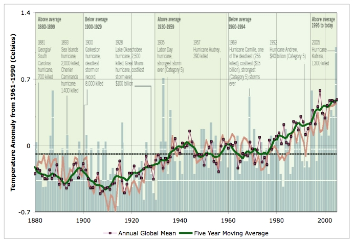
Global average temperature 1880-2005, five year moving average, and North Atlantic sea temperatures (on the same scale) and storms in the background. Data: UEA CRU, and LA Times for background figure.
My understanding is that most of the impact of global warming is in the relatively far future, decades away, in the latter half of the 21st century. Some small effects are being noticed now, changes in growing seasons, changes in animal and plant distributions, but nothing major.There is currently a debate in the scientific literature about when exactly climate change will constitute "dangerous anthropogenic interference" in the climate. The phrase comes from the United Nations Framework Convention on Climate Change, which aimed
to achieve stabilization of greenhouse gas concentrations in the atmosphere at a low enough level to prevent dangerous anthropogenic interference with the climate system.The British Government recently released a report on Avoiding Dangerous Climate Change, which argued that:
A number of critical temperature levels and rates of change relative to pre-industrial times were noted. These vary for the globe, specific regions and sensitive ecosystems. For example, a regional increase above present levels of 2.7 oC may be a threshold that triggers melting of the Greenland ice-cap, while an increase in global temperatures of about 1 oC is likely to lead to extensive coral bleaching. In general, surveys of the literature suggest increasing damage if the globe warms about 1 to 3 oC above current levels. Serious risk of large scale, irreversible system disruption, such as reversal of the land carbon sink and possible destabilisation of the Antarctic ice sheets is more likely above 3 oC. Such levels are well within the range of climate change projections for the century. While a clear temperature threshold has not been identified for shutdown of the Atlantic thermohaline circulation, studies were presented suggesting that a shutdown becomes more likely with increasing temperature.and
There is a range of emission pathways that could be followed theoretically to avoid different temperature levels. Probability analysis provides a quantitative estimate of the risk that a particular temperature level would not be exceeded. For example, limiting warming to 2 oC above pre-industrial levels with a relatively high certainty requires the equivalent concentration of CO2 to stay below 400 ppm. Conversely, if concentrations were to rise to 550ppm CO2 equivalent, then it is unlikely that the global mean temperature increase would stay below 2oC. Limiting climate change to 2oC above pre-industrial levels implies limiting the atmospheric concentration of all greenhouse gases. Based on new insights into the uncertainty ranges of climate sensitivity, a stabilisation at 450 ppmv CO2 equivalent would imply a medium likelihood (~50%) of staying below 2oC warming. In many cases this would mean that concentrations would peak before stabilising, though whether this could be achieved practically was not considered.I think this is definite progress is recognizing the seriousness of the situation, but I do not think we are there yet.
I'm going to argue that the changes due to global warming are full-on, old-testament, wrath-of-God stuff, they are starting already, and they will get much worse in our lifetimes. This is not a problem for our grandchildren, it's very much a problem for us.
There are a number of things to pick, but I'm going to focus on two: hurricanes (this post), and sea-level (next post).
Hurricanes
Here's my argument.1) Atlantic Sea Surface Temperatures follow global temperatures. They aren't anything special - they pretty much follow the global temperature trend. Remember that nice picture we discussed from the LA Times? The one that showed Atlantic sea temperature and storm count? Here it is again as the background for a plot of global surface temperatures, together with the five year moving average of global temperature. The global temperature graph is scaled to match that of the background Sea Surface Temperatures (SSTs), which are the orange curve.
Global average temperature 1880-2005, five year moving average, and North Atlantic sea temperatures (on the same scale) and storms in the background. Data: UEA CRU, and LA Times for background figure.
As you can see, the Atlantic SSTs pretty much follow the global temperatures. We don't need a special Atlantic oscillation to explain them. They have a slight wrinkle or two of their own going on now and then, but the big movements of the two curves all occur together. Clearly, whatever explains the one curve is going to explain the other to a pretty decent approximation. When you know how one curve will evolve in the future, you'd probably feel pretty safe assuming the other would continue to follow it. Certainly, if the solvency of your investments depended on the assumption that those two curves were going to break lockstep, you would rightly be very worried.
2) Hurricane damage is controlled by SSTs. Here's Fig 1 of K. Emanuel's Nature paper last year. It shows the total power dissipated by hurricanes and the sea surface temperature. The total power dissipated -- the total amount of energy that the hurricanes take out of the ocean each year and transform into howling gales -- is a function of wind speeds (cubed), the size of the storms, and the length of the hurricane tracks.
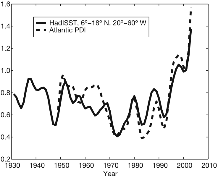
Estimate of total amount of power dissipated (PDI) by Atlantic hurricanes each year, together with average SSTs in hurricane forming region (offset by a vertical constant). Source: This is Fig 1. of Emanuel, 2005.
The correlation coefficient between the two lines is 69% (ie the r2 for those statistically inclined). This implies that most of the variation in hurricane power dissipated is explained by sea surface temperatures - they are the dominant effect. The economic damage caused by hurricanes is likely to be proportional to the total power dissipated times the value of the developments that lie within reach of the storms.
3) Global temperatures are explained by known forcings. The current models, with recent understanding of forcings, while there are residual uncertainties, are well able to explain the temperature history of the planet in the twentieth century. We discussed this at length the other day. The fit by models such as GISS GCM Model E are excellent, but even my simple one dimensional model was able to produce most of the important features of the curve given the right forcing input.
4) Forcings are climbing fast. Under any reasonable emissions scenario, the climate forcing is going to climb further in the future. Even if we could hold emissions constant, which doesn't seem very plausible at the moment, the forcing would continue to climb as we add CO2 to the atmosphere faster than the sinks remove it. Here's the historical climate forcings, together with projected forcings in the case of linearly extrapolated climbing carbon dioxide emissions, exponentially extrapolated emissions, and emissions constant at the 2004 level. This assumes all other forcings stay flat in total (ie aerosols don't get cleaned up, or made worse, and methane + CFCs continue to stabilize. You can imagine adding volcanoes to taste - but it would take biblical scales of volcano interruptions to avoid biblical hurricanes.
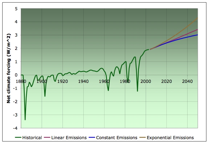
Historical radiative forcing estimates plus projected forcings due to various carbon emissions scenarios. All other forcings held constant. Historical estimates from Fig 1 of Hansen et al, 2005. Uses Table 1 of Hansen and Sato, 2000 for conversion formulae from CO2 mixing ratios to radiative forcings for projections.
5) The temperature rise is just beginning. Under any likely emissions scenario, absent heroic efforts, temperatures will rise much more in the next few decades than they already have. The core problem is that there's so much warming already in the pipeline. The earth is now a little less than one watt per meter squared out of radiative equilibrium - thus we are gaining that much heat all the time. Thus, even if we stopped CO2 emissions altogether tomorrow, temperatures would still rise by around 0.5oC in addition to the rise to date. Given further emissions, the temperature rise is likely to be significantly greater than the rise so far.
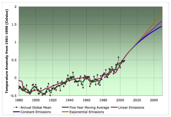
Global average temperature 1880-2005, together with one dimensional model fit (as described in the text) extrapolated to 2050 for the case of linear, constant, and exponential emissions (all other forcings held constant after 2003). Data: UEA CRU.
Remember that the temperature increases projected in this figure are on the lower end of the range for the IPCC 2001 report - these are not outside of mainstream climatological expectation at all.
6) Conclusion. Unless something radical happens to one of the trends in points 1)-5), hurricane intensity is likely to get dramatically worse with each passing decade from here on.
Readers may we wondering about NOAA's insistence that global warming has nothing to do with hurricanes. I've read Goldenberg et al, 2001, and Bell et al, 2004, and I don't find it very credible. Firstly, they completely are in accord that SSTs are a major driver of hurricane activity. However, they had noticed empirically that there's an apparent oscillation in the SSTs, and postulated that there must be some underlying mechanism for this oscillation which would continue to operate in future. As far as I can see, there's no real physics behind this supposed oscillation at the present - it's just a name for the fact that the historical record goes down, up, down, up. They viewed the history of the temperature fluctuations as inconsistent with a global warming explanation which they thought should be a gradual trend. However, as we have seen, once the full history of forcings is adequately understood, this is not the case.
As Hansen et al put it:
In summary, the warming in the model in recent decades is due to the assumed forcings, and we have presented evidence in this paper that the magnitude of the model’s response to forcings is realistic on time scales from single volcanic eruptions to mutidecadal GHG increases. The period 1970-2005 under discussion with regard to hurricanes is the time when forcings are known most accurately, and during that period anthropogenic GHGs were the dominant forcing. Although unforced fluctuations undoubtedly contribute to Atlantic Ocean temperature change, the expected GHG warming is comparable in magnitude to observed warming and is likely a significant contributor.In my view there's an excess of scientific caution in those words, given the strength of the evidence. Scientists are trained to be careful and cautious in their statements, but given what's at stake here, I think there's a danger of lots of politely caveated "probably"s and "likely a significant"s falling on deaf ears. After recent news, one can't help wondering if the NASA PR people had some input on the wording.We conclude that the definitive assertion of Gray [2005] and Mayfield [2005], that human-made GHGs play no role in the Atlantic Ocean temperature changes that they assume to drive hurricane intensification, is untenable. Specifically, the assertions that (1) hurricane intensification of the past decade is due to changes in SSTs in the Atlantic Ocean, and (2) global warming cannot have had a significant role in the hurricane intensification of the past decade, are mutually inconsistent. On the contrary, although natural cycles play a role in changing Atlantic SSTs, our model results indicate that, to the degree that hurricane intensification of the past decade is a product of increasing SSTs in Ocean and the Gulf of Mexico, human-made GHGs probably are a substantial contributor.
I think Hansen et al's pictures speak much more forcefully than their words.
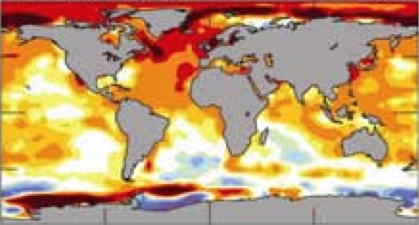
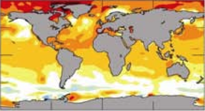
Temperature anomaly in sea surface temperatures from 1995-2005 relative to 1970-1994. On the left is actual observations, and on the right is output of GISS Model E. From Fig 22 of Hansen et al, 2005.
Update [2006-2-2 23:26:35 by Stuart Staniford]: Here's the temperature anomaly scale:

You can see the model generally gets it right, but it misses how much the North Atlantic and parts of the Arctic really warmed (indeed it underestimates the global temperature rise over that period by around 15%). Roughly speaking, that's the degree of change that bought us the hurricane intensity of the last few years. Now look at what the model says about the extra anomaly from 2045-2055 over 2000-2010. Ie, this is how much extra SSTs we would get over the era that bought us Bonnie, Charley, Frances, Ivan, Dennis, Katrina, and Rita (not to mention Epsilon).
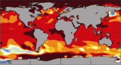
Temperature anomaly in sea surface temperatures from 2045-2055 relative to 2000-2010 from GISS Model E. On the left is the IPCC scenario A2, which lies between our linear and exponential extrapolations, and on the right is an alternative emissions scenario designed to minimize the risk of ice sheet loss. From Fig 22 of Hansen et al, 2005.
The world is already tracking above the alternative scenario due to higher than prescribed CO2 outputs. But even in that case, we experience more increase in SSTs than it took to get us the hurricanes of the last few years. The A2 scenario is unimaginable.
Just a quick reminder of what this all means in human terms. This used to be people's houses. This is in New Orleans, but a lot of the Mississippi coastline looks like this too:
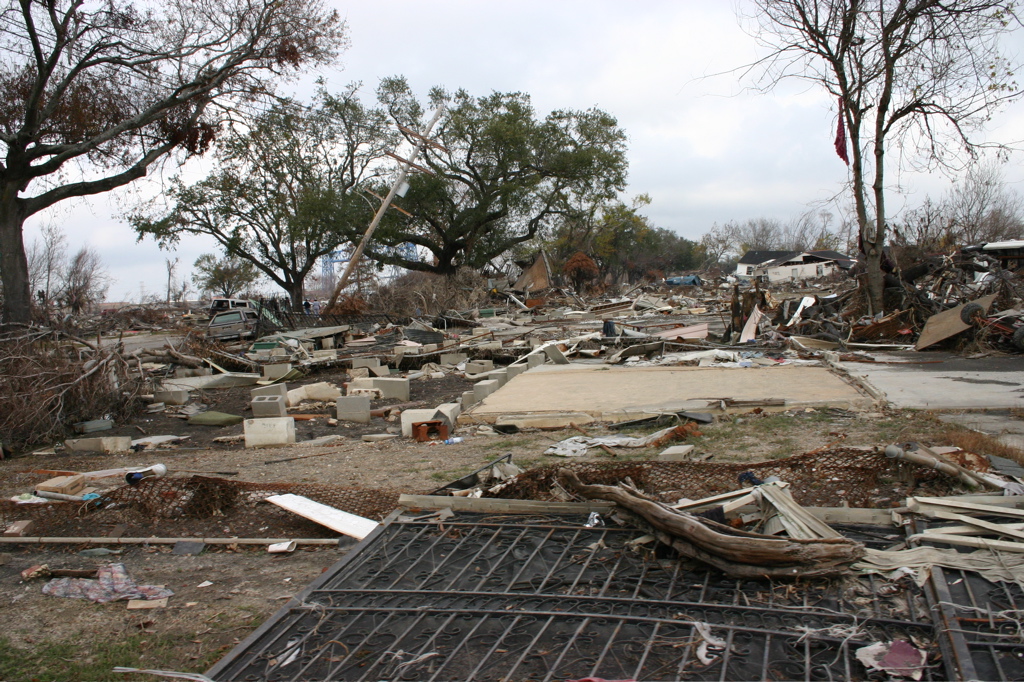
Lower 9th ward of New Orleans, December 2005. Picture credit: Zoe Hare.
The only way I can read the evidence right now is that this kind of thing is going to be happening year after year after year, getting worse with each decade. There'll be fluctuations year-to-year, but it's very hard to see how this can get better.
Oh, and it's not very good for the oil supply either:

Thunder Horse Platform. Picture credit: MMS.
Contact
- Content: editors at theoildrum dot com
- Tech support: support at theoildrum dot com
License

This work is licensed under a Creative Commons Attribution-Share Alike 3.0 United States License.
The best bet from what I can see is to move to a place that gets wetter in the IPCC predictions, isn't near huricanes, is far above sea level, and have enough land to grow your own heat and food. Good luck.
Don't move here though, we want to stay under the radar:-)
Didn't you get the memo? We Huns launched our very successful invasion well over a decade ago. The natives have already learned to make nice with us. ;)
If I were living in Oregon I would grab my trusty United Farm Catalogue and head north.
Slight quibble - the global temperature anomaly maps would be better if you gave us the temperature scale, and on my combination of wet string and MS IE6 they came out on top of the caption. Even better than the color scale (for those of a numerical bent) would be a summary of (say) max, median, min and quartile delta-T for each scenario - if you've got that handy that is.
My non-meteorologically trained gut feel for this sort of thing is that hurricane intensity should be a function of (lateral? vertical) spatial temperature gradient in the hurricane belt rather than absolute temperature. Are GCMs sufficiently high resolution to allow extraction of this sort of quantity on the relevant scale? And what is the relationship between temperature and the different phases of hurricane life cycle? - presumably some sort of event analogous to crystal seeding (formation of a stable storm cell) followed by growth - and IIRC it was the intensity of maximum storms that was increasing, rather than their frequency (but remember Epsilon!). How does this play out in a hotter world, exactly?
PuD
I'm a farmer and native plant seed collector in Western Washington. Lately I have been discussing the topic of local climate change with a fellow seed collector who lives about 200 miles away on on the east slope of the cascades. We both depend on temperature driven ecological events for timing of seed ripening of common native trees and shrubs.
Over the last 10 years I have noticed that the time of ripening for one species, vine maple has shifted from early to mid September to late August. We have also noted changes in other species.
We have begun to look at maximum/minimum temperature records from a single weather station in each of these two places and only during times that directly effect seed ripening. This is during 6 week periods mid July thru August and for general interest January to mid February.
Our initial look at this data shows dramatic changes in temperatures (5 to 30 degrees, winter and summer) over the 52 year period of record keeping. When we finish our analysis I will be happy to forward this to you for comment.
By cherry picking data, I think will help us to understand direct effects on plant communities, ie summer pollination and ripening and winter seed conditioning in the soil to satisfy seed germination.
Rich Haard
Changes in flowering times are being tracked across Canada through a volunteer network.
I'm not talking about occasional years, I'm talking about the norm being shifted, and very noticeably. I have changed my vegetable growing to suit the new norm, as long as I take precautions against late frosts I can be eating some vegetables a month earlier than I could 20 years ago.
There have been detailed studies in the nesting behavior of birds across the whole UK, flowering of wild flowers, too. These unequivocally show 2 to 4 week advances on 20 to 30 years ago for most species. This weekend was the first warmish one this year in my area, the blackbirds and wood pigeons are mating, the robins are paired (and probably mated but too discrete to do in public, LOL). This is a month early. I, and they, were a bit too busy to talk about it today, but we will soon ;)
I know that during the last several decades there has been mountains of extremely accurate geophysical data, and I have a high level of confidence in these global average numbers for say the period from 1960 to the present.
But what about the early time frame of your graphs, say 1880 to 1930? Surely, the number of weather readings and sea temperature data points were but a small fraction of what they are today. Would a weather station in southern Argentina circa 1887 produce temperature data any more accurate than almost the entire range of your graph?
Ditto for early sea temperature data but even more so. Someone throws some kind of a thermometer off the back of a ship, hauls it in, reads a line that might be 40 or 41 degrees and records it. That one degree is already half the range of your graph. Then one must ask: how is this averaging done for the early years? If someone has a dozen or so data points taken over a period of months in a remote area of ocean extending some hundreds of thousands of square miles, then how reliable is that 'average' number and what does it really mean?
I don't think this is nit picking, because we are trying to draw inferences by comparing a modern high-tech data set with an old data set that is probably orders of magnitude less reliable. None of this would matter if the temperature variations were large, but they are not; and for the early years the variations arrived at are probably on the same order as the overall accuracy inherent in the temperature measuring and averaging methodology.
Please understand that I am not posing these questions to refute the notion of global warming or your particular analysis: it's just that I have been bothered for some time by this problem of comparing modern data with data that is over a century old. True, it may be the only data available, but one needs to recognize its limitations. If data for the period 1995 to 2005 says that the North Atlantic sea surface temperature rose 1.2 degrees, I believe it. But if the data for the period 1800 to 1990 says it dropped 1.2 degrees, I am inclined to not put much stock in it.
Well, if it is indeed the case that for the years before WW II O18/O16 ratios are being used as a surrogate for global temperature rather than actual meteorological measurements, then the early global temperature 'data' is even more dodgy than I thought. Certainly such a method is not going to give an accuracy on the order of 1 degee C, which is about half the total range of the graph Stuart has used in this post.
What I still don't have any feel for is exactly how a global average temperature is arrived at for a given year, particularly as we go further back in time. It must be very difficult to come up with a reliable average because some parts of the world are overflowing with temperature data while other parts have a much more limited data set. (e.g., how much temperature data for say the year 1947 do you think exists for a 1,000 km x 1,000 km patch in a remote part of the southern Indian Ocean or the northern Pacific?)
Can anybody out there explain to me how these yearly average global temperatures are actually arrived at?
It has been used to get this graph of historical global temperatures from the Antarctic ice sheet:

My guess is that the more recent the year is the more accurate the method would be, as it will become easier to gather more samples from all around the world, that will eliminate potential deviations. In defense of the method is that when the results of the samples from the Antarctic ice sheet were compared to those from Greenland ice sheet 10 000 miles away from it, they practically matched.
P.S. Question to the blog editors: why is it not possible to edit a post? For me it is a bit frustrating, because I often see syntax errors I've made (English is not my native) that I can not correct afterwards.
Now they're not going to get much more of their energy from oil or NG given Peak Oil/gas. We're probably looking at most of the addition being almost pure carbon coal.
This is not just exponential growth. This is more and faster exponentials piled on top of the existing exponential which is already causing this much disturbance.
Is there any good reason we should not be scared shitless at this point?
Firstly, carbon dioxide emission are not
increasing at a linear rate. Latest data from
Hawaii indicates that the 1ppm, 1.5ppm, 2ppm
pattern of accelerating emissions increased
spectacularly in 2005: a provisional figure of
2.2ppm in 10 months implies around 2.5ppm for
the year. So not only are emissions accelerating,
but the rate of acceleration is increasing.
Taking the current CO2 level as 382ppm, we have
only 18ppm to go before reaching the IPCC 'safe'
level of 400ppm and at the increasing rate we
are witnessing, that will take just 6 or 7 years.
Secondly, it is worth remebering that the relationship
between saturated vapour pressure of water and
temperature is not linear either, though the
slope at low temperature is moderate.
However, when we are discussing sea surface
temperatures, the effect is profound indeed.
Thus, at temperatures below 28oC hurricanes are
unlikely to form; the rate of evaporation of
water molecules is too slow. Above that
threshold, evaporation increases, [upward]
thermal effects take over and hurricane
formation seems to become an inevitability.
We should note that SSTs in the GOM /Caribbean
were in the range 28-31oC last August-September,
Thirdly, climate-related damage is not
resticted to hurricanes. The freqency of
tornadoes has increased, as has the length of
the tornado season. There is the very real
prospect of there being no season as such, with
tornadoes occuring at any time of the year.
In the worst case scenario, most of the region
from Texas to Florida will become largely
uninhabitable, except for those who are
prepared to live in concrete bunkers.
Finally, although the focus has been on the GOM,
these effects are occuring all over the planet:
thus Japan was hit by 14 typhoons in a row in 2004
and fared little better in 2005. Mumbai was
inundated with 936 mm of rain in one day,
whilst in other parts of India drought
prevailed.
I suggest that anyone who thinks that climate
change is a theoretical possibility that may
start to take effect some time in the distant
future had better start using the Internet and
find out what is really happening in the world.
Alternatively, a trip to Alaska or Northern
Canada would provide an eyewitness account of the
catastrophic meltdown that is occuring right now.
conclusions from one year's CO2 data. But when
that data is a continuation of a trend (ever
increasing quantities of CO2 detected in the
air) and it matches empirical evidence of
greater use of fossil fuels, to pretend it is
not significant on statistical probability
grounds is to be be foolhardy.
I am yet to see any proper discussion of the
Precautionary Principle in relation to climate
change. There seems to be the perception that
'things won't be too bad' and 'amelioration is
still possible', yet every study on cliamte
chmage reveals that it is proceeding faster
than previously thought.
Let's recall the words of Sir David King, 2 years
ago: I am paraphrasing, but essentially he said:
'by the end of this century Anarctica will
be the only habitable land (literally) unless
we immediately implement policies to bring CO2
emissions under control'.
Well in the past two years virtually nothing has been done to limit
CO2 emissions amd most nations emissions are up
substantially -even signatories to the Kyoto
Protocol, even nations that have a 'clean green
image like New Zealand (emissions up around 20%
in the past three years, and we could discuss at
length what a sham 'clean green NZ' really is,
but not now).
Whilst we appreciate the work you have done in
tabulating and graphing information, I think
people should not get too carried away
with TOD graphs alone, but should also listen
carefully to what other [expert] people have
already said on the matter, especially the
Europeans. The Hadley Centre (UK) probably
should have the last word on global warming at
this point of time.
But just in case TOD readers are unaware, many
Europeans are openly saying that we have passed
the point of no return on global warming, as
reported by 'The Independent' UK several weeks
ago and that substantial, if not abrupt,
climate change is inevitable within decades.
I guess that if Sir David King was right, then it's too late and we're just going to have to deal with it. I just can't imagine China and India condemning themselves to everlasting poverty even as Sir David and academics like him expend jet fuel without limit in pursuit of scary speechmongering, or is that speechifying fearmongering.
http://cdiac.esd.ornl.gov/trends/co2/graphics/mlo145e_thrudc04.pdf
Yes it's the Mauna Loa chart.
Well, if you smooth out the annual variation with a 12 month moving average, and then take the 12 month rate of change, it varies quite a bit from year to year, but overall there is a rising trend in the rate of increase. At this stage I couldn't conclude the CO2 curve is exponential, but it's rising faster than linear.
A parabola fits the 12 month moving average data from 1958 - 2004 very well. The coefficient of determination is r² = 0.9987 for a parabola vs r² = 0.9886 for a linear trend.
If I do a least squares regression for a 2nd order polynomial, a null 2nd order term has a p value of 1.8 x 10^-261. i.e. It's strongly rejected at just about any confidence level you like.
If I take the logarithm of the 12 month moving average I get r² = 0.9924 for a loglinear trend (i.e. an exponential). That's a little bit poorer than the parabola at the previous case but also much better than the simple linear. Visually the logarithm is also rising faster than linear, so its an accelerating growth rate. Even in the logarithmic case, a null second order term has a p value of 6.4 x 10^-196. This is definitely accelerating growth.
http://cdiac.esd.ornl.gov/trends/co2/sio-mlo.htm
If you are interested here is another study (pdf) on sea level change. I posted it some time ago.
http://www.pacificsealevel.org/files/CountryReport_tv_2004.pdf#search='sea%20level%20Country%20Repor t%202004'
Pity it's only a decade of data.
In time that study is going to be really useful.
- Peak Oil and Climate Change are both highly incendiary and controverted issues. But in the case of Peak Oil, at least, it is overwhelmingly obvious for those who carefully study the data that we face an impending peak. In your judgment, is the proposition that we face substantial climate change in the coming decades overwhelmingly obvious to an approximately equal degree?
- Peak Oil can get quite complicated once you examine the details closely, but I think that arriving at the obvious, first-order-approximation-type conclusion that peak is quite near really is relatively simple. One merely needs to combine an appreciation of the finitude of currently available fossil fuel reserves in the ground with a firm grasp of the laws of thermodynamics. Is the same fundamental simplicity also true of the climate change controversy, or is there something fundamentally more complicated about it?
I pose these questions because I have immense respect for the care and reserve you exercise in rendering judgments about the things you write about. I teach philosophy, and epistemology is probably my chief interest, because it is so hard to really KNOW anything. You possess what one might refer to as "epistemic sobriety" to an unusual degree, so please give me some basic epistemological guidance on this climate change business.As to epistemology, probably worrying another decade or two about how we know anything should provide an answer.
But, since I cannot figure out anything in a definitive way, I feel that it is also wise to be emotionally prepared for the possibility that no major catastrophes will occur during our lifetimes - whether due to global warming, Peak Oil, or any other potential cause.
I would answer your questions with further ones:
- Peak oil is inherently more simple in concept and variables than climate change. Is it not, therefore, surprising that most of those governments that have been spouting warnings of climate change for years (like UK) have not issued one bleat about peak oil?
- Climate change is an obvious and real thing to folks with any awareness of nature (here in UK at least), but many have minimal such awareness, why should they care?
- Is it possible that much of the climate change emissions from politicians is proxy (and perhaps preparatory) for the peak oil truth they will admit to when unavoidable?
To me both peak oil and human induced climate change are blindingly obvious. It seems impossible for a rational human who investigates the data to conclude otherwise. Either I am deluded or those who perceive otherwise are, perhaps by choice, perhaps by lack of intellect.I have attempted to inform friends about peak oil, a very few have been willing to seriously explore the issue, most avoid it (very obviously). Some have said things like: I don't come out on a Saturday to talk about doom and gloom, then proceed to talk about 'Big Brother' and other meaningful TV shows. Maybe I just smell, LOL.
http://storm.uml.edu/~woods/2005canes.htm
sea surface temperatures are not a good indicator of ultimate
hurricane strength:
... Often [sea surface temperatures, SSTs] can be very uniform
across a body of water like the Gulf of Mexico due to radiation
heating of the surface ...
Instead, he says,
... when hurricanes pass over warm core ocean eddies ... they will
often strengthen explosively ...
In `warm core ocean eddies' the warm water can extend downwards 180
meters or more from the surface. This warm water can provide a great
deal of energy to a developing hurricane -- on par with or higher than
the solar influx.
According to the article, in the Gulf of Mexico, `warm core ocean
eddies' last 9-12 months with an average of one forming every year.
Since the planet is already out of radiative equilibrium, this does
not invalidate Staniford's conclusion that "hurricane intensity is
likely to get dramatically worse with each passing decade from here
on".
Is there any consensus that Milankovitch forcings (variations in Earth's orbit around the sun: eccentricity, obliquity, and precession) are reinforcing or opposing man-made forcings? Milankovitch forcings presumably coincide with glaciations.
In other words, thinking only in terms of the geometry of the Earth, are we moving towards or away from global warming?
There is no reason to suppose that any one cause (e.g. Mil. forcings) or volcanic activity or asteroid strikes or changes in the earth's magnetic field and polarity explains glaciations and warming trends. For one thing, the old assumption that solar radiation was essentially constant has come into serious question in recent years.
It is interesting to survey the history of ideas about climate change: Whenever there has been a solid consensus of conventional wisdom, it has turned out to be entirely (or almost entirely) wrong. SCIENTIFIC AMERICAN has done a bunch of great articles on these topics over the past thirty-five years; they make good reading. What is perhaps most amusing is the strong consensus in the early seventies that global cooling was a certainty, that we were beginning to enter a new glacial period, glaciers were advancing everywhere, ocean temps dropping, etc., etc., etc.
Serious climatologists learn humility at an early age.
Because the geometry of Earth's orbit "may" be a factor--and can be factually described--, does the geometry of its orbit reinforce CO2 forcing, or does it mitigate it?
Looking for expert opinion here. Do you know, Sailorman?
However, in all seriousness, I am going to claim sincere Socratic ignorance when it comes to climate change. It is sort of like collective behavior or social change in sociology: The theories are numerous, contradictory, and unsatisfactory.
Anybody who makes a firm and unqualified statement of knowledge of what is going to happen in regard to climate has self-identified himself or herself as an ignormanus. No, worse than an ignoramus--somebody who is working hard to win a Darwin award.
False claims to knowledge bug the heck out of me.
The factual part: Where is the earth now in terms of eccentricity, obliquity, and precession? According to Milankovitch, would that indicate warming or cooling. In this part of the question I am really looking for factual answers.
The second part deals with cause and effect. Is there consensus that the geometric path of the earth plays a part in warming and cooling?
Alas, there are not. If you look at all the different Mil. interpretations, you come up with a mess. You can describe all the different things that are happening, but how do you weight each one?
The consensus is that the Mil. is somewhat important, but there is no consensus as to how important. Some would say it is usually the decisive factor driving variations, others say, "pooh-pooh, small potatoes--except under special circumstances." There are literally scores of very bright people with original ideas who have published in this area over the past forty years with wildly different interpretations of the data. To the best of my memory, the only time there was maybe 80% consensus was in the early 1970s, when all the data were interpreted to show unambiguous and strong global cooling as we were definitely entering a new ice ige. And of course we now believe that interpretation was entirely wrong.
There is no substitute for going back to original sources to trace the history of ideas. Also, it is very interesting and englightening.
By the way, I've oversimplified a bit to make my points and have left out a whole bunch of qualifiers, because the true story is rich in detail--e.g. the popularity of the theory that variations in volcanic activity caused glaciations and global warmings; that one was in first place for maybe a decade (and has never been convincingly refuted).
There doesn't seem to be a clear answer as to whether the prior collapse of the North Atlantic current was a cause or an effect of the onset of an ice age, but we do know that warming, current collapse, and ice age onset seem to go together in several of the past ice ages.
Regardless of what happens in the future, continued climate change is likely to be disruptive to homo sapiens. I suppose the only question is how disruptive.
http://www.homepage.montana.edu/~geol445/hyperglac/time1/milankov.htm
I remember, from back in the 1960s, people were saying, based on climate correlations with sunspot cycles, that 1960 and neighbouring years would be the warmest till 2016. Ooops!
There are a number of cycles and factors one needs to consider when projecting climate. Milankovitch, sunspot, el nino / nina, volcanic activity, greenhouse gases, atmospheric particulates, positive and negative feedback loops...
But the more we know the more it seems there is a very clear and persistent effect from atmospheric CO2 concentrations due to human industrial activity.
I am seriously concerned by human induced climate change but I feel that peak oil will bite us sooner and harder. The climate change might bleed us to death thereafter, though.
However, the situation with respect to what would be happening now is somewhat controversial. The holocene (the period of stable climate since the last glacial period ended) is longer than other recent interglacials. There is one school of thought which says that it just happens that the various solar forcing factors combine in such a way as to make for a long interglacial. There is another school of thought (expressed very nicely in the recent book Ploughs, Plagues, and Petroleum by William Ruddiman) that says we would be starting the long slow slide towards the next ice age if it wasn't for pre-industrial CO2 and methane releases by humans (due to land use/agriculture). There's a nice discussion of this debate at RealClimate. I haven't developed an opinion on that particular issue.
However, I don't think any mainstream climatologists believe the variations of solar forcings in the present time ± a few centuries are very relevant compared to the industrial-era human-supplied forcings, which are an order of magnitude larger.
Another thorough post. Nothing I didn't know already but to see it all in one spot and the interactions highlighted is very powerful. You are a one man Energy and Climate educator!
This information should be in a college course so that more people than on TOD can understand the relationships between burning fossil fuels, obtaining fossil fuels, climate change, and how these directly impact people's lives today.
Thanks for bringing all the studies into an easily comprehended package. Write your book soon.
Excellent presentation. I agree that we will see the effects within our lifetime. Even some of us seniors will see it.
Regarding hurricane intensity: If we will have increased intensity, it seems plausible to conclude that the intensity will increase throughout the entire storm scale, moving strong tropical storms into hurricane category. In short, although it has not been empirically verified, I see no reason why there should not slowly be an increase in the number of hurricanes.
In addition, we should be able to measure an increase total wind velocity over the entire earth.
There's a fairly heated debate (probably adding a little extra to GW) on the Eastern US Weather Forum at the moment on this very topic.
I'm sure you'll be interested in the discussion there, especially as some meteorologists are highly dismissive of some of your arguments.
Global Warming and Hurricanes
Enjoy the fight.
One of the old guys said of a young (woman) researcher that she didn't know what she was talking about, and she in return said that the old guy's brain was "fossilized"! So now everyone's so mad that the two camps won't even appear in the same forums. It's quite a spectacular lapse of scientific decorum. However science has survived many such disputes before, and meanwhile the process works behind the scenes, as papers are accepted and rejected from the journals.
From the outsider's perspective it is not only an entertaining soap opera but a fascinating and important scientific detective story. I will quote a wise comment from the discussion board you linked by meteorologist Don Sutherland:
Again I encourage people to follow FTX's link - it provides a much more complete sense of the nature of the controversy among people interested in and knowledgeable about meteorology.
A more general observation. I have observed, both in myself and in others, a considerable psychological risk in being an acknowledged expert. There is ego gratification in being an "expert". Depending on one's personality structure, that ego gratification may be more or less important to one. If one becomes psychologically very reliant on the emotional rewards of being an expert, one becomes reluctant to take risks. Experts don't make mistakes, right? However, if one does not take intellectual risks, especially as one gets older and picking up new things becomes harder, there is a risk of getting into a situation where one does not understand some new development that comes along, it's a lot of work to learn it, one cannot be an "expert" on the new thing during that learning process. Thus the psyche can decide that the risk of emotional pain is so high that it is better to deny the truth of the new development. I decided some time ago that it was very important to maintain a continued willingness to be wrong. Combine that with the enormous social and political significance of the hurricane and the social hurricanes should be as severe as the physical ones for a few years probably...
Stuart this is great work, if not good news.
I am enjoying your exploration of Climate Change. Please continue. In light of the scientific evidence implicating CO2 in Global Warming, I would be interested in how you would stabalize CO2 emissions: Kyoto/sequestration, etc, etc..
Thank you for all your efforts...
The solar constant is about 1370 watts per square meter depending slightly on whose value one uses. You say the earth is now about one watt per square meter out of equilibrium. So, on the simplest radiative model, I'd expect the temperature to rise according to a change from 1370 to 1371 watts per square meter. Radiation goes as the fourth power of the temperature, so I'd expect the temperature to go up by one part in (4*1370), or one part in 5480. At somewhere around 290K to start, that's about 0.05K or 0.05C. That value uncannily resembles a famous satellite-measured temperature rise that seems now to be discredited.
If the actual response to 0.05C worth of forcing is 0.5C, that implies an amplification by a factor of 10. That's a lot, more than enough to put a system on the razor's edge of violent oscillation, i.e. oscillation growing without bound until it hits a limit. (In electronic work, I'd normally pitch a design like that.) Where does all that amplification come from? And, the anthropic question: why didn't it boil or freeze all life off the earth eons ago? How is it that we are here to talk about it, when the system's presumably been on the razor's edge for four billion years, during which time there have been more than enough triggers and parameter shifts to push it over the edge and, most likely, stick it fast to some limit?
Over the eons, there have been asteroid impacts, orbit precessions, considerable secular and perhaps irregular changes in the solar constant, movements of land masses, increases in the moon's orbit radius, and so on. And yet, still, we're here. So, I have to ask, is it conceivable we're getting up in arms about something that's been blown out of proportion?
By the way, how do we know the solar constant is constant?
What about the Maunder Minimum and the Little Ice Age? The premise that the solar constant is actually a constant is highly questionable in the light of the past ten years' reasearch.
But relax, the probability that the sun is going to go nova in our lifetimes is infinitesmal (assuming, that is, that our theories are correct. And on this issue I think they are.).
Not to answer for Stuart who is quite capable. But some thoughts.
First, Many of the life from 100,000's of years ago is Not here anymore. When we talk on a scale of millions of years, or Billions over which some life has existed than most life has not been able to adapt to the changes in climate.
Clearly most of the dinasaurs didn't make the transition. Similarly, woolly mammoths, camels, oxen and other large mammals that were prevalent during the last ice age couldn't cope with the sudden warming afterwards. Humans as a separate large numbered species has only been around about 100,000 years. Even the Neanderthals (nearly humans?) went extinct 35,000 years ago.
Just because we are here now doesn't guarantee that humans have to be on earth in the future. Life on earth will not go extinct if we monkey with the climate. But Humans might go extinct and be replaced by some other dominant species.
But the Earth albedo is around 30%, so 30% of it is radiated back into space and 70% is absorbed by the Earth surface and atmosphere. So the amount that heats the Earth is:
0.7 * 1367 = 966.9 Wt/m2
Of these an increase of 2 Wt/m2 would represent 0.21%. The average Earth temperature was 15 degreeas C = 292K, temperature of a single body is proportional to the heat absorbed (the radiation is proportional to the 4th extent) so 0.21 * 292 K <font color="red">would give us 0.61 degrees temperature rise.</font>
Some coincidence, huh?
In a simplified "the Earth surface as a static heat absorber" scenario a 2 Wt/m2 increase of solar forcing causes a 0.61 degrees C warming. The "heat" coefficient is 0.31 degrees C /(Wt/m2)
That life has not been 'as you know it, Jim'. It has been a punctuated equilibrium. Die offs of perhaps 80% of all known fossil species have occured in a relatively short time in the past. Apparently mostly due to exogenous events, this would probably of our own making. Stupid monkeys.
Let's be honest here, we are talking about human life. It is very plausible that the coming climate change could make Earth uninhabitable for humans, ergo: we would die off, completely, fini, ca va. But life would continue.
In 10 million years we may be barely visible in the fossil record. Perhaps future archaeologists will muse on whether some form of mechanistic alien life was responsible for these strange structures they cannot otherwise explain, not finding any evidence of otherwise 'intelligent life'.
Humans have changed this planet radically (I'll not digress into value laden sideroads), that evidence will remain for a while. But in a few millions or tens of millions of years there will be negligable remains to give a clue to what were were or might have been. It may have happened before, and let us hope, should we fail, that it may happen again.
And, one day, that it does not fail and makes it to the next level in a responsible way. I hope that might be us, but for now my bets are hedged.
This experiment we are doing has not been done before, the results are really just a guess. I am aware of that. Perhaps my perception of the error bars is more realistic, perhaps not, perhaps I am mad, perhaps I hope so, perhaps I fear not. I know you don't know, I'm less sure I don't, I know I have fear and I fear that is not irrational. I absolutely realise the logical explanation for my apparently distorted perception is in my head, I have a degree in psychology, lol. Time will tell.
Definitely. There is a suspicion among a large number of climate scientists that their models are underestimating the forcing. For example, from this nice article Reducing uncertainty about carbon dioxide as a climate driver (pdf) which I recommend.
I applaud Stuart's application here - glad forcing function is getting public use.
The major concern of mine is not the change in temperatures but rather the RATE of CHANGE of temperature. Ecosystems can adjust but only so fast. How long does it take a redwood forest to migrate from California to Alaska?
Change faster than ecosystems can adjust and natural productivity falls. Moving wheat farming from Colorado to Hudson Bay can happen in a few years but without the changes in soil biota, it might not have the yields we expect. Growing bananas in Oregon could take a while.
As a nuclear engineer, I've deliberately taken a back seat on global climate change issues. To be too vigorous an advocate appear look overly self-interested. I do hope that others will come to the same conclusion I came to 30 years ago - the planet NEEDS nuclear power if we humans are to enjoy a prosperous life.
As far as nuclear energy is concerned, I agree. At least from the climate change perspective, and probably from many other perspectives, nuclear energy has the smallest ecological impact of any of our energy system alternatives.
I don't know much meteorology... don't know much climatology... but I do know that I love you... and I know if you love me too... what a wonderful world it would be (Sorry, got carried away there). Anyway I will mention a couple of minor points which illustrate some of the uncertainties.
Hurricanes are heat engines, so it seems like heating the oceans will of course cause more and stronger hurricanes. But this is not as obvious as it seems. In fact hurricanes, like all heat engines, rely on temperature differences, not absolute temperatures. Hurricanes work off the temperature difference between the ocean and the upper atmosphere. It follows that if the ocean heats up but the upper atmosphere heats up just as much, then you would not get any more hurricanes. Only if oceans heat up more than the upper atmosphere would you expect to see more hurricane activity. And since ocean warming is ultimately due to atmospheric warming, you might actually expect the atmosphere to heat up more than the oceans, decreasing hurricane strength.
Now, as I understand it, in fact detailed global warming models predict the opposite of this, that the oceans heat up more than the upper atmosphere. But it is a second-order effect. The point is that the linkage between ocean temperatures and hurricane strength is not as obvious as it seems; it requires detailed modeling of how and where heat will be distributed in the atmosphere.
The second point is that the Nature paper linking increased hurricane intensity to ocean warming required some rather novel measures of hurricane strength. Traditionally people looked at obvious measures like the number of hurricanes; or perhaps, the number of strong (cat 4 and 5) hurricanes; or perhaps, the maximum wind speeds of hurricanes. Surprisingly, none of these traditional measures can be linked statistically to global warming.
What the Nature paper did was to come up with a new measure of hurricane intensity. Basically Emanuel multiplies the average number of hurricanes per year, times the average duration of each hurricane, times the third power of average wind speed (this "cubing" is considered the appropriate way to measure hurricane strength). By combining all this data in this way, he was able to achieve his result of showing that this measure of hurricane intensity was increasing and was arguably linked to global warming.
That's a valid result and it is not an unreasonable measure of hurricane strength. But it remains true that there is as yet no statistical relation between the number of hurricanes and global warming; or between the number of strong hurricanes and global warming. You have to combine all the statistical data together and get a sort of "sum total of hurricane-ness" over the whole season to find something which is linked.
It's not clear to me that this measure will directly correlate to hurricane damage. You could get the same measure value with a lot of weak, long-lasting hurricanes, or a few strong, brief ones. Would both have the same economic impact? It's hard to say. It doesn't seem obvious to me.
I must sleep and can't read to the bottom of this thread (it's 04:50 here, I've neglected TOD for a few days and I'm only half way through the backlog, ouch). But I have a point that must be made and no one yet has saved me the trouble...
Recollect the report of atlantic conveyor reduces by 30% between 1992 and 2004? Well, hey, not so much hot water going north, tough sh*t UK. No, watch out GOM. That hot water is going somewhere else, take a guess. Yep, back into the central atlantic hurricane cauldron.
Individual years will be largely a matter of luck but one can bet on hurricanes being an increasing problem at least until this high phase turns in about 15 years. GULP!
ACT IV. SCENE I.
A cavern. In the middle, a boiling cauldron. Thunder.
Enter the three Witches.
FIRST WITCH. Thrice the brinded cat hath mew'd.
SECOND WITCH. Thrice and once the hedge-pig whined.
THIRD WITCH. Harpier cries, "'Tis time, 'tis time."
FIRST WITCH. Round about the cauldron go;
In the poison'd entrails throw.
Toad, that under cold stone
Days and nights has thirty-one
Swelter'd venom sleeping got,
Boil thou first i' the charmed pot.
ALL. Double, double, toil and trouble;
Fire burn and cauldron bubble.
SECOND WITCH. Fillet of a fenny snake,
In the cauldron boil and bake;
Eye of newt and toe of frog,
Wool of bat and tongue of dog,
Adder's fork and blind-worm's sting,
Lizard's leg and howlet's wing,
For a charm of powerful trouble,
Like a hell-broth boil and bubble.
ALL. Double, double, toil and trouble;
Fire burn and cauldron bubble.
http://wind.mit.edu/~emanuel/anthro2.htm
Some excerpts:
(This is part of why I have such a strong preference for looking at the raw data myself rather than relying solely on someone else's spin in the abstract and conclusions sections).
I think it's a problem, because I don't think the science is really providing society with the warning it should. Eg. it's unfortunate that the IPCC report in 2001 made sea level out to be a total non-issue in any timeframe we'd care about. That is now starting to look rather shaky. Similarly, why is hurricane science only getting around to noticing in 2005 that the proportion of hurricanes which are Cat 4/5 has doubled in 30 years (noted in Webster et al's paper)? That's a huge signal and a really easy analysis to do - it was the very first thing that occurred to me to do when I first thought about the problem. What were the experts up to all this time? (Actually, I know the answer - it was Kuhn - people can't see the data because they get too attached to a theoretical paradigm that keeps them from asking the right questions. It looks like we are witnessing a paradigm shift in tropical meteorology as we speak - I predict that in a year or five, we'll have had a few more cities flattened by hurricanes, Gray will retire, and it will be conventional wisdom that hurricanes are rapidly increasing on account of global warming)
Similarly, the general problem with inference from US landfalling hurricanes (eg as to damage) in the past has been that there weren't enough of them to draw statistically meaningful conclusions about much of anything. However, that seems to be changing, unfortunately.
I am curious about Emmanuel's assertion that there is no global warming signal in the total storm frequency, however. It sure looks like it to me in the LA times graph. One shouldn't be looking for a "long-term trend", one should be looking for variations that match the global temperature curve, and I certainly see that in the data - maybe I'll have to investigate that more carefully.
The other thing that seems worthy of investigation - what would one have said the prior probability of the 2004-2005 hurricane seasons was, if one had done the analysis in 2003. Subjectively, they feel very unprecedented, but it would be interesting to quantify that. You are, of course, free to decide that I'm full of it. Peak oil is in 2035 (or it's going to cause an instantaneous societal collapse), OPEC reserves doubled in the 1980s, hurricanes will not increase due to global warming, 4th quarter GDP will be up 3.3%, etc, etc...
It raises the question of what we might see this year. If 2006 is a rather pathetic year for hurricanes, I don't think that would rule out a global warming link. Likewise if it turns out to be on the level of 2005, or even greater, that should not be seen as confirmatory. There is considerable variation from year to year, and only with several years of data can we reliably see a pattern.
As far as the general issue of predictions: while your analyses are useful and insightful, ultimately I don't believe in this methodology. My readings on how people gather and process information strongly suggest that you cannot plausibly expect to uncover truth on matters like these by the kinds of intensive investigations that you are doing. These efforts provide hints at the truth, a piece of the truth, but the most accurate picture will require combining the inputs and insights from a variety of viewpoints and perspectives.
The most reliable guide to truth, based on the studies I have read, is social consensus; particularly where institutions exist to elicit best-effort, honest inputs into the consensus process. I particularly respect scientific and market consensus. All of these point to near-term Peak Oil as being at least controversial and probably not an issue; and they also point to near-term global warming problems as probably not an issue as well.
Now, it's possible that your own ideas and analyses will tip the balance; that the new information you add to the consensus will be so overwhelming as to bring about (or at least facilitate) a dramatic change of viewpoint on these questions. A priori, the odds are against you personally being such a person, but it's logically possible. Unfortunately, I don't know of a proven methodology for identifying such paradigm-shifting sources of information, so I can't really judge whether you are the exception. For now I have to go with the very long odds that say that you are seeing just a piece of the big picture, and that the larger consensus is far more likely to be accurate.
When scientists conclude every publication by saying, "More research is needed," they are not just playing the game of trying to justify more funding. When it comes to meteorology, the jokes are essentially true: Because of chaos and complexity [and lack of data] it is impossible to make honest prdictions with much confidence.
By the way, we know essentially nothing of hurricanes prior to a few dozen years ago; the long-term record is so sketchy and incomplete as to be almost worthless.
There is a saying among pilots, "Never bet your life on a weather forecast." There are old pilots and pilots who ignore this advice. There are no old pilots who accept weather forecasts without a few teaspoons of salt, and sometimes more. BTW, the pilots of the plane carrying Paul Welstone bet their lives (and those of their passengers) on a forecast. They lost.
to retreating arctic ice (reducing surface albeido) and antarctic (latent energy of phase change), to the dying of the seas basic food block, plankton
and possible thawing of frozen methane hydrates (clathrates).
That is the crux of the problem - predicting how the forcing functions and their feedbacks all inter-relate.
As to insolation and re-radiation rates, it should be noted that the Earth already radiates more energy than falls on it from the Sun.
The difference is about +3 to 4% (I understand). This is from the decay of naturally occurring uranium, thorium, and other radioactive elements.
feedback mechanisms will be the key to the
future of this planet, not records of what has
been happening over the past 150 years. And
there is plenty of evidence that several
positive feedback mechanisms have already
been triggered.
I think the comments regarding meteorologists
are worthy of further comment: how many times
have we seen entrenched (fossilized) old-school
'experts' proven wrong by emerging science?
150 years ago biologists reagrded species as
immutable and put up all kinds of fallacious
arguments to demonstrate that evolution was
impossible. Just 80 years ago geologists
regarded the continents as fixed bodies and
rejected the concept of continental drift out of
hand. So now we have braindead meteorologists
telling us global warming has yet to be proved
and that there is no link between the burning
of fossil fuels and extreme weather events. Has
anyone considered who might be paying them to
say such things?
Of course those braindead meteorologist will
probably be bodily dead before the really dire
effects of global warming start to take their
toll. No wonder it is younger, brighter people
who are scared to death when they look at what
is already happening to the planet and make a
few logical extrapolations about the effect of
less ice in the Arctic region on the absorbance
of incident radiation, the effect of chopping
down massive areas of tropical forests, the
effect of rapid industrialization of China
and India, even the effect of a few people
digging up ancient peat bogs in Ireland and
burning the peat....... they are all happening
at once, right now.
What we are seeing is the CUMULATIVE EFFECT of
250 years of increasing industrialisation and
increasing human population. The planet is
already well into overshoot. I know such statements
make a few people feel uncomfortable, who ever
said that reality has to be comfortable?
As for anyone saying they'd rather keep driving
their SUV and keep shopping than provide for
the welfare of the next generation, there
really is no answer to such a philosophy of life
except to say that this generation is the
first ever to knowingly destroy its own
progeny's future, in the pursuit of happiness.
If you find a better link for what these guys think this multi-decadal Atlantic oscillation really is, please post it.
BREAKING NEWS
This story is from our news.com.au network Source: Reuters
back PRINT-FRIENDLY VERSION EMAIL THIS STORY
Glacier break up hastened
From correspondents in London
February 04, 2006
TWO major glaciers in Greenland have recently begun to flow and break up more quickly under the onslaught of global warming, according to a new study which has raised the spectre of millions drowning from rising sea levels.
The report by the University of Swansea's School of the Environment and Society said the Kangerdlugssuaq and Helheim glaciers had doubled their rate of flow to the ocean over the past two years after steady movement during the 1990s.
This spurt meant that current environmental models of the rate of retreat of Greenland's giant ice sheet - which could add seven metres to the height of the world's oceans if it disappears - had underestimated the problem.
"It seems likely that other Greenland outlets will undergo similar changes, which would impact the mass balance of the ice sheet more rapidly than predicted," the study said.
It said the fact that the two major outflow glaciers had shown the same sudden acceleration despite being more than 300km apart suggested the cause was not local but more likely climatic or oceanic in origin.
"In both of these glaciers the acceleration and retreat has been sudden, despite the progressive nature of warming and thinning over some years," the report said.
"The longevity of this flux increase is unknown but could be substantial," it added.
The report followed a warning earlier this week from Britain's Hadley Centre for Climate Prediction and Research - a branch of the Meteorological Office - that the Greenland ice sheet could be disappearing faster than previously thought.
The ice sheet contains one-tenth of the world's freshwater reserves.
Scientists predict that global average temperatures will rise by between one and six degrees Celsius this century unless urgent action is taken now to cap and reduce carbon emissions.
Even a rise of three degrees could result in cataclysmic species loss, melting polar icecaps raising sea levels by many metres and wholesale famine and disease.
Greenland is only part of the picture, and there is also evidence of local warming and melting on the giant Western Antarctic ice sheet.
Scientists said on Monday the world had to halt greenhouse gas emissions and reverse them within two decades or watch the planet spiralling towards destruction.
The first phase of the global Kyoto protocol on cutting greenhouse gas emissions runs until 2012, and negotiations have only just started on finding a way of taking it beyond that.
The United States, the world's biggest polluter, has rejected both the protocol in its current form and any suggestion of expanding or extending it.
Being realistic it is hard to imagine this bunch of monkeys acting fast enough to avoid the Greenland ice cap melting. But, hey, look on the bright side, it will deprive a few hundred million muslims of their productive crop growing land. Wonder where they will go / kill?
Hopefully the utterances will continue thus: "The longevity of this flux increase is unknown but could be substantial", one should not disturb the sheeple.
As a slight change to my conjecture above that the real culprit could be the forcing function rather the SST, I would add that the temperture difference will be due to the forcing function convoluted with an exponetial equilibration function of the sea surface and atmosphere. (this would be the same 11 or 15 year exponetial Stuart used for the fast componetn in his one-d model) This would have the effect of smoothing out some of the dips in the forcing function - making it look much more like the SST.
Some equillibria are more stable than others. But one can analyse and model this, even make predictions about probable state changes. There is a possibility you may be observing such.
what may or may not generate
hurricanes for the moment and start
looking at the whole picure. A 2oC or
3oC rise in temperature of the
oceans is going to generate a substantial
increase in the volume of the oceans
and thereby raise sea levels, irrespective
of any melting that may be going on.
When we factor in the meltdown of land
bound ice and glaciers etc. it does
not take a lot of imagination to see
that not only are cities like New
Orleans doomed, but large tracts of
coastal land (say 0.5m above current
sea level) are going to be washed away
or inundated in the next few decades
-now that does include large
sections of many densely populated
cities such as London, Shanghai,
New York etc., and presumably must
lead to the swamping of most of
Holland, Bangladesh etc.
Obviously Greenland ice sheets are
going to take more than a couple of
decades to melt, but there is the
potential for a fairly large
percentage of the total possible 7
metre rise in a matter of 80 or 100
years, should all the factors
combine to produce runaway self-reinforcing
global warming.
Then there is the matter of food
production. We are already seeing
the effects of disturbance to 'normal'
weather patterns, just at the time
when the results of profligate use
of water is beginning to impact in
numerous locations around the world.
(The Dead Sea is drying up so quickly is will
become a salt pan unless a large inlux of water
is diverted into it; the same is true of
numerous lakes in southern Russia, Central Asia)
Irrespective of global warming, large
regions of Australia are suffering
salination and it has been speculated
that half the agricultural land in
Victoria will be lost to salination
by 2050, at current rates of loss.
When we consider that Australia was
more than 1oC hotter than the long
term average in 2005, we must
anticipate an acceleration of
salination. I'm sure similar
arguments can be applied to numerous
other localities... just take a look
at the satellite images provided by
NASA Earth Observatory of East Africa, where two
lakes have disappeared over the past year.
We can see how we have simply pushed
the Earth's capacity to cope with over-
population and general abuse beyond the limit.
I am sure there will be those who will insist
that you cannot take anything from
one year's temperature data or
drought data, but as with all these
matters, we are seeing the culmination of
centuries of interference with natural systems
that have evolved to make this planet habitable
over millions of years and the damage is
cumulative. To imagine current western life-
styles are sustainable is to suffer from severe
delusions. To imagine that all the people on
the planet can achive a western life style is
pure insanity. Yet, that is what the system is
telling us to aim for.
When I was asked whether the Bush philosophy of
going to Iraq, killing Iraqis and stealing
their oil might actually be in the best
interest of America after all(leaving aside all moral
arguments), I suggested rather tongue-in-cheek,
that it might be more appropriate to go to Iraq
and kill as many Iraqis as posible, but leave
the oil in the ground [to limit CO2 emissions].
temperatures, so please do not accuse me of
exaggeration. I wrote 2oC, but the small 'o'
I typed for 'degrees' somehow got changed into a
zero. So lets be clear, there is a very real
possibility of a 2 degrees Celsius or 3 degrees
Celsius rise in ocean temperatures over the
next couple of decades, especially if several
positive feedback mechanisms come into play. Of
particular concern is that just a 1 degreee Celsius
rise in Arctic or Antarctic regions will have a
substantial effect on the stability of sea ice.
But in practice NSAS Earth Observatory recently
reported a plus 3.5 degrees Celsius anomaly for
the Arctic region in 2005 -surely enough to set
alarm bells ringing! But not within mainstream
pro-business-as-usual media it seems.
I am particularly interested in the global
dimming phenomenon; widespread pollution and
aircraft emissions,especially in the Northern
Hemisphere, seem to be substantially reducing
the rate of global warming by simply reflecting
incoming solar radiation into space. It is said
(and this is purely anecdotal) that immedaitely
after 9/11, the lack of aircraft in US skies
led to an immediate increase in [land] surface
temperatures. Some verification would be useful.
This leads us to the thorny question of whether
global dimming will decrease after peak oil,
since aircraft movements will reduce, or
whether global dimming will increase, due to
the increased use of coal for heating and
industry. Of course, an increased use of coal
would increase the CO2 effect anyway, so as far
as I can see, we are now caught in a catch-22
with little or no way out.
With respect to food production, I think your
response is a bit glib. Food production may
have been increasing, but that has been on the
back of intensive farming, based on very high
energy inputs -in particular nitrogen
fertilisers that are made from natural gas
(which is depleting fast in the US and UK) and
of course the huge inputs of energy via
tractors and other machinery, all happening
whilst oil supply was increasing and oil and
natural gas were relatively cheap. And of course
ground water for irrigation being pumped faster
than it is being replenished by raifall.
There is the much quoted '10 calories of petroleum
energy for every calorie of food energy'. Maybe
we should start thinking in Joules. Whatever
unit you choose, that is not a very nice looking
ratio long term. Almost the entire western food
supply is dependent on cheap oil and gas. If we
start thinking about greater extremes of weather,
the farmers job gets ever more difficult as he
tries to cope with alternate drought and
inundation, interspersed with higher wind speeds,
incidents of hail etc. New Zealand is certainly
suffering such efffects already, with several
regions having been hit by major storm systems
since 1999 and still not recovered from the
loses.
I think you will find that in many regions of
Europe grain production fell in 2005 (drought
in the west, flooding in the east). With ever
more expensive natural gas and oil, (farmers
deciding it is no longer worth the effort) we
will soon see food production start to fall in
the US.
I'm not interested in scaremongering. I am
interested in realistic analysis of the facts and
discussion about solutions, if there are any.
But I, along with many others, believe the juggernaut
is moving too fast in the completely the wrong
direction to be even slowed down, let alone reversed.
I look forward to evidence to prove that is
not so.