Whither The Bumpy Plateau?
Posted by Stuart Staniford on February 25, 2008 - 11:00am
Average daily total liquid production, by month, from EIA (green), IEA (plum), and OPEC (indigo) plus daily crude+condensate production from EIA (teal), and Oil and Gas Journal crude oil production estimate (dark red). Each series has the 13 month centered moving averages of each line, recursed once. Click to enlarge. Graphs are not zero-scaled. See below for sources.
However, a few months have passed, and the evidence for a change in trend in oil supply now seems somewhat stronger, albeit there is still a lot of uncertainty and conflicting data. I won't draw firm conclusions in this piece, but I'm starting to lean towards a bump up in 2008, rather than a bump down.
Let's start with the numbers for total liquids from the EIA, the IEA, and (for the first time) the OPEC monthly oil market report (MOMR). I should say a few words about the last: I was able to extract monthly figures from graph 19 in the OPEC MOMR from January 2005 on. Before that, I could not find global monthly figures, and instead I constructed quarterly figures by adding together the numbers for OPEC crude, OPEC NGLs, and Non-OPEC oil production. I placed the quarterly number in the middle month of the quarter (Feb for Q1, May for Q2, etc) and then linearly interpolated to get the other months. So that's the situation in this graph from Jan 2002 - Dec 2005:
Average daily total liquid production, by month, from EIA (green), IEA (plum), and OPEC (indigo) together with 13 month centered moving averages of each line, recursed once (LHS). WTI spot price (blue - RHS). Click to enlarge. Graphs are not zero-scaled. See below for sources.
Both OPEC and the IEA have initial estimates through January, but the EIA only goes through November. As you can see, both OPEC and the IEA show Dec and Jan stronger even than Oct/Nov. Since there's a lot of correlation between the fluctuations in these series, it's a decent bet that the EIA will also show a strong Dec/Jan, which will likely be enough to start to pull the EIA moving average line upwards again, after a couple of years of being consistently very flat.
For many people of course, the total liquids number is not really oil since it includes coal-to-liquids and biofuels in addition to things that are somewhat more colorably oil, such as natural gas liquids and refinery gains. I track two series that are more just "oil" as it comes out of the ground: the EIA's Crude + Condensate series (in Table 1.1 of the International Petroleum Monthly), and the Oil and Gas Journal's estimates of global crude oil production. Those two series (which only go through November at present) are as follows:
Average daily crude+condensate production, by month, from EIA (teal), and Oil and Gas Journal crude oil production estimate (dark red), together with 13 month centered moving averages of each line, recursed once (LHS). WTI spot price (blue - RHS). Click to enlarge. Graphs are not zero-scaled. See below for sources.
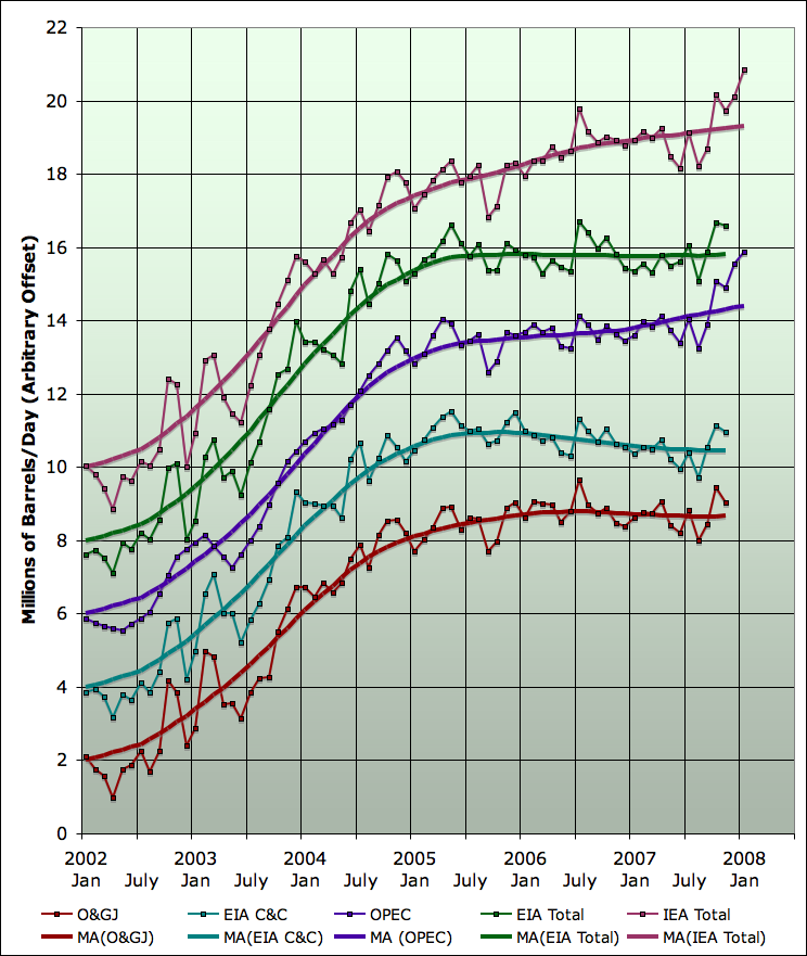
To get a better sense of the trends of all these series I have replotted them on the same graph. I have started each moving average at an arbitrary offset (2mbd, 4mbd, 6mbd, etc), but there is no rescaling of the data - just a fixed vertical offset. This allows us to compare the shape of the various series:
Average daily total liquid production, by month, from EIA (green), IEA (plum), and OPEC (indigo) plus daily crude+condensate production from EIA (teal), and Oil and Gas Journal crude oil production estimate (dark red). Each series has the 13 month centered moving averages of each line, recursed once. Click to enlarge. Graphs are not zero-scaled. See below for sources.
As you can see, the last four strong months have caused the IEA line to rise significantly, but also started the OPEC line (which was flat) to begin heading up. The others are not heading upwards, but it seems likely the next two months will be strong, and then they likely will begin to head up. No certainties, of course, till we actually see the data. But historically, the correlation in these month to month fluctuations is quite good.
What is not so good is the agreement on the underlying trend. If I replot just the moving averages as anomalies from their Jan 2002 level, you can see how large the divergence is getting:
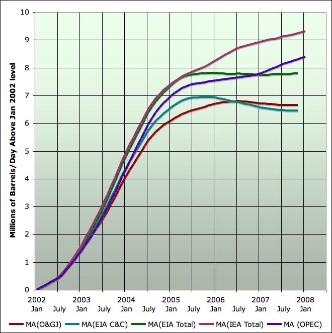
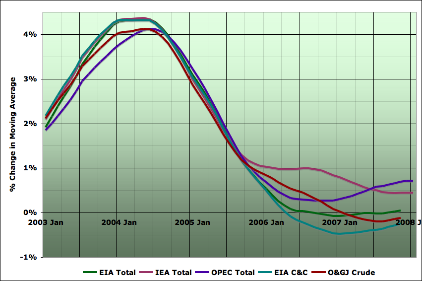
Moving averages of daily total liquid production, by month, from EIA (green), IEA (plum), and OPEC (indigo) plus daily crude+condensate production from EIA (teal), and Oil and Gas Journal crude oil production estimate (dark red),. All curves are expressed as the anomaly from the Jan 2002 value. Click to enlarge. See below for sources.
I am still mystified by the large and growing discrepancy between the EIA and IEA total liquids numbers. It does not seem to come from one or a small number of countries, and it does not seem to arise out of any particular component of oil supply (at least in so far as it's possible to tell).
However, all of the curves share a common feature when looking at the year on year growth rates (here in the moving averages):
Caption
As the growth decelerated in 2004/2005, it was possible to think that it would continue through zero and the world would go into decline. That hasn't happened, and instead the growth rates have been fluctuating at or near zero - we have been on the bumpy plateau, with the forces trying to increase production and those trying to decrease production in approximate balance. And so the endless debate on whether the plateau would eventually break upwards, or downwards, or continue more-or-less flat for a long time.
The reason I had a bias towards the bump down before was based on a country by country analysis. The growth in global oil supply from 2001 to 2004 came primarily from two sources Saudi Arabia and Russia. In both cases, I believe this growth was primarily a result of putting in service spare capacity - explicitly spare in the Saudi case, and in the Russian case disabled following the Soviet collapse.
The Saudi's stopped increasing production in 2005, and then declined in 2006, before making up a small fraction of that decline in 2007. My interpretation of this sequence of events was that they didn't have any deployable spare capacity left (they may well have a final reserve that will be used only in the event of a real geopolitical emergency interrupting the oil markets, but not just to moderate prices). And it seems unlikely that they would produce large increases in production soon, since the new projects coming on line have to balance considerable depletion of key old fields (North Ghawar being the case we understand best).
Meantime, the Russian's have been working harder and harder for smaller and smaller increases in production, suggesting that declines (albeit likely very slow ones) cannot be too far off.
In the meantime, the world has had flat production with new capacity just offsetting declines (as well as the depredations of various terrorists). However, there is some preliminary evidence that 2008 new capacity is much larger than recent new capacity:

Gross new capacity from Megaprojects by year. Source: Wikipedia.
Of course, the Wikipedia oil megaprojects tabulation is still not finished and the totals may change. Still, my sense is it's not likely that the large step up in 2008 will entirely disappear. What is certainly the case however is that not all the gross additions will actually come on in 2008. Ace has estimated that only about 2/3 of the new capacity will actually arrive in 2008. If that was typical of prior years, then we'd have a hangover of new capacity coming from them too, but about 2/3 of the step up (from about 3-4mbd of new capacity in recent years to 7mbd in 2008) would lead to rise of about 2/3 x 3-4, or a couple of mbd rise.
I'm a bit sceptical that we can really expect to see a doubling of the industry's ability to bring on new capacity from one year to the next, particularly given that global rig counts are not increasing nearly that rapidly:
Global monthly rig counts from Baker Hughes. Excludes US and FSU.
Furthermore, a couple of mbd is small enough that a revolution, war, or hurricane in any one of a large number of locations on the planet could easily offset it. Still and all, the balance of the incoming information seems to be shifting towards a modest increase in 2008 oil supply, rather than a small decrease.
Sources for Oil Series
Monthly data are from:
Contact
- Content: editors at theoildrum dot com
- Tech support: support at theoildrum dot com
License

This work is licensed under a Creative Commons Attribution-Share Alike 3.0 United States License.
OPEC set to fine-tune oil output to match demand
All I'm saying is isn't your article a bit premature? Also why not address the possibility that the increases have mainly come from storage?
Economic growth requires a steady increase in energy or efficiency. So the plateau of 2005 to now in Crude and Condensates (C&C's) seems to indicate that economic growth will be flat or declining.
Second, infrastructure takes 50 years to re-tool. So any flatting trend should cause everyone to implement long term actions to mitigate declining energy.
Third, Crude and Condensates is what we built our economy on. Focus on it should be a priority until other sources of liquid fuels prove themselves capable of displacing C&C's in a stable economy.
So the plateau of 2005 to now in Crude and Condensates (C&C's) seems to indicate that economic growth will be flat or declining.
The C&C peak in May 2005 has had no notable effect on growth in world output or trade, as you can see from the chart:

(Source: UN World Economic Situation and Prospects(pdf))
Why would it? It's not the peak that's the problem and we have yet to see any serious shortages that would crimp economic output.
I don't think its that simple. Until recently the world was awash in borrowed money. A lot of people in the US had and additional 100-300k in disposable income from HELOC's and home sales and the housing bubble was pretty much world wide. Given the flood of cheap money its no wonder that the economy was insensitive to oil price. With this receding and people now forced to live only on their salaries oil prices have suddenly become important.
So expect high oil prices to suddenly become a very big issue in the US.
One of the unintended consequences of high oil prices is a shift from consumption to savings. If gas costs 2 bucks at the pump, and the consumer has 3 bucks, the consumer will spend 90% of that dollar on, say slimjims. (The marginal propensity to consume (MPC) is about 90% or so). When gas is 2.90/gallon that additional 90c goes to the producer who is very likely to save it. In a way the sovereign wealth funds are dollars we did not consume.
The oil producing countries then take that money and for a good part of it (depending on the country of course) invest it. One way to invest is to buy US treasuries, which keeps rates low in the US. Another way is to buy stakes in, or complete US companies. (in this example I’m limiting myself to the US, but obviously it extends to other countries as well. The US is somewhat of a special example because oil is transacted in, and the savings of exporters are in USD, making it easier to buy US assets rather than farms in Zimbabwe).
So one can argue that the petrodollars have eased the pain in the US by virtue of the USD being the transaction currency.
I think your right at the macro scale. Its why the wealthy in the US don't mind the dependency on oil as long as the petrodollars flow back home. However its still a transfer of wealth from the poor to the rich the fact that the wealthy in both countries share in the profits is not so important. The lenders in the consumer countries are able to get consumers to accept more debt to subsidize the gasoline purchases at low interest rates.
Your making a mistake by assuming its cash transaction where in reality its credit transactions with the minimum return a transaction fee. Along with high interest rates on unpaid balances. A lot of Americans actually pay stunning taxes on gasoline just its hidden as CC interest and goes to the wealthy not the government.
So the inflow of petrodollars back into the consuming country to be converted to debt via loans is just part of the overall bubble. Once the consumer is toast then your right and it moves on to equity positions in various companies etc.
We played the same game with Japan finally selling properties at inflated prices that where later bought back at pennies on the dollar. Also China is just as involved.
At each round of the boom bust cycle real wealth and assets become more concentrated in the hands of the winners even as some take nominal dollar losses to be inflated away in the next bubble or simply defaulted on. Think Enron on steroids.
However this time around I think the middle class has finally been squeezed to death so I think we will see a massive conversion back to commodity based simpler economies. Where the wealthy sell necessities at inflated prices. When I lived in Vietnam I noted that the milk distributor was one of the wealthiest in the country. This reversion to extracting wealth via control of the land, rental housing and commodities seems to be in progress right now. People are reduced to living month to month with some having slightly better lives than others depending on skills.
Depending on the final levels most people end up at and if the the wealthy are willing to sustainably extract wealth from the workers it could be a decent life. It seemed to me in Europe that in a lot of ways they where already at this level and that for the most part the rich where satisfied with a long term fleecing of the poor without grinding them down. Maybe because they have already done that a few times in the past so there is no sport in it for them.
Oil is priced in dollars, not transacted in dollars. Oil can be, and is, sold in whatever currency the buyer and seller agree on. The EU does not use dollars to puirchase oil from Russia, for example, nor need to store any for this purpose.
Aside from this, I agree with your post.
The concept that petro dollars don't matter.
Well lets say that your holding US dollar and the dollar declines in value then you have to buy a few Mansions or Jet Planes. You can either buy US Mansions or Planes which are now relatively cheaper or buy European which are more expensive. The point is not the transaction but the holding currency. The petrodollar consists of several things.
A reserve currency thus as its value decreases vs other currencies goods from other countries are expensive. A currency for a transaction. A currency for denominating savings.
If the currency did not matter why not say use Mexican pesos ?
Why does the US care about the petro dollar ?
What happens to the trillions of petro-dollars floating around the world if it chooses new currencies for oil transactions ?
What about Asian countries that use the dollars too by oil ?
Because in general because of its status the US is in a unique position its able to print as many dollars as it wants and they are absorbed by the global economy and better the value does not decrease. Other countries like Asian manufactures play the game to keep their currencies low for trade.
Its been a grand game for a long time with the US effectively able to print as much money as the world could take.
Its been a three way trade.
1.) US produces dollars
2.) Asian Manufactures produces goods and accept dollars and buy more using other currencies to keep the dollar high because of real or effective pegs.
3.) Asian Manufactures and US and Europe send dollars to OPEC for oil.
4.) OPEC reinvests dollars in US T Bills or other dollar denominated Assets. OPEC also
has a dollar peg so it periodically buys up dollars to protect the peg.
5.) US produces more dollars as needed.
Understand that the US has exported more dollars than any other export. If you counted the flow of dollars out of the US its our top export.
But its coming to a end.
What the run-up in oil prices has had an impact on is the financial system. We don't think of that as a problem, partly because the connection is not as obvious, and partly because there hasn't been any huge crash (yet).
THe direct impacts are most clear. The current high oil prices are having an impact on people's ability to pay for other things, like restaurant meals. It is also clear that food prices are also being affected, and these are causing feedbacks into the system as well.
What is probably not as clear is how this fits into the broader context. Over the years, we have developed a huge balance of trade problem. This is to a significant extent related to our desire to continue to buy oil, and products made by oil, even though we are not producing nearly as much as we used to, and the willingness of other countries to let us do this. The balance of payments problem started about the same time we started importing large amounts of oil.
Our country was growing rapidly during the time when energy costs were decreasing. During this time, it was easy to make investments that had decent yields. Once the decent yields went away, our financial folks managed to design products (depending on infinite growth) that would give decent yields. The infinite growth really isn't there, so these products are falling apart.
These aren't impacts we would expect, so we don't look for them.
Based on EIA (C+C) data, the world 2006 annual decline rate was -0.4%/year, and through November, the 2007 annual decline was was about -0.4%/year.
It's interesting to compare this to the initial Lower 48 (C+C) decline rates:
1970: 9.41 mbpd
1971 9.25 (-1.7%/year)
1972: 9.24 (-0.1%/year)
1973: 9.01 (-2.5%/year)
The long term Lower 48 decline rate, after intense drilling and enhanced recovery efforts, has been about -2%/year.
Note that world production numbers today, unlike the Lower 48 in the early Seventies, are helped by tar sands mining operations.
I think that 1970's trends may not be correct for today. Primarily because of the technical advances in extraction that have happened. Either increased extraction efficiency will result in a accelerating decline rate or reserve additions from better extraction and discovery technology are real and we can keep a fairly flat base production.
The exhaustive drilling campaign in Texas in the 1970's is a good initial fit but it was not smart drilling like we have today. And back then you really could not keep production high right to 90% depletion this is from horizontal drilling and smart completions.
A big factor and one reason that oil technology has advanced like it has is that most of the current oil reserves are controlled by national oil companies forcing the private companies to develop marginal reserves the moment they are economically feasible. Thus we have exploited reserves that probably would not have been developed as early if the national oil companies had not taken control.
So I think we are entering uncharted territory. If technical advances have as I suspect primarily lead to increased extraction then we see a asymmetric decline with accelerated decline rate.
If however we really are better at finding oil and have increased recovery then we should be able to stave off declines as we have to date and see yet again flat to increasing oil supplies in 2008. It also makes the case for a gentle decline esp if Iraq/Iran can be settled and technical advances are applied to fields in these regions.
Also of course Russia could easily change some of its laws and get a bigger inflow of western extraction technology. Of course a lot of politics need to be settled but you can see that if we can see more areas open up over time then we get a slow decline rate.
However is the world decline rate is accelerating then the increments added in 2008 probably will not prevent a decline of some magnitude. There is a chance that the data will not be decisive but we will just have to see. Depending on how it moves we may get a really good idea of what the future has in store for us. If I'm right and we see a 2mpd decline despite the new increments then we are in trouble.
Is the whole world like Texas? We don't know yet. I played around a bit with ANOVA and we need at least four "post-peak" years to prove that the world is different. Will be an interesting wait...
Year post peak Texas World
1 -1.7 -0.4
2 -0.1 -0.4
3 -2.5 0.0???? Still, sample too small...
4 ?? ???? We will know
Until 4 PP, repeat of the same data will not add additional information.
Well, as much as Texans like to think otherwise, Texas is not the only state in the Lower 48 states.
What we can say is that mathematically, based on the HL models, the world in 2005 was at about the same stage of depletion at which the Lower 48 peaked in 1970, and we can further say that, based on EIA (C+C) data, the world, just like the Lower 48, has shown two years of slow production declines after crossing the vicinity of the 50% depleted mark on the HL plots.
BTW, when Hubbert did his low case/high case Lower 48 projections in 1956, he found that a one-third increase in URR delayed the projected peak by all of five years.
http://reddit.com/info/69wub/comments/ (science)
I suppose it could be that 2008 shows a modest production increase. But we in the US won't notice it. If the Russians and the Saudis are producing more and exporting less, globally traded volume continues to shrink. What matters to the US, to Europe, to China, to India... is what's available to purchase. The price of oil strongly suggests less is available. EIA and IEA data notwithstanding.
As CTL, biofuels, tar sands, and the rest of the "manufactured" oil production is ramped up, there will probably be a growing disconnect between the oil price behavior and the supply charts. We may see a nicely climbing total liquids curve maybe even surpassing the demand curve climb, yet see the oil price continue to climb. The real net energy supply curve is actually something resembling the C+C curve in the 3rd figure above with the higher EROEI add-ons like NGL added. The whole array of current alternative oil in the total liquids curve is running EROEI estimated at around 3-4 or much less and as such displaces very little "real" (meaning conventional) oil. Because all this oil uses nearly as much conventional oil to make as it replaces on the market, the price of oil will seek out the net energy supply curve as it's supply/demand balancer. It would be constructive to develope and watch a net energy supply curve for plateau behavior since this is what is determining real supply/demand.
Are you aware of any systematic effort to estimate net energy? That seems like the most useful data point for our purposes, but also a very difficult one to calculate with any real certainty. For that the picture might be even less encouraging than you say due to the increasing energy costs of developing new fields.
The Millenium group with Charles Hall and others is working in this area. We will also have a series of guest posts coming up on EROI of various fuels.
IMO the difference between total liquids and C+C + NGL should be divided by 2. This amount should be added to C+C + NGL to give Total liquids, as at least this amount of Total liquids are counted twice. Oil sands, bio-fuels, CTL, and GTL are causing the divergence in Stuart’s curves due to the increasing amounts produced Y on Y.
Oil sands and bio-fuels also use large amounts of Natural gas that could otherwise be used in place of current crude demand.
We talk about adding various liquids, such as ethanol and natural gas liquids, with lower energy levels than oil.
Originally, I was thinking that in trying to evaluate what the energy impact of these lower energy fuels is, we would want to know the energy relativity to gasoline. Gasoline is already relatively low energy itself, compared to, say, diesel. Perhaps instead of the relativity to gasoline, we should be comparing to the relativity to oil.
One set of Btu figures I found showed the following Btu's per gallon:
Oil________138,100
Gasoline___115,000
Ethanol____75,700
With this estimate, ethanol's energy is 66% of gasoline's, but only 55% of oil's.
Does this make sense? We don't really burn all of the heavier fractions, so perhaps they shouldn't be in the comparison.
I think you might get pretty close by looking at how the average barrel is processed and estimating the amount of fuel products of each type result. You would then have a pretty good idea of how many useable Btus result from each barrel.
you are correct
but once you start splitting those hairs, you are missing the larger point that oil, to society is 'free'. Ethanol is not - so the energy investment to get an equivalent amount of BTUs from ethanol as oil is well over an order of magnitude difference.
Another way to look at it is where do we draw the line between a fuels inherent energy, and the efficiency of harvesting it - this has confused many people, including myself, over the years. (The biggest current confusion is Wang, Khosla and others compare the efficiency of turning oil into gasoline (about 80% efficient, as you show) with the Energy return of ethanol (which, if you exclude externalities and wide boundary subsidies) is about 30%. This 30% should really be compared to the energy return of oil, which is around 2000% (though declining)
The easiest one to see is hydrogen which is a pure energy carrier. So maybe the best way to look at this is energy to produce hydrogen btu equivalents with electrolysis of water as the baseline. This is sort of like a calorimeter but can include the process.
Then you simply eliminate the costs of steps that are not needed for the final fuel.
This seems to allow you to compare a wide variety of fuels on a apples to apples basis.
I agree with Nate. The lower energy density of ethanol is a second order issue. The critical point is the huge difference in net energy of different fuel types. It was masterfully concealed in Dan Kammen's 2006 Science article about ethanol (with a lead 'editorial' from Steve Koonin from BP).
One good way to see the difference is to start with Kammen's Science paper numbers and then imagine what it would take to replace oil with ethanol. The net energy for ethanol reported in the Science paper was about 25% (energy return on energy investment of 1.25). That means 1 unit of energy is used to return 1.25 units of energy (the extra comes from photosynthesis harvesting sunlight).
So, to completely replace 73 million barrels a day of crude+condensate with ethanol would require finding and consuming a source of energy equivalent to 292 million barrels of oil a day (73 x 0.25/1.0). It is obviously completely mad to think about doing this.
The sources of energy used to make 100 units of ethanol in the Kammen study were 5 units of oil, 40 units of coal, and 30 units of natural gas. Much of the recent sudden increase in all liquids is explained by things that aren't crude+condensates. Since as the Kammen study showed, oil is currently not used to make ethanol, what has happened is that additional coal and natural gas have been converted into ethanol (with a small 1.25x gain). This can't go on for long.
I agree that a low energy balance fuel like ethanol is a poor candidate to replace conventional oil, but your arithemtic for calculating the required gross energy output is incorrect. If the EROI of ethanol is 1.25 then only one out of every five units of ethanol produced counts as net energy. I call this fraction (=0.20) of the gross output energy the energy utilization rate. If the net fuel output of conventional petroleum that we wish to replace is NP, then the required amount of ethanol is E = NP/0.2 which is equal to 365 million barrels if NP=73 million barrels. However 73 million barrels of oil is not the net energy of the transportation fuel supplied by those barrels. Only 92% of the energy content of the crude oil ends up in the form of refined fuels, and about 13% of that 92% is consumed from other energy sources during the refining process. Therefore the net fuel from 73 million barrels is 58.4 million barrels, and the ethanol equivalent is 58.4 million / 0.2 = 254 million barrels.
Sorry for the typo (I meant 1.0/0.25, not 0.25/1.0) and error (should have been 1.0/0.2, not 1.0/0.25).
And you are of course correct that some energy is lost turning oil into fuel (as detailed in the Kammen article).
Glad the main point survived my mess!
Good, important reporting Stuart. However, I have a question from this analysis. Namely, is there simply a delay between the rise in price of a barrel of oil and increased production? After all, with so much investment in time, rig equipment, drilling, etc., wouldn't there be a few years delay between knowing the money's there (with higher per barrel prices) and increased production? We see these reports of huge oil field of Kasaghan (not sure how it's spelled), Angola and the recent offshore disovery in Venezuela, so maybe with time they will offset depletion and raise world crude production. Is that possible?
"Good, important reporting Stuart. However, I have a question from this analysis. Namely, is there simply a delay between the rise in price of a barrel of oil and increased production? After all, with so much investment in time, rig equipment, drilling, etc., wouldn't there be a few years delay between knowing the money's there (with higher per barrel prices) and increased production? We see these reports of huge oil field of Kasaghan (not sure how it's spelled), Angola and the recent offshore disovery in Venezuela, so maybe with time they will offset depletion and raise world crude production. Is that possible?"
This is a correct assessment. The time lag between the start of a oil project and its delivery to market is many years. The question is, and is always being asked here, will this increase in new capacity continue into 2010 or beyond or is there simply not enough new resouces or expansion of old ones to compensate for depletion while meeting growing world demand?
Clearly, that's the most obvious interpretation of the megaprojects graph - all spare capacity got tapped out in 2005, prices went through the roof, the projects that were in the pipeline were only enough to just hold off declines, but a wave of new projects got started as a result of the high prices, and that wave is now about to start breaking on the shore of actual delivered oil supply.
However, it's a little bit hard to reconcile this story with the rig counts. They have only been going up much more gradually. If the industry is about to double the number of delivered projects in 2008, it must have roughly doubled the number of started projects back in about 2005/2006. But it certainly didn't double the rig count. So that suggests perhaps the average length of a project increased a lot also. Which makes one wonder how much of the 2008 new projects will actually slip into 2009 or beyond.
This is all very conjectural however. Need to go do a bunch more analysis on the megaprojects to really straighten it out.
Nice analysis,
Preliminary production estimates for December-January are available in the EIA STEO (http://www.eia.doe.gov/steo):
December 2007: 86.300 mbpd OPEC: 36.74 mbpd
January 2008: 86.210 mbpd OPEC: 36.81 mbpd
Therefore, it's also a new record for total liquid production in December for the EIA. It's too bad the IEA does not provide estimates for C+C. The problem with the IEA, is that only the last three months are published and afterward only the quarterly and annual estimates are available. The EIA always revised its number up to three years after and the correction is always significant, my guess is that it is the case for the IEA but we have no way to directly track the corrections. it is strange that the EIA and the IEA are diverging since 2006 despite being in perfect agreement before (your figure on growth rates is particularly telling).
So I looked at that page, looking for those numbers and couldn't find them. I just looked again quickly, and somehow I'm still not seeing them. Where are they exactly on the page?
Its on the right side of the page under tables.
Look for 3a. International Petroleum Supply and Consumption
When I click on that link, all I get are annual numbers.
You have to change the frequency by clicking the radial button at the top.
http://tonto.eia.doe.gov/cfapps/STEO_Query/steotables.cfm?periodType=Mon...
I haven't tried this recently, but when I tried it earlier, it seemed to be a Windows application that wouldn't work on my MacIntosh. I had to go use an old Windows computer to make it work.
Looks to me to be just a regular old html form. Should work on any browser.
I can confirm it does not work in Safari on Macintosh... must be some javascript in there that is acting badly... if you hit the radial button and click Apply Changes, it just switches back to Annual.
That's my experience too (also in a Mac on Safari). I guess at least we know what's going on.
i was able to get the monthly view up in firefox with javascript blocked.
Another excellent analysis as always, Stuart, All Hail SS
Anyway I think Khebab brought up an excellent point with your graph of the growth rates being particularly "telling." They are pretty interesting to look at and I think it would be interesting to look at such a graph with a longer time range.
Also I think if you mix that information with growth in oil exporting country's internal consumption growth then I think you could make a fairly good case for peak "oil exports." In fact with a good analysis in biofuels, such as you have already done, and some good estimates of the oil shales and tar sans limits to production I think you could make a good case for peak "total liquids." I would take time to graph it but by the time I got around to actually messing around and perfecting it, I think the post would be far behind in the dust, but those are just some idea's. I think they might be a good indicator of predicting shortages and rises in oil prices on the international market. In summary, I'm saying a post a graph of growth rates in oil production vs growth rates in internal consumption from oil exporting countries vs actual exports. I'm not saying use the ELM or anything but just a look at the data.
I like the idea enough to try it myself, but I'm sure Stuart would do a much much better job though. Just some rambling and idea's.. trying to contribute..
There's some information on internal exporter consumption rising in this article. http://www.energybulletin.net/18475.html
In retrospect it might not that accurate to try to predict trends in exports because you can't really predict the behavior of several entities or expect those trends to continue as exporters start to better understand their position in production..
Thanks,
-Crews
Could the IEA's numbers be diverging due to political pressures?
As the IEA is an US government organization, could it be that they, like other agencies, bend to the will of the administration?
There are certainly good arguments that show material manipulations of things like the Consumer Price Index. One strong, simple example, and often pointed at, is the Fed's love of "Core Inflation," which backs-out energy and food in order 'to give the public a "better" understanding of the "real" inflation number.'
I may not be remembering this right but it seems that the IEA's numbers are consistently the most optimistic.
...
...Stuart rocks...
I believe you have the IEA mixed up with the EIA which is a part of the DOE (US).
Ouch, thank you for pointing out my retardedness.
Perhaps the divergence can be explained by political manipulation of the 'public', recent (last 3-months) data.
If the IEA were publicly estimating the recent data high, but then privately correcting the older data low, then this would account for the difference with the EIA.
How do the quarterly figures match up? Is there no way to get hold of the data that is older than 4 months to check for downward corrections? Is there no-one in TOD's readership that has access to these figures?
Stuart-
I read all this and I still just don't understand -- especially in light of there being no one particular source for the bump. Why would it happen? What would cause it to happen? Why after a couple of years plateau?
How certain is the data? What room is there for fudged data here? I know you have nothing else to go by, but it just doesn't smell right.
Well a couple of things. First with the high prices remaining steady efforts to extract more oil after almost five years of high prices should be paying off. Given that projects would have been started about the time that prices increased they should be coming online.
A lot of these won't show up in the mega projects list since they are infield drilling developing now profitable small fields. Accelerating development of current projects etc.
So finally seeing a increase makes sense.
Next KSA had a excess supply of heavy high sulfur oil that its had problems selling this has been documented. It seems they are now able to sell it. So we have always had a known increment of production that KSA was willing to produce but until now no one wanted it.
I've heard claims of 2mbpd of idled heavy sour production I think thats high but it seems that this is now in production.
Next KSA keeps a real temporary spare capacity capability this consists of overproduction and storage. This is available by definition for 90 days.
I don't think anyone has argued that KSA is unable to provide this temporary surge.
If they are using it now or using some of it in combination with extra heavy sour shipments is anyones guess. If you look at the production history for KSA 1mbpd variability month to month was not uncommon.
http://www.economagic.com/em-cgi/data.exe/doeme/paprpsa
Its not unreasonable to suspect that KSA and friends attempted to see if they could influence oil prices to the point that Bush in co could have some political breathing space. Given past experience one would have expected this surge to send oil prices into the 80's or lower and it did not happen.
Also the error is huge just between the various estimates and god knows how valid the production values are. Only tanker trackers offer a check on the data. I'd have to see a sustained ( greater than 6 months) increase or decrease by 2mbd to call the end of the plateau.
In my opinion current prices seem to show at least at a global level exports decreased despite the claims in production increases. This may be ELM related, bad numbers etc no telling. But a shorter time frame test is to see if production increase and prices move in the same direction.
You might want to compare this graph with Saniford's at the top. This is based on EIA production data with net exports subtracted. You can see the pronounced ELM trend. I wanted to see if the production trends were in the exported oil or in the remaining oil. I wish I had later data.
how does the 'exported oil' chart compare?
Here Nate, you can look for yourself. Over the same time period it's averaging down. http://netoilexports.blogspot.com/ It looks to me that much of the variation is in the exported portion of production but I could be wrong.
What am I missing that would allow net exports to exceed total production?
Cheers
Ohh thats the abiotic oil not-bugs that contaminate the pumped oil so you get more as its shipped :)
I think that there are two scales on the graphs - then the left hand side would refer to total all liquids; the right refer to net oil exports.
Peter.
Knew it had to be something. This is why I can only comment on others' work as opposed to producing any.
Oy vey.
Thanks, Peter.
Cheers
http://www.news.com.au/story/0,23599,23277253-1702,00.html
Venezuela limits food exports
From correspondents in Caracas
February 26, 2008 05:30am
Whether it is food or energy, food and energy exporters tend to take care of the home team first. It is increasingly apparent that this is not a good time to be both a large food and energy importer.
Hank:
What's your data source and methodology for computing the net exports?
Stuart, I'm relying for data from http://netoilexports.blogspot.com/ You might want to ask there.
Any chance of contacting one or another of the agencies about the discrepancies?
If nothing else, the EIA will have a conference in April. I would think this issue would be discussed then.
The EIA/IEA variance in total liquids is intriguing and if unraveled, could provide a good clue. Questions: What are the criteria for consideration as a liquid fuel by either body? To what extent does the recent incursion of non-conventional oil production into the gobal market affect the ability to accurately gauge ptoduction and assess inventory levels? Could it be that the rapid diversification into non-traditional fuels has led to all this confusion and lack of consistency in data? It seems plausible to me that one or another agency could be disallowing or undercounting a fuel type or vice versa.
Vaguely related...
What if it's true that Iraqi oil production is being diverted thru a pipeline to KSA?
http://www.paulchefurka.ca/Iraq%20and%20Saudi%20Arabia.html
Hmmm. Interesting theory.
It would be interesting to plot Iraqi and Saudi oil production on the same graph to see if there is a dip in Iraqi output when the Saudi production increases in 2004.
OK, so what if KSA is actually stealing Iraqi oil with US aid? As far as the numbers go, perhaps the IEA is somehow double counting this stolen oil while the EIA isn't? This would detail a variance in production along the order of magnitude of the difference in the numbers between the groups. Have you noticed that the big "supply gains" have largely come out of Saudi Arabia lately? Hmmmmm.
岡崎市 不動産
[http://www.okazaki-fudousan.com/loan.html 岡崎市 不動産]
[url=http://www.okazaki-fudousan.com/loan.html]岡崎市 不動産[/url]