Predicting the Past: The Hubbert Linearization
Posted by Robert Rapier on March 12, 2007 - 12:21pm
Part I- Texas Myths
Like Cindy Crawford, I have done quite a bit of modeling in my career. However, mine has been in front of a computer. There are various types of models. They can be empirical, such that you curve fit data without having a clear explanation of the underlying mechanisms. Or they can be theoretical, in which the system is modeled according to the governing scientific principles and mathematical equations.
However, one thing is critical to keep in mind. If you are going to use the model for forecasting, the model must be tested. Testing the model is called “validation”, or sometimes “back-casting.” This involves feeding the model real data, and observing how well the predictions match up with the observations. If the predictions match up on a consistent basis, and any large variations are explainable, you have the makings of a predictive model. If you have not validated your model, or if you have attempted to validate it and found that the predictions were inconsistent, the model should be used with caution (if at all). In this essay I have done some back-casts on the Hubbert Linearization (HL) model and attempted to use it to make predictions using historical data.
Qt and Peak Production
I am unaware of a case in which a country has completely run out of recoverable oil and had Qt verified by the HL method. However, there are plenty of examples in which a region’s production profile follows the expected path determined by the HL. There are also many examples showing that a region’s production peaked at very close to 50% of Qt. Quoting from an article by Jeffrey Brown and Khebab:
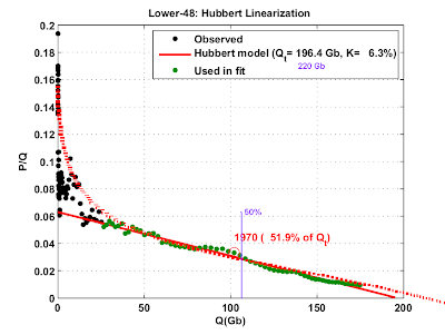
With time, a HL data set starts to show a linear progression, and one can extrapolate the data down to where P is effectively zero, which gives one Qt, or ultimate recoverable reserves for the region. Based on the assumption that production tends to peak at about 50% of Qt, one can generate a predicted production profile for the region. The Lower 48 peaked at 48.5% of Qt.
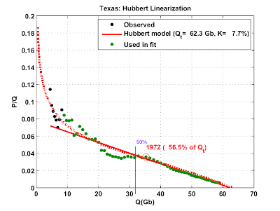
Some areas have tended to peak at a higher % Qt than others. It is commonly claimed that Texas production, for example, peaked in 1972 at 57% of Qt (the reason for the qualifier will become apparent later in the essay). The fact that Texas peaked later than most regions is sometimes explained by the fact that prior to 1972 Texas was the swing producer, and production was regulated. This situation is similar to that of Saudi Arabia, so Texas is often used as an analog for predicting Saudi Arabia’s peak.
So far, so good. But the astute reader may wonder “Can the value of Qt change significantly over time?” If the answer is “yes”, then the inevitable follow-up is “Then how can I be confident in using the HL to predict a peak?” I will attempt to answer these key questions by looking at the evolution of the HL for Texas over time.
Evolution of the Texas HL
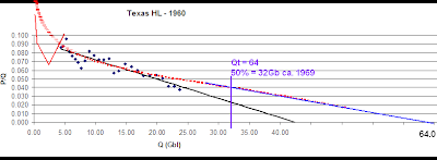
I have retrieved historical Texas oil production records and modeled a series of HLs at various time periods. According to a 1956 Hubbert paper, (1) Texas had extracted approximately 4 billion barrels of oil prior to 1935. Beginning in 1935, we have annual production statistics that take us through the end of 2006. (2) Therefore, we can construct a series of HL curves. To avoid any bias on my part, I had Excel extrapolate the line and make the forecast once there was a relatively smooth trend. Let’s take a snapshot from 1960:
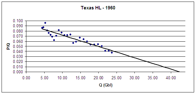
Figure 1. Hubbert Linearization of Texas Oil Production Using Data Available in 1960.
As you can see, we have a nice trend. In fact, the latest 10 points are reminiscent of today’s HL of Saudi Arabia. The points have settled down and are staying pretty close to the line. So, what could we say in 1960? Qt as determined in 1960 from the intercept above is 42.5 billion barrels (Gbl). Texas crossed 50% of Qt in 1957, and by 1960 was at 56% of Qt – almost the same value as today. Surely peak was imminent. In fact, if you look at the data, Texas clearly peaked in 1956 at 1.079 MM bbl/day. By 1960, Texas was down to 892,000 bbl/day. It had undergone an annual decline of 5.5% for 4 years, and was well past 50% of Qt.
In 1960, we could have said “Texas oil production peaked in 1956, as predicted by the HL method.” But as we know, that’s not at all what happened. That would have been forecasting the peak 16 years too early. So let’s fast-forward to 1970:
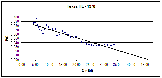
Figure 2. Hubbert Linearization of Texas Oil Production Using Data Available in 1970.
Well, that’s not very helpful. Our Texas HL in 1970 is much more muddled than in 1960. The 1956 record was broken in 1968 – twelve years after the 1960 analysis indicated a peak. We are starting to see some points rise above the line and extend Qt out further than was implied in 1960. The trend line that Excel drew is now forecasting 46.25 Gbl as our URR. That puts production in 1970 at 73% of Qt. The last 14 years had been spent well above 50% of Qt. But, the last 4 points – starting in 1967 – seem to indicate that Qt may end up being even further out than we thought. Now remember, it’s 1970. What exactly about this curve would indicate that we are 2 years from peaking?
Let’s jump forward now to 1980:
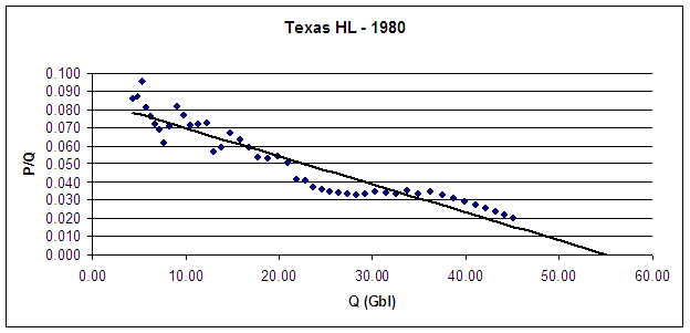
Figure 3. Hubbert Linearization of Texas Oil Production Using Data Available in 1980.
Qt continues to grow. Excel is now forecasting Qt at 55.5 Gbl. The trend toward a higher URR is evident. The last few points imply that the forecast will grow to 57 Gbl. If so, our 1980 HL would put Texas’ 1972 peak at 63% of Qt. So, not only do we see Qt growing with time, we see that the % of Qt when the 1972 peak occurred is getting smaller. So, can we forecast the 1972 peak by 1980? No. We have already seen a case where the 1956 production record wasn’t broken for 12 years. The % Qt during that time was well over 50%. The % Qt in 1970 had climbed to 73%. Yet that still didn’t enable us to call peak. On what basis could we have done so in 1980? We have now gone through 24 years in which we could say “peak might be here.” To suggest that we could have made any other forecast at that time is wishful thinking.
So let’s skip to present day – end of 2006:
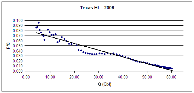
Figure 4. Hubbert Linearization of Texas Oil Production Using Data Available in 2006.
Qt is now at 62 Gbl, but look at those last few points. They are once again pointing to a higher Qt. Some time in the 1980’s, as production continued to fall, we could have finally said “1972 was the peak.” But the % of Qt for the 1972 peak is still a moving target. Today, the 1972 peak clocks in at 58.3% of Qt – not far from the value in 1960. In 1980 it was 63% of Qt, and in 1970 it was 73% of Qt. Therefore, the claim of “no examples of large producing regions showing sustained, steady increases in production past the 60% of Qt mark” is clearly wrong. Texas showed steady production increases past the 60% mark of Qt, because it reached that level in the early 1960’s. Texas even showed production increases past 70% Qt, as it reached 73% two years prior to the production peak.
Implications for Saudi
So, is Saudi like Texas in 1956, or is Saudi like Texas in 1972? Or is it like neither? The HL can’t tell us that. This essay should make clear that confidently predicting a Saudi peak on the basis of the Texas HL is nothing more than an exercise in faith-based forecasting. The only reason that the Texas HL looks as it does is because we have decades of data points following the Texas peak. But what is missed is that the HL has changed greatly from the time Texas actually peaked. So the Texas HL at its peak looked nothing like the Saudi HL of today.
It is invalid to use three decades of hindsight for refining the Texas forecast, because we clearly don't have the same option with Saudi Arabia. Yet some argue that the Saudi peak can be forecast with confidence using the knowledge obtained from the case of Texas – a region in which the uncertainty of the method spanned almost 3 decades.
So, the HL has shown that it is good at forecasting the past, but can be very unreliable for predicting the future. In Part II, we will examine the evolution of the Saudi HL over time.
Note
For those who may be unfamiliar with my position, this argument in no way diminishes my belief that we need to take action right now concerning oil depletion. I am merely evaluating one of the tools that is used to forecast peak, and trying to determine whether that tool can give us any precision on forecasting a peak in Saudi Arabia. My conclusion is that it can’t, but we will look at the specific case of Saudi Arabia in Part II.
References
1. Hubbert, M. King. Nuclear Energy and the Fossil Fuels. Paper presented at an American Petroleum Institute meeting in San Antonio, Texas. March 7-9, 1956 p. 10.
2. Oil Production and Well Counts in Texas 1935-2005, Railroad Commission of Texas, Accessed March 2007 at http://www.rrc.state.tx.us/divisions/og/statistics/production/ogisopwc.html
Contact
- Content: editors at theoildrum dot com
- Tech support: support at theoildrum dot com
License

This work is licensed under a Creative Commons Attribution-Share Alike 3.0 United States License.
Insofar as I know, I have never argued that the pre-peak Texas HL plot was stable, or that one could have accurately predicted the Texas peak, using the pre-peak data.
I have argued that we can--in retrospect--determine at what stage of depletion that Texas peaked. I have also argued that the Saudi HL plot is much more stable than the pre-peak Texas HL plot. The small change in deflection in recent Saudi data was also seen right before the Texas peak.
Hubbert, using some mathematical methods (estimating the area under a production rate versus time graph, which is what HL does), stated, in 1956 that the Lower 48--inclusive of Texas--would peak in 1966 if URR was 150 Gb and in 1971 if URR was 200 Gb. A one third increase in URR only delayed the estimated peak by five years.
The post-1970 cumulative Lower 48 production (again inclusive of Texas) through 2004, using only the production data through 1970 to generate the model, was 99% of what the HL model predicted it would be.
This is the method that can't be used to predict the Saudi decline, even as production is declining as predicted?
http://www.energybulletin.net/16459.html
Judge for yourself how stable the following HL plots look (all done by Khebab, all on the same vertical scale):
Khebab's HL plots:
Texas:
http://static.flickr.com/44/145149303_e59bbf9890_o.png
Saudi Arabia:
http://static.flickr.com/52/145149302_924470eaa7_o.png
Lower 48:
http://static.flickr.com/45/145149304_a4a72211e6_o.png
World (C+C+ NGL):
http://static.flickr.com/54/145149301_b930ef7bc4_o.png
(GreenMan tiptoes through a minefield in attempting to comment)
If I am understanding your point, you are saying that a stable HL plot is necessary before it has predictive ability?
The Texas HL, as analysed by Robert, did not have predictive ability until well after peak, at which point the HL plot stabilized, and can be used to predict future production and Qt?
Do we have a mathmatical definition of the requisite "stability"? Could we give some metric of "stability quality" to a particular data set as a way of expressing confidence in its predictive ability?
Of the four plots you offered, Texas, KSA, Lower 48, and World, the Texas HL was unstable prior to actual peak, the other three seem to be stable, but the peak of KSA and World are debatable, in fact, the primary topic of debate. That leaves only one data point, Lower 48?
Robert ended his essay saying his next target would be HL plots of KSA. Perhaps we need a similar analysis of Lower 48, since that now seems to be the sole case in which we had both stability prior to peak and clear (in hindsight) peak?
I suppose we could throw the North Sea in there, as well, though you did not mention it in your list. I think we are all comfortable saying that the North Sea is past its peak. Did its HL plot prior to peaking exibit stability? How far in advance?
Is there a suitable data set for Prudhoe Bay? Or is that folded into the data for the rest of the US? Or can it be obtained by subtracting Lower 48 from total?
Is instability in an HL plot solely a factor of having been a swing producer, or are there other factors? For example, could we hope to do a predictive HL analysis on Iraq given its history of war and sanctions?
I guess the point of this is trying to answer the question "for a given data set, how confident can we be in the predictions it makes", and can we come up with a definite mathmatical expression of that confidence?
Do we have a mathmatical definition of the requisite "stability"? Could we give some metric of "stability quality" to a particular data set as a way of expressing confidence in its predictive ability?
Exactly the right question to ask. I think Stuart is looking at this. We have been discussing this essay some via e-mail, and I sent him my Texas data set so he could look into it.
I guess the point of this is trying to answer the question "for a given data set, how confident can we be in the predictions it makes", and can we come up with a definite mathmatical expression of that confidence?
Bingo! Give that man a cookie!
Could you come up with a non-linear, asymptotic formula that would fit better with the observed increase in URR toward the end of the cycle? It's been many years since I saw the inside of a math classroom, so it's just a thought.
It never gets much consideration IMO is the impact of technology. I fully understand the law of diminishing returns but some of the most productive improvements had to come into play at some point.
I don't understand how this would not add both to peak production and URR as what ever the (____)became widely accepted. The increase in production should generate somewhat of a addition to the curve.
I'll venture into hand slapping territory and speak on DelusionaL's point.
If there is a impact of new technology on the HL result for Texas, wouldn't this impact come into play earlier on a Saudi HL and result in an increased stability of the curve compared to the Texas HL? Am I correct in thinking that Saudi oil came 'that much' later in the game?
A kid with a question should also show up with a toy in hand, so hope this at least is new:
http://www.energyandcapital.com/consumption.php
Very cool! Thanks.
Stuart has done some work on stability analysis, but as you can see from the four plots, it's not hard to find the HL plot that was pretty noisy prior to its peak (and again, all four regions are--at present time--showing overall declining crude oil production). So, I wonder why Robert focused on that one plot--especially when Hubbert accurately predicted the approximate time frame for the Lower 48, inclusive of Texas?
The North Sea (EIA, C+C), on my HL plot, started showing a rock solid linear progression in 1988, until it peaked in 1999 (between 48% and 52% of Qt, just like the Lower 48), and production has precisely followed the predicted downward trend. Note that this was empirical. I did not predict a North Sea peak (although Matt Simmons did, using his own data).
According to Matt Simmons, the top oil companies working the North Sea--using the best data and personnel available--were predicting that the North Sea would not peak until after 2009.
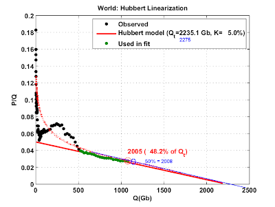
All of the following regions have shown peak or plateaus, (with stable HL plots prior to the 50% mark) in close proximity to their respective 50% of Qt marks: Lower 48; Russia; North Sea; Mexico and now, the world.
Remember Khebab's prediction that Mexico would peak in 2006?
The two post-peak cumulative models we did were quite supportive of the method. The post-50% of Qt cumulative Lower 48 production through 2004 was 99% of what the HL model predicted (using only data through the 50% mark) and the post-50% of Qt cumulative Russian production through 2004 was 95% of what the HL model predicted (using only data through the 50% mark).
If our period of stability started in 1988, how much later was that stability evident? Are two years of stable data enough to establish stability? Three? How much is enough to say "we have stable data, now let's make some solid predictions"?
Perhaps another way of asking the same question might be "in what year, using only the data available up to that year, would we have been able to correctly call the peak?", with subsequent production data falling substantially onto the predicted curve.
The North Sea is a nice case to consider since, as far as I know, there were no above ground factors in its development.
As I noted in a separate post to robert, I see mexico as a better example for sa than texas. In addition to what I said there that, to me, shows sa/mexico to be more like each other than texas:
high tech simultaneous secondary and primary production
ultimate resort to high tech horizontals
each country has an old super giant field that dominates, rapid loss of which results in unavoidable peak
there is a further point, also different from texas, that is both are gov run and are, compared with what would have been done had they been exploited by private companies, starved of investment.
For all of these reasons, comparing the HL plots of sa/mexico may be informative. Can you resurrect and post the two?
And, I have a separate question; does the data suggest that the 'dog leg' up following a stable regime is predictive, not of higher Qt but, rather, that peak is nigh?
Thanks
We saw small deflections in the Texas and Lower 48 plots, right before the they peaked, much like the small deflections in the Saudi and world plots, right before they (IMO) peaked.
WT do you have the OIP numbers for Texas and can you give me
the % recovery factors based on the HL analysis ?
Thats the plot we need.
Mike, the problem with using recovery factors based on Texas is that we gutted many of our early-discovered giant fields with overproduction.
Secondary and tertiary production and Maximum Efficient Rate (of recovery) were all invented by my homies in the oil patch around here. As a consequence the is a recovery factor of the oil in place of about 1/3rd, while the mid-east and North Sea are getting about 50% of the original oil in place.
The Bureau of Economic Geology at the University of Texas should have the exzact figures you are looking for.
Right I forgot about this. We really damaged our fields early on. In a sense its a blessing since fixing the damage is probably what keep us going. I don't think Texas by itself is all that useful as a model past a certain point because of this.
For all of these reasons, comparing the HL plots of sa/mexico may be informative. Can you resurrect and post the two?
And, I have a separate question; does the data suggest that the 'dog leg' up following a stable regime is predictive, not of higher Qt but, rather, that peak is nigh?
Mexico did the dogleg up in 1995 resulting in a new stable regime with a Qt roughly twice what the previous data was pointing to, see my post from two month's ago:
http://www.theoildrum.com/node/2149#comment-144998
Thanks for the link. SO, mexico's HL is not a good predictor for sa, or at least not if sa has peaked.
Mexico, sa, kuwait, maybe china remain special cases with a super giant that dominates overall production; for each of these, the question is, when will the super giant go down? HL is probably silent on this issue. Ghawar and cantarell were produced with the latest high tech, meaning that the decline, when it comes, will dominate production and almost certainly signal that peak is here. We know about cantarell and mexico, daqing and china, burghan and, probably, kuwait. Ghawar remains veiled because of sa stonewalling, but precipitous decline would neatly explain sa production profile over the past year.
The early HL plot for Mexico showed a P/Q intercept of about 13%. While it is not impossible, 13% is unlikely.
Compare it to the P/Q intercepts on the four HL plots I have shown above.
Yet another example of a region: (1) Declining and (2) As predicted (by Khebab in this case).
Let's see, what's the score so far?
Notice a developing trend here?
Notice the escalating attacks as the reality of a near term peak becomes more apparent?
Notice the escalating attacks as the reality of a near term peak becomes more apparent?
You are taking this far too personally. I am not attacking you. I am pointing out that in the case of Texas - which you have indicated is reflective of Saudi - the HL performed very poorly at the time of peak. So, I am pointing out that we can't then have much confidence in using the HL to predict Saudi's peak. In turn you have resorted to "Who's right!" Come on.
You would have been right had you predicted Texas peak in 1956. You would have been right for 12 years. But you would have ultimately been wrong because you used a tool that is not very reliable for what you are trying to use it for.
On the other hand I think Stuart's work was very interesting, and this is by no means an answer to his posts. I still don't think the world has peaked, but the HL gives me absolutely no useful information one way or the other. The kind of analysis Stuart did gave me more to think about though.
So, one of us predicts the peak, and he is so far right, but you criticize the work, even as the Lower 48, Saudi Arabia, Mexico and the world are declining as predicted, based on Hubbert/HL models, and as the North Sea is following the HL model.
The other one observes that Saudi Arabia has peaked, and his work is more valid?
(BTW, Stuart posted an article last year, to the effect that we were probably at or past world crude oil production).
Somehow, I get the feeling that you are getting ready for the following admission:
"Saudi Arabia has probably peaked, but by God, Jeffrey's methodology was wrong."
Cut to new Titanic Scene:
Jeffery the problem is everyone that has confidence in HL has paired it with other data to develop that confidence and its not just QT.
In the case of KSA its the fact that
1.) HL is showing a peak about now.
2.) They are out of easy oil look at how they are drilling now and what they are producing.
3.) Ghawar has a rising water cut and is in decline.
They peaked.
You only need HL plus some other information and you can pick the right HL plot with almost 100% confidence.
I assert you need no more information.
WT
I'm just curious why the vehement tone in the responses to RR? It is possible to come up with the right answers using a wrong methodology. I keep reading the exchange between you and RR and I really don't get the impression that he thinks your answer is either right or wrong, but rather he has taken you to task about the path you took to arrive at your conclusion.
Ultimately you can argue that you are right in that dependence on fossil fuels needs to end ASAP, and the difference between now or 5 years from now or 50 years from now will in the grand scheme of things be a trivial detail.
Given the evidence I too think we are pass/at peak, but I understand from an academic point of view why models should be tested, analyzed and refined, and from what I read that is what RR appears to be doing.
You however seem fixated on being right, just for the sake of being right. Perhaps it is just a personal thing, but I like to be right including as to why I was right. And in RRs case I think he wants to be right down to the details in his methodology because he has the fear that crying wolf too early could cause resistance to a Peak Oil warning if this turns out to be a false Peak.
The media constantly bombards those "Peak Oil Nuts" as being whacks because from the beginning of oil there have been those claiming it will end tomorrow. Given the climate surrounding Oil and the competiveness surrounding this commodity today, this type of debtate takes on even more importance. RR has stated previously that his big fear is in crying Peak too early and giving ammunition to the opposing side which will in turn make it that much harder to convince people when the real peak will occur.
I can understand RRs hesitation and from a academic standpoint admire his humility and skeptism used in his efforts to forcast oil related events. RR has the mark of a true researcher, one who does not rest on his laurels claiming he has found the answer, instead he takes what he thinks is right, and subjects to even further scrutiny. Its an excercise I think is well worth doing, because if it turns out that this is a false peak, this community had best have moral fortitude and academic honesty to go back and admit they were wrong and review WHY they were wrong. During that process, it will mean that methodologies will need to be picked apart.
Amen
I totally agree - Robert's approach is IMO entirely correct, and he is to be highly commended in taking the line he has.
Beautifully put.
:)
That is funny....
Robert: "We sank in 2 hours, 23 minutes and twelve seconds and your math was wrong".
The early HL plot for Mexico showed a P/Q intercept of about 13%. While it is not impossible, 13% is unlikely.
Russia's HL also has a P/Q intercept over 10%. Its predicted Qt is also likely to be inaccurate.
Notice a developing trend here?
The trend I've been noticing is the tendency for HL to produce false alarms 10-15 years before peak.
Dream on while you still can.
As I stated before if production was with 5-10% of peak 10-15 years before peak its not a false alarm. Its a good prediction.
The fact that we feel 20 or more years at peak is a long time is simply applying how we feel about time to a process.
Put it this way a mountain say spends say 30% of its lifetime within 10% of its maximum height this could be millions of years. But I think mountain weathering and HL are closely correlated and behave the same way. Other factors have to be taken into account to do a better prediction of when a mountain will reach its peak these are the filters I speak of.
But its the same problem and you can see HL is not something you discard.
Its not a personal attack. Stay focused.
I guess what I am trying to express is the contribution of "above ground factors" to noise in the production data.
For example, was Prudhoe Bay production ever limited by the throughput of the Trans-Alaska Pipeline? For how many years? By how much? Would that have contributed to false predictions from the HL plot? Or is it small enough that we would get good predictions anyway?
Would we get better results if we simply discard data points during points which are strongly impacted by above ground factors, such as for Iranian production during the Iran-Iraq war?
While not a mathmatical process, it could be documented. "I started with data set A, removed data points B2, B7, B8 due to clear above ground factors, and did my HL on the remaining points. The data points C1 through C12 exhibited stability quality XYZ, and I have used them to make the following predictions". Something like that.
Well, let's consider the two most stable cases, with essentially no material restrictions on drilling or constraints on production (other than as noted below): the US Lower 48 and the North Sea.
Both regions peaked in close proximity to their respective 50% marks, after showing solid linear progressions on their HL plots.
Within the Lower 48, Texas produced at less than capacity, i.e., it was the swing producer. This was the basis for using Texas and the Lower 48 as a model for Saudi Arabia and the world. Not to belabor a point, but Saudi Arabia and the world are declining as predicted (EIA, C+C).
Because of political problems, there have of course been huge swings in production, e.g., the Iranian revolution and the collapse of the Soviet Union.
But again, consider the Lower 48 and North Sea--developed by private companies, vastly different producing regions--yet they are both following the predicted downward production curve after peaking in close proximity to the 50% of Qt mark.
So, absent political/technical problems, IMO, large producing regions tend to show linear HL patterns and to peak and then decline in proximity to the 50% of Qt mark.
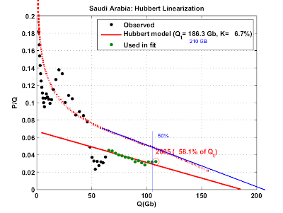
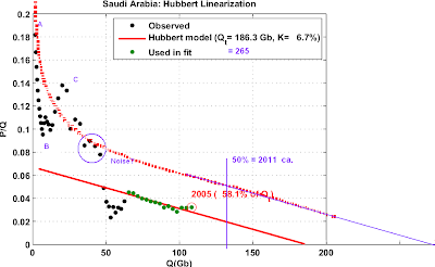
Westexas points at this HL for Saudi Arabia by Khebab:
Notice how the last 3 green dots are up a bit and are dragging the fitted line up. Suppose we had done this plot 3 years earlier, and didn't have those last 3 dots? Then the red line would have gone through just the other green dots, which are very close to a line. Looking at the chart, this would give a Qt of more like 150, compared to about 180 today. And that would mean that production as of 2002 would have been an even higher percent of Qt than what the chart shows in 2005! Probably over 60%. Especially coming after a couple of years of decreases, we would have had an even stronger case 3 years ago of saying that 2002 was the peak than we do today for 2005 or 2006, based on HL analysis.
So, even if true, we are talking about a 20% increase in URR?
Hubbert estimated that a one-third increase in URR only delayed the Lower 48 peak by five years. If the math is roughly the same for Saudi Arabia, we are talking about a difference of three years.
In any case, Saudi Arabia is declining as predicted.
This whole exercise is roughly akin to passengers arguing over how soon the Titanic will sink--even as water laps at their ankles.
In any case, Saudi Arabia is declining as predicted.
I think the whole point of this essay still eludes you. Texas declined as would have been predicted in 1956. It continued to do so for 12 years before breaking out to new highs. So, how can you tell where we are with respect to Texas production on the basis of the HL? You can't.
This whole exercise is roughly akin to passengers arguing over how soon the Titanic will sink--even as water laps at their ankles.
You keep saying that, but it isn't. I am still telling people to get on the lifeboats. I am just trying to figure out how much time we have to load the lifeboats. What I am trying to avoid is telling people we are going to sink in 2 hours if it's going to be 6 hours, because people might start jumping in 2 hours.
Robert,
---would have been predicted in 1956.
Did it get more predictive in 1969-70? WT has maintained that we are at/past peak at KSA then the question in my mind is how well did HL work at or near peak. Did it tell peak? IMHO this will tell us if we need to man the life boats so to speak. I will go back and reread your post looking for this.
I find it very difficult to believe that oil co.'s fly by the seat of thier pants, something isn't right here IMHO.
Hi Robert, Westexas,
I respect all your work.
I think you two miss each others point.
While RR may (probably is) correct that early HL predictions are inaccurate (20-30% off by the looks of it), Westexas' prediction is not *solely* based on HL, but also other observations which are difficult, if not impossible, to discount (as in Stuart recent analysis as well).
The predictive ability of HL will be lost on the MSM, reality will be the only fact they awake to. And debating CERA is a losing battle.
As RR stated earlier today, we may know soon if KSA can increase production, and, of course, if they can't the rhetoric will still continue...
I will gladly get into the lifeboat 6 hours before the ship sinks...I would like to have a seat and a life preserver, and maybe some rations(not many on a lifeboat). *Sorry a little humor*
I think I speak for many TOD'rs, we love and respect both your contributions, but it is hard to see either of you take the debate personally.
===================
It's all about population!
PS: Forgive me if you think I am out of line...as I am not really qualified even comment on both of your expertise.
Thanks, PTO, for expressing what I suspect many of us feel about these two articulate, smart gentlemen...but note I didn't throw in handsome.
I think I have seen on this board an updated graph of SA production trough 2006, and it showed the last point right on the red line..
Notice how the last 3 green dots are up a bit and are dragging the fitted line up. Suppose we had done this plot 3 years earlier, and didn't have those last 3 dots? Then the red line would have gone through just the other green dots, which are very close to a line. Looking at the chart, this would give a Qt of more like 150, compared to about 180 today.
You are stealing some of the thunder from my next essay on Saudi. :-) This anticipates where I am heading.
There is one thing that make me very worried about Khebab's HL plots. For Saudi Arabia only the last points are used and if the same thing is done with Texas between 20 - 40 Q(GB) you will end up with a much larger estimate. It seems like Saudia Arabia is overestimated.
Robert,
I appreciate what you are trying to say here, but it may (for the sake of balance) be worth emphasizing that it is equally invalid to use changes in the structure near the endpoint of a Hubbert Linearization plot to extrapolate to a large ultimate. For example, you could have taken the HL plot for 1970 as you did above, used the last 10 data points (1960-1970), and projected an ultimate that was for all purposes infinite. This would have been equally wrong as the under-projecting examples you have shown above. I have seen a number of instances where this has been done with the uptick in Saudi production in 2005 - as if that single datapoint somehow carries any information about the ultimate by itself.
The bottom line - prediction is difficult, especially about the future...
For example, you could have taken the HL plot for 1970 as you did above, used the last 10 data points (1960-1970), and projected an ultimate that was for all purposes infinite.
Yet Texas was two years from peaking. You are getting close to my point, which is: We don't know where on the HL Saudi actually is. The current stability of the Saudi HL in 2006 doesn't look much different than the 1960 Texas HL. In fact, the 1960 Texas HL was probably more stable than the 2006 Saudi HL. I can guarantee you just by looking that the r-squared of those last 15 Texas points in 1960 will be similar to the last 15 Saudi points - and the Qt is also very close.
I agree that with 30 years of hindsight, the Texas HL looks pretty stable. Has it been 30 years since Saudi peaked? When Texas peaked, it was over 70% of Qt. Saudi is less than 60% of Qt. All I have heard about for the past year is that we can use the Texas HL to tell us something about Saudi. Well, the Texas HL in 1972 looked nothing like the Saudi HL of today, did it? So, Saudi and Texas are apples and oranges.
You could have called a Texas peak wrong many times in the past by using the HL on Texas. You could have called it in 1956 and been correct for 12 years. So, in light of all of this, on what basis do we say that the HL can predict a Saudi peak? Claiming that it can is akin to a religious conviction in light of what I have shown here.
Last time I post this promise.
Oil in place estimates are fairly independent of production generally based on the reserve information gathered in the first few years of production. This information needs to be used to calculate a upper bound on reasonable URR.
This of course leads to a good reasonable guess on URR given our technology. Then we need to check HL stability with this upper bound included. I think that the second derivative of the production rate will give a minimum that agrees with OIP estimates plus the expected economic recovery factor.
Any data taken after this inflection point reflects advanced methods both increasing production rate causing increases in URR that may or may not be real. The point is that to reach that URR using these methods may mean production for hundreds of years this is not relevant. So another way to look at it is how many years at x production rate is required to reach the URR for a given field. As the production rate declines at a lower or even practically flat rate this increases to infinity.
Advanced recovery is financially feasible in America in the context of overall world oil production I just can't see these methods remaining important as the world moves away from peak.
Hello m,
I appreciate this point.
re: "Last time I post this promise."
Please keep posting this when it's relevant.
re: "...reserve information gathered in the first few years of production."
Is this known (sorry if you don't mind my asking)...in some cases? All cases? Known but not revealed?
re: "this inflection point".
Are you referring to: "a upper bound on reasonable URR"? (in your previous paragraph)
re: "So another way to look at it is how many years at x production rate is required to reach the URR for a given field."
Well-stated. Is it assumed in the models that X is fixed? (Again, if you don't mind the q - I'm learning.)
re: "As the production rate declines at a lower or even practically flat rate..."
Is this generally known (specifically) in advance? i.e. any way to know this in advance?
Reserve estimates are known from the beginning the quality is often low. Despite the slams HL has taken as far as I know it leads to better results then most of the official models.
Generally reserve estimates are revealed. In the case of OPEC the dubious nature of some of the reserve additions is cause for controversy. Also understand that a region like the US still has large reserves its just that the production rate has plummeted as the fields have aged.
The inflection point I'm talking about is caused by a field moving from primary/secondary extraction to more advanced stuff like steam extraction or simply being extracted with a 90% or higher water cut.
The good or cheap oil comes at a high production rate during the first phase of extraction you may still get a lot of oil from later methods but generally the production rate is low less than a tenth of what it was at peak. The only reason its a issue is it causes the URR to kick out since the rate of change in production flattens sending URR to infinity.
HL is unstable in this regime just as its unstable early in production. Point taken after enough fields are in final extraction mode probably should not be fitted using HL since it does not apply.
I assume your X is production rate and its not fixed but its declining generally in a linear fashion with a small slope.
The reason of course is their is a lot of oil still in the field and the depletion rate is close to zero.
HL is good for finding the URR of cheap oil not the final URR since the field production profile no longer fits the model.
Thanks, memmel,
re: "The inflection point I'm talking about is caused by a field moving from primary/secondary extraction to more advanced stuff like steam extraction or simply being extracted with a 90% or higher water cut."
Does this "inflection point" *necessarily* show up on a graph? Or, is it something that can be known only by knowing the history of the extraction methods employed on a particular field/(and/or region)?
(I.e., you are referring to something literal (about the physical means of production), then. (Yes?)
Does this necessarily show up in data if you do not have a source for knowing about it otherwise?)
The idea is its literal lets say a field goes to 90% water cut
and you are maxed out on water handling equipment then the rate of production is controlled by the rate you can manage the water not the amount of oil remaining.
For the most part. I think its easier to find out if a field is terminal and remove it from the HL analysis.
Note we have a lot of this in the US and thus the increasing URR its a bit bogus.
Hi memmel,
URReka! You've just turned on a light. There must be some repeatable process or behavior at work in order for HL to produce similar outcomes in different oil provinces. Is it below ground factors (geology) or above ground factors (people) or one driving the other? Here is a hypothesis:
The infrastructure put in place for an oil field closely correlates with the initial estimate of URR. URR(E) determines the size of the investment and thus the rate of extraction. This correlation will tend to produce similar production histories for different oil provinces and similar HL plots.
That is why HL works. Think about Prudoe Bay. What inputs set the size of the pipeline that carries the oil away? Somebody took the rate at which the fields could produce (acre feet, permeability) and URR(E) and came up with a flow rate which determined the pipe size. No one would put in a big pipe for a small field or visa versa. This stable relationship of geology driving investment size provides a [possible] explanation for the repeatability of HL plots. Colin Campbell has stated that BP's initial URR(E) for Prudoe Bay was spot on but they under reported at the start. Reserves rose as more was moved into proved as per SEC rules.
Above ground factors (demand) drives the rate of investment but URR(E) drives the total investment.
I hope Robert and westexas find this a plausable theory.
Collect your Nobel prize at the exit, memmel.
Hi Alan,
I'm just reading now, and don't know if people are still on this today. Perhaps bring it up again?
Rates proportional to size of the discovery go into the Oil Shock model. This leads to a solution in terms of conventional first-order differential equations.
There is also a mathematical equivalence between the size of a discovery and the number of discoveries in a given year. Either way works because we are dealing with a linear superposition of data sets.
I agree that the Oil Shock Model covers this, WHT, but you have personally often wondered what drives the Hubbert model into showing the accuracy it has shown. I think this explanation fits. Would one way to test would be to find a field whose URR(E) was badly underestimated and see how such a field played out over time? (Assuming we can find such a field?)
Ghawar Is Dying
The greatest shortcoming of the human race is our inability to understand the exponential function. - Dr. Albert Bartlett
I think Khebab's idea of Loglets also covers a superposition of data sets.
Yes, it will drive me insane trying to figure out why the Logistic model works as well as it does.
Unfortunately I can't answer your hypothetical question until I can get just a bit more insight into your premise.
Your model directly incorporates information about discovery. But even if the model fails to incorporate that information, it still exists and it governs the production rate of a given field. Assume I have a field that can produce 20,000 barrels per day but I err in my estimate of URR and therefore build infrastructure to produce 5,000 barrels per day. It does not matter one bit that the field is actually capable of producing 20,000 barrels per day because I am not going to be able to handle more than 5,000 barrels per day of production. So, even though this does not appear in the logistic model directly, it is still constraining that model in some manner.
We also know that in order to minimize both legal and economic risks, newly discovered fields are often reported as well below what they ultimately turn out to produce and are developed against this lower boundary rather than the upper. Again, while not explicitly stated, this constraint ends up impacting the production curve when you look back historically at that field. Again, the shock model directly accounts for this but the logistic model must account for this as well, even if implicitly.
I feel like I am groping around the edge of something here with regards to the logistic and can't quite fully put my hands on it but the above is my initial attempt to express these thoughts.
Would not the slope of the line in the Hubbert linearization be directly related to the initial assumptions that govern infrastructure building that then controls production flows?
Ghawar Is Dying
The greatest shortcoming of the human race is our inability to understand the exponential function. - Dr. Albert Bartlett
This one is a cinch. Since the oil shock model uses a kind of Poisson (i.e Exponential) distribution of rates, I can easily adopt a lower rate field (say 5000) in the model. As long as some are low and some are high, I have a standard deviation equal to the mean which accomodates a large variance.
Thanks for the endorsement:)
Actually I like your concept. If you applied it to KSA then it seems they are far more interested in investing in Water handling than moving oil these days.
I think what your saying about looking at infrastructure is important please bring it up again.
Peak oil can easily be seen from infrastructure investment also.
Your the one with the right idea.
"So, Saudi and Texas are apples and oranges."
Hardly apples and oranges, I suspect. The same laws of physics apply to both fields. If HL is a reflection of geophysical processes, then I suspect there is a reasonable basis of comparison.
Incidentally, just how stable/accurate does a given model have to be? Weather forecasters miss forecasts--sometimes big busts--but continue to use the same models the very next day. Note that these forecast can sometimes have huge ramifications economically, personally and politically. Say either from a surprise storm, or one that was forecast to hit and didn't, with major and costly evacuations undertaken. And, yet, the models continue to be used, because they’re the best ones available. Has someone proposed a better model for forecasting future oil production rates?
You make some good points, RR, but I wonder at what point an insistence on perfection in modeling gets to an unrealistic, and unreasonable, level?
-best,
Wolf
You make some good points, RR, but I wonder at what point an insistence on perfection in modeling gets to an unrealistic, and unreasonable, level?
Perfection? They aren't even close. When Texas peaked, the HL looked nothing like today's Saudi HL. Yet we have been told again and again to look to Texas as a model for Saudi. So what is Texas supposed to tell me about Saudi, given that the HL in 1960 looked more like today's Saudi HL, and that Texas peaked at over 70% of HL, compared to 58% for today's Saudi? THAT is the point.
I suspect that Texas production provides an idea about KSA's production in the same manner that a hurricane striking Miami in 1926 might inform about the consequences of a hurricane striking New Orleans in 2005. One can find differences in the specific details of the outcomes due to different geography, specific structural details of the storm, year of impact, etc., but in both cases, disaster resulted.
I wouldn't discount the Texas production profiles entirely in terms of estimating an outcome for KSA. Though I do understand what seems to me to be the core concern: timing. Right? This is still largely a debate about when world peak oil production will occur (if it hasn't already)? That usually seems to be the trick, doesn't it? In a forecast, "what will happen" is often the more accurate part--"when it will happen" is often more prone to error.
So... If HL doesn't seem good for the timing part of PO, then what other model might have a better track record for timing? Surely there are other methods out there?
-best,
Wolf
Has someone proposed a better model for forecasting future oil production rates?
Oh of course we have better models. My problem with the Logistic model is that it does not follow from any known physical process or first principles. It is simply a compact rate representation that produces an analytical result. Check out the Oil Shock model if you want to follow something from first principles; it doesn't disagree significantly with any of the HL numbers (BTW, I like your analogy to weather forecasting), but it gives the satisfaction that you can actually understand what is going on!
You can't get that fundamental understanding with the Logistic model because it never has made any sense apart from some empirical fit (like Rapier mentioned at the top of his post). This leads to a never-ending struggle to second-guess or doubt the feasibility of the approach. In my experience tracking physical phenomenen, I can't think of a worse (better?) example of a poorly understood heuristic than the Logistic model as applied to oil depletion (i.e. it actually makes a lot more sense when applied to biological population dynamics). Somebody on the Drum actually mentioned 1/f noise as another example of a poorly understood empirical observation, yet that one scientists can actually make sense out of from fundamental principles, and it actually accurately represents the observations. Alas, the Logistic curve may do neither apart from some coincidental equivalence.
Robert,
The Lower 48, inclusive of Texas, peaked within the time frame that Hubbert predicted.
Do you deny this?
What I have stated is that Saudi Arabia, in 2005, was at the same stage of depletion at which Texas peaked. I have further stated that the Saudi HL plot is much more stable than the Texas plot. You are therefore correct that the pre-peak Texas plot is noisier than the pre-peak Saudi plot.
Congratulations. You have gone to enormous effort to reinforce what I have long admitted to. Now, why don't you do this same analysis on the Lower 48 and the North Sea?
The Lower 48, inclusive of Texas, peaked within the time frame that Hubbert predicted.
Do you deny this?
Well, Khebab suggested lower down that he merely got lucky. But what I have addressed in this essay is the case of Saudi and Texas. Recall that you have told us again and again to look to Texas as an analog of Saudi. What I found when I modeled Texas through its peak is that it looked nothing like the HL of Saudi today. It has nothing to do with being noisy. In fact, the Texas HL in 1960 wasn't very noisy. The r-squared looks good. The %Qt is favorable to today's Saudi HL. So, by what objective criteria can I say that Saudi today is not like Texas in 1960? There are none.
You have gone to enormous effort to reinforce what I have long admitted to. Now, why don't you do this same analysis on the Lower 48 and the North Sea?
Not as much as you might think. I wrote this in about 3 hours on a rainy Aberdeen afternoon. Saudi is up next, and then if I think it is worth the effort I might tackle the others. But I am not sure that the North Sea with its double peak is going to be a good case.
But I am not sure that the North Sea with its double peak is going to be a good case.
That is an argument you must let RR put forward against you, WT..
And the think is, maybe the SA is not as depleted as it seems, this is the message RR is trying to spread.
But we must recognize that SA is much more dependent on one field than Texas, and after half a century operating, it wouldn't be susprising if it enters now the down slope..
Does somebody know when the East Texas field started to produce?
But I am not sure that the North Sea with its double peak is going to be a good case.
Double peak caused by a double peak in oil discoveries several years earlier. Apart from the fundamental problems with an immaculate-conception-based Logistic model, deterministic factors win out over stochastic considerations in the case of the North Sea.
As a MAJOR novice in all of this geologic modeling, it appears to me that the accuracy of the HL model varies depending on your goal. If you are trying to discern the peak of production, it seems to work fairly well. But if you are trying to determine the URR, it may not be as predictive. Am I understanding this correctly?
Cheryl
If you are trying to discern the peak of production, it seems to work fairly well. But if you are trying to determine the URR, it may not be as predictive. Am I understanding this correctly?
Not exactly. Here is the key point. When predicting, how do you determine the %Qt that defines peak? That's the thing. We have hindsight to guide us, but the point of this essay shows that leading up to and even years after peak the graph is changing so much you can't get a handle on things. Does a region peak at 50% Qt? 70% Qt? How can you tell? The difference can be 30 years.
Also, the moving URR affects the %Qt, which is the same as %URR. So if URR is changing - and it does - then %Qt evolves over time.
Okay, gotcha. That makes sense. Thanks!
But I do have one more question, and it may be too complicated to answer in a comment or may have already been answered elsewhere.
When an oilfield is discovered, how do they come up with their initial estimates of URR? I'm thinking of "Jack" right now. It seems that estimates are made on very limited data. Or am I confusing "probable" versus "proven" versus "URR" in that the first estimate is "probable" which becomes "proven" after some amount of production and that eventually leads to "URR"?
All that Hubbert Linearization does is fit the second derivative around the peak, i.e. the perfection of an inverted parabola around a maximum. The URR equivalence is secondary and it relates only to the choice of the underling Logistic model. If that model is wrong then all bets are off in making sense out of the URR and the halfway point for peak.
So as Rapier is showing, as the "perfection" of the inverted parabola starts disintegrating, due to an undulating plateau (for instance) the HL starts creaping right in time, making a mess of the Logistic-derived URR.
Face it that all the properties of peak=1/2 URR, etc. have to do with the selection of the Logistic model.
So to your question, a better model is to use a priori estimates of URR, in the form of discovery estimates (as for "Jack"), and then use something like the Oil Shock model to estimate the stochastic temporal dynamics as an aggregate of a set of discoveries plays out.
Thanks, that makes sense, although hopefully I'll never foolishly try to explain it to anyone...but that's what you guys do so well.
I have no idea what you said... but it made sense... the question is.. can you make a graph to illustrate the difference between that and the HL method.
These "linearized" models clearly don't follow a linear trend.

But what's the point of plotting something like this that's not linear? You just end up compressing and contorting the data for no real reason.
Notice the concavity up front. This gets swept aside for various reasons, yet it invariably shows up in real data.
So the difference between the methods amounts to plotting the modelled production rates using discovery data as a forcing function.
I think we are saying the same thing in a sense.
I'm saying that HL needs external factors to in a sense pick the right one your model includes one of those factors.
The problem is more realistic models explode as you try to include more factors. Above ground factors for example swing producer status. Recovery factors etc etc.
And at the end of the day the models don't seem to beat HL.
Esp if you include these other factors as simple data filters for HL.
Another problem is that the more advanced models use more data and are prone to be optimistic i.e the err on the high side.
While HL strength seems to me to be its error is balanced in the sense it goes low as often as it over estimates and predictable within 5% of peak.
This means its good for both putting a upper and lower bound on the peak and URR. More extensive analysis either ad hoc or numerical is needed to make the final estimate or in the case of HL pick the most favored HL plot out of a large set.
This goes back to what I've said ten different way HL coupled with more information to pick the precise peak is a pretty good simple model and in my opinion gives results within the error range of the data itself.
Its a bit funny since I know HL would behave as Robert has presented. I missed the tail issue and increasing URR but I did not take this to mean the model is invalid over its entire range. HL is basically correct we just need better defined filter criteria. Needless to say I think the rush to ditch HL is a bit premature.
I had been working on this as you posted:
I'm not satisfied with the lower 48, but the others seem to fit imo.
Thats about what I thought would happen. The point is HL is not garbage its useful. In a sense it measures peak of easy oil.
I like it. Where do the dotted red lines come from?
Stole it from you and stretched it.
Don't have the time nor the equiptment to do it myself.
And probably not the right formulas. But had it on the back of an envelope (looked mostly the same) before I read your post!
Cheers, Dom
That's a nice trick. If you just have the graph, often you can use something like Photoshop or Paintshop and change the background to transparency to give a quick and dirty fit. Many of these equations obey affine transformations so it works out pretty well.
Hello there PeakPlus - ace charts with a somewhat familiar style. Would you care to add some narrative to the Saudi Arabian HL? It seems you are dividing the data between pre-1982 "unconstrained production" and post-1982 constrained production which is a smart approach, if so. You may want to consider the possibility that the pre-1982 data are also "constrained", i.e. Saudi only producing a handful of fields, and probably not pumping flat out.
On another subject - I sam your anotations to the iea production chart for Saudi - re the rising wedge and would agree this is as good an indicator as any for Saudi capability. If Saudi production breaks the lower support line it could be a sign of serious trouble.
ace charts with a somewhat familiar style.
Nice hack on my charts! :)
Thank Mr. Telescope! the curve's from him.
ps:
Trying to do a better one for Saudi Arabia.
Only have statistics back to 1960 though. Noticed that you have some (extrapolated?) pre-1960. Where they from? You got a table or something?
Cheers, Dom
Thanks Euan, very motivating to make me post again.
Got a day job, you know. And wife and kids for my "leisure" time.
re: "It seems you are dividing the data "
Exactly.
The question is, how early does a stress/HL work. Changed the chart to make the last four points "noise". My guess is that this is a bit optimistic, but why try fighting the charts? Besides, 2011 is not that far off:
Going back to Texas with the same question, the last three points being perhaps "noise" and also being what Hubbert saw ca. 1956 ...
I'm Eyeballing the whole thing, but I do that while putting up tiles in my bathroom as well.
re: "this is as good an indicator as any for Saudi capability."
No, it would only be a CONFIRMATION of what you think you already know.
re:"somewhat familiar style", are you referring to something I've missed or do you mean Hubble?
Cheers, Dom
Another problem is that the more advanced models use more data
But then Loglets use more data as well.
I kind of say ditch HL, but more as a way to get a fundamental understanding of production than anything else.
I have no problems with the more advanced models except that by introducing one factor say discovery and not say controlled production the model is biased. Once you go down that road you need to add all factors.
Other model although cool have to many tunable parameters.
And don't forget the noise issues.
What you need is a good model competition to find the simplest
model that can beat HL. With the noise in the data we don't need a complex model we need a simple one.
I suspect you could find a better equation I'm not sure it would have any more or less predictive power than HL.
HL seems to get the URR right within 5-10% thats pretty good
IMHO.
You make a good point that HL is not very accurate, and WT makes a good point that the 1970 texas HL behavour looks quite like what SA HL looks like now. Personally, I never leaned on HL, but attach more importance on SA cutting more, and earlier, than the opec agreement, combined with 3x rigs in 2 years.
So, you need more data to be convinced sa has peaked. Would the following bring you into the sa peak now camp, or would you still need more evidence?
SA production continues to decline, say 100k/d/month, resulting in around 7.6Mb/d end 07.
OECD stocks continue to decline, as forecast by eia, down another 80Mb end 07.
NYMEX price climbs past previous peak, say at least 80/b end 07.
It will be easy to convince me I'm wrong... don't need to see their promised 12.5Mb/d, 9.5Mb/d would be enough. However, I don't think stuart's straight line downward projection will extend much further, see ghawar going down 18%/y, balance at 6%, resulting in 7-8Mb/d 2008-2012, avg 7.6Mb/d, provided planned projects are on schedule and produce as hoped.
You make a good point that HL is not very accurate, and WT makes a good point that the 1970 texas HL behavour looks quite like what SA HL looks like now.
The 1960 HL of Texas is much closer to today's Saudi HL. Much closer.
As far as what would convince me, I outlined that in today's Drumbeat. I think we are about to find out.
IMO, Texas in 1960 is analogous to Saudi Arabia in 1990. While the data after 1960 are not great, they are much more stable than the data prior to 1960, and I would have shown a much steeper fit to the pre-1960 data than what you showed.
In any case, Texas--other than knowing at what stage of depletion that it peaked--is not the issue. Saudi Arabia is the issue.
Look at the post-1990 Saudi data. It's vastly more stable than the pre-1990 Saudi data. And I assume that you will agree that Saudi Arabia, after showing a solid linear progression since 1990, in 2005 was at about the same stage of depletion at which Texas peaked, thus the so far accurate model: http://static.flickr.com/55/145186318_27a012448e_o.png
Let me know when we see higher Saudi crude oil production (beyond the 9.55 mbpd that they averaged in 2005).
And I assume that you will agree that Saudi Arabia, after showing a solid linear progression since 1990, in 2005 was at about the same stage of depletion at which Texas peaked...
That's completely inaccurate, as I showed in the essay. Texas peaked in 1972 at over 70% Qt. It has retreated in the 35 years since to 58% Qt. Saudi today is at 58% of Qt. Had it been 35 years since the Saudi peak, then you would be correct. As it stands, if Saudi is peaking now it will have done so at a far lower %Qt than did Texas.
That's completely inaccurate, as I showed in the essay. Texas peaked in 1972 at over 70% Qt. It has retreated in the 35 years since to 58% Qt. Saudi today is at 58% of Qt. Had it been 35 years since the Saudi peak, then you would be correct. As it stands, if Saudi is peaking now it will have done so at a far lower %Qt than did Texas.
I think this nails it!!! Robert has convincingly shown that HL alone can't be used to reliably predict the peak. However I do believe that Saudi Arabia has peaked for several other reasons. They are declining at 8%/annum while the rig count has tripled and the price is high, their fields are very old, they cut two times their share of OPEC quota, they are unilaterally cutting shipments to Asian refineries, etc. etc.
I think this nails it!!! Robert has convincingly shown that HL alone can't be used to reliably predict the peak. However I do believe that Saudi Arabia has peaked for several other reasons.
While I don't think Saudi has peaked, what I have attempted to show in this essay is that the HL won't tell us either way.
I kept thinking about the old Superbowl/Stock Market predictor: If the NFC won, it was a good year for the stock market, and vice-versa. But in truth, this had no predictive value. If we really want to gauge the stock market, we look to factors other than who won the Superbowl.
I don't agree you did the right plots but not enough of them to see the trend. You need to do HL from 1960 to 1980 for every year and plot the URR estimates and peak estimates for these 20 years. You need 20 HL plots not 3.
Then I think you will see HL does a good job of bracketing the
real peak.
If anything the massive drilling campaign around the peak distorts the data making these years the worst to use.
This suggests that 1960-1969 and 1975-1980 are the stable regions.
The thesis behind HL is that if the field is in stable production i.e its been in production for a while and is developed at a stable rate and production is allowed close to a natural rate then you can predict URR.
In practice you need a good ten year span of stable production to get a URR estimate.
WIthout reading thru the drumbeat, it sound as if what I outlined would not be convincing to you.
Regarding HL, I can imagine SA as being particularly difficult because of the reliance on one field, ghawar. Even if we had good production data from this field, HL might not be reliable for a single field. WIthout ghawar sa is not more important than iran, not much more important than mexico. Regarding the latter, all agree that mexico is (just) past peak, and this country also has most production from one major field, cantarell, acknowledged to have peaked a year ago. So, comparing SA and Mexico HL plots might be interesting, particularly because mexico and sa have been using similar advanced techniques, such as combining primary with water flooding secondary, and ultimately resorting to horizontals, all absent in texas production prior to its peak.
Why might ghawar be peaking now? Well, imo resorting to horizontals announces that peak is not far off - there is no need to use such expensive wells if one still has a 1000-ft thick oil column available. Furthermore, the water flood used on this field sweeps oil towards the center, meaning that the producing area is constantly becoming smaller, accelerating rapidly towards the end. It is quite typical that when such production methods are used the decline, when it comes, is very rapid, say 15-20%/y.
WIthout reading thru the drumbeat, it sound as if what I outlined would not be convincing to you.
Now how could you know that without looking at the Drumbeat?
http://www.theoildrum.com/node/2360#comment-167865
Well, you did say such things would be convincing, but not at what point. Well, we'll just have to see. New reductions to asia are only coupled with 60 oil and 90Mb oecd stocks decline from last oct, so probably not yet. Maybe by fall.
Separately, I see reduced ng imports from canada, and have heard expectations for atlantic storms. Interesting...
Sounds like we need some error analysis. Can we at least place some upper/lower bounds on future production, QT, etc?
I swear someone else posted about the need for error analysis :)
A upper bound is possible via OIP estimates and a reasonable recovery factor. Advanced recovery may result in higher recovery factors but the EROI is poor and the whole world will at some point move to a EROI decline/maximum use pattern that is far more important than peak oil.
Only fission/fusion exhibit high long term EROI's with reasonable unlimited maximum production rates. Actually only fusion does fission just has a reasonably long depletion curve and high EROI. Wind/Solar etc all result in some sort of maximum thats the downside to sustainable energy its just that sustainable. And the EROI is lower than what we have today. Leading to society having to reinvest a significant amount of its production into the energy sector to break even.
How much is a issue I'm sure the EROIdrum will address in the future.
Hi m,
Second again. Thanks.
re: "A upper bound is possible via OIP estimates and a reasonable recovery factor."
Naive Q (asked above) - are these estimates always known? Known and not revealed? Or, what's the deal?
Yes they generally are known. In the case of OPEC they were inflated for political reasons.
My understanding I could be wrong on some of this.
Proven+Probable+Possible+Unrecoverable = OIP
Proven+Probable+Possible = URR
or more simply
OIP*recoveryFactor = URR.
The thing is the recovery factor changes and the break out of proven+probable+possible changes. Or in other words the OIP estimate can change in time. In general its pretty stable in fields that have been produced for a file since the nature of the field is well known.
Unrecoverable is a really big number generally on the order of 50% of OIP. Thus by playing games with the recovery factor and Possible you can easily double or triple your reserve estimates and its only a white lie. For some of the majors this can also result you drastically reducing your reserve estimates when caught. For KSA people seem to accept it.
In my opinion OIP is probably a pretty good number others with more knowledge can comment on this.
The important point is that only 50% of the Proved plus probable is going to be produced at high production rates pre and slightly post peak. So lets say on 25-30% of the oil extracted from a field is extracted during primary/secondary production the rest is extracted in a long tail.
We only care about this 25-30% of the oil thats extracted at reasonable rates. HL seems to be stable during most of this range giving a nice balanced prediction of URR and peak within 5%. Now I'm not saying you won't still be producing a lot of oil past peak most of the US is in this long twilight of production and we are still the third largest oil producer in the world. But that does not help us or the world maintain a ever expanding oil based economy.
Robert,
Very nice article. I am looking forward to Part II.
How does the HL analysis take into account the introduction of new technologies. If the earliest historical data is associated with mainly veritcal well and subsequent data is associated with newer technologies such as enhanced well placement, horizontal wells, multilateral or fish bone type completions, the production rates may be higher than the historical rates althought the ultimate recoverable has may not changed.
Suppose Saudi production may have started declining had wells continued to increase water cut and no horizontal drilling occured. By introducing horizontal drilling KSA avoids the water cut until later in life, when it may occur much more rapidly. Because of the new Technologies, We may see a production increase or stay the same leading to a conclusion that the ultimate recoverable may be larger than initially thought.
I don't know how the HL method would handle the technical influences that could be changing the dynamics.
How does the HL analysis take into account the introduction of new technologies.
That's part of the empirical part of the model. It could only deal with that when the technologies were observed as higher production. Over time that would skew the URR to a higher value, which would make the snapshot of a %Qt today that would shrink over time.
Heh. So your analogy with Texas would break down completely...
This, I think, is the seduction of the debate... The Saudi peak, when it comes, will be brutal. Ghawar will collapse at least as hard as Cantarell.
If Ghawar had indeed started its decline during the production push of 2006, then how would the Saudis have handled it? Would they have immediately announced it to the world?
... Or would they wait for high price to destroy demand, then cut production as fast as it could be replaced by other producers?
I know, you will reply "ah how convenient, demand declines just in time to cover the Saudi decline". But I find that answer rather facile. The point is, the Saudis haven't ever had to produce at such a rate before as they did in 2005/2006, and that would be a logical time for decline to set in.
But I agree, HL seems week as a predictive tool...
This is my complaint with the whole thing.
How can oil co.'s not know or at least have better data/prediction tools to choose from? They have to know where to drill, how to drill, and based on what?
If they know all of this then they should IMHO also make forcasts related to projected drilling rig availability, availability of crews, etc., etc.
First their is a reason for the terms wildcat and dryhole.
Drilling for oil is still a art.
Next your mixing in the decision to develop a field with its decline. And you mixing in field decline rates with something like HL generally better suited to producing regions since each field is unique.
In general they drill a few test wells have seismic info and lots of other studies most focused on the formation some giving density measures that relate to actually detecting the oil in the rock. This is to make the decision to develop the field. Once it comes online then production data and more information results in higher confidence in the actual reserves. I'd say their is still a fair amount of risk in the decision to develop a field.
This is my simple explanation from what I've read. We have some great tools for finding oil today and most of the earths major oil producing regions have been discovered and produced for many years so we have a lot of experience to use as a guide for new fields.
When a field will enter decline is still problematic I think
thus the heated discussion. I think a good estimate say within 5% of the peak production rate is easy to determine and HL by itself seems to be a good tool for this.
Memmel, Thank you very much for your reply. I get frustrated that this issue doesn't seem to end easily. Obviously drilling in known areas is safer, if I had to make that call I would probabaly do the same until the price got high enough that I could again justify the risk. God, I wish this was easier, and I bet they do too.
Robert one thing that needs to be addressed is technical advancements and economic factors to see how they effect your claims. The crash of the texas oil prices must have effected production during the 80's for example.
Finally you can use test data to drive the model a bit better make some assumptions that technology leads to higher extraction and thus increased URR etc.
I'd say that the problem is advances in technology result in a flattening of the production rate causing HL to over estimate URR as advanced recovery methods are employed.
Just as it not a good model when you don't have enough production data its also not a good model for URR when the fields are well past peak production if they are still produced using advanced methods.
You might want to look at California its still producing oil
and is a reasonably sized region or even Pennsylvania.
These regions span almost 100 years of production or more and are still producing we should see the same effects that your seeing and they can be attributed to newer technologies.
Next I'd like to see how the curve deviates from the theoretical on the downslope.
My thesis is the URR predicted by HL anaylsis using data say up to 60-70% QT based on known peak production is probably correct and deviations are caused by advanced methods that allow the oil production rate to stay higher than predicted by HL. The real URR is NOT increasing its just the production profile is deviating from the ideal.
Its common sense in a way to say that HL is inaccurate when their is not enough production data and that advanced methods can and do lead to higher extraction rates than HL would predict fore depleted fields. So if you assume that HL is inaccurate once what I would call heroic actions are taken to extract the oil that makes sense.
To take the case down to a single well a lot of wells in the US produce a few barrels of oil a day and have done this for decades a HL plot of one of these wells would go to infinity. So obviously we need a cutoff on the depletion side.
Whats not obvious is where you should stop using production rates.
The rate of change of production rate has a maxima at peak production and we should see some sort of minima post peak.
Can you graph the rate of change of production rate.
I need to see the acceleration curves.
The same could be done for URR.
Lets look at some second derivatives. Not sure if we get a clean derivative but I think we can get a decent cutoff.
In reality this just says you need to do generic filtering
high bandpass low bandpasss to remove the low frequency components that are kicking out your URR post peak.
The URR increase is a artifact of the model IMHO.
I started to dedicate this essay to you, as you have been asking for it. :-)
The URR increase is a artifact of the model IMHO.
Whether it is or not, the URR for the Texas HL increased by about 50% after the stable series from 1960. So, how much will the Saudi URR increase? It's been increasing in recent years according to the HL. Are we to believe that it is done, and we can make a call on %Qt? Based on the Texas HL, I think that would be foolhardy.
Can you add that second derivative post. I need to see the change in the change of the rate of production.
I'm confident that a data cutoff is needed as extraction at low rates implies recovery factors greater than 50% of the OIP and thus the steadily increasing URR reaching 100% OIP.
The doglegs that everyone is noticing are indicative of this effect. Since we are primarily interested in production around the peak the fact that Texas may be producing oil 5,000 years from now is not important.
Can we look at Romania maybe ? To determine a reasonable point for this cutoff you need to look at regions that are way way past their peak. You mad the assertion somewhere that we don't know of regions that are practically full extracted this is not true. They are smaller than Text but we do know a lot. Also plenty of individual fields have cycled through their productive life cycle.
So we can develop a strong case for this cutoff number.
Another maybe simpler approach is to assume OIP numbers are
driven more by geology than URR and you can say the cutoff
is when URR is say 40% of OIP. Then we need to map how far the production data can be used without crossing into higher recovery factors that are not relevant to the current way we use oil. At some point post peak the infrastructure for oil extraction and use will simply degrade so we probably won't be using it like we do today if at all.
In any case your work is cool I'd never even have thought of this (right or wrong) without your perspective.
Thats what real science is about it forces you think.
Some links
A important one.
http://www.beg.utexas.edu/resprog/delbas/summary.htm
This supports my assertion that HL becomes unreliable
as more desperate attempts are made to recover the oil.
Since these advanced methods so far never result in higher production rates.
http://aapg.confex.com/aapg/2006am/techprogram/A102648.htm
http://www.fossil.energy.gov/programs/oilgas/eor/index.html
Thanks.
Can we look at Romania maybe ?
Romania -- bad idea. As we approach smaller and smaller regions, the deterministic factors start showing up and completely obscure the stochastic properties. Even though I don't buy the Logistic model, except as a cheap heuristic, it really is meant to be used in a substantial population of "entities", whatever the entity is. Romania doesn't cut it.
Yeah your right. And I agree about what your saying about HL but I don't by the complex models either since they lead to what I call the missing factor effect. Once you start down the path of more complex modeling your forced to include all important factors in the end or your model is skewed. In general in my opinion they tend to be to optimistic.
So that leads you back to my suggestion HL and reasonable filtering criteria.
I find it a bit annoying that it seems we have peaked in oil production before we even have enough data to predict the peak accurately. I think this shows why it was a surprise to people who should have known.
I don't think that most of these URR increase will substantially change the date of peak oil since for example new well technology allows much higher extraction rates at the expense of much higher decline rates later.
So I'm inclined to believe the URR increases are not important for changing the time of peak extraction but they could signal a region that in decline since its now being exploited with advanced methods even though it gives a basically phantom boost to production early on.
A more general way to say this.
The assumption generally made is that less than 50% of the oil in place can be recovered economically advanced extraction moves this number out increasing URR generally at much lower extraction rates that also close to constant.
World wide it means we probably could produce oil at 5-10% of todays current rate for centuries as we move towards 100% recovery. I'd have to guess that using the most advanced methods we have today the recovery of OIP is probably as high as 70% or higher if you want to wait long enough.
I think KSA believes this what they won't say is what the production rate will be.
Thanks to Robert for the great article and thanks to you Memmel for the great questions/comments.
Maybe a given HL regime works for a given technology? Perhaps the initial Texas URR was accurate for the original extraction methods, but improved methods changed the percentage of OIP that could be extracted? That's basically what you're saying Memmel, but perhaps we could break down the extraction by extraction method or extraction technology in that era to determine how much of the increased URR was due to a given technology. We could then use the adjustments due to technology being used to adjust the URR and get a more accurate peak date. It seems like someone at ASPO must be already working on this.
Taking that to its logical conclusion, if you had infinite money and technology, you could pulverize the oil-bearing rock to a slurry, water-flood it all out of the reservoir, and URR would equal OOIP. I've always thought Deffeye's dig on the economists wasn't quite fair ("show up with enough money and God will put more oil in place.") I've thought for a while that what CERA is trying to say is that if we throw enough money at the problem, we can use the latest technology everywhere and delay the peak for a while. Eventually the extraction would overwhelm our technology, but the game might be able to go on for a little while longer, and CERA could skim more off the investment flow for a while longer as well.
All of this begs the question: how did Hubbert get it right?
How did Bakharati (misspelled sorry ) nailed not only the world peak but the inflection in production once the super-gaints deplete and are no longer distorting production.
He is still alive. And he knows what Hubbert knows.
The clincher is he is the only one that has the inflection right and its obviously their once you think about it.
As soon as Robert posts the second derivative of the production rate and OIP/recovery factors for these regions we can assess the predictive power of peak oil.
I think both of these researchers included factors such as this i.e external filtering factors to pick out the most probable HL plot from the analysis.
I agree with Robert actually that HL alone is not enough but HL analysis does not live in a vacuum and a bit of common sense and detective work allows you easily to determine the probability that a HL plot is accurate.
As far as I know all the other methods indicate a peak by 2010-2015 or so and also they tend to have high estimates.
To put it another way one HL plot is correct we need to do a bit more filtering to increase our confidence in which one.
Robert is wrong to discount the method. To date it was a invaluable tool in the hands of a expert. The fact we can't replicate his work indicates a incomplete understanding of the tool and how it should be used not that it can't be used.
Robert is wrong to discount the method. To date it was a invaluable tool in the hands of a expert. The fact we can't replicate his work indicates a incomplete understanding of the tool and how it should be used not that it can't be used.
Are you talking about Hubbert? I have seen it stated on more than one occasion on this board that it is unknown if this is actually how Hubbert did it. And Khebab below suggested that Hubbert got lucky.
Anyway, what I discount is that the HL is a tool that can tell us in real time whether a region is peaking. I have seen no evidence that it can.
Last post from me tonight. Bis morgen.
I disagree all you have shown is that a filter is needed to pick the right HL plot. It does not work on its own. Its a combo of the filter method and the plot that gives you confidence in the peak not each one individually.
To sum my various posts.
HL analysis when its numerically stable seems to hit all the years within 5% of the peak value. That is valuable if true.
Additional information or filters can be applied to pick the most likely HL plot and thus predict the actual peak with higher precision.
You have not shown that throwing out HL results in better
predictive methods indeed so far HL in the hands of a expert has beaten all other methods.
So give me a HL plot thats reasonable and any indication that a region is having trouble increasing production and I'll call peak. The issue is how do you turn this extra info into a numerical filter for HL results.
I did not realize I was filtering until you posted but I am and its important. I never used HL by itself but find it powerful when you have other information.
Robert, I want to say that I appreciate your using the then available data and not the corrected data (if I understand your preamble).
My debate with Westexas was futile as he refused to believe my position that HL's predictive ability is diminished due to its resolution being in the area of ten years in pre-peak studies.
I stated in that February thread that in 1956 Hubbert predicted a peak of 3.15 mb/d in 1962 based on a URR of 60 Gb. Jeffry dismissies this fact each time I or others have presented it.
The last three (high) datapoints on your 1960 workup shows that Hubbert's '62 prediction of a Peak was accurate based on "his" data.
Hubbert uses Gb/a on his graph and text and I wonder if your 1960 commentary mistook Gb/a for mmbd. Your 1960 forecast looks low to me.
I use HL, loglets and their hybrids constantly. This is not a dismissal of their usefulness. But they are only a guide to be used to confirm other data sources. In his quest for notoriety, Jeffrey's statements for these past months have not been helpful in the credibility department but he has made his own bed aside from others beckoning and caveats.
Again thank you for your essay today. Your results mirror what Laherrere is seeing on the global analysis via HL: multiple results based on chosen data period.
Momentarily, I must turnaround and leave harbour before darkness and won't be able to comment on your fascinating results and implications because I'll again be upload-challenged.
Laherrere has plenty of examples where HL proved too optimistic! (sorry this is a PDF so can't link to the images)
Figure 6: Oil decline of East Texas, largest US L48 oilfield 1930-2005:
About this Laherrere says;
AND
figure 7; Brent oil decline showing a late collapse Nov.1976-Apr.2006:
Plus many more goodies to see in this paper such as;
Myth 1: Middle East is under explored
Myth 2: oil recovery factor (RF) is about 35% in the world and 50% in North Sea, so world reserves can be increased widely, and my favourite,
Myth 3: technology increases reserves
Basically any field developed using new methods horizontal drilling early water flooding nitrogen injection etc. Has a high chance of crashing HL cannot predict this. And your right it is over optimistic in these cases. Notice that when this happens its not a good thing tm.
Certainly for KSA we have a good chance of Ghawar not declining but basically crashing with decline rates higher than 15% I actually believe this will happen but HL cannot predict this and at the moment the argument is simply about decline in general not the real chance that we could see quite a few fields collapse over the next few years.
I suspect if you dig you will find that we have a lot of smaller fields that are close to collapse and they add up ...
Fascinating. Thank you for the article.
Personally, I consider the question of whether Saudi Arabia has peaked to be interesting, but not critical. The evidence already seems to suggest that use of oil is being curtailed by those least able to afford it at higher prices. OPEC's abandonment of price ranges less than half of today's price says quite a lot. Economic expansion in India and China (and elsewhere) is likely to swamp any possible increase in production. The date of peak world oil production is of mostly theoretical interest, therefore - it's more a question of when demand "outstrips" supply at any "reasonable" price, whether that supply is increasing or not.
First, excellent piece.
I have one request: Could you show all the different time-snapshot-fit-lines on one graph (ie. same vertical and horizontal scales) for comparison?
Well, they all do have the same vertical scale. I just chopped off the horizontal wherever the URR prediction ended up. For my Saudi essay, I would look and see how it looks. I agree, though, that it would paint an interesting picture to lay them all on top of each other. What you would see is a series of lines stretching out to increasing URR as time goes by (like what Euan posted below).
Just want to express my appreciation for your work. I have had reservations about the technique and this significantly clarifies the issues for me. I have placed more faith in bottoms-up methods and looking at decline numbers for fields and regions (which are also inexact) than in HL precisely because I didn't know how good/bad it really was under the situations you outline. Taken together with other evidence, it can perhaps add to confidence, but apparently only when the peak is pretty clear anyway.
So we will see how SA reacts late this spring, but I am suggesting to friends not to be too surprised if TSHTF.
Robert where’s discovery? How can we know if what you’re doing makes sense without an understanding of what discovery was?
Texas seems a good case where multiple cycles took place (like the UK), why don’t you try some Loglets on it?
That's the problem with RR's article. There was plenty of discovery during the late 50s/early 60s which his HL peak model. There's little to no discovery now in 2007 which is why KSA isn't going to climb out of their peak.
There's little to no discovery now in 2007 which is why KSA isn't going to climb out of their peak.
How do you know? Do you know how much of their country Saudi has explored? No. Others say "Oh, but technology allowed Texas to extract more." So, are we at the end of technology then?
The point is, based on what we saw with Texas, you can't make a strong defense for using HL as a key piece of your evidence pointing to peak. It is not reliable enough.
Do you know how much of their country Saudi has explored?
There was a link here on TOD to an interview with the former head of exploration for Aramco in retirement. He kept small vials of oil from each of his discoveries. He said something like "We have looked in all the obvious places".
Aramco is redeveloping once developed and since abandoned fields (problems differ by field, but all problematic). Surely if they had any hot, new prospects they would also be in development.
In any case, any future significant new discoveries in "unexpected places" would take almost a decade to go into full production.
I think Aramco knows where the oil is,
Alan
There was a link here on TOD to an interview with the former head of exploration for Aramco in retirement. He kept small vials of oil from each of his discoveries. He said something like "We have looked in all the obvious places".
I have seen comments contrary to that though. These comments were essentially of the nature "When you have Ghawar, what's the point of spending money exploring right now? There is enough oil to supply demand for a long time."
I think Ghawar is pretty close to peaking though - if it hasn't already - and I think that's why you saw such a large increase in drilling rigs in Saudi over the past couple of years. I think they are on an exploration binge.
The logical time to have been doing "wildcat" drilling was when Aramco was looking at the possibility of redeveloping once abandoned, problematic fields. Expand their range of options.
The oil province of KSA is not THAT big. Seismic surveys have surely been well and properly done. It would not take that many rigs to drill one or two wells into every potential trap of any size and see what is there.
Although prospects that would keep WT up at night (say, potential 250 b/day IF oil is in the trap) would likely be ignored as "too small".
No, I think the new rigs are there for development wells (plus some workovers/replacement wells). That effort on a KSA scale will require LOTS of rigs, more than exploring every potential wildcat.
Best Hopes,
Alan
One aspect of looking at these data points in detail is that they are linked. 1957 is linked to 1958 which is linked to 1959 et al. This linking effectively limits the # of independent data points which limits the predictive ability of the model.
But there are break points. The Great Depression & WW II are two linked series with a serious discontinuity in between. Any trend line where those two trends strongly affected the results will be distorted by "above ground effects".
The North Sea depletion had no major discontinuity (other than low prices and now high prices). Not surprisingly, it has a better HL "fit".
I have never believed that HL was predictive regardless of above ground factors (Iraqi Oil embargo & now civil war surely has some affect on production). I do believe that HL shows upper (but not lower) bounds on production with some adjustment for above ground realities (WW II for Texas as an example) and your work does not change my view.
In 1972, Texas peaked. In the following decade, prices increased ten fold, drilling went past record efforts, the # of producing wells increased 14% (from memory) and production dropped significantly (down ~30% from memory).
Qt for Texas may have increased from 55.5 to over 60 Gbl (my eye says 65 Gbl) as a result of these heroic efforts but that did not change the date of Peak Oil Production.
My expectations of the HL model are limited and circumspect. It is not a precision tool for micro production prediction. It does tell me that Saudi Arabian production is peaking now. When one looks at the underlying fundamentals of the model it makes assumptions about
1) The distribution of reserves
2) The order in which reserves are discovered and developed
3) That the pressure to produce rises smoothly over time.
I think #1 and #2 are valid and #3 is highly questionable i.e. wrong in many cases. However one can make "seat of the pants" adjustments for the failure of #3. (Great Depression > WW II is an example of #3 being wrong for Texas)
Heroic efforts by Aramco may extend the peak (and raise Qt) a bit and even set a new production record in a future month, but I do not expect to see a material increase in KSA production over past records (i.e. I will not take Stuart's bet that production will never get to 10.7 million b/day).
In summary, I recognize that assumption #3 in the HL model is often wrong, but the predictive value of assumptions #1 & #2 make it a valuable tool none the less. And I see no better tools available.
Best Hopes,
Alan
My expectations of the HL model are limited and circumspect. It is not a precision tool for micro production prediction. It does tell me that Saudi Arabian production is peaking now.
On what basis, Alan? What are the parameters that to you indicate a peak? That's the biggest problem I see here. There are really no defined criteria. We can have a range of 30 years in which we could say "The HL predicted the peak." We could have %Qt at 50% or %Qt at 73%, and then we have Qt (and %Qt) moving around. So how do you decide peak on the basis of the HL? That's my argument here.
My answer is that OIP and reasonable recovery factors plus a analysis of the second derivatives of the rate of production slightly before peak and post peak can give you confidence in a upper bound estimate. These should be used in developing a weighting factor.
For example you can take a running average of the HL for any two years and its obvious that above ground factors and advanced methods will cause the HLL URR estimate to deviate from the absolute OIP % recovery factor constant.
This is the basis for the error in HL this difference is the error in the data and can be used to filter outliers from the data set.
Generally %recovery of OIP estimates are themselves optimistic but thats another issue.
In general deviations point to HL and other estimates over estimating the amount of oil that can be recovered at reasonable rates not underestimation.
Finally in the real world the super-giant fields have had a large impact on the overall rate of production for the world. The peaking of just these fields is all thats required for the world to peak.
So at the end of the day all you need to know is if Ghawar has peaked since we know the rest of the super-gaints have. So the important estimate is the URR/ OIP recovery factors etc of a single field. The rest of the world is only important for the decline rate once these super-giants are no longer distorting the production rates.
Are you seriously suggesting taking numerical second derivatives of uncertain, noisy, and relatively sparse data? Do you have any idea how unreliable the result of that tends to be?
Look at the production graphs - they're already bouncing all over the place. If you think you're going to get sensible second derivatives from those, I urge you to try and see for yourself how absurd the numbers you get are.
Yep :)
We just need to see a break or dip.
Dunno if it will be above the noise or not.
Since we care about the slope not the values it may
be real.
You get one about every second data point.
A numerical second derivative of even relatively-smooth data is typically noisy enough to cause problems; for data as noisy as the rate of oil production, the results are garbage.
Plot it for yourself - here are the production numbers for 1951 through 1975, straight from the RRCT, along with the first and second derivatives:
1951 992
1952 1010 18
1953 1001 -9 -27
1954 954 -47 -38
1955 1002 48 95
1956 1079 77 29
1957 1056 -23 -100
1958 910 -146 -123
1959 944 34 180
1960 892 -52 -86
1961 895 3 55
1962 894 -1 -4
1963 915 21 22
1964 929 14 -7
1965 933 4 -10
1966 1000 67 63
1967 1074 74 7
1968 1088 14 -60
1969 1107 19 5
1970 1208 101 82
1971 1182 -26 -127
1972 1263 81 107
1973 1257 -6 -87
1974 1225 -32 -26
1975 1186 -39 -7
The second derivative changes direction 14 times over the course of 23 years. You get 14 dips. What "analysis" were you hoping to do on that data? Not anything to do with the "slope", hopefully, since the R^2 of a linear fit to that second-derivative data is zero.
It really sounds like people are trying to rationalize their support of an unreliable method that gives the result they want. Face it - the method is unreliable for a producer with substantial above-ground production constraints. Desperately holding on to a broken tool just makes the overall argument look shaky - unfairly.
Wow should have done it myself your right. But this does highlight just how noisy the data is if your trying to predict peak oil down to something like a year.
Not going to happen no matter what method you use.
Another way to look at it is peak oil is linked closely to the second derivative its the rate of change of production rate.
This shows that in the raw data at least its just noise.
Which means you need a model but thats not really removing the noise.
Thanks for the whipping sir :)
When one looks at the underlying fundamentals of the model it makes assumptions about
1) The distribution of reserves
2) The order in which reserves are discovered and developed
3) That the pressure to produce rises smoothly over time.
By saying it makes assumptions about the model, you are implying no assumptions, right? Because AFAIK, the HL/Logistics is only a heuristic that cannot infer any physical process.
If you know something I don't, it would be nice to express assumptions 1,2,3 mathematically.
The core of HL is a combination of the Central Limit Theorum (The distribution of an average tends to be Normal, even when the distribution from which the average is computed is decidedly non-Normal for those readers unfamilar with CLT) for several physical characteristics which HL models and steady growth in demand.
HL/Logistics is only a heuristic that cannot infer any physical process
I do not understand how you can say that (other than you are a skeptic caught up in the math rather than the reality of oil production).
HL tries to model the combination of several very real factors.
The following is reality.
Oil reserviors come in a variety of sizes AND production characteristics (geology). Khehab did a nice article on TOD on this distribution a while back.
Humans find large reserviors early and most small ones typically later. Humans develop and produce oil that flows easily (and cheaply and in large volumes) first and produce this oil the most (i.e. light sweet, and we are past PO for light sweet). All other factors being equal (see CLT), light sweet oil depletes faster than oil humans find less desireable.(more geological reality)
HL is a means of modeling the reality of the distribution of reserves and the order in which reserves are discovered and developed and the CLT is the way that it models a large and widely diverse data set, with layers of geological reality and human behavior reality.
Underlying oil production reality is a secular trend to demand more oil over the history of oil production. If the demand increase is steady and consistent, HL deals with it well. HL models the reality of development of more and smaller reserviors as time goes on, whilst depleting the early and larger fields.
The weakness of HL (IMHO) is that is uses a time series of data with each year being given equal weight. This is an implied assumption that demand for oil is growing at a steady rate and there are no "other factors" restraining production. True in some cases, not true in many others.
So I make the adjustments to the time data points as I noted elsewhere. If the Texas RR had Texas production at 75% of maximum; I take 4 years, make them 3 years and increase production by 1/3rd.
I am aware that the production quotas were artifical and overstated (see production when they went to 100% of quota). But it gives a good approximation.
Alan
I read the intent of what you said but I still don't get the math. At its most basic, the simplest Logistic model consists of 2 variable parameters. However, no one has ever been able to explain the parameters' interplay adequately in terms of realistic physical processes. If you can do it, great.
I have tried in the past but it boils down to some real questionable assumptions:
http://mobjectivist.blogspot.com/2007/03/derivation-of-logistic-growth-v...
Why should it map to physical processes its empirical ?
I can't see that it was ever intended to map to a reasonable set of physical processes.
You can use other information to filter out HL predictions or remove data points but its not intended to be tied to physics.
That's troubling. I am reality-based so I tend to believe in the laws of physics, even if it amounts to something as simple as using rate equations on a fixed volume of fluid.
On what basis Alan ?
[deep breath]
Repeating some of my "take" on HL.
HL can predict an upper bound on production but not actual production or a lower bound.
One example, current Iraqi production is not constrained by Hubbert Linearization type depletion, but by "other factors".
HL is a decent predictor of two significant factors; the geological distribution of smaller oil fields and the human tendency to find, develop and produce the largest and cheapest oil fields first. A third HL assumption is flawed, a growing pressure to produce on a smooth and continous basis.
I have adjusted the underproduction of KSA and Texas by time compression. If the Texas RR Commission was on 75% allotment, I replaced (mentally) 4 dots by 3 in the trend line and raised the output level by a third.
Likewise, for KSA I have taken the limited periods which I expect them to have been pumping "all out" and time compressed between then. A different HL plot emerges (in my minds eye) with a "width" to the line to represent the error bars in my estimation of time compression.
For all practical purposes, 1971 Texas = 1972 Texas = 1973 Texas. If one or two Austin Chalk finds (noted for their heavy and very short production) of later years had been found on 1-1-73, 1973 would have been the peak Texas year.
I assume that there will be no significant new wildcat finds in KSA (certainly none that will be producing significant oil within a half dozen years). The scattered undeveloped and once developed & abandoned fields (except Manifa) on the schedule "fit" my expectations for HL residual fields. The schedule for the reopening of Manifa has slipped and is less of a factor.
It seems that KSA has entered the plateau region (~=Texas 1970-1973) via my adjusted HL, which is supported by other observations and the occasional Aramco statement. The peak month within the plateau is subject to random small factors (see Austin Chalk example) and these factors will have no material effect on the rest of the world.
I also see Ghawar as not a unitary whole but in segments. The most productive segment of Ghawar appears to be in decline, while other segments are still robust producers and one segment (Haradh ?) is just now maturing.
So, all in all, I will NOT take Stuart's $1,000 bet :-)
Best Hopes,
Alan
Biggest problem I have with this. Texas prior to the seventies has very little tech enhancement for URR. Sure, in ten years the Saudi curve could look different if the reserves (and thereby total production) go up. But at this stage of the game how probably is that?
Biggest problem I have with this. Texas prior to the seventies has very little tech enhancement for URR. Sure, in ten years the Saudi curve could look different if the reserves (and thereby total production) go up. But at this stage of the game how probably is that?
Texas URR peaked 72 years into the game. URR continues to creep up 107 years into the game. And Texas is much further into the game than Saudi. My question for all is, how do you use the lessons of Texas to tell you what's going on today in Saudi? I can't see that you can.
I'll answer :)
You can't based on URR alone from HL analysis your 100% right.
Tail Creep Is the result of advanced extraction methods slowly pushing the % recovery of OIP higher. Its certainly interesting and I agree no one looked at it before. Its a good call. I believe that filters to detect and eliminate tail creep effects on HL plots can be created. A reason to create them is KSA has employed technologies that result in tail creep early in a fields production. And we want to compare total URR before tail creep with HL plots of regions that have not gone to deeply into advanced extraction.
Tail creep can and should be identified and removed to normalize URR based on what I would call reasonable extraction methods.
Basically advanced extraction methods work one of two ways.
1.) They increase production rate at the expense of greater drops in production later.
2.) They increase recovery factors for old fields at low production rates. For large old fields like the US this is still quite a bit of oil. Traditional methods leave behind
a lot of oil and it can be produced for along time at low rates leading to tail creep.
What they never do is increase both production rate and recovery factors at the same time. They are not magic.
The second piece of information you need to call peak is if the largest fields in a region have peaked are or close to peak and if the region is fully developed or you can predict when the region will be fully developed i.e its say 80% developed and you know all the projects to finish and the projected production rates.
You combine the above with HL and I assert you get a surprisingly accurate estimate of time of peak with a fairly high confidence.
Put it this way one HL plot for a region that is fully produced is the correct one ie its 100% correct. The trick is to determine which one this is or rather get close.
Next the problem is to put the full process on a firmer mathematical basis.
I always took HL plus other factors into account and in doing this I believe WT is correct. Whats not been done is to highlight these other factors.
For me if I know the current HL plot predicts a peak and that the region is looking like is is at full production and has been for some time its peaked.
I hope you read my mountain building post peak oil in my opinion has the same physics.
1.) The initial plate collision or other geologic disturbance starts mountain growth.
A field is discovered.
2.) The mountain grows and starts eroding immediatly
The field starts depletion on day one of drilling.
3.) The mountain grows as long as the uplift overrides erosian
As long as new infield drilling or new methods are developed to get the oil production rate increases until the field is fully developed.
4.) When uplift stops or slows lower than the erosion rate the mountain shrinks.
Once the field it fully developed it goes into decline.
5.) A mountain spends a good bit of time with a height near its peak.
A good bit of the lifetime of the field is spent within 5% of its peak value.
Take texas produced for 70 years and spent 20 years near its peak in production this gives about 30% of the time the field was producing near its peak.
Now for HL it seems to give peak estimates that all fall within this 30% time interval. So it seems capable of determining the peak production rate within 5%. This is a good thing.
Next the URR numbers actually seem pretty good to me. The tail creep effect is real but only important post peak.
Doglegs in the graph are I think early tail creep effects.
They should be removed to compare early HL plots with later plots since they skew the results.
To get a better number with HL you need to include more information.
Is the region fully devleoped or is the development schedual and predicted production known. I'd hazard that in 1960 Hubbert knew a lot of the projects that would be in place well past 1972 ?
Has the region been well explored ?
Have the Kings and Queens etc been found and developed ?
Do you have a single piece of information leading you to believe production may have maxed or is close to maxing or you are confident in predicting the maximum rate using HL.
No one has created reasonable mathematical filters for elimination or more correctly determining the HL plot with the highest confidence interval. No one has looked at the historical data known at the time in conjunction with the HL plot. And this is a bit tough since we would and could easily pick the best facts.
I think that HL + other data is a robust indicator of peak.
If the other data can be integrated easily with simple mathematics all the better.
And finally finally URR is not important what important is maximum production rate. I think we have plenty of information to say that both KSA and the world will never produce 5% more oil than whats produced today.
Next we have very good reason to believe peak is very near or has passed us recently.
Only one question for you do you feel HL on its own has been robust enough to predict the peak within 5% for both the world and KSA and next has this happened ?
Lets figure this out then figure out if its possible to narrow down the peak date since 5% as shown above could mean a decades of production near current rates.
Next is the argument that we are actually on the tail end of this 5% range not the beginning for both KSA and the world.
I happen to think that both the worlds 5% plateau and KSA will not last 20 years like it did for Texas for two reasons . Far to many regions or in real decline now and KSA has in a already deployed both types of advanced extraction in many of their fields for years in addition to the fact that the fields are generally mature. At the absolute best we get 10 years in this 5% of peak window and probably even less.
So the question we need to ask is not the date of peak but how long will we stay within 5% of peak production world wide and the same for KSA. The peak date prediction is simply the midpoint of this range. Hubbert did this and did not explain his reasoning.
Certainly we should work to make a better model and if possible show our exact position as early and as reliably
as possible.
This makes alot of sense to me. Filtering the known "noise" of advanced extraction.
The New Unified Theory of Peak Oil...excellent observations, memmel.
This is a great post... trying to show that there is a method that will reliably show when sa or the world is within a few percent of peak would be more convincing than one that sometimes hits, and sometimes misses, the peak date. More research on this subject by TOD's (not mine) very smart brains are in order.
For SA, if they are within 5% of peak would show that 10Mb/d is max, and this is still far below sa and the cornies' assumptions. For the world, we would never get to 90Mb/d, and this too would be informative.
Robert, just started reading, but my linguist eye got stuck here:
I think yearly and annual production is the same thing
Fixed. Thanks. Just when you think you have all of the typos spotted....
I have been concerned for some time that too much weight is placed on the HL technique. Fundamentally, the background for this is the logistic model differential equation, and therefore there is really nothing new in the HL model that is not already contained in curve-fitting to either the yearly production numbers or the cumulative production predictions as derived from that model. And in either of those cases, a little bit of playing around with curve fitting, or doing a non-linear least-squares fit to the data indicate that there is a huge amount of play in the parameters that appear to give a good fit. This is reflected, I believe, in the results that RR finds. Actually, the least-squares fit, with URR as one fit parameter, yields a value of about 1400 Gb, far too low it appears.
Backing away from the HL constraints, it actually turns out that a quadratic fit works best to describe the cumulative production data from the 1980s to present (in the sense of a smaller R2 value. Unfortunately, there is no URR asymptote in that case.
This all gets back to the problem that has been discussed repeatedly on TOD - there are no particularly good data on which to base a causal theory (model) and therefore we are all left to either gaze at the numbers as they appear from EIA and IEA each month, or try to generate curves that seem to fit the data, but which provide us with little confidence in their predictive powers.
which to base a causal theory (model)
You are right, the Logistic model is non-causal. It gives degenerate solutions, one of them being zero, and any kind of perturbation in initial conditions cause the solutions to go all over the map.
But then again what do we expect for a model that doesn't follow from any first principles?
A General Comment on All of the Foregoing
I've got three rigs running and a stack of work to do. So, some general comments.
I've been hammering on the Net Oil Export issue since January, 2006--based on work by Deffeyes, Simmons and Khebab.
Robert has disagreed with me every step of the way. Who has been right so far?
I noted in my January Net Oil Export post that Saudi Arabia was at about the same stage of depletion that Texas started declining, and I emphasized this again with the Texas/Lower 48 article shown above.
Robert has disagreed with me every step of the way. Who has been right so far?
I have also strongly and repeatedly advised you to Economize; Localize and Produce--"Cut thy spending and get thee to the non-discretionary side of the economy."
Robert has agreed with these recommendations. However, this whole debate--given the preponderance of the evidence--in my opinion is akin to arguing about how fast the Titanic will sink, even as the water is lapping at our feet.
I've been hammering on the Net Oil Export issue since January, 2006--based on work by Deffeyes, Simmons and Khebab.
Robert has disagreed with me every step of the way. Who has been right so far?
Well, we have been through this a hundred times. After exports fell last spring - which as I pointed out coincided with refinery maintenance season - you started declaring victory. As summer came and we started setting new import records, you changed tactics and said "The U.S. is not the world." So, do you now have export data for the entire world? Or have you changed criteria again such that you are only looking at the U.S. again?
However, this whole debate--given the preponderance of the evidence--in my opinion is akin to arguing about how fast the Titanic will sink, even as the water is lapping at our feet.
As I posted upthread:
You keep saying that, but it isn't. I am still telling people to get on the lifeboats. I am just trying to figure out how much time we have to load the lifeboats. What I am trying to avoid is telling people we are going to sink in 2 hours if it's going to be 6 hours, because people might start jumping in 2 hours.
I noted in my January Net Oil Export post that Saudi Arabia was at about the same stage of depletion that Texas started declining,
But this essay shows that you were wrong. Texas peaked at over 70% Qt. Saudi is at 58%.
A general comment: WT, you're sounding defensive to the point of shrillness, and it does not become you.
HL is a tool - nothing more and nothing less. If the tool turns out to be ill-suited for the job you're doing, you stop using that tool and get another one.
The alternative is "to a man with a hammer, all problems look like nails". Don't be that man.
The truth and the whole truth about the Saudi HL
Ali al Naimi said:
Is there any example of severely depleted regions that show that 'dogleg up' phenomenon only to crash later to a URR more in line with what was predicted before the dog leg?
In other words, is the dog leg an all out effort, pulling out all stops and using horizontal and other technology to borrow from what would normally be a slowly declining stable line?
Nate - first of all appolgies to all for this double post - my computer or server hung and I ended up pressing lots of buttons.
In answer to your question, Westexas below points out that Texas showed a dog leg before peak - and then declined in a fairly orderly manner. Production did not go off a cliff edge.
The term crash is not one I've heard used in the oil industry apart from when applied to stock prices or helicpoters. But the point you make about borrowing from the future using horizontals etc is worth bearing in mind. It would be interesting to see loglets applied to KSA. The decline that set in April 2006 is too high to be natural in my opinion.
Texas showed the same "dog leg up" right before it peaked. Get back to me when the Saudis show crude oil production above the 9.55 mbpd rate.
It almost sound like they are wishing the reserves upward; "Our Saudi engineers love this HL technique" because they can artificially extend URR to infinity by boosting production suddenly :)
Web - in fact the Saudi booked 1P reserves are 264 billion barrels - and this red line leaves them with around 115 billion. So its curious for me that even when Mr al Naimi comes out and suggests that official reserves are greatly overstated, and that Saudi Arabia are past peak that many folks still cry foul ;-)
The truth and the whole truth about the Saudi HL
Ali al Naimi said:
There is one thing that make me very worried about Khebab's HL plots. For Saudi Arabia http://static.flickr.com/52/145149302_924470eaa7_o.png only the last points are used and if the same thing is done with Texas http://static.flickr.com/44/145149303_e59bbf9890_o.png between 21 - 40 Q(GB) you will end up with a much larger estimate. Saudia Arabia actually seems to be overestimated. Is it possible that the step around 50 Q(GB) appears then they started to constrain the production?
I can hardly believe any engineer or statistician would advocate only using two points out of 15 for a line! I understand the rationale being this was when production was full out, but the year-to-year variation in production due to other factors is too great to rely on two points, on top of which are questions of whether the "all-out" points were at all sustainable (if not, you'd find a significant drop shortly after which would conveniently be missed) or if some sales from storage were represented.
To say nothing of the oil price issue - considering it has remained over twice what their target price was just a couple of years ago! Such generous Saudis, cutting their production to help everyone else. Something doesn't smell right.
Peakearl - I understand your concern. So lets imagine a sheep farmer who buys a new set of scales in 1991 and every year he weighs all his new born lambs at birth. He does this every year. After 7 years he recognises a trend that the average weight of his lambs at birth is falling slowly. This trend continues for another seven years, he has not been alarmed because the lambs look fit and healthy - but those average weights just keep dropping. Eventually he buys a new set of scales and finds that the average jumps back to the original weight of 14 years ago. So what does he do - assume that the all past data are valid and that the weight of his lambs has been falling and then suddenly jumped back to normal. Or does he ignore all the data points inbetween and extrapolate between the two.
So here's what ME OPEC production looks like. HL only works quantitatively in basins that have been allowed to undergo a natural economic process of discovery and production. By 1986 with the oil price down the toilet, ME OPEC were withholding around 12.5 million bpd in my estimation - and that has been reintroduced to the market slowly. For Saudi the big question is whether or not they were producing at sustainable capacity between 1991 and 2005. If not, then their HL trajectory may have declined along the red line - which is an hypothesis.
So what do you think? How do you think it should be drawn?
The farmer disovered that his scales were corroding and every year gave increasingly erroneous results.
Certainly if we were looking at data from the 70s to 2005 the big dip in the mid 80s pretty well messes things up. From 1991 to 2005 isn't so bad, though. I understand your analogy but it's not quite right - the same scale is being used in both cases. So, was the scale having a few bad years, was the feed or weather bad, or what? In such an uncertain case you must use all the points, not just the high outliers.
However, this is not quite right either, because we have information that production was being held back during those middle years, but with a declining reserve capacity. One could estimate annual average reserve capacity, add it to production and linearize that, (which would bring the lower group up closer to the high points but likely keep the same slope), but without really good information you also may bring in more error. In my view we should just use all the data and recognize that the technique is simply rather limited in precision.
Thanks for your response.
Euan Mearns wrote:
That's it in a nutshell.
And that's why folks should probably give up attempting calculus on the House of Saud's collective headspace.
They are human like the rest of us, but their society obviously does things differently and, yes, that means that natural resources are exploited differently. Besides, like us, those guys learn stuff and change. Who can doubt that the Saudis learned something last year, and are different for it going forward.
The real narrative of the recent Saudi production graph could be a very convoluted tale indeed, like many things that humans do.
Robert - excellent analysis - thanks for your cool rationality.
It is interesting to me that the rightward shift in the Texas HL graphs seem to correspond to the changes in the price domains for oil. (This is a 'soft' analysis - I am only looking at very broad price trends, since oil-production investment has a high time-lag).
The first shift rightward seems to start around 1972 (first oil shock), and continues until 1981 or so. (This also corresponds to the end of the quota system, I belive...) This would seem to be explained by the exploitation of newly economical reserves due to the new price regime. Then the HL 'coasts' down again during the oil glut in the 80's and 90's, until prices start inflating again in the 2000's, whereupon we see another (ongoing) rightward drift.
It seems to me that this argues that the HL is useful for predicting the minimum URR for a region for a given price domain, which makes intuitive sense as well. We should expect that the URR line for every oil producing region (ignoring above-ground factors) will shift to the right for a few years, now that oil is in the > $50/b range, including the Saudi's. If the price keeps escalating, the graphs will keep shifting to the right, to account for the increased economically recoverable reserves... If the price were to decline due to a future (presumably temporary) glut, the HL lines would again 'coast' downward (or may even drift leftward, if producers have the discipline to shut in capacity...)
Above ground factors, and technological advances should also be expressed in terms of "leftward" (e.g. quotas/swing production, under investment), or "rightward" (horizontal drilling, water flood) shifts in the HL charts.
Again, thanks for your post. It is going to be an interesting year...
CW
Global peak: 2007 - 2010
Global decline rate, Post peak: 2%
Economic response: Severe global recession, ~5 years, then slow recovery
This drift is just a change in the recovery factor vs OIP.
Its real and exists but production rates themselves do not increase dramatically post peak. The world depends on the rate of production not URR.
The falling production rates make the possibility of recovering most of the oil remaining after the world peak or at the minimum to using it to maintain business as usual remote to say the least.
To put it another way even though HL shows instability what it does not show is a massive increase in production rates even as the URR becomes higher for the reasons you noted.
What we need are the error bars around peak production for HL and it seems we must introduce OIP/% recovery to get a real confidence interval. OIP/% recovery is simply the result of a bottom up analysis.
The recovery factor changes with the price of oil etc but a reasonable one can be used to provide a upper bounds for HL.
Put it this way the easy oil is extracted with a fairly low recovery factor at a high production rate. The rest is extracted at higher recovery factors and lower and generally decreasing production rates. This oil will be extracted post peak at probably much lower production rates the influence of this extraction on the peak needs to be discounted.
The URR estimates in a sense treat the 50% of the oil extracted before peak as equal to the 50% extracted afterward in the real world the oil extracted before a field has peak is extracted at higher rates than post peak as advanced methods are brought online.
Correctly discounting the these effects is the issue as you noted. In general since we have several years worth of data now when both the price of oil is high and we have not seen a major increase in production and its not clear we will even have enough production come online in the near future to offset current declines and HL is indicating peak.
I'd say we have peaked or are so close its not important.
The only thing we need to do is polish up the analysis to get a good set of confidence intervals.
I'm like 99% confident the world has peaked. KSA is at best reached a plateau in production less than 10mbpd. So world exports have almost certainly peaked we need only confirm a decline in Russian production over the next few years.
Can any present a plausible case that we can arrest declining world production and increase it by a significant amount say 5 mbpd this means increasing production by at least 7 mbpd over the next few years its not going to happen.
Agreed that shifting of estimated Qt in the HL method does not imply that the production _rate_ is above or below historical peaks - only that the Qt estimate inflates as prices increase (and deflates as production is suppressed below unconstrained economic development).
The only reason this matters is if you want to use a specific Qt ratio as an indicator of a true 'final' peak in production rate for a region. If you want to say "60% Qt" estimate + flat y/y production growth == peak, you have to be able to determine whether your Qt estimate is stable or not.
CW
Global peak: 2007 - 2010
Global decline rate, Post peak: 2%
Economic response: Severe global recession, ~5 years, then slow recovery
Right you need to actually use a QT for the major extraction phase. WT may comment but it seems to be 60% in general.
Texas which was drilled like no region before or after might not be a good poster child in some sense for this.
But all this means is Texas is too optimistic to use for KSA.
As noted before almost all the approaches are either unstable when used with data that is too early or to optimistic vs the real results.
All my posts just add up to how to pick the HL that is just right :)
It depends on what you call a significant change. Let's say the estimation is stable if variations are less than 10%. Using the same data, the relative variations of Qt are shown below and it's below 10% since 1980:
Peak or no Peak?
I want to test the following hypothesis using the HL:
- H0: the production has peaked
- H1: the production has not peaked
Production has peaked means that the observed production maximum will never change in the future. Let's say that I decide H0 if Q(end year)/Qt>60%. Note that it is not a predictive use of the HL but rather a test to confirm if production from a region/country is in terminal decline.
IMO, you should not have included data points that have values of P/Q>0.05 which correspond to years before 1958. Those points are too instable (i.e. immature production) and will produce very noisy results. This criterion can be justified by doing an error analysis on the logistic differential equation but basically it means that low Qt values can amplify low variations in P.
Using all the data points from 1935
As you said, I would have predicted that Texas has peaked since 1960! so the test is clearly failing.
Using only points from 1958 (P/Q<0.05)
The estimation is better behaved. I would have said that Texas has peaked in 1982 (with a close call in 1961 and 1962) or 10 years after the observed peak. Note also that cumulative production in 1972 as a percent of Qt is rather stable since 1980 between 50 and 55%.
In Conclusion:
The use of the HL as an indicator of decline is also dependent not only on the end year but also on the start year. I agree that the HL as a predictive tool (i.e. in peak forecasting) is highly imprecise. Using a Monte-Carlo simulation (http://www.peakoil.com/fortopic16604.html) you can assess the probability to have an accurate estimate of Qt for a given production profile. For instance, if you are before peak at 40% of Qt you have only 30% of probability to estimate the correct Qt within 10%. I'm planning to revisit that analysis in the next few weeks.
So are we saying that Hubbert simply got lucky with the Lower 48 because one of his two estimates tagged close to the correct URR or Qt?
Yes I believe so, predicting a peak that early in production is very difficult.
I disagree he applied a filter. It may have been intuitive but it was a filter and obviously a good one. Roberts post and yours illustrates that you have to use other information to determine the confidence levels of various HL analysis.
My guess is he did bottom up analysis of production coming online discovery and OIP/recovery estimates either rigorously or more probably informally since he did not publish the method to determine his confidence in the HL plot.
The fact that Ghawar has been produced for so long and is almost certainly in decline not to mention that most of KSA fields have been in production for a while leads to confidence that the HL plots today are probably correct.
Maybe another way to say this. If your HL plots don't match other criteria then you can be safe to assume they are wrong but if you have reasonable reasons to suspect a certain QT/URR over others and the HL plot confirms this then you are safe to call peak.
Hopefully instead of abandoning HL outright we can quantify these filters and the confidence interval for choosing one HL over another.
I don't think Hubbert got lucky. The reason he was able to make an accurate assessment of URR ahead of the production peak is because he was using discovery data.
Discovery was well past peak, so the URR estimate was relatively robust, allowing him to make a reasonable estimate of peak production based on growth rates and the range of possible URR values.
If we had good discovery data, we could predict peak production for any country earlier than using production profiles. But we don't so our HL predictions aren't as powerful us Hubbert's.
cheers
Phil.
Actually we do have discovery data thats pretty good. In the case of KSA many fields were developed or redeveloped long after they were discovered so its a bit mucked. We have not seen a lot of new discovery coming out of KSA. But yes the relationship between discovery in peak has been well studied.
I think he had more information than this that was not disclosed in public. It might have been simply knowing that the texas fields where well developed or that further development could be predicted. Obviously he assumed no new large discoveries would happen.
Roberts discounted HL but all I think he has done is highlight that it needs to be combined with other information to make a strong prediction.
I think that determining if this is true or false is important dropping HL with whats been presented today is not correct.
We have discovery data but it doesn't get used; actually it can't because the Logistic formulation prevents it from being used. This is unfortunate on several counts. First, we should never throw away useful a priori data. Second, discovery data is if nothing else, acts as a forcing function to production. Third, differential rate equations can accomodate a time-varying stimulus through techniques such as convolution.
We don't have enough info test a model of this complexity.
Again back to climate change I'd say that oil production is on the same order complexity wise and we are just now getting reasonable models out. And I suspect we don't know how much we spend to do this but its a enormous effort.
I'm not saying it can't be done but by the time we have a good robust model based on the geology and above ground factors we can read about it on CNN.
I would say it's orders of magnitude less complex than climate models. Its an exercise in extraction of fluids from a container. Whereas predicting climate is an exercise in non-linear fluid dynamics.
IMO, you should not have included data points that have values of P/Q>0.05 which correspond to years before 1958. Those points are too instable (i.e. immature production) and will produce very noisy results.
They had been producing for 58 years in 1958.
The estimation is better behaved. I would have said that Texas has peaked in 1982 (with a close call in 1961 and 1962) or 10 years after the observed peak.
Perfect, and exactly my point. Texas's peak could not be determined until 10 years after the fact - which was my conclusion as well. So why does anyone think we can use an HL to say that Saudi is peaking now?
They had been producing for 58 years in 1958.
It doesn't matter, it's a question of numerical stability.
So why does anyone think we can use an HL to say that Saudi is peaking now?
You know it`s not the only argument, you have the dubious jump in proven reserves in the 80s and the particular way Saudi Arabia production is structured (i.e. a lot of giant fields that have been production for more than 40-50 years and very few small fields). IMO, the use of the HL on Saudi Arabia is questionable by the simple fact that production has been severely constrained for economical/political reasons leading to a multi-modal production profile. The uncertainty interval on Qt (URR) is close to 100Gb!
Because the pre-peak Saudi HL plot is much more stable than the pre-peak Texas HL plot, and it is quite similar, in terms of stability, to the Lower 48, North Sea, Mexico and World HL plots. By the way, all five of these regions are declining--in four out of five cases as predicted by Hubbert and/or HL methods (no HL prediction that I know of for the North Sea).
What I used the Texas HL plot for was to determine--admittedly after the fact--at what stage of depletion that Texas peaked (57% of Qt, on Khebab's plot).
I have long admitted that the pre-peak Texas plot is noisier than the pre-peak Saudi HL plot. All that you have done is to go to enormous lengths to confirm what I have long admitted to.
westex, i have a question for ya (very little to do with the current discussion) . ok i read in a press release that penny stock company x had tested a certain well for mucho bpd but that the allowable was 250 bopd. and now the ? does texas still have allowables ?
Texas still has allowables--in order to prevent damage to reservoirs. When Texas production was curtailed, operators were limited to a certain percentage of allowable, which varies according to depth, reservoir, pressure, etc.
Re: Perfect, and exactly my point. Texas's peak could not be determined until 10 years after the fact
Robert, I'm having trouble understanding your point!
The use of the criterion Q/Qt > 50-60% is not a predictive tool. It's a indicator that we are post-peak. For this indicator to be useful we expect two things: 1) a low false alarm rate (i.e. certainty) and 2) a short delay between the actual peak and the time point when Q/Qt > 50-60% (i.e. precision).
What you are showing is that we had a lot of false alarms in the past using this test. fine. But it's only an a posteriori test once you have passed the peak! it's not a predictive tool. In fact, your post does not discuss the predictive ability of the logistic model as used by Hubbert.
The use of the criterion Q/Qt > 50-60% is not a predictive tool. It's a indicator that we are post-peak.
But when? At 50%? At 60%? Where is the indication? And of what utility is it if that prediction spans 30 years?
I know that YOU have not touted this as an indicator that Saudi peaked. But as you know, some have. This essay shows that the indicator would have had lots of false positives, and indicated that we were past peak when we weren't. So if it's an a posteriori test, how do you know when you are a posteriori? Ten years later? Saudi is being called now.
I would add that it has also certainly been used as a predictive tool. That's why some have said that Saudi is on the verge of a peak. "On the verge" is a prediction.
This chart is amazing, focusing on the black dots which represent % of Qt estimated at each year:
Compare to Westexas oft-repeated claim, quoting from today's Drumbeat:
As I noted the other day, my Saudi prediction last year was really easy, since we have no examples, insofar as I know, of large producing regions (60 Gb or more) showing sustained higher production past the 55% to 60% of Qt mark.
Yet this chart shows that Texas was in this %Qt range and showing sustained higher production from 1960 to its actual peak in 1973. This appears to be a counter-example to Westexas' claim.
It looks to me that production is within 10% of the peak within the range predicted by HL. The fact that peak production in texas was smeared over 20 something years is interesting. We need to see if 5% within peak for 20 years is a constant I happen to think it is fairly constant or at least constant scaled against OIP.
So lets narrow the range and say that HL is accurate if it can say predict peak production with say 5% using numerically stable points. Is this true or not ?
I say it is.
Next I'll note that KSA has been capable of producing around
10mbps for twenty years.
Thus HL as a predictive tool states that if it is numerically stable then production at peak will never exceed
by say 5% the production predicted by a stable HL analysis.
Ever.
Given my 20 year rule the range that production is within peak KSA not only has peaked but should decline.
And further given the fact the Ghawar alone has been producing within its peak range for almost 30 years. It should go down hard.
I guess the good news is that at least the blue curve does look like it's heading to an asymptote, though convergence is slow.
I just noticed that the pre-1935 cumulative production estimate has a great impact on the result. Robert assumed 4 Gb but if I assume 7 Gb instead, suddenly the Q/Qt indicator is crossing the 60% line in 1971. The URR estimation is also much more stable and the estimate using the period 1936-1960 is only 2% larger from the estimate based on all the data points.
It's another reason not to use early production points in the fit because they are very sensitive to an error on the cumulative production. Also, Texas is not probably the best example because the dataset is incomplete.
I just noticed that the pre-1935 cumulative production estimate has a great impact on the result. Robert assumed 4 Gb but if I assume 7 Gb instead, suddenly the Q/Qt indicator is crossing the 60% line in 1971.
I ran across multiple sources that put pre-1935 production between 3.5 and 4 billion barrels. In fact, I believe that is also the number that you and WT used in the EB article that I cited. I calculated mine from Hubbert's graph. They all point to the same number.
I finally found this graph from Jean Lahèrrere:
A rough estimate from the graph gives something between 4.0 and 5.5 Gb for pre-1936 cumulative production.
They lost a lot of oil then via poor drilling practices.
So you could consider the lost oil as produced this probably brings you closer to the 7Gb you mentioned. It either went out a gusher or is still in the ground in a damaged field.
This would say that early on 2Gb was lost either via poor field management or left in the field. HL does not handle this but its a reasonable assumption to make and brings HL in line.
Or throw it out ...
HL should give basically the same answer with data reasonably filtered or removed.
This is what I mean by filtering HL using other information.
I get an estimate of 4.
Production rises (approximately) linearly from (about) zero in 1915 to 0.4 in 1935, giving 20 years at an average of 0.2GB/yr. 20*0.2 = 4, which is about what RR's other sources suggested.
Geesh.
It seems like I went through this whole argument about 6 months into my tenure here. Some may recall my posts on "URR" and not being able to determine Qt, so calling halve of Qt was highly unlikely with any real accuracy, and my series of "running in the blind" posts, in which I said that we did not have enough real data on URR and exactly when in the unknown URR you could call peak was virtually impossible, that given such huge quantities, a miscall of a few percent could move peak and the backside outlook by decades.
Our newcomer Cheryl phrased in perfectly and with brevity:
"But if you are trying to determine the URR, it may not be as predictive. Am I understanding this correctly?
Cheryl
Clever....:-)
I got skewered back at the time I mentioned all this, and expect to again....and by the way, if you look at the newest ASPO newsletter, the back side post-peak just keeps moving upward.....I wouldn't give up my quarter million equity in my suburban home or my retirement fund just yet folks....but buy a solar hot water heater for the place and do yourself some good on that damm nat gas bill anyway, o.k.....:-)
Roger Conner Jr.
Remember, we are only one cubic mile from freedom
I love working with you guys - because youre all not only smart, but objective and enjoy coming up with new questions for eachother to get to the truth, which is what we are all after (in addition to raising awareness)
It strikes me that we are missing the larger issue here, in that we all know oil is finite - there is no precise model for when it will run out -in fact that is the wrong question - the real question is when the perception it will be unable to meet demand. This will be the critical moment that triggers people accessing their emotional rather than rational wiring in large masses.
HL is not perfect - but most of the alternate techniques (with excpetion of some of Rembrandts work) are all based on technology and the markets, two things that are not theromodynamically constrained as oil is. HL is the only method that implictly (though not explicitly) works on premise that there are numerous factors that lead us to never be able to recover beyond a certain % of a region or basin. I think declining net energy is at the heart of Hubbert linearization, though its not stated as such.
We have limited oil and unlimited dollars. HL is making a stab at joining the two concepts.
I love working with you guys - because youre all not only smart, but objective and enjoy coming up with new questions for eachother to get to the truth...
Handsome. Don't forget handsome. And articulate. :-)
Hi Robert,
And in my case I hope you don't add badgering. (;>)=(<> +) darn can't put legs on this thing but maybe the rest of this post will walk.
You mention that you would like more than .0000001 % here on TOD to be convinced of P.O. and that to convince them one has to have a very rigorous mathematical argument. I think you are right when you are dealing with those who can understand that argument or leaders who have advisor's who can understand that argument, (possibly .0000001% of the people on the planet). The rest have to become familiar with the bare concept before they will accept it. Much as one approaches a unknown dog in order to pat it, that takes time.
I could go on but I don't feel too rigorous myself today and I think, in a frugality of the same, left out a zero or two above.
Please don't think my lack of agreement, on the timing of when to present the concept of PO to the general public, denotes a lack of respect for your talents and work.
Unlimited dollars, yes, and this might imply unlimited rigs, but while this was more or less true in the past, it is not true now either in the short or long run.
IMO HL works for regions with unlimited investment, and for periods where unlimited investment really means unlimited rigs. For SA/mexico/russia/texas, investment was always limited, so HL did not work as well as for the lower 48/alaska/north sea, and might not work well in the future as a higher percentage of oil is in the hands of govs, and also because rigs/personnel are becoming more limited as more regions need more rigs/personnel to produce every new barrel.
So, for regions where HL does not work so well, we may have to just wait until other signs appear. IMO, for sa, they have.
Hi j,
re: "IMO HL works for regions with unlimited investment, and for periods where unlimited investment really means unlimited rigs. For SA/mexico/russia/texas, investment was always limited, so HL did not work as well as for the lower 48/alaska/north sea, and might not work well in the future as a higher percentage of oil is in the hands of govs, and also because rigs/personnel are becoming more limited as more regions need more rigs/personnel to produce every new barrel."
So, the upside of "peak" production rate is not fixed... (?) Or, do you mean the rate does essentially become fixed, because there's a way to keep the same production rate going, (say, replacing rigs, or whatever.)
So, a good point to include, along w. the confidence intervals mmemmel speaks about above.
Hi Nate,
re: "...the real question is when the perception it will be unable to meet demand. This will be the critical moment that triggers people accessing their emotional rather than rational wiring in large masses."
It seems it is important to come up w. a statement of assumptions (production rate fixed, etc. what else?) , methods and predictions, error bars and other confirmations...because...then we're saying something well-reasoned about the state of current/future production flows. (It's an attempt to grasp some physical reality.)
The "perception"...I'm not so sure. At least some people in a position to interpret the perception, eg. http://www.energybulletin.net/559.html, have perhaps already reached the trigger point you mention, and have acted.
In terms of "wiring in the masses", well, as has been discussed, here and elsewhere, a couple of points:
1) Things like economic upheaval may mask evidence linking said upheaval to oil supplies.
2) Many (most?) people may lack the context (in my experience this is the case) to come up w. the implications most of us here at least contemplate (one way or another). (eg. "Ok, so oil peaks? So what?")
3) Even if one has the context ("What is the role of energy in industrial society?"), it also is my experience that the ability to emotionally deal with any of it is completely unrelated to one's education (or much anything else, far as I can tell.)
I just want to add my support to Robert's great post. I agree that the key to understanding any prediction methodology is it's out-of-sample performance, and Robert has done us a great service in exploring this issue for Texas. I'm not aware of a country profile that behaves the way Texas does, at least not to that degree. The most mature production profiles I've looked at are the US as a whole, and Romania, which are more stable than this. But it maybe that Texas' role as the swing producer is what causes the error (I'll try and look into it as soon as I've done the post I'm looking at now). I'm particularly interested in understanding whether the kind of stability analysis I, Roberto, and others have done would have detected this problem or not.
At any rate, I propose that we christen this phenomenon "Rapier Tail Creep" in honor of its discoverer :-)
At any rate, I propose that we christen this phenomenon "Rapier Tail Creep" in honor of its discoverer :-)
Hey, who are you calling a Tail Creep? :-)
About to be offline for the night. It will probably be late tomorrow before I can weigh in again.
Good night TC :)
Gee, take it Robert. It's a whole lot better than "Robert's Creepy Tail." LOL
I'm sure you have a great tail. It's got to look better than these creepy graphs!
Cheryl
Stuart,
As I have now said a thousand and one times, I used the Texas HL plot to determine--in retrospect--at what stage of depletion that the prior swing producer peaked.
Other than the recent "dogleg," does the Saudi HL plot since 1990 look at all like the data preceding the Texas Peak?
So, why all the hue and cry over what was never really an issue?
Three facts: (1) Based on Khebab's HL plot, Texas peaked in 1972 at 57% of Qt; (2) Based on Khebab's HL plot, Saudi Arabia was at 58% of Qt in 2005; (3) Based on the foregoing two facts, I predicted--accurately so far--that 2006 was the most likely year for Saudi Arabia to start declining.
Note that none of this was based on using the pre-peak Texas data as a model for Saudi Arabia. My sole purpose for using Texas was to determine at what stage of depletion that Texas peaked.
This whole discussion has been an attack on an argument that I never made.
I'm not sure why you are finding Robert's point quite so difficult to grasp. If you had used the methodology you are using to determine the peak in Saudi Arabia in Texas back in the 50s/60s, you would have called it too early. He seems to have proven that beyond reasonable dispute. His caution, which I agree with, is that relying on HL alone in the absence of other evidence has dangers.
Obviously, this is a methodological point rather than a substantive one - I agree with you and disagree with Robert on the substance of your view that KSA is in decline. So, in summary, it looks like you were right. It took more evidence than you were willing to rely on to convince me. Maybe you are brilliant, maybe you just got lucky. It looks like it's going to take more evidence again to convince Robert.
Stuart,
I have readily acknowledged that the pre-peak Texas data set is noisy, but that is not true of Saudi Arabia. The only post-1990 instability in the Saudi data set is the recent inflection that we also saw in the Texas data set, right before the Texas peak.
Or let me put it this way. IF the Saudi data set since 1990 looked like the data set prior to the Texas peak, I would have had doubts about the Saudi peak. But that is not what we have. What we have is a stable data set since 1990, with an inflection right at the end.
In effect, I used the stable portion of the Texas data set to get an estimate of when Texas actually peaked. I then used the stable portion of the Texas data set and the stable Saudi data since 1990 to predict that Saudi Arabia was likely to peak in 2006. (All HL plots were done by Khebab.)
What Robert has established is that it is difficult to get an accurate Qt measurement from an unstable data set, but that is not what we have in the Saudi data set.
Models, initially and with small data sets, have lower predictive qualities. Models can be modified as more data is applied to the model. I suspect that the power of HL to model reality improves the closer you are to true peak and once you have moved beyond peak, more data does not improve the model any longer.
I think that is what Robert has shown. Now, has the model moved close enough to reality with KSA so that additional data points do not change the model?
That is the test and the confirmation and only time will tell.
Based on your graphs, I'm not seeing the distinction you're claiming. You use the last 15 years of data for KSA - of which the last 3 are a dogleg - and yet including 3 years of dogleg for Texas (i.e., ending at 1962) gives 12 years of fairly stable data leading up to it.
And, of course, another decade until peak.
What we have in Texas for 1962 is a stable data set since 1951, with an inflection right at the end.
This is just eyeballing of curves, of course, so there's scope for substantial personal bias. Unless this early dogleg of Texas can be shown - numerically - to be a much worse fit for current KSA production than the peak-era graph (with its less-noticeable dogleg), then there's little reason to suggest your interpretation of how these graphs correspond is the only correct interpretation.
Define stable. Numerically. Without that kind of rigour, whether or not RR used an "unstable" dataset or not is opinion, and you've already made your opinion on KSA abundantly clear.
(Perhaps this question is better addressed to Khebab: why is 0.05 an appropriate cutoff for determining whether data is "stable"? Shouldn't some measure of stability, such as how well a line fits, be used instead?)
Three facts: (1) Based on Khebab's HL plot, Texas peaked in 1972 at 57% of Qt; (2) Based on Khebab's HL plot, Saudi Arabia was at 58% of Qt in 2005; (3) Based on the foregoing two facts, I predicted--accurately so far--that 2006 was the most likely year for Saudi Arabia to start declining.
But the crux of the matter is that in 1972 Texas was at 70% of Q(t) based on the information available at that time. Now, 35 years later, we know that Texas was at 57% of Q(t) in 1972. Robert's point is that the same thing may happen to Saudi Arabia. In other words, if Texas's Q(t) can retreat from 70% to 57% in 35 years, could it happen to Saudi Arabia? If the answer is yes, then you can't use HL alone to predict the peak. If the answer is no, why not?
The debate is not over whether you called the peak correctly; it is whether the evidence you presented is conclusive.
Except that we know that in the case of Texas and the lower 48 that the reported discovery had a lot of room for "reserve growth" as has been previously discussed. Saudi Arabia is a completely different case, and we know what the reserves were prior to the "jump" in the 80's.
FWIW - In his 1956 presentation, Hubbert used high and low URR estimates that were 25% apart. Didn't move the date of peak that much though. My reading of this document indicates that he clearly didn't have a number. He had a range. The high end of the range turned out to be correct for the US.
Note that the more you aggregate the fields the less sensitive the estimate is to geological variation. The accuracy of the estimates will still be very sensitive to changes in the economy. Note the result of the oil shocks substantially altering the fuel usage efficiency.
As one would expect. I wonder if our results would be any more interesting if we considered the Persian Gulf (really, one relatively compact region) as a single oil-producing region rather than 7 or so regions divided by arbitrary lines on the map.
Maybe above ground factors dwarf any increase in accuracy.
Simmons said that when KSA peaks, the world has peaked. I think we can agree that when the Persian Gulf has peaked, the world has certainly peaked.
I wonder if our results would be any more interesting if we considered the Persian Gulf (really, one relatively compact region) as a single oil-producing region
It's been done:
http://www.theoildrum.com/story/2006/7/7/13359/29714
Kewl! Thanx!
Why not just fit the data for cumulative production to a general logistic equation. Taking a derivative causes problems, so don't take it.
If you make a prediction each year, then it will trend to a certain value. That's the true URR. You should probably make a fit of the evolution of the URR's to some appropriate function. There is a numerical methodology for this, I believe.
I have a feeling that technology does fit into these models. You see it as those humps. This is the production 'switching curves'. In economics, this is called 'shifting the product/demand curve'. Anyhow, the above technique of extrapolating the URR should help take this into account.
maybe even just a typical sigma function would suffice. You could try a symmetrical and asymmentical sigma's and see if you a get a better value.
After this, do your error estimation.
This is the formula to use.
In this example, 'P' represents cumulative production up to a certain year. 'a' represents URR. dP/dt is yearly production.
Find a, m, n and tau. t-zero will also need to be set.
So you need at least 6 data points. Then after each year, a new data point is added, and you repeat the fit, getting a different a, which in our case is URR.
Perhaps you can find a format more amicable for fitting, but taking derivatives should not be done.
Once you have 'a' values from 1945 to 2005, then plot the 'a' values versus time and extrapolate to find URR.
FYI: This is a web page that tells how to do non-linear curve fitting.
http://www.aip.org/tip/INPHFA/vol-9/iss-2/p24.html
I highly recommend checking it out, because it gives an example using a 'sigmoidal' function, just like the one in which we are interested.
Anyhow, pretty sure this is the 'right' way to get the 'correct' figures.
I explored fitting the logistic directly in the US case. It's less predictively stable than doing HL. That post also has error estimates for the parameters in the US linearization (assuming the methodology is basically valid). There's errors for the world linearization here.
I read both of these.
There are two types of stability. There is stability over the years evaluated, and there is stability over the parameters.
When you try to 'fit' a non-linear ansatz to data, you have to do so iteratively (some may call this 'relaxation'), that is you have to guess a first approximation to the parameters. 'Stability' means that you can perturb the initial parameters significantly and the results still converge.
I wouldn't worry about the starting year vs ending year thing.The more years you have, the more info you have, one would expect lots of variability with few data points.
I would use the difference between URRyr and URRyr+1 as the 'error' for URRyr.
Even so, if you extrapolate the URRyr into the infinite future, then the error for that is what matters.
To achieve this, you may want to try sampling the data. Use every even year as your set, then every odd year or some random sample (but choose sample points from over the entire data set..all the years). and repeat the process for each sample set, that is, get an extrapolated URR for each sample set as if it were the only data you have. This should give you a good approximation of the variation of the extrapolated URR. I don't see any need to get any more fancy.
I wish I had a chalkboard. This is real nerd talk.
The gaussian approximation is the right way to go, although you may want to experiment with 'asymmetrical' ansatz formuli as well.
It think this is related to Aitken's formula. It's really high power stuff. But the process I outlined should be good enough given the amount and quality of data that we have.
Actually now that you mention it my suggestion is in a sense a relaxation analysis for HL.
Doing cumulative HL plots from year zero to the current and even adding interpolation points say based on some of the functions you mention. I still think to keep the model simple you should use data like production data wars times of constrained production as filters and test the stability against the filters. Instead of doing a complex model.
I was thinking about Gaussian myself :)
The big stability issue IMHO for HL is stability over the parameters.
One more comment. Technology does seem to be able to shift the hubbert curve 'out', despite Hubbert's view that techology considerations can be ignored. I think that the technological improvements until 1972 just weren't significant enough to make a difference.
In some sense, I think each 'breahkthrough' in technology represents the next order correction. That is , we can expect these URR shifts to get smaller each time, i.e. there is rapid convergence, which is westexas' point.
That is just my current thinking on the matter.
Robert, thank you for an interesting analysis and for sharing.
I used the HL method for NCS (Norwegian Continental Shelf) based upon NPD (Norwegian Petroleum Directorate) data for crude oil, and most of he readers are aware that Norwegian crude oil production has not been limited to any aboveground factors.
Inspired by your essay I revisited my analysis.
By applying the HL with the production data for the years 1982 – 1998, the HL method came out with an intercept of Qt (URR) of approx. 29 Gb, an predicted the peak in 2000/2001. Norwegian crude oil production peaked in 2001, and based on the HL for 1982 - 1998 Norway peaked at approx 51 % Qt.
This was used to model and forecast Norwegian crude oil production, and as of 2006 actual production has closely followed the prediction derived from the above HL analysis.
This evening I performed the HL with the actual production data for the years 1982 – 2006, resulting in an intercept of Qt at 27 Gb (in other words using more data resulted in a reduction of Qt with some 2 Gb!). This new intercept (based on HL) suggests that Norway peaked at approx 55 % Qt.
The interesting thing is that the early HL came close to NPD estimates of URR, and during a press briefing back in January 2007 NPD presented data suggesting (so far) a slight downward revision of URR for NCS.
As your analysis shows the URR is a moving target, and HL analysis for NCS suggests that the URR can move either way.
Why I consider this important?
I consider the peaking and decline in global oil production as an extremely important issue. And given the admirable work carried out by many and presented and discussed here at TOD, it now looks like there are issues surrounding the HL method that calls for some caution before any firm conclusions can be drawn.
What I also think should be some food for thought is that if global oil production presently is at, say 60+ %Qt, it could be expected that the decline rates could be steeper than previously thought.
I hope this may help illustrate that it should be important to have a good modelling of future global oil production, which of course is an immense task, and that the HL method may, until otherwise proved, only give some limited guidance in Qt estimates.
NGM2 (in Norway)
"Like Cindy Crawford...modeling...curve fit data...underlying mechanisms."
Hmmmm...Cindy Crawford....population control...failed that test.-)
Are we still talking about "Tail Wiggle" or whatever.
Someone please tell me this isn't how Hubbert predicted the US 1970 peak? This graphing of annual production / cumulative production seems very silly as a predictive tool. I had always thought Hubbert's predictions were based on peaking of oil discoveries and not simply based on oil production numbers. Am I completely wrong in thinking this?
Bravo Robert, and Westexas too, for objective technical argruments. This is what real science is about!
As far as I'm concerned, this fued between Robert R. and Westexas is not what we should be concerned with. In the end noboby wins. Robert R. is at one end of the Titanic and Westexas is at the other end. Both are debating when the ship sinks. And there all of you who follow this developing reality of peak oil who take sides with who they think is right about this unfolding situation. I happen to agree with Westexas and Robert R. that peak oil is a reality. Both Westexas and Robert R. are in reality on the same page. The exact time when SA peaks is not the point. And it's obvious to me that both Robert R. and Westexas are extremely intelligent, and I wouldn't dream of taking either of you on in a debate, or for that matter most of you who are posters to this site. The question is, what do we do relative to this situation which has presented itself to us? We are facing something, the scope which has never been seen or experienced. Technology will not save us. It can't! So, what do we do? I would imagine that a great deal of you who follow this site think or believe that the answer lies in technology or in a mental approach to solving the problem. It won't happen! The mental approach has been used for eons and has produced our current state affairs, so why would more of the same bring a different result? Garbage in garbage out. There is another way to approach issues in our lives, and it has nothing to do with trying to fix apparent problems.
Hello gregb-2
Thanks, and I'd like to comment, even though I need to re-read most of what's been said so far by everyone.
re: "The exact time when SA peaks is not the point."
It would be good, it seems, to come out with a cohesive statement that's based on reality plus thinking, to say a "confidence interval" as memmel has said before.
re: "The mental approach has been used for eons and has produced our current state affairs, so why would more of the same bring a different result?"
I'd say the "mental approach"...well, it depends on what you mean by it. Could you elaborate?
Learning to know how one feels is a mix of both. My experience is to know and name feelings is a wonderful thing (If one can do it - some people learn it early.)
At the same time, being able to think constructively involves integrating feelings and thoughts, for example, being relaxed (as opposed to paralyzed w. fear and so not thinking at all)...
re: "There is another way to approach issues in our lives"
I'm interested to hear what you have in mind here, if you'd like to share.
re: "...believes...the answer lies in technology"
Technology may play an important part. Understanding plays a part, making wise decisions, also, design, also...
Here are some of my practical "best hopes":
On working together: www.cnvc.org, www.gordontraining.org, www.newconversations.net.
On establishing community (no matter where you are): http://www.ashland.or.us/Page.asp?NavID=541
On maintaining the humanity of oneself and others, while coming up with radically new ways of resolving conflicts:
http://www.combatantsforpeace.org/, http://www.womenforwomen.org/
On economics: (w. a nod and smile to AMPOD/Matt because the conclusion and action she suggests is actually rather positive) http://www.solari.com/
-----Okay. So, as far as this group here, TOD, do we have any practical suggestions? (Goal? Strategy?)
I'm thinking of how much Pugwash accomplished, as an example: http://www.pugwash.org/about.htm
The exact time when SA peaks is not the point.
But that is not the point of my essay, as I have explained before. We are not debating whether WT is right in predicting a peak last year, or I am right in predicting a peak in 5 years. You are right, that is not the point.
The point is that we want to convince a much larger audience than just the 0.000000001% of the (U.S.) population who frequent this board. To do so, we have to have confidence in the methodologies we are using for forecasting.
So the issue is not “Peak Now” or “Peak in 5 years.” It is “Peak soon with a high degree of confidence based on the following methodologies.” Those are the arguments that skeptics will have difficulty punching holes in. Faith-based forecasting, even if it ultimately turns out to be the right answer with the wrong methodology, won’t, because the skeptics will poke holes in the methodology and cast doubt on the message. We need to do our own policing, and poke our own holes as necessary. That will enhance our credibility, which is not all that good.
You appear to genuinely misunderstand human psychology. Most people are never, ever, EVER convinced of something from factual argument alone. First of all, they screen all information through their current world-view filter. If the information makes it through that filter, then any emotional impact the data has is allowed to take hold and make itself felt within the individual's response.
You appear to believe that clear factual arguments, laid out before the public, will win the day. If this is so, then why do clear factual arguments about other topics usually fail to sway public policy?
I agree that rigorous review of positions, data, and theses is necessary to ensure factual accuracy but if you expect factual accuracy alone to win the day, you are in for a rude awakening.
Ghawar Is Dying
The greatest shortcoming of the human race is our inability to understand the exponential function. - Dr. Albert Bartlett
You've misunderstood his post.
RR did not suggest facts alone were enough; what he said was that a lack of facts and actual incorrectness would severely undermine the message.
He's basically saying, "don't be the boy who cried wolf."
Per claim in the Stuart quote, Rapier is NOT the discoverer of the inadequacy of Stuart's favored model.
Reading this thread, I also note that Robert Rapier fails to acknowledge the modeling contributions and similar objections of Mobjectivist (Web Hubble Telescope), a materials scientist who has been visible, active and rational in the small but growing peak oil community since May of 2004.
I'm more than scornful and less than impressed.
I've watched these threads before, as Stuart slavishly and continuously posts on a flawed technique, (One which big oil apologist Michael Lynch accurately describes as "curve fitting").
The atmosphere is so chilly towards Mobjectivist when he flatly debunks the linearization model, as he has done for well over a year, that some posters on these threads have grown confused and attacked him as if he were in opposition to the central thesis of peak oil - that is, individual reservoirs predictably deplete.
Sorry, no.
Rapier says, "Testing the model is called “validation”, or sometimes “back-casting.”"
Mobjectivist does this all the time, with multiple models. He has posted source code and equations over at his blog.
Robert Rapier, your references are incomplete if you do not acknowledge the ongoing work that Mobjectivist has done in this space.
Peak oil is something everyone has an opinion about, but at the core exists solid, empirical science. Science does not exclude ideas that are transparent and reproducible. Hubbert might agree, but it is time to stop appealing to his authority, for he is long dead.
I expect more rigor and honesty out of the subset of people in the peak oil community who have degrees which include the words "science" on them.
What are we, a cargo cult science? Hope not.
A number of more advanced methods have been proposed posted and are known. In my opinion and I said it in another post they suffer from the missing factor problem. Once you start including major perturbations directly in the model your forced to eventually include a complete set and next your forced to use some of the data to tune the model.
Climate models suffered through this for a long time with a lot of people working on them not to mention the enormous amount of funding that went into constructing them.
Next its not like we have huge amounts of data to use for testing complex models and the data we do have is highly inaccurate to the point that we lose the production of Mexico in the noise. So we have a major garbage in garbage out problem that cannot be solved by using a more complex model. I've written before that I'm not sure we can even call peak once its past until production drops by more than 4mbpd for geologic reasons.
I suspect by the time we have the model for oil production peak oil won't be and issue.
Next most people that are critical of HL take in in isolation I've never considered it a method that stood on its own merits but always used it in conjunction with other data as I think Hubbert did once I realized how it behaved.
I actually urged Robert to write this paper because I knew it behaved this way.
But I think the wrong message has somehow gotten out that the method is completely flawed. It has flaws yes but more important it should not be used in isolation its the combination of knowing the HL results and the fact that you know or can predict when/how a region is mature.
We know that most of the world is now mature with in fact many fields in decline. Only two major oil regions remain which are not in decline. Thats KSA and Russia. The combination of HL and other information points to a very strong possibility that KSA is now in decline. This leaves Russia which seems to be approaching its second peak on schedule in any case we have no reason to believe that Russia is able to boost production by say 4mbpd.
So again given a HL plot with enough stable production years and any reasonable data that points to the fields in question being mature I think you can actually call peak withing about a 3 year period.
In closing I don't think your attack is justified an I'm not convinced that more complex models are better for the problem we are looking at and the data set we have to work with.
I'm more than scornful and less than impressed.
One thing that has become very clear to me is that just about anything you do in the public domain will generate reactions that span the range. You will have those who think it is the greatest thing since sliced bread. You will have those who think it is interesting but irrelevant. There will be those who think it is nothing less than a satanic conspiracy to discredit some people or group. And there will always be some who are scornful for one reason or another.
I note that WHT is participating in this discussion, and he has added some very valuable commentary. People are responding favorably to his comments and don’t appear to be hostile to what he is saying. I was very impressed with what he wrote. We certainly appear to be saying the same thing, albeit via different methodologies. And I bet if I looked hard enough, I could find a dozen or more people who could claim that they weren’t given credit for one thing or another regarding this essay. I could make this claim all the time. In fact, nothing any of us do is without a long line of people who did something similar, before us.
I came up with the idea for "The Day after Tomorrow" a couple of years before the movie was made. I had written it up. Didn't get "proper credit." I came up with a mathematical theory of infinite universes 2 years before it appeared on the cover of Scientific American. I had written it up on several message boards. Even though what I wrote was very close to the article that appeared in SA, I didn't get "proper credit." I can point to numerous examples like that. So I think your scorn is a bit “over the top.”
Believe me, I get hate mail every time I write one of these; and I get it from people on both ends of the political spectrum. Conservatives call me a liberal, liberals call me a conservative, Peak Oilers call me a cornucopian, and cornucopians call me a Peak Oiler. This happens when you try to remain objective. I learned long ago that there will always be someone who gets offended by one thing or another, and that it is simply impossible to please all the people all the time. In fact, I frankly don’t care if I am pleasing any of the people ever. I am trying to determine the confidence level we have in calling a Saudi peak.
You are right. I shouldn't assume you have knowledge about mobjectivist model, but, he has been active on these forums for a long time. There is a little back history here, moreso involving Staniford. I think I merged you both together unfairly. I'll post again tonight, to highlight some of the issues I have seen, and I'll be keeping my temper in check.
I think that the community of people who thinks about these issues is very small and there are benefits to taking a few minutes to familiarize ourselves with everyone who is working in the space.
Ignorance is not bliss.
"I note that WHT is participating in this discussion, and he has added some very valuable commentary. People are responding favorably to his comments and don’t appear to be hostile to what he is saying. I was very impressed with what he wrote. We certainly appear to be saying the same thing, albeit via different methodologies. "
Thanks for the support. As I have said before, I have some sort of mental block concerning overly empirical models. I just can't seem to use any intuitive reasoning in taking them a step beyond where we want to be. I think RR understands this as well, since he clearly pointed out the difference between empiricism and theoretical leanings in his description of HL.
I have given Staniford some grief over time but as long as he puts effort into the analysis, interesting ideas will pop up. The danger, as Jon S points out, is that people like Michael Lynch use their opponents reliance on empiricism against them.
And Lynch and company do it in a way that is very roundabout and difficult to refute.
BTW, Jon S = monkeygrinder of the always entertaining http://peake.blogspot.com/ blog.
That would be a good point, if he had suggested his references were complete, or if he had suggested that he was the only one to attempt to validate the model.
That does not, however, appear to be the case.
Blogs are not held to the same standards of citation as peer-reviewed papers, and even those are under no obligation to cite blog posters. While you may be entirely correct that WHT has provided valuable commentary, your manner of complaining sounds like little more than sour grapes.
A couple of points:
Yeah, we are blogging. And if we are playing at math and science, we better do it right. No excuses.
Sour grapes: Nope. If my rant had been penned by Mobjectivist, sure, but it wasn't.
"While you may be entirely correct": Come on, are you skeptical of WHT or not? Don't construct arguments this way.
Overall I was unfair in that I kind of lumped two seperate people in one post, and I'll clarify a bit later tonight.
Pitt the Elder: "Blogs are not held to the same standards of citation as peer-reviewed papers, and even those are under no obligation to cite blog posters. While you may be entirely correct that WHT has provided valuable commentary, your manner of complaining sounds like little more than sour grapes."
There are compelling reasons why peer-reviewed papers have extensive bibliographies, such as attribution of merit for purposes of funding and promotion.
TOD has no such profession-related reasons, and hence RR had no need to cite other posters to attribute professional merit.
Moreover, not all mentions of a topic are cited - to do so would leave no time for doing research. So even in scientific journal papers, one makes judgements about which references to include. One important criterion is whether inclusion of the reference will help the reader, giving insight into the argument you're presenting by showing background work.
RR did not rely on reader knowledge of prior challenges to HL in presenting his argument; hence, there was no need for him to cite such previous challenges for the purposes of exposition.
In other words, the two main reasons for citations in scientific publications did not apply to RR's article, and complaints about how he should have cited certain posters are unfounded.
Whether or not I am skeptical of WHT is irrelevant to whether or not your complaints were reasonable.
> TOD has no such profession-related reasons, and hence RR had no need to cite other posters to attribute professional merit.
I saw one editor of TOD praising another editor of TOD in this thread for critical analysis of linearization.
Which was odd to me, very odd, because there is a lot of history around here where the editor in question fiercely resisted acknowledging that such criticism should ever apply.
I found it absurd.
Here, let me provide a reference, from TOD which manages to unearth a gleaming statue of Hubbert.
http://www.theoildrum.com/comments/2005/12/5/133418/045/19
"Stuart Staniford on December 6, 2005 - 12:17am | Permalink | Subthread
I've explained to you about 10 times what you need to do to establish that you have a better model. You never do it - you just complain that people still choose to use the best predictive model we have right now If you had the first bit of sense, you'd realize that Hubbert was a first-rate scientist, and name-calling him takes away from your credibility rather than his. "
So, being insular sucks. Linearization is a great tool with great limitations. Now we all agree, it seems, and I apologize for turning on the flameflowers without specifying which marshmellows I was roasting.
The problems that I see with the Oil Shock Model are not really problems of the model itself. But they are (a) it is more difficult for most people to understand than the logistic model, and (b) it hasn't been assessed against as many data sets as the logistic model. The first item is unfortunate but true, yet can be addressed by more education about the model plus finding ways to describe it in a sort of "shorthand" for laymen. The second item simply will take time to do for those qualified to do so.
Ghawar Is Dying
The greatest shortcoming of the human race is our inability to understand the exponential function. - Dr. Albert Bartlett
I've been thinking about this a little. But then you consider global warming where there is absolutely no simple equation, and I feel much more confident.
WHY WHEN MATTERS
This has certainly been a fascinating string of discussion, hats off, more like the old days....:-)
I am laying aside the issue of HL and accurate modeling for the moment, to deal with another issue that has been mentioned in several posts down through the string, and which I have commented on before here at TOD, that being why knowing WHEN peak will occur within a rough estimate is as important as knowing that it will occur.
The reason this stands out in my mind is because I was such a partisan on the issue back in 1977 and thereafter.
I remember vividly the 1973 Arab oil embargo. It was obvious that the embargo only worked because we had peaked on production in the U.S.
If we could still turn up the taps and flood the market, the Arab oil embargo held no power over us. But we couldn't. And they knew it. They had to have known it, or they would not have taken the risk of such a threat, and run the risk of being counted out as a supplier because they were now unreliable.
But they knew that we could NOT count them out. Thus, the American Peak signaled what I will call "the end of U.S. leverage" to us partisans in the argument then. 1978 only further confirmed our worst fears: The U.S was peaked, and with the whole world now draining the OPEC countries, they would soon follow. Many estimates at the time felt we had maybe to the late 1980's or so to find a solution, and bring down consumption fast. The need for alternatives was obvious, and many firms and government research projects attacked the problem with all they had. Coal to Liquid was explored in Kentucky, and a plant was permitted to begin construction on the Ohio River. Solar projects were funded and some built (the only full solar house ever seen in my home county was built at that time, and solar drying of grain on farms was used, with mixed success). Ethanol plants were discussed (yep, it's got a long history....) and geo-thermal heat pumps installed. On and on we could go, but the important point is this....
It was a false peak. In 1982, oil production began to climb at a pace that is ASTOUNDING to this day. Prices fell, and then crashed completely. It was one of the most stunning turnarounds in industrial history. Those partisans like myself who were certain that the peak was here were completely discredited in our own eyes, and the public figures (like California Governor Jerry Brown {a believer in solar power, who became known as Governor "Moonbeam"}, and former President Jimmy Carter were discredited in the eyes of everyone.
So what did it matter? So we mistimed it, we know that Peak WILL OCCUR, it is merely a question of when.
Only a very small fringe of abiotic oil believers, and the true "cornucopians" who believe that the URR of oil and gas on Earth are so great that they can not be exhausted until past 2100, when all bets will be off due to technical breakthroughs such as space travel to extract all the needed rare minerals we need to build anything we want, and fusion electric power can generate enough power that we will not wear out switches by turning out lights (remember those promises from the scientists of the 1950's?) believe that "Peak" of some type will not occur.
So if peak will occur what does it matter when? as one poster said, RR and Westexas are just at each end of the Titanic, it will sink sometime.
But WHEN is more important than the fact that peak will occur, because we accept that peak will occur as a given. And here is why WHEN matters:
(a) If we misjudge Saudi Arabian output possibility to any great degree, we are giving them a level of power that is unmatched in human history. Just as they knew we were peaked in 1970, and could use this power, so we can now be certain that they know the North Sea is peaked, and Mexico showing signs of being at or very near it. They know that IF they have more oil to spare than we think they do, they can control the destiny of any attempt to get off oil. it is as simple as that. If we assume we KNOW that peak of Saudi production is nigh, and this time it's real, we will invest, in deep sea exploration and production (expensive) in alternatives (expensive) in arctic E&P (expensive), while they can sit with their reserve in the till, ready to pour it out when it will completely destroy all competitors. If we make the effort at alternatives and at expensive oil and gas E&P, we MUST know what we are dealing with, or we risk investing billions to produce expensive power when the Saudi's know they have Billions of barrels of cheap power to unleash on us at will.
(b) Personal planning. There were many young technicians, investors and entrepreneurs who essentially lost the best years of their careers in the 1970's-early 1980's by mistiming the peak of oil production and the need for alternative energy. They answered the call for a patriotic effort on reducing oil consumption, and invested their career, their money and their talent in achieving something, energy efficiency, that after 1982, no one gave a damm about. These people gave all and it paid about as well as if they had become ski or surfing bums.
Many investors made the same mistake, and while the "Pirates of Silicon Valley" made fortunes, and investors in such energy efficient projects as Hotels, Condo's, Casino's, private jet and high powered yachts made a killing, the alternative energy firms were wiped out. The industry was essentially dead for 30 years (until just recently), and many of the early pioneers are now near social security age. Being right on fact but being wrong on timing was deadly.
So, timing the "exact" moment of peak is of no importance. One can even be off by a small number of years, and get away with it. But if one mistimes it by any longer than that, it can be a terrible error, destroying wealth, destroying investment, and destroying even personal retirement prospects. WHEN is of extreme importance.
Allow me to close with an example: We will say it is a fictional example to protect what may, like the 1970's, turn out to be the poor basturds who are willing to answer the call:
A small partnership is looking at the possibility of a liquid fuel saving breakthrough. They see that service trucks for utilities, construction companies, cable companies, etc., and school buses and sanitation (garbage trucks) use a lot of fuel. But these are fairly heavy trucks, so battery hybrid is not easily viable for them, and batteries are still very expensive and of questionable long term reliability.
This partnership sees another route: Hydraulic Hybrid, in which cylinders are used to store hydraulic pressure, and save the wasted power of deceleration of a heavy vehicle (always hard on truck brakes), and used to relaunch the vehicle from stop, or on slow speed acceleration, a form of hydraulic regenerative braking. Testing has shown that with this system, a smaller Diesel engine can be used to drive a hydraulic pump, and the pump will drive the truck, thus the engine can be small and tuned for one speed only. The truck can also be arranged "duel fuel" so that the engine can be run on Diesel fuel, or on natural gas, depending on environmental and fuel cost needs and variation. This is not new technology, and many of the trucks (such as sanitation trucks, utility bucket trucks etc.) already use hydraulics in their daily operation.
The issue: Diesel fuel will have to be at least $4.00 plus per gallon to make it a paying proposition. Firms buying or leasing the trucks will be very cost conscious, so if Diesel does not hold to at least the above price, sales of the truck will be very difficult. Of course, if "peak" is getting close, or if Saudi Arabia cannot act as "swing producer" and flood the world with cheap oil, Diesel prices at $4.00 are well within the realm of possibility, in fact, almost certainty.
BUT: If the timing is wrong, and peak is still, say, 10 or 20 years away, the firm will not make it, and there is no point in technicians and business people wasting their time and money. Or, if at any moment, as it did in 1982, the oil price could collapse by 75% or more, then the risk simply becomes outrageous, and no one will touch it.
The EIA is saying that until 2030, we have already seen fuel prices as high as they will be. Strike one against the firm above.
OPEC says don't worry, we have more than enough oil to hold prices down to mid century. Strike two.
ExxonMobil says "no peak in sight", stable to 2030. Strike three.
But let's say some investors bet against all of the above, and fund the firm. The hydraulic truck is now being built in custom shops on the frame and body of mass produced trucks, the conversions are starting to sell.
And oil prices drop. To $30 or $35 a barrel. Diesel prices go under $2.00 per gallon, and then to under $1.50 per gallon.
Now what happens to our little hydraulic hybrid truck firm, with such an efficient promising breakthrough, and the technicians and investors who bought into it and gave all?
Sure, in 2017 or 2020, full peak may hit.....but can our little firm and it's people survive until then to be proven right in principle, just wrong in timing?
As a nation, it may not matter whether peak was a year ago, or whether it doesn't occur until 2030. The long range will be the same. But as an individual, planning career, investment, and life, it matters a great deal.
Because "In the long run, we're all dead.", said Kaynes.
WHEN PEAK OCCURS MATTERS AS MUCH TO THE INDIVIDUAL AS THE FACT THAT IT WILL OCCUR.
Roger Conner Jr.
Remember, we are only one cubic mile from freedom
This could be the Oildrum manifesto good post.
My only comment is that we will always be dealing with incomplete data since the main or lynch pin producer KSA has no desire to make the exact nature of their reserves and production capability clear. This means that we probably won't be able to accurately predict when they peak but we should focus on determining when the peak has happened. This means we need to determine when KSA has already peaked if we want clear answers. The proof could come as early as this summer certainly by early next year. We need to come to a consensus on when we have enough evidence to prove that KSA peak production is behind them since we will never prove it a priori.
If you think about it looking at the peak in the rearview mirror is not a big issue if we are vigilant and can call it early. Your talking say 18 months lost but with a huge gain in credibility.
And hence my obsession and hours spent reading TOD every day while I handle my investments. I'm retired, and my hubby and me are working our butts off to ELP and become as self-sufficient as possible and reduce our dependence on all fuels and the grid.
But I'm tired and would love a vacation of significance. We live in one of the most isolated places on the planet -- the Hawaiian Islands -- and I think peak oil will initially hit here very hard. I really worry about whether we keep ourselves to the grindstone or not. HI already has the most expensive gas and electricity in the nation. Lately, thefts of catchment tanks have been skyrocketing and more than 10% of the population is on public assistance in spite of Hawaii boasting one of the best unemployment rates in the nation. Are they employed but paid such low wages that they are still classified as impoverished? It isn't going to get any better as the government hyperinflates its/our debts away.
I see peak oil as having potentially devastating effects in some areas -- especially isolated areas like this. But I also see the possibilities that brought me here: mild climate that requires no heating or cooling (at least where we are), lots of fresh water from rain, an incredible climate for growing food, and some of the most beautiful scenery you could hope for. Up until about 1940, the Hawaiian Islands were entirely self-sufficient in areas such as food production. Alas, it is no more.
So, while I manage my investments --- and wonder where to invest with peak oil on my mind --- and wonder what we should do on a daily basis --- vacation or no vacation --- and even whether we should leave our ELP investment unguarded for a few weeks --- I read TOD and learn. Meanwhile, my husband is busy digging holes in lava, mostly by hand, and I know his tired old body could use a major rest. Hopefully I will learn enough to make the right decisions. So yes, when matters just as much as the fact that it will happen.
Good post, but I want to see the "WHY" answered as well as the WHEN. The whole basis for RR's original post IMO points to dangers in empiricism.
This pattern also unfolds in the global warming arguments, which display a similar scientific tension in terms of people asking both the WHEN as well as the WHY. You have to cover both or you get mercilessly skewered by deniers.
Hi WHT,
re: "...both the WHEN as well as the WHY."
Exactly. Where you get to and how you get there. This way there's a basis for modification with new thinking or new data.
Hi R.R. and westexas,
Given that the production pre 1935 looks like a complete guess, doesnt that make Texas an inappropriate test case. Why wouldn't you choose something with crystal clear production data?
Thanks.
Posted above for Khebab, but the same answer. I have seen nothing to indicate that pre-1935 was a complete guess. I ran across multiple sources that put pre-1935 production between 3.5 and 4 billion barrels. In fact, I believe that Khebab and WT used in the EB article that I cited. I calculated mine from Hubbert's graph. The Texas RR Commission says 3.5 billion barrels. They all point to the same number.
1956 Texas Oil Peak
This peak was entirely due to "other factors". The closing of the Suez Canal after the invasion of Israel, UK & France lead the Texas RR Commission to order 100% production. This removal of restraints was prompted by a change in demand which then lead to a short term surge in production.
The drop oil production in 1957 & 1958 had nothing at all to do with depletion but was just a return to the status quo ante (until the US overthrew the democratic gov't of Iran and installed a despot; which required another surge of Texas production).
If one adjusts the 1955-1957 production by the quota allotments of the Texas RR Commission, there was no peak in 1956 and I think it is misleading to posit that there was one.
Best Hopes for Reality Based Planning,
Alan
You've entirely missed the point.
Nobody suggested the 1956 peak had anything to do with depletion; all RR is saying is that HL would have given the wrong answer, and hence it is a demonstrably crude and inaccurate tool.
Which should not be surprising. One of the key assumptions of HL is that production is constrained by geology, rather than by politics. As you point out, that causes it to fail for an artificially-throttled producer like Texas.
By the same logic, it's unlikely to be reliable for an artificially-throttled producer like KSA.
Unless one makes adjustments, such as the time compression that I have proposed.
If, in 1955, Texas produced at 75% of maximum production, then consider 1955 to be 75% of a year; i.e. 9 months. Multiply by 1.333 to get "annual" production, plot the dots closer together in "compressed" years, etc.
Best Hopes,
Alan
(a) Have you checked that your proposed revision makes HL more accurate, or are you just guessing?
(b) Your proposed revision would make HL largely useless for analyzing KSA, since we don't know what their maximum production capacity is in any given year. Indeed, that's what people are using HL to try to find out.
So your own argument still says that HL is useless for analyzing KSA.
We have several data points for KSA. I think it was 1982 when Aramco "went dark", so good estimates of restraints on production before then. And both Gulf Wars are also good data points for max production. and recently, post-Katrina, etc.
There will be error bars in estimating what % of max production was in, say, 2000 (look to 2002).
And no, I have only done this in my head and hope to induce someone else >:-) My plate is TOO full ATM here in New Orleans.
Best Hopes,
Alan
By itself, I agree, HL is not reliable especially for domains that have had other than geologic factors dictating production. However, HL is not the only piece of the KSA puzzle. We have OIIP estimates by IOCs before they left. We have the startling and arguably bogus massive inflation of reserves by all OPEC members across the board in a tiny time frame. We have production numbers for KSA versus those OIIP estimates. We have reports of increasing water cuts, increasing rig counts, etc., for KSA.
In other words, calling peak on KSA is not solely dependent on HL. Rather, HL is one more check on the whole picture that lends credence to a KSA peak. This is exactly Stuart's point in the highly read articles last week - Saudi Arabian oil declines 8% in 2006 and A Nosedive Into the Desert. Stuart has assessed several different pieces of data and they all are explained simply by KSA hitting peak and beginning to decline. Yes, other explanations exist but if you read the thread, people had to choose multiple other explanations at different points in the time series to account for all the different things going on. Occam's Razor usually wins such arguments though...
So Stuart used HL as a talking point but not alone. HL helps build a confidence factor when taken in conjunction with OIIP, oil produced to date, etc. Even Saudi Aramco has admitted to HL being accurate about existing wells.
KSA's response to that HL accuracy is that it is all their undeveloped reserves that will save the day. Yet there is little real proof of the existence of these undeveloped reserves in KSA or any other OPEC nation other than an almost magical sudden bump up in reserve numbers nearly doubling (and in some cases more than doubling) prior OIIP estimates. And note that this doubling occurred exactly when OPEC switched to a system that decided quota based on national reserves as a percentage of overall OPEC reserves!!!!!!
So there are many factors available to help us determine whether the current peak in KSA is a real peak or an artificially induced one (for political reasons). As RR has stated, we will shortly see if they can increase production. But more importantly, even if they can increase it, how much can they increase it.
I will state here that if KSA increases production even a few hundred thousand barrels per day that the naysayers will jump on that as "proof" that KSA has not peaked. And that is a bigger leap of faith than any reliance on HL. KSA should be able to show a sustained increase of close to 1mbpd for many months before anyone assumes that all is well in the kingdom.
Ghawar Is Dying
The greatest shortcoming of the human race is our inability to understand the exponential function. - Dr. Albert Bartlett
I did a similar calculation as Robert did, about a year ago, based on the data from Oil and Gas Journal for the world. The peer review process took over nine months, but here it is:
http://mecheng.osu.edu/~korpela/KorpelaCurrentScience.pdf
Since this is for the entire world, new domains, such as deep water, do not change things much.
I tried to put to rest the most obvious objections to the Hubbert's model. The fact that logistic equation gives a symmetric production curve is irrelevant, as the model has predictive value for the future oil production in USA, left side of which can no longer change.
Similarly, if one draws a space curve with "technology" as the third axis, then assuming that technological progress could be quantified, the projection of this curve on the plane of Q'/Q vs Q gives the same plot as we have now, and the estimation of the parameters can is done in exactly the same way as it is done now without accounting for technology. Clearly this is a thought experiment for the technology cannot be quantified. Hence the influence of past technology is taken care of implicitly.
Since the curve on Q'/Q vs Q plot is concave upward, URR increases slowly, but this is slow today. One could also fix the value of the ultimate and estimate the intrinsic growth or decay rate by applying least squares to estimate this constant.
My first attempt at Hubbert's model is at
http://www.carfree.com/cft/i023.html
and as the notes for this article point out, I noticed that the prediction of the URR was pretty wobbly already then.
The important issue today is to get engaged in local politics to prepare your "community" for what comes after peak. Those who are in a position to make decisions need to be fed the best policies to put into action. This depends somewhat on the local conditions. This kind of work is very time consuming, as one needs to attend countless meetings.
There is always someone saying why can't we just do this or that and the problem is solved. One can point people to books to read, but one cannot make them read them. My favorites are "Overshoot" by William Catton and "Arrogance of Humanism" by David Ehrenfeld. I would not suggest Derrick Jensen's Endgame to policymakers, even if its brutal logic needs to be taken seriously.
Seppo Korpela
Nice article. I'm not quite through yet, but I like the overview aspect of the article and think this would be a great document to send to friends/family to better acquaint them with my concerns -- and what they don't yet grasp are their big time concerns too.
I get tired of the responses "it's just the big oil companies trying to screw us" or "Cheryl, you just don't understand that the only problem is the refinery bottleneck. If we'd just build more refineries the problem would be permanently solved and we'd have cheap gas again."
Do you have a problem with your article being sent to others who do not read The Oil Drum?
Thanks,
Cheryl
The article is available from the journal site itself, so I would expect that it is freely distributable and I certainly have no objection to it being sent to anyone. In fact, I sent it to CERA after their report came out recently.
http://www.ias.ac.in/currsci/nov102006/contents.htm
best, Seppo Korpela
As I outlined over on the Drumbeat thread, I define "Probable URR" as the URR indicated by all of the Texas data.
Then the question we should be asking is what portion of the pre-1973 Texas data would more or less fit the Probable URR?
If we apply that model to Saudi Arabia, it suggests a Qt of 150 Gb.
WT I sent this as a email to the editors.
I think we should all refocus a bit on our goal.
First my position on HL. It seems good for predicting the peak in primary/secondary extraction production rate and URR
within 5-10% but the year of peak can span a large range 10 years or more for a region since real production tends to plateau close to peak. Other information is needed to narrow in on the peak year. Its not clear that this approach can be
turned into a mathematical one.
Other more complex methods:
Important to do but we have a limited noisy data set.
Real production is effected by a number of factors and its
not clear the better models with noisy data give better answers.
Is predicting peak oil important ?
The answer surprisingly is no.
My letter follows with some edits to clean it up.
I sent it in a rush.
The letter.
I've had a sort of epiphany from Roberts post. Do we need to predict peak oil ?
Is it useful to us.
First we all recognize that the predictions will carry a fair amount of uncertainty.
Next what does predicting by us before peak oil itself starts to become obvious ?
One year two ?
In the big scheme of things considering that it will take years to get action on peak oil this time is not important vs the chance of being wrong.
What is important is to determine when we can be safely assured that peak oil is in the rear view mirror. We need to do this as early as possible and with as much confidence as possible.
I'm sending this letter to the editors at the oil drum and Jeffery because I think the next step is to stop trying/focusing on predicting peak oil and start focusing on how we can know its happened with certainty.
Certainly we can continue to make predictions and we should discuss them.
But I'm not convinced we can even determine when we peaked until well after the fact without a lot of work.
I enjoy the predictions of peak oil as much and anyone and we need to test our models but the reality is we would better serve our world by collecting irrefutable evidence that the peak is past at the earliest possible date.
Also I' love to see a co-paper by WT and RR :)
Memmel,
How is your "ripples in the pond" model of crude oil price holding up? If I remember correctly, you said price will peak between Jan 15 - Feb 15 and then decline. You predicted a higher peak 4 months later between May 15 - June 15. I think you are predicting higher peaks every 4 months. Am I right?
Thanks.
Yes thats correct and I almost cannot believe how well the prediction has turned out so far. I suspect this is first timers luck we will see.
Everyone knows the summer peak is coming so it will be managed.
The fall will be peak could easily be swamped by a hurricane.
I'm actually hoping we squeak by without a hurricane so its not whats blamed for the price rise. But if we do have a hurricane that impacts oil production don't look at the price look at the response from other producers. This would pretty much tell us if we are at peak.
Then again of course in the winter probably about this time.
I need to think about it and weather is a factor.
I think this summer will be muddy since I'm certain KSA is going to try something for a few months to show they are a swing producer I've explained this before. But despite their
show of force the price will rise.
This fall would be the first unmistakable signature of peak oil. Next summer if we are at peak expect us to actually get the first dose of reality of living with a declining oil supply it won't be pleasant. I'm betting on a warm winter again allowing a bit of a breather so the peak will be lower. But global warming is about heat not temperature and heat primarily causes wind so we could get one of the worst winters in history. Sooner or later we will get smacked hard in winter I expect the winter storm of the century in the next few years.
If we basically peak in 2005 and the decline rate is 2% a year world wide 2008 would be three years and we would be down about 4mbpd which happens to be my criteria for being certain the world has peaked. Once we drop 4mbpd below now
their is no way to ever recover. You may note I set peak in 2005 not 2006 this is because we probably peaked in 2005 and it was masked by excess capacity being brought online and produced at a unsustainable rate. Euan convinced me that a lot if not all of KSA's extra capacity is actually wells that are being rested and would decline quickly if produced for a long period of time. This gives them the ability to burst say 1mbpd at least once a year for say 3 months from the rested wells.
Also btw I'm not convinced that a crashing world economy can go down fast enough to have a big impact on peak oil. Oil usage actually did not change much during our last recessions. It would be cool if someone could did up data from the Great Depression.
At some point in 2008-2009 we should see peak oil become a respected problem. So we have plenty of time to hone our evidence and remediation suggestions.
I think its getting close to time to start compiling information on this site and peakoil.com and other sites
into a book like form.
I even advocate for chapters on the various fringe responses . But make it clear that we consider these fringe. This approach would keep people from mixing in some of the wackier stuff that crosses sites like the oildrum with the real information.
I am not sure that comparing the current situation to the Great Depression is really worthwhile. In both Europe and the United States there was still a significant fraction of the population enmeshed in agriculture and both Europe and the US were deeply into the heavy industries. Today we have less than 2% agricultural populations in the US and Europe and the heavy industries have moved elsewhere.
Ghawar Is Dying
The greatest shortcoming of the human race is our inability to understand the exponential function. - Dr. Albert Bartlett
True and street cars and trains where still predominate.
Probably a better model would be civilian fuel usage in the US during WWII.
Found some info on the rationing. Kinda cool.
http://www.alumnibhs.com/old%20geezer%20photos/gas_rationing_during_ww2.htm
They are talking about 8-20 gallons a week and I don't recall cars of that period being particularly efficient.
If you had a plug in hybrid and moved reasonably close to your work and used public transport when available I could easily see us able to function with a 20 gallon ration.
I work at home and often walk to the store but its only a block away so I don't feel to bad about driving. Its hard to manage the kids and a lot of groceries walking in traffic at the same time. When the cars are gone it will be a lot easier to walk with young children.
I honestly don't know how much gas I use since it can be months before I fill up. I'm waiting for a plugin hybrid that can seat 6-7. I don't understand why we don't have hybrid small mini-vans.
Or put it this way say you spend a average of 200 a week on gas with some reasonable life style changes you could handle
10 dollars a gallon gas without impacting other expenses.
Since we don't spend all that much of our budget on gasoline.
You could afford a higher price or by more if required.
But 10-15 dollars a gallon is getting close to what you would pay for many food grade organic material of the same energy density as gasoline. Used vegetable oil runs 1.00 a gallon in bulk. This could easily be used as a feedstock for gasoline or better diesel fuel. I'd guess the final price would actually be around 3 dollars a gallon or so.
http://www.bulkoil.com/scripts/bulk_item.asp?p_com=5334
Technically at 3-4 dollars a gallon alternative carbon sources are already competitive additional cost to 10 would
be caused by supply and demand. Its interesting that we are actually close to price points where natural organic sources could easily compete with gasoline.
Next your figure that oil prices that would lead to gasoline costing say more than 5-6 dollars a gallon will force some conservation and you begin to see that peak oil can be dealt
with its not the end of the world. It just seems to me that its the end of the wasteful suburban lifestyle.
The typical American family burning almost 100 gallons a week would be toast at 5 dollars a gallon they don't have that extra 500 dollars to spend on gasoline higher than that
and ...
So back to conservation I just don't see it happening unless a lot of people have no money or the price of oil skyrockets to over 200 a barrel. This of course means depletion will probably continue unabated.
Hi memmel,
I'm so glad you said this.
re: "What is important is to determine when we can be safely assured that peak oil is in the rear view mirror. We need to do this as early as possible and with as much confidence as possible.
I'm sending this letter to the editors at the oil drum and Jeffery because I think the next step is to stop trying/focusing on predicting peak oil and start focusing on how we can know its happened with certainty."
So, something to cover:
1) Ways of predicting peak and resulting range of predictions (assumptions, confidence interval, etc. etc.)
2) Ways of determining "peak is here" or "past peak" and what "we" (you all) consider the criteria to be
3) "How to deal" (esp. on policy side) in a little more (or a lot more) detail.
It would be interesting to solicit views on (2) in greater depth from others as well, eg. Simmons, Bakhtiari. "What does your hypothetical rear-view mirror see?"
re: "Also I'love to see a co-paper by WT and RR :)"
Yeah - and you, as well.
Hi and thanks again, Memmel,
I just found where I'd posed this q to Robert and Jeffrey:
http://www.theoildrum.com/node/2138#comment-144361. Robert offered - (at least a "first pass" at) - an answer.
Thanks for the link I remember this.
Its a good response but it needs to be expanded.
We certainly need to continue our modeling of peak oil its a important part but we need to define firm criteria for calling peak with the models as supporting evidence esp for regions like KSA that may not be willing to admit to peak.
Also not that since we know the decline rates in the rest of the world we are moved to the position that KSA would have to increase production by 4mbpd every year to compensate this is not possible so even if the claim they have the oil their is no way they could develop the reserves fast enough to offset decline.
Obviously the earlier we can reliably detect peak oil the better.
This posting and thread is certainly a classic for TOD and worth rereading several times. Many thanks to all the contributors for sharing all this expertise!
After reading through this thread, my head is spinning.
On other threads, RR says its possible that "KSA is at peak, or close to peak" and this summer we should know for sure.
WT has been saying that this is it.
What the hell is the difference? Is is not obvious that we cannot wait any longer for preperation?
I expect to see both of them on MSM within the next year. Unless, we enter a severe recession and demand destruction hides the fact for a bit longer, and allows industry to "catch up" to whatever demand may exist.
I can only imagine who is lurking on this board.
Great job RR, and all of the guys and gals.
Sandor
All of the charts are very nice, but they omit
the people factor in Saudi. I was there from
1978 until 1988. We went from 30% expats in
operations to 0% in 1988. The same thing was
happening in the Drilling Dept. We even had a
joke "when the last expat leaves, turn out the
lights". It looks like it has happened.
Aniya
Sorry it's taken so long to get back to you. What I mean by the mental approach is that our capacity to think rarely gets used. Most of human activity is based in reaction to circumstances. We see something that we judge as being wrong and then set out to fix it, and thereby create more problems. This has been the accepted state of affairs for a very long time, and it has create the world we now have. What we see in our enviornment is the end result of an earlier cause. It's the by product. What is needed is a right cause so that a right result appears. As I said, reacting to our enviornment is not thinking, it's reacting.
Hi gregb-2
Thanks for responding.
re: "What is needed is a right cause so that a right result appears."
Could you elaborate on this (as well)? What is "a right cause"? Could you explain what it might be?
Aniya,
Hello, I was just reading along and bumped blindly into the conversation you and gregb-2 were having, and it caught my attention as being very interesting.
I am not familiar with gregb-2, do not know his view on things in general, and did not bother to check how long he has been with us at TOD, but he did manage to say something very profound and thought provoking whether his own words or extracted from somewhere else, I do not know:
""What is needed is a right cause so that a right result appears."
I would not be so bold as to put words into gregb-2's mouth, but will simply react to his quote, and "elaborate" on where gregb-2's quote takes me.
Those who read some of my posts over time may see why gregb-2's words caught my eye. I have often said, "It's all about the aesthetic"., which is an interesting sentence, but perfectly obscure in many ways, isn't it? :-)
And yet.... the aesthetic we value as having quality has real results. If for example an auto roughly equal to a Citroen 2 CV or a Volkswagen Beetle are considered, for whatever reason, the status car, the "in" thing to be seen in at the country club or the executive parking lot, it would certainly have an effect on fuel economy, as compared to the Caddy Escalade, Lincoln Navigator or the Hummer being the "in" thing.
By the way, this actually happened in the 1960's, when Volkswagen Beetles, Fiats and BLMC Mini's achieved a type of "reverse snob appeal" status, and people who could afford bigger and faster bought them because they were "in" as status vehicles.
How does this tie into gregb-2's "right cause"? Because like aesthetics, cause leads to real results, real effects.
What exactly, is the "American" cause, now? I know, that's very nationalist, "Yankee" centric, but trust me, it is more than enough to deal with at the moment. It is also a very esoteric question, especially down at "street" level.
One can most easily deal with the question by way of admittedly limited examples.
If the cause is comfort and convenience, as it seems to be for many consumers, then the effect becomes consumption. Or does it? Up to now it has, but it does not have to be so in all cases. Take an example or two:
I have a female friend who is lured in by the promise of the Toyota Camry hybrid. But what draws her? The hybrid option, as we know if we do the math, will have a hard time paying off in fuel efficiency. Many gasoline or Diesel cars of only slightly smaller weight would match the fuel economy of the Camry Hybrid, but she really wants a car of about Camry size, to take her grandchildren on outings, and be comfy carrying her legal case in the job she is involved in. But, interestingly, she has no problem affording the fuel for even a larger car, because she has a very good income. Fuel economy for financial need is relatively unimportant to her. What drives her thinking?
She is a clever woman, and looked at the possible range between refueling of a Camry Hybrid and was impressed. She told me, "I get tired of standing in the cold at a convenience store gas pump, why do that so many times a month?"
Interesting! Her cause is "convenience" but her result would be less consumption. She is willing to pay the premium (a type of "status" price) for not having to refuel as often. That is worth more to her than added bulk of vehicle, or faster acceleration, a "status" premium that many people are willing to pay.
This woman, as I said, is a grandmother. She also gardens, because she makes the case that outdoor activity does her good, so she can garden instead of going to the gym, that growing veggies assures her of knowing where they come from, and there is a pleasure (an "aesthetic" delight if you will) in going out behind her back deck and grabbing an absolutely fresh tomato, carrot or cabbage. And her grand kids love it, it is a child care activity as well. She has little real thought of the "savings" in energy local food may help create, again, she can afford produce from the organic store if she so chooses (and she does sometimes).
In 1980, Alvin Toffler, in his great book "The Third Wave" spoke of the "experience" industry. It was his contention that any purchase or activity humans engaged in was primarily a quest for "experiences" from the purchase of a car to a visit at the local brothel. Sugared water (soft drinks) are now sold as a great "status" or life changing item, because the item itself is not really that special....instead it is attached to being a part of "The P---si generation". What is being sold is an "experience", the item itself is marginal.
But what "experience" is now considered "quality" or "deep" (reference Pirsig "Metaphysics of Quality", what is quality?
If I never get to drive a Ferrari, have I missed a "quality" experience? O.K., but if I could rent one, for a day, or a week, would I have to own one, or would that simply become a burden? How can we enhance "quality" while holding down waste and consumption? What DO Americans now feel is a real quality of life? Is bigger, then bigger than bigger again, faster, then faster than faster again, a real way to measure quality?
One last example: I once had the experience of driving a Fiat X 1/9. For those who do not remember them, they were little mid engine sports cars from the 1970's, using a 4 cylinder economy car engine from the Fiat 124, turned around and placed midcar....in a tiny low slung Italian body....the car barely weighed in at 1500 pounds, had little horsepower, but needed little due to the size of the car, the aerodynamics and a top speed of maybe 105 miles per hour.
But the "experience"...something that didn't show in the stats....quick turning, so short it could be parked and placed almost on your porch, not a fast car, but "quick" in the way European cars often are....slot car like, down on the road...with the top removed, it felt more like 4 wheel motorcycle than a car.
Oh, did I mention that it got, according to the EPA, roughly 38 mile per gallon on fuel?
If we look at "elegant" design, "true efficiency" design, we begin to see examples and possibilities everywhere. We often hear Alanfrombigeasy referring to rail and trolley systems, some so beautiful that they are the stuff of songs, movies and literature. It is an "aesthetic" as much as a technology, as is the automobile or the airplane (who can forget the combination of Diesel train, biplane, and Jaguar automobile in the movie SilverStreak with Gene Wilder...and at the close of the movie, Richard Pryor steals a
Fiat X 1/9!).
The key is to strike a balance, to look at the "cause", the aesthetic of what we want to be, what we want to experience. In the end, that will determine more than anything else what we do, how much we consume and the choices we make, much more so than what is technically doable or in the long run, sensible or sustainable.
It bears a bit of thought, before we decide what path we will take and what choices and technologies to endorse. The science is exceptional in almost all modern cases. What Isaac Newton, or Clark Maxwell, or Thomas Newcomen, James Watt or Karl Benz, would have given just to see a modern locomotive, plane, electric power station, or automobile just once, with it's grand mix of technologies, applied physics, chemistry, electromagnetic principles layered one upon the other, the beautiful mix of art and science, and pure human desire, science and effort for a "cause" creating an aesthetic unmatched in known world history.
For humans to remain truly human, life is and always must be as much about art as about science, as much about what we desire, the aesthetic of existence as important as existence itself, the deep "quality" of existence and human effort, and of course for humans, our effots are our existance. These are aesthetic and an ethical choices, because as the Ancient Greeks taught us, ethics and aesthetics must be related. What looks right is right, IF, IF, we look hard and deep enough to see behind the curtains and under the skin, beneath the shiny designer exterior.
As Albert Schweitzer once said, "The crisis of the West is essentially an ethical crisis."
Of course, that can be said for the human race, for all times and all places.
Roger Conner
Remember, we are only one cubic mile from freedom